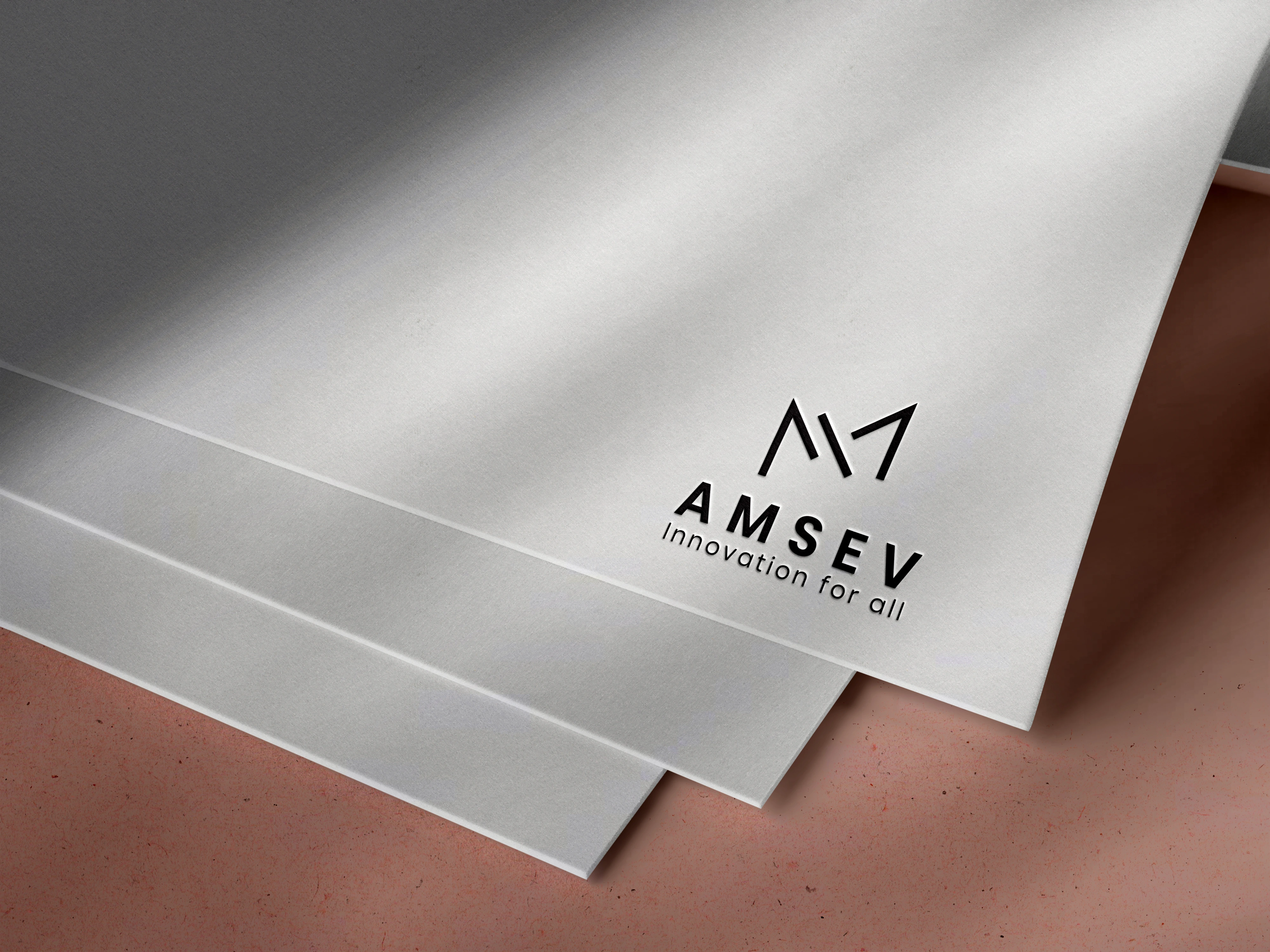
AMSEV - Logo & Brand Identity
Raza Ul Mustafa
🏢 Brand Name:
AMSEV
Tagline: Innovation For All
Industry: Tech – Software & Call Center Solutions
🚀 Brand Identity Overview
AMSEV positions itself at the intersection of innovation, accessibility, and customer service. The brand reflects high-tech precision, futuristic thinking, and inclusive innovation for businesses and consumers alike.
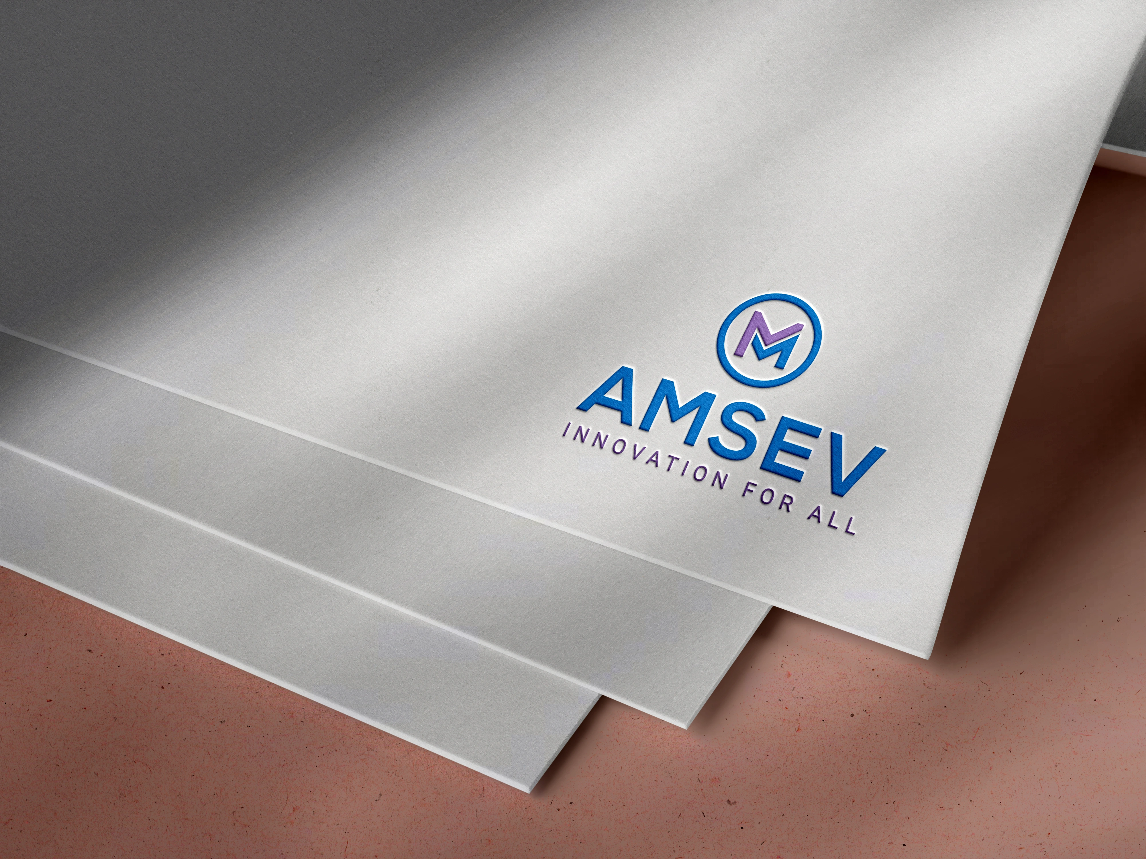
🖼️ Logo Overview
🔷 Primary Elements:
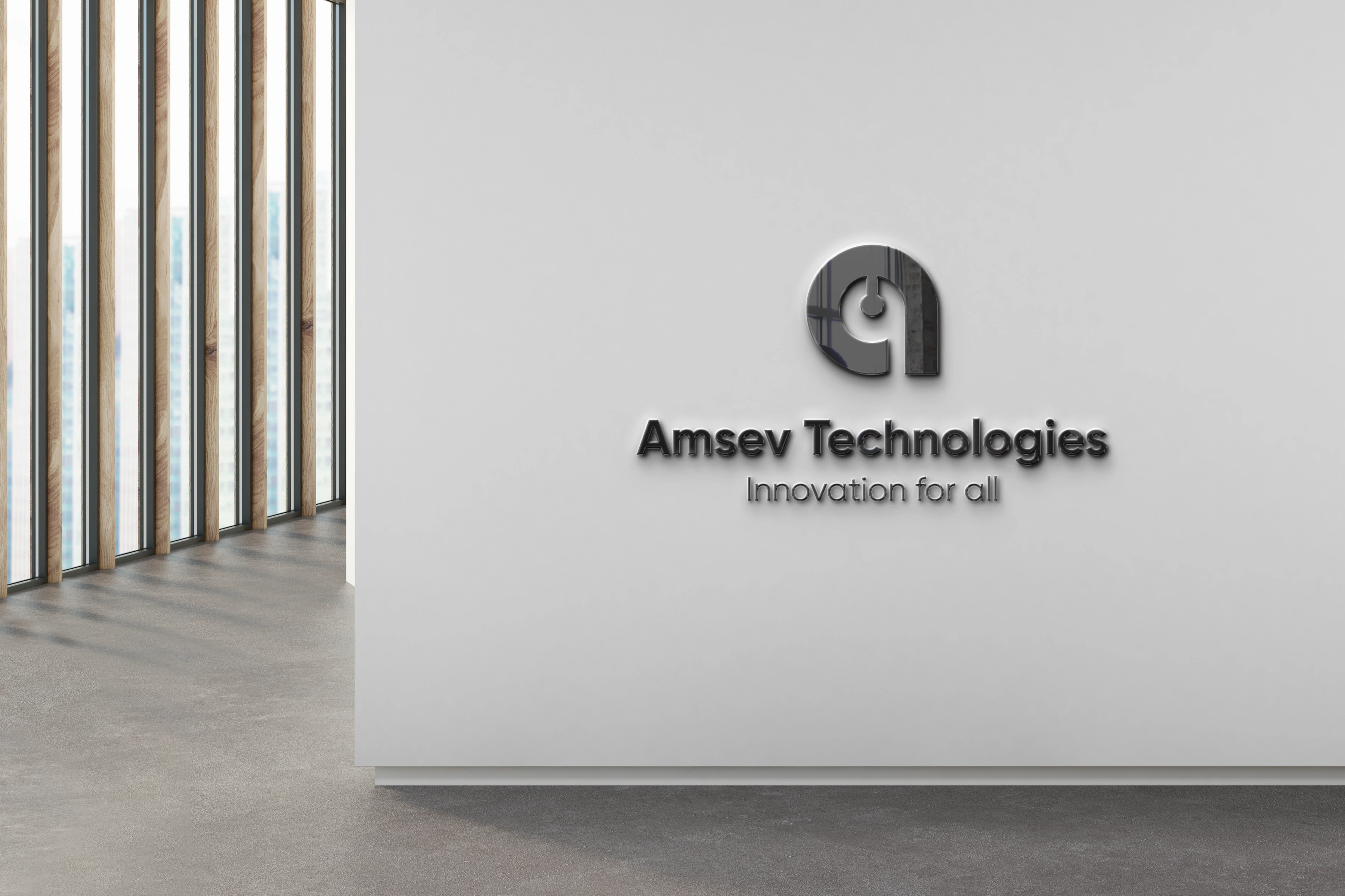
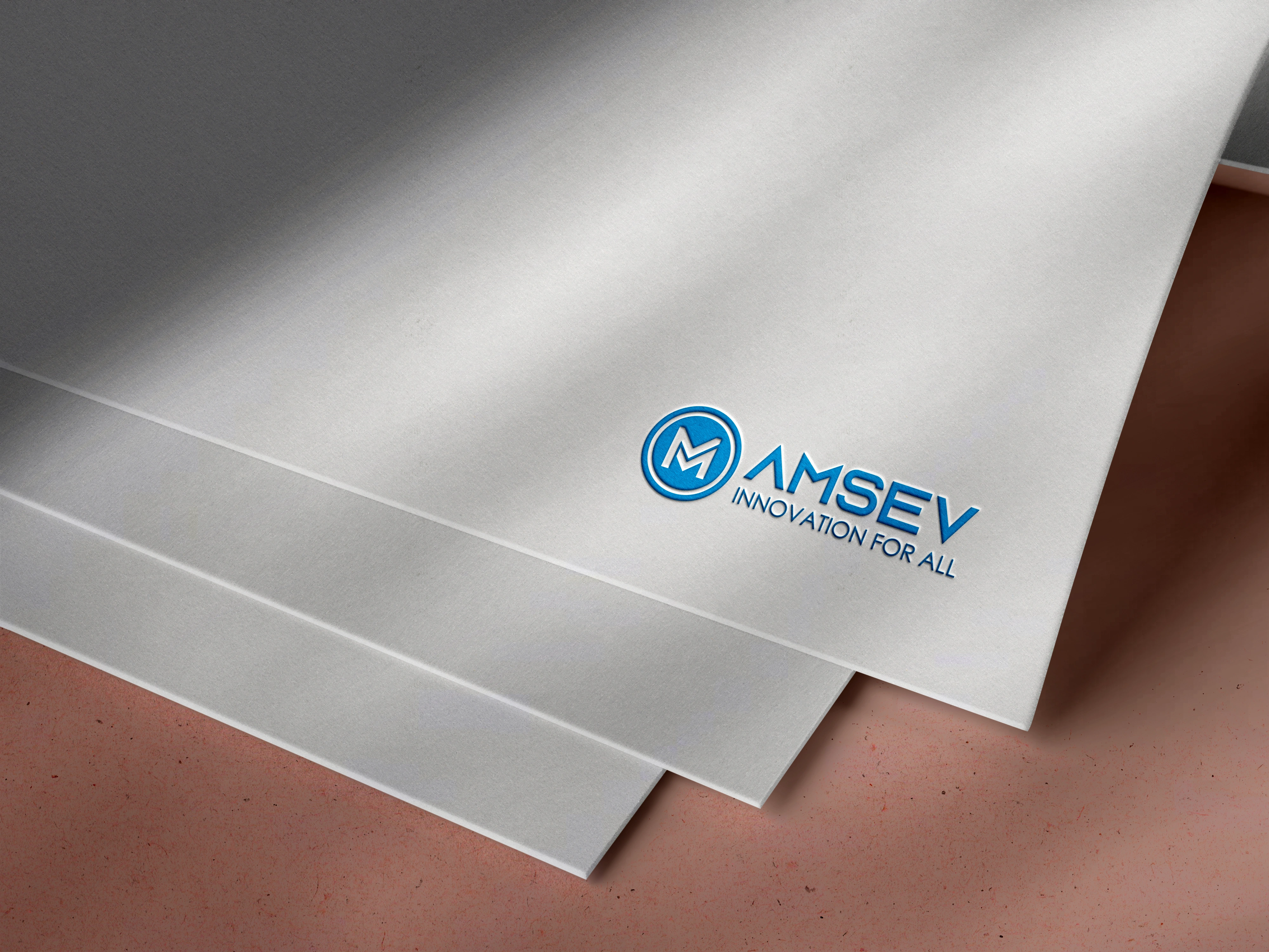
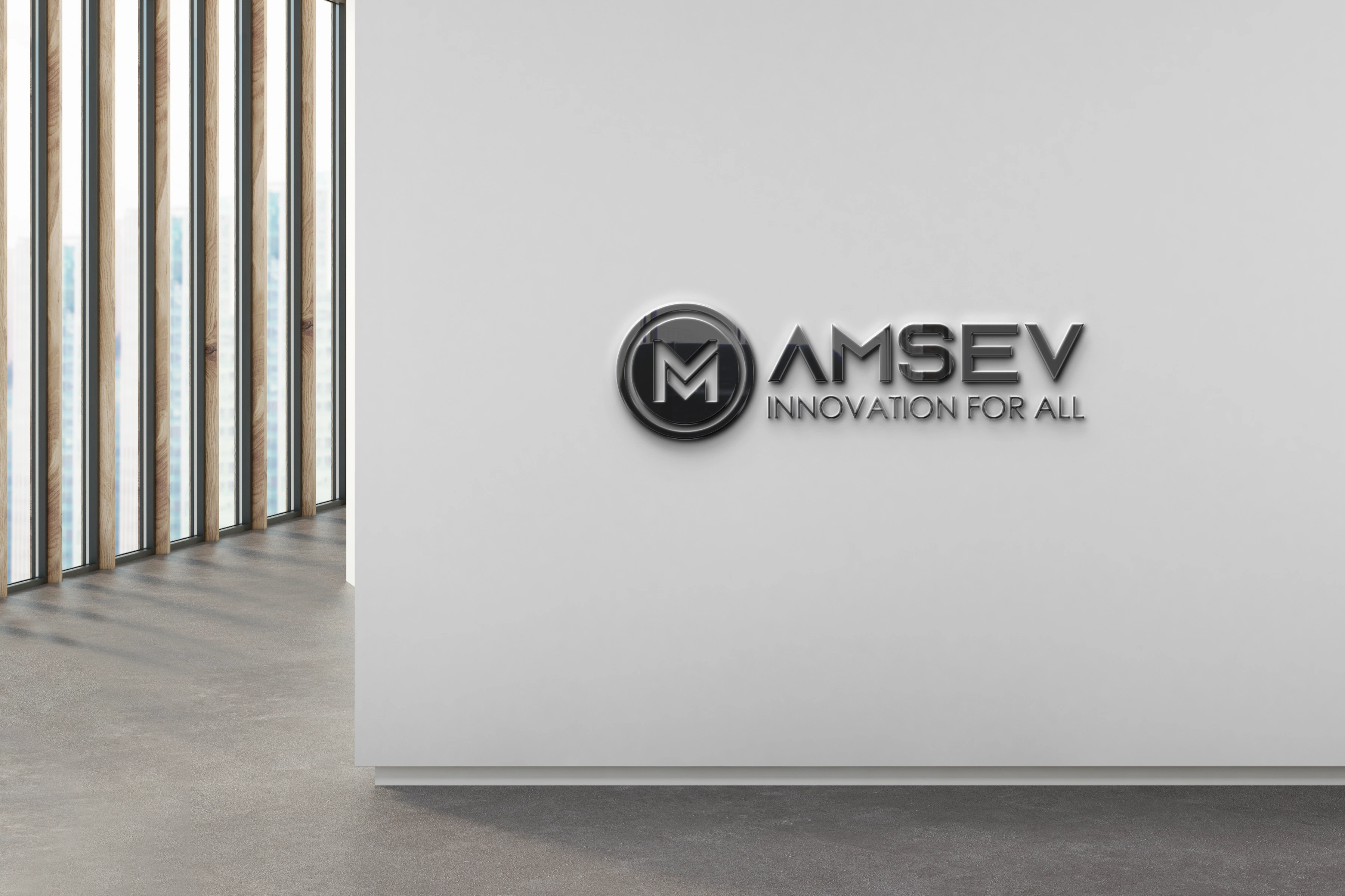
Symbol: The circular icon encloses a stylized “M” in a gradient blend of blue and purple. The circle represents completeness and global reach, while the “M” reinforces brand recognition.
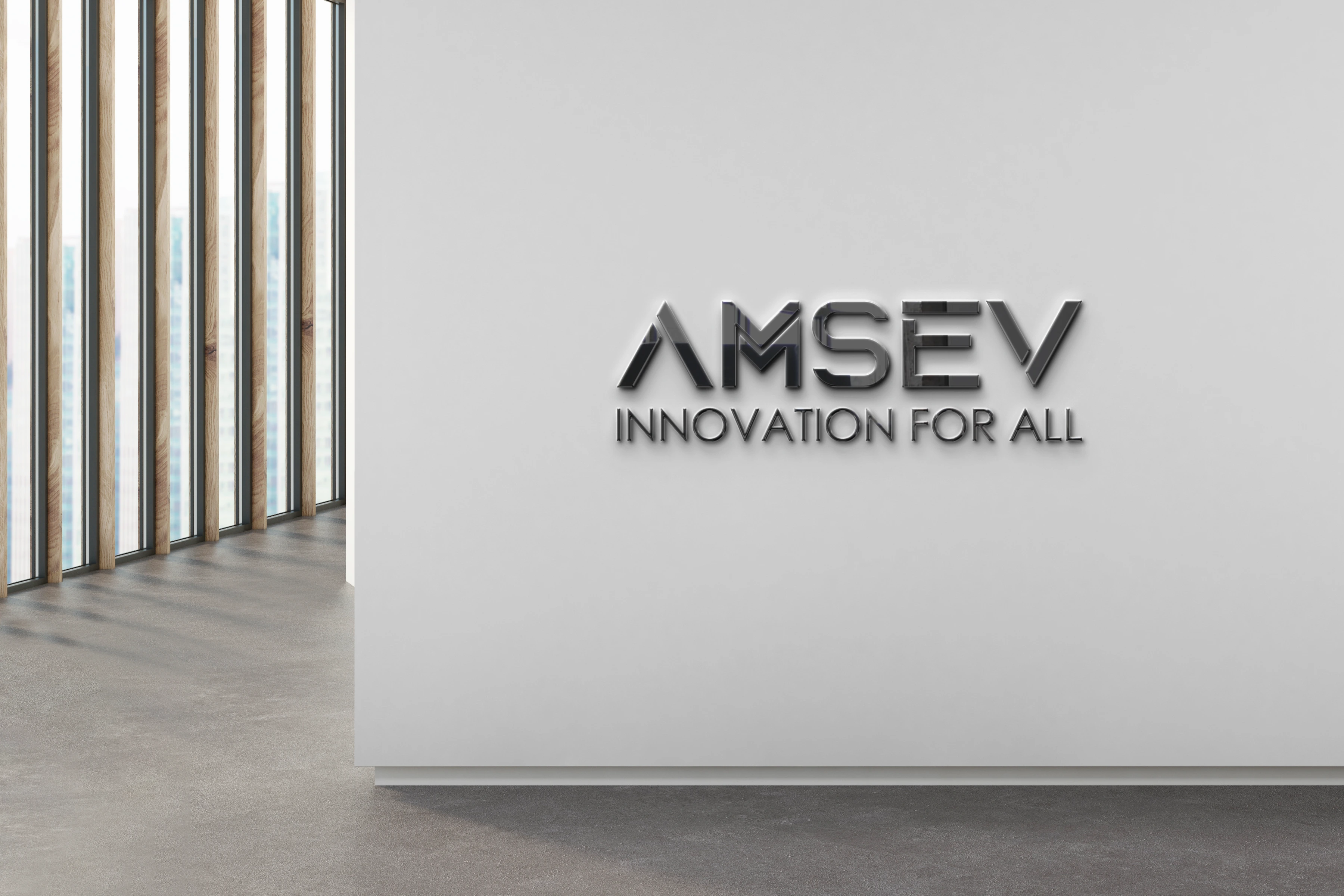
Typography: Strong, modern sans-serif font emphasizing professionalism and technological excellence.
Tagline: Clean, uppercase sans-serif font, in a subtle purple tone that complements the logo symbol.
🎨 Logo Variations
1. Primary Logo (Full Color)
Use: Official documents, website headers, pitch decks.
Includes: Icon + AMSEV + tagline.
2. Icon Only
Use: App icons, favicons, social media avatars.
Highlights: The stylized “M” inside the circle.
3. Horizontal Layout
Use: Navigation bars, email signatures.
Format: Icon on the left, wordmark and tagline to the right.
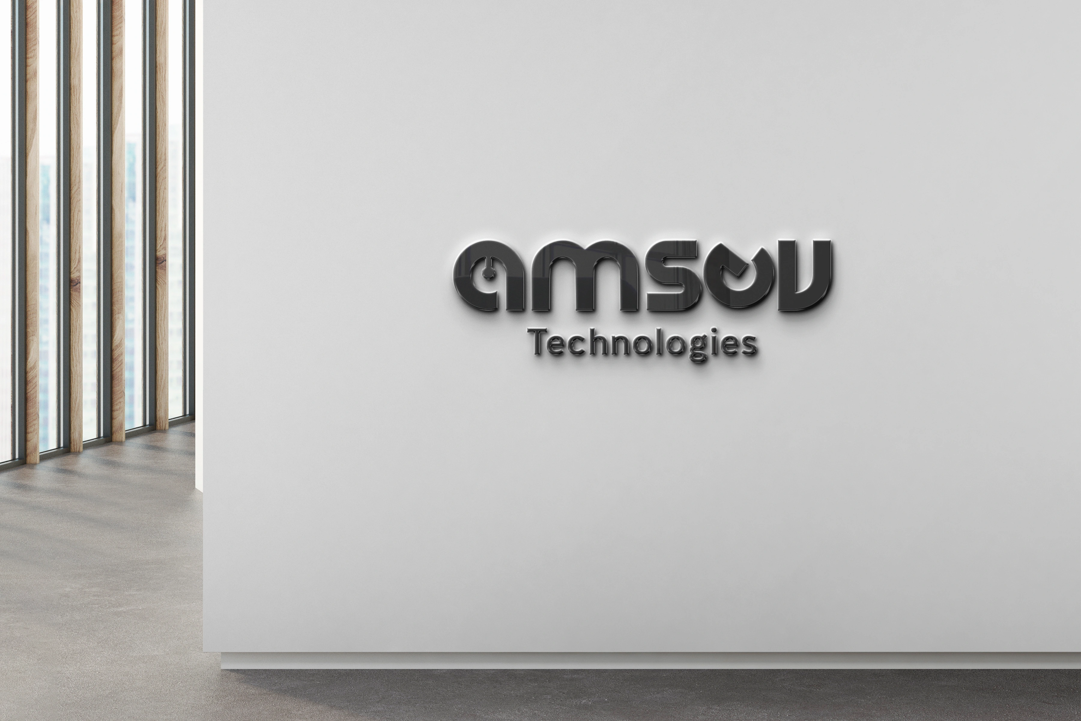
4. Monochrome / Reversed Logo
Use: Black & white prints, dark backgrounds.
🔤 Typography
Primary Font Family:
Heading: Poppins Bold / Montserrat Extra Bold
Body Text: Roboto Regular / Lato Light
Tagline: Uppercase Sans Serif – Light / Medium
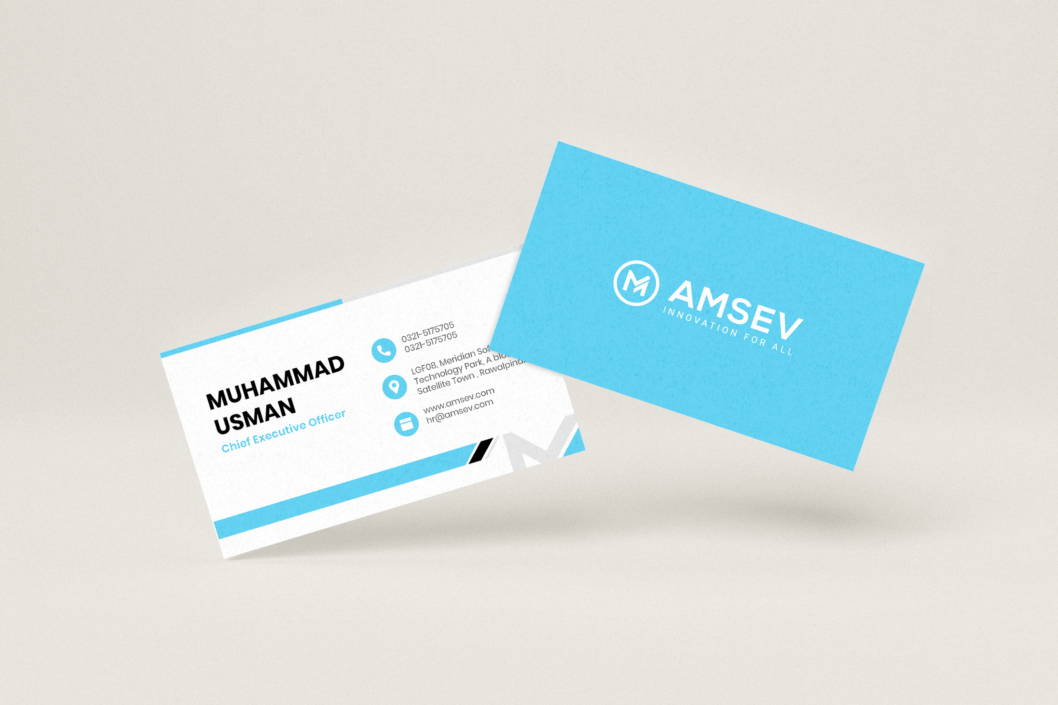
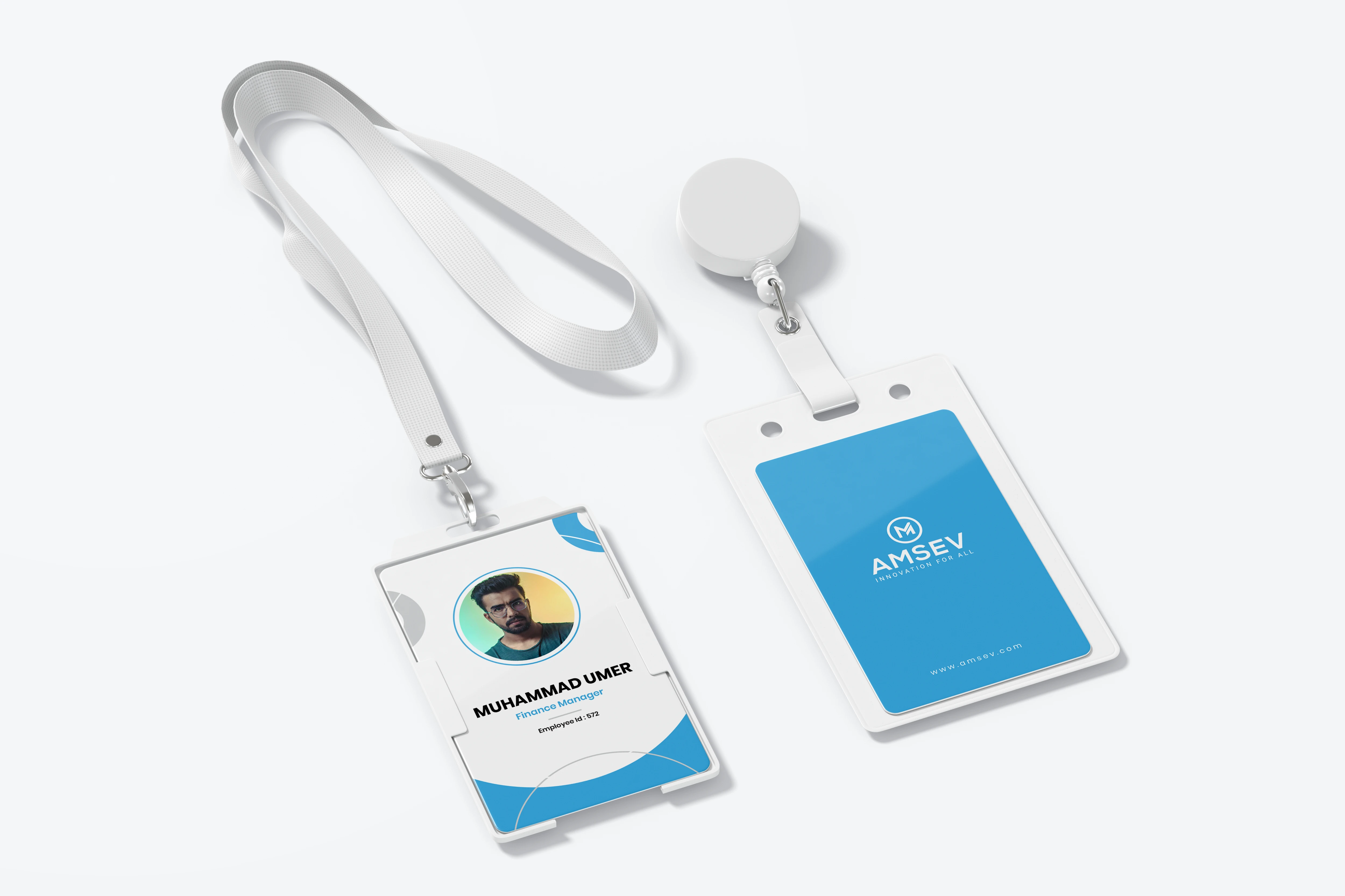
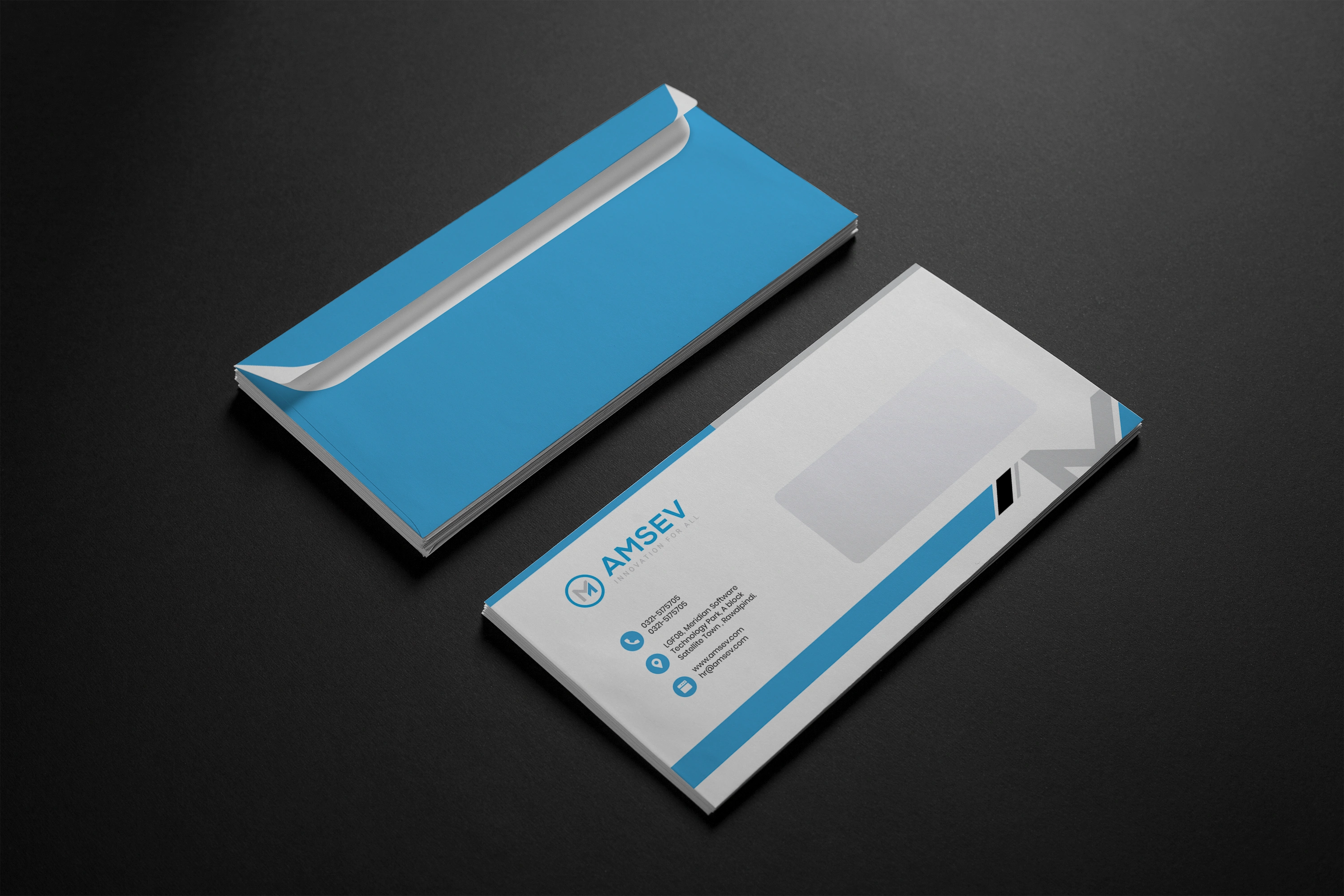
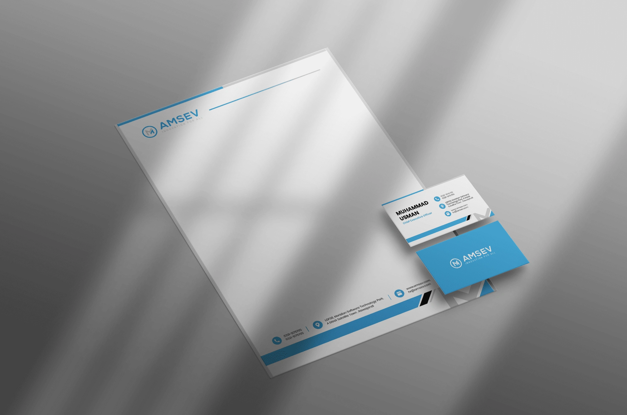
📄 Usage Applications
Website, dashboard UI, and mobile app interfaces
Corporate documents, business cards
Software packaging and digital brochures
Call center agent IDs, uniforms, and branded merchandise
LinkedIn banners, social media posts
Like this project
Posted Aug 28, 2024
The "Amsev" branding features a sleek, modern logo symbolizing connection and efficiency, complemented by consistent typography, colors, and imagery across all.