Brand Identity Development for LIVE - AI tool.
Eman Mansour
Project Overview
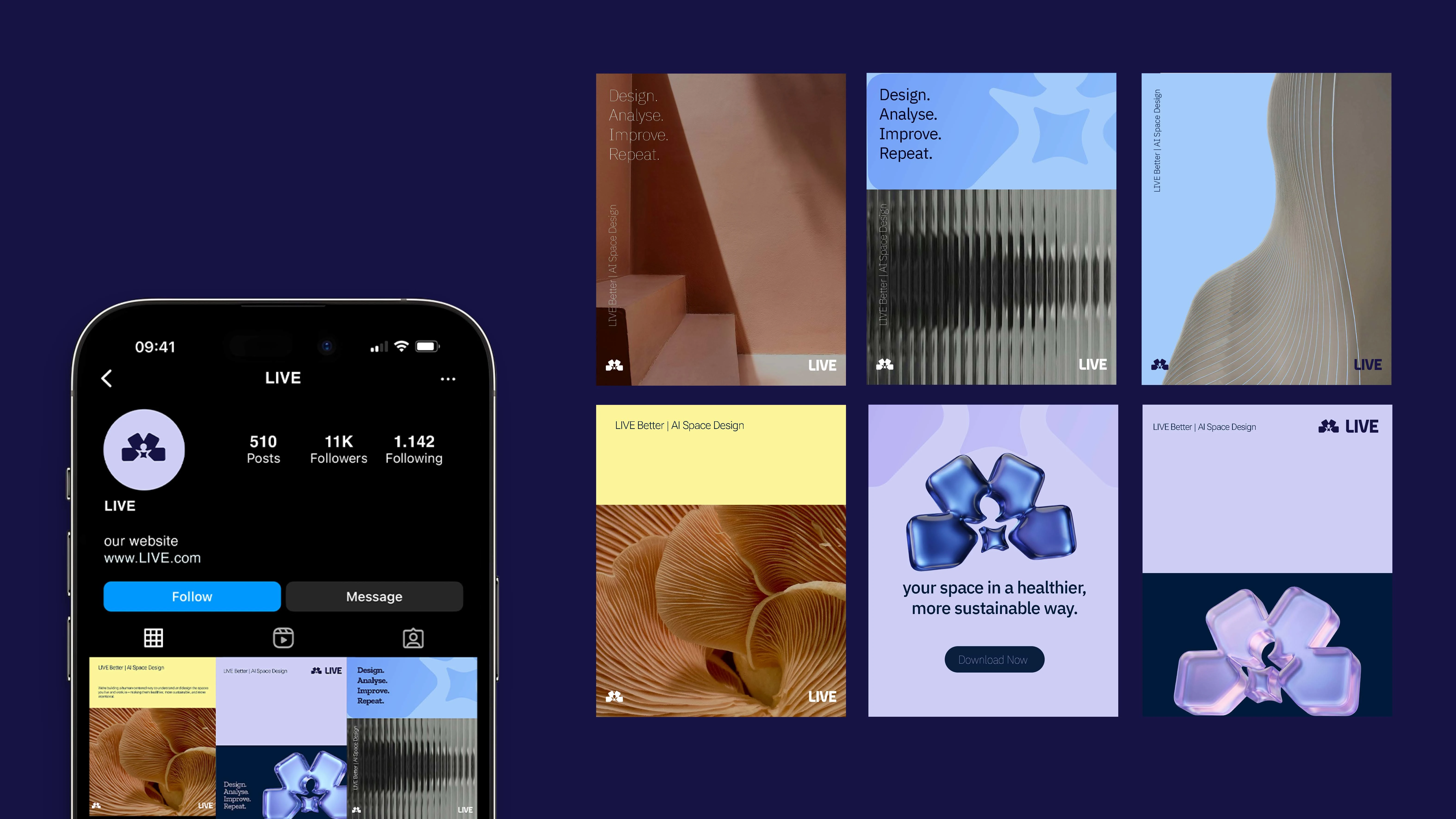
LIVE is a lifestyle brand that exists at the intersection of people, nature, and science. The goal was to create a brand identity that feels gentle yet intelligent, emotional yet structured — a system that could grow, adapt, and stay consistent across multiple touchpoints.
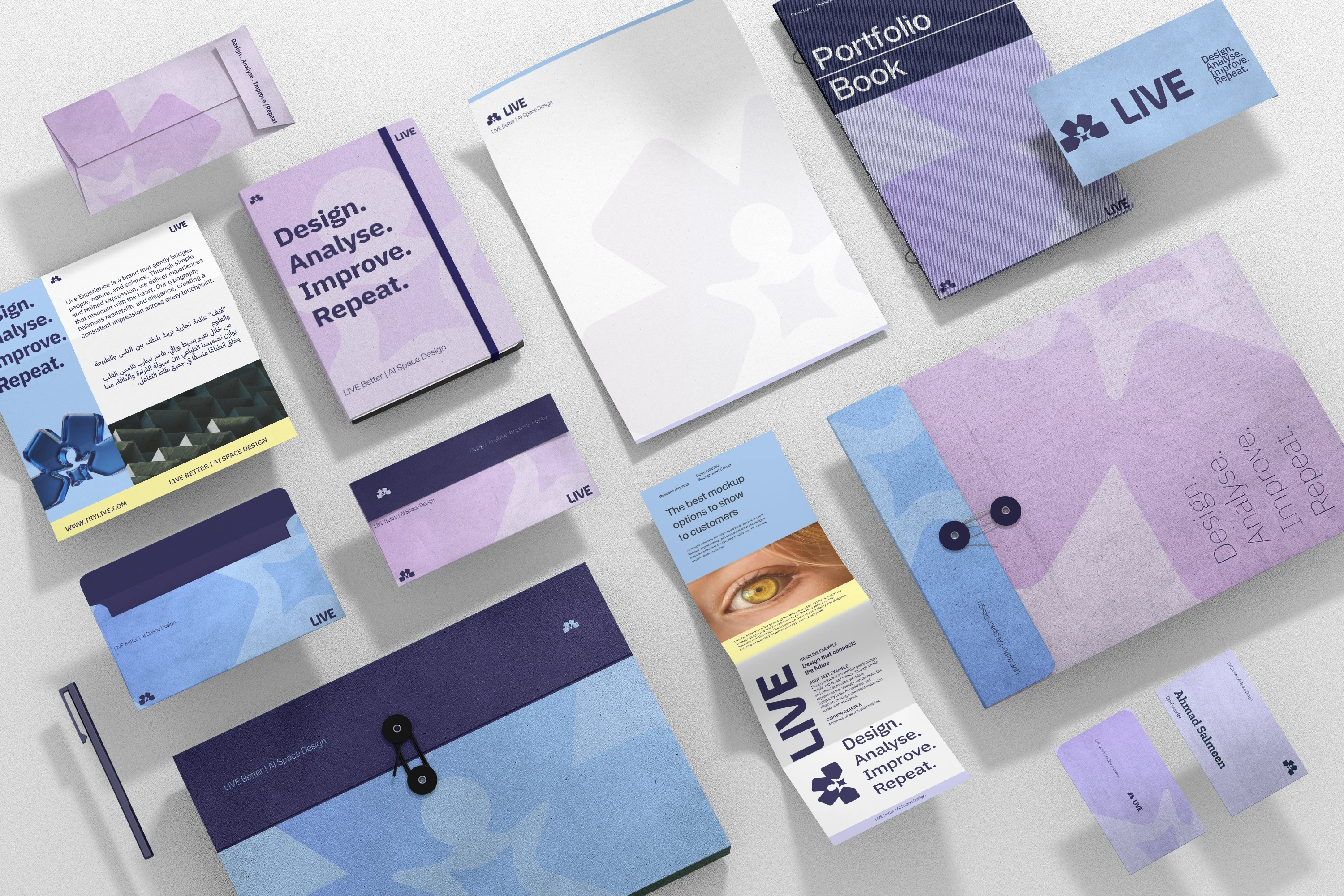
This project focused on building a complete visual ecosystem, not just a logo. Every element was designed to support a long-term brand presence rooted in clarity, warmth, and refinement.
The Challenge
LIVE needed a brand that could:
Communicate trust and emotional resonance without becoming overly soft
Feel modern and scientific without becoming cold or clinical
Work seamlessly in both Arabic and English
Scale across digital, print, and experiential environments
The key challenge was creating a visual language that balanced precision with warmth — a system that feels alive, not mechanical.
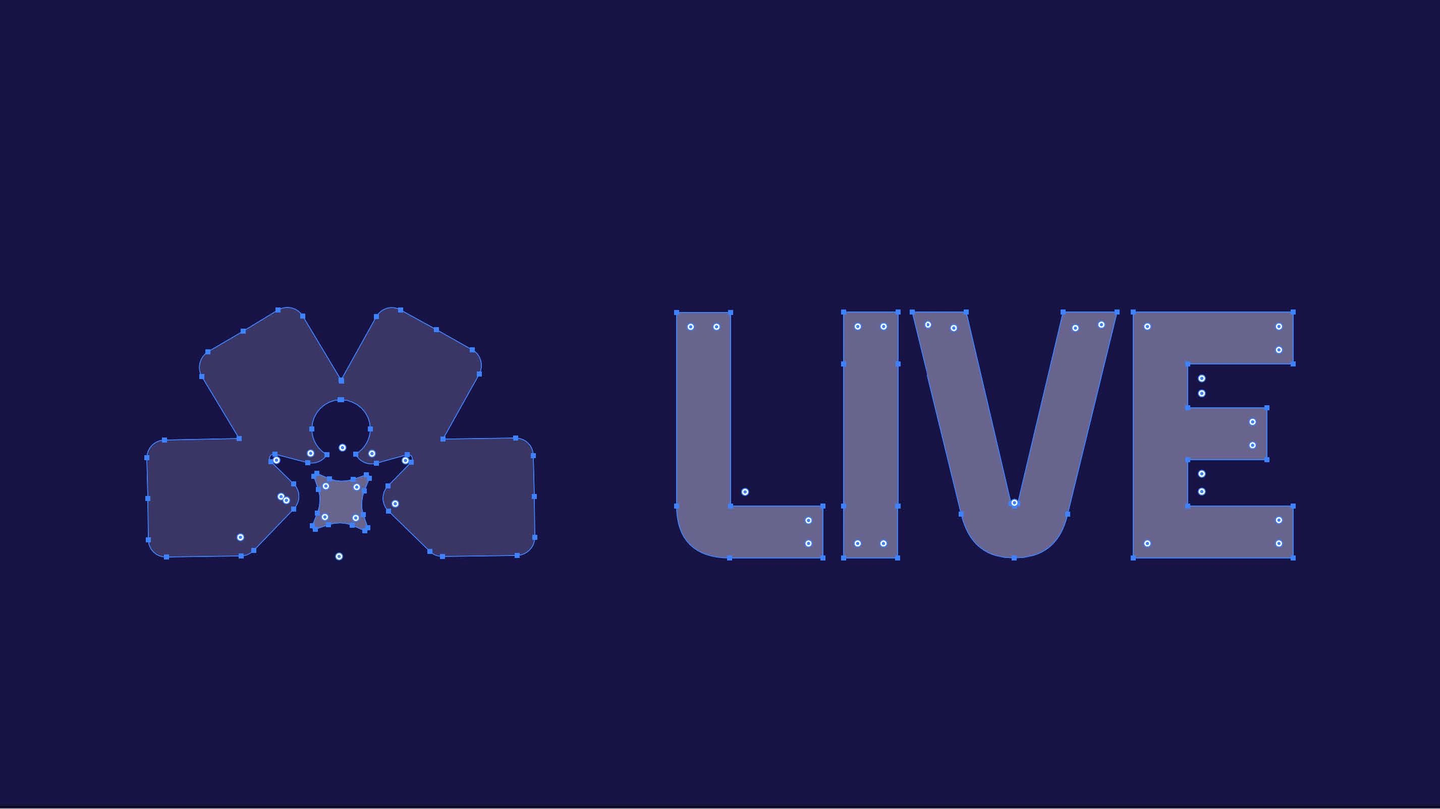
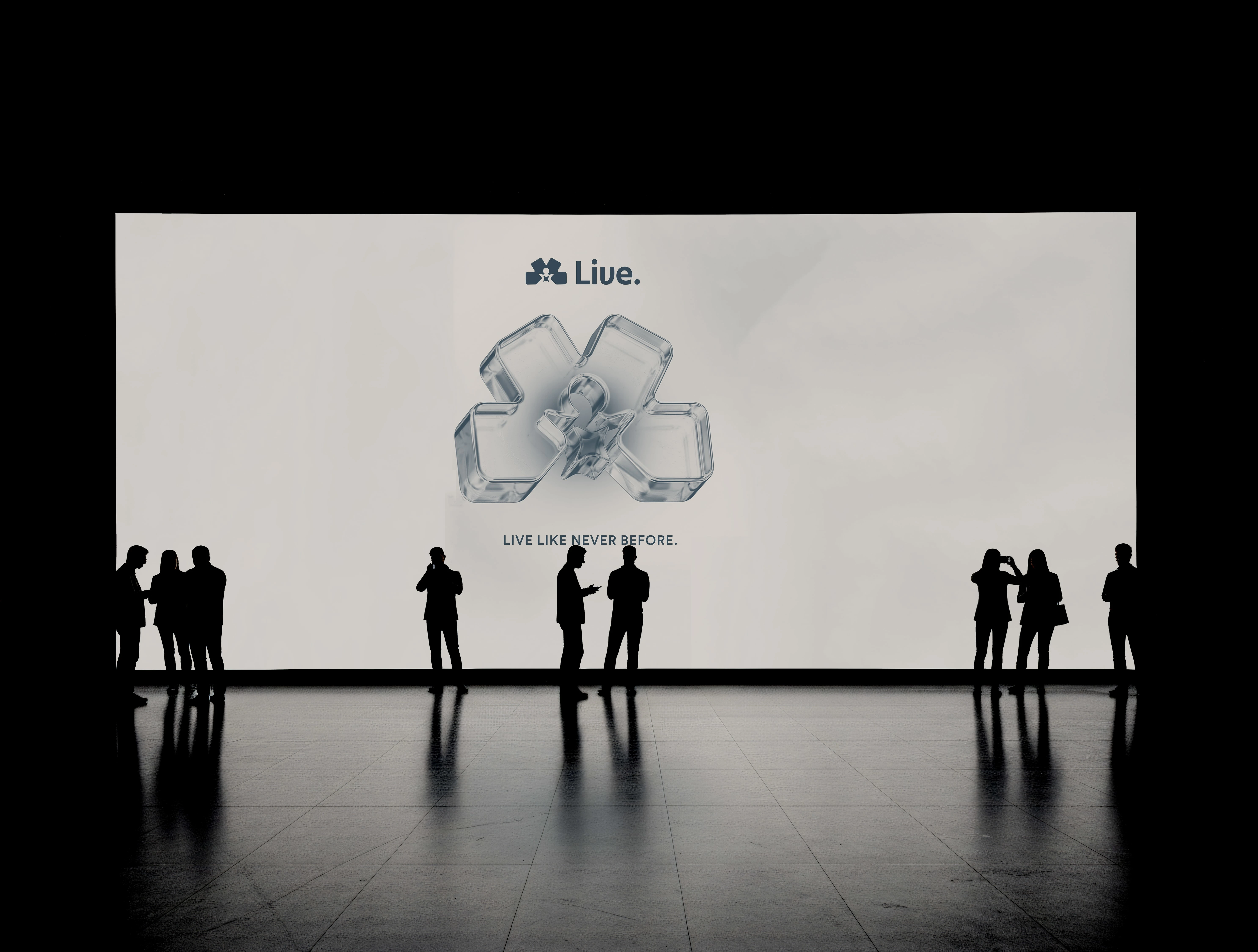
Logo Concept
The LIVE logo was designed as a minimal yet expressive mark that represents continuity and flow. Its structure balances geometric stability with soft movement, reflecting the harmony between science (structure) and life (fluidity).
The logo system includes flexible variations to ensure clarity and consistency across all sizes, backgrounds, and applications.
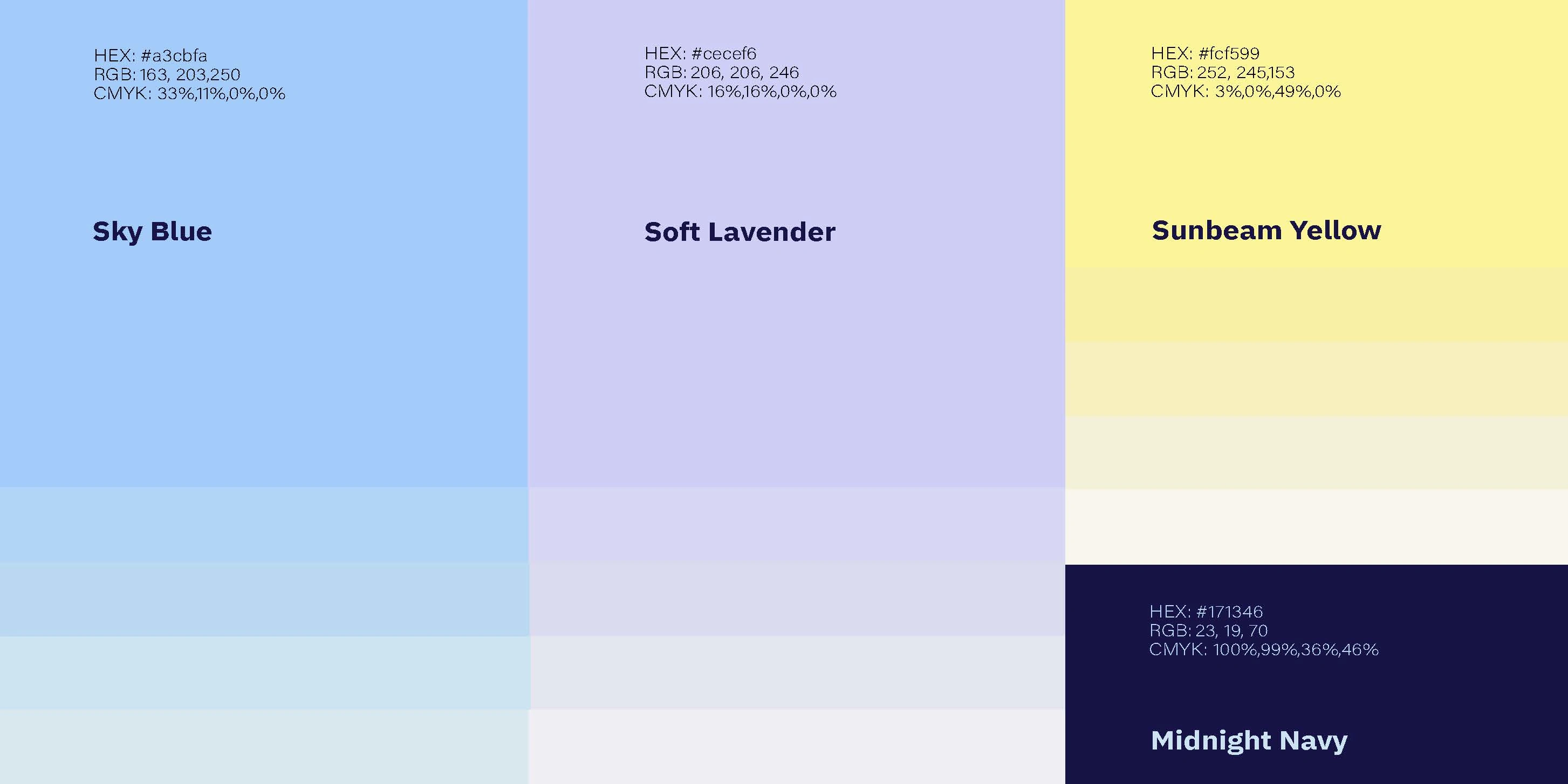
Color System
The color palette was built to express clarity, warmth, and emotional balance.
Primary Palette
Midnight Navy — Trust, depth, intelligence
Sky Blue — Openness, clarity, breath
Soft Lavender — Calm, emotional softness
Sunbeam Yellow — Optimism, energy, life
The combination allows the brand to feel grounded yet uplifting, scientific yet human.
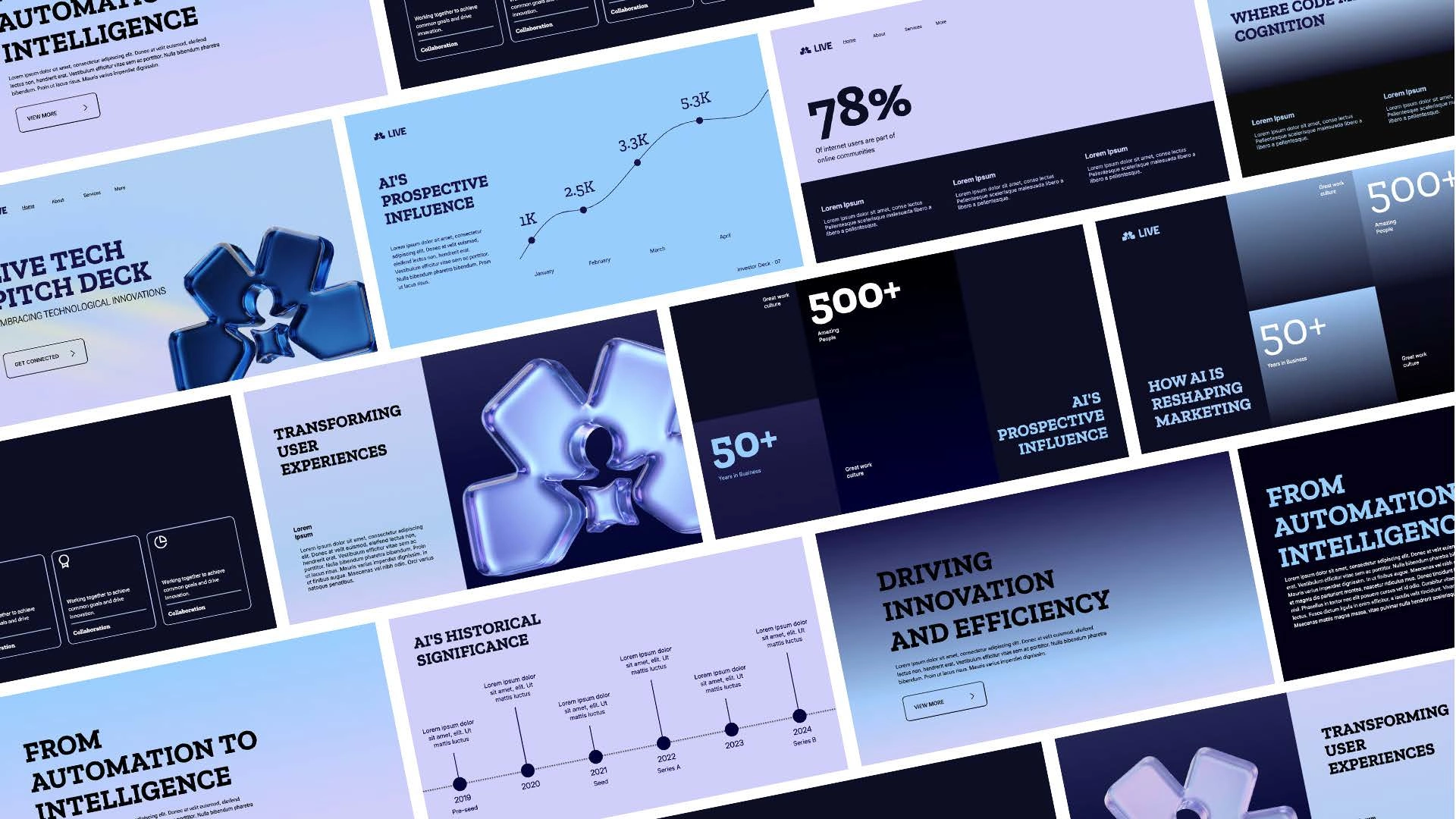
Typography System
Typography plays a major role in expressing the brand’s dual nature — refined but accessible.
Primary Typeface
IBM Plex Sans (Arabic & Latin)
Chosen for its modern structure, excellent readability, and ability to bridge technical precision with human warmth.
Secondary Typeface
Acumin Variable Concept
Used to introduce hierarchy, contrast, and flexibility across layouts.
The bilingual system ensures that both Arabic and English communications feel equally considered and harmonious.
Outcome
LIVE now has a cohesive, scalable, and emotionally intelligent brand system. The identity is flexible enough to grow with the brand while remaining rooted in its core philosophy:
Design that connects people, nature, and the future.
Like this project
Posted Feb 4, 2026
Created a cohesive brand identity for LIVE Experience, balancing warmth and structure.