Built with FlutterFlow
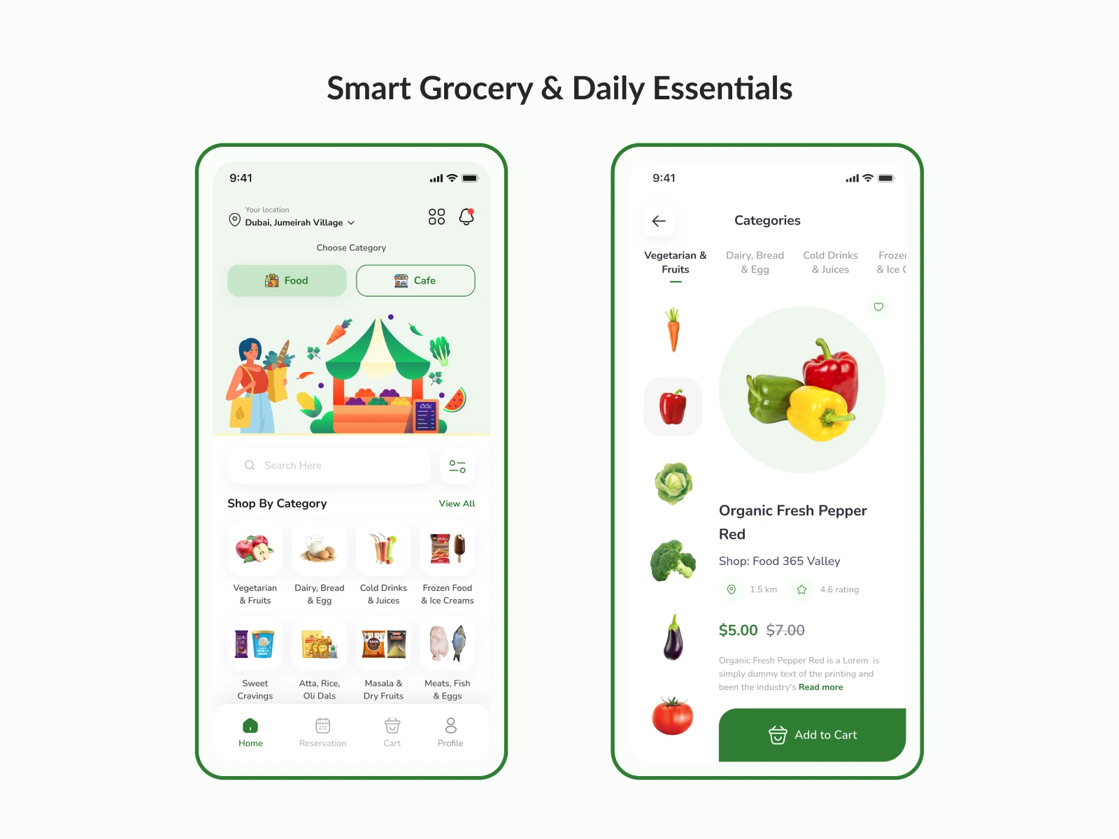
Grocery & Cafe Application Design
Empiric Infotech LLP
Overview
Maze is a food ordering and restaurant booking mobile application designed to help users quickly discover groceries, cafes, and dining experiences in their area. The project aimed to create a seamless, intuitive, and visually cohesive experience that balances user convenience with business profitability.
The app combines multiple services—food delivery, grocery shopping, and table booking—into a single platform, reducing friction and decision fatigue while encouraging repeat usage through saved items, notifications, and personalized discovery.
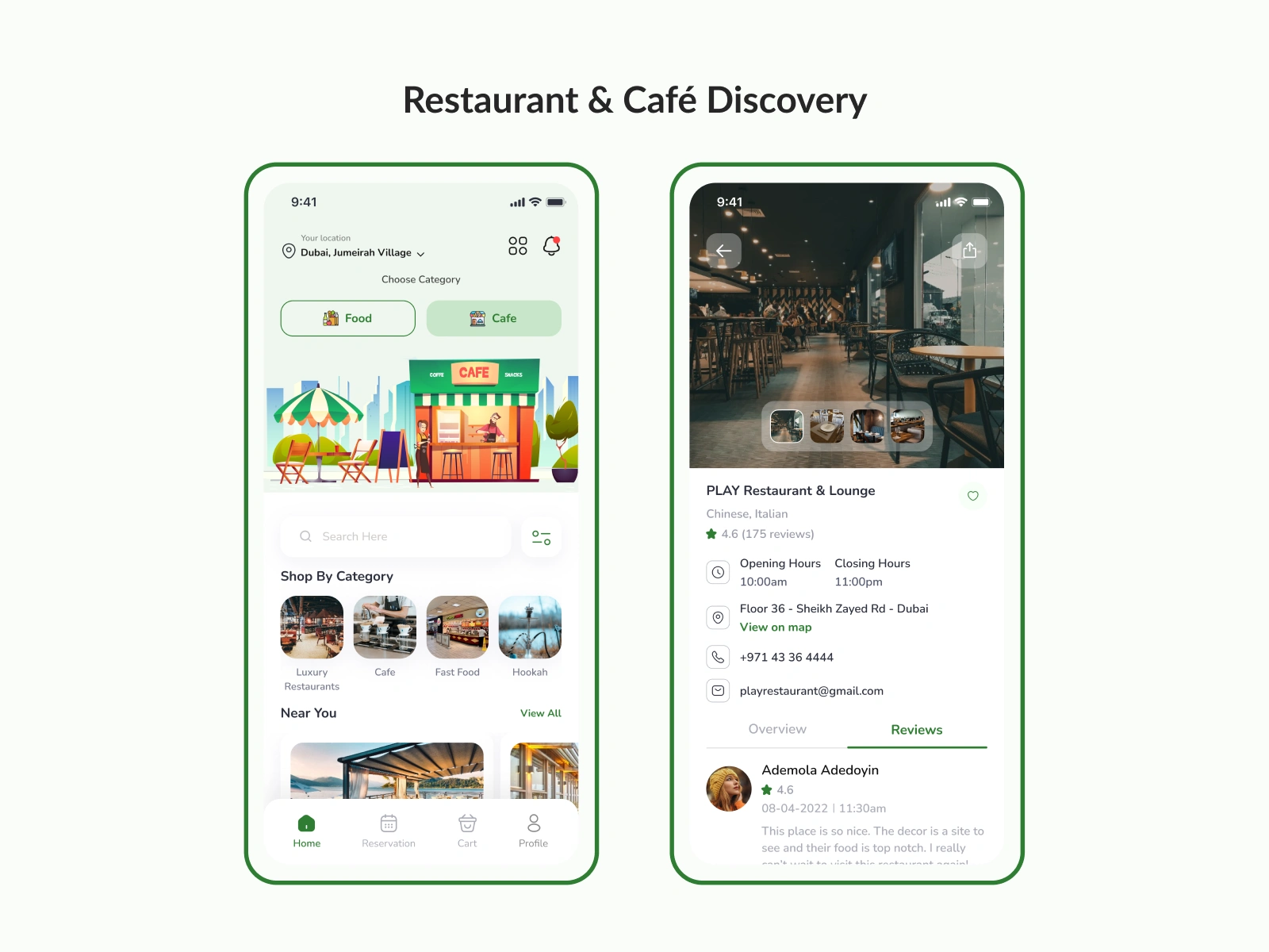
Restaurant & Café Discovery
The Challenges
Through research and competitor analysis, several key challenges were identified:
Complex Navigation
Competitor apps often overwhelmed users with crowded home screens and unclear category hierarchies.
High Drop-off During Checkout
Lengthy and unclear checkout flows led to cart abandonment and low conversion rates.
Lack of Visual Consistency
Inconsistent typography, spacing, and color usage across screens reduced trust and usability.
Poor Discovery Experience
Users struggled to quickly find relevant groceries, cafes, or restaurants based on their needs.
Unclear User Priorities
Businesses focused on upselling, while users prioritized speed, clarity, and ease of use.
My Approach & Solution
Research & Strategy
I began with competitor analysis to understand strengths, weaknesses, and design patterns across leading food and booking apps. This was followed by creating user personas that represented real-world users such as busy professionals, families, and health-conscious shoppers.
The design strategy focused on creating a counterpoint between user needs and business goals—ensuring fast task completion while still supporting promotions, upsells, and bookings.
Design Solutions
Simplified Navigation
Clear category-based structure for food, cafes, and groceries
Bottom navigation with intuitive icons and labels
Quick access to recent searches and saved items
Thoughtful Onboarding
Friendly visual onboarding to explain app value
Easy account creation with minimal friction
Guest access to reduce early drop-offs
Improved Discovery
Strong search functionality with recent searches
Visual category cards for faster recognition
Location-based recommendations
Seamless Checkout Flow
Fewer steps from cart to payment
Clear pricing, fees, and totals
Simple cart management with empty-state guidance
Consistent Visual Language
Clean green-and-white color palette for freshness and trust
Consistent typography and spacing
Friendly illustrations for empty states and onboarding
Key Deliverables
User Personas & Journey Mapping
Competitor Analysis Insights
High-Fidelity UI Screens, including:
Onboarding & account creation
Home & search experience
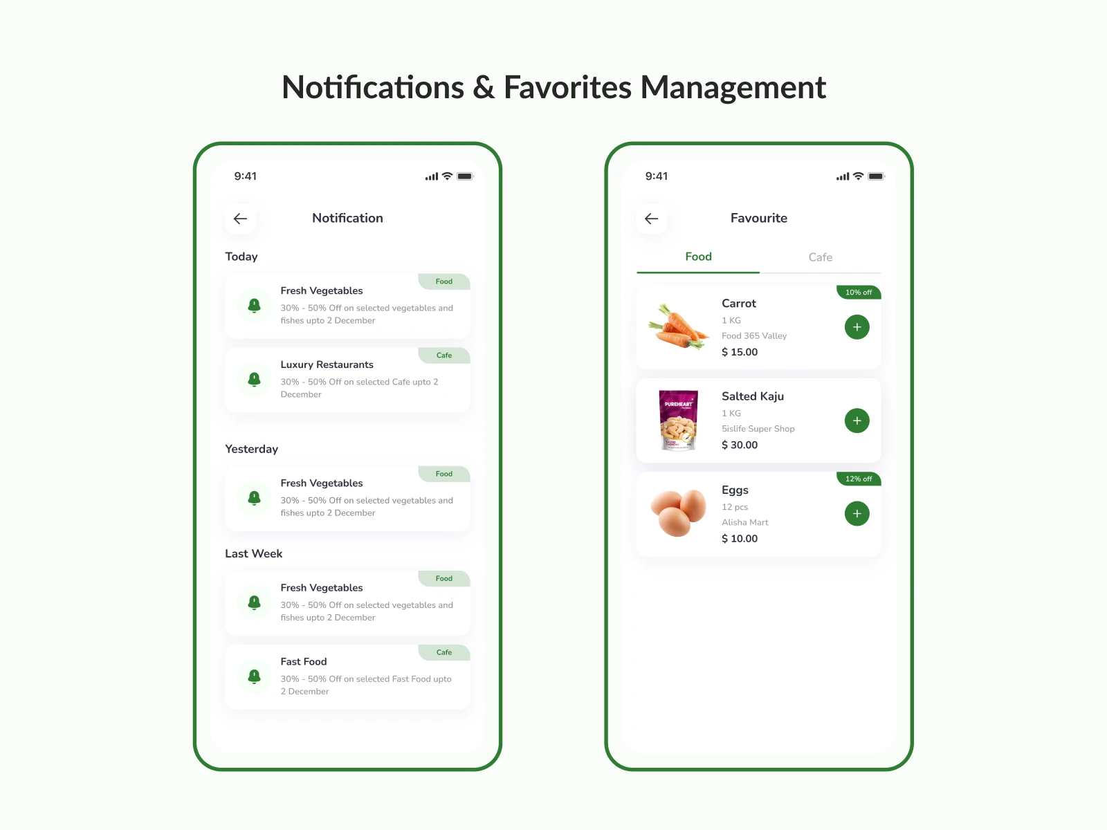
Notifications & saved items
Grocery item listing
Restaurant booking flow
Cart & checkout experience
Design System Guidelines
Color palette
Typography
UI components and states
Results & Impact
Reduced Cognitive Load
Clear navigation and visual hierarchy helped users complete tasks faster and with less confusion.
Improved Checkout Experience
A streamlined checkout flow minimized friction and encouraged higher conversion rates.
Stronger Brand Trust
Consistent visuals and thoughtful micro-interactions created a reliable and professional feel.
Enhanced User Engagement
Features like saved items, notifications, and recent searches encouraged repeat usage.
Balanced User & Business Goals
The design supports quick ordering for users while still enabling restaurants and businesses to showcase offerings effectively.
Like this project
Posted Jun 5, 2026
Grocery and cafe ordering app built with FlutterFlow and Firebase. Intuitive shopping and ordering experience with fast performance and engaging UI.