Vistara - Redefining Indian aviation
Kinshuuk Bose
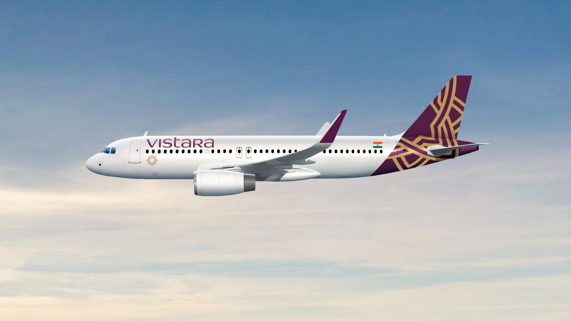
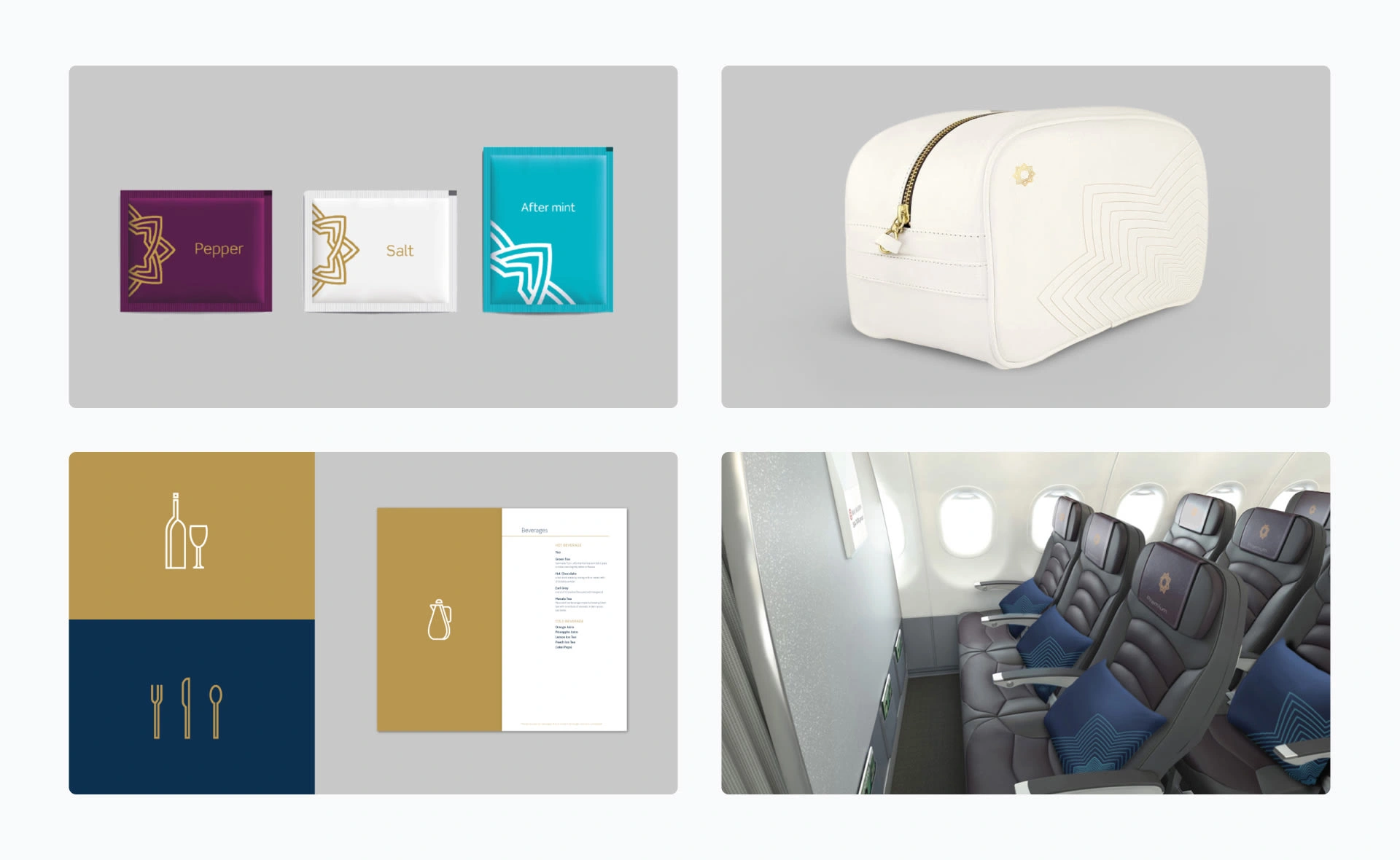
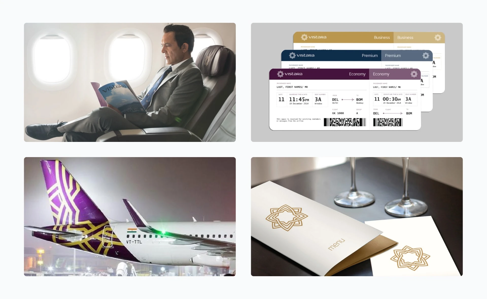
Vistara provides a seamless flying experience, thoughtfully delivered to each passenger.
The challenge was that the Indian aviation industry is a saturated marketplace with well-established competitors and an overall emphasis on cost minimisation.
Vistara focuses on providing a more premium and seamless flying experience which is thoughtfully delivered to each customer.
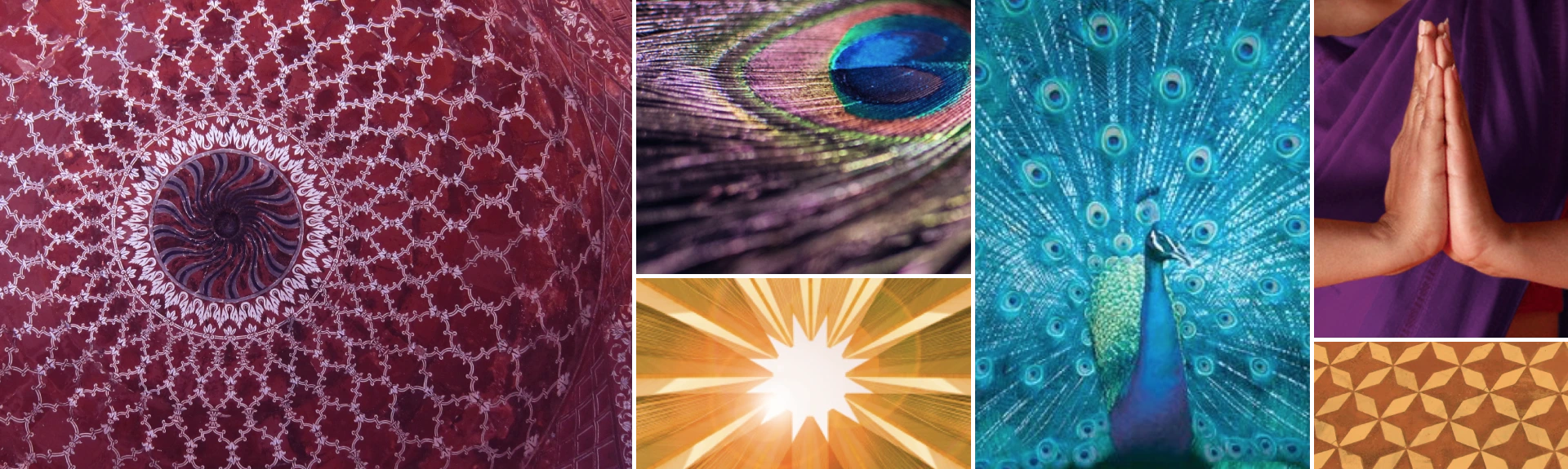
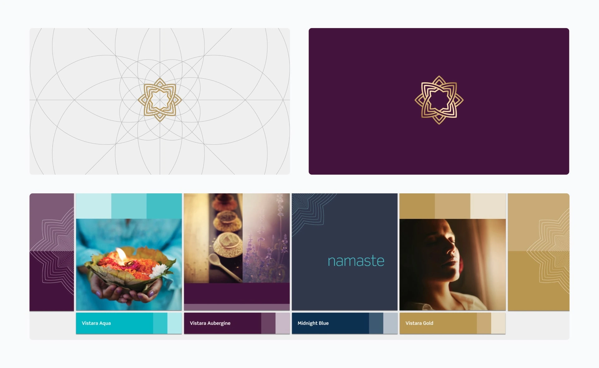
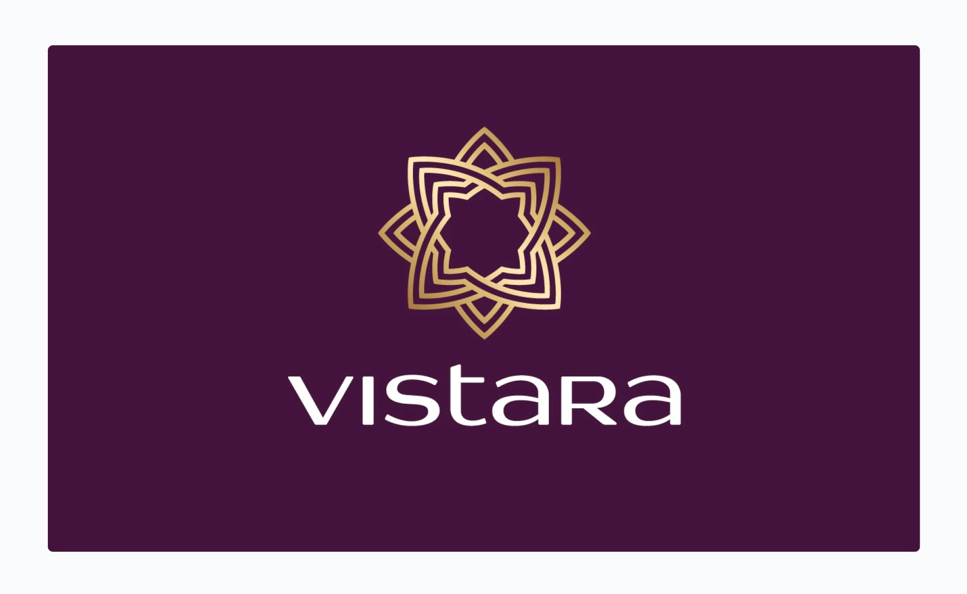
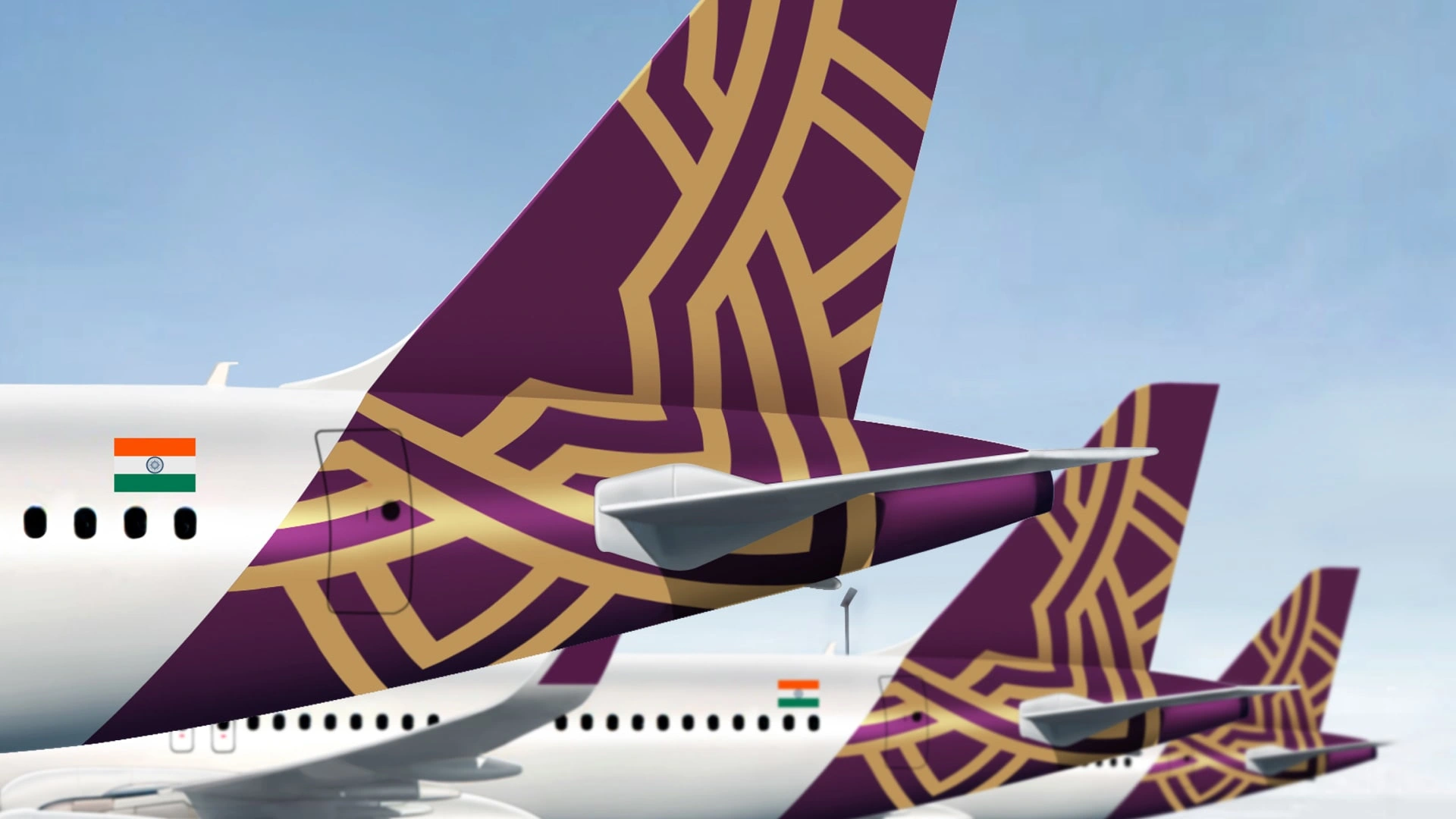
Vistara is derived from ‘vistaar’ which means ‘infinite expanse’ in Sanskrit. The Vistara symbol is an 8 pointed star which resembles a compass rose that signals the brand’s commitment to excellence in everything that it does.
The expansive star is a pattern which has grown from the boundary of the Vistara symbol. Its far-reaching shapes reflect the diverse, expansive journeys across India and the world.

Success Story
Vistara, launched in 2015 as a joint venture between Tata Sons (51%) and Singapore Airlines (49%), redefined Indian aviation by offering a high-end, full-service experience.
Vistara established itself as a premier carrier, operating 70+ aircraft, serving 32 domestic and 18 international destinations, and capturing a ~10% market share before merging with Air India in 2024
Like this project
Posted Apr 16, 2026
Premium brand identity and design system for Vistara, reframing India's full-service airline as a craft-led challenger in a cost-driven aviation market.
Likes
0
Views
4
Timeline
Jan 1, 2015 - Jan 1, 2024
Clients
Vistara