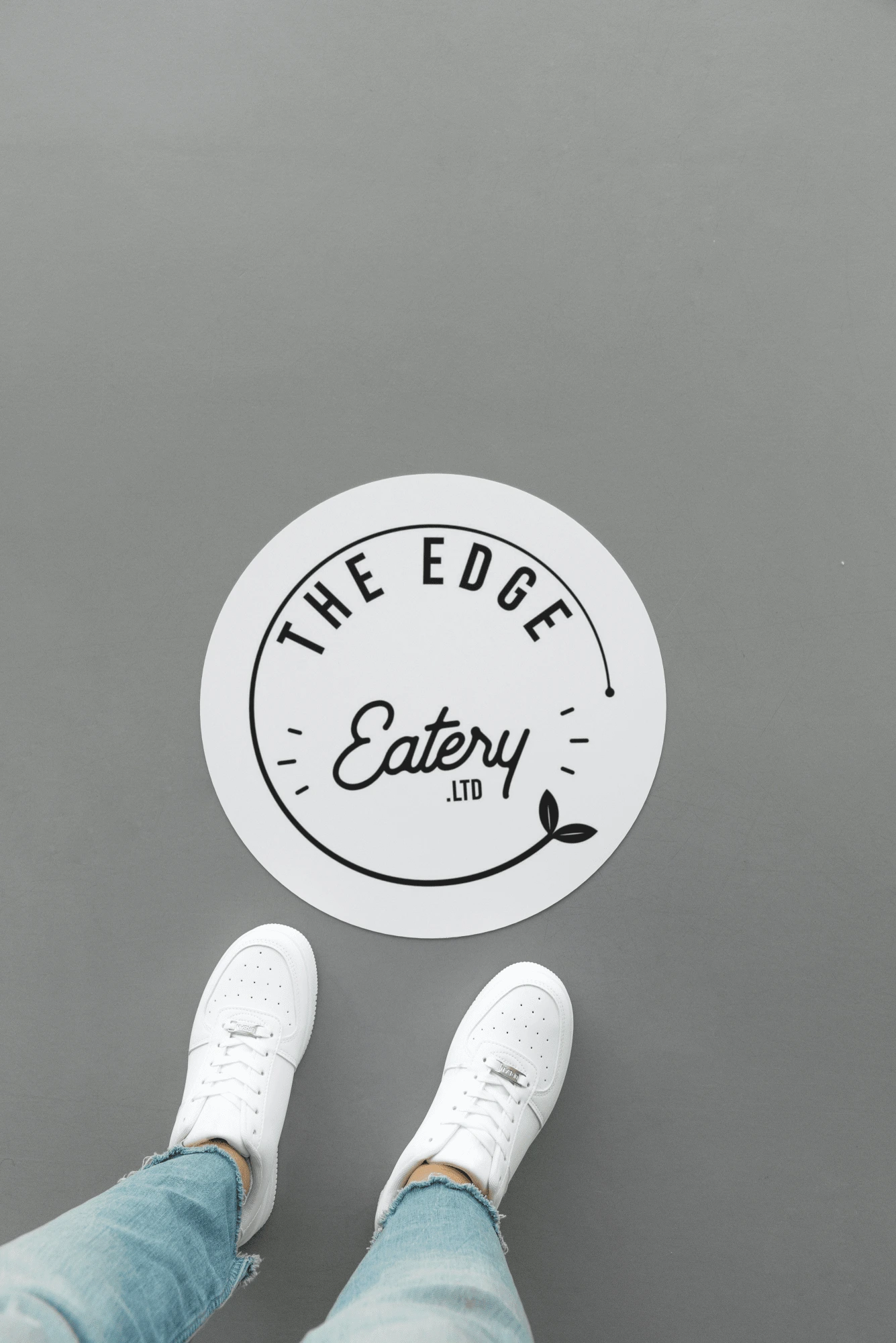
EDGE EATERY
Berry Brown
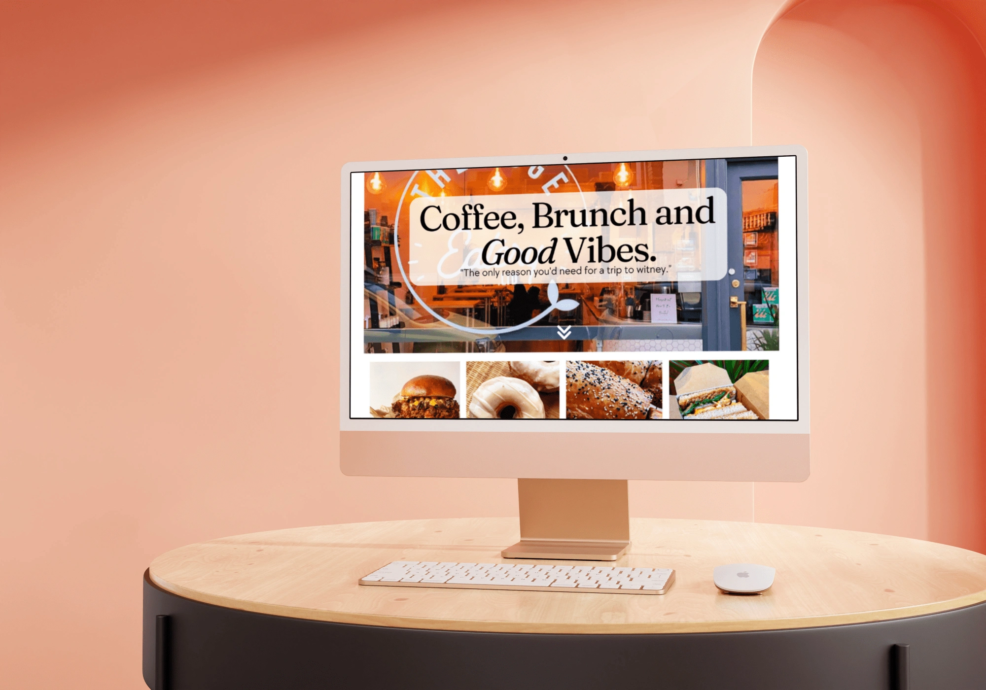
I have been working with the Edge Eatery for years and initially helped them design their logo at the start of their successful journey. luckily for me they have been loyal customers ever since!
Their style is very minimal so I keep the layouts clean and un-clustered. The food from the Edge sells itself so having the images big and bold and in full colour is always important to draw the customer in. Finally, they are niche company so I lean towards fonts that portray this, along with quirky illustrations I have designed.
I love that I've had the pleasure of watching their brand progress as they've built a wider customer base. Transitioning from a low-lit, shabby chic and eat with your hands atmosphere, to a stylish top notch and edgy establishment.
Like this project
Posted Mar 4, 2023
The Edge Logo and website creation.