
01 — Brand Introduction
Japanese Heritage × Contemporary Hospitality
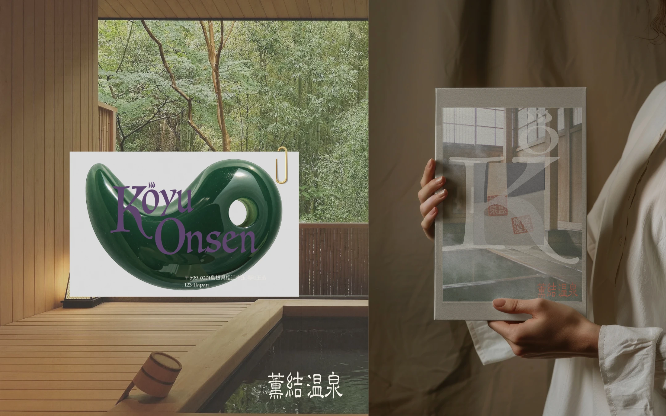
KŌYU ONSEN is a conceptual luxury ryokan inspired by Tamatsukuri Onsen in Shimane, Japan.
Rooted in the cultural heritage of Izumo, the brand reinterprets traditional Japanese bathing rituals through contemporary visual identity, refined typography and a thoughtful approach to hospitality.
02 — Brand Story & Visual Identity
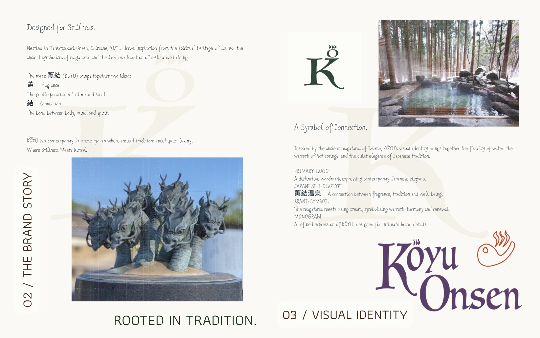
The Meaning Behind KŌYU
The name 薫結 (KŌYU) combines fragrance (薫) and connection (結), reflecting the relationship between nature, body and mind.
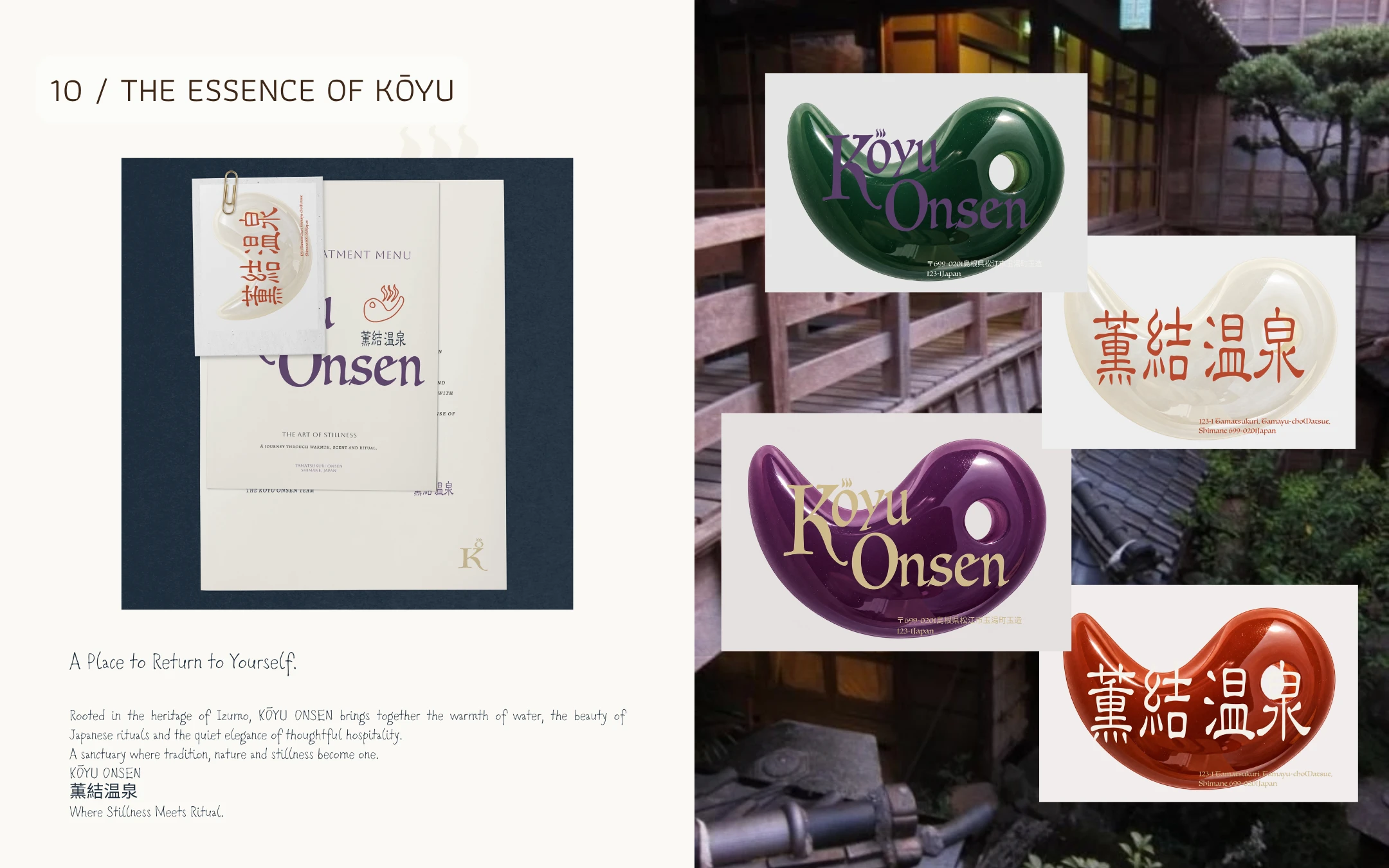
Inspired by the ancient magatama and the spiritual traditions of Izumo, the visual identity translates cultural symbolism into a contemporary logo system, balancing fluid forms with quiet elegance.
03 — Colour Palette & Brand Applications
Colours Rooted in Heritage
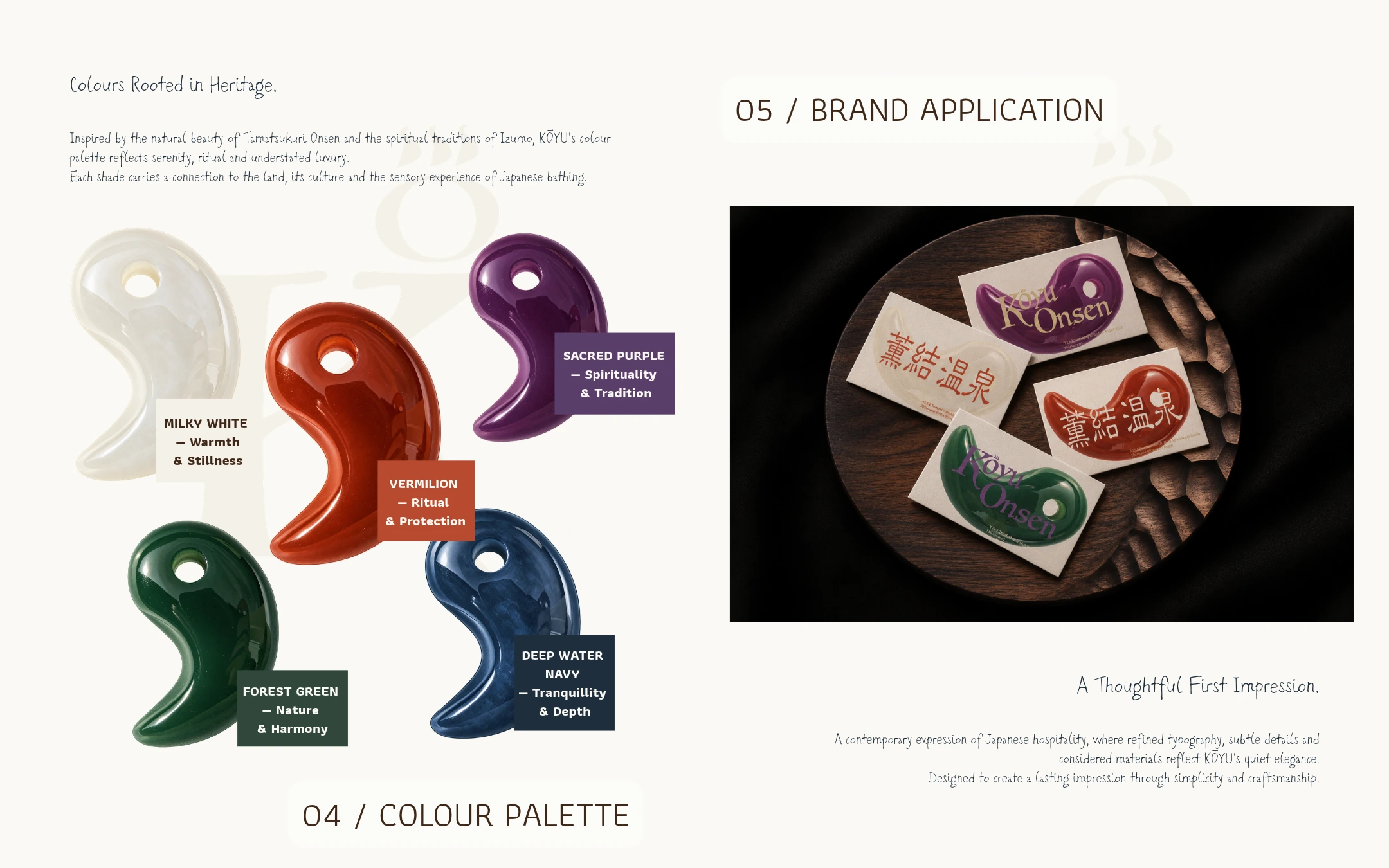
Five signature colours express the brand's connection to nature, water and Japanese spiritual heritage.
From mineral-inspired whites and deep forest greens to sacred purple and vermilion, the palette creates a balance between serenity and cultural significance.
The identity extends into stationery, where material textures and distinctive typography bring the brand into everyday interactions.
04 — Treatment Menu & Welcome Card
Editorial Design Meets Omotenashi
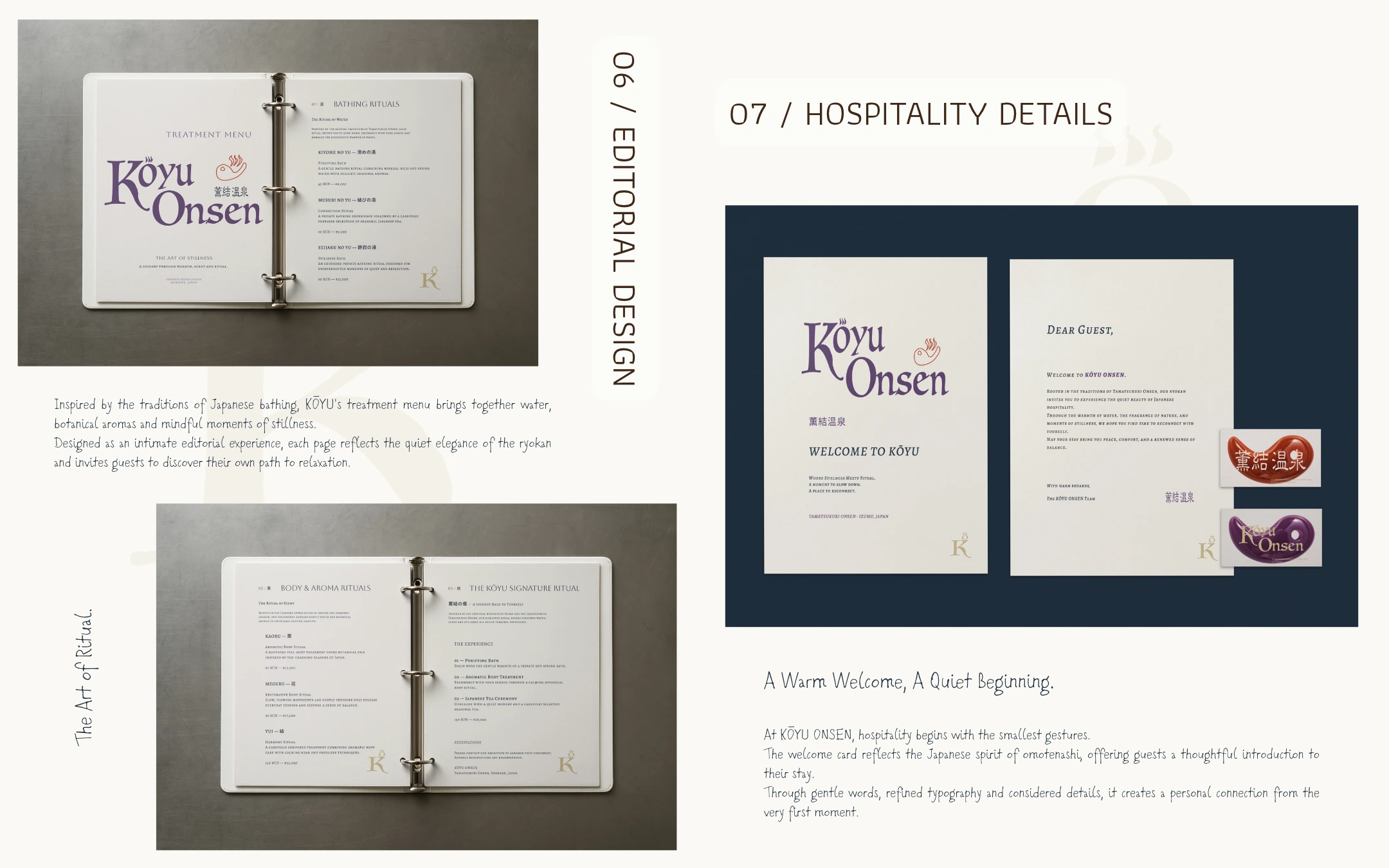
The treatment menu was designed as a four-page editorial experience, guiding guests through bathing rituals, aromatic treatments and KŌYU's signature wellness journey.
Complementing the menu, the welcome card introduces guests to the ryokan through thoughtful typography, carefully composed details and the Japanese spirit of omotenashi.
05 — Brand Details & Ryokan Experience
Beyond Visual Identity
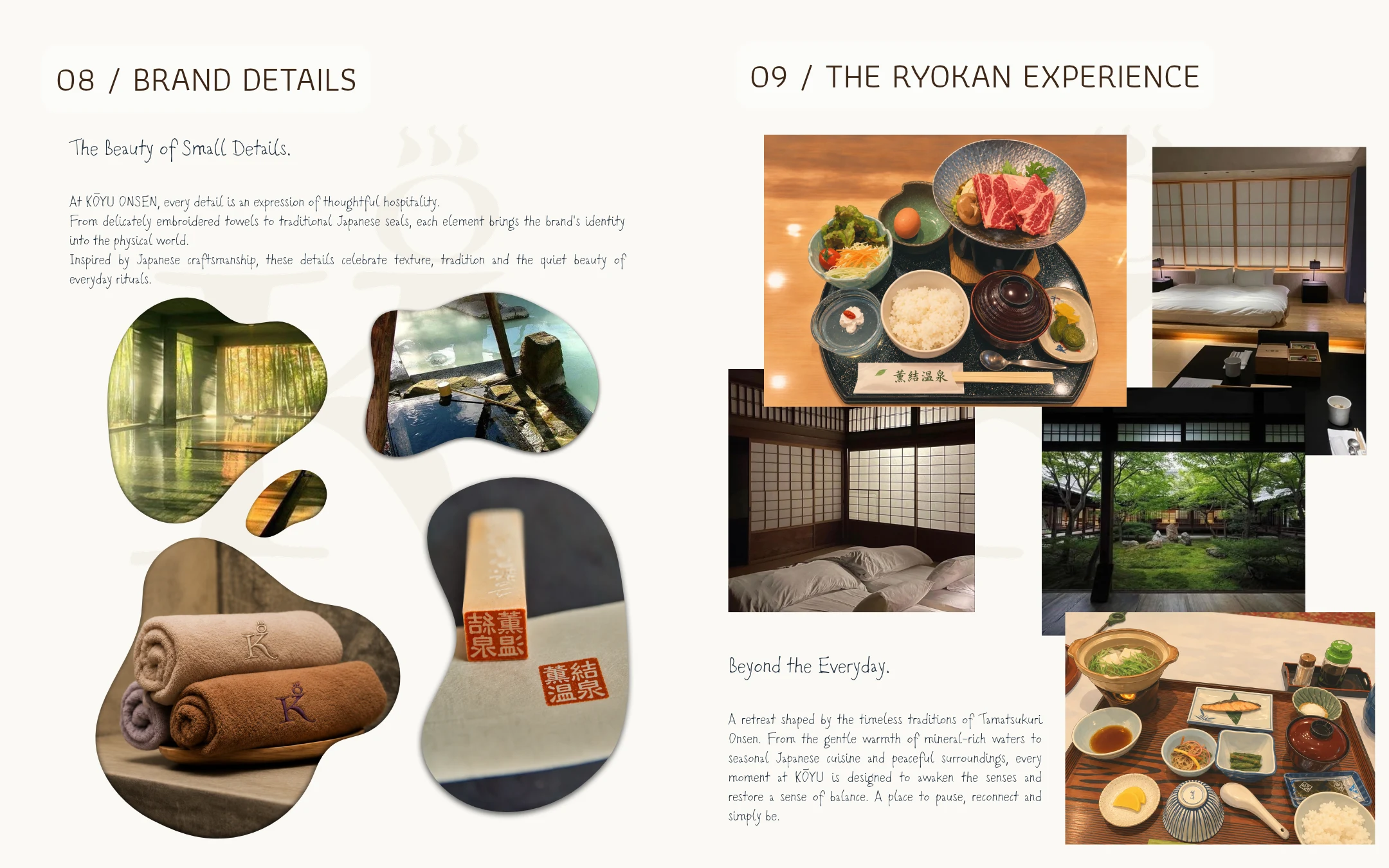
KŌYU's identity extends beyond printed materials into the guest experience.
Embroidered towels, traditional seals, natural textures and carefully selected hospitality imagery express the brand's attention to detail.
Every touchpoint is designed to evoke warmth, stillness and a sense of connection to place.
06 — Brand Essence & Closing
A Place to Return to Yourself
KŌYU ONSEN brings together the heritage of Izumo, the symbolism of magatama and the restorative traditions of Japanese bathing.
Through a cohesive visual identity and thoughtful hospitality applications, the project explores how cultural heritage can shape a contemporary luxury experience.
Where Stillness Meets Ritual.
Brand Identity & Art Direction — By Izumo
0 likes · 0 views · Nov 9, 2026
Created brand identity for KŌYU ONSEN, merging Japanese heritage and modern design.


