BOLLICINE Visual Identity & Brand Exploration

Izumo Kobu


01|Visual Identity & Creative Exploration
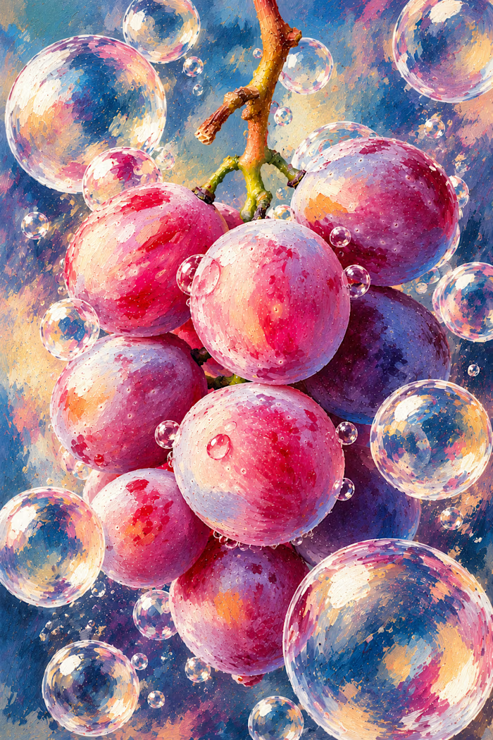
A playful exploration of bold typography, vibrant colours and expressive illustrations. Inspired by grapes and sparkling bubbles, BOLLICINE brings together artistic textures and a distinctive visual identity full of energy and character.
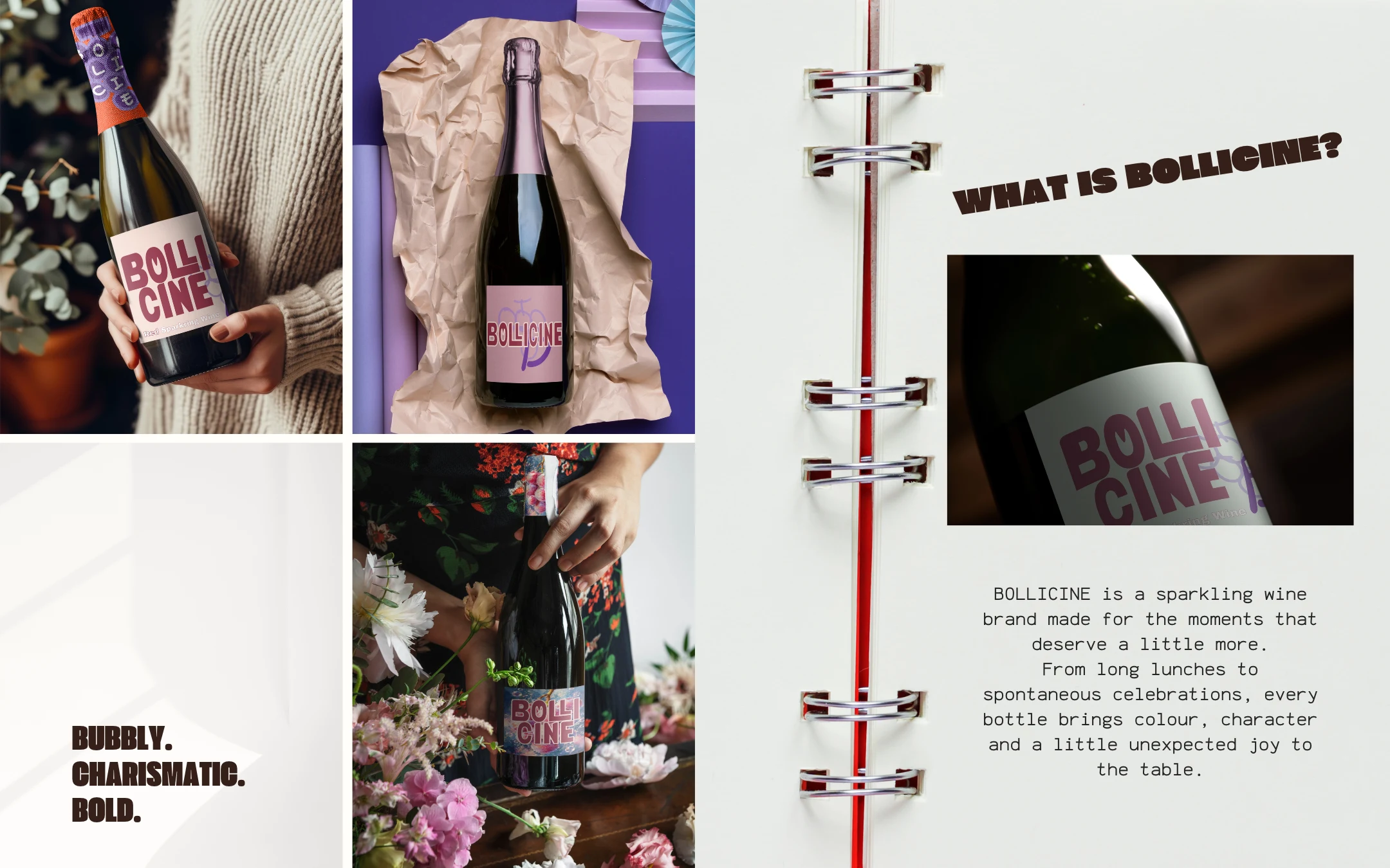
02|Brand Concept & Personality
BOLLICINE celebrates the little moments that make everyday life special. The brand combines expressive packaging with a playful personality, creating a sparkling wine experience that feels approachable, colourful and full of life.
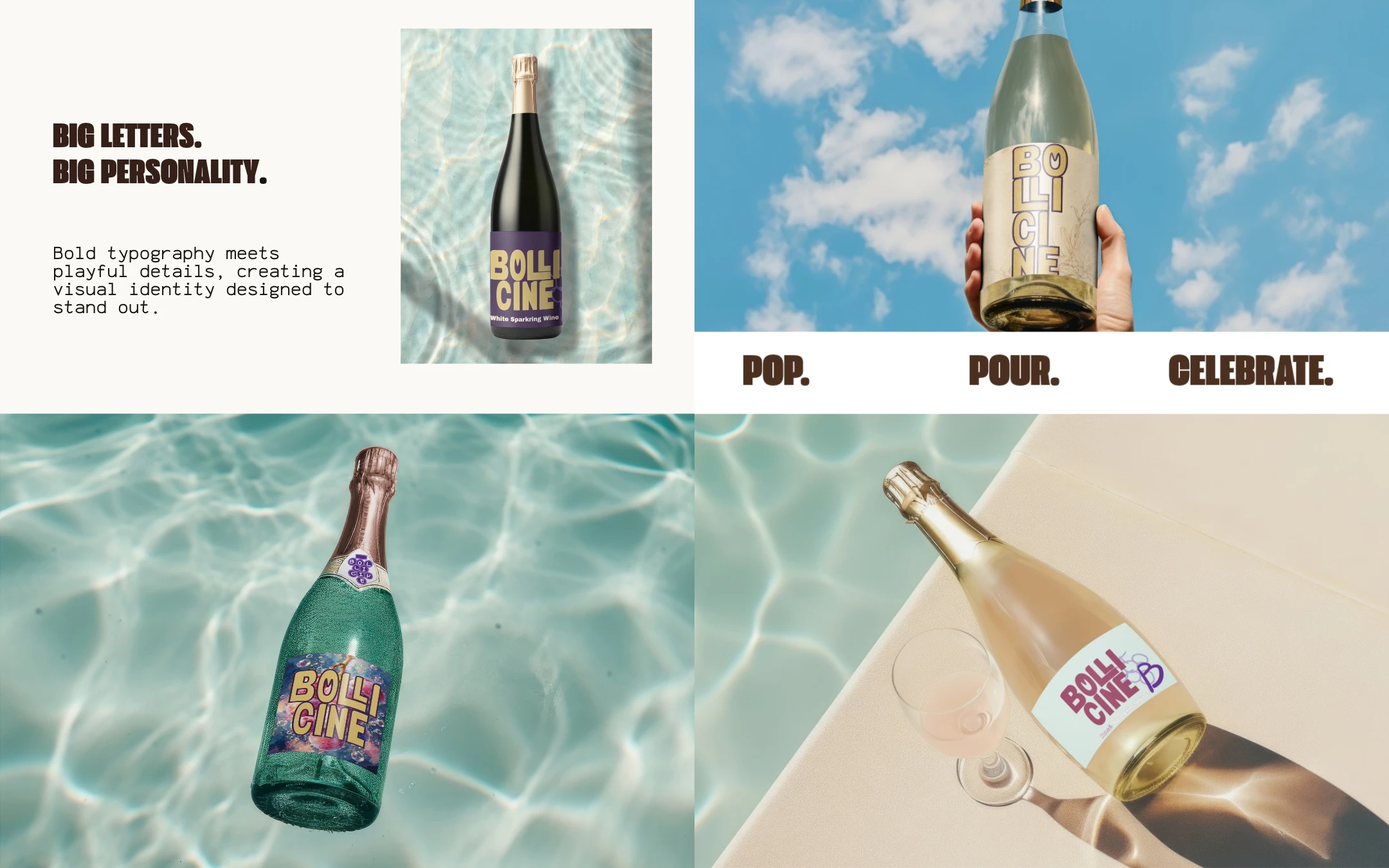
03|Typography & Brand Experience
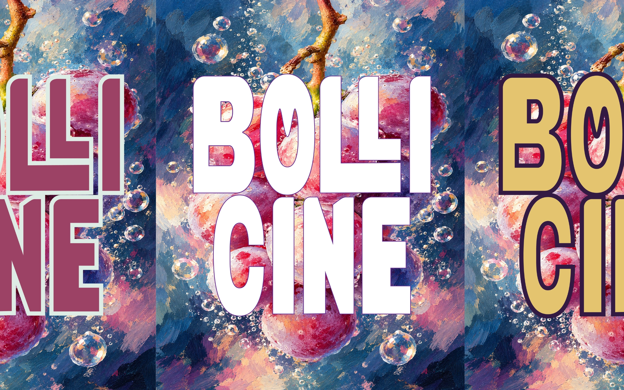
Bold, custom-inspired typography forms the foundation of the visual identity, complemented by playful grape illustrations and vibrant packaging. The designs extend across different lifestyle settings, connecting the brand with moments of celebration and enjoyment.
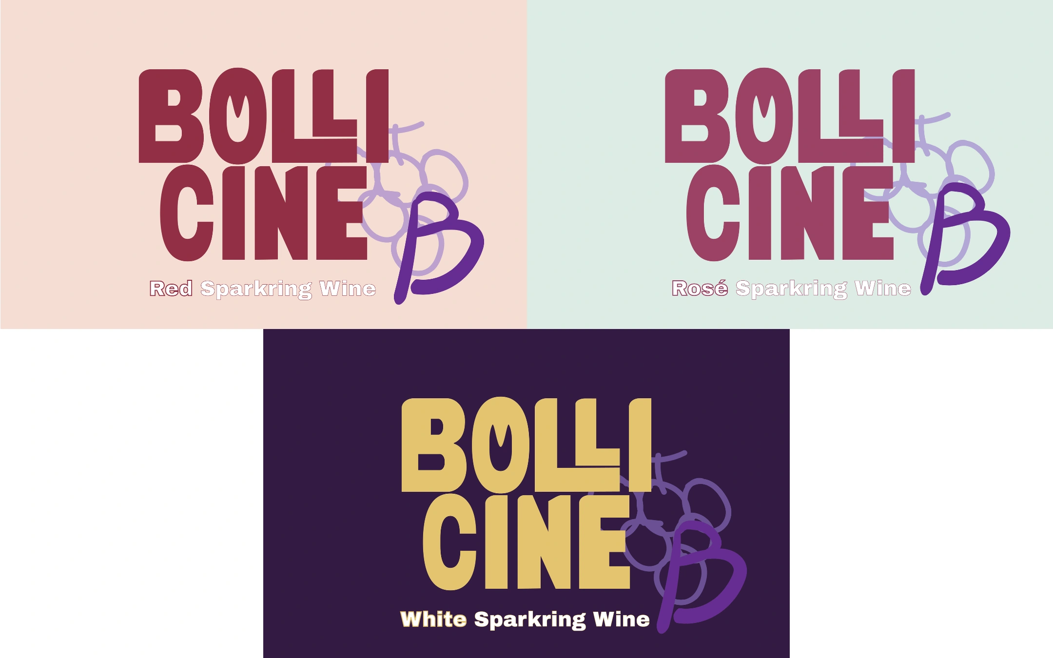
04|Colour System & Product Collection
Three sparkling wines, three distinctive personalities.
RED — Warm, bold and expressive.
ROSÉ — Fresh, playful and charming.
WHITE — Bright, elegant and celebratory.
Each variety features its own colour palette while maintaining a cohesive brand identity through consistent typography and grape-inspired graphic elements.
Like this project
Posted Oct 27, 2026
Through bold typography, vibrant colours and grape-inspired illustrations, this project explores a cohesive visual identity across three varieties.