OLIVE CLUB Brand Visual Identity and Digital Experience

Izumo Kobu


01 — OLIVE CLUB | Brand Introduction
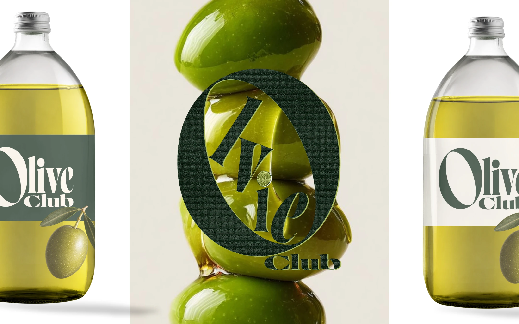
OLIVE CLUB is a contemporary Spanish olive oil brand concept inspired by Mediterranean culture and the beauty of everyday rituals.
The project explores how expressive typography, natural textures, and a refined visual identity can transform an everyday ingredient into a premium brand experience.
02 — The Story Behind OLIVE CLUB
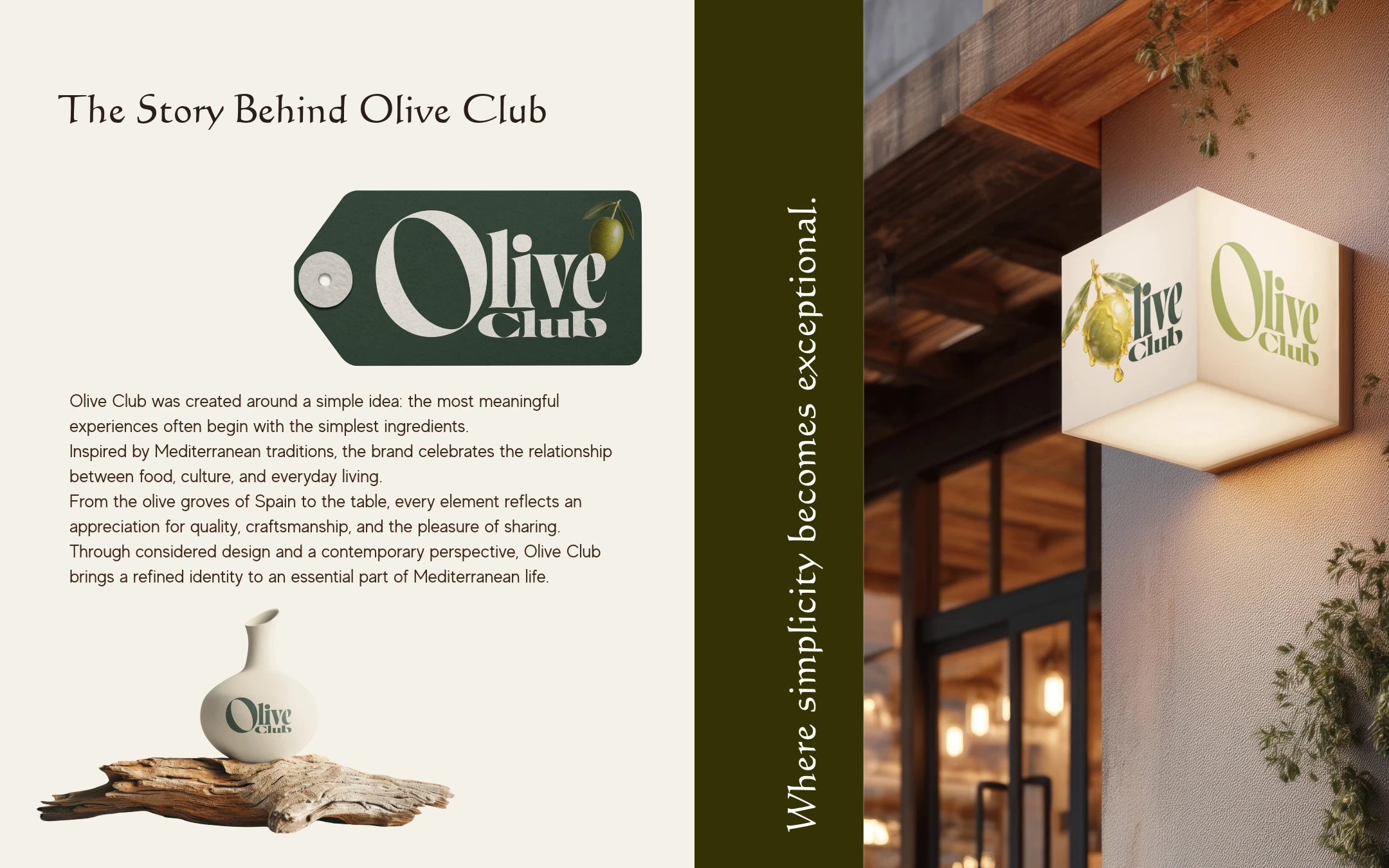
Rooted in Mediterranean traditions, OLIVE CLUB celebrates the connection between food, culture, and the pleasure of sharing.
The brand identity extends across packaging, printed materials, and environmental applications, creating a consistent experience inspired by craftsmanship and everyday living.
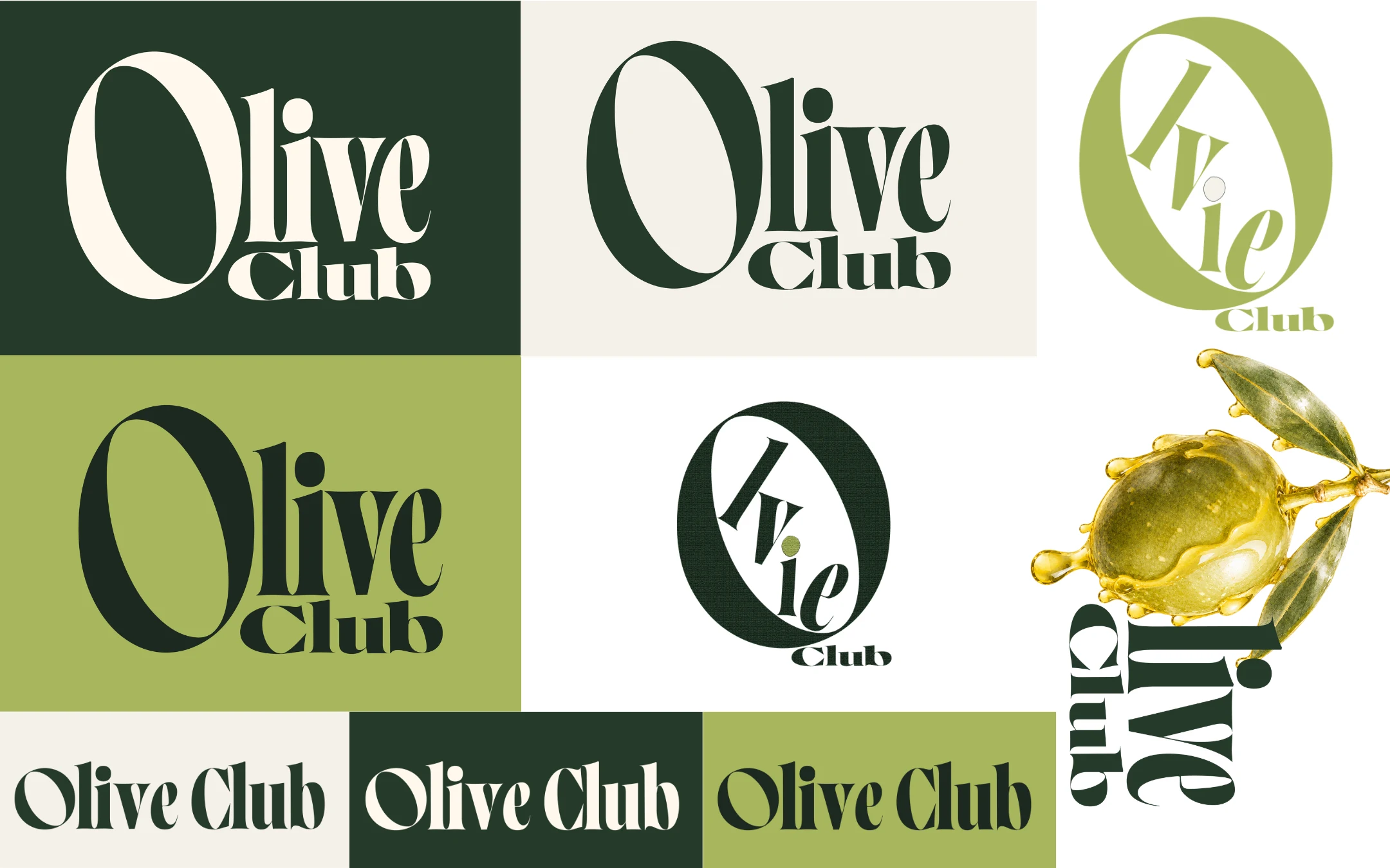
03 — Logo & Visual Identity
The visual identity is built around bold, expressive typography, with an oversized letterform that creates a distinctive and recognisable brand signature.
Deep olive green, soft ivory, and fresh olive tones form a cohesive colour system, balancing contemporary luxury with the natural character of the product.
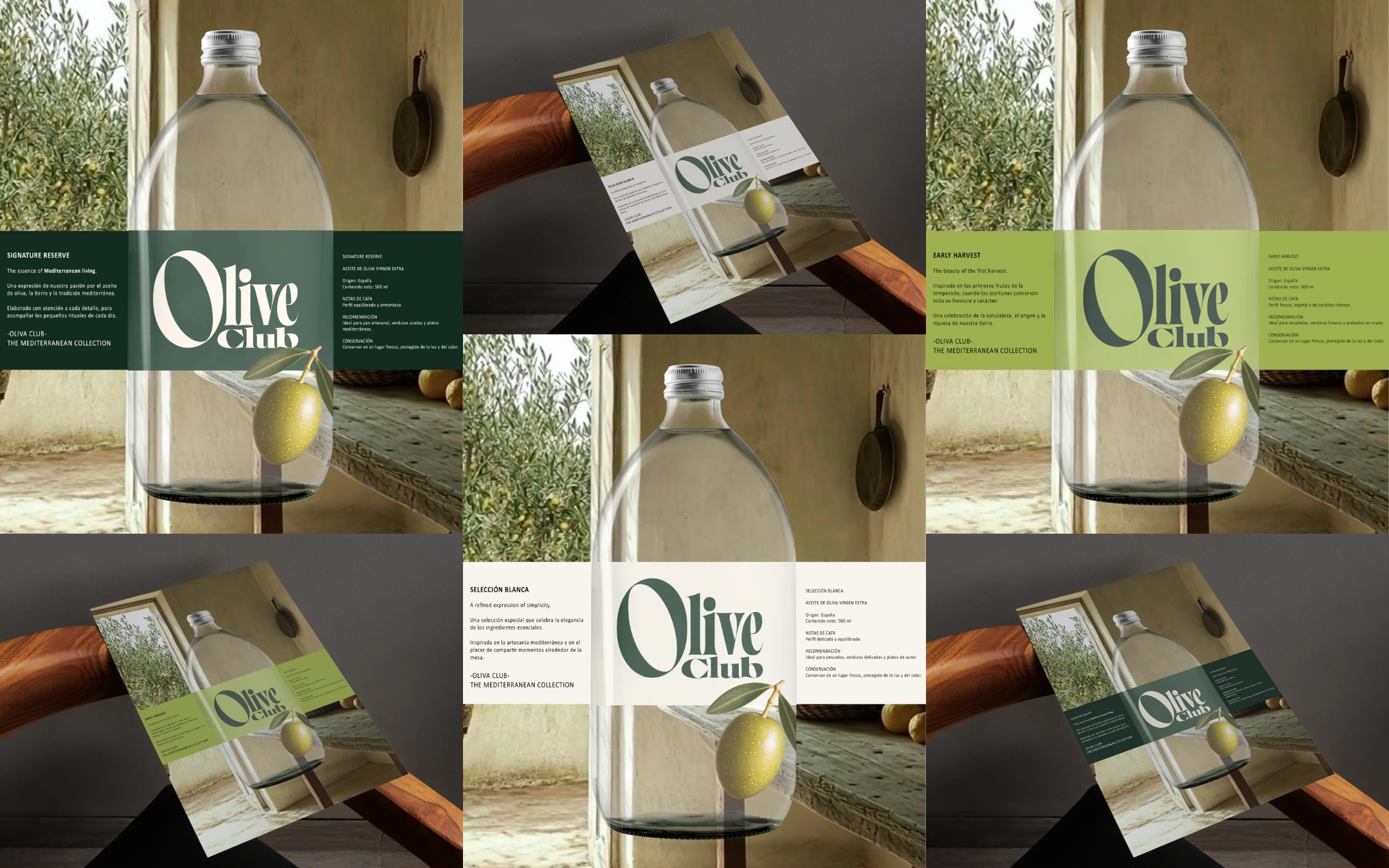
04 — Packaging Collection
Three distinct expressions of extra virgin olive oil — Signature Reserve, Early Harvest, and Selección Blanca — are brought together through a unified packaging system.
Each product introduces a different colour and personality while maintaining consistent typography, imagery, and editorial layouts.
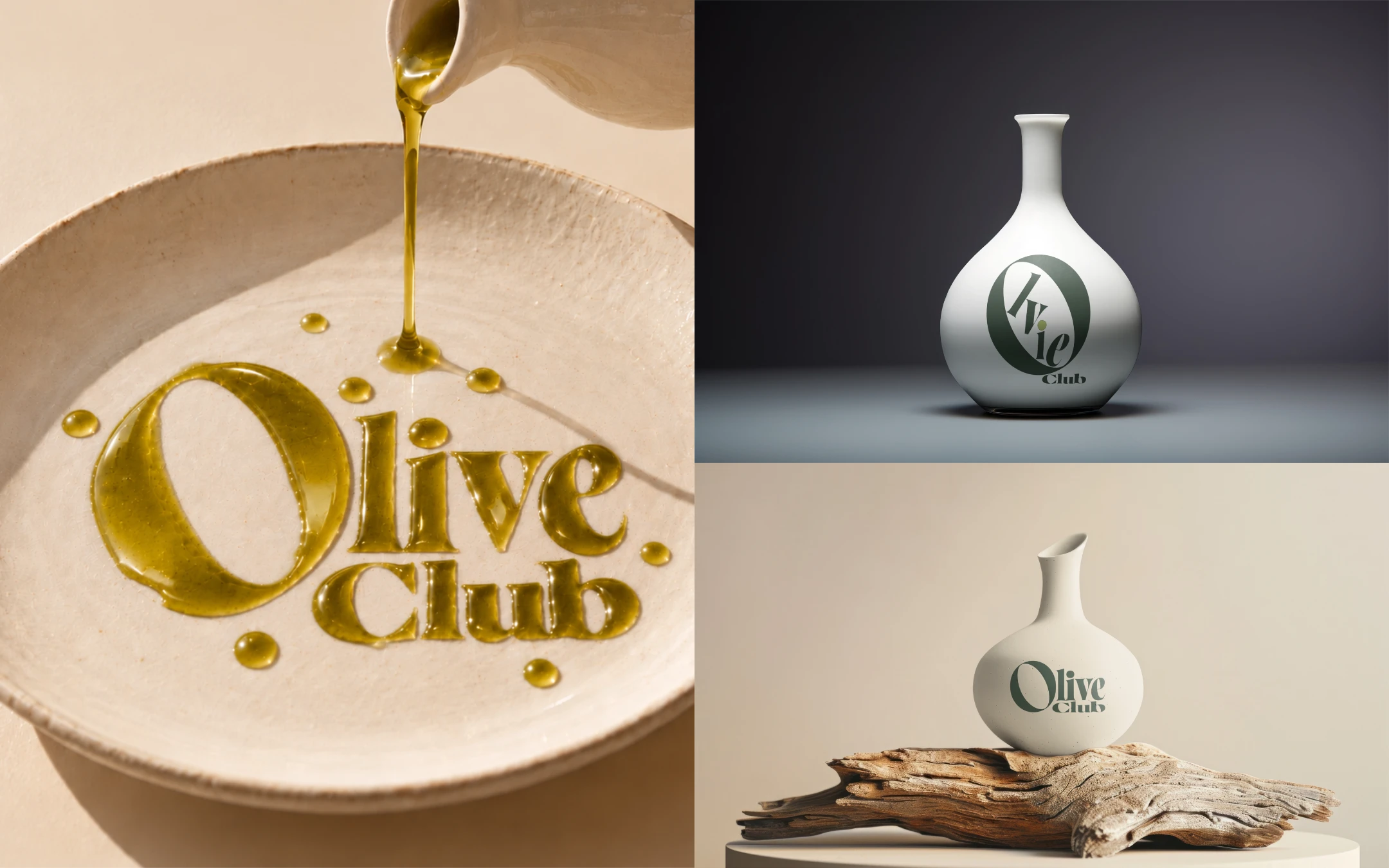
05 — Brand Applications & Materiality
Beyond packaging, OLIVE CLUB explores how the identity translates into different physical expressions.
From ceramic vessels to olive oil-inspired typography, the visual language combines refined design with organic materials, textures, and a sense of Mediterranean craftsmanship.
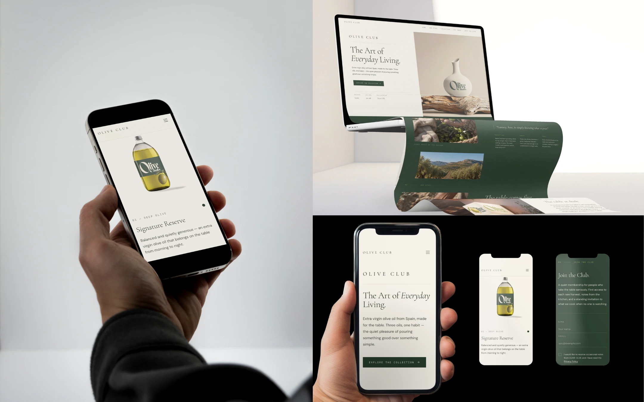
06 — Digital Brand Experience
The visual identity extends into a responsive website designed to connect the physical product with a contemporary digital experience.
Built with Base44, the website combines editorial layouts, product storytelling, and a functional membership experience through Join the Club.
Explore the live website:
OLIVE CLUB — The Art of Everyday Living.
Like this project
Posted Oct 24, 2026
Developed OLIVE CLUB's visual identity, packaging, and digital brand experience.