vHive Brand Identity Design

Ricardo da Fonseca


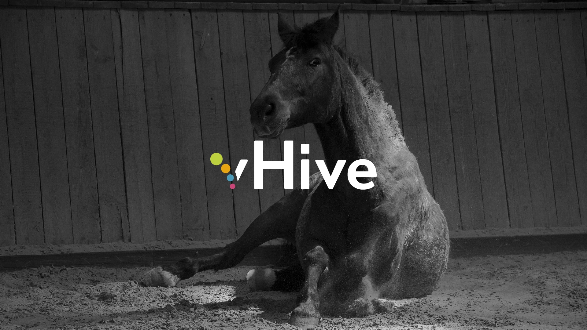
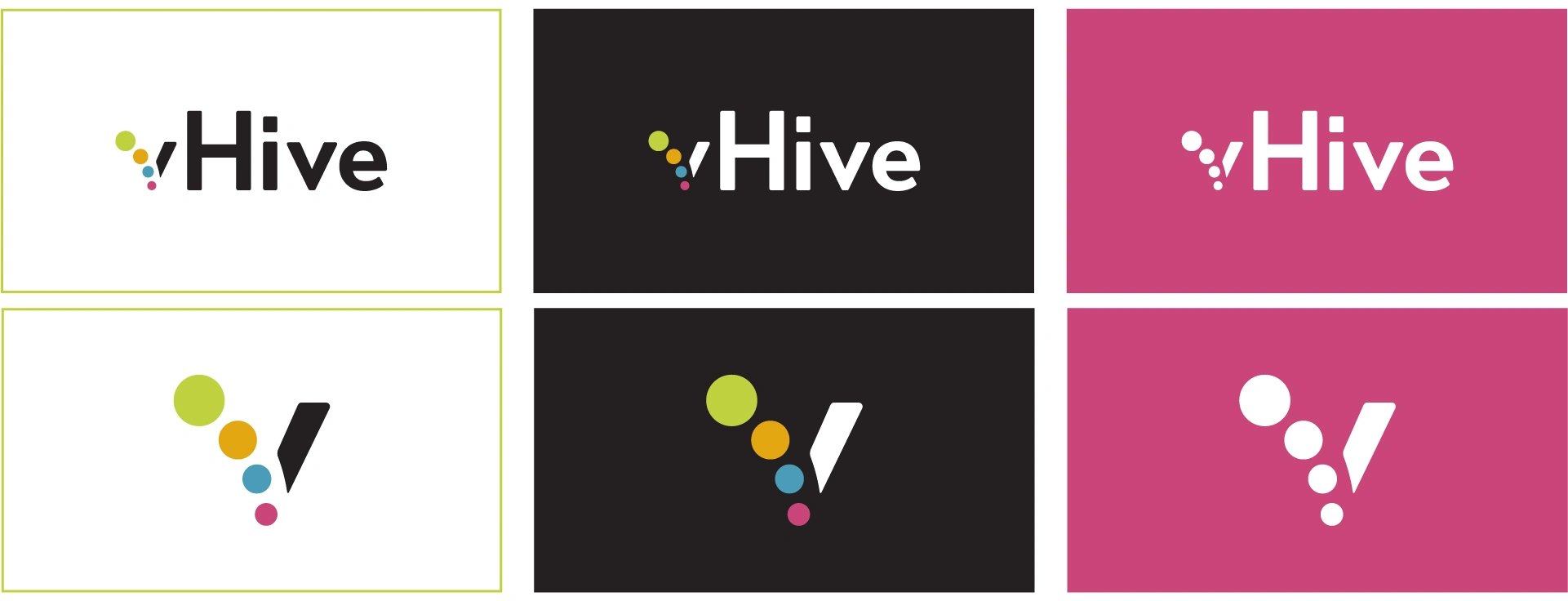
The vHive logo was designed to bring their four core brand pillars to life: Research, Problem Solving, Education and Training, and Knowledge Brokering. Each is represented by a coloured dot forming the “v” in vHive, creating a simple visual system that reflects connection, insight and progress. The “v” also functions as a standalone icon, making it suitable for social media, apps and broader digital applications.
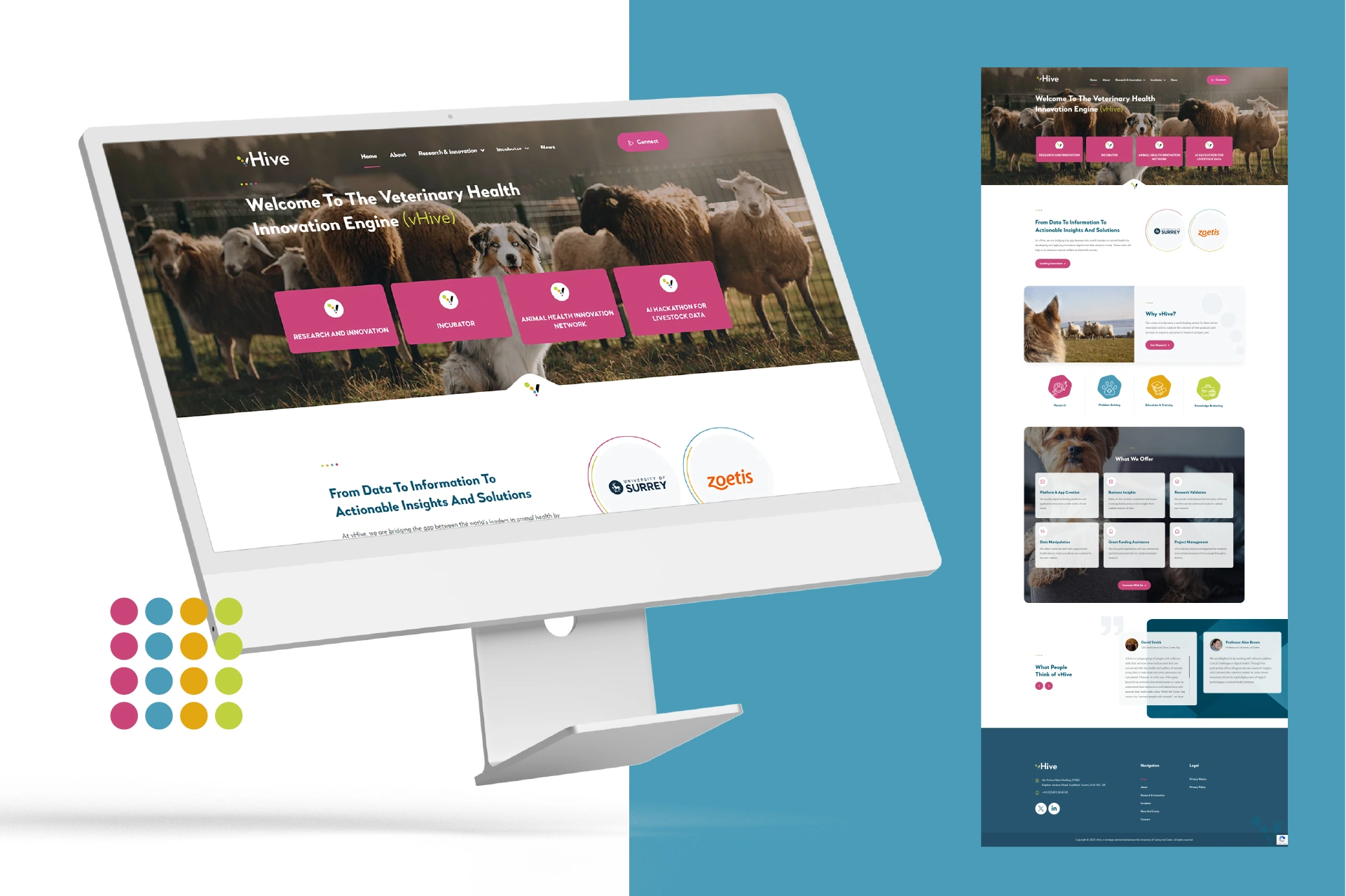
A key consideration was ensuring the identity remained accessible and legible across different colour combinations, particularly for the upcoming website redesign where usability and clarity are critical.
I developed a colour system that maintains strong contrast and supports accessible digital experiences, ensuring the identity works effectively across web and digital platforms. The result is a flexible, accessible identity that translates clearly across digital touchpoints and provides a consistent foundation for the wider brand and website experience.

Like this project
Posted Jun 3, 2026
Designed vHive's brand identity focusing on accessibility and digital adaptability.
Likes
0
Views
5
Clients
vHive