Lift Coffee Co. Logo Design

Ricardo da Fonseca

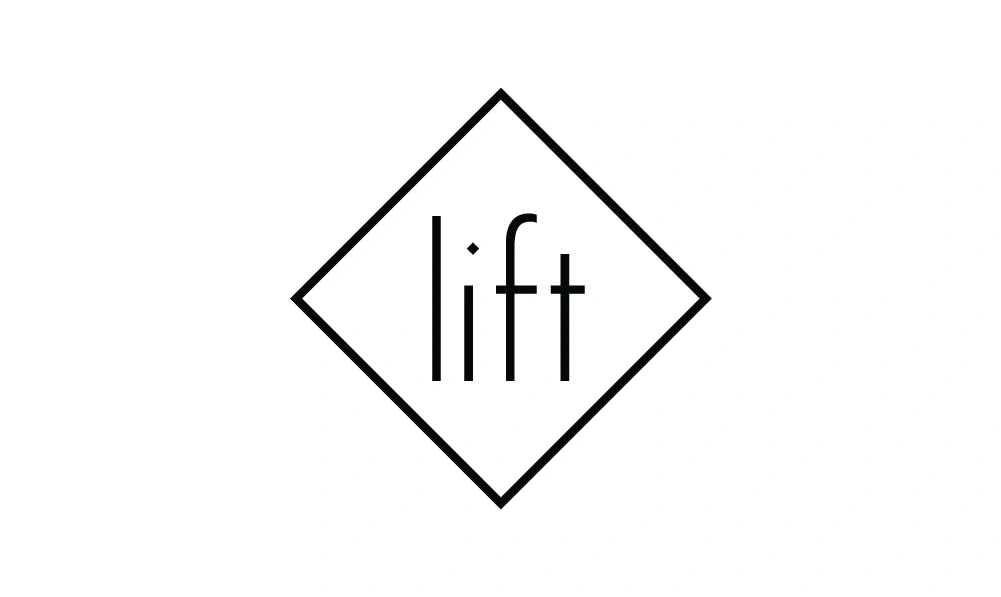
Lift Coffee Co. logo design for a premium coffee brand, focused on clarity, flexibility and subtle storytelling.
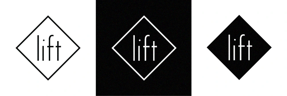
Lift Coffee Co logo design using modified Futura typography
When designing the logo for Lift Coffee Co., I was commissioned by 3rdHouse Design and faced three key challenges. The identity needed to reflect the premium quality of the coffee while remaining cost-effective to reproduce across packaging and merchandise. It also needed to feel elegant and avoid typical coffee branding clichés, while expressing the idea of “Lift” in a subtle, meaningful way.
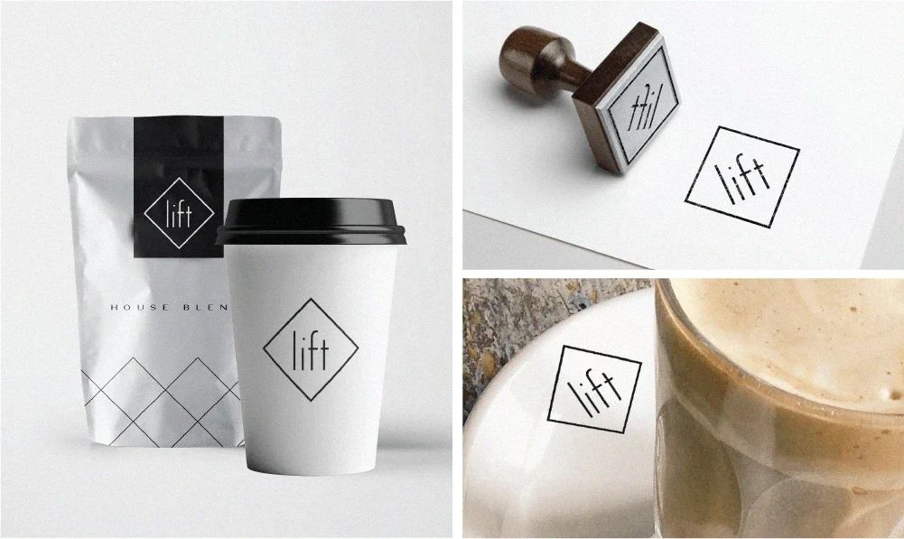
I addressed this by developing a simple one-colour logo that could be printed, stamped or embroidered consistently across applications. Rather than relying on literal coffee references, the focus was on creating something refined and distinctive through typography. I modified the Futura typeface to create a taller, more vertical structure, introducing a subtle lift through the treatment of the ‘i’, where the tittle is raised and slightly angled. This small detail brings the idea of “lift” into the mark in a clean, understated way, while referencing the geometric structure of the overall form.
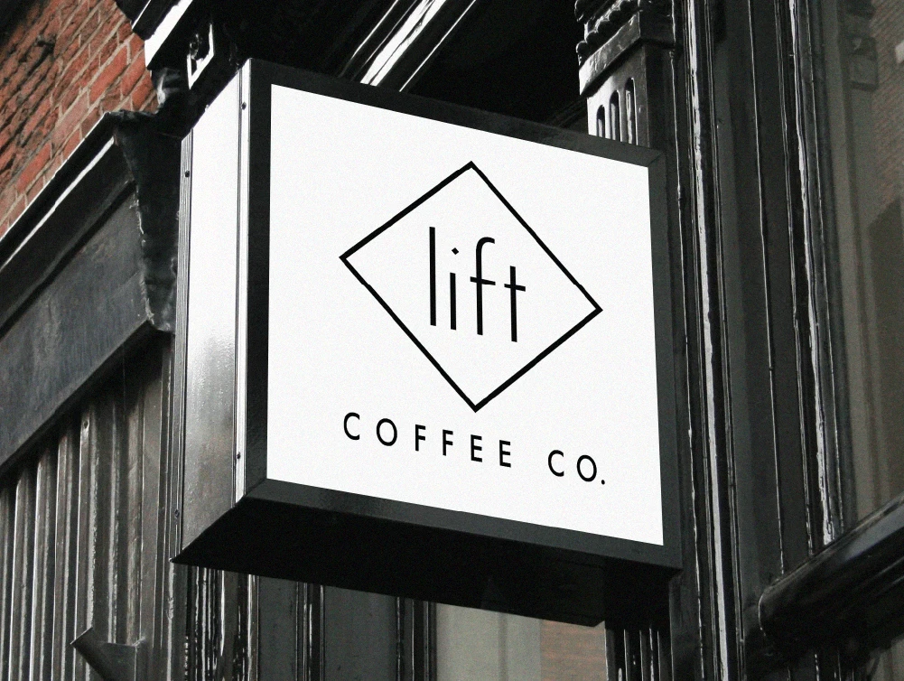
The result is a simple, versatile identity that maintains a premium feel while remaining practical to produce, and works consistently across packaging, merchandise and brand materials.

Like this project
Posted Jun 3, 2026
Created an elegant, versatile logo for Lift Coffee Co. using modified Futura typography.
Likes
0
Views
6