Baek Korean Bakery - Brand Identity
Veronica Firaux
Baek - Brand Identity
Keywords: Minimal, Modern, Soft, Clean, Korean
Baek is a modern Korean bakery inspired by traditional flavors, soft textures, and calm everyday moments. The bakery offers a curated selection of pastries, breads, desserts, and drinks that blend Korean baking culture with a contemporary approach. From black sesame pastries and milk breads to matcha desserts and seasonal specialties, BAEK focuses on creating a warm and comforting experience through thoughtful details and minimal presentation.
The Challenge
The challenge was to create a bakery identity that felt unmistakably Korean without relying on clichés or overly traditional visuals. The goal was to design a brand that felt contemporary and minimal while still communicating warmth, comfort, and cultural inspiration. The identity also needed to feel flexible across packaging, signage, social media, and printed materials while maintaining a strong and cohesive personality.
The Solution
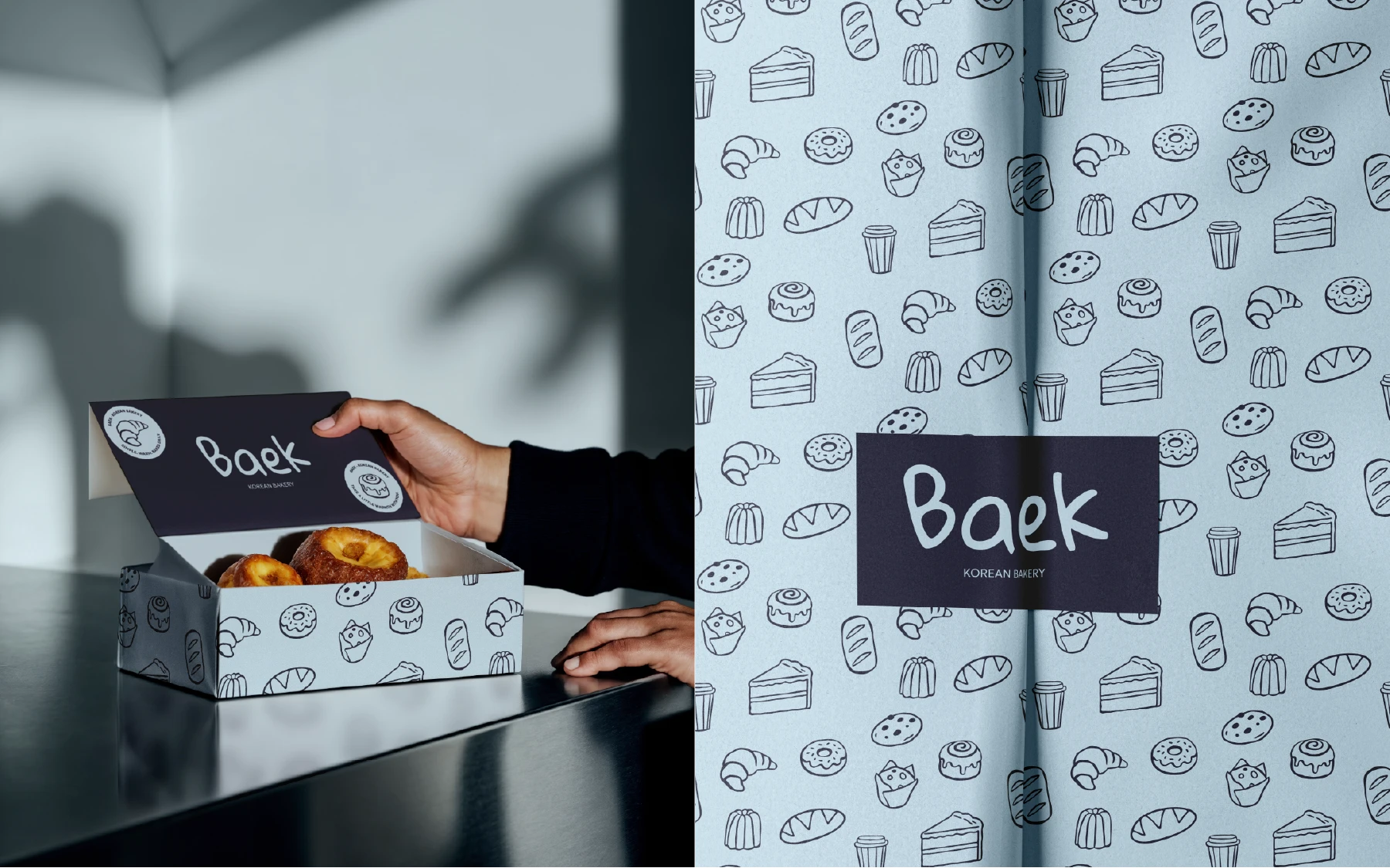
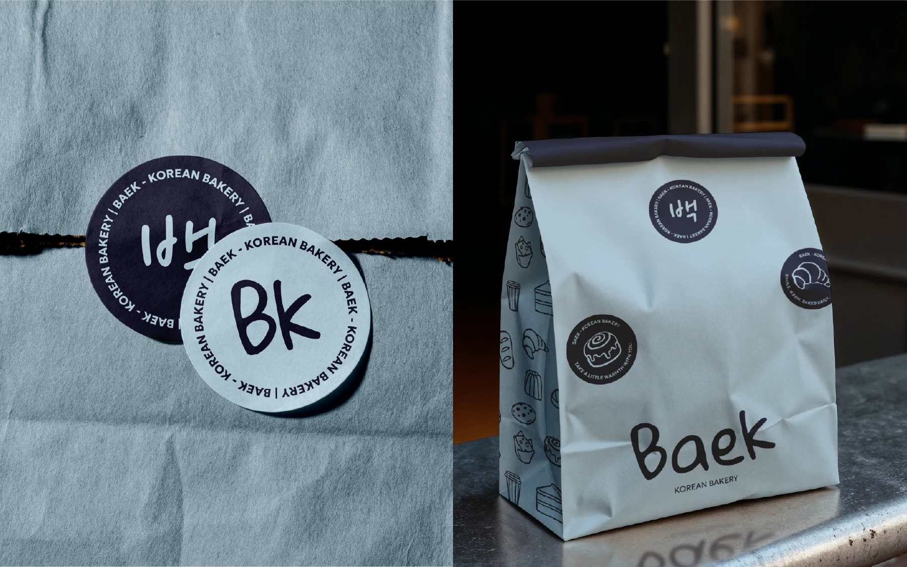
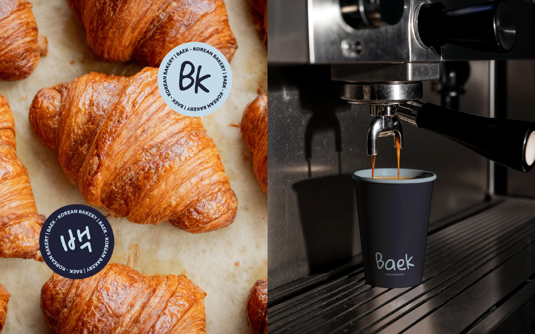
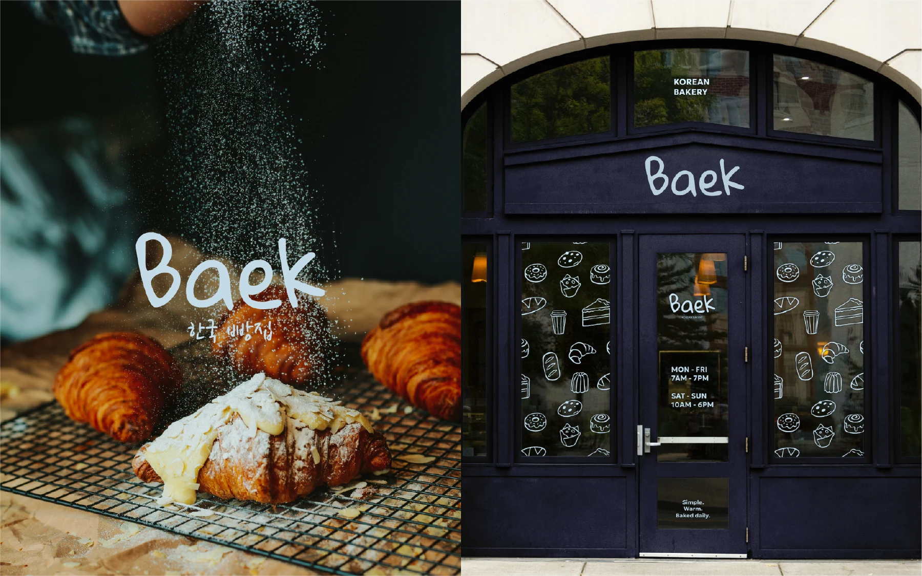
The final identity embraces a restrained monochrome palette paired with expressive handwritten details and playful graphic applications. Inspired by Korean stamps and packaging aesthetics, the branding introduces subtle cultural references in a modern and understated way. Rounded forms, soft typography, and minimal compositions help reinforce the bakery’s calm atmosphere and contemporary positioning.
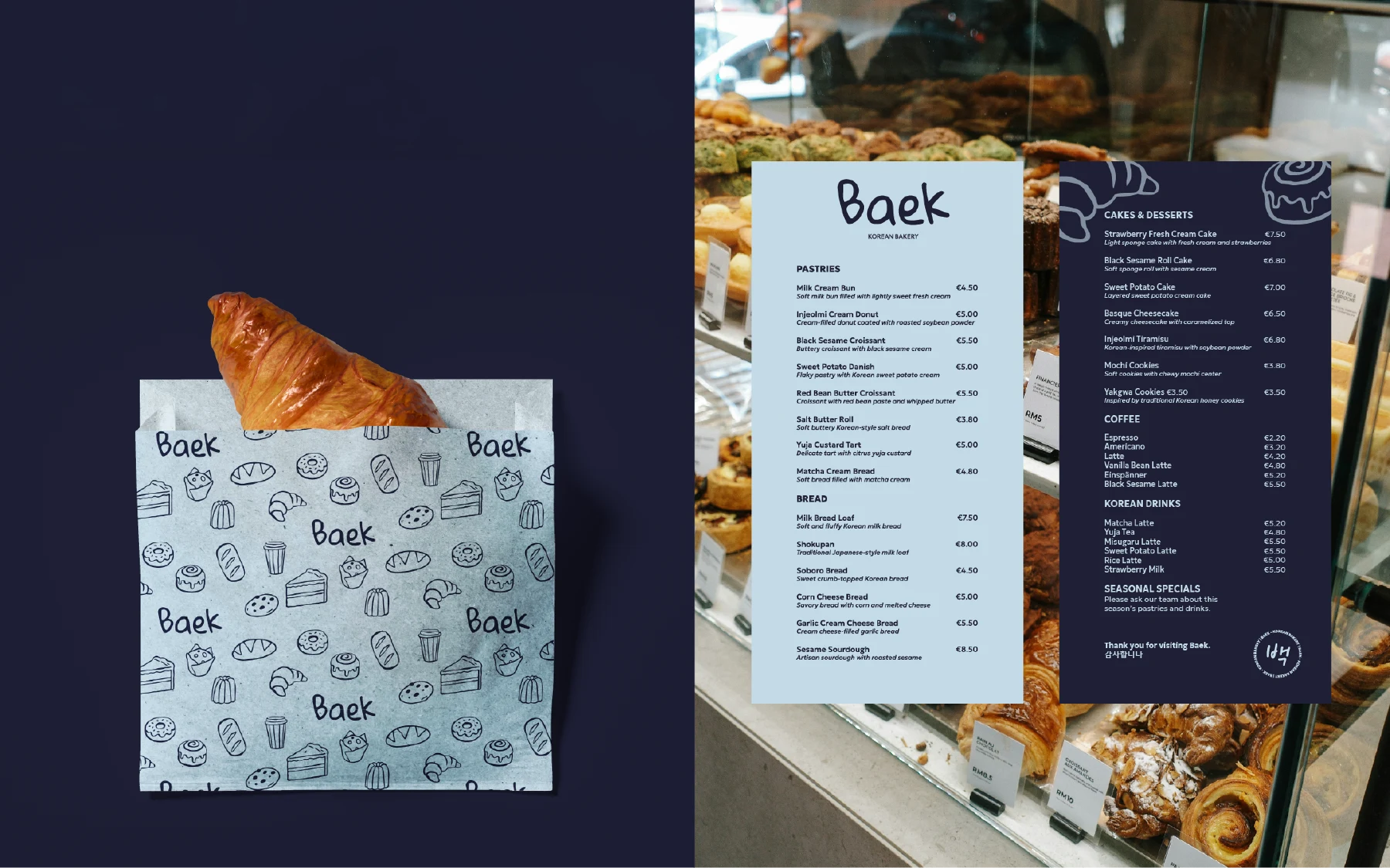
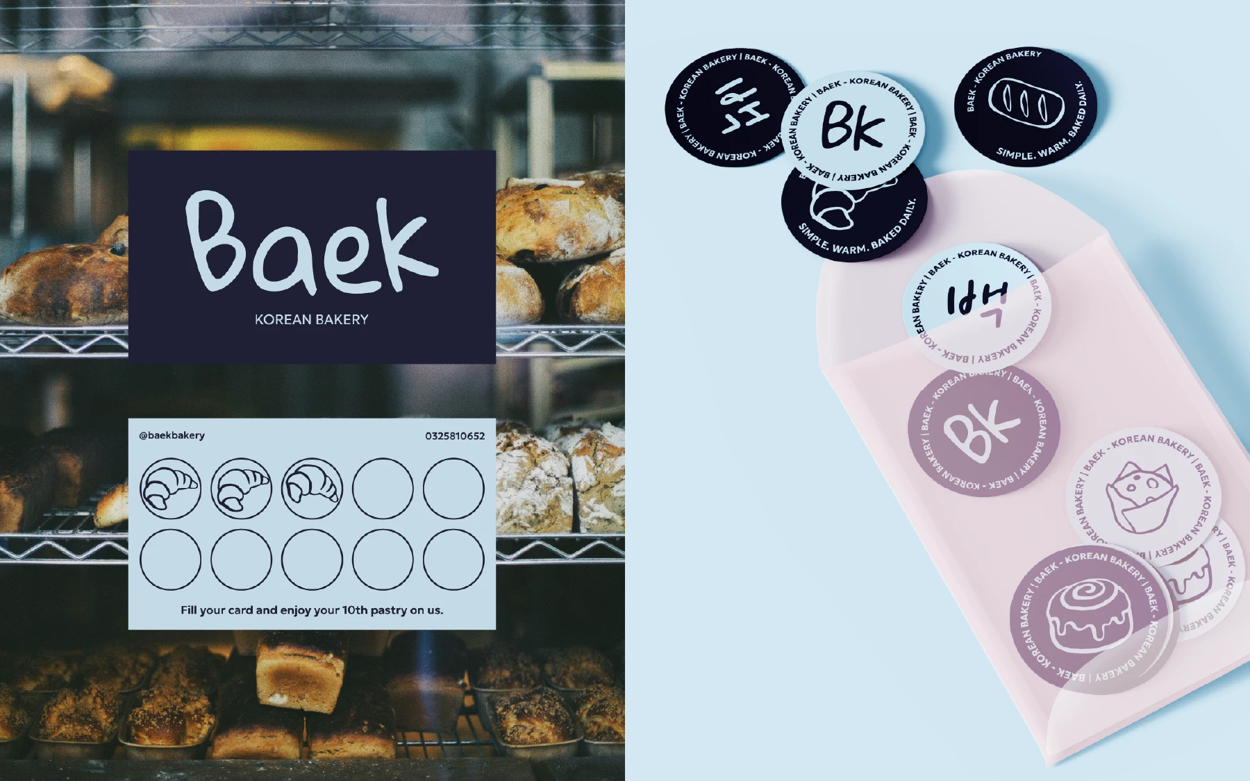
The visual system was designed to feel cohesive across every touchpoint, from takeaway bags and stickers to menus, loyalty cards, and storefront signage. The balance between clean structure and handmade elements creates a brand experience that feels warm, memorable, and authentic.
The Visual Identity
The identity system centers around contrast: minimal but expressive, playful but refined, contemporary but rooted in tradition. Handwritten typography adds softness and personality, while structured layouts and monochrome packaging keep the brand feeling modern and elevated.
Seal-inspired graphics and small Korean typographic details subtly reference the bakery’s cultural roots without overpowering the minimalist aesthetic. Repeating patterns, stickers, and stamp applications help create a tactile and recognizable brand language that feels both functional and collectible.
The result is a visual identity that captures the atmosphere of a modern Korean bakery soft, calm, and thoughtfully designed.
Thank You!
Follow me on Instagram and Tiktok
@verauxdesign
Like this project
Posted May 21, 2026
Baek is a modern Korean bakery inspired by traditional flavours, soft textures, and calm everyday moments.