Good Nuts - Brand Identity Design
Veronica Firaux
Good Nuts - Brand Identity
Keywords: Cheeky, bold, conscious, playful, memorable.
Good Nuts is a nut butter brand that focuses on creating sustainably made, consciously sourced spreads without compromising on taste or personality. The brand aims to make everyday products more enjoyable by combining simple, natural ingredients with bold flavors and a playful attitude. Rather than following traditional health food conventions, Good Nuts is designed to feel approachable, fun, and proudly displayed in everyday life. At its core, the brand promotes a balance between conscious living and enjoyment, proving that doing good can still feel light, expressive, and a little bit cheeky.
The Challenge
Most health-focused food brands rely on muted colours, minimal layouts, and overly serious messaging. While this communicates “clean” and “natural,” it often lacks personality and shelf impact. The challenge was to design a brand that still feels conscious and trustworthy, but breaks away from the typical aesthetic, creating something that stands out, feels approachable, and connects emotionally with users.
The Solution
The solution was to build a brand that embraces contrast: combining sustainability with a bold and playful attitude. Instead of minimizing personality, the identity leans into it, using strong typography, confident layouts, and a cheeky tone of voice to create a more engaging and memorable experience. The result is a brand that feels less like a “health product” and more like a lifestyle object, something to be seen, shared, and enjoyed.
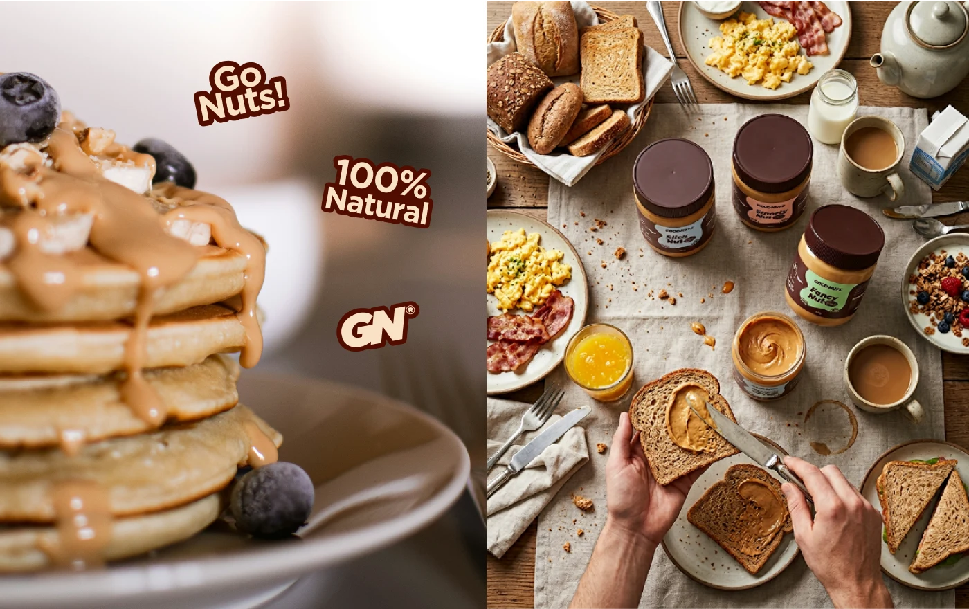
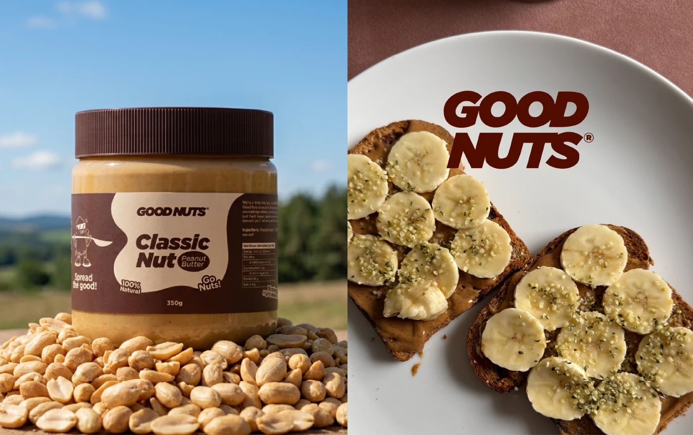
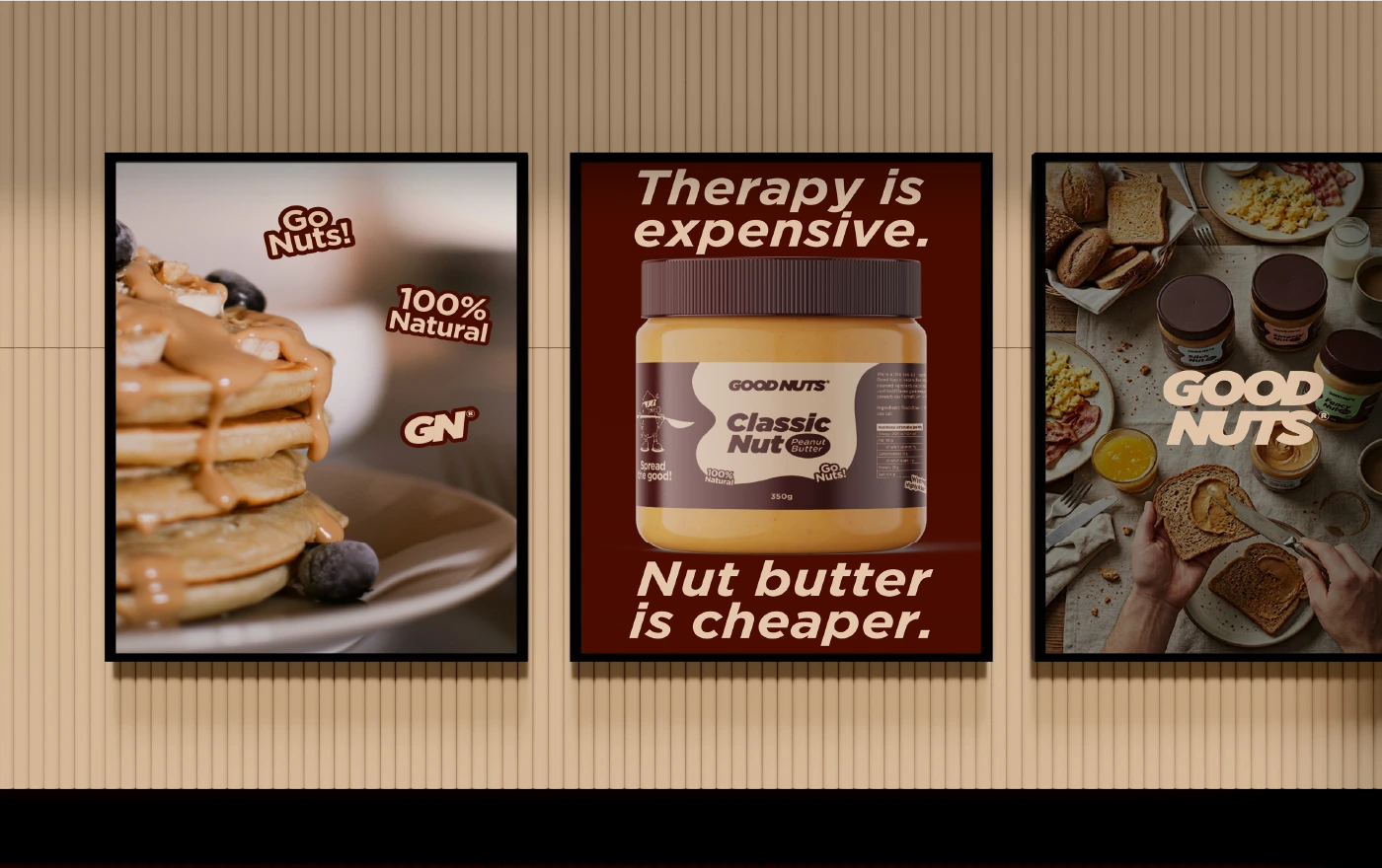
Packaging Design
The packaging was designed to live on the kitchen counter rather than being hidden away. A bold label system, combined with a limited and warm color palette, ensures strong shelf presence while maintaining visual consistency across products. Clear hierarchy and minimal information keep the design clean and easy to read, while small details add personality and depth. The overall approach transforms a simple jar into something more expressive, balancing function with character.
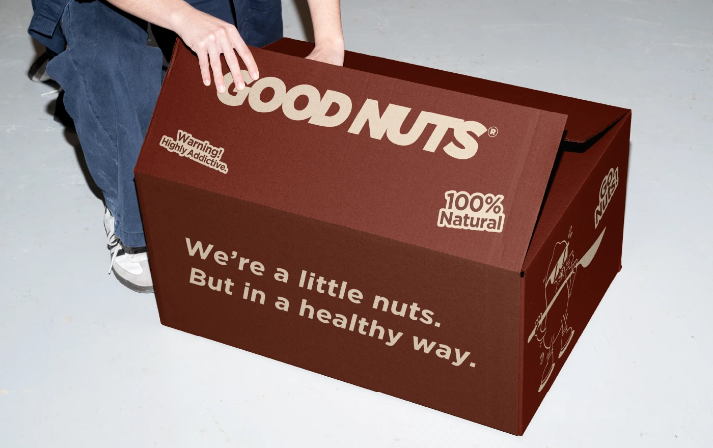
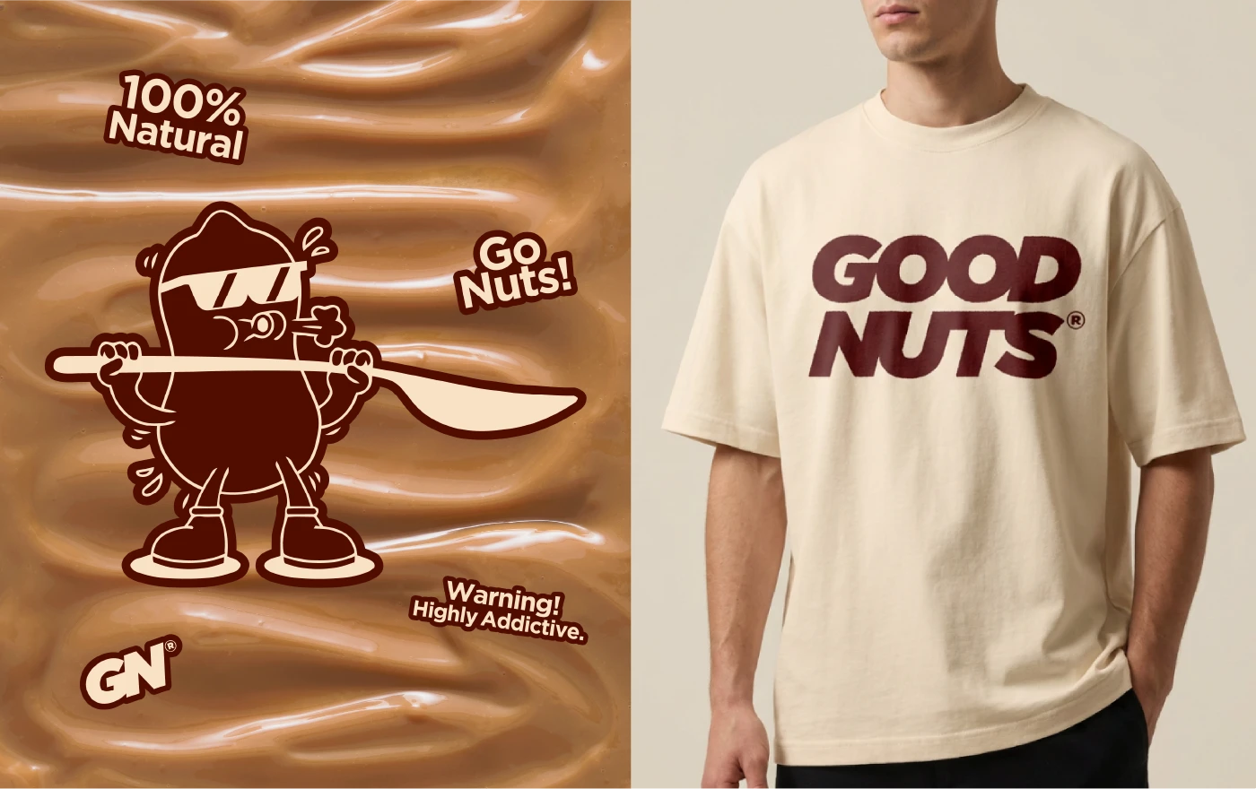
The Visual Identity
At the core of the identity is a playful peanut mascot that introduces a human, cheeky element to the brand. Its confident attitude reinforces the idea that conscious choices don’t need to feel restrictive or overly serious.
The visual system combines bold typography, simple shapes, and a consistent color palette to create a cohesive and recognizable brand across all touchpoints, from packaging to tote bags and social content. Together, these elements build a brand that feels approachable, memorable, and full of personality while staying aligned with its conscious foundations.
Thank You!
Follow me on Instagram & Tiktok
@verauxdesign
Like this project
Posted Mar 30, 2026
Good Nuts is a nut butter brand that focuses on creating sustainably made, consciously sourced spreads without compromising on taste or personality.