#ArtAtTheL: DePaul Art Museum Exterior
Drew Hesler
The Client
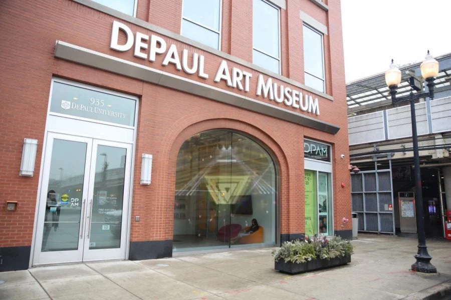
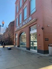
The DePaul Art Museum is a small art museum located on the Lincoln Park campus of DePaul University. Its means are limited and its exhibit space is small; it’s not exactly the Art Institute of Chicago. It only has about 4,000 elements within its collection. The problem that it faces is that it is practically unknown, even within the community. To solve this problem, the exterior needs to change drastically in order to convey its existence to the community.
The Questions
How can we utilize the exterior of the DePaul Art Museum to bring people inside?
How can we bring knowledge of the interior of the museum to the wider community?
The Team
Drew Hesler
Audrey Williamson
Vivian Tran
Joseph Narcisa
Jacob Gibson
Joanne Crowley
The Research
For my own individual research, I reached out to three people. The first is my father, who represents a museum visitor. His approach to visiting a museum is very different depending on whether or not he’s visiting the museum is dependent on his company. When visiting with children, he’s more content to letting them lead where to go; when visiting with his wife, he’s more likely to follow his own path. The second was a friend who had visited the DePaul Art museum as part of a class. The third was my aunt, who lived in Lincoln Park and didn’t even know that the museum existed. Various design ideas were also floated as a collective team, collected from each and every aspect of the design world. Our design research process mostly involved looking up websites and new
articles that would involve concepts we would like to deal with. For one example, when we were focusing on the side of the building, I brought up a Wichita art street. Another example that was presented was inspired by a LA mural involving a basketball player. Yet another example was inspired by a series of optical illusions.
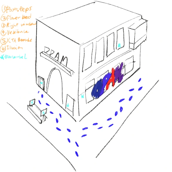
It was also important to establish where we would design for, and multiple iterations of the process involved designing for the different areas. This would eventually turn into a single user flow with around 6 different points of entry for users. These include the footsteps, the flower bed, the right window, the vestibule, the CTA boards, and the vestibule.
The Problems
Various problems were encountered across the design process, almost too numerous to count. The major problem, and one that significantly affected our design process, was a lack of communication on what we could or could not do. Ideas would be floated to the client, but we couldn’t further iterate upon them with certainty. Time and effort would go to waste developing ideas, only for us to talk to the people at the art museum and for them to say that we couldn’t do it, or to previously contradict what they said we could do.
Another issue encountered involved budgets, which became especially prominent as the Winter Quarter transitioned into Spring Quarter. This eventually concentrated into a line of thinking that would result in a massive alteration to our final product, which would take the form of a series. As the budget changed, so did our priorities; it closed some doors, but opened others. We had previously discarded the idea of doing banners when we decided that they were too expensive, but the reintroduction of them was brought out by the budget issues. To resolve their budget issues, the DPAM indicated a preference for one-time installations.
The Ideas
My solution, at first, was to essentially turn the museum inside out. The exterior was to serve as an extension of the interior, so that the beautiful art displayed on the inside could essentially be seen simply by passersby. One of the ideas floated around involved a virtual mural, wherein people could interact with the museum from the outside. Another conception of the entirety of the space was that it consisted of a front and side portion, and the eventual solution would be solely on one side. For example, an AR experience involving phones would involve the front of the building.
Eventually, however, the lack of technology within the context of the building became a part of the whole appeal. We proposed, as part of the design, to install a projection that would be mounted upon the door. However, there were several problems with this; the nature of Chicago weather means that the projection unit would be exposed to the most extreme temperatures. Furthermore, the DePaul Art Museum did not trust media players; it had a lot of them, and they had a spotty history of working in the museum.
Location is an important aspect of the design process in this case, and provides a valuable aspect to focus not only our ideas on, but also our personas. Our personas consisted of three people who would be entering the museum: the DePaul student, the Lincoln Park resident, and the CTA rider. Repeatedly, it was brought up that the angle with which the user would interact with the experience would render the only people who would see the museum would be people leaving the area, not incoming people.
Another idea we wanted to emphasize was that the museum is free and open to everyone who wants to visit. Visiting hours are a bit sloppy, but the fact that you don’t have to pay to get in is a massive plus. So, incorporated as a part of the design is the logo of the Free And Open Chicago from the Museum of Design. Outside help came in the form of guest critique from Seulki Seo, who provided various valuable perspectives and was helpful in making the final product the way it was. Our decision to turn it into
a framework for community events was a result of her input.
The Testing
Our group was only able to prototype and test some of the projects, specifically the footprints and the optical illusion. It was a beautiful day when we tested them, and it was one of the most wonderful experiences of my life. Personally, testing the prototype was one of my favorite moments of doing this project. The first one I did not witness. It was a cold and wintry wet day, and the people involved with the testing didn’t have the right type of chalk. The testing involved using black chalk on the sidewalk. Talking about the data, in this case, there were only about 26 people who walked by, and of those people most of them were looking at their phones.
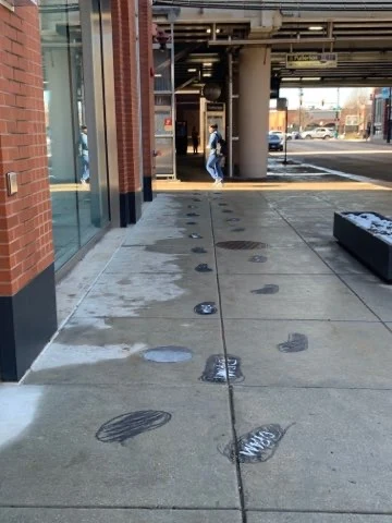
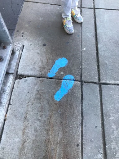
The second testing took place on a day wherein the museum was closed, and it was a bright and sunny day. It was a tuesday, and we spent the morning utilizing blue chalk to draw upon the sidewalk, then taking a step back to collect data. Of the 35 people who walked past the museum, 95% of them had taken notice of these steps. It worked wonderfully, but it was only a temporary
solution.

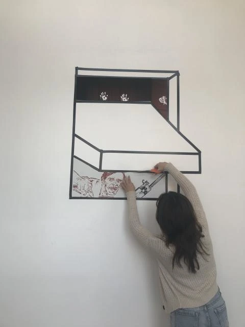
The second testing consisted of two portions, which were put up and eventually tested. The first consisted of vinyl footsteps, painstakingly cut and numbering about 30, plus a vinyl version of the Free and Open Chicago logo put onto the ground. The second portion consisted of a “light-switch” optical illusion on the wall of the vestibule, which would consist of black electrical tape and art sampled from the museum’s as-then current exhibition regarding the history of the US’s hijinx and escapades in Central America.
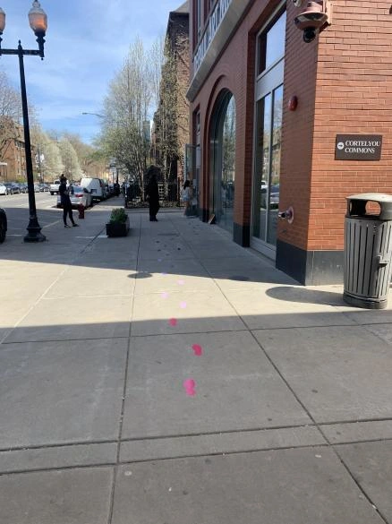
The results were a little surprising, in that these more quality footprints actually seemed to be less effective than the more makeshift chalk footprints. The footsteps were effective, but only in getting people into the door. It seemed to be related to how visible the steps were, so we needed to find the right material that would be as durable as the vinyl footsteps but as visible as the chalk footsteps. Unfortunately, we were running out of time.
‘The Final Product
Coupling this with the budget issues, our eventual prototype was something a bit different than a concrete deliverable. Our final prototype consisted of a series of instructions and methods to engage the community that the DPAM can switch out and customize depending on varying needs. They can make them temporary or permanent, interactive or not, or made of whatever materials that work. As a result, the final deliverable consists of two parts: the physical parts, and the community framework. When these elements would be handed off to the DPAM, they would be able to take care of them. The team split up in this case in order to work on these individual parts.
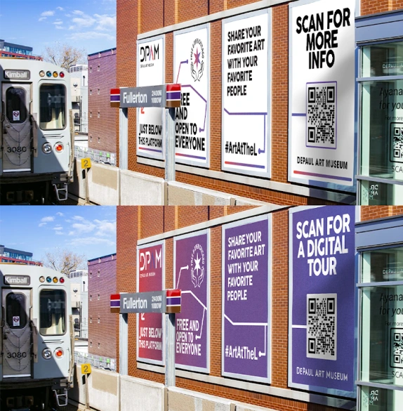
Included in the package first is the banners. This was designed by Joseph Gibson, and he did some A/B testing to determine which design was preferred. This design ingeniously includes a reference to the imagery of a train line, a QR code which can connect with the rest of the projects within this Senior Capstone along with whatever other things that the DPAM would like to link towards.
The second part of the physical aspect of the side, including the footsteps, was handled by Joseph Narcisa. These footsteps, as well as their connection to the side of the building, could be made of anything from temporary sidewalk chalk to a more durable vinyl to even something permanent like traffic paint. These footsteps would serve as breadcrumbs for potential visitors, directing them to the museum and inside.
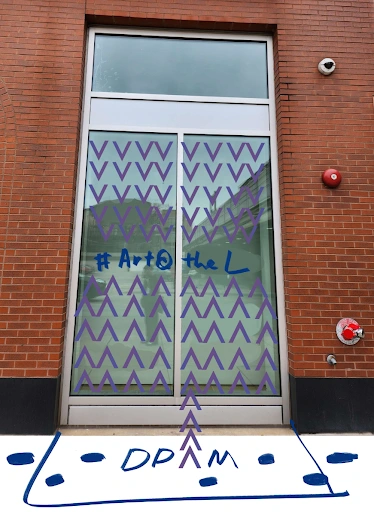
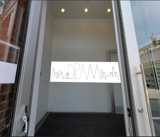
The third part consists of a series of vinyls on and behind the front door. This portion heads into the interior a bit, only into the vestibule. These vinyls would serve as a final step, a final pop for people to notice before they head inside to spend 15 minutes looking at what the museum had to offer. This was a substitution for the ideas that were proposed by the This design, its concepts and its mockups are mostly the work of Joanne Crowley.
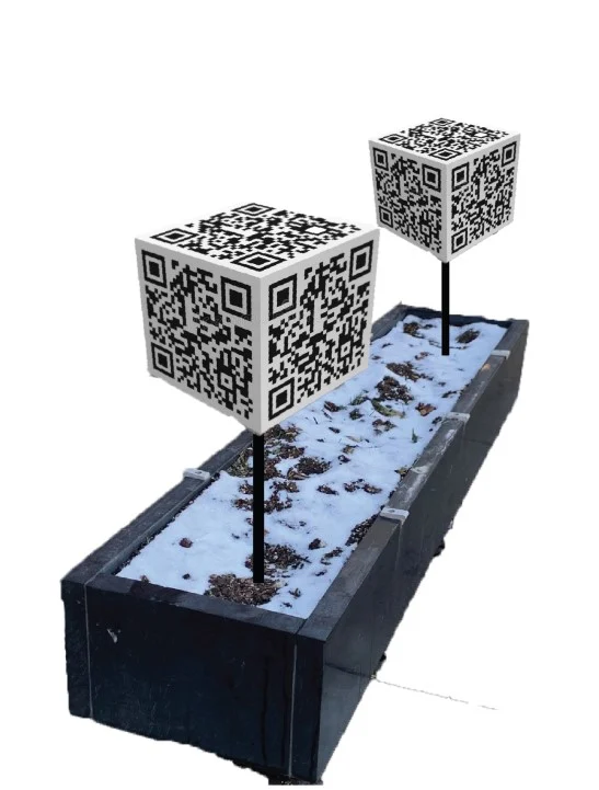
The final part of our series of instructions includes how to utilize QR codes in a flowerbed. I said that this was a revolutionary new way of election campaigning; no need for signs when you can redirect to political advertising. We developed multiple ways of shaping these individual flowers, from laminated pieces on top of a wooden slat to an interactive pinwheel design. Audrey Williamson is responsible for the design in this case, and her contributions matter the most in this regard.
Accompanying these things is a non-tangible effort to engage the community through partnerships with local businesses and seasonal community events, as well as connections with other groups that were part of this senior capstone event. For example, the museum could offer its sidewalk and some chalk in order to grab interest during the summer. This was the result of my own efforts, as
well as Vivian Tran’s.
Like this project
Posted Jul 19, 2024
#ArtAtTheL: DePaul Art Museum Exterior The Client The DePaul Art Museum is a small art museum located on the Lincoln Park campus of DePaul University. Its mean…
Likes
0
Views
19
Clients
DePaul University