Craigslist Redesign
Introduction
In 1995, Craigslist began its life as a email-based distribution list to friends in the San Francisco area. The name comes from its creator, Craig Newmark, who created it because of his relative isolation as a newcomer to the area. Eventually, it grew and grew enough that it completely disrupted the newspaper classified business. However, life goes on, and the website eventually settled into its current state. This redesign serves to maintain the old-web style and spirit of the site, while bringing in new elements and features in order to improve on issues users have with the main page, the category pages, and the product pages.
Comparative Analysis
Craigslist is not technically e-commerce, although it functions like an e-commerce site. It is analogous to classified advertisements in newspapers, which still exist today but in much less robust form. Before the internet, the nature of a classified ad was that you would call the newspaper and pay to have them post your advertisement in the classified section of the local newspaper, often accompanied by the phone number that one would need to call in order to answer the request cited in the advertisement. This is a more intimate act that the point-and-click that would normally be the result of such a transaction on a site like Amazon, and needs to be taken into account for any type of redesign involving the site.
The closest site to Craigslist in terms of content is e-Bay. Like Craigslist, the site is attempting to recreate something in the digital world that Unlike something like Etsy, its content is of interest to people with an interest in collecting or any sort of knick-knacks that would be interested in a site like Craigslist. However, its design has kept with the time, and resembles a more traditional e-commerce site than anything else.
PErsonas

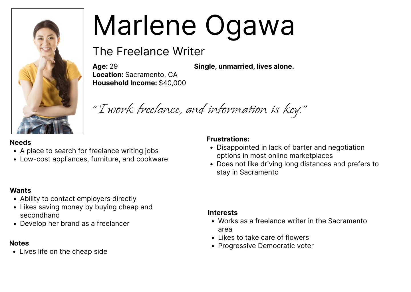
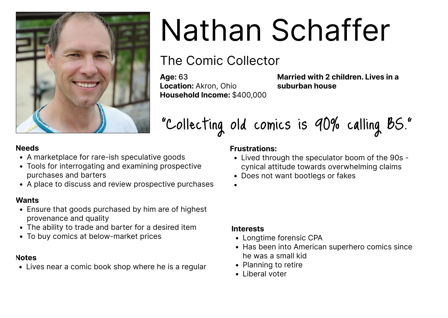
The users that are presented in these personas are concerned with safety, the ability to check transactions before they actually do them, and are seeking cheaper options. The redesign of Craigslist means that these features should be added to the user experience without sacrificing the unique aspects of Craigslist, keeping the spirit while evolving the site.
Redesign
Home Page
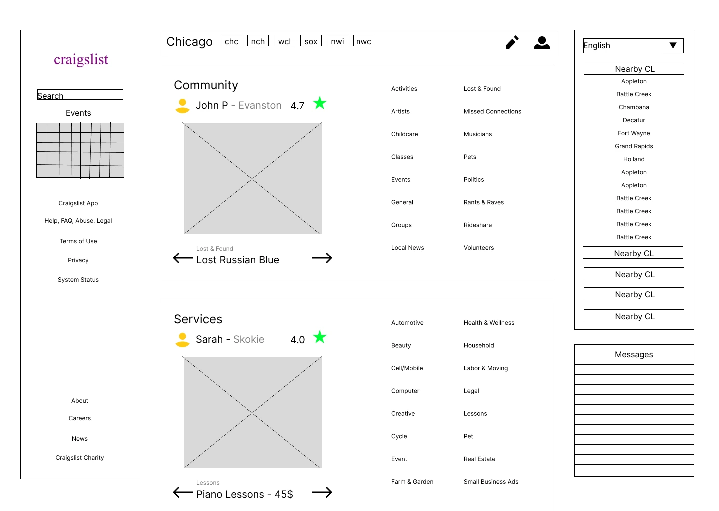
The changes I made to the home page include:
The home page now has a direct message feature. This is an effective update of the process of responding to a classified ad in a newspaper. Instead of phoning someone in order to respond to a posting, users can now respond to a posting through direct messaging.
The categories are reorganized into cards by topic, containing a carousel with recommended postings and the categories of posting.
Category Page
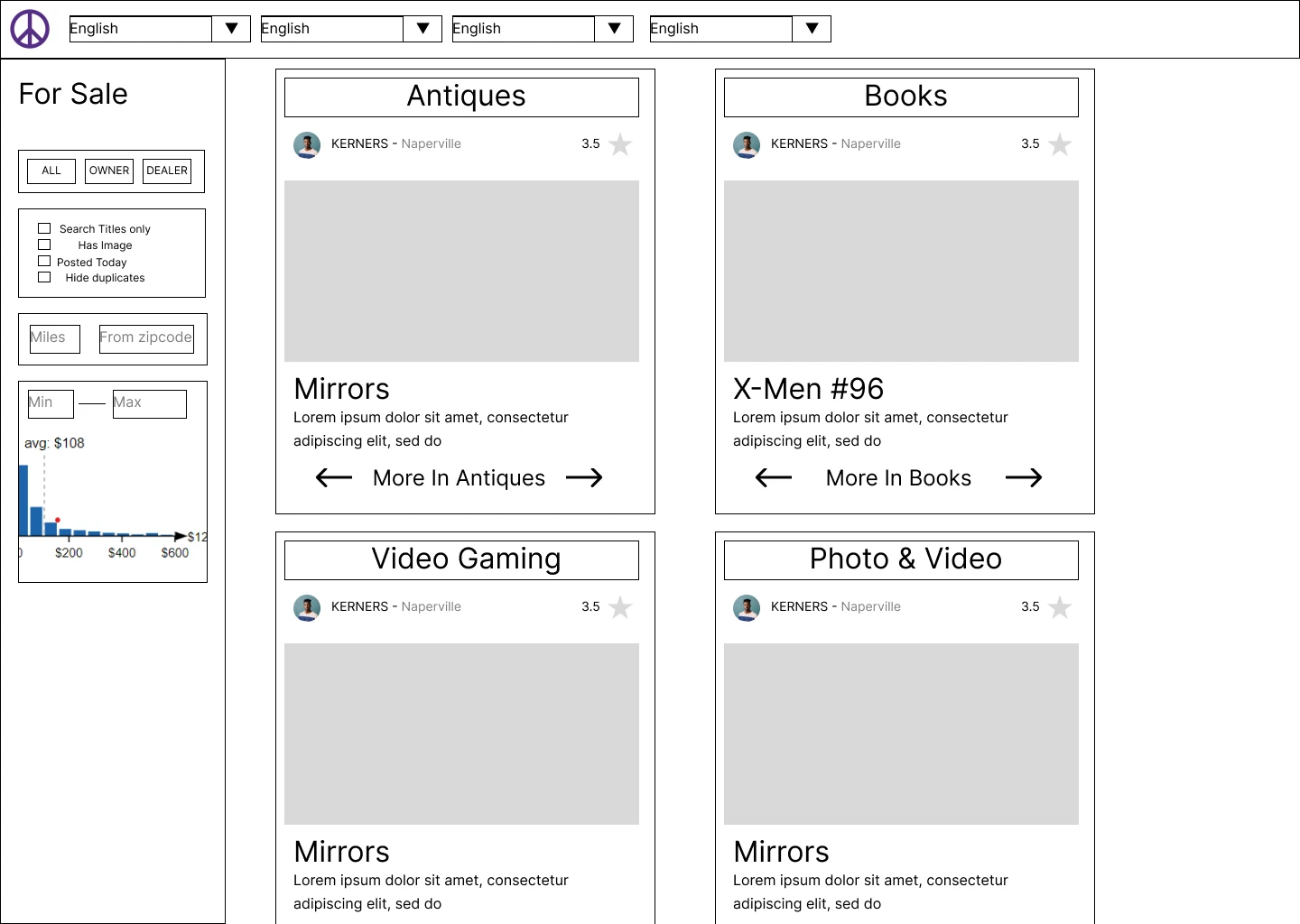
This is a new page that I created located in-between the home page and the sub-category page. It contains all sub-categories contained within the category. This results in an extra click, but users can essentially see what a given sub-category contains before proceeding.
Registered users also have a star system to rate sellers, in order to increase the level of safety involved in a transaction.
For Sale Page
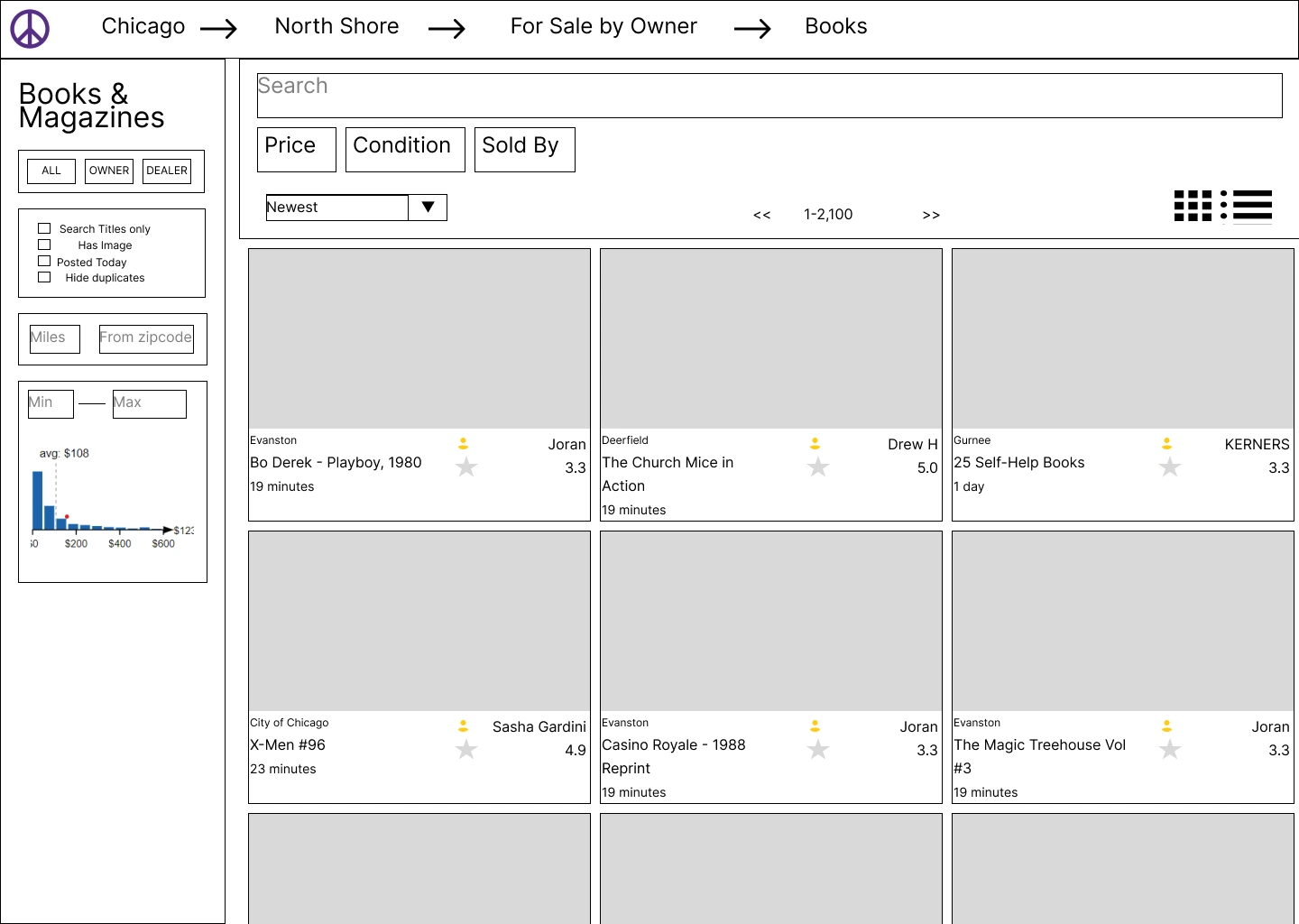
The for sale page was kept mostly the same. Again, I only added features and retained all the chintzy visual design.
Product Page
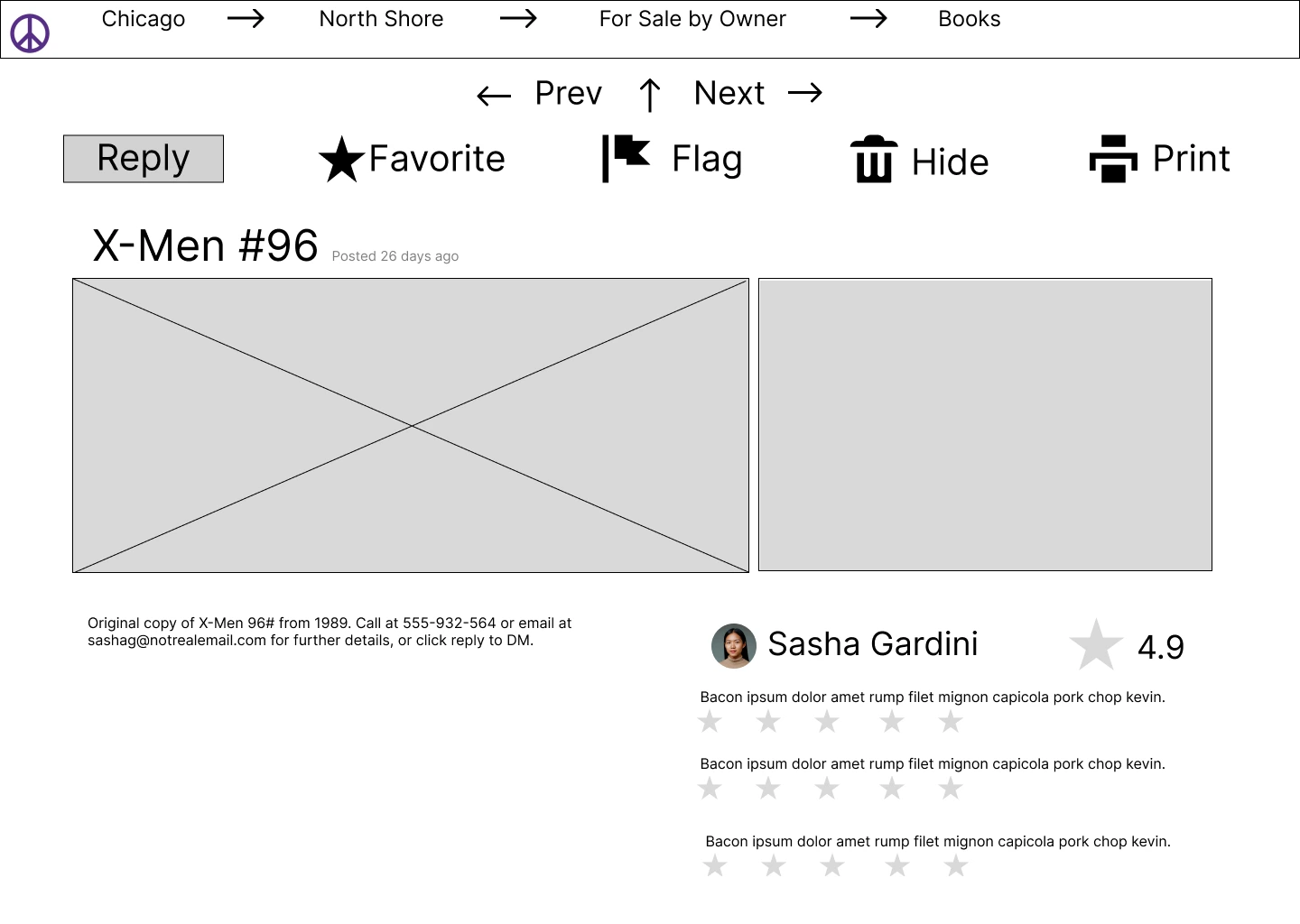
The new features that are on the product page include icons next to the options above the page. To increase safety, the seller’s rating is displayed next to the information about the product, along with reviews that the seller has received.
Like this project
Posted Jul 19, 2024
Craigslist Redesign Home PageCategory PageFor Sale PageProduct Page Figma Link Introduction In 1995, Craigslist began its life as a email-based distribution li…
Likes
0
Views
13


