Pet Rodeo E-Commerce UX/UI Redesign

creede fitch


Pet Rodeo
A redesign for an apparel company supporting low cost veterinary care
SOLO DESIGNER — RESEARCH, UX, UI
E-COMMERCE UX/UI REDESIGN (SHOPIFY)
CLIENT PROJECT · PARTIALLY IMPLEMENTED
PROBLEM
Two audiences shopping the same store. One came for the shirt, one for the mission, and the site half-answered both.
INSIGHT
Whatever I designed, she'd be the one running it. The reasoning had to ship alongside the design.
OUTCOME
A tested redesign, a new Shopify theme carrying what the budget allowed, and a heuristic review she could keep working from.
Nothing looked broken. A few things quietly were.
Pet Rodeo sells animal-themed apparel and donates a portion of every sale to nonprofit veterinary care. The founder had run a nonprofit operating low-cost vet clinics, the mission was real. Her site looked clean at first glance, too.
But in the cart, two donation mechanisms sat stacked on top of each other. Try to add a dollar, and the cart filled with a hundred one-cent line items.
Nothing about the site screamed broken. That's exactly why it needed a closer look.
First, I needed a record of what was actually broken.
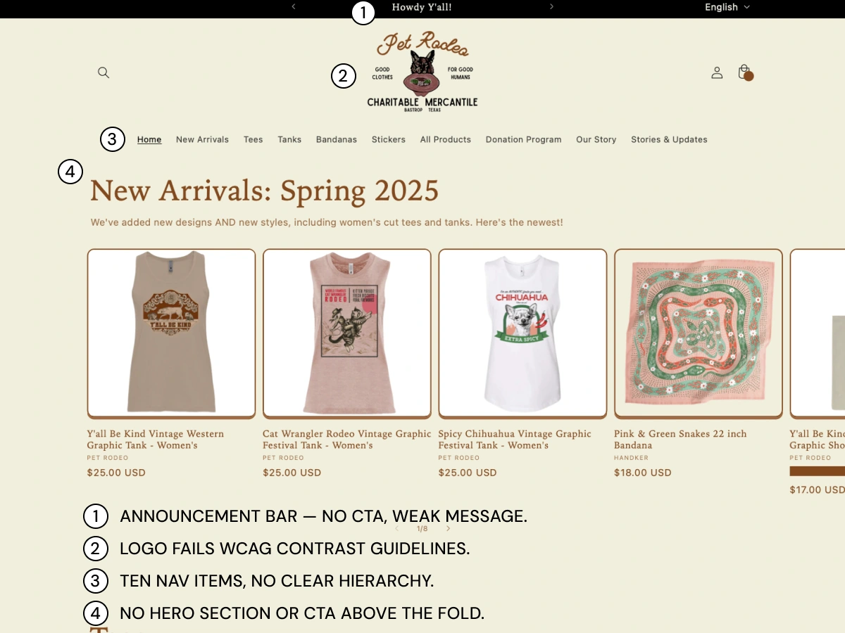
I conducted a heuristic review and documented the findings in Figma. A missing CTA above the fold, a logo that lost legibility on mobile, ten navigation items with no real hierarchy, gaps against WCAG guidelines.
I benchmarked it against Nielsen Norman Group and Baymard research on nonprofit e-commerce specifically, then packaged the whole thing as its own deliverable, something she could act on no matter what happened with the rest of the project.
Then I talked to the person who built it.

I sat down with the founder for a recorded interview, going in without assuming I already knew the fix. What came out of it was a real tension: two different audiences were shopping the same site. Some people wanted the shirts, funny, Western, a little weird in a good way. Others wanted to support the mission and barely cared about the design. The site wasn't speaking clearly to either one.
I think people want to support the mission, but it's not always obvious how it works.
Then I designed what it could look like instead of just where it was breaking.
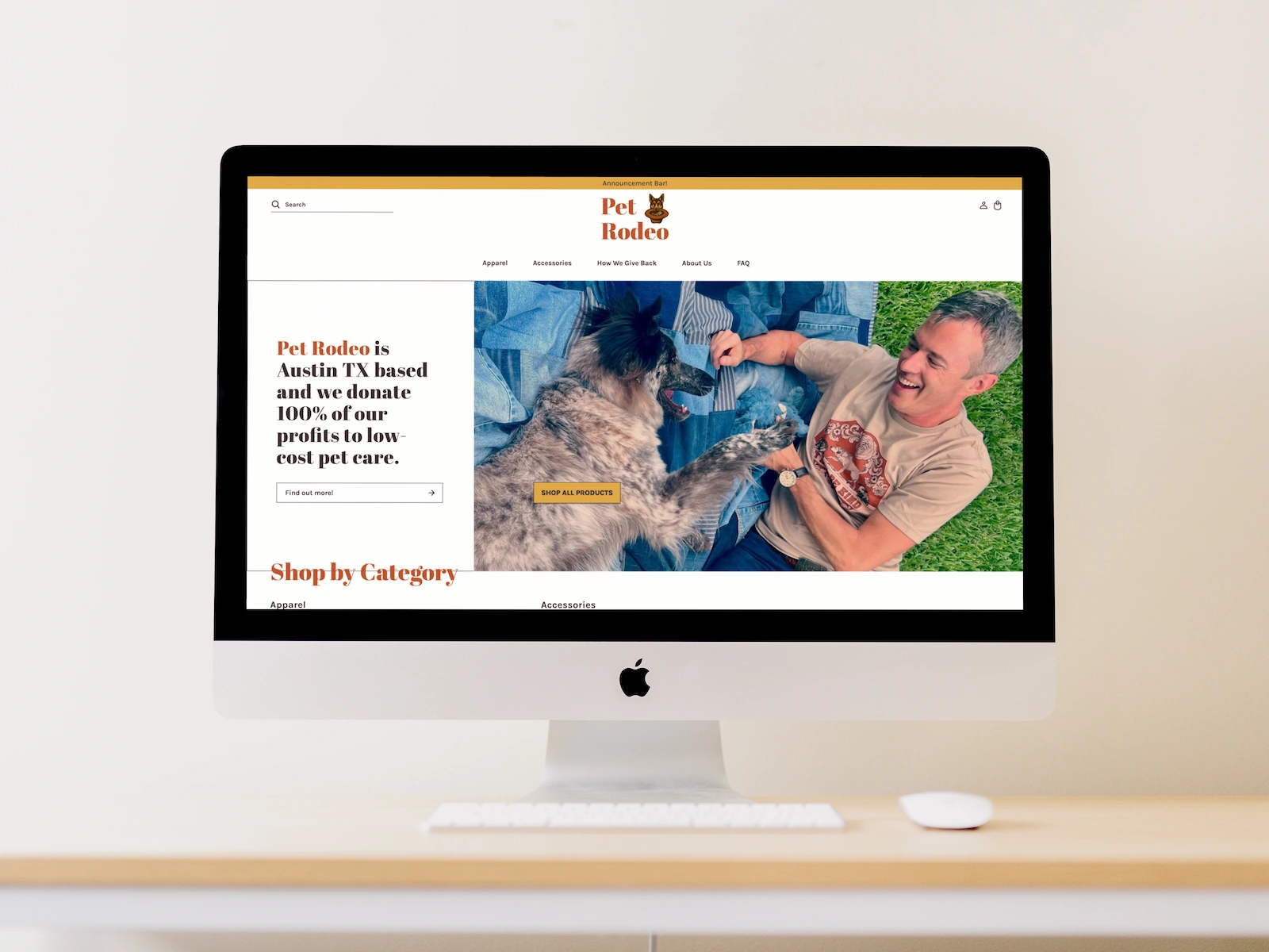
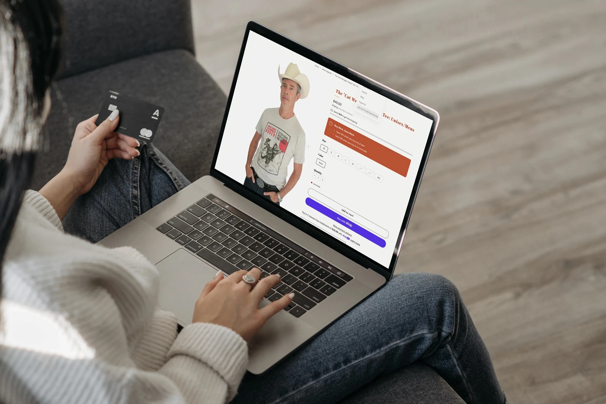
I built a complete concept in Figma rather than a list of fixes. A hero section now states the mission above the fold, with a clear call to action. Navigation dropped from ten scattered items to seven, organized under two real categories instead of one long list.
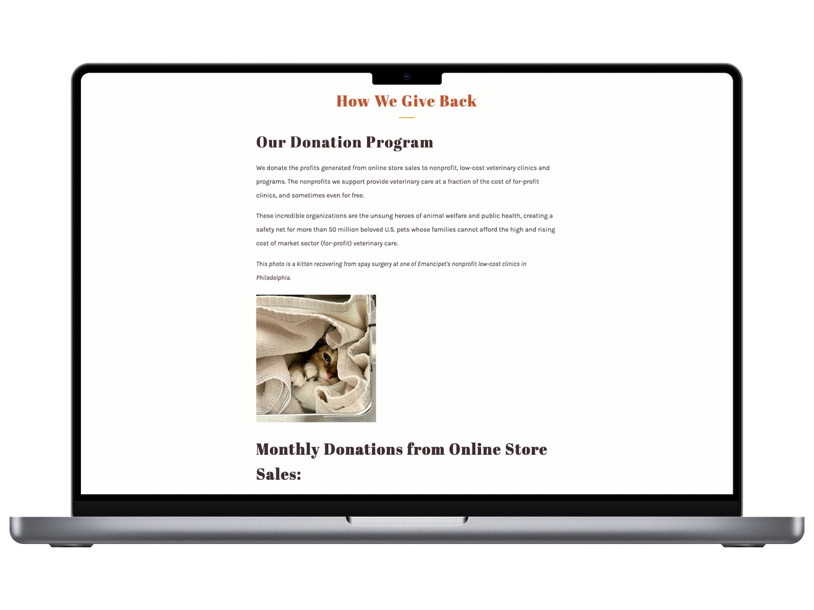
The donation math got spelled out too — 100% of profit, with the exact mechanic underneath. No more "proceeds." An actual number, stated plainly.
The real problem wasn't the product. It was trust.
Everything I had so far pointed at the same root issue. The mission was good. The product was fine. But nothing on the site built confidence that either one was real.
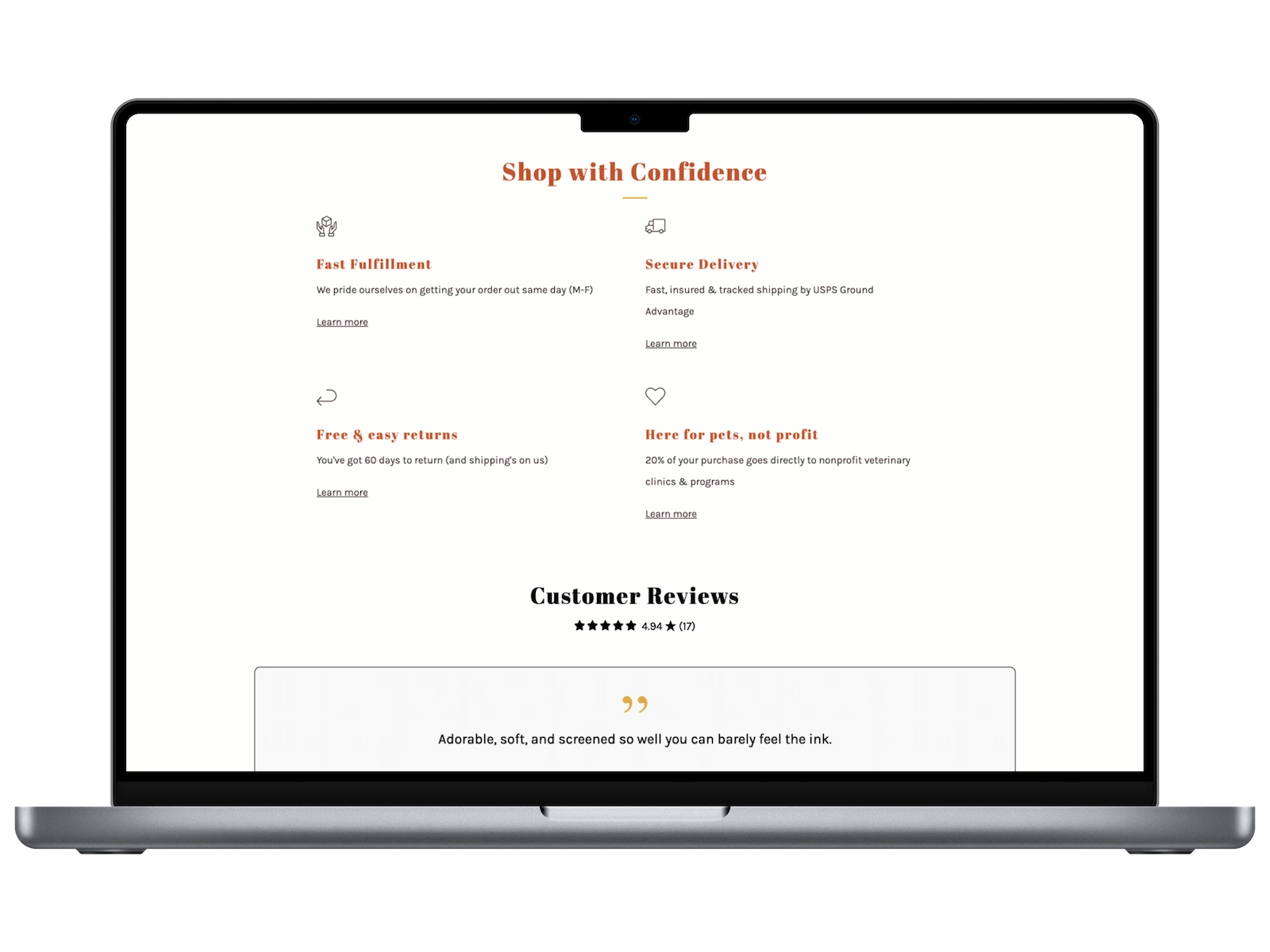
A shopper who came for the shirt needed confidence in the product, sizing, photography, quality. A shopper who came for the cause needed confidence in the mission, where the money actually goes, and how much of it. The site was built for neither conversation in particular, so it half-answered both.
Fixing the UI wasn't really the job. Fixing what the UI failed to say, to two different people, was.
Then I put it in front of people.
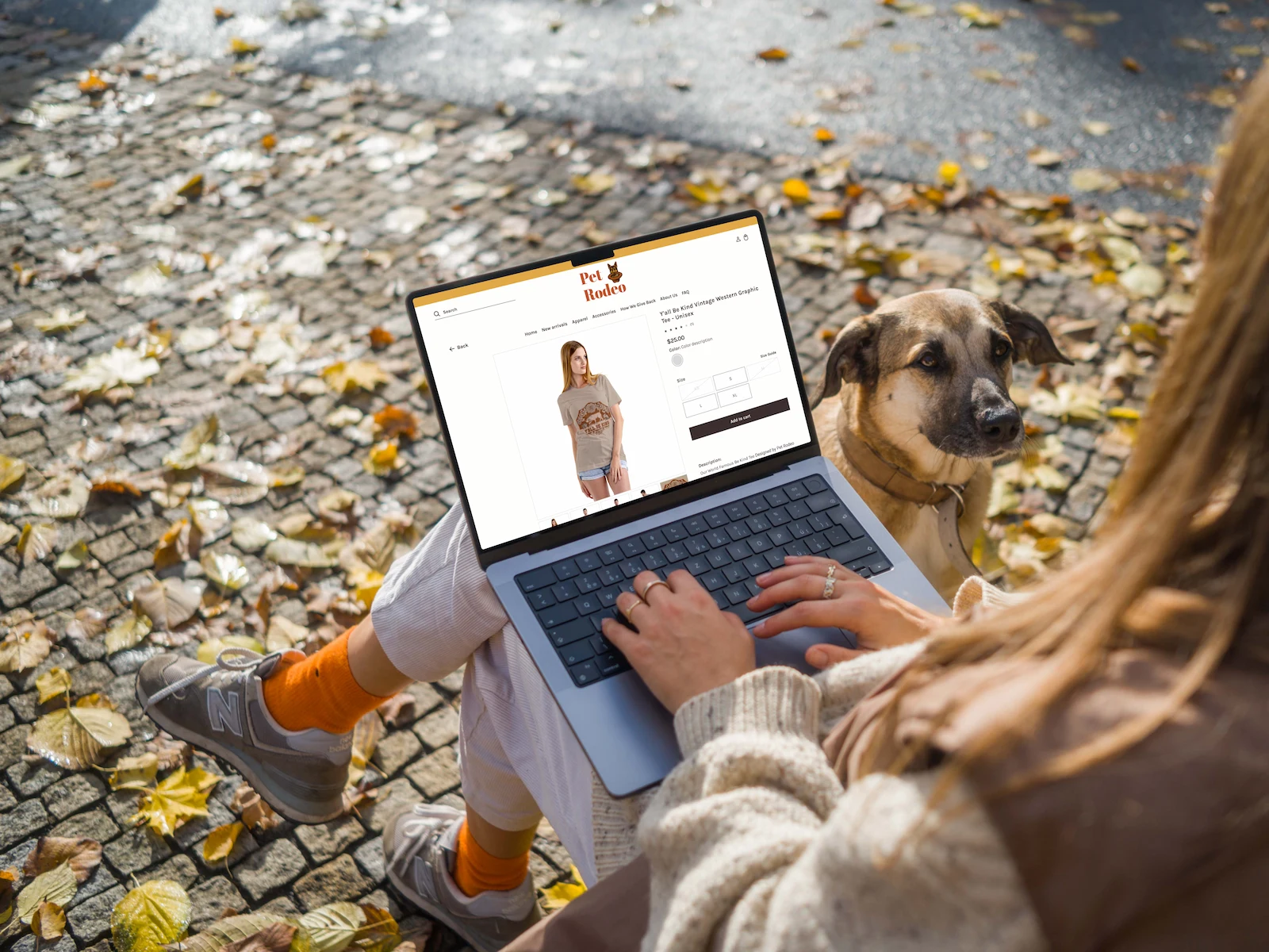
I ran recorded sessions with five participants, first on a low-fidelity version and again once the design was built out in Figma. The same want kept surfacing: people needed to see the shirt on an actual person and know how it would fit before they'd buy.
So I mocked up photography on real models and wrote sizing copy around real reference points — a model's actual height and weight next to the size they're wearing, instead of a generic chart. The new logo concept got tested here too, on a real product page instead of in isolation.
Ashley is 5'4" and wearing a Medium. Rob is 5'10" and wearing a Large. That's worth more than a size chart.
I designed the whole thing. She didn't get the whole thing built.
A fully custom Shopify build matching every page was beyond my experience at the time, and well beyond her budget. So the deliverable became a complete, ready-to-reference design instead of a finished product.
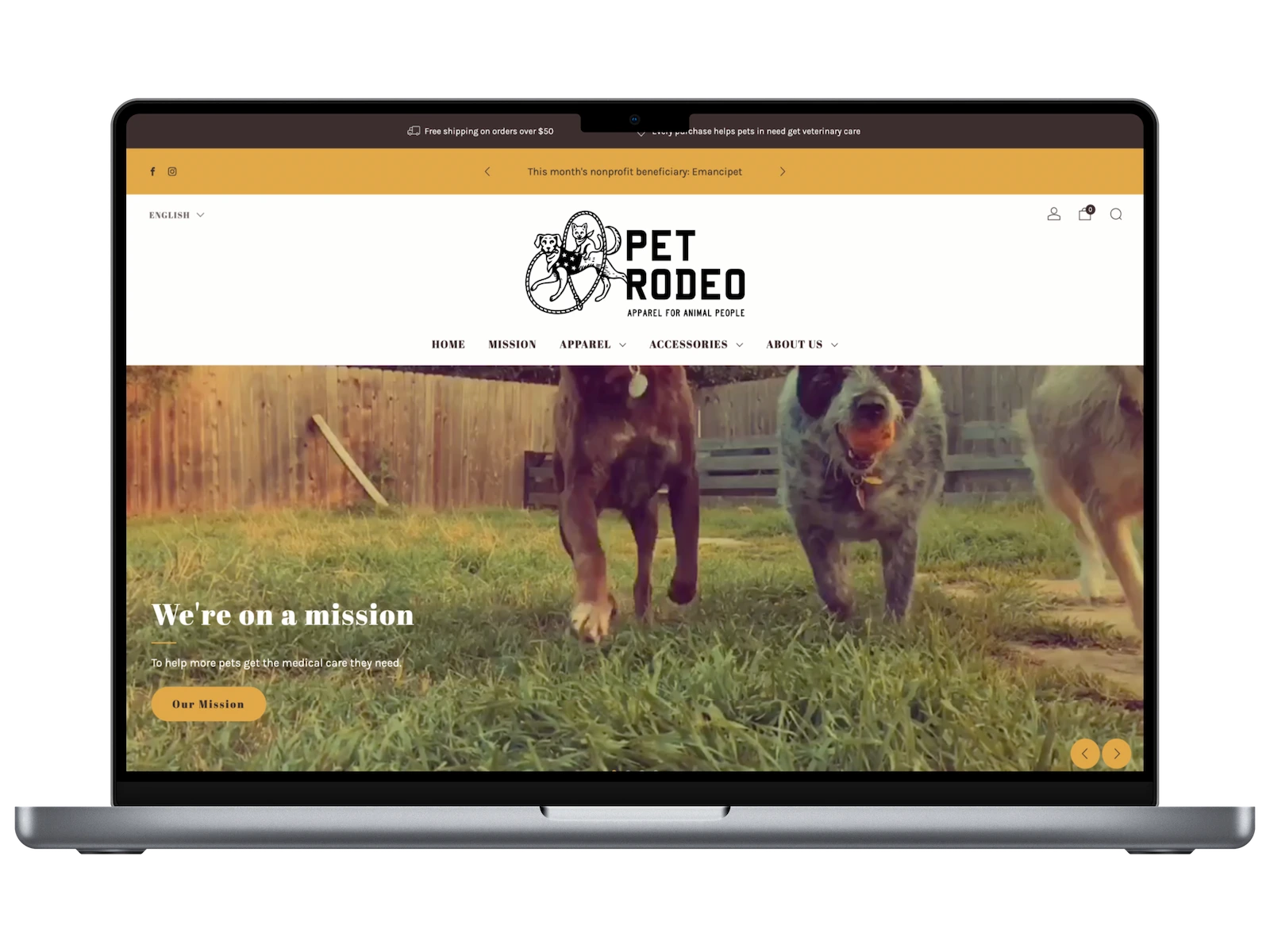
She took it from there, hired a graphic designer for a new logo, picked up the photography herself, and brought me back to help implement what I could on a new Shopify theme.
Sometimes the most senior design decision is knowing which battle to pick.
Outcome
A heuristic review packaged as a standalone deliverable, a recorded founder interview, two rounds of usability testing with five participants, and a complete redesign concept in Figma of the homepage, navigation and product page, photography direction, donation messaging and sizing.
Some of it stuck. Some of it didn't.
The photography stuck completely, she's since run her own shoots on real models, which was the whole point. The new logo shipped too, though it ended up different from the one in my concept. Navigation got simplified for a while, close to what I'd recommended. Checking back recently, it's already creeping toward where it started.
None of that's a failure. It's what happens when you hand a non-designer the reasoning instead of staying on as the one making every call.
Like this project
Posted Aug 27, 2026
E-commerce redesign and heuristic review for apparel company supporting veterinary care.
Likes
0
Views
1