My Praia: Personalized Beach Finder App

creede fitch


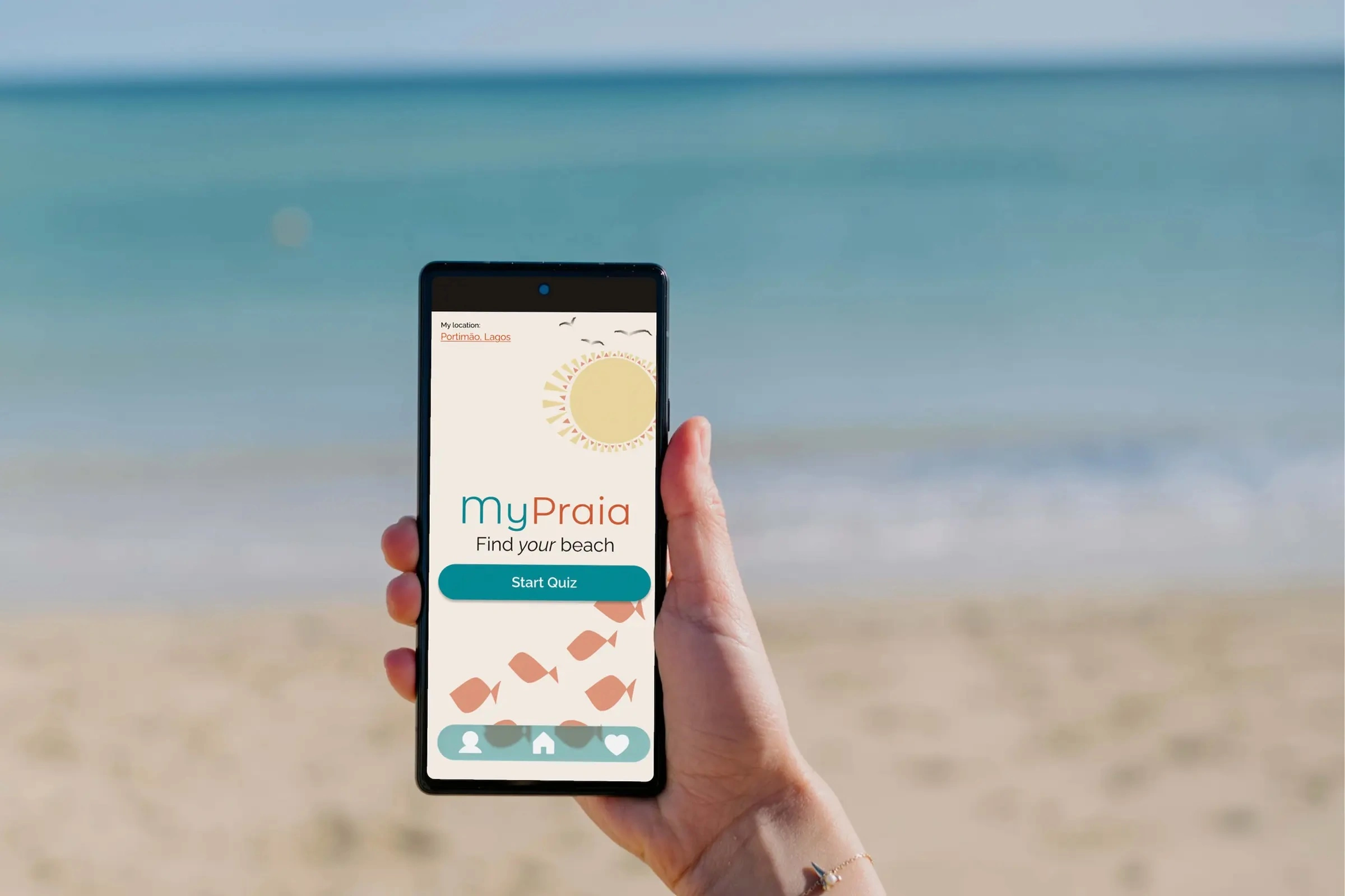
My Praia
An app to find your beach in Portugal
PRODUCT DESIGNER
UX RESEARCH & MOBILE APP DESIGN
SELF-DIRECTED · TESTED PROTOTYPE
PROBLEM
Every beach app tells you everything about a beach. None of them tell you if it's the right beach for you.
INSIGHT
People weren't asking about conditions. They were asking whether a beach fit what they planned to do there.
OUTCOME
A tested prototype that asks what you want to do, ranks the beaches that match, and explains why.
I love a good beach. I don't love most beach apps.
I visit the beaches in Southern Portugal several times a year, and I always struggle to compare local beaches.
There are plenty of apps that will tell you everything about a beach. Tide charts, wind speed, wave height, UV index. Useful if you know the beaches. Not so useful if you're a visitor trying to figure out which one's right for you.
The best resource I've found is algarvetips.com. Good descriptions, written by people who know the beaches well. But it was a lot of reading, and it left me a little overwhelmed.
Lots of information. No clear answer.
There had to be a better way.
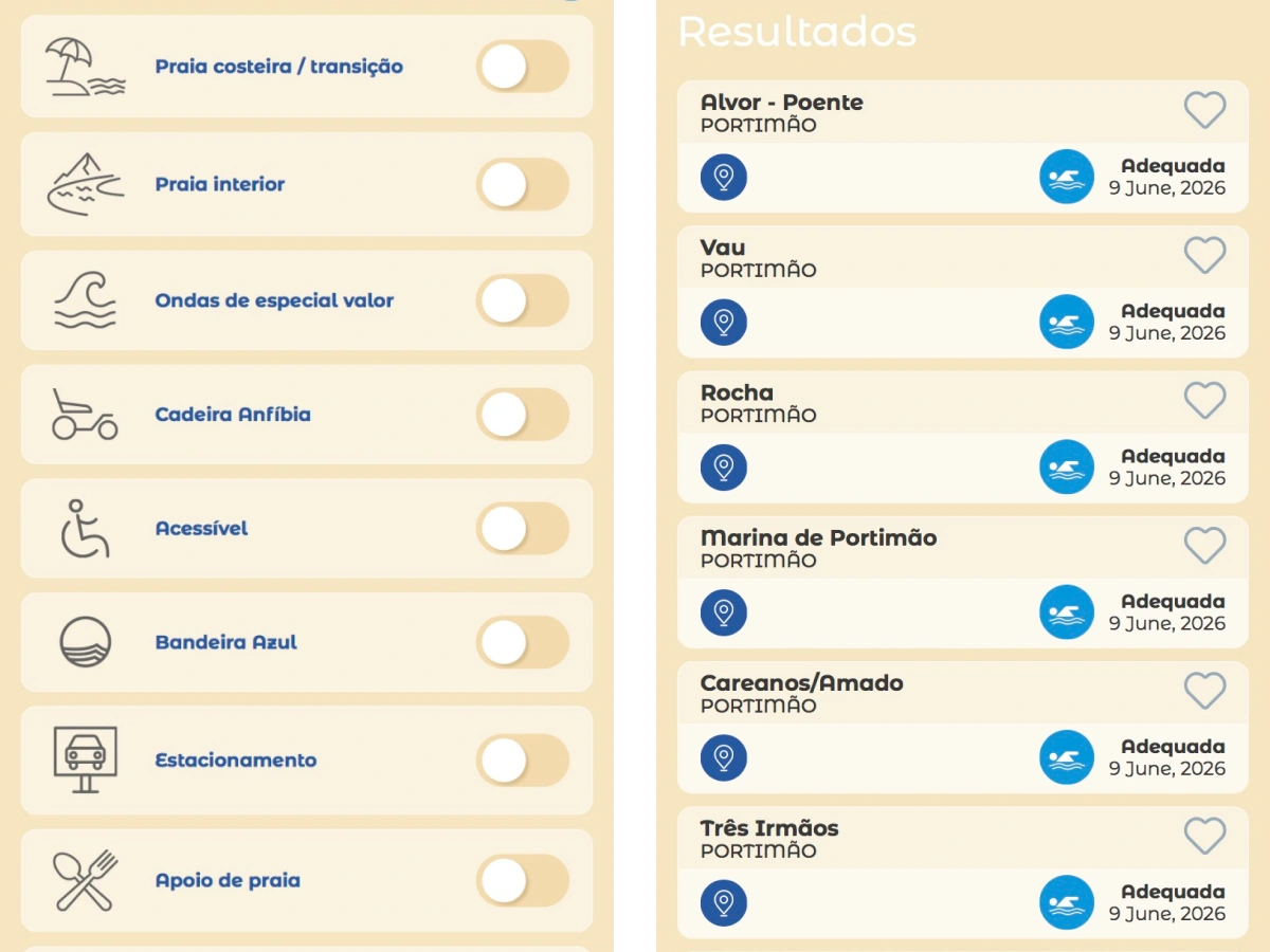
So I wrote a discussion guide and sat down and ran recorded interviews with family and a couple of friends on how they actually choose a beach. Everyone had different priorities. That explained why beach apps are so information-heavy: they're trying to accommodate everyone at once.
I affinity mapped the transcripts. Buried in all those different answers was one consistent pattern: they weren't asking for data. They wanted to know if a beach was right for them.
They wanted to know which beach fit what they planned to do there.
The Headspace moment.
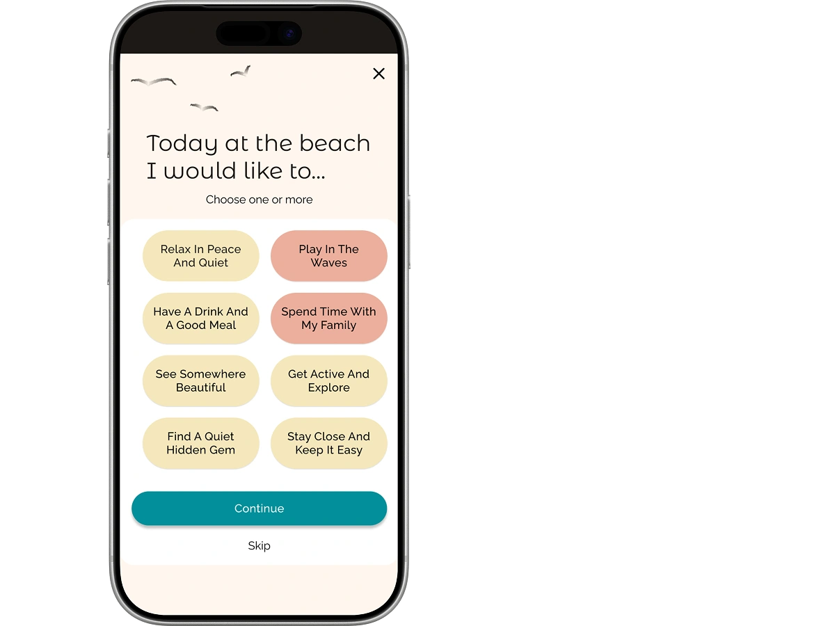
I went looking for an interaction pattern that asks before it tells. Headspace does exactly that: a quick check-in, then a recommendation built from your answer.
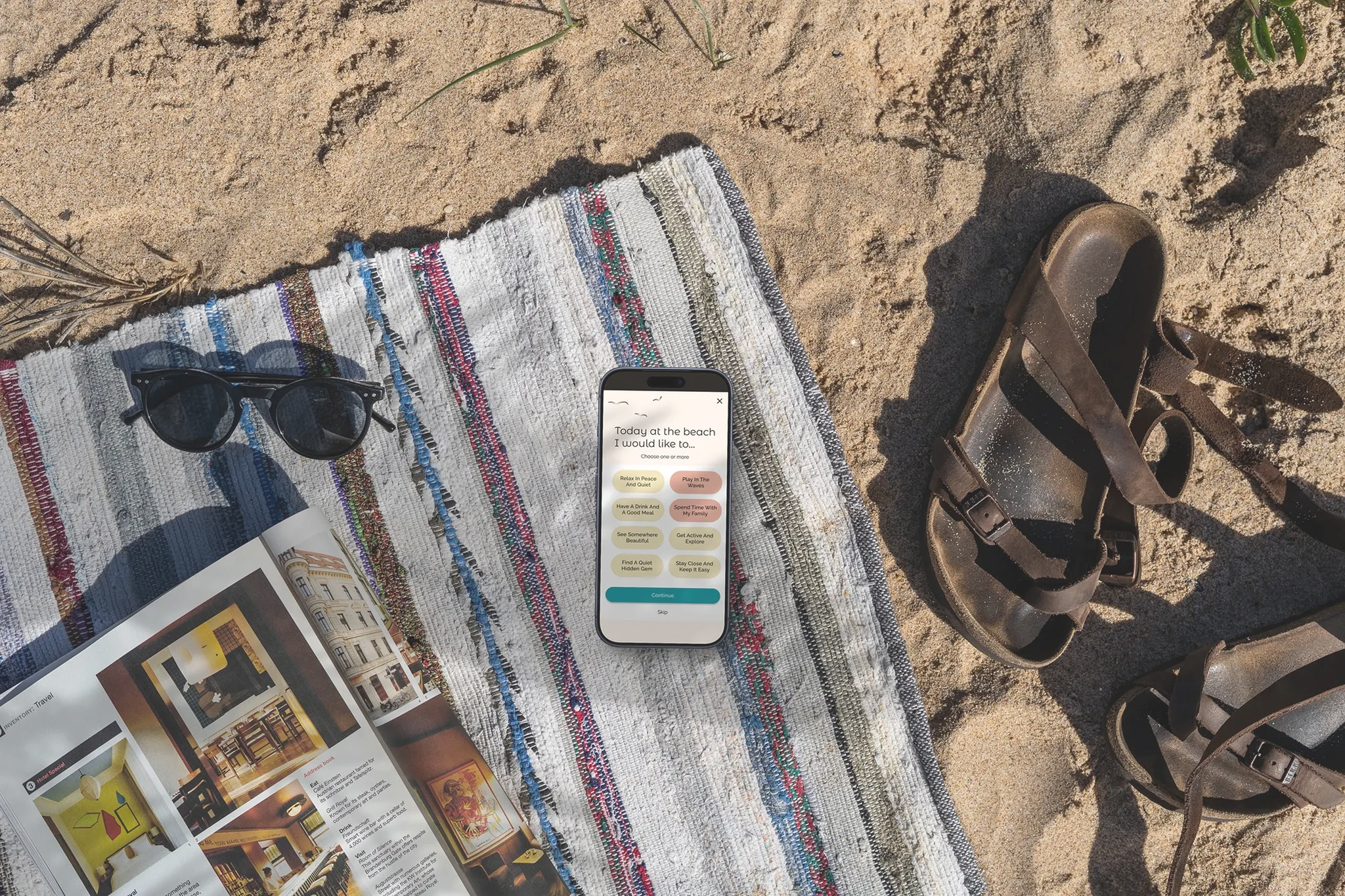
Every beach app I'd looked at did the opposite. Dump everything up front, let the visitor sort it out. What if the question came first instead? Build an app that asks what someone wants to do at the beach, then use an algorithm to rank the beaches that match.
Quiz first. Ranked results. Detail page to confirm the fit. Get them out the door.
Testing broke things. That was the point.
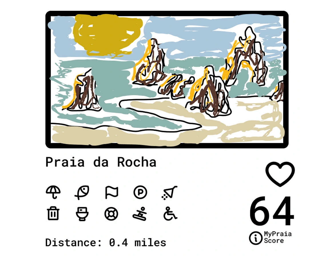
I mocked up a low-fidelity version in Figma and tested it in the Algarve. My kids, their friends, my wife and sister-in-law surfaced problems fast.
"Find your beach" wasn't obvious as a button. One in five didn't tap it. Changed to "Start Quiz." Done.
The score was a bigger problem. Four out of five couldn't identify what the number meant.
Is it temperature? Is it like how many people liked it?
The real lesson wasn't about labels.
People didn't understand why the app was showing them what it was showing them. That bothered me more than any individual UI problem.
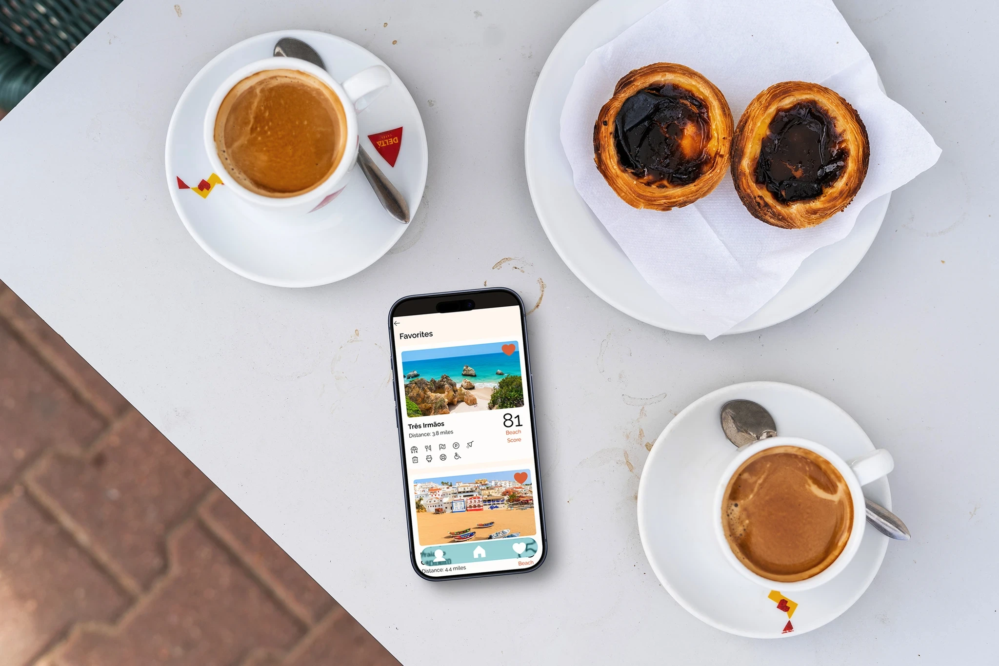
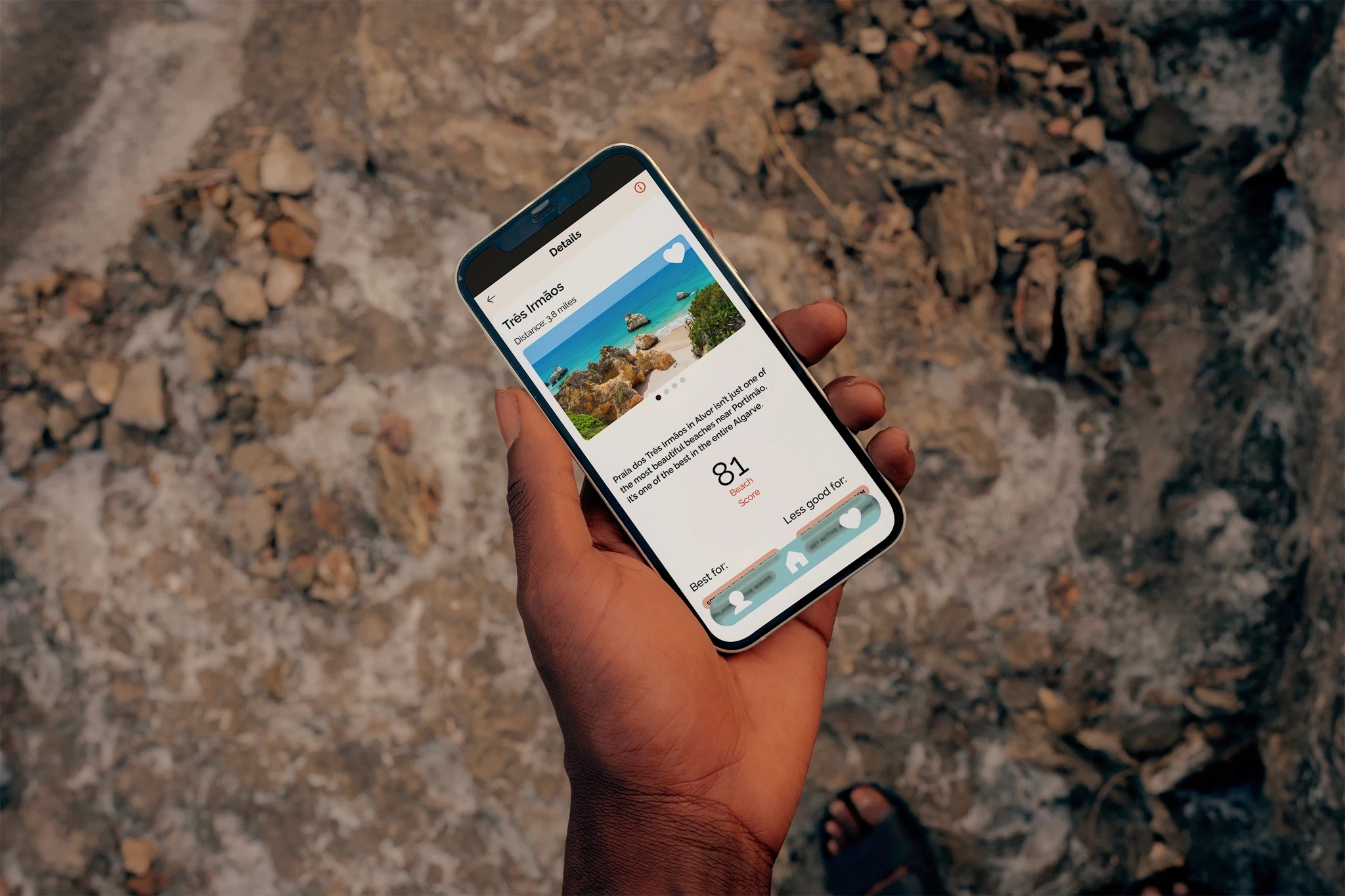
So I built transparency in at every level. The Beach Score became tappable with a clear explanation. Every amenity icon got a pop-up. The results page showed exactly which quiz answers were driving the rankings.
And on every beach detail page, whether someone arrived from a search or from their favorites, a "Best For / Less Good For" section told the honest story of that beach at a glance.
It's best for spending time with family and playing in the waves. That's cool. I actually like that a lot.
The hi-fi round confirmed the fixes worked.
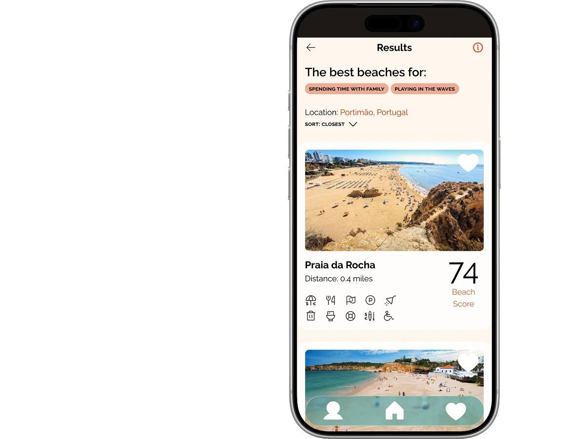
This time, the prototype looked and felt like a real product. Clear hierarchy, obvious tap targets, nothing left to guess at.
Gone was the hesitation around the quiz button. Gone was the confusion about what the score meant. The amenity pop-ups and "Best For" sections held up too, nobody asked what an icon meant or why a beach ranked where it did.
It's a great way to get a high-level view of some good beaches in your neighborhood — and then you actually have pretty detailed information. A great way to discover beaches in the Algarve
On the branding.
I needed a visual identity, and I wanted something that felt like the Algarve, not like every other beach app.
My first instinct was the hand-painted lettering on the Schweppes tile signs you see all over the region. I tried pulling the typography straight from them. Gorgeous on ceramic. Didn't translate to a phone screen at all.
Outcome
A tested prototype of the full flow: quiz, ranked results, beach detail. Two rounds of testing in the Algarve. The first killed "Find your beach" as a button and exposed that four of five people couldn't say what the Beach Score meant. The second confirmed the fixes: nobody hesitated at the quiz, nobody asked what the score was.
What I'd do differently.
The quiz logic is theoretical. The questions work, but the underlying algorithm was never validated with real data. That's the work that would need to happen before this was a real product and it would mean talking to people who know these beaches far better than I do.
Like this project
Posted Aug 27, 2026
Designed an app prototype to recommend beaches in Portugal based on user preferences.
Likes
0
Views
0