DarlinQ Logo Design & Branding
Arda Kilic
DARLINQ is a business link company that provides digital business cards, allowing users to connect their business information through a QR code. The branding had to be clear, functional, and directly tied to its purpose. Since DARLINQ operates as a sub-company, the design maintains a connection to its parent brand while establishing its own recognizable identity.
Concept & Communication
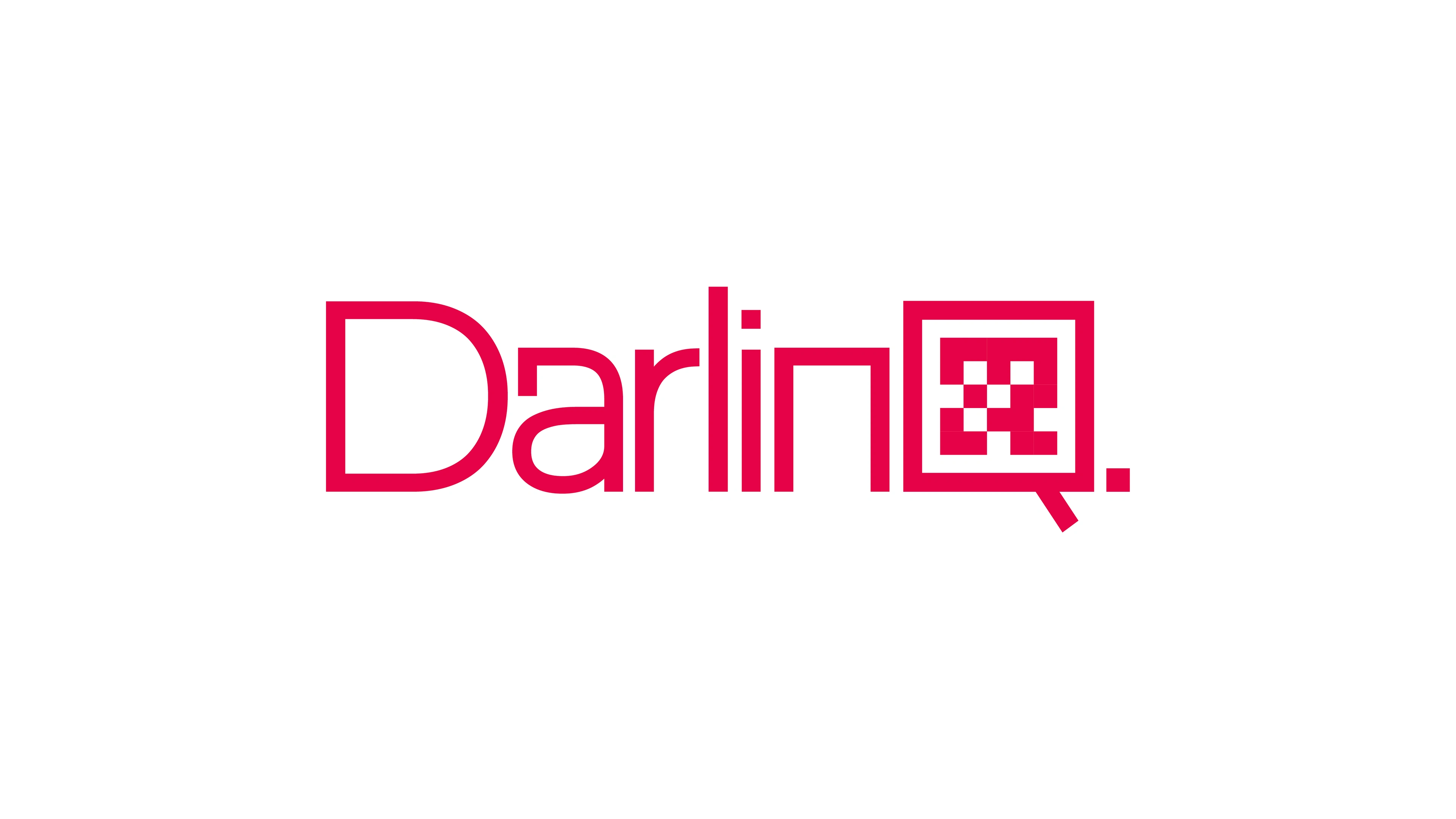
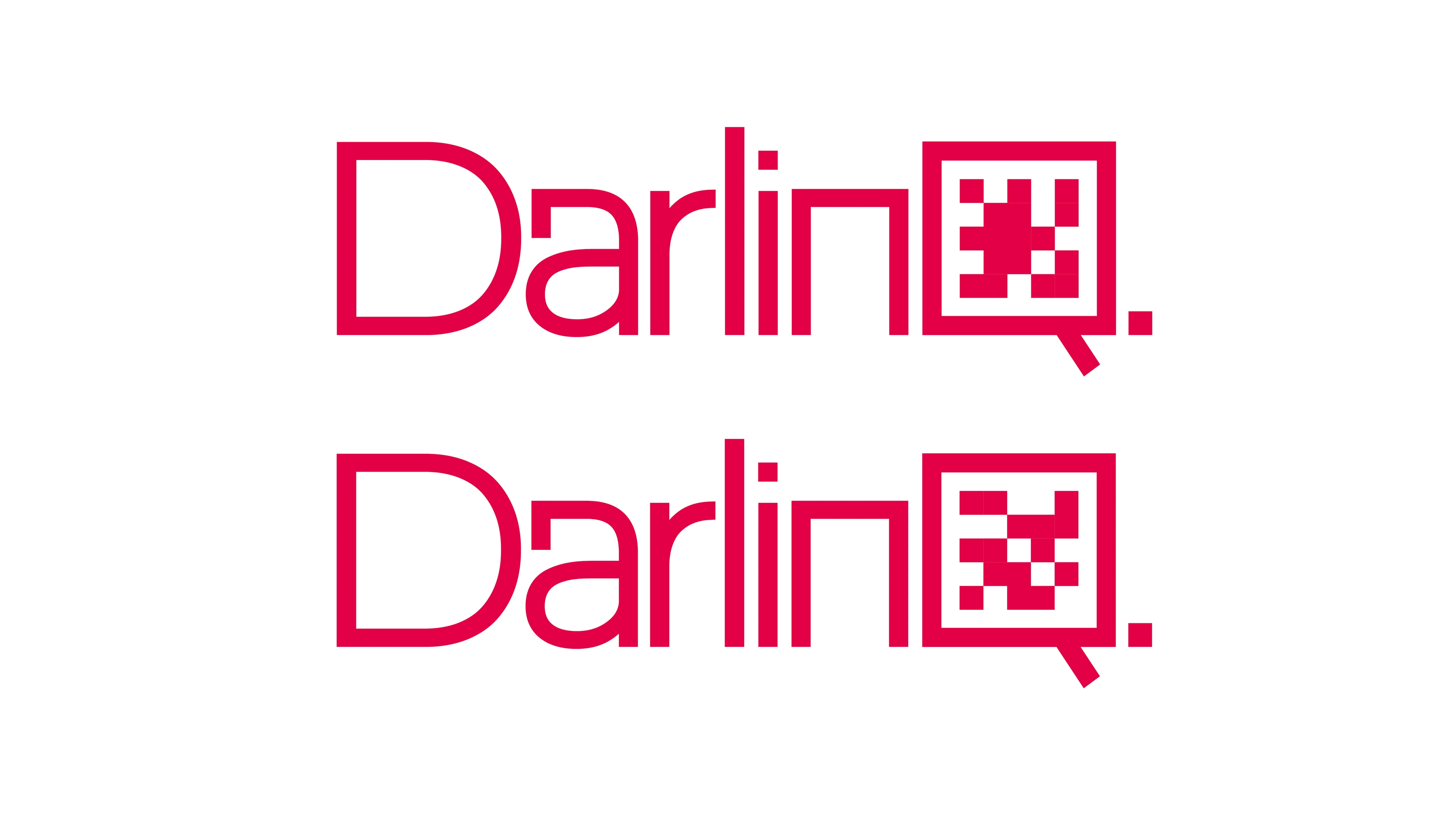
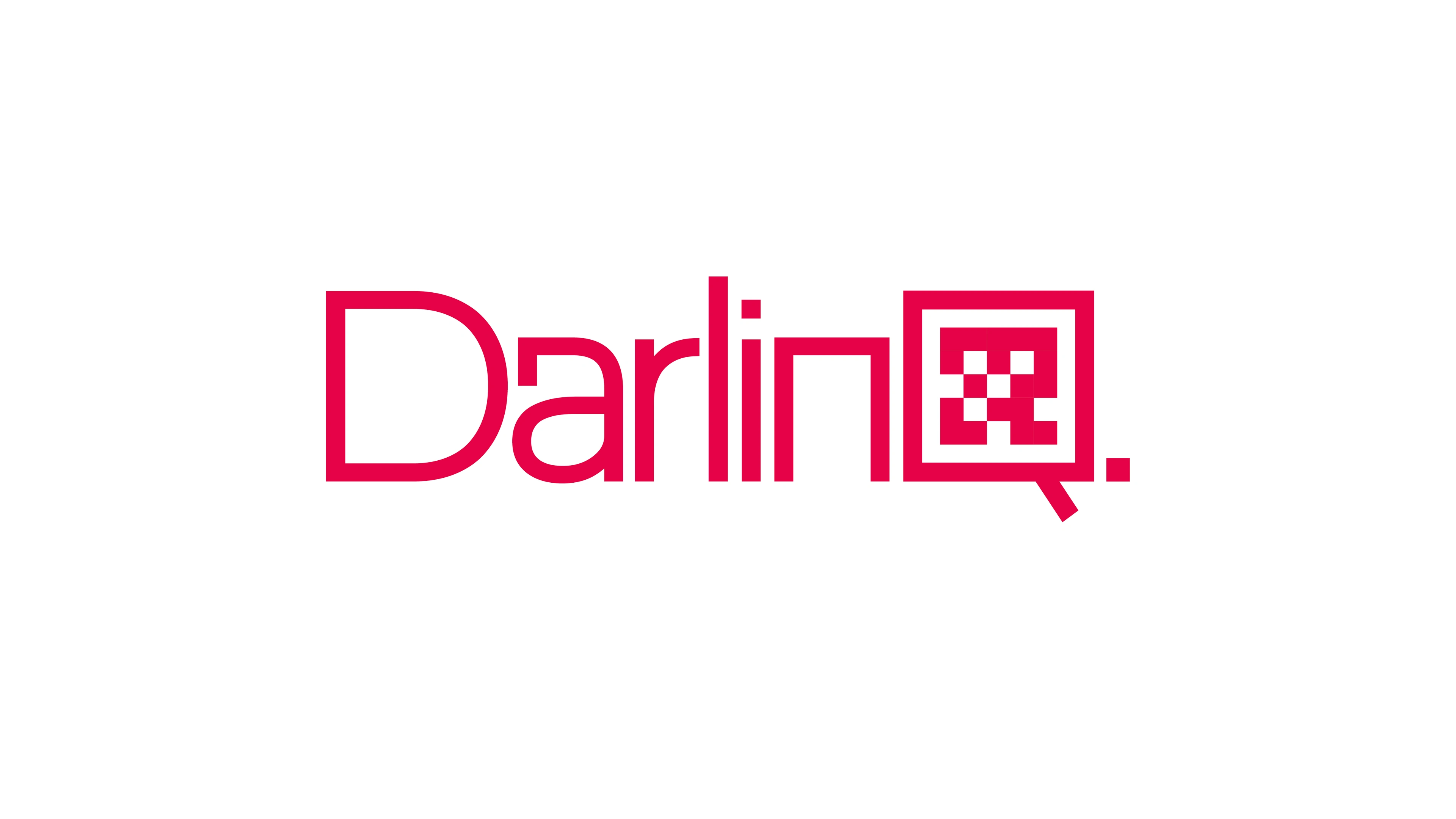
The core idea was built around a QR code integrated into the letter “Q”, visually reinforcing the company’s function. This approach ensured that the logo itself tells the story—a direct reference to scanning and instant connection.
A defining feature of the logo is the stylized “Q”, which incorporates the idea of a QR code. This subtle yet effective detail directly represents DARLINQ’s core function—seamlessly linking business information through scannable technology.
The Starting Point – Raw Typography
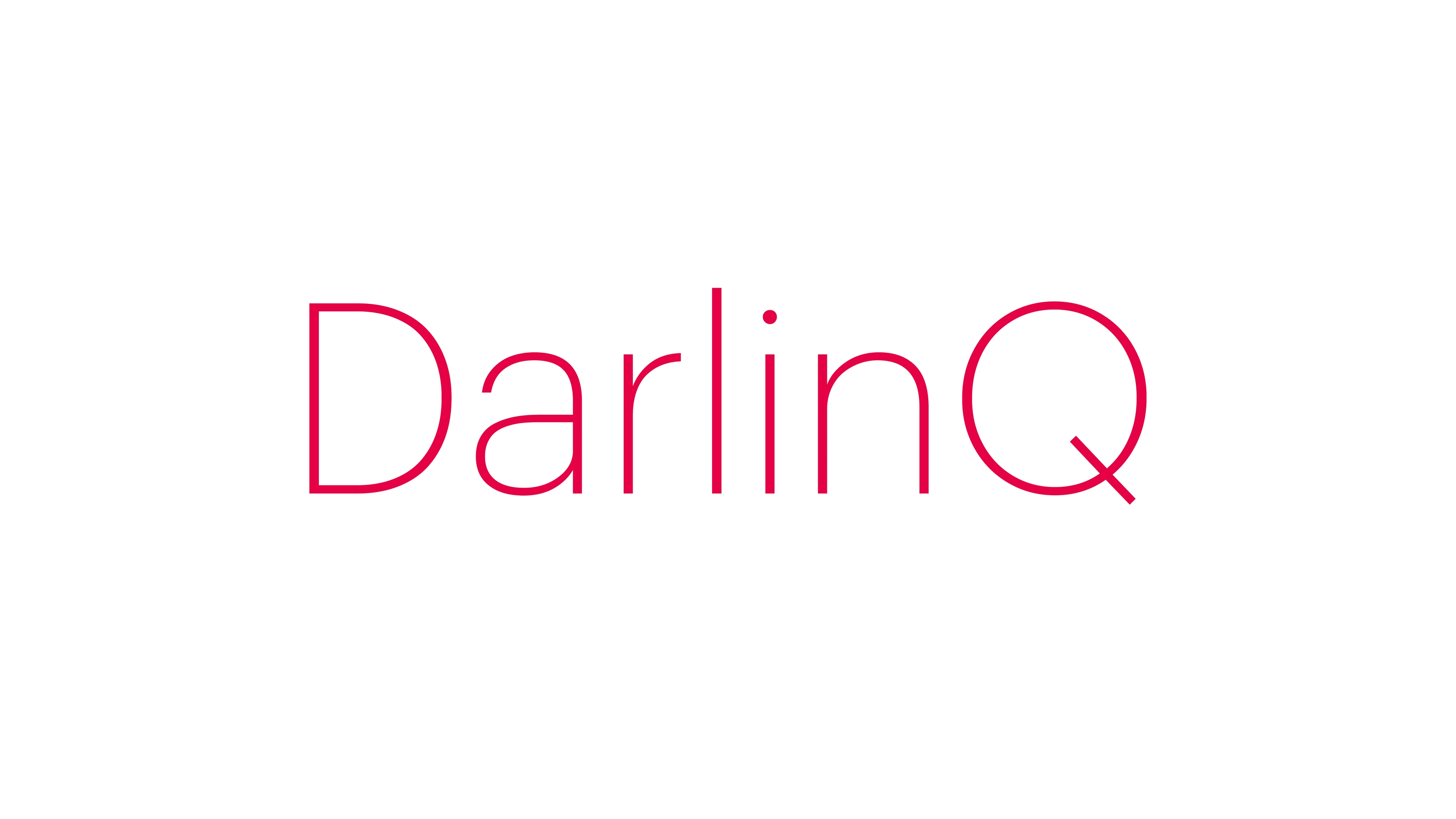
The initial version of the logo began with the Graphik font, shown in its unaltered form. At this stage, the text appears in its basic structure, without the modifications that later refine it into a cohesive brand identity.
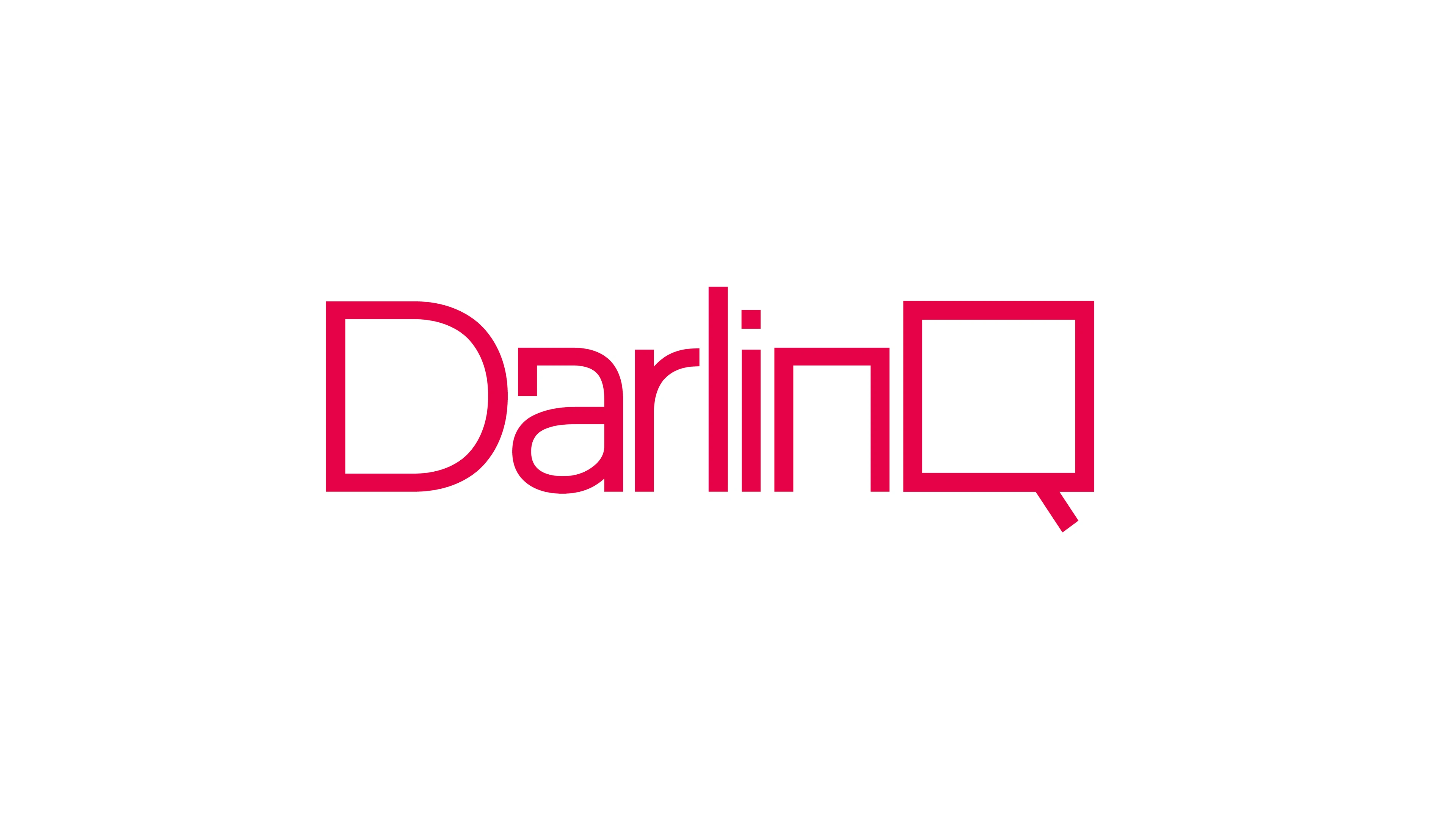
he next step was to develop a custom version of the typeface, making it more bold, cohesive, and aligned with DARLINQ’s branding strategy. Key modifications included adjustments to letter thickness, refined spacing, and an enhanced structure that seamlessly integrates the QR-inspired Q into the overall design.
To reinforce the QR code aesthetic, rounded edges were replaced with sharp corners, mirroring the structured nature of QR codes. This subtle yet impactful design choice strengthens the connection between the logo and the brand’s digital focus.
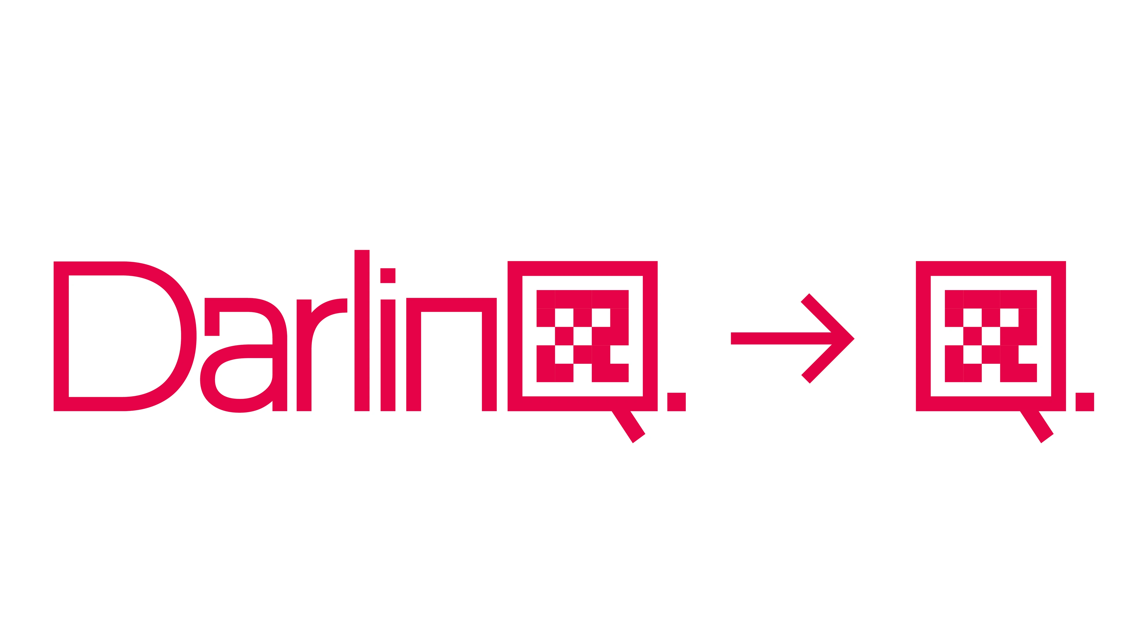
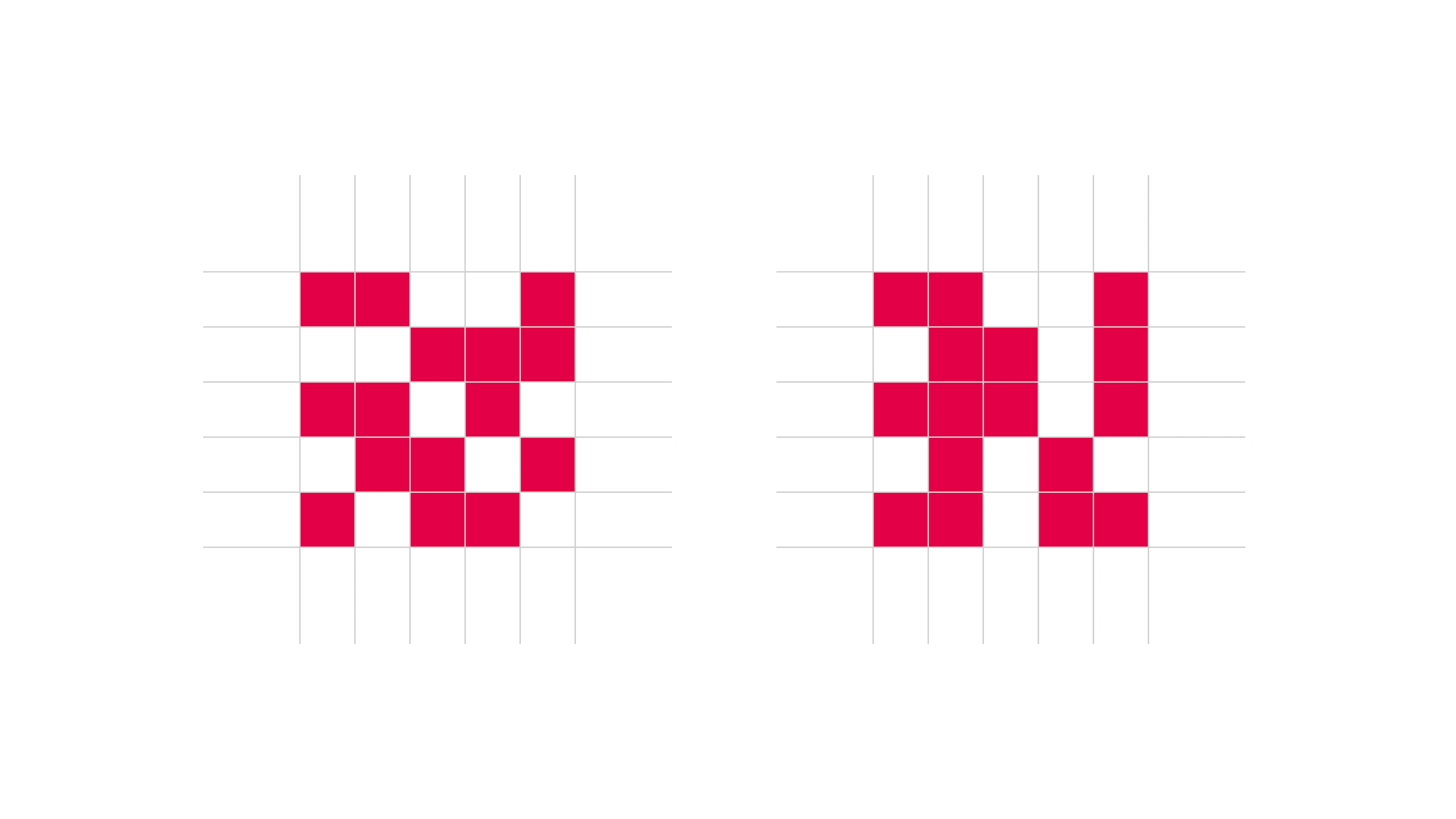
To create balance and consistency, I used a grid-based system to refine the QR-inspired detail within the logo. While it doesn’t function as an actual QR code, it carries the visual language of digital connectivity, reinforcing the company’s purpose without unnecessary complexity.
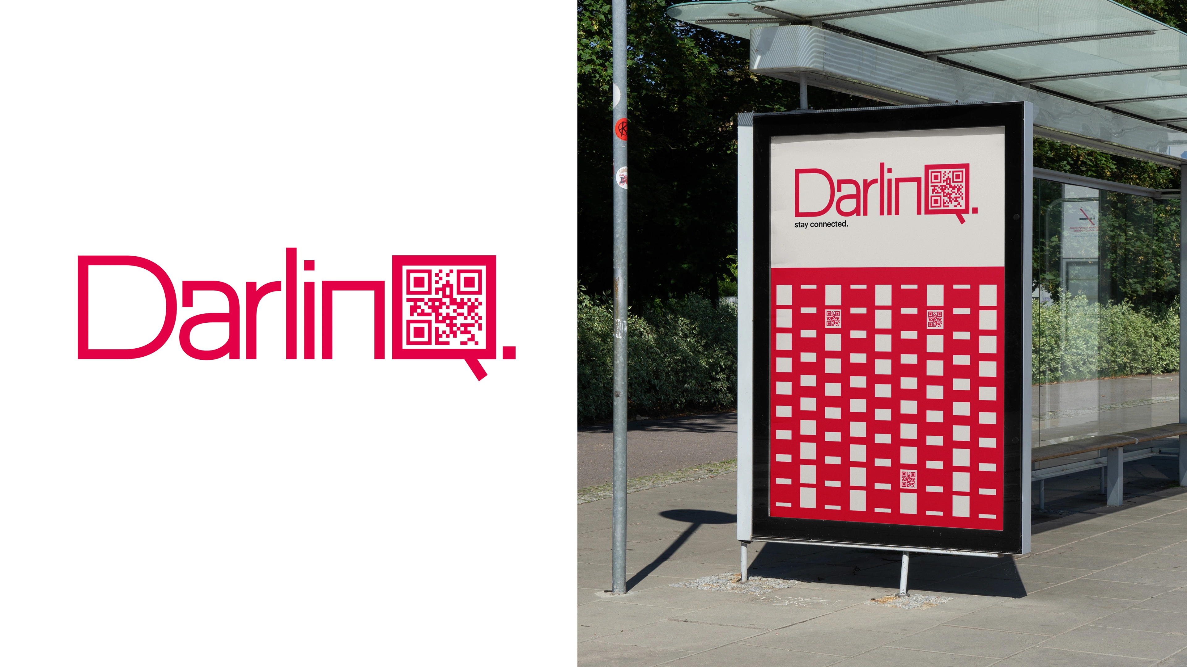
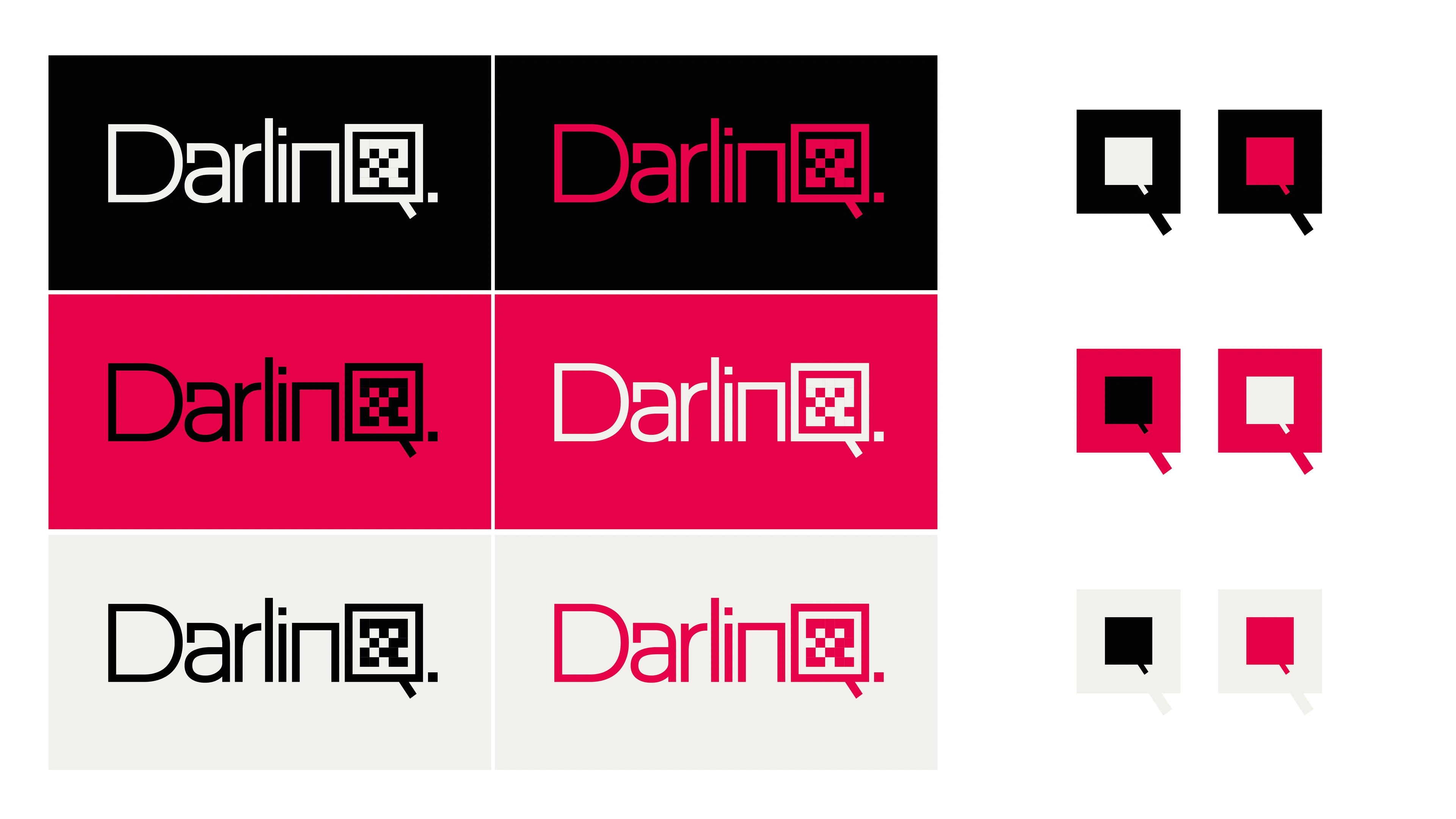
he Q itself was designed with adaptability in mind, allowing for various QR-inspired illustrations within it. This flexibility showcases the brand’s ability to maintain a consistent identity while allowing for customization. Additionally, the Q functions as a standalone symbol, making it an effective icon for branding, app visuals, and other digital applications.
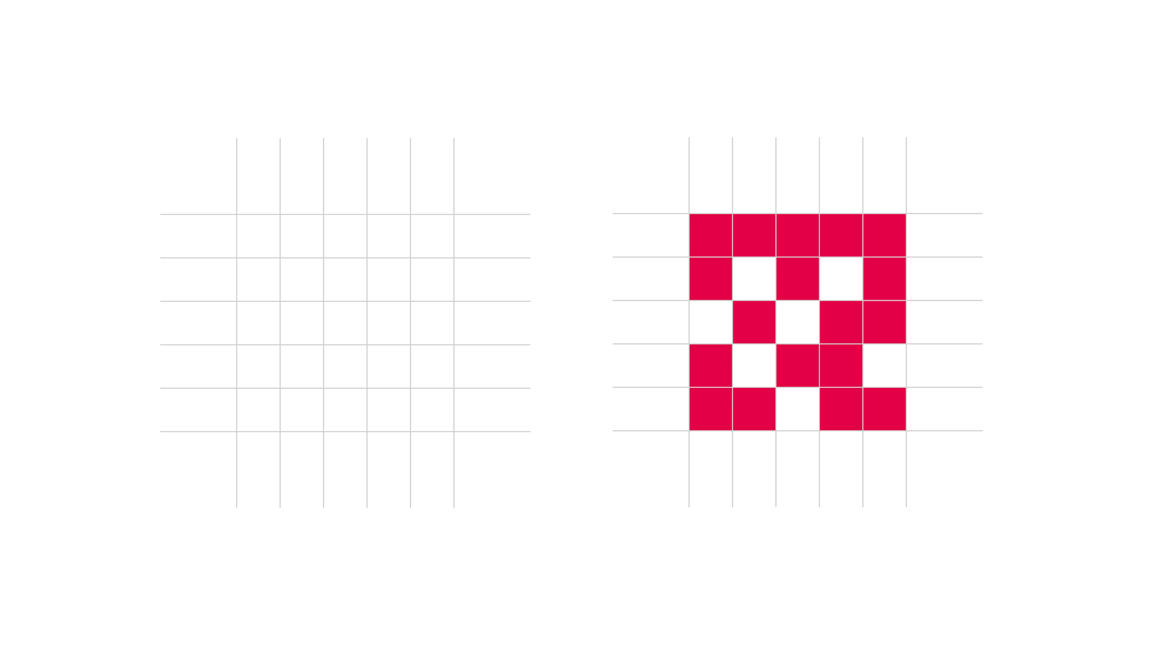
A structured grid system was used to refine the QR-like symbol within the Q, ensuring visual balance and scalability. This system provides a clean, structured foundation for different iterations of the logo while maintaining brand integrity.
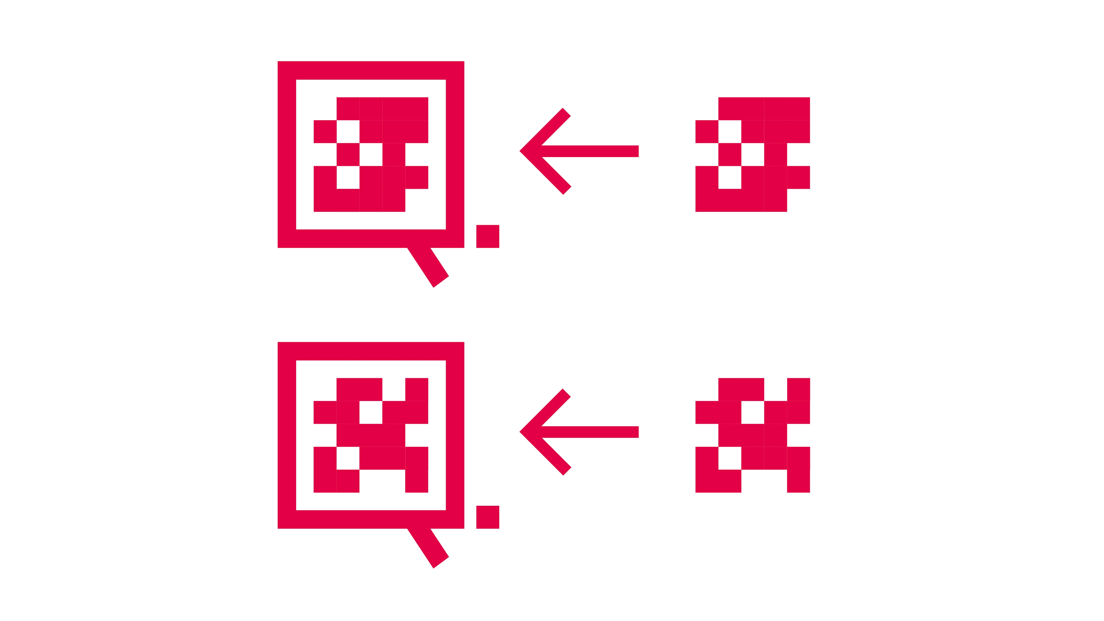
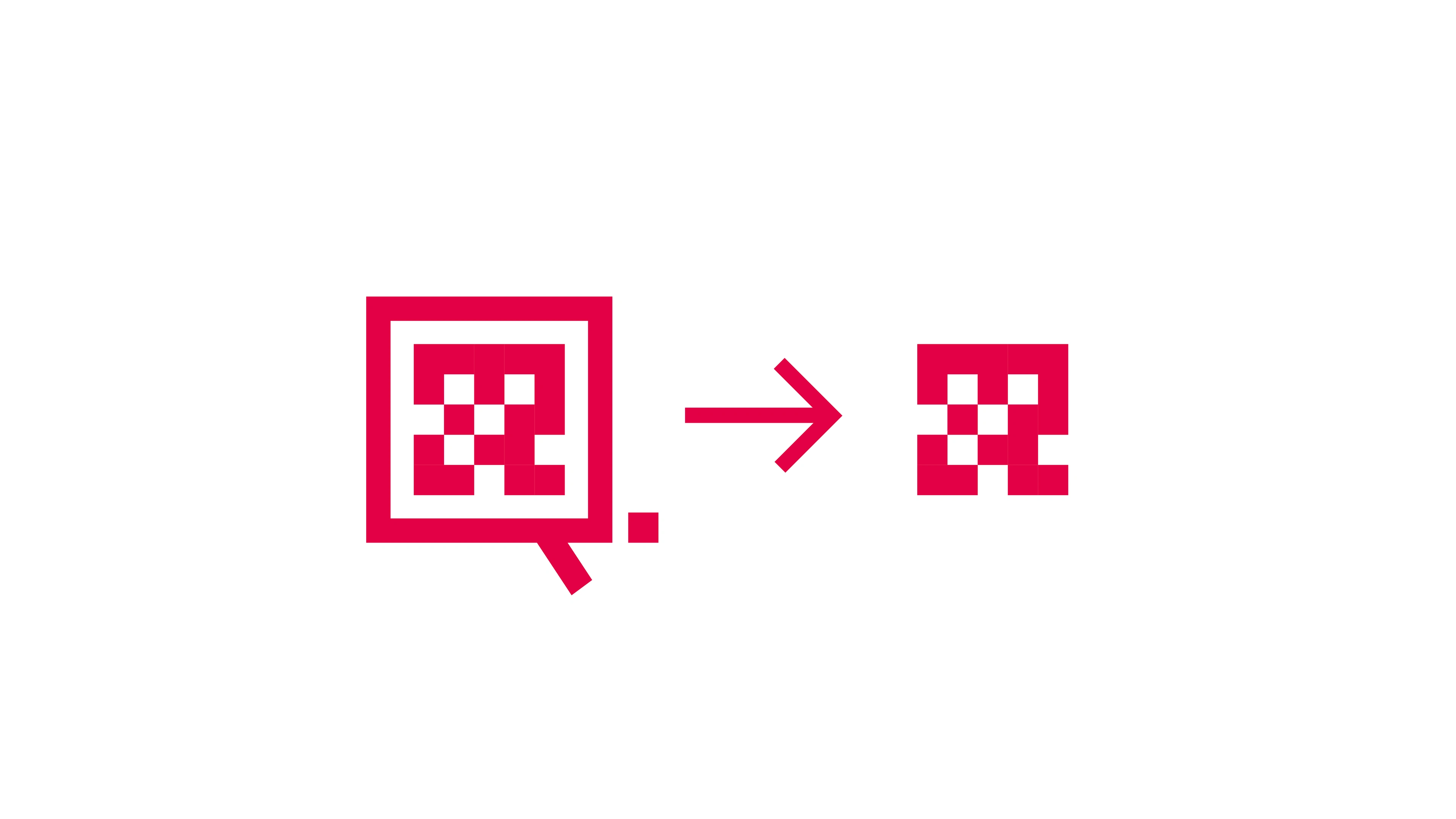
The ability to extract the "QR-mosaic" as an additional design element remains possible for various use cases, such as business equipment.
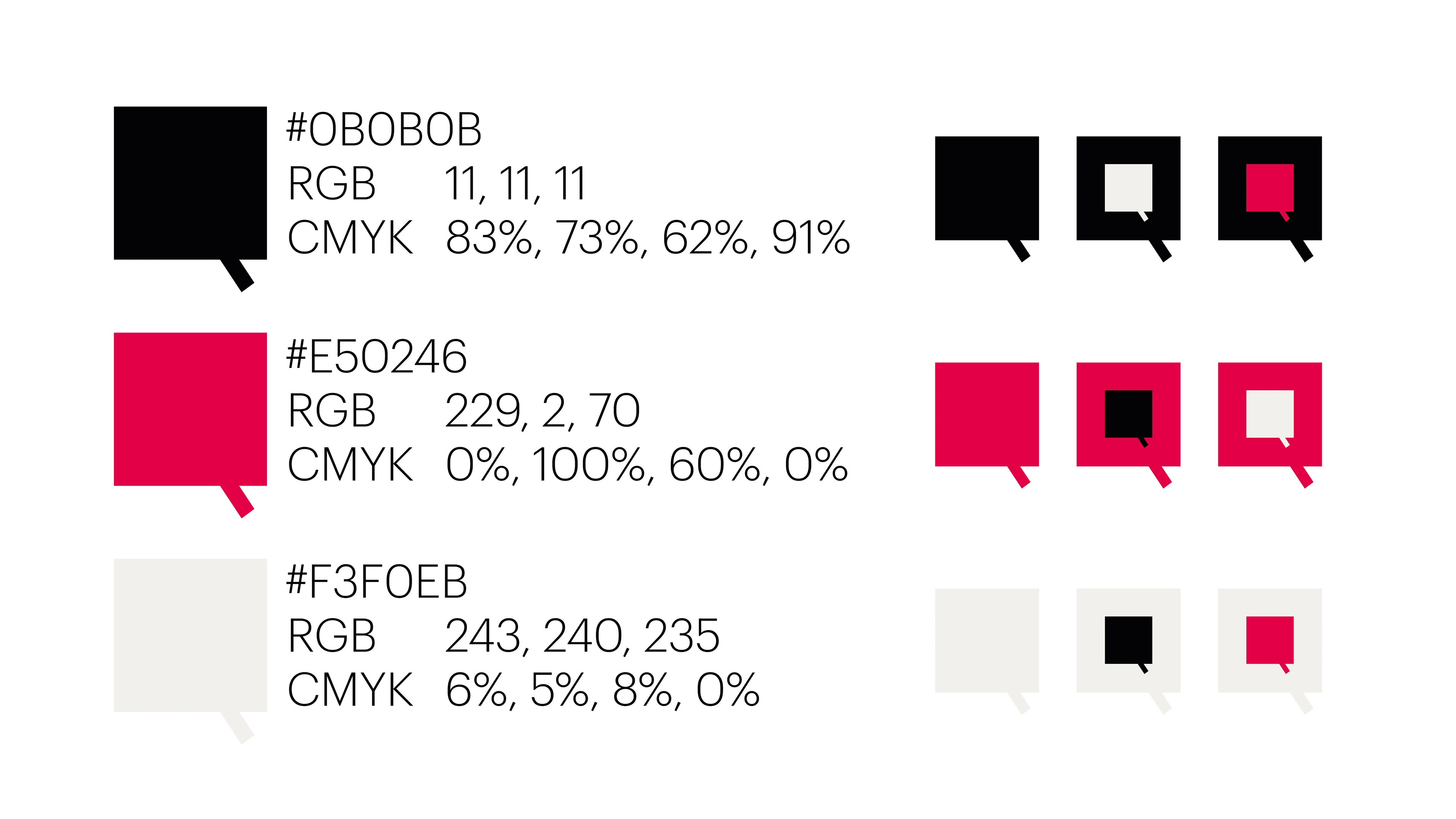
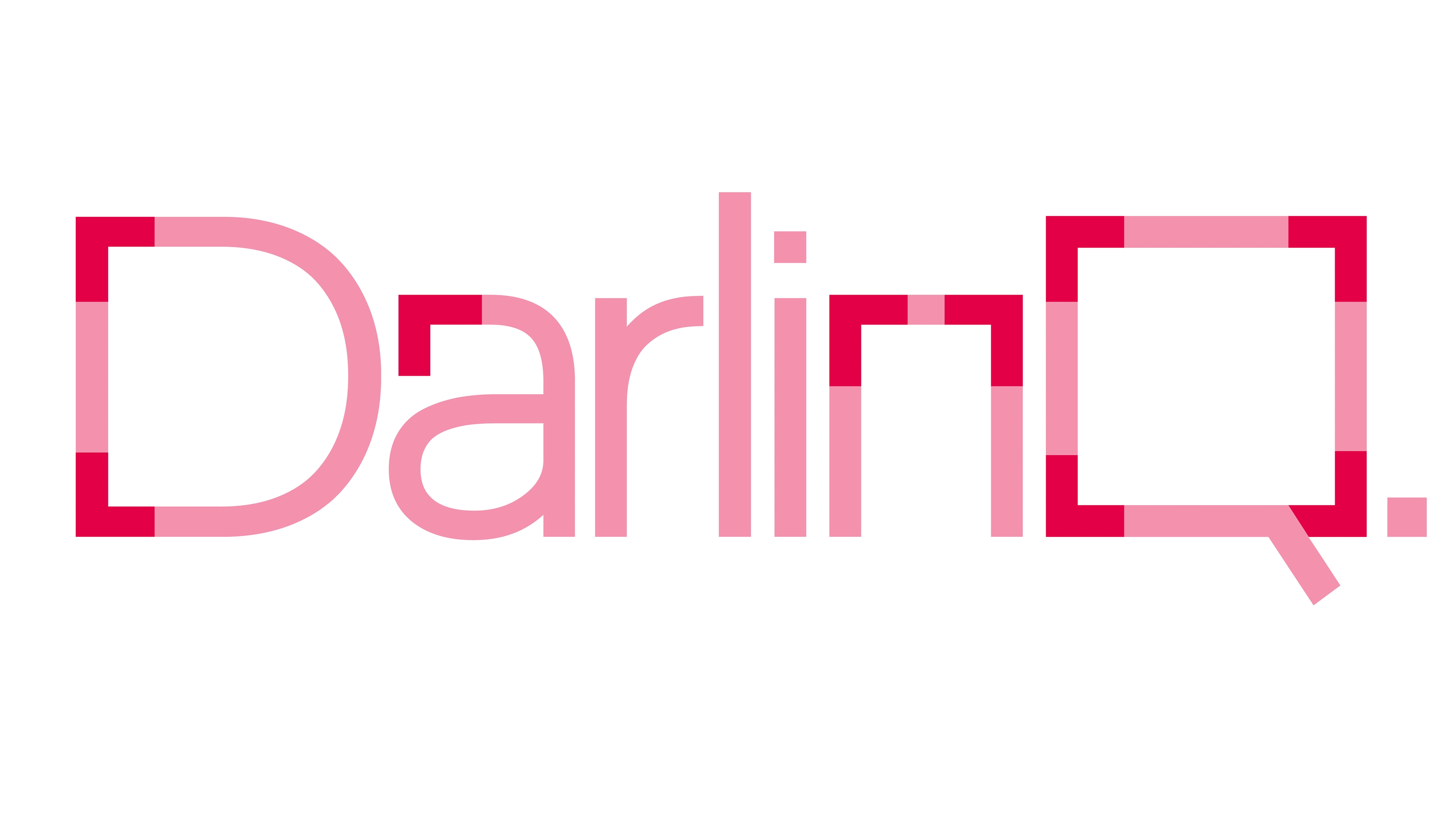
The color palette consists of black, red, and eggshell-white, chosen to maintain strong contrast, ensure brand consistency, and reflect a modern, high-tech aesthetic. The interplay of these colors enhances readability and reinforces DARLINQ’s sleek, professional image, while also creating a visual connection to its parent company, DARO.
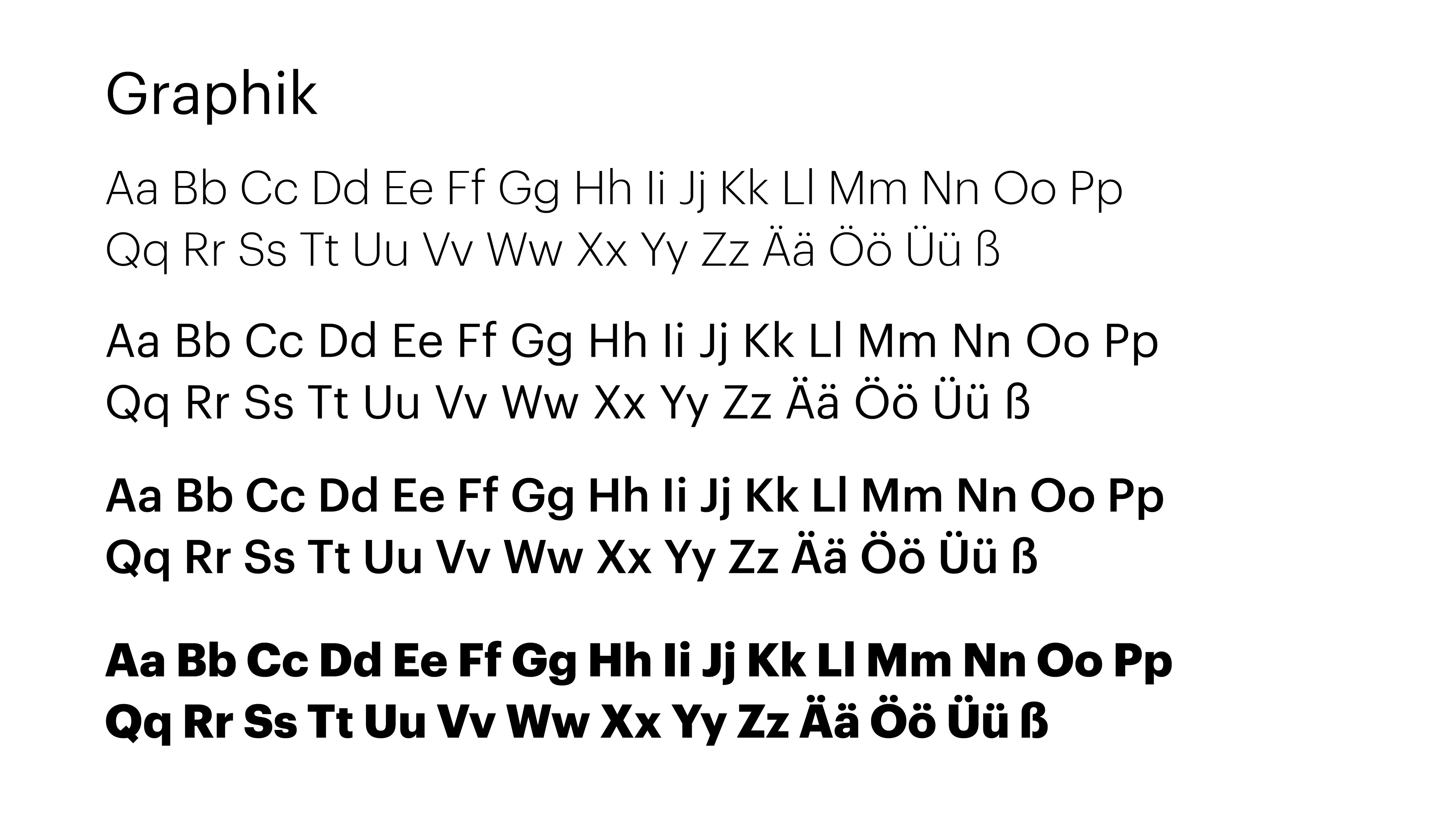
The font choice for DARLINQ was based on a pre-existing selection within the brand, yet it proved to be an excellent fit. With its geometric structure, the typeface maintains a clean, modern aesthetic while ensuring strong readability across digital platforms. Its balanced proportions and structured letterforms align seamlessly with the brand’s focus on connectivity and efficiency, making it an ideal foundation for customization and refinement.
Like this project
Posted Nov 23, 2024
DarlinQ’s branding merges sleek design with a QR-inspired logo, custom typography, and a bold color palette, ensuring strong digital presence and brand identity