Zardana Suji: Packaging Design Directions

kaleemullah kalyar

The challenge
Zardana sells suji (wheat semolina) in Pakistan and needed design directions to guide the next generation of its suji packaging. Before any print work, the brand needed to see clear options side by side and choose one direction to develop.
Our approach
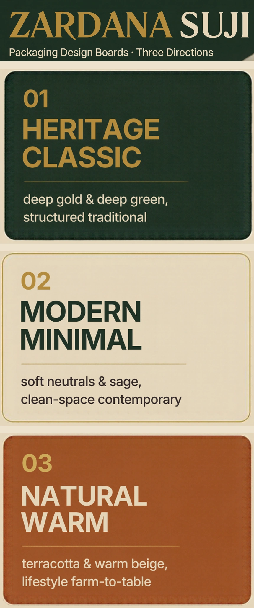
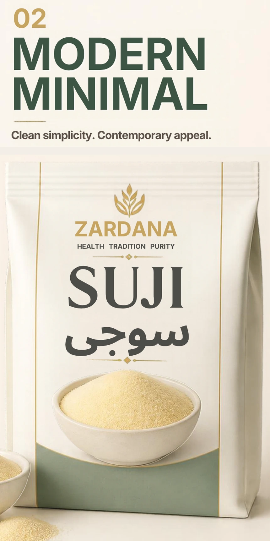
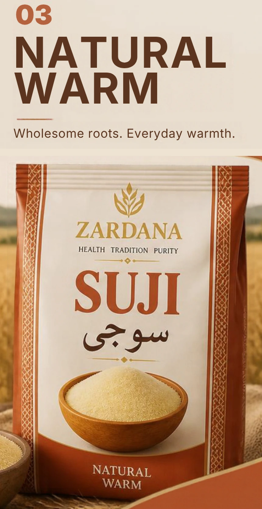
We built a set of design boards with three distinct directions. Each one keeps the same core pack elements: the Zardana mark, the product name in English and Urdu, and a bowl of suji as the hero image. Each direction then changes the colour, type and mood, so the choice is easy to compare.
What we built
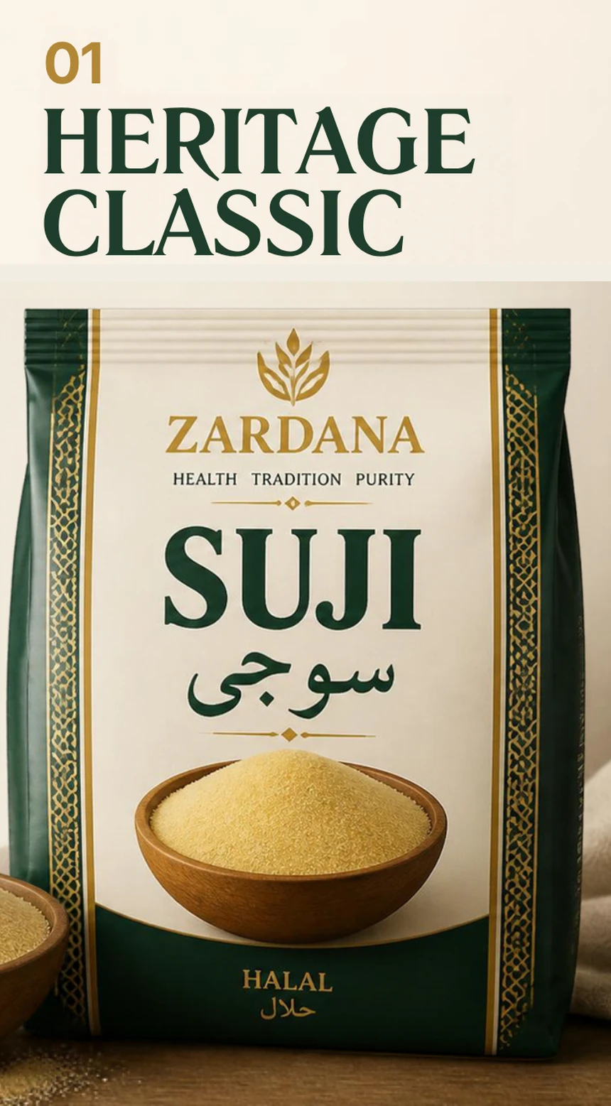
01 Heritage Classic: deep green and gold, a vertical geometric border, classic serif type and a wooden bowl. The direction closest to a traditional Pakistani pack.
02 Modern Minimal: ivory and sage, light modern type, generous white space and a clean product photo.
03 Natural Warm: terracotta and warm beige, a farm-to-table mood with a wheat field backdrop.
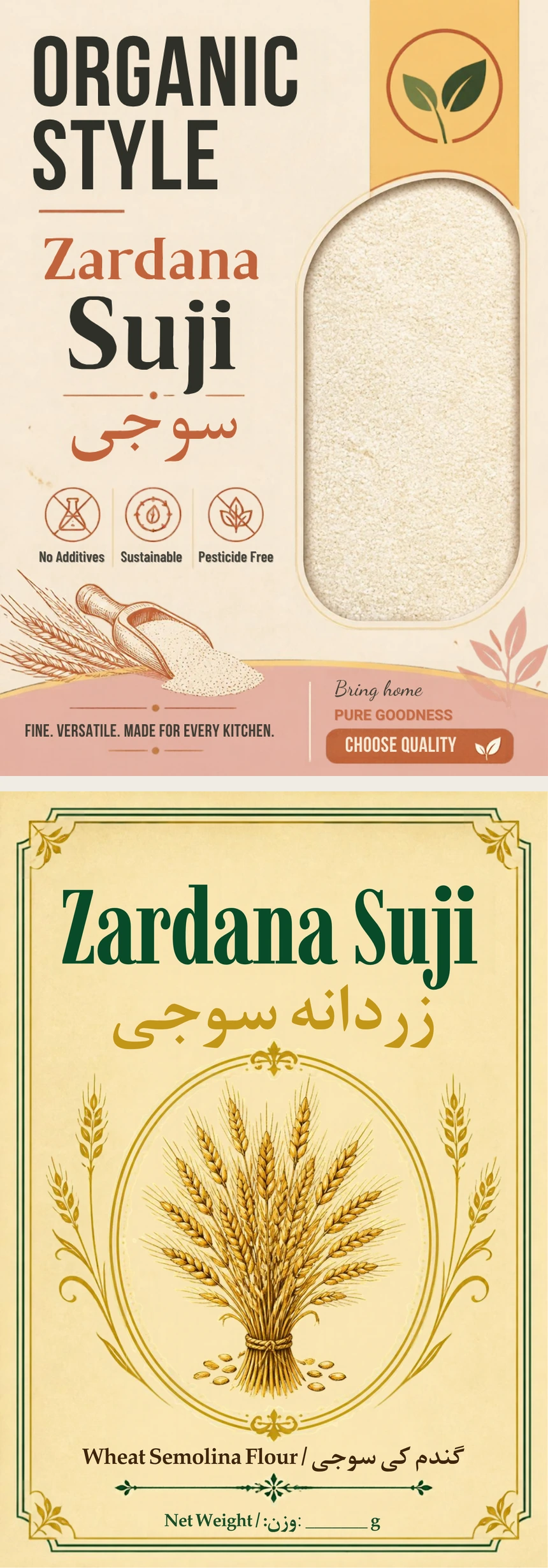
Two label studies: an "Organic Style" front label and a green and gold label with a wheat illustration.
The result
The brand has three ready-to-compare packaging directions in one board set. This is concept stage work: the next steps are choosing a direction, refining it, and preparing print-ready files once final text and nutrition details are confirmed.
Like this project
Posted Oct 16, 2026
Three packaging design directions for Zardana Suji, a Pakistani semolina brand: heritage, modern minimal and natural warm, prepared before final print.
Likes
0
Views
1