Frosted Mango - Creating my own brand identity
Frosted Mango is my design and marketing agency. The goal of creating this brand was to flex my own brand identity design skills, and to create something that represents my personality and my vision for this new business.
My mission is to help entrepreneurs scale their business and break through the noise by creating an awesome, strong brand presence through brand strategy, brand identity design, and marketing strategy. I believe that a strong brand and compelling content sharing the business's values and stories will foster authentic connections with the audience and convert that audience into paying customers.
I'm particularly passionate about helping female entrepreneurs find success in a mostly male-dominated world. The gender gap exists in all financial areas, whether it's corporate salaries, revenue, or funding. I believe it's important for women to feel not just empowered but supported in reaching for their goals, and I intend to do just that through my work.
This brand's personality is meant to be both fun and professional, friendly, a bit sarcastic, and most importantly, welcoming and inclusive. The logo design was informed by this personality, while the colors brought into play a bit of my own personality. Autumn being my favorite season, I naturally gravitate towards warmer colors. I knew I wanted orange to be the main, but I also wanted to bring in a bit of cool to the color palette as well, especially given the "frosted" in the name. Through ideation and iteration, I created the brand you see below.
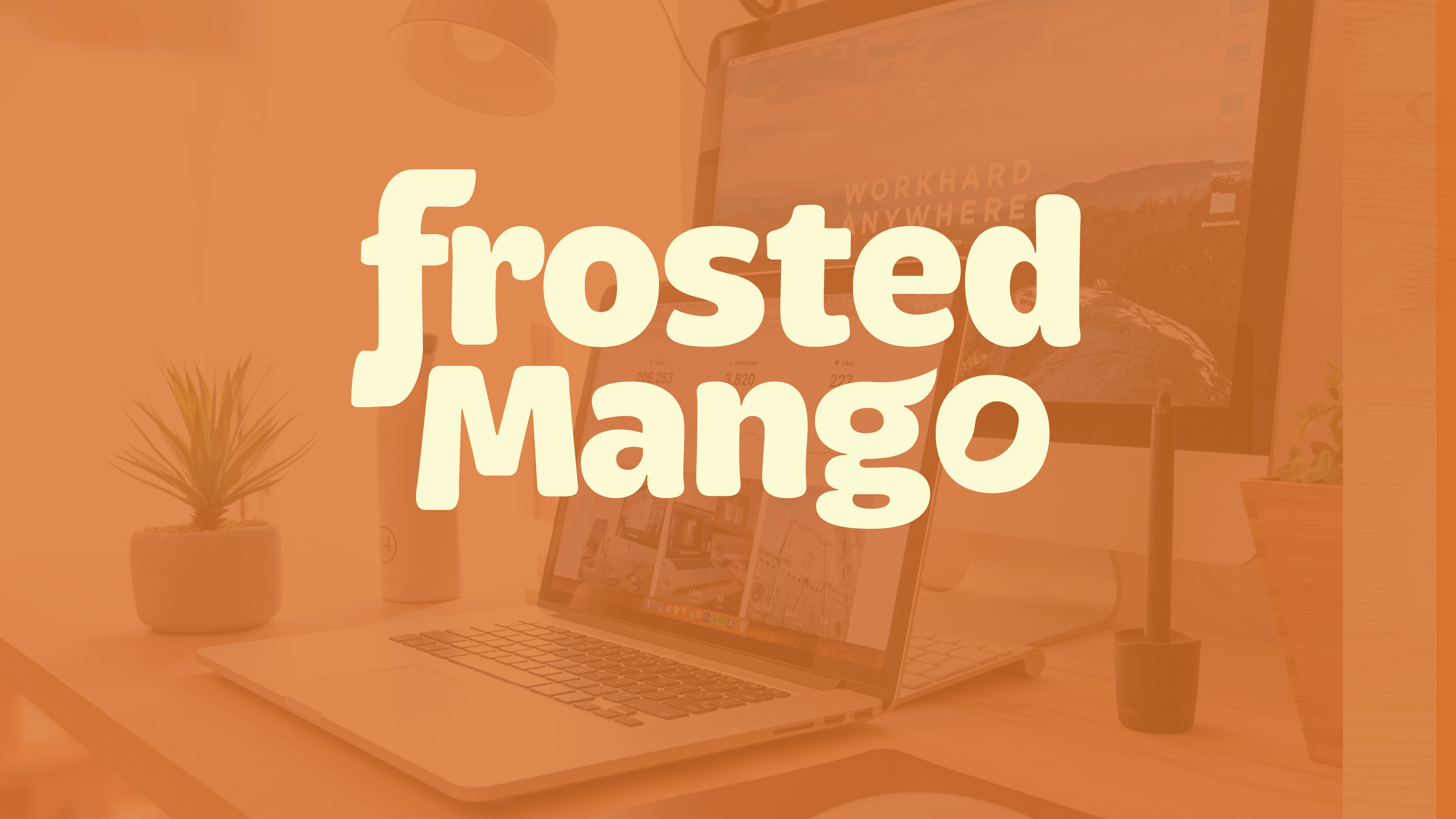
Main logo in primary brand colors
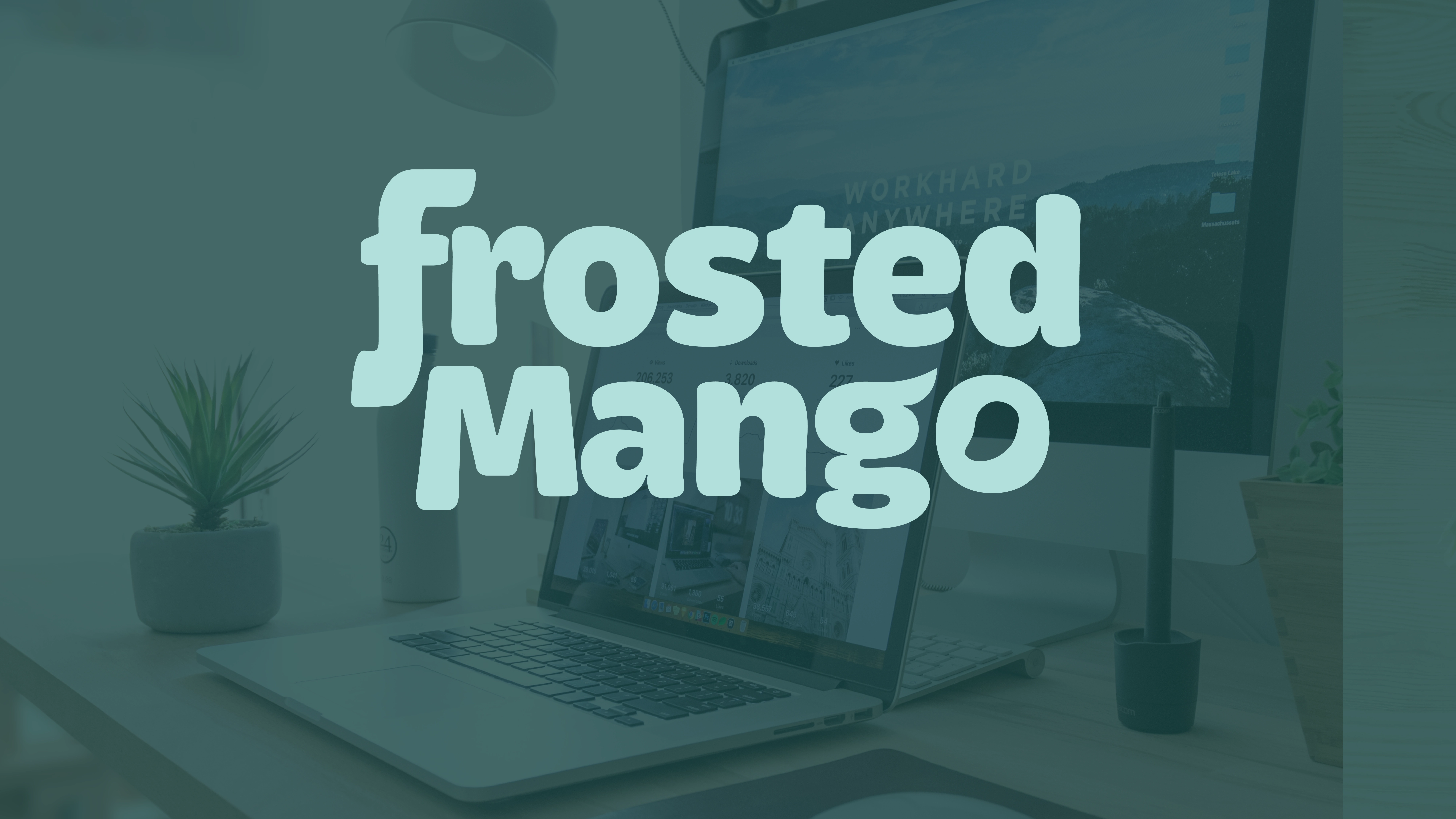
Main logo in secondary brand colors

Logomark in primary brand colors
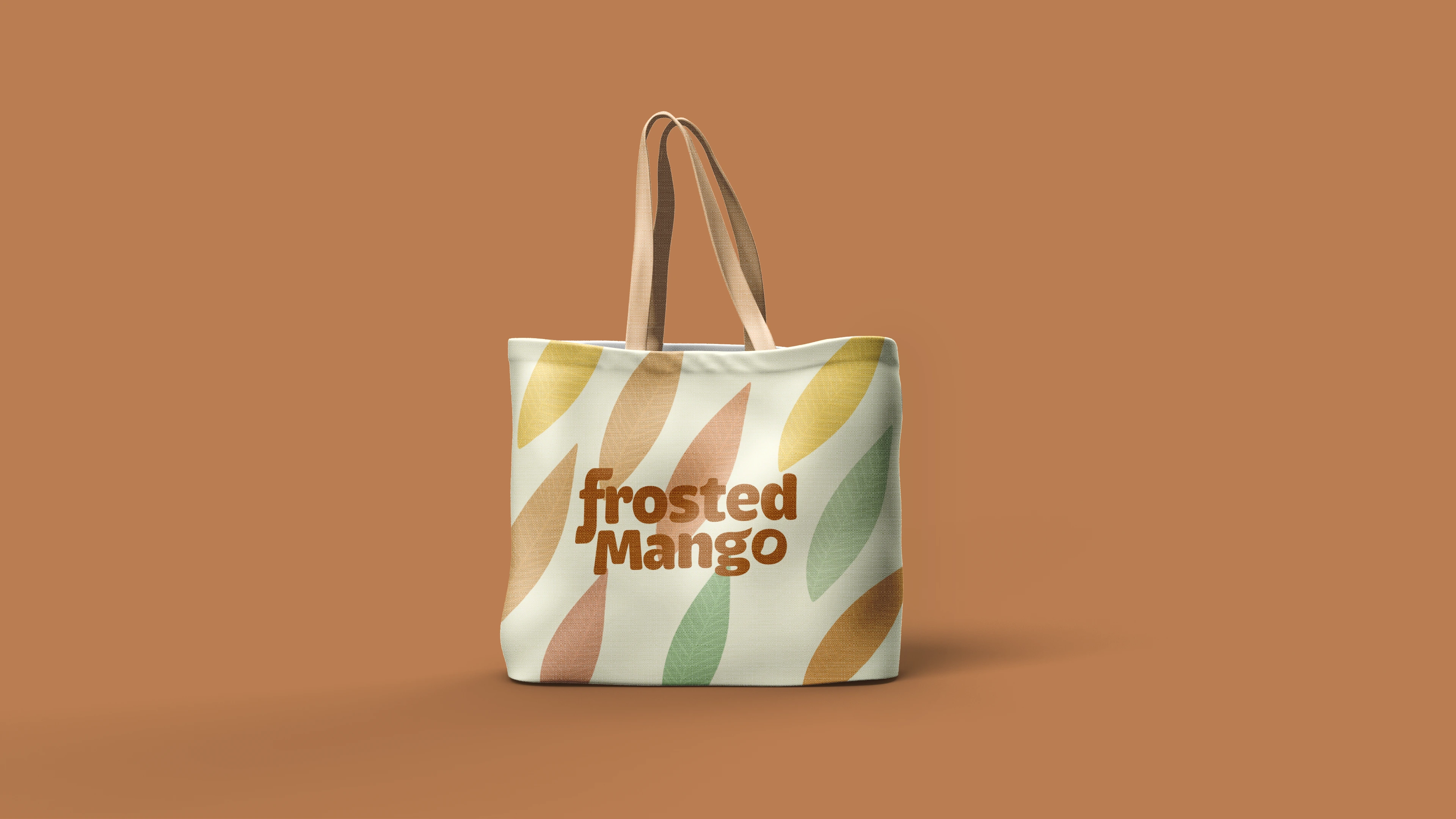
Mockup of main logo on tote bag with brand pattern in background
Like this project
Posted Jul 31, 2024
Frosted Mango is my own agency, and this is the brand identity I created to bring my vision to life and flex my design skills.

