Simpler Ordering Experience for Shake Shack’s Canadian Launch
Andrija Prelec (Sharc)
Adapting Shake Shack’s Digital Ordering Experience for Canada
Multi-platform ordering experience for mobile, kiosks, and web. Designing a simpler ordering experience for ShakeShack’s Canadian launch.
We partnered with Shake Shack to design a cohesive digital ordering experience across multiple touchpoints—mobile app, in-restaurant kiosks, and web ordering.
The goal was to make the process of discovering, customizing, and ordering food fast, intuitive, and consistent regardless of where customers interact with the brand.
The challenge was designing for very different environments: quick mobile orders on the go, high-traffic self-service kiosks inside restaurants, and desktop web ordering with richer browsing and account features. Each platform required a tailored UX while still maintaining a unified visual language and brand experience.
Our work focused on simplifying menu navigation, making customization effortless, and reducing friction during checkout—helping customers get their favorite Shake Shack items faster.
iOS App
Fast mobile ordering with loyalty, rewards, and personalized offers
The mobile app was designed for customers who want to quickly place orders, track rewards, and reorder their favorites. We focused on creating a clean browsing experience, clear menu structure, and seamless checkout flow optimized for one-handed mobile use.
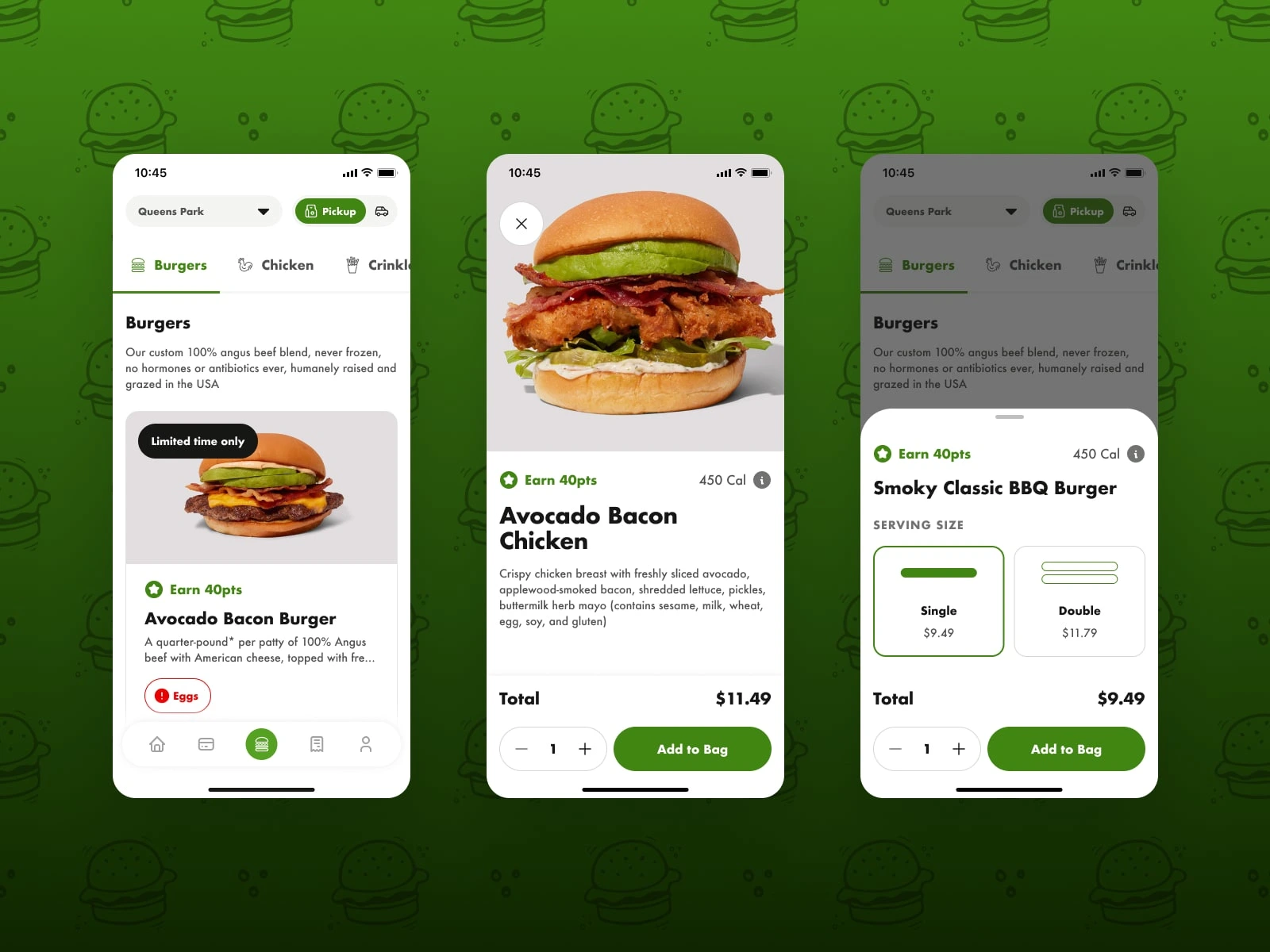
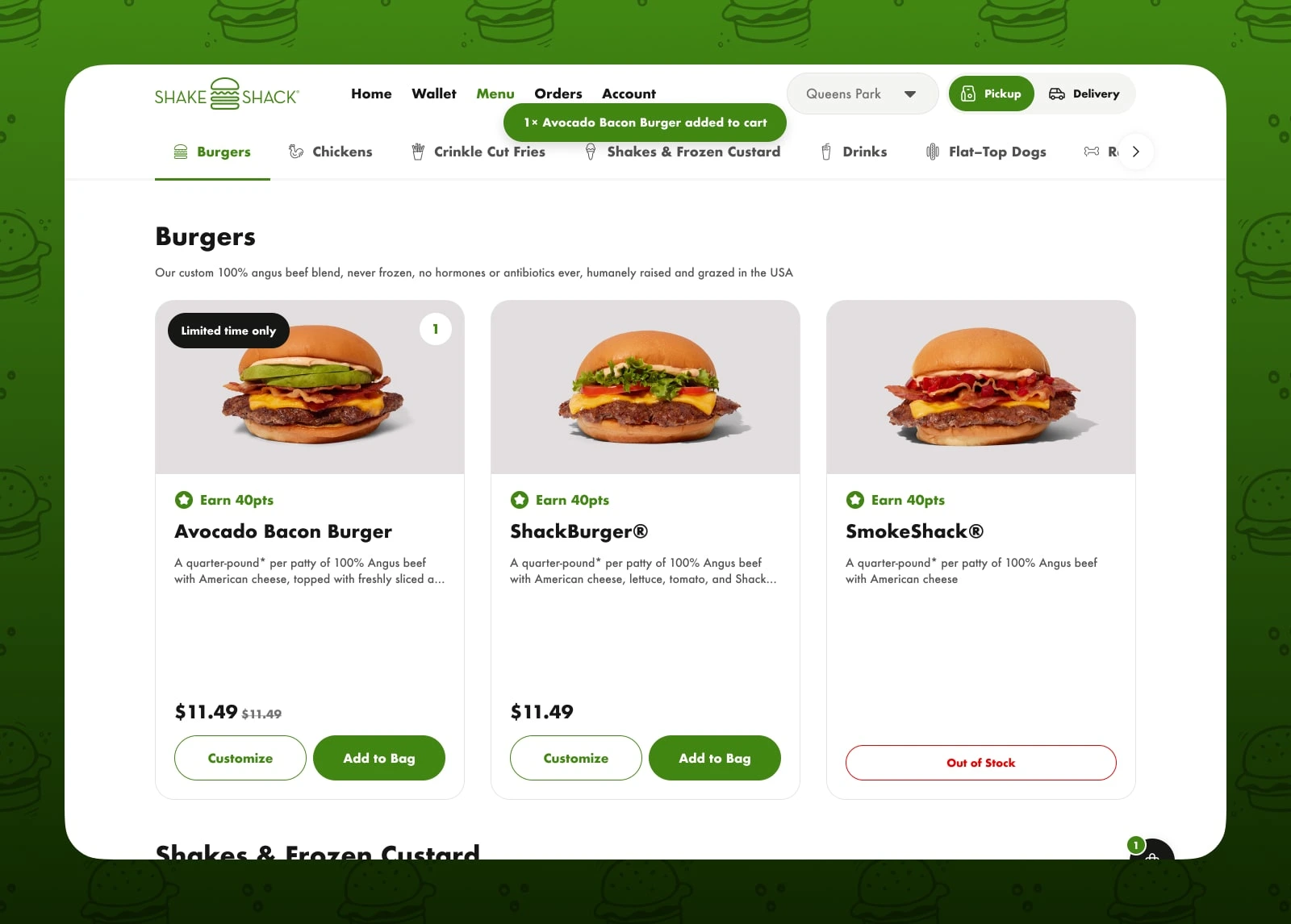
Menu browsing
The mobile menu organizes categories with clear visual hierarchy and large food imagery, helping users quickly find items while browsing on smaller screens.
Product details and customization
Each item includes clear ingredient descriptions, calorie information, and customization options, making it easy to tailor orders without overwhelming the interface.
Serving size selection
Serving size options such as single or double burgers are presented as large selectable cards, allowing quick decision-making before adding items to the bag.
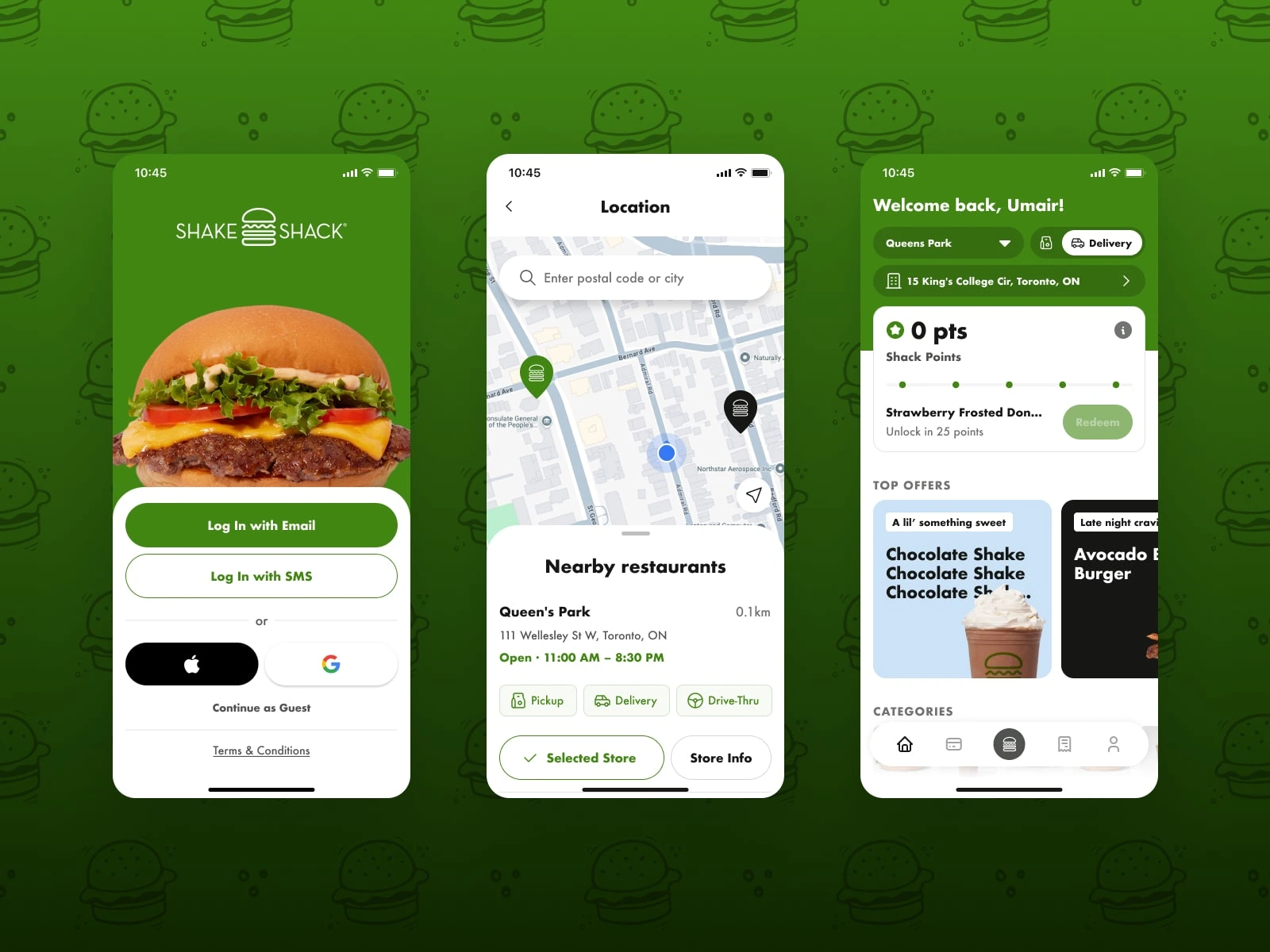
Login and onboarding
The login screen offers multiple sign-in methods including email, SMS, and social login to reduce friction and speed up onboarding.
Store selection and location discovery
Location selection uses map integration and nearby store listings so users can quickly choose where to order from.
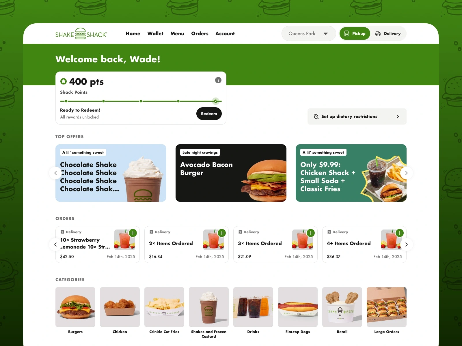
Home dashboard and personalized offers
The home screen welcomes returning users with their selected store, loyalty points, and personalized offers. Key actions such as pickup or delivery are immediately accessible, while featured promotions and menu categories help users quickly discover items and start an order without navigating deep into the menu.
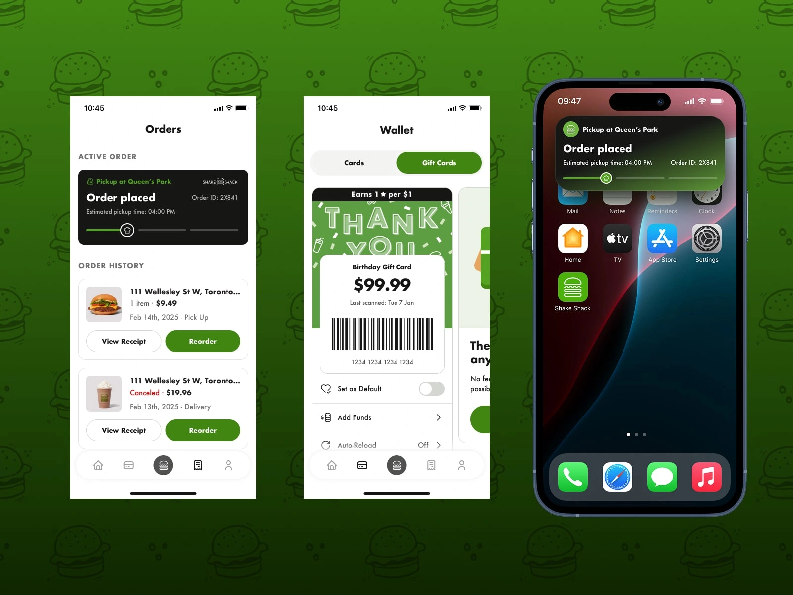
Orders and order tracking
The orders screen shows current and past orders with clear status updates, making it easy to reorder favorite meals or track pickups.
Wallet and gift cards
The wallet feature allows users to manage gift cards and balances while integrating Shake Shack’s loyalty program.
Order live notifications
Live Activites on iOS keep users informed about order progress, estimated pickup time, and order confirmation.
Kiosk App
High-contrast self-service ordering experience for restaurants
We designed a tablet-based kiosk interface used inside Shake Shack restaurants for self-service ordering. The interface needed to work quickly in busy environments while remaining readable from a distance.
Because kiosks are often placed in bright restaurant lighting, the UI uses high contrast, large touch targets, and bold product imagery to ensure clarity and accessibility.
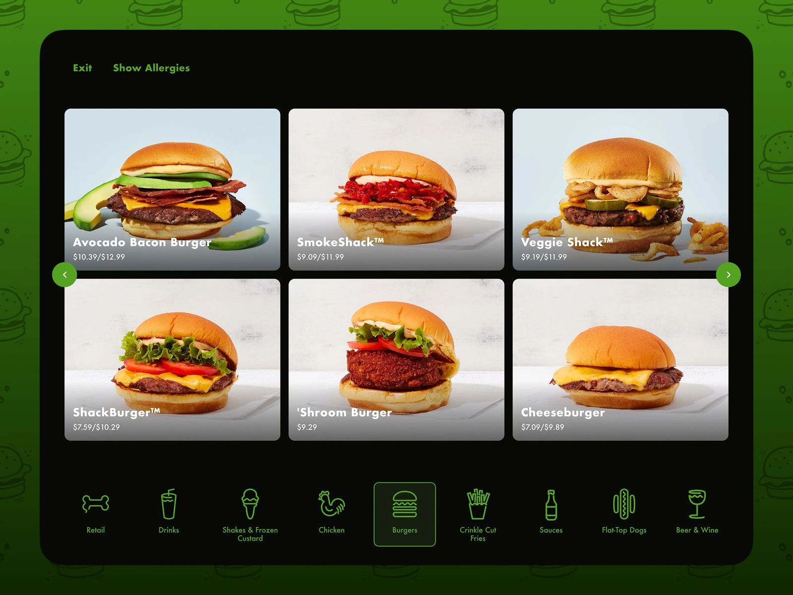
Category browsing
Menu categories are displayed as large visual cards, making it easy for customers to quickly scan and choose items on a larger touch screen.
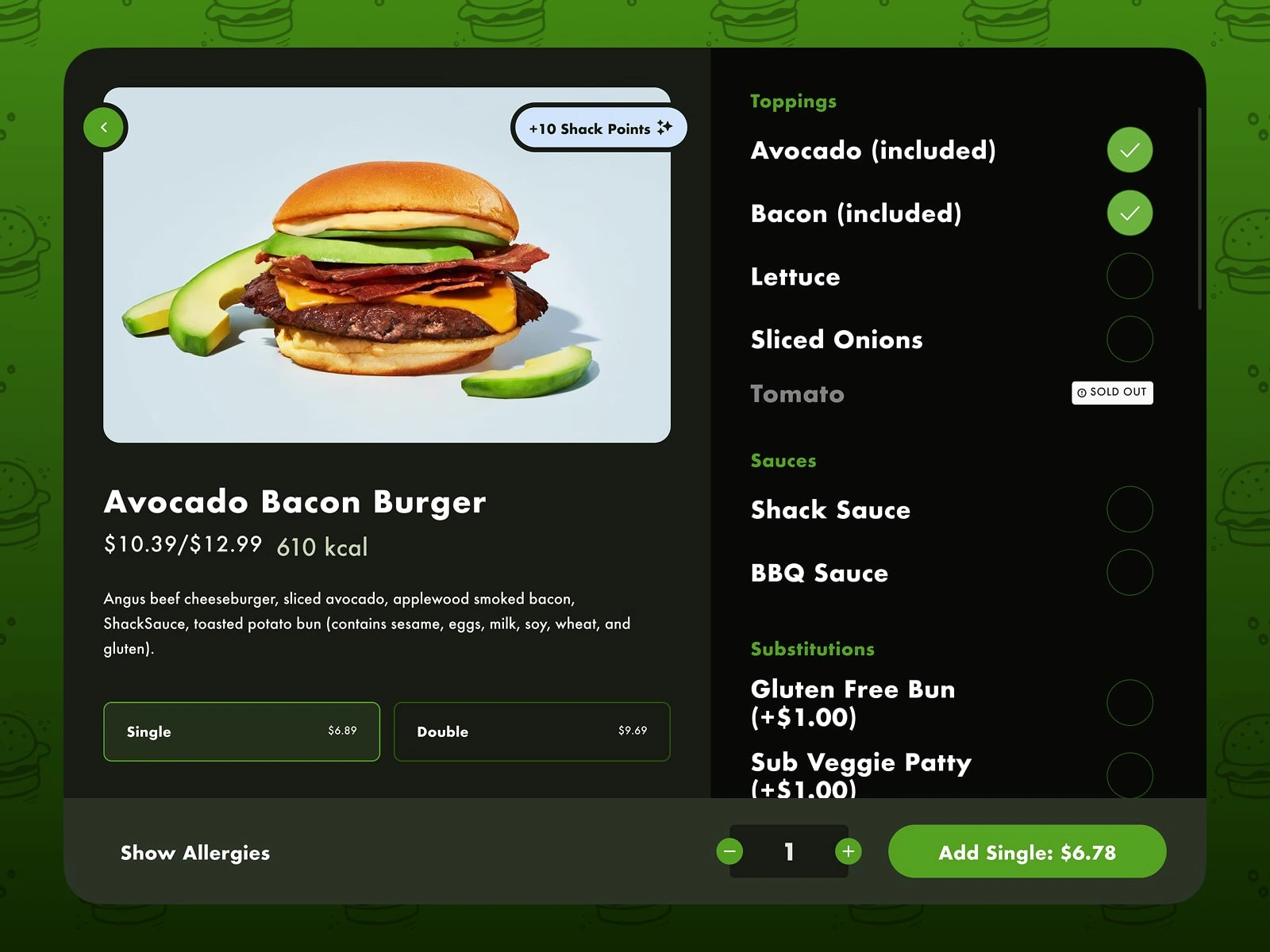
Product customization
Customization options such as toppings, sauces, and substitutions are organized in a clear vertical list so customers can easily personalize orders without confusion.
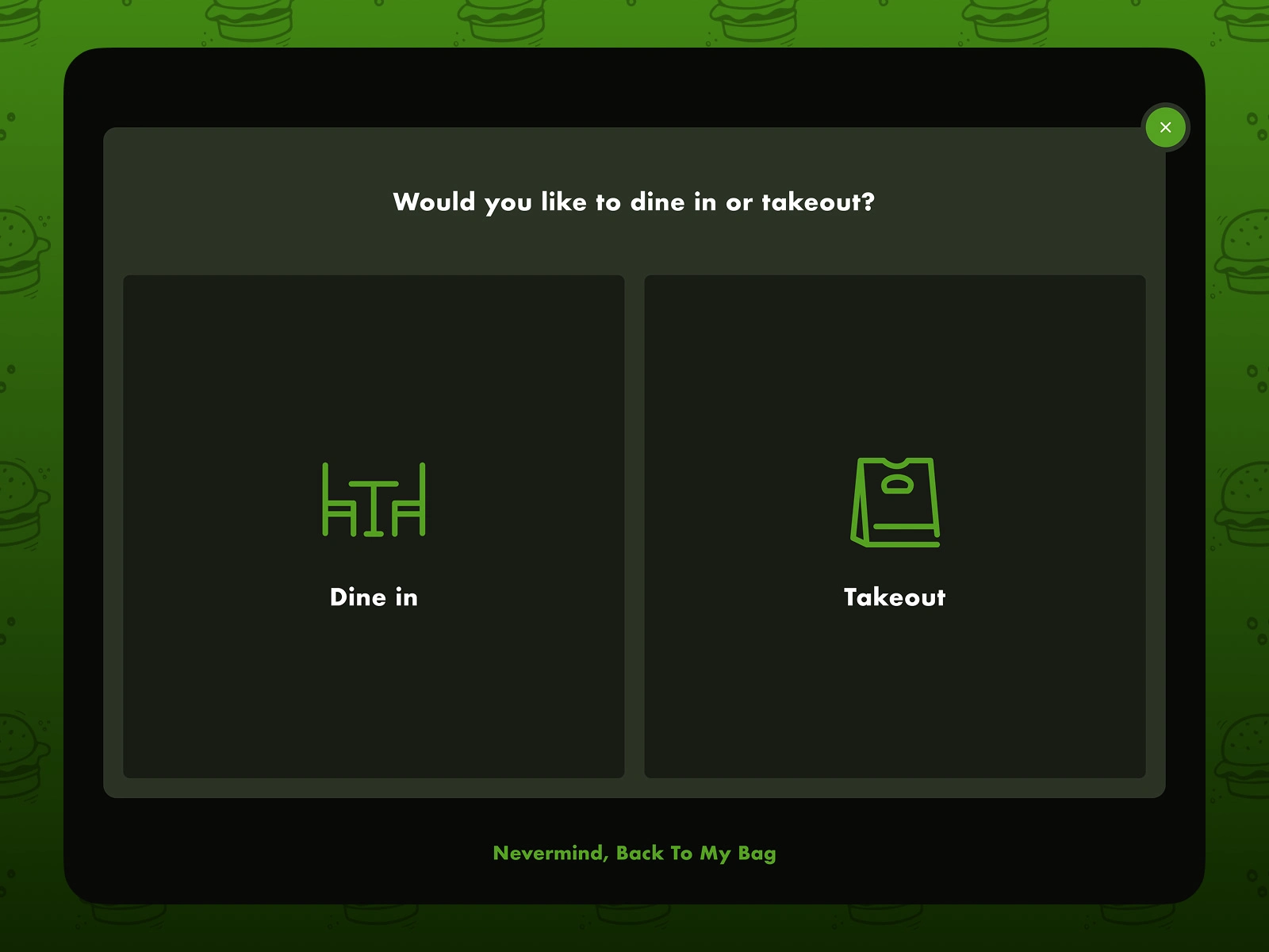
Dine-in or takeout selection
A dedicated screen prompts customers to select their dining preference, ensuring orders are properly routed in the restaurant workflow.
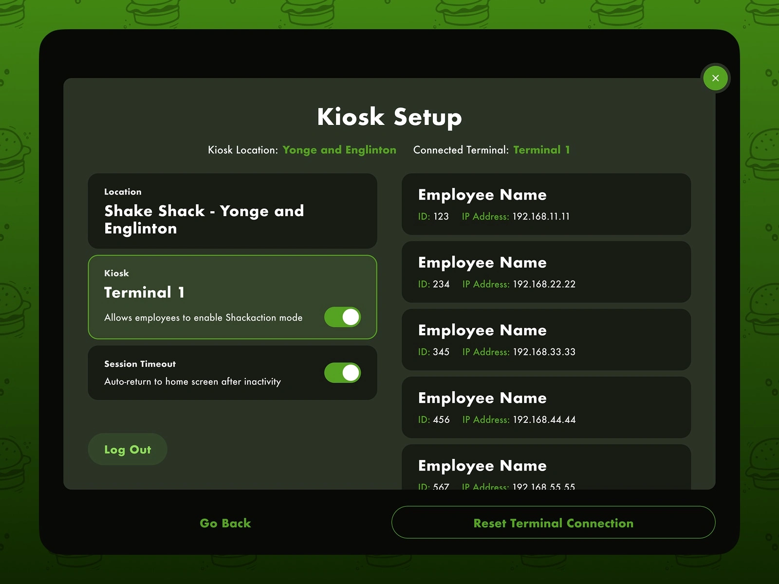
Kiosk setup and employee controls
An internal setup interface allows staff to configure terminals, manage kiosk sessions, and ensure devices remain properly connected during service hours.
Web App
Full ordering experience for desktop and larger screens
The web ordering experience was designed for users browsing Shake Shack from desktop or larger devices. It combines menu exploration with account management, loyalty rewards, and detailed checkout functionality.
Home dashboard
The dashboard welcomes returning customers with personalized offers, loyalty points, and quick access to recent orders.
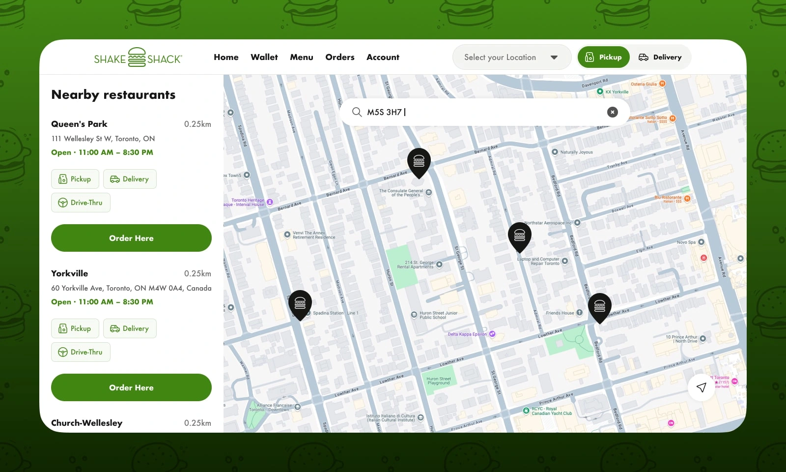
Store locator with map integration
A combined list and map interface helps users quickly find nearby restaurants and select their preferred pickup location.
Menu browsing on desktop
The desktop menu layout takes advantage of larger screens by displaying multiple items simultaneously while keeping customization actions visible.
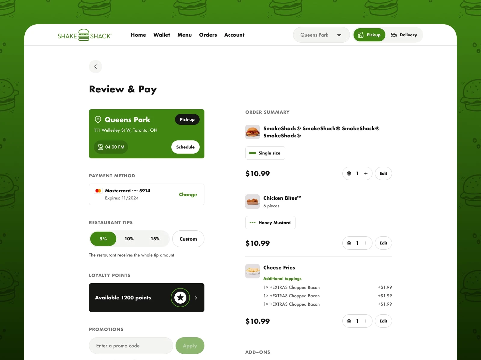
Checkout and payment
The checkout page clearly summarizes the order, payment method, tip selection, loyalty points, and promotional codes in one streamlined flow.
Outcome
The final result is a cohesive digital ecosystem that supports Shake Shack customers across multiple environments—mobile ordering, in-restaurant kiosks, and desktop browsing.
By focusing on clarity, speed, and consistency across platforms, the experience allows customers to discover menu items, customize meals, and place orders quickly—whether they’re ordering from their phone, a restaurant kiosk, or their desktop.
Like this project
Posted Mar 28, 2026
Designed a cohesive ordering experience for Shake Shack's Canadian launch across mobile, kiosks, and web.