Kao Naka-Web design
Pisacha S
Introduction
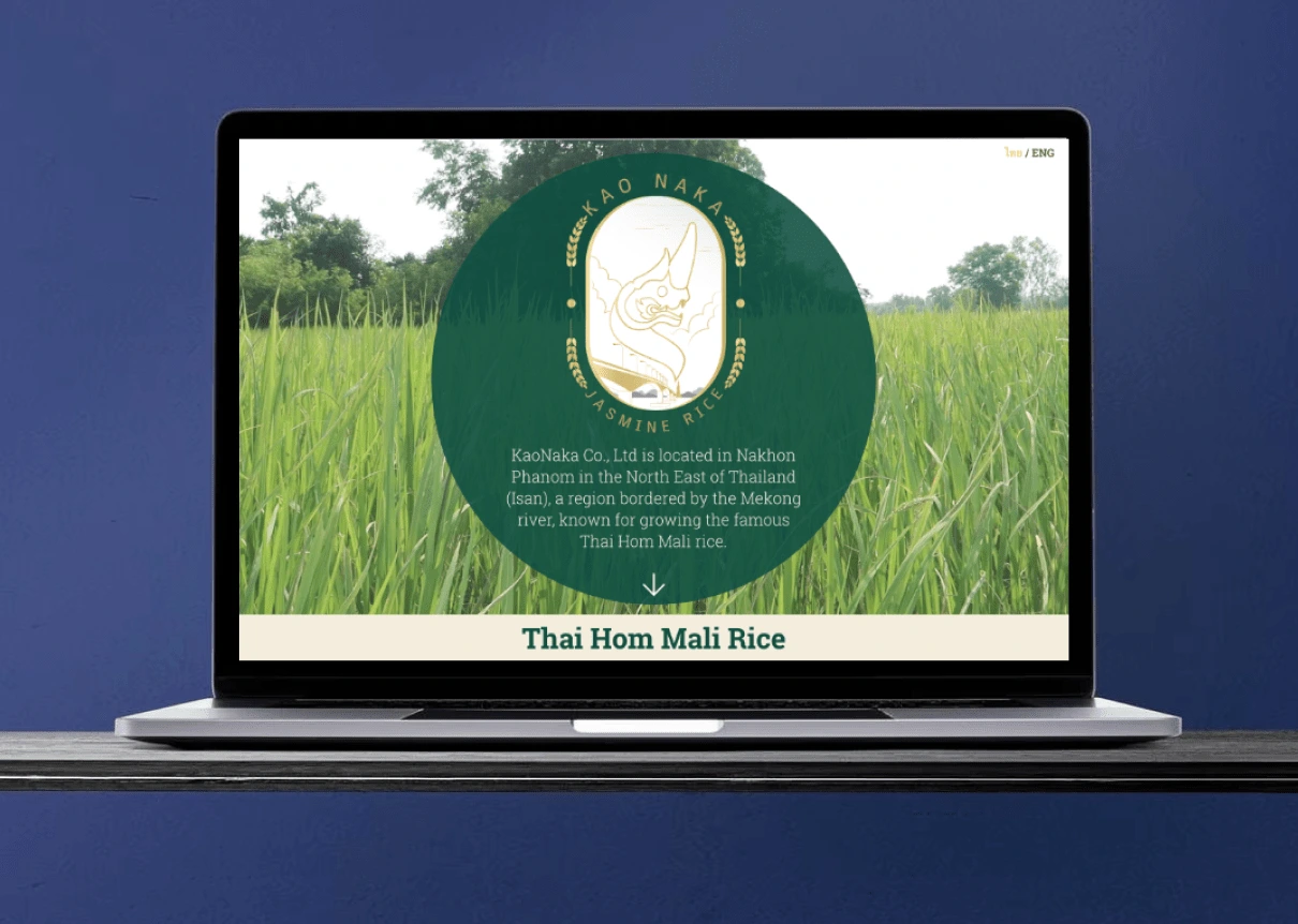
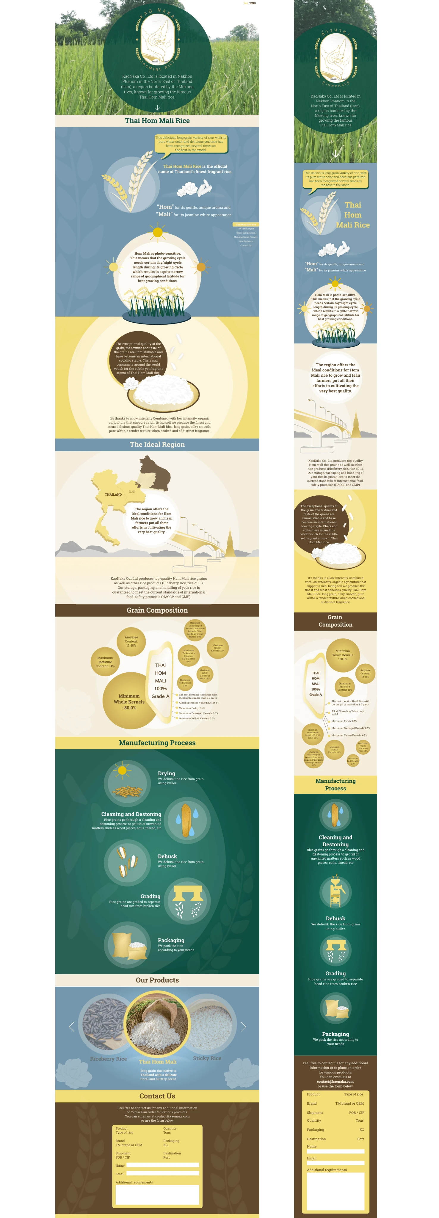
The Kao Naka website serves as a digital introduction to a prominent rice company located in northeastern Thailand, by the scenic banks of a river. Designed primarily to showcase the company’s offerings rather than facilitate e-commerce, the site highlights the unique qualities of Kao Naka's rice, emphasizing its commitment to quality and heritage.
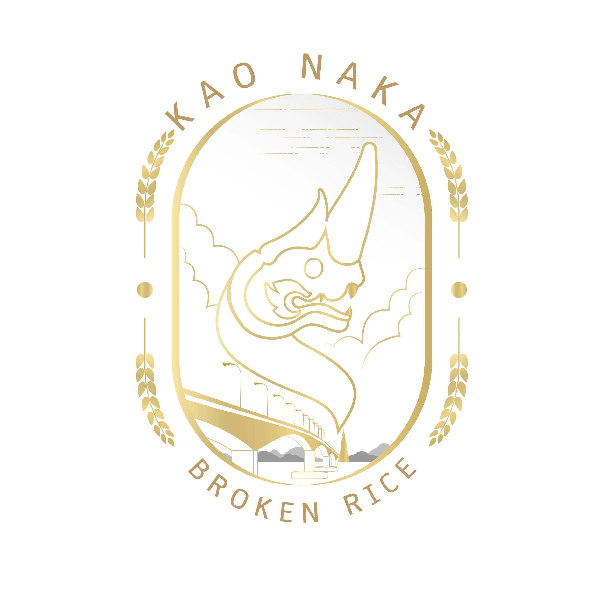
Logo Design
The Kao Naka logo design faced several challenges, including the integration of Thai characters, cultural representation, versatility across different packaging, market differentiation, and balancing aesthetic with informational elements.

Website Design
Non-Ecommerce Focus: Since the primary goal was not to drive online sales, it was challenging to create engaging content that would still attract interest and showcase the brand effectively without a transactional focus.
Visual Integration: Harmonizing various design elements, including illustrations and text, required careful attention to ensure that each component contributed to a cohesive visual narrative that represented the brand’s Essence.
Cultural Representation: Accurately representing the local culture and agricultural practices in a way that resonates with both local and international audiences was essential, requiring in-depth research and sensitivity to cultural nuances.
Like this project
Posted Dec 8, 2024
The Kao Naka website serves as a digital introduction to a prominent rice company located in northeastern Thailand
Likes
0
Views
19