Redesigned Crypto Recruit’s Landing Page for Clarity&Conversion
Toniloba Jolayemi
Redesigned Crypto Recruit’s Web3 Landing Page for Clarity + Conversion
Project Summary
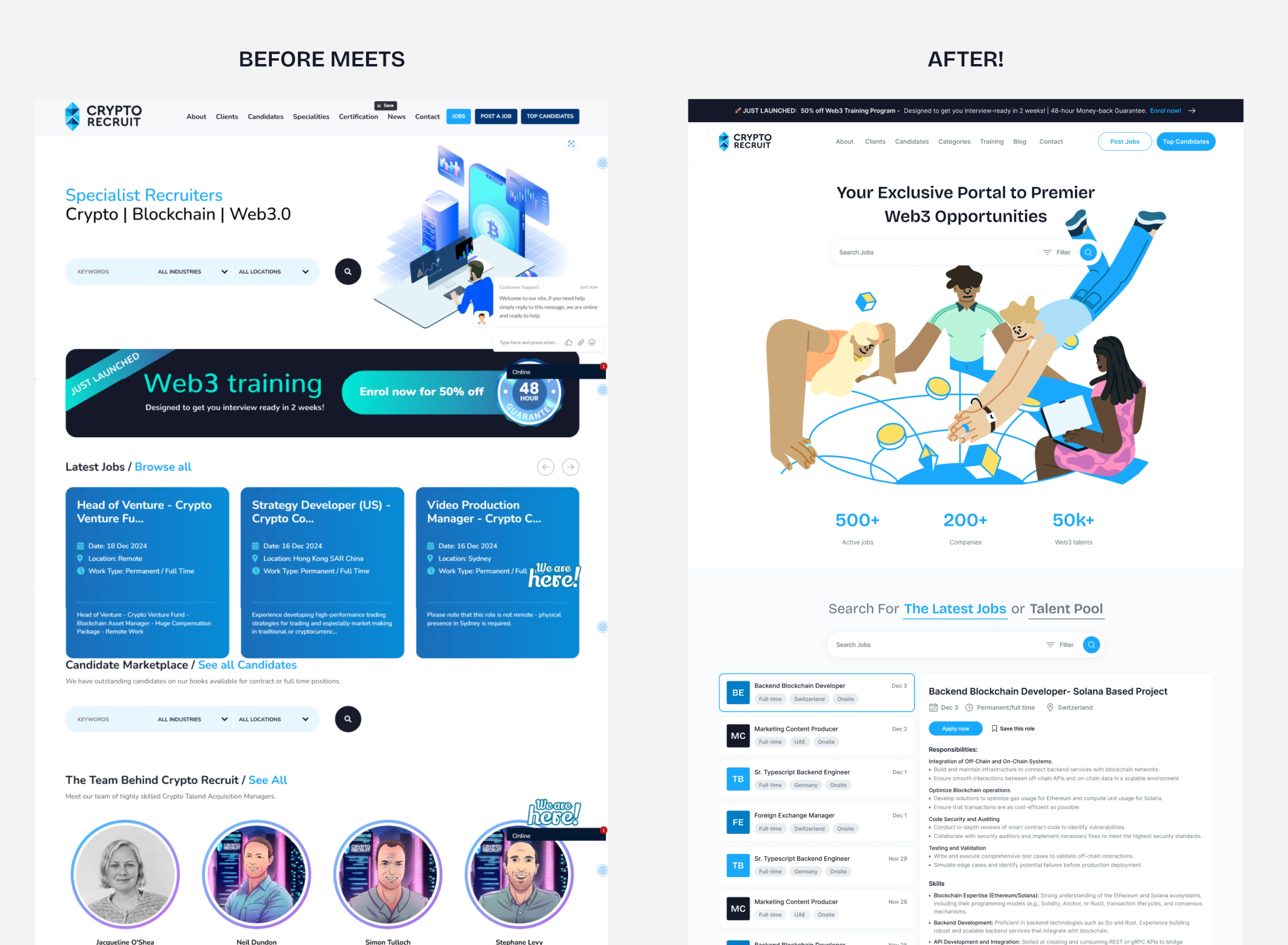
I redesigned Crypto Recruit’s landing page as part of a pitch to the founder, aiming to transform the experience from cold and cluttered to playful, purposeful, and Web3-friendly. The redesign focused on clear user paths for recruiters and job seekers, clarified confusing sections, and added personality through collaborative illustration and UX copy.
The Challenge
Crypto Recruit's existing site had unclear CTAs, weak content hierarchy, and an overwhelming layout. Users didn’t know where to go, recruiters and job seekers were treated the same, and messaging lacked direction.
✅ The Solution
I created a bright, engaging Web3 landing page that:
Clarifies navigation and CTA intent for two user types
Adds social proof and personality through visuals + copy
Highlights real value props for hiring and finding work
Reorganizes cluttered sections into clean, conversion-focused blocks
Goals
Improve clarity of CTAs and user roles
Create a modern, exciting Web3 job experience
Add credibility through social proof and storytelling
Restructure layout for better flow and conversion
My Role
I led the UX and visual redesign, including:
Structure and hierarchy
Copy improvements
Custom component layouts
Collaboration with Sashdsgns on illustrations
What I Delivered
My solution focused on separating user paths, clarifying navigation, and embedding social proof. The hero section introduced distinct CTAs for each user type and a clearer value proposition: “Your Exclusive Portal to Premier Web3 Opportunities.”
I reorganized the job listing experience to let users read job descriptions directly on the landing page and renamed “Candidate Marketplace” to “Talent Pool” - a more intuitive, modern label. I also replaced the swipe interaction with visible categories and added custom icons for visual clarity.
New sections like “Why Choose Crypto Recruit”, a dual-CTA block, and a newsletter signup turned the site from static to strategic.
🔥 Impact
Though this was a pitch project, the design:
Dramatically clarified user journeys
Created a more engaging and brand-aligned experience
Made content easier to navigate and convert on
What I Learned
Designing for Web3 doesn’t mean dark or flashy, it means clarity, trust, and a little joy. Structure and emotion can (and should) coexist in high-converting landing pages.
“You’ll never know what lies beneath until you step inside the portal... But we already know what lies beneath and that’s where the opportunities are.”
View full redesign here 👇
Like this project
Posted Jun 6, 2025
Redesigned Crypto Recruit’s landing page with clearer structure, tailored CTAs, and improved UX for job seekers and recruiters.
Likes
0
Views
12
Clients
Crypto Recruit