Streamlining the Loan Request Experience for Business Owners
Toniloba Jolayemi
FundSure – Streamlining the Loan Request Experience for Business Owners
Project Summary
I designed a loan request and monitoring flow for small business owners in financially sensitive moments. The goal was to create an experience that feels clear, supportive, and emotionally safe, not more stressful.
The Challenge
Small business owners like food vendors and retailers often struggle with traditional funding platforms, they’re either too complicated, too cold, or too intimidating.
The friction usually comes from:
Overwhelming forms, Unclear repayment terms, No feedback or progress cues and A lack of empathy in copy and flow
These gaps reduce trust, increase drop-off, and add to user stress, exactly what loan applicants don’t need.
✅ The Solution
A clean, 3-step loan experience that:
Breaks the process down into manageable pieces with progress indicators
Shows fees and repayment terms upfront to build trust
Gives users control through confirmation screens and clear dashboards
Designed with empathy at the core, every state, microcopy, and interaction helps users feel guided, not judged.
🎯 Goals
Reduce anxiety and cognitive load
Build clarity through visual hierarchy and simple language
Increase completion rate by breaking steps into chunks
Create an emotionally aware product that adapts to user states
👤 Target Users
Busy entrepreneurs like food vendors, shop owners, and service providers, who need a quick, transparent loan flow that doesn’t overwhelm them.
UX Approach
I built the experience around a fictional user: Simon, a shop owner in Portugal, trying to make ends meet during a slow month. Everything was designed with him in mind, from drag-and-drop uploads to success modals that feel human, not robotic.
What I Delivered
1. Emotionally Supportive UX
Chose green for growth and psychological safety
Clear feedback for skipped or failed actions
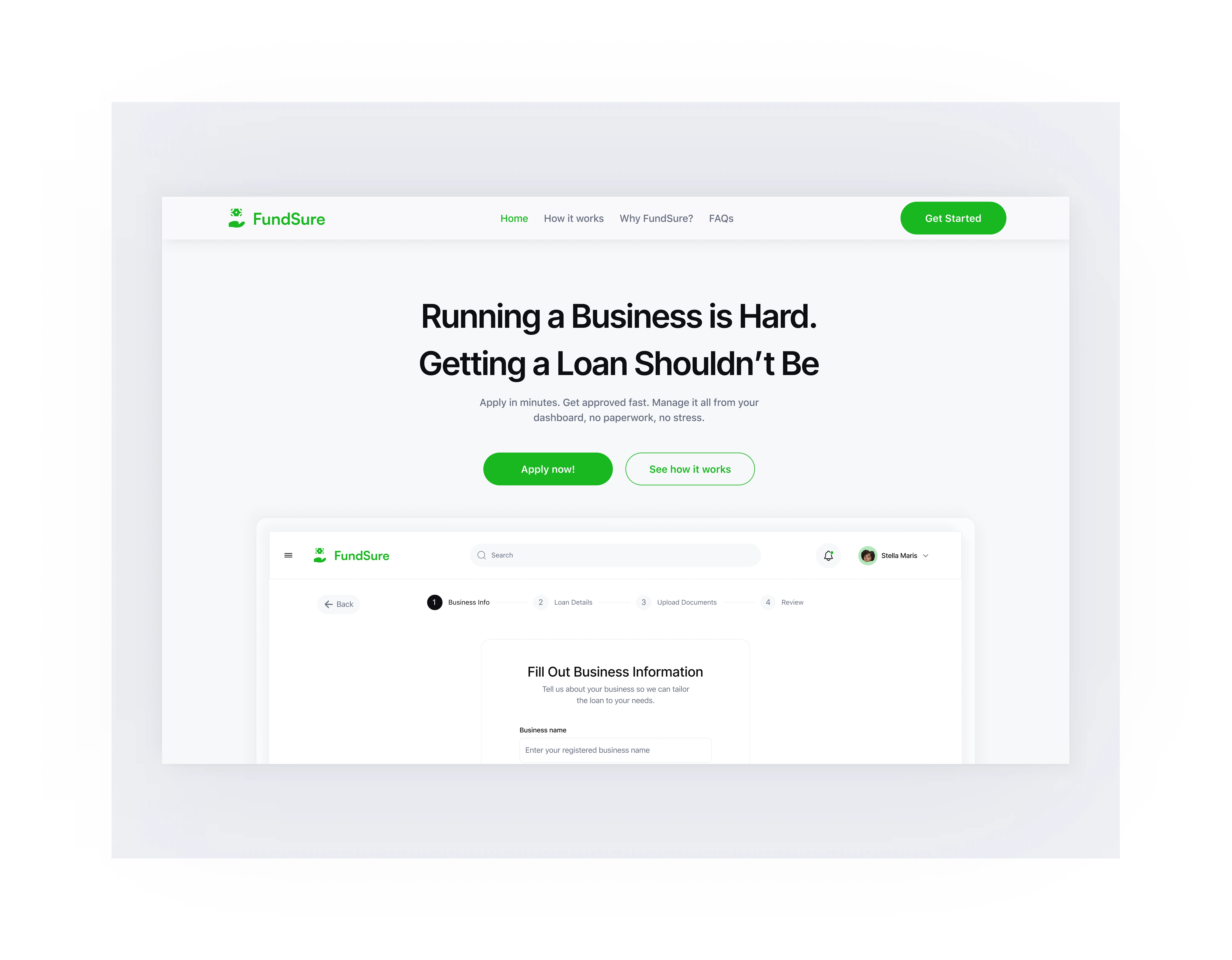
Landing page with simple and clear messaging: “Running a business is hard. Getting a loan shouldn’t be.”
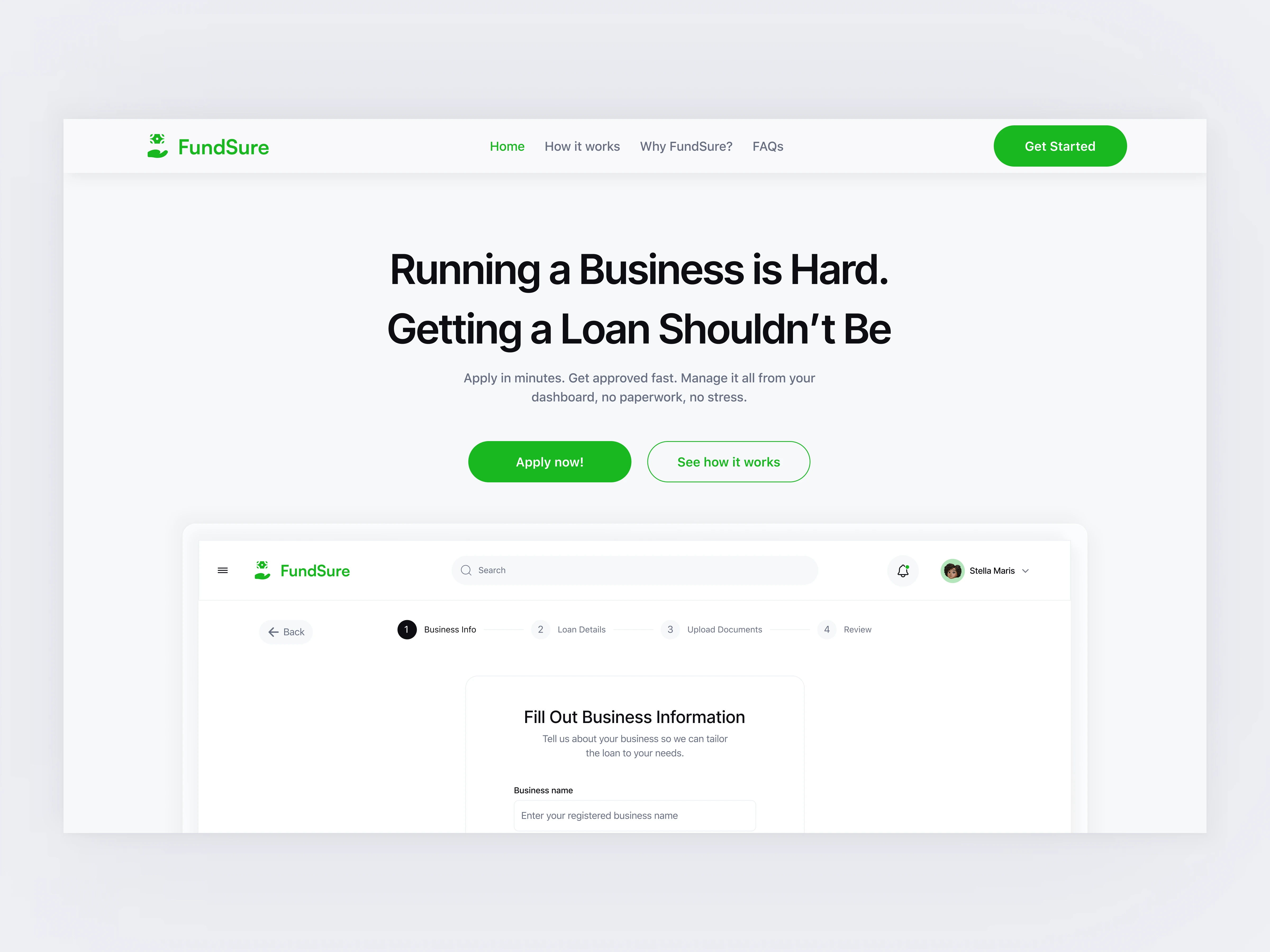
Hero Section
2. Clean, Guided Loan Flow
Progress bar across four clear steps
Straightforward forms for business info, loan terms, uploads, and review
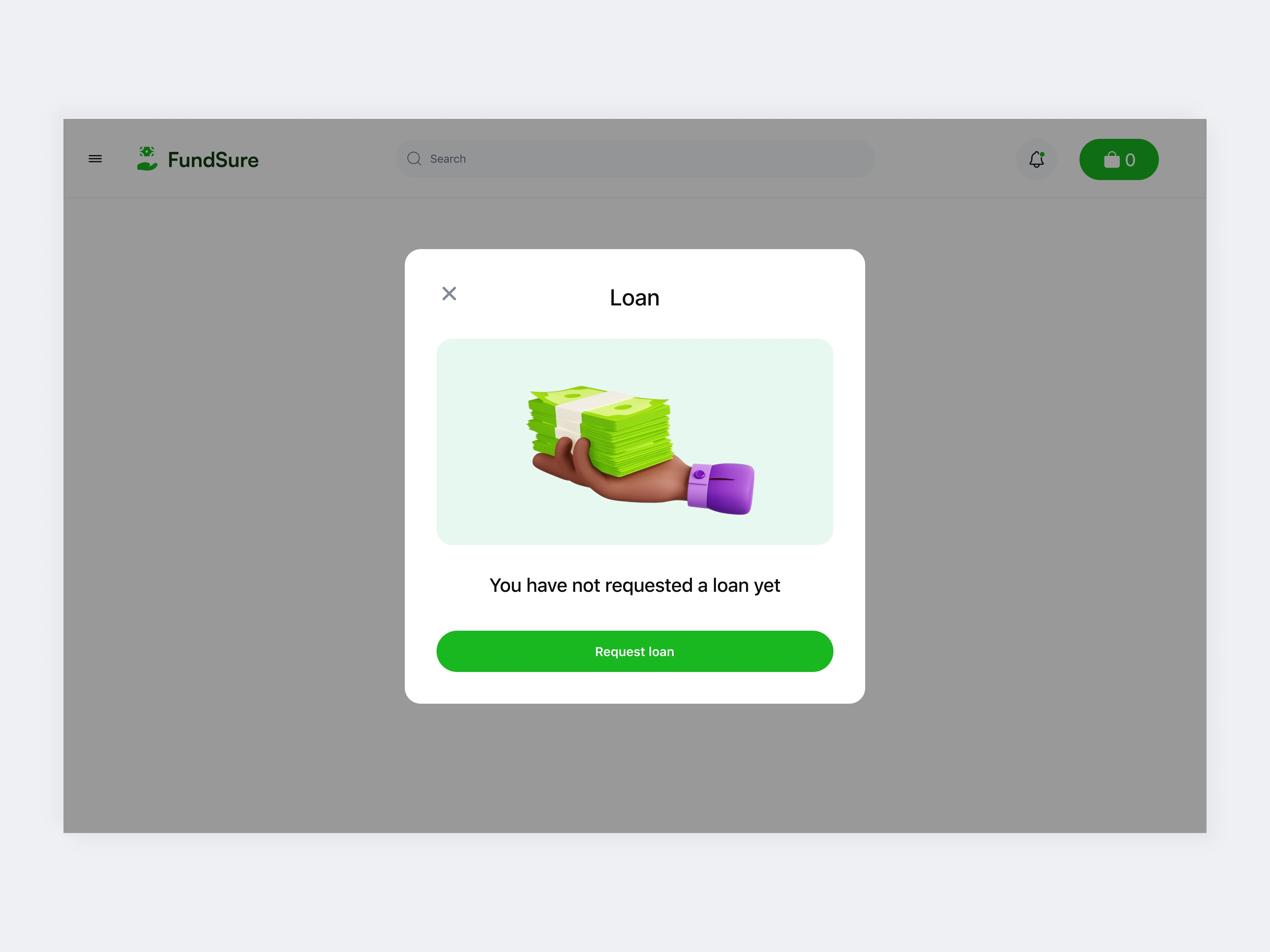
Request a loan modal
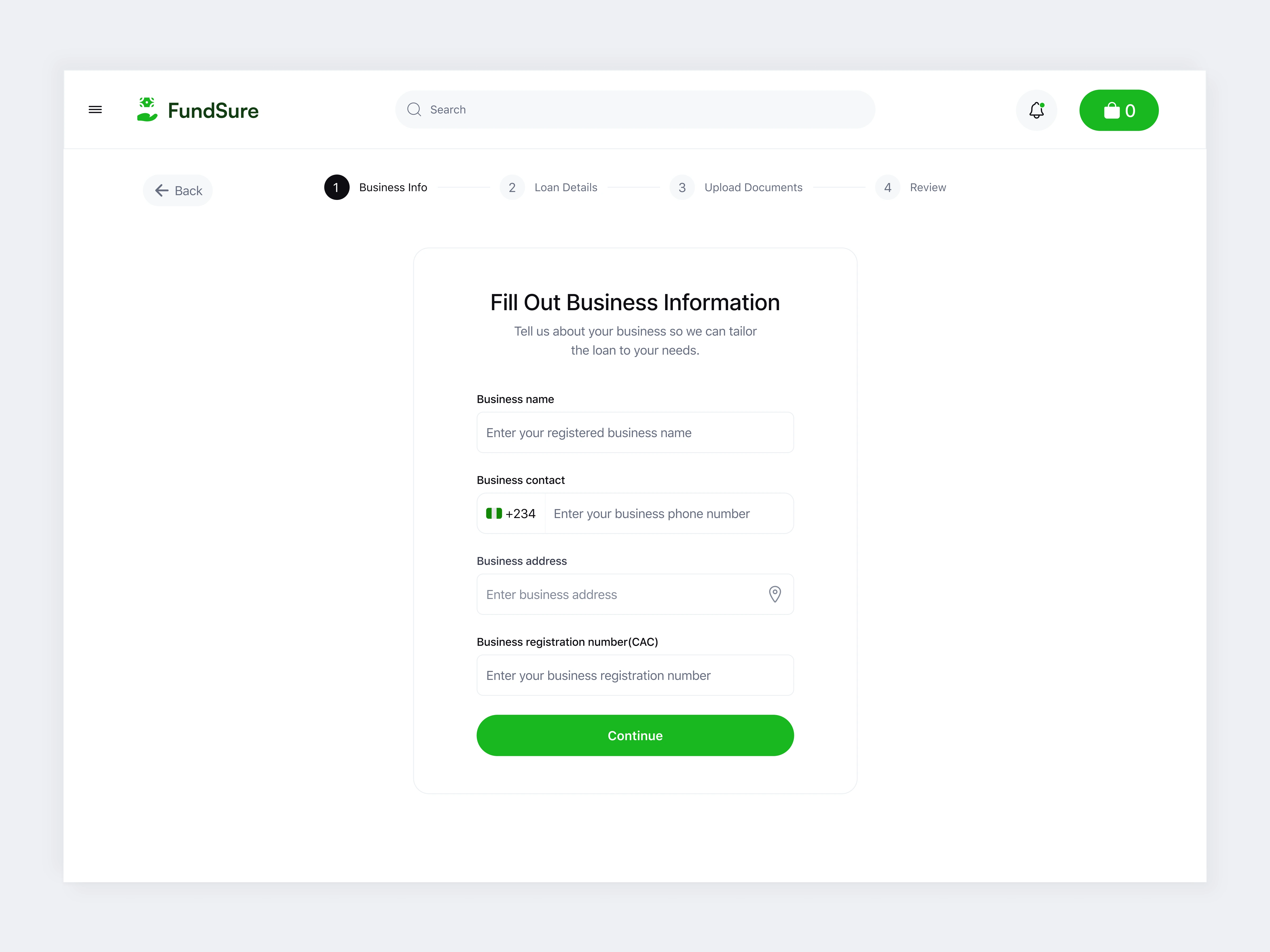
Loan form, step 1 - Fill in Business Details
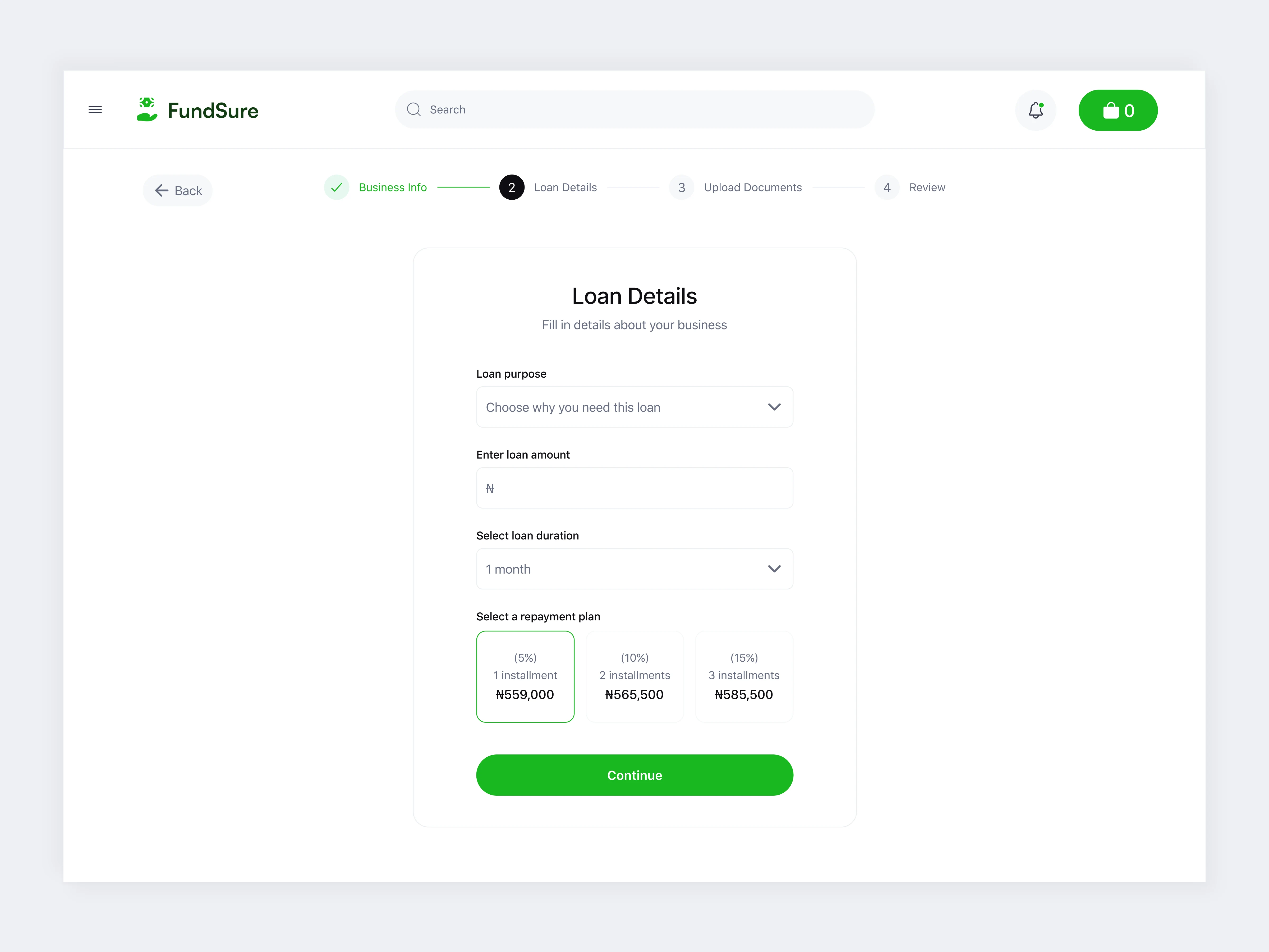
Step 2 - Fill in loan details
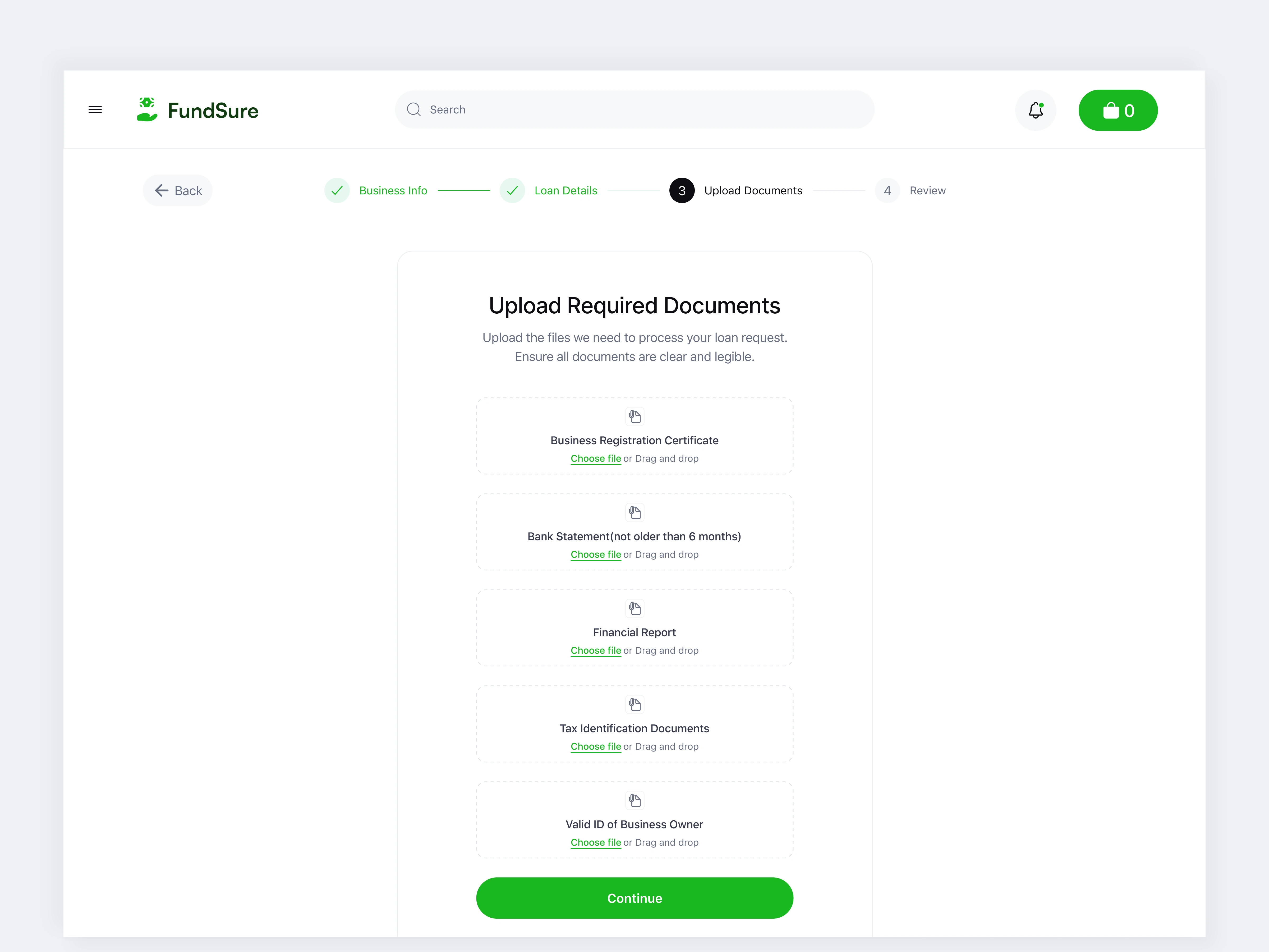
Step 3 - Upload required documents
3. Transparent Financial Decisions
Repayment options with visible fee percentages
No hidden info, no guesswork
Final screen shows all info side-by-side before submission
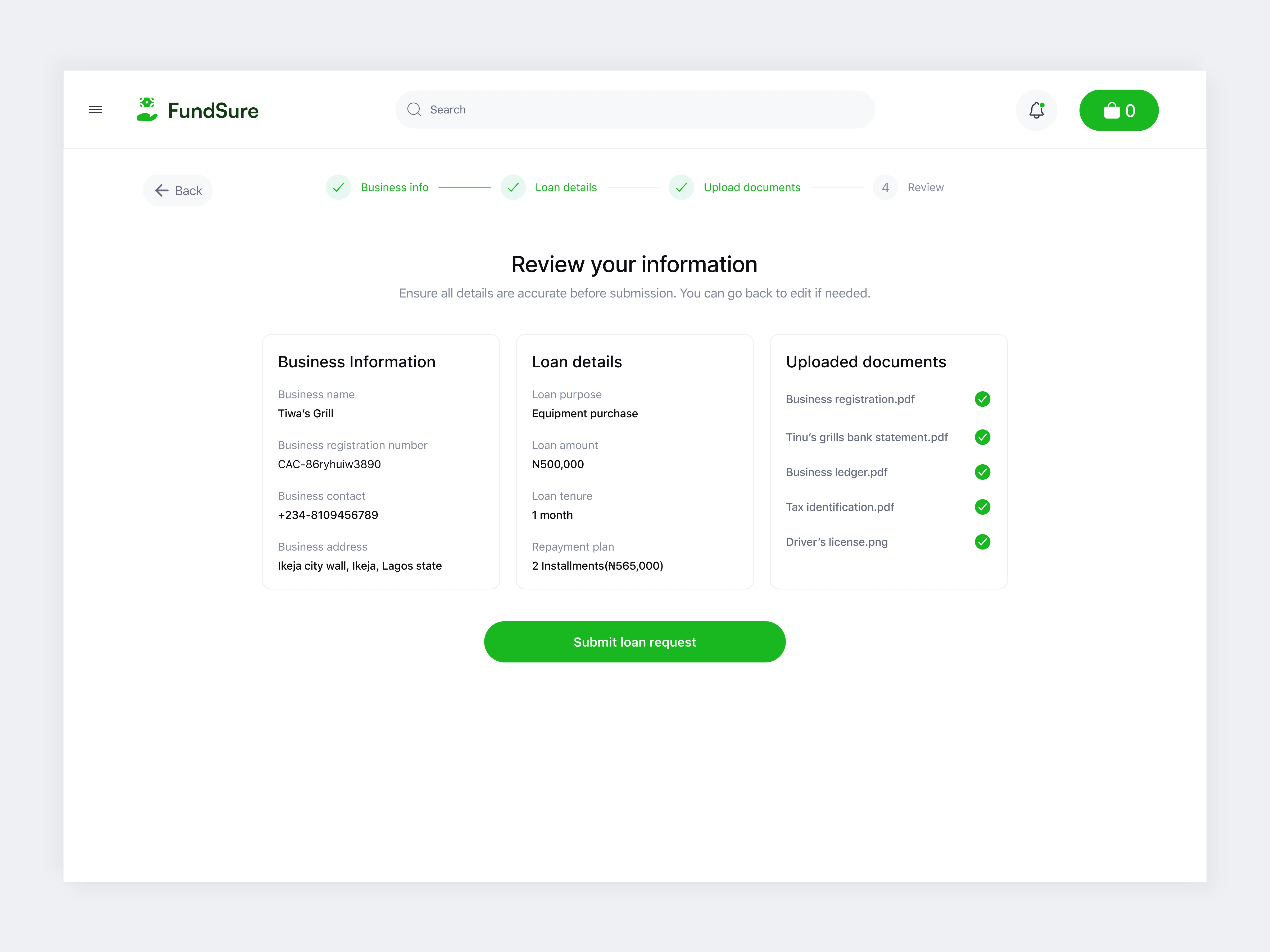
Review the information provided
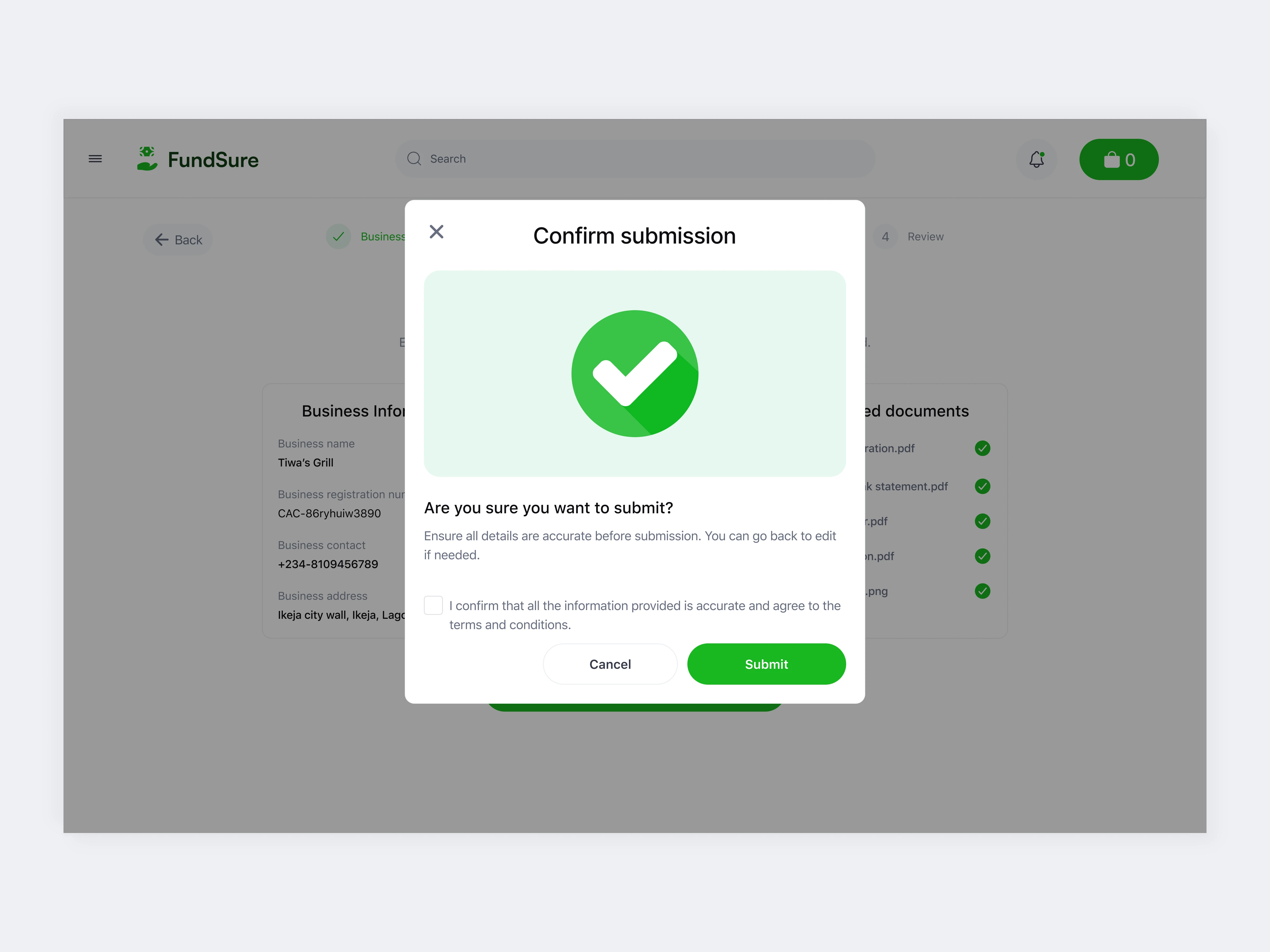
Confirm submission
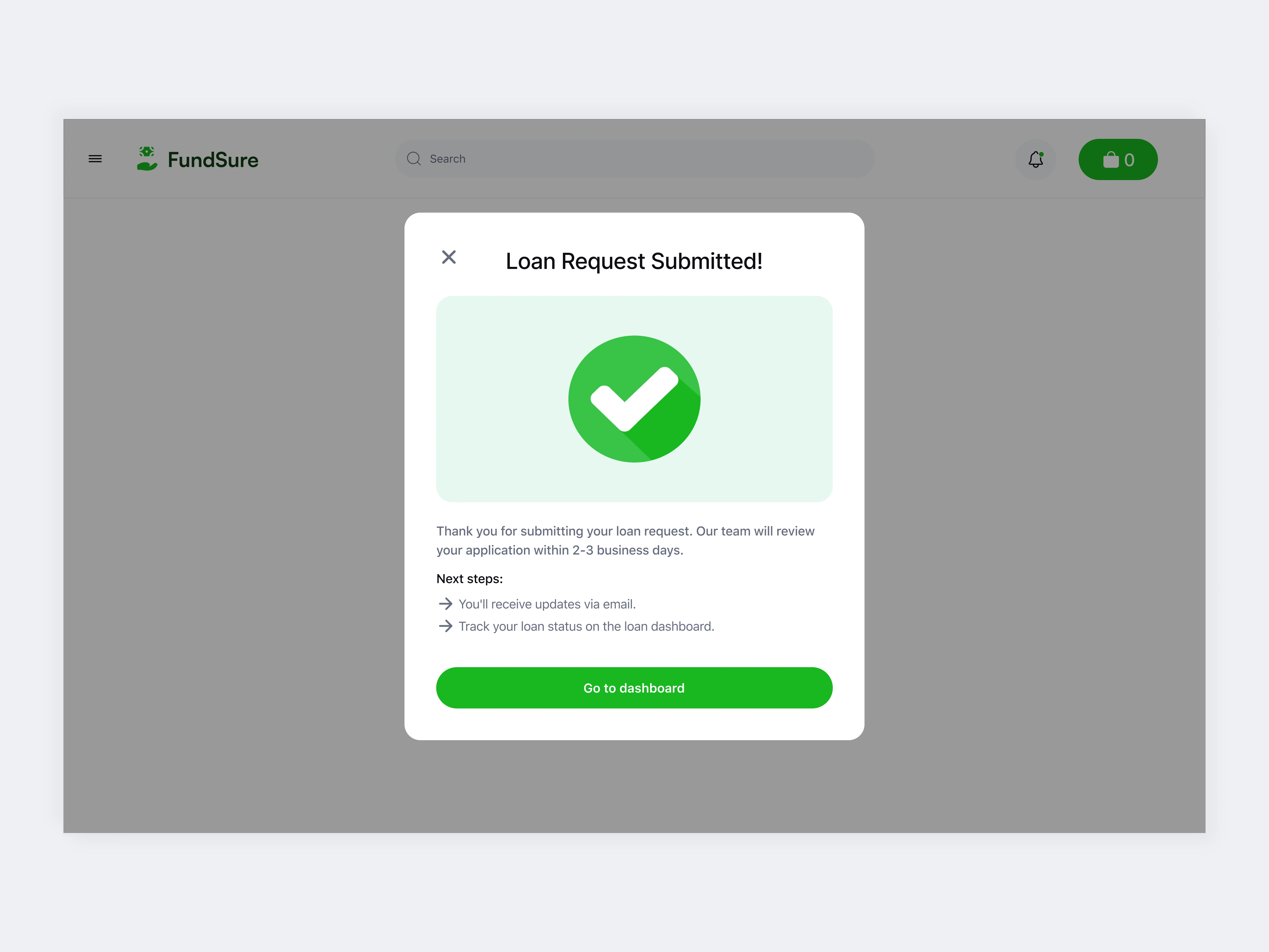
Loan request Submitted
4. Adaptive Dashboards
Pending state = uncluttered, supportive
Advanced state = all loan statuses shown clearly
Users can track and plan without friction
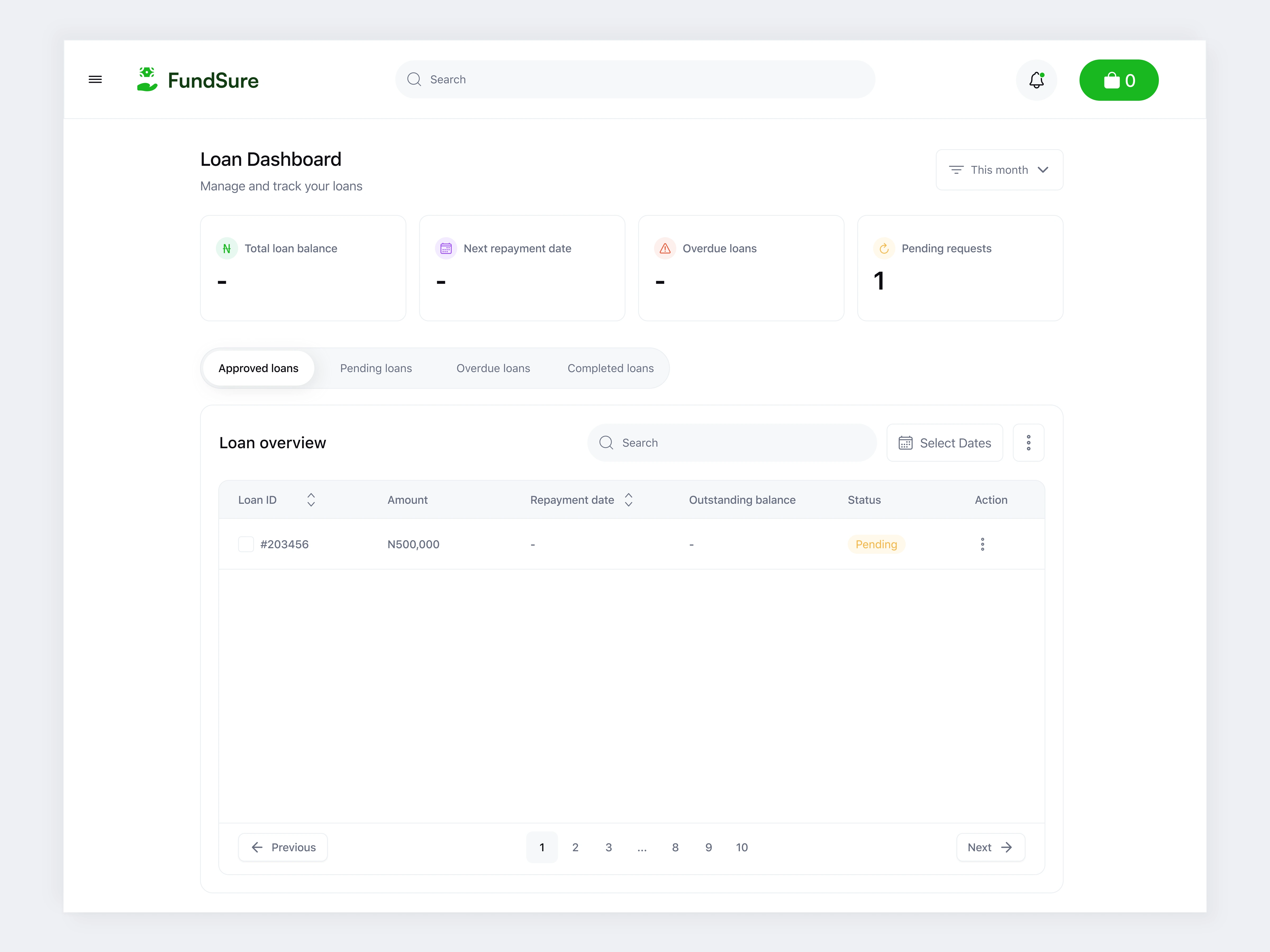
Minimal view for new users - just one pending loan
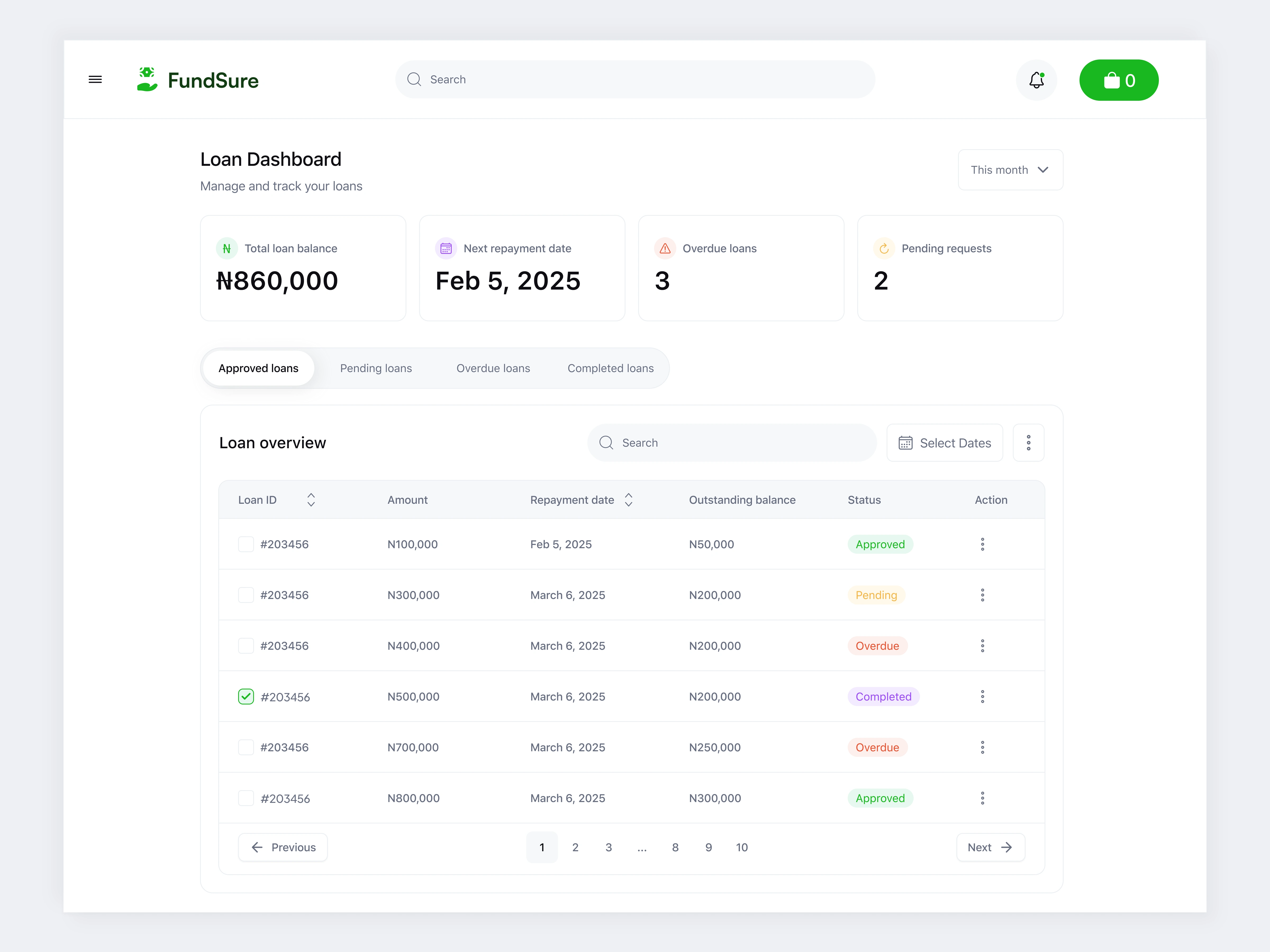
Dashboard when user has requested multiple loans:
🔥 Impact
This flow reflects strong product thinking:
Reduces drop-off by simplifying each step
Builds emotional trust through honest design
Encourages re-engagement and user self-confidence
Makes financial tools feel like a partner, not a barrier
💬 Final Reflection
Designing for financially stressed users means every detail counts. A tone, a color, a form layout, all of it impacts how safe and in control someone feels. Emotional design is not soft; it’s strategic.
When people are stressed about money, design can either overwhelm or empower. I chose the second.
If you're building tools for vulnerable moments, I’d love to help make them clearer, calmer, and more human.
Like this project
Posted May 31, 2025
Created a step-by-step loan request experience that builds trust, reduces user stress, and gives small business owners full clarity and control.