ScuPay – Redesigned EdTech Landing Page for Clarity & Conversion
Toniloba Jolayemi
Redesigning ScuPay – A Clearer, Trust-Building Landing Page for EdTech
Project Summary
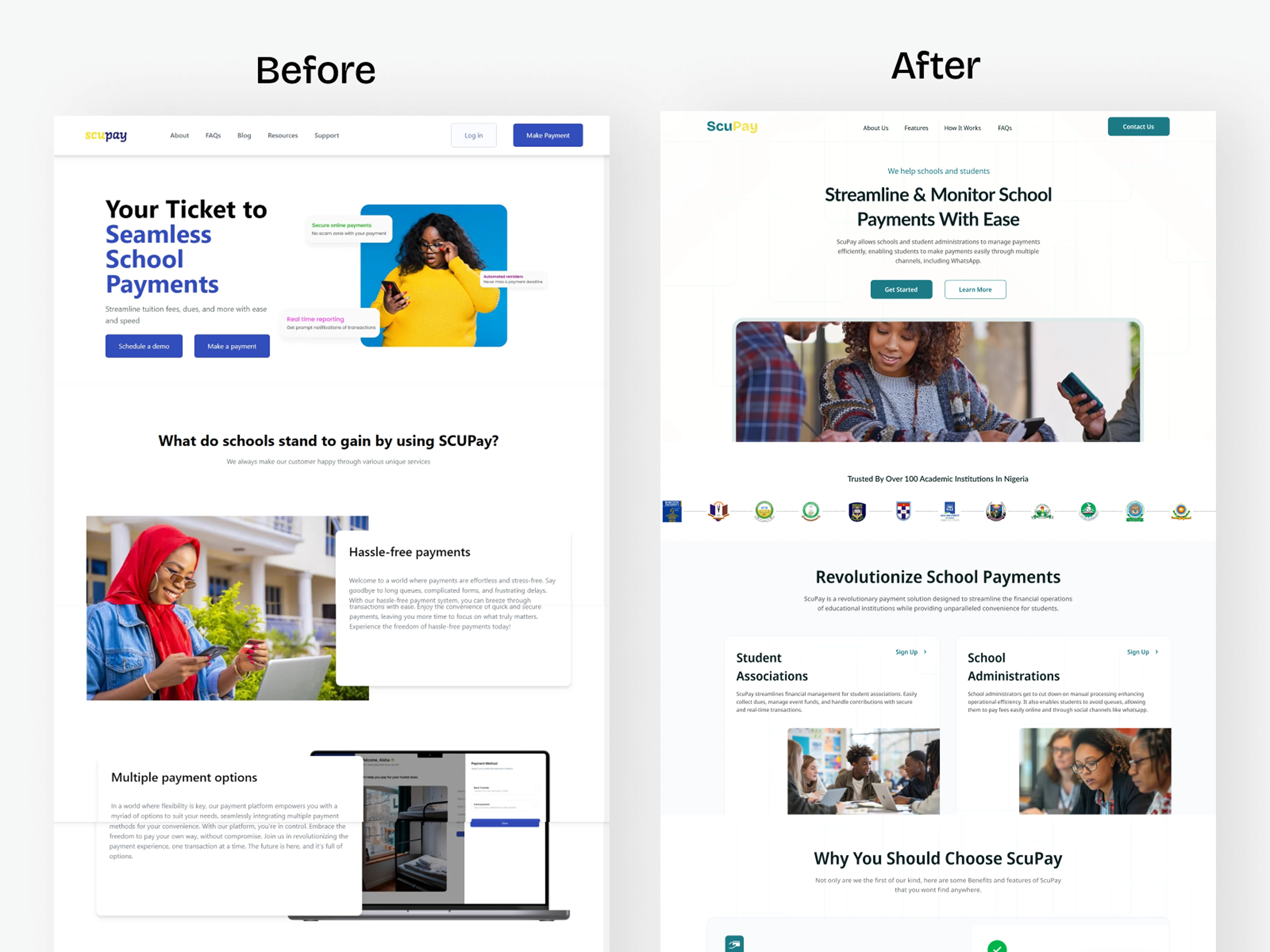
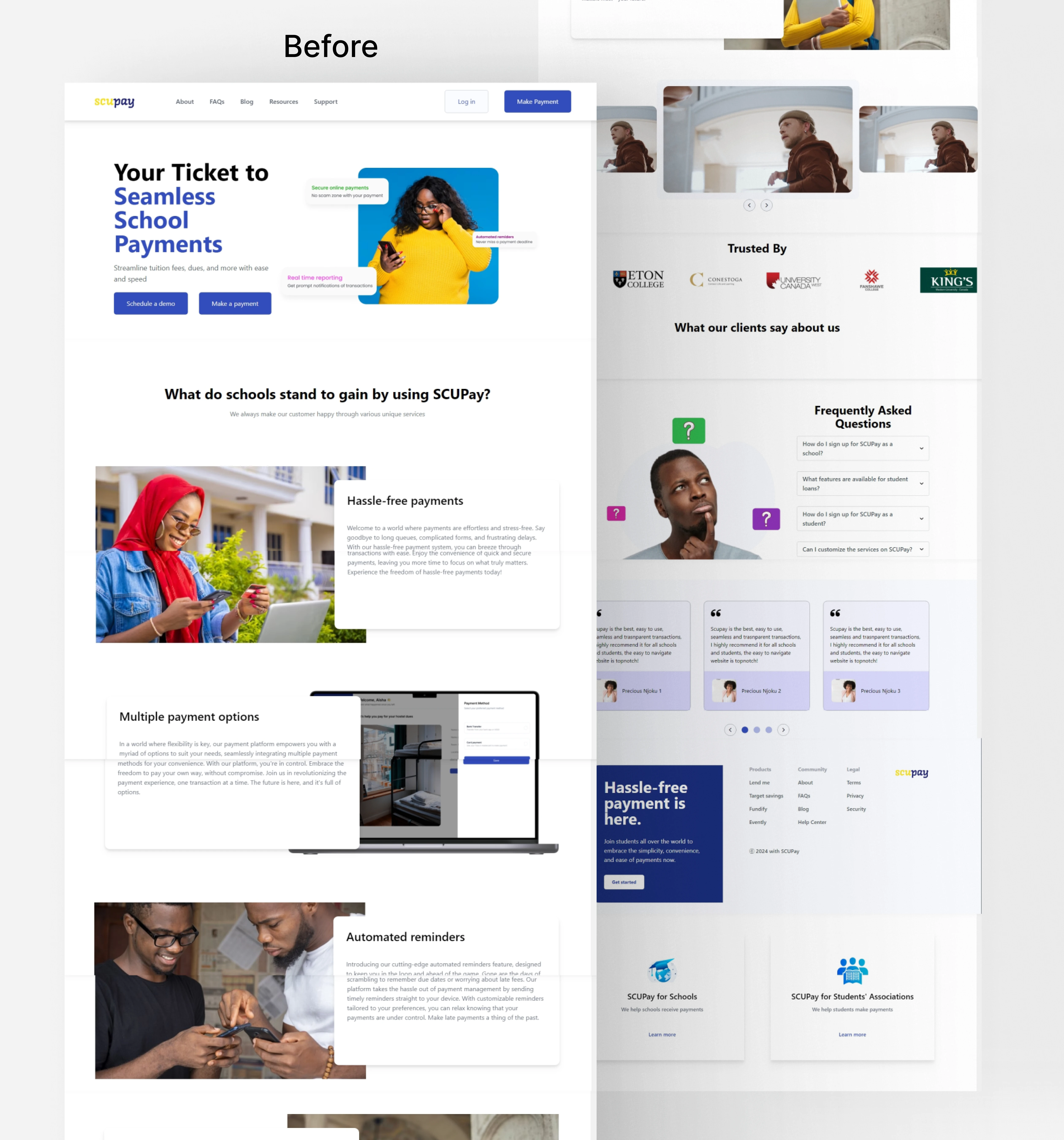
ScuPay helps schools and student associations simplify fee payments, including via WhatsApp. But their original website didn’t reflect that clarity or innovation.
I redesigned ScuPay’s homepage to tell a clearer story, build immediate trust with schools, and guide users toward action. Every section was rewritten, reorganized, and redesigned to reduce confusion and turn a busy pitch into a focused, conversion-friendly experience.
🔍 The Challenge
The original site was trying to say too much at once, cluttered visuals, unclear CTAs, and no real structure. It wasn’t communicating what ScuPay does or why it’s valuable.
✅ The Solution
Led with a clear, benefits-first headline
Split audiences visually: school admins vs student unions
Introduced social proof with a logo bar of 30+ schools
Created “Why ScuPay” grid with bite-sized product value
Spotlighted their WhatsApp payment feature as a major differentiator
Added real testimonials, clearer FAQs, and a simplified contact section
Designed every scroll to feel purposeful, not overwhelming
Impact
Stronger product understanding at a glance
Clearer sign-up paths for both target audiences
Higher trust and perceived credibility
Mobile-optimized, clean Figma prototype ready for dev
📌 What I Learned
Sometimes a redesign isn’t about doing more, it’s about saying less, better. With ScuPay, clarity, trust, and flow were the unlock.
🔗 View Prototype
Like this project
Posted Jun 7, 2025
Redesigned ScuPay’s homepage to tell a clearer story, build trust with schools, and drive action with focused UX, messaging, and mobile-ready design.
Likes
0
Views
7