Landing Page Redesign for Pay4Me’s Global Payment Platform
Toniloba Jolayemi
Redesigned Cross-Border Payment Platform for Global Students
Project Summary
I redesigned the landing page for Pay4Me - a cross-border payment platform that helps international students and immigrants pay tuition and institutional fees. The original site had strong content, but its layout lacked clarity, focus, and emotional connection.
My goal was to streamline the structure, introduce clear messaging for global users, and guide visitors toward high-intent actions like downloading the app.
The Challenge
The existing landing page was packed with information but lacked a clear visual path. Trust signals were buried, CTAs felt scattered, and the layout didn't reflect the product's modern, tech-forward positioning.
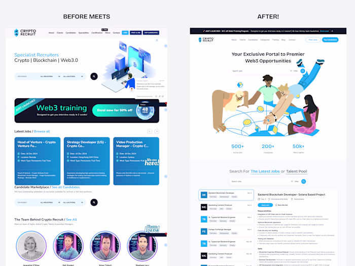
The Old Design
The Solution
Introduced a clean hero section with map visuals and country flags to localize the experience
Consolidated testimonials, FAQs, and CTAs to reduce cognitive load
Added a step-by-step “How It Works” section to explain the process in 3 easy steps
Strengthened brand trust with improved partner logos, social proof, and QR code clarity
Used playful iconography and global design accents to reflect the app's audience
My Redesign
🔥 Impact
A clearer, more accessible experience for international users
Stronger app download funnel with improved CTA placement
Higher perceived credibility through design consistency and layout logic
What I Learned
When designing for global fintech users, clarity is king. Every section must answer: "Can I trust this? Can I use this?" and design needs to say “yes” before words do.
Like this project
Posted Jun 6, 2025
Redesigned Pay4Me’s landing page to improve clarity, trust, and engagement for international students and immigrants. Clean UI. Clear CTAs. Real results.