The Rebranding Real Challenge MineralBalance operates

Aleksandar Coric


The Rebranding Real Challenge
MineralBalance operates at the intersection of health, nutrition, and laboratory analysis.
As HTMA continues to be associated with inconsistent messaging and wellness trends, the brand needed to communicate something more grounded: precision, credibility, and clarity.
The challenge was to create an identity that felt scientifically rigorous without becoming cold, clinical, or pharmaceutical.
- The Concept
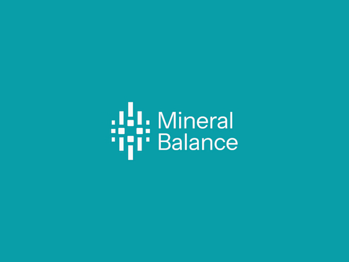
At the core of MineralBalance is the relationship between individual minerals and the balance they create as a system.
The symbol translates this idea into a simple modular form: four elements representing four essential minerals:
Na, Mg, Ca, and K. The vertical bars introduce a subtle reference to laboratory analysis and data visualization, connecting the mark to the process of measurement and interpretation.
- The Identity
The rebrand gives MineralBalance a clearer and more distinctive visual foundation for its next stage of growth. The identity moves away from generic health and wellness conventions and creates a system that reflects what the brand is ultimately about: measuring, understanding, and finding balance.
Like this project
Posted Sep 21, 2026
The Rebranding Real Challenge MineralBalance operates at the intersection of health, nutrition, and laboratory analysis. As HTMA continues to be associated w...