Opern.news - Logo Design

Aleksandar Coric




Posted Oct 16, 2026
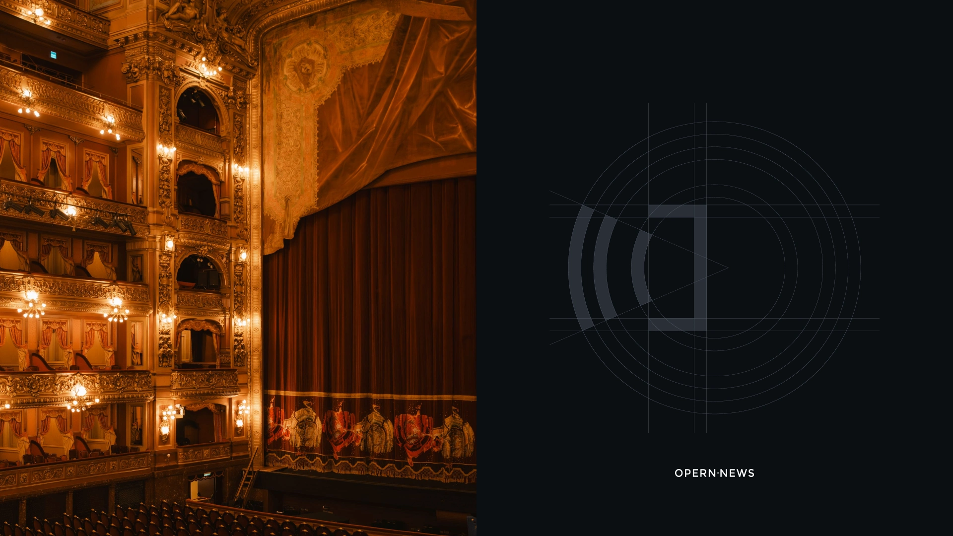
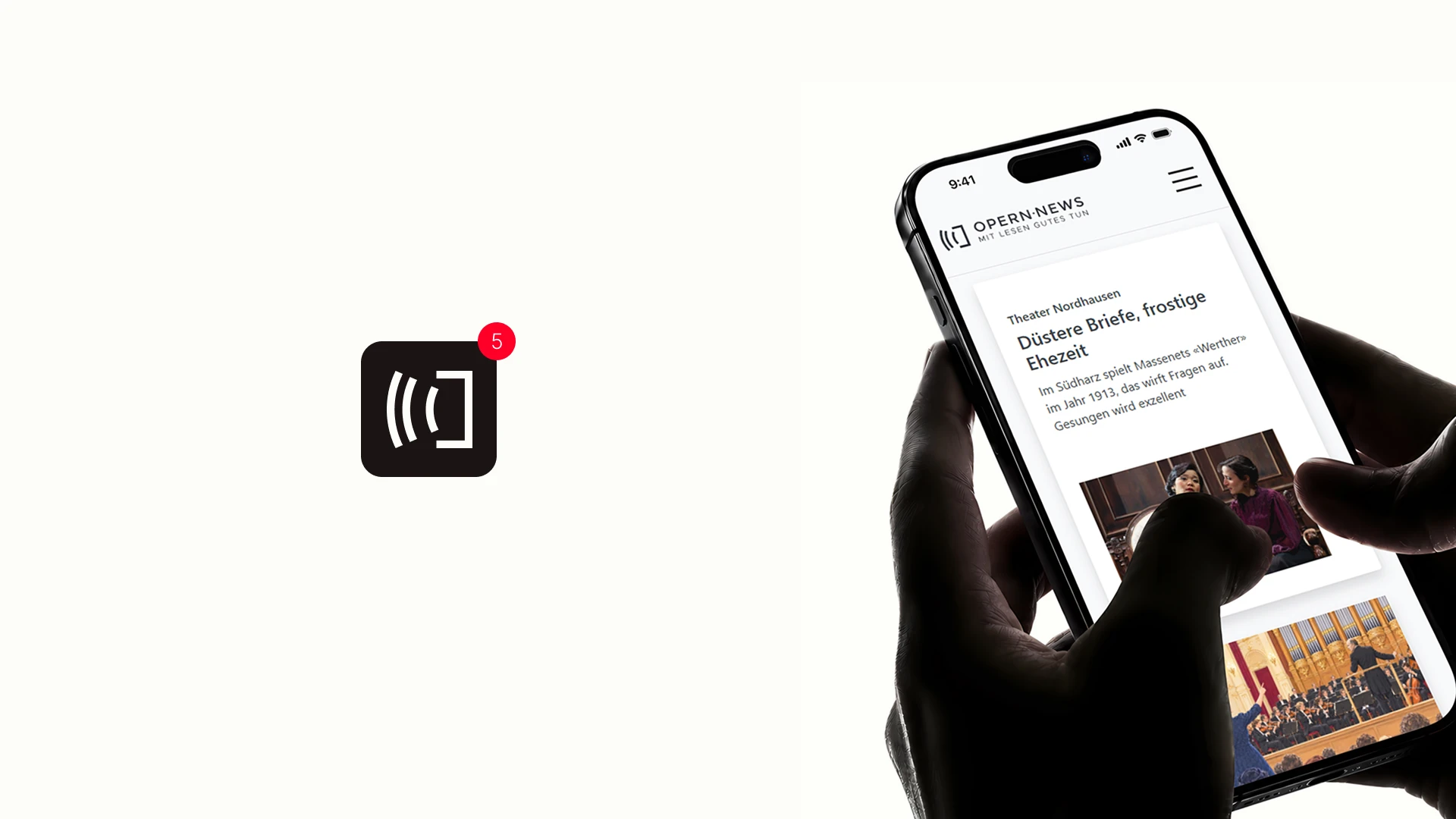
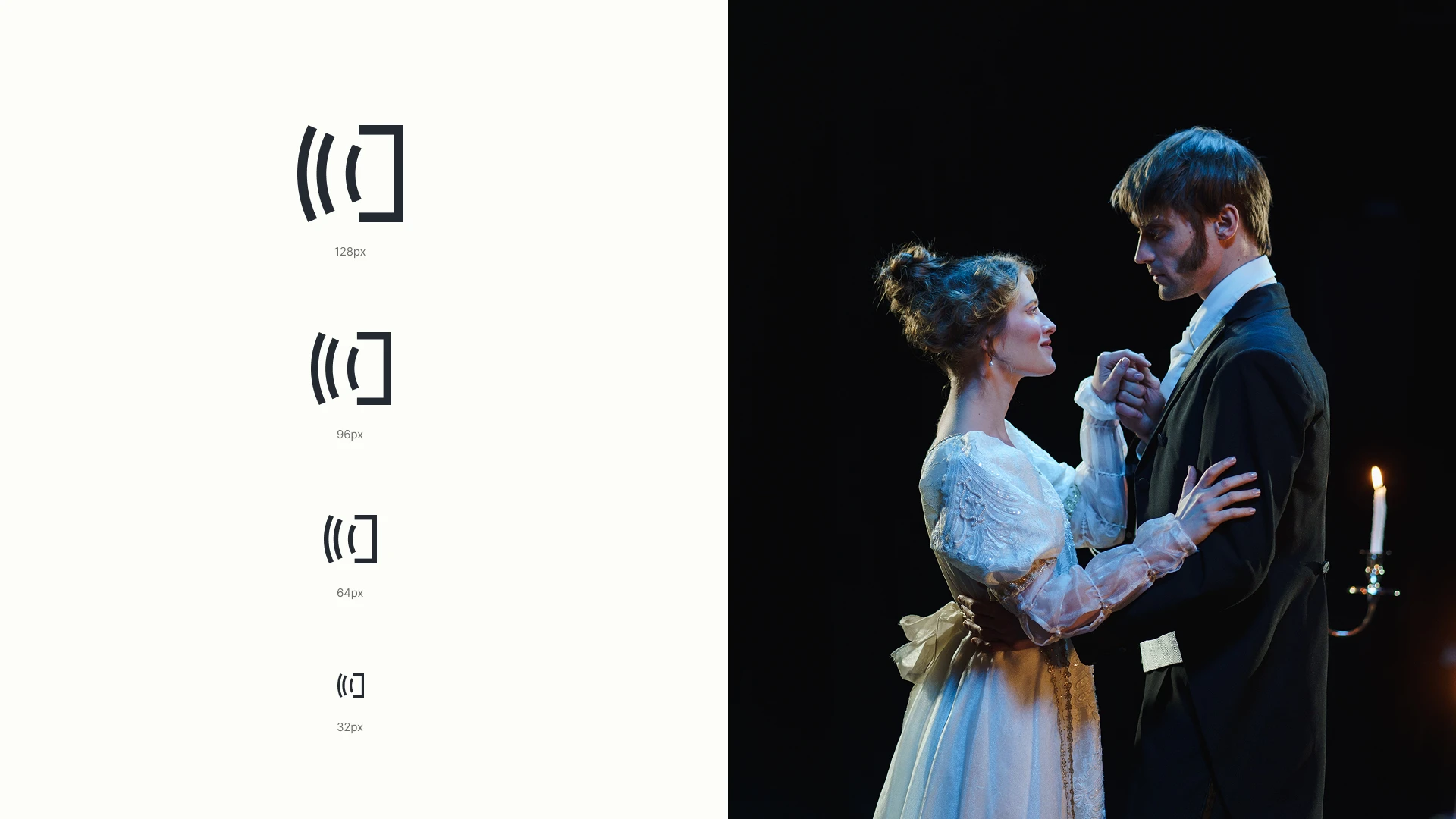
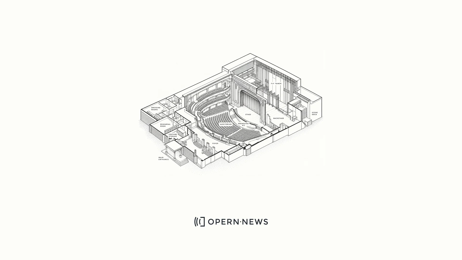
Designing a logo for Opern.news came with an interesting challenge: how do you create a contemporary identity for a platform built around an art form with centuries of history? Opera carries a strong visual and cultural heritage: grand theaters, classical architecture, tradition and ceremony. Opern.news, on the other hand, is a modern digital medium focused on news, communication and what is happening in the opera world today. I wanted the logo to exist somewhere between those two worlds. The starting point came from the architecture of the theater itself. Looking at opera houses and classical amphitheaters from above, I became interested in the relationship between the stage and the rows of seats surrounding it. By simplifying that structure, a very recognizable geometric form started to emerge. But there was another reading hidden in the same shape. The repeated lines also resemble broadcast waves, a simple reference to news, communication, and the distribution of information.