Kilnwood: Sourdough Bakery Identity and Packaging Suite

Supreme Dream


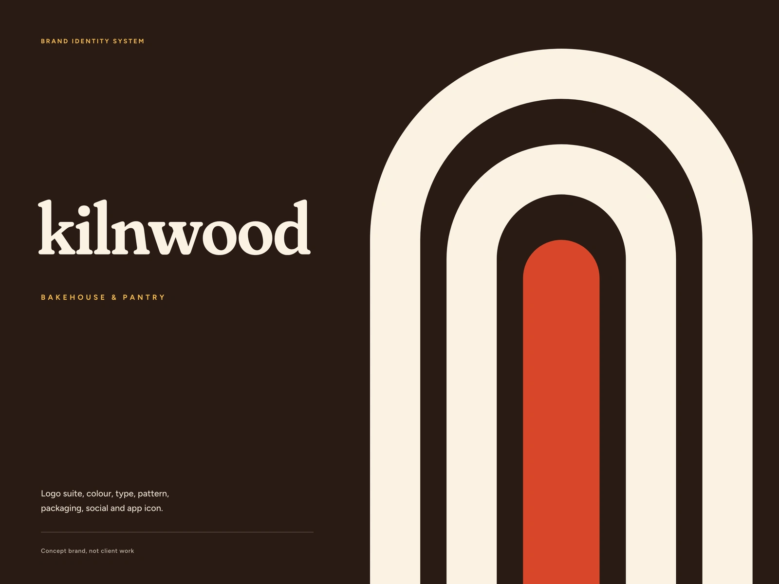
A bakery brand has to work at two distances: on a sign you see from across the street, and on a sticker the size of a thumbnail on a paper bag. Kilnwood was designed for both from the first sketch.
Kilnwood is a concept brand, not client work. The names and products on the boards are placeholders.
The brief
A bakehouse and pantry that bakes slow-fermented loaves at first light. The identity had to feel warm and handmade without leaning on stock wheat illustrations, and it had to survive kraft paper, a one-colour stamp and a 20 px app icon.
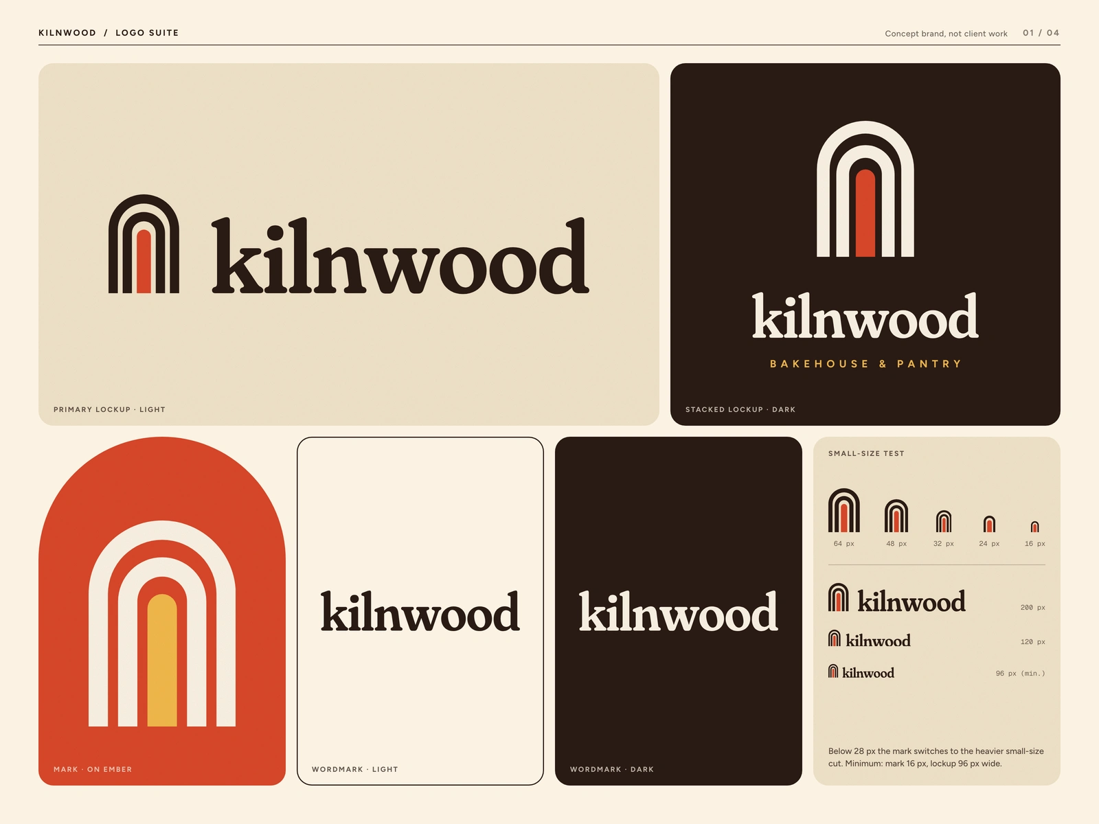
Kilnwood logo suite: horizontal and stacked lockups, the mark on ember, light and dark wordmarks and the small-size test from 64 px down to 16 px
The idea
The mark is a kiln mouth: nested arches around a glowing ember core. The gaps follow a wood-grain rhythm, wider at the top than at the sides, so the arches feel cut rather than drawn with a compass. Below 28 px the mark switches to a heavier small-size cut with two levels instead of three.
The colours come straight out of the oven: Cocoa, Ember, Butter, Flour, Crust and Basil. Flour on Cocoa reads at 14.8 to 1, so the dark lockup stays sharp on a dim shop sign.
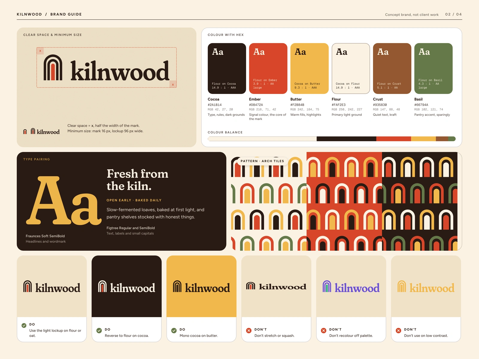
Brand guide: clear space and minimum size, colour with hex and contrast, Fraunces and Figtree pairing, the arch-tile pattern and do and don't rules
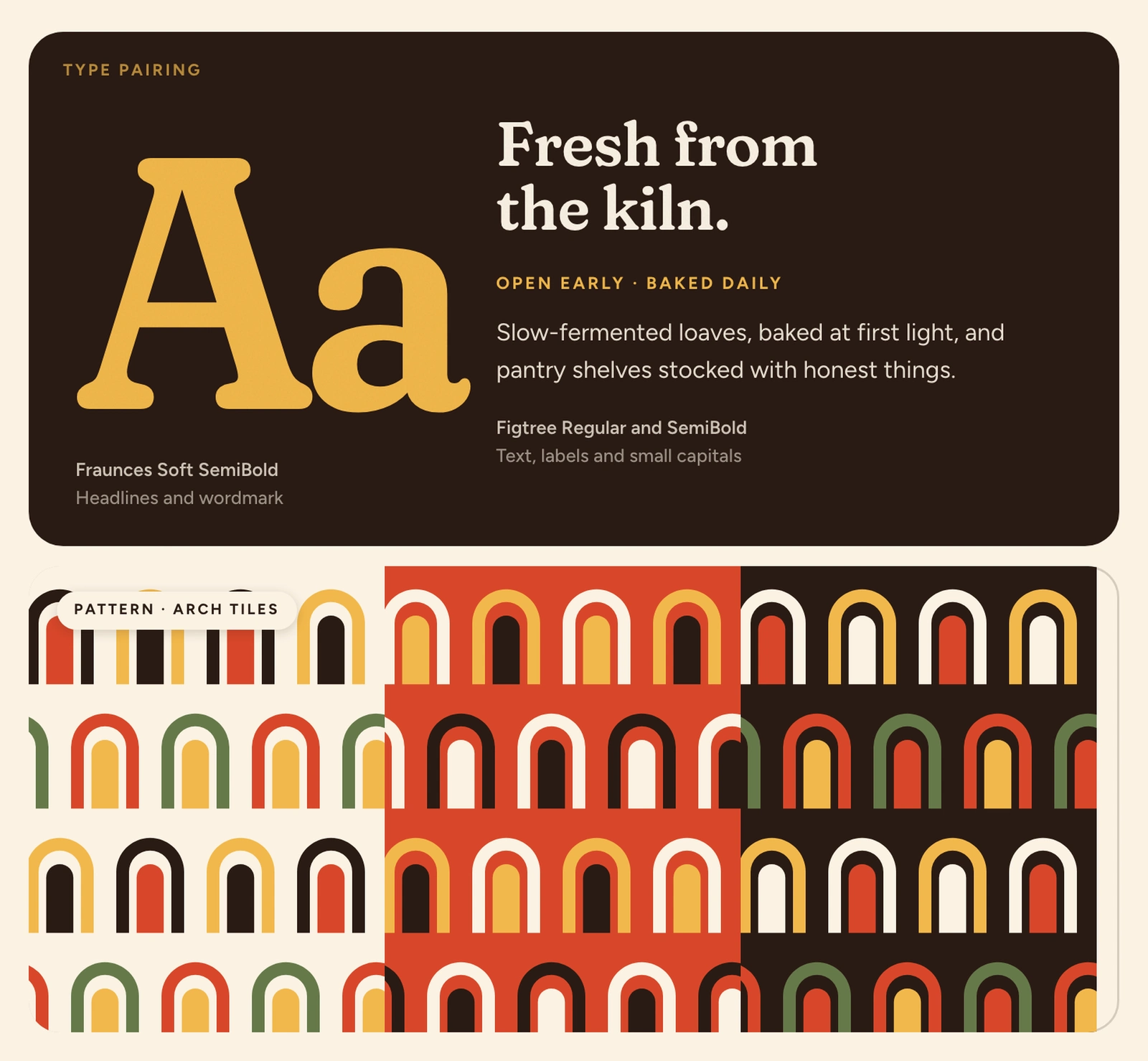
Type and pattern: "Fresh from the kiln." in Fraunces Soft SemiBold, next to the arch-tile pattern in three colourways
How it is built
Every mark is generated from geometry in Python and written out as SVG: 23 logo files in SVG plus 23 in PNG, including a small-size cut and three app icon colourways. The boards are laid out in HTML and CSS and rendered in a headless browser. Wood grain and paper grain are generated in code. No stock photography, no scanned textures.
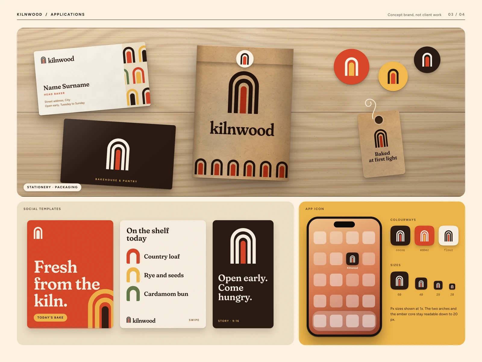
Applications: business cards, a kraft bread bag with the arch pattern band, stickers and a hang tag, three social templates and the app icon
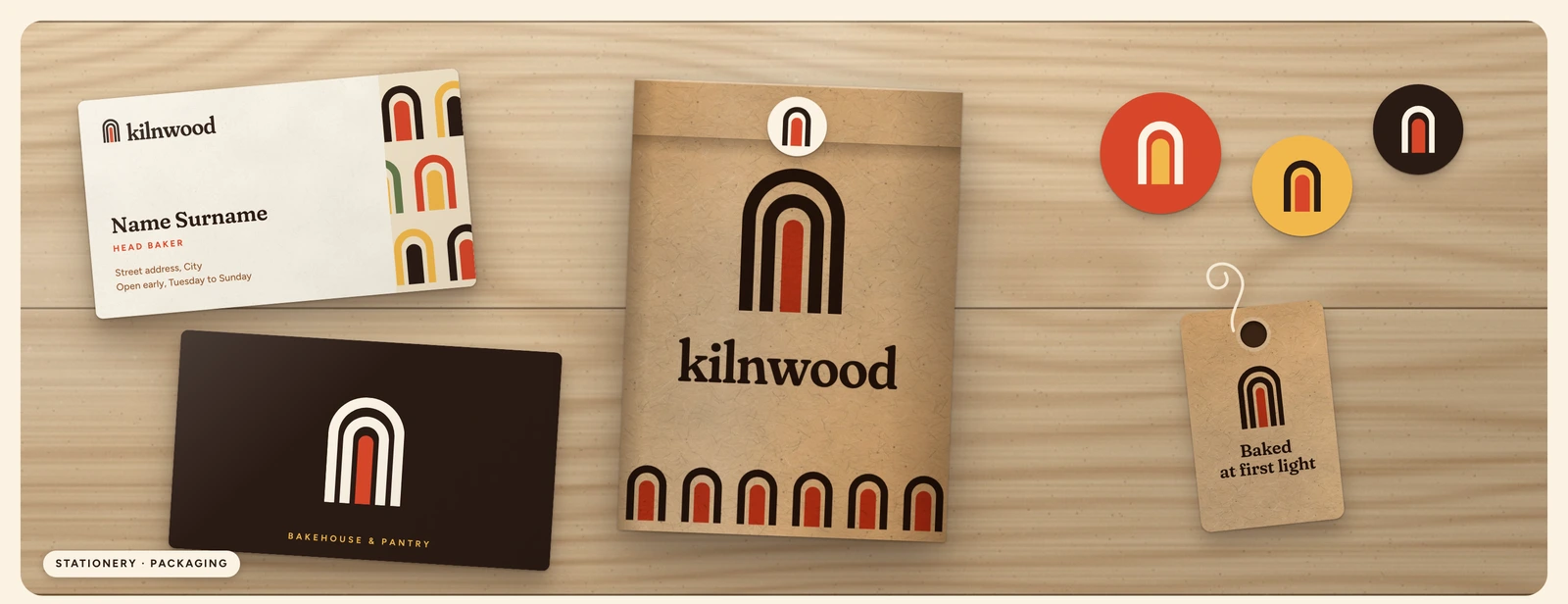
Packaging detail: the kraft bag, ember and butter stickers, and the "Baked at first light" tag
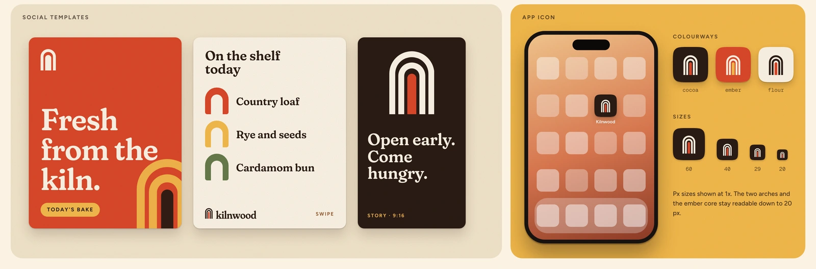
Social templates and app icon: "Fresh from the kiln", today's shelf, an opening-hours story, and the icon at 60, 40, 29 and 20 px
What a client gets
An identity that is ready for the counter, the bag and the phone. Master logo files in every colourway, a guide with contrast already checked, packaging that prints on kraft, social templates for the daily bake, and an app icon set.
Work with us
This is a concept brand made to show the system. If you run a food or hospitality brand and want an identity that holds up from the shopfront to the sticker, tell us about it.
More work: givemeprompts.com/work
Like this project
Posted Oct 3, 2026
A concept identity for a small-batch sourdough bakery: nested-arch mark with an ember core, a warm palette, kraft packaging plus an app icon.
Likes
0
Views
2