Public Voting System
The Challenge — The Project
We were to design the experience & interface of two platforms for public voting and ideation; one for private companies and one for government sector in KSA. Along with an admin dashboard for each platform.
The Scope
Several internal meetings, discovery meetings & an inbox full of supporting documents later we ended up with a vague idea of the project’s real size and a somewhat clear understanding of the client’s vision. The problem was to arrange all that in a comprehensive way in order to be able to choose the correct UX activities and therefore draw the timeline correctly.
What I learned: you can plan the timeline for any big project accurately up until wireframing phase. That’s when all requirements, research results & possibilities are applied and you can never guess how long that may take before you do anything because you don’t know how big “it” may be…
UX Research & Design
Here’s how it goes: to build a successful product it has to be functional, beautiful & tailor-made for target audience.
My team’s collective skills are enough to build a gorgeous product that works perfectly, but it could end up as a big FAIL if we don’t consider the real needs of those who will actually use it.
To empathize with users we need personas; and while we have our assumptions based on info provided by the client we can’t build an entire product based on an assumption now, can we?
Therefore we needed to do a round of user interviews to validate those assumptions. (Actually a lot more than that 😳, see below)
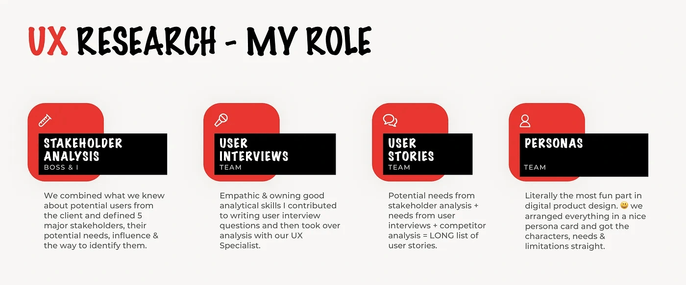
Add to that a full-on competitor analysis by none other than our chief UX Specialist, and a complicated looking Service Blueprint done by our UX Lead because honestly no one else could do it even with the nice miro template.
It did not stop there, of course. We still needed to know how these personas will use the products. so…
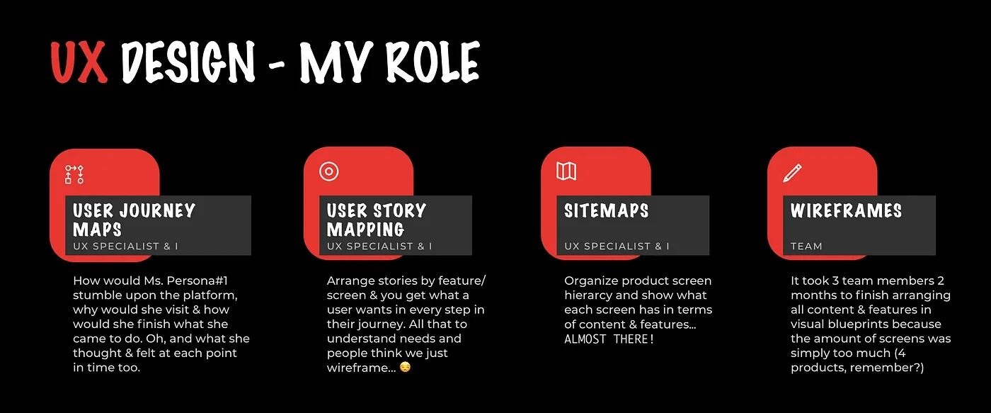
Everything went lightning fast, we were on a roll..until we got to wireframing phase. Seriously, the minimum number of screens required to cover all content & needs was ridiculous.
Most importantly, we planned to do a usability testing round on the 2 most critical of the 4 products prototypes before we start with UI. It’s no joke changing critical system structure when you’re well into UI design.
So in 2 months, we managed to finish all 4 prototypes, get feedback from client, fix, perform user testing, analyze results, fix again.
Then it was my turn.
UI & Interaction Design
But it wasn’t just me, it was me & the junior designer. And it was my job to build the design system, design my fair share of screens, review the junior designer’s work, design microinteractions and prepare all that for implementation.
times 4.
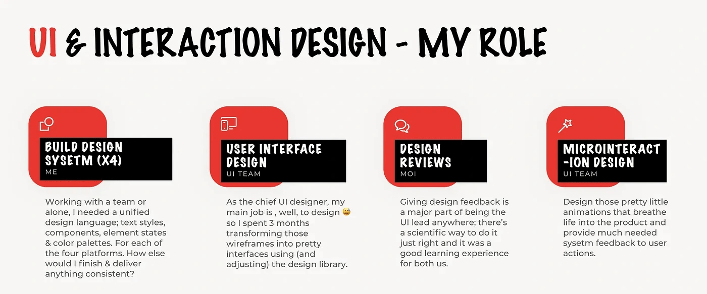
It took a long time and tried me repeatedly because I was thrown face first into situations I never had to even think about before…but we managed to finish it. And the client was really impressed with the final results.
I learned SO MUCH.
What I learned during UI phase equals what I learned in all previous ones put together:
Don’t think that your design system is done before you start UI design. Something will always come up and you’ll need to add stuff.
Giving feedback is a science. I had to learn how to do it correctly before I did it because this is the first time I mentor someone while working on a client’s project with a deadline looming in the horizon. I suggest reading Kim Scott’s Radical Candor. It’s worth every penny but you must practice. it isn’t easy.
Sketch & InVision are each visual designer’s best friends. Especially in small teams when most work needs to be automated somehow.
Sketch is my go to design tool because of it’s support of design systems, amazing symbol functionality and plugins to automate so much work & power-up your process. InVision, is the second tool I can’t live without; seamless integration with Sketch. Extremely handy Inspect for handover. Data & prototyping. It’s all in there.
It’s ok to be independent and self-reliant. But a designer always should know when to ask for help. That it’s OK to ask for help. And how to do so.
final results
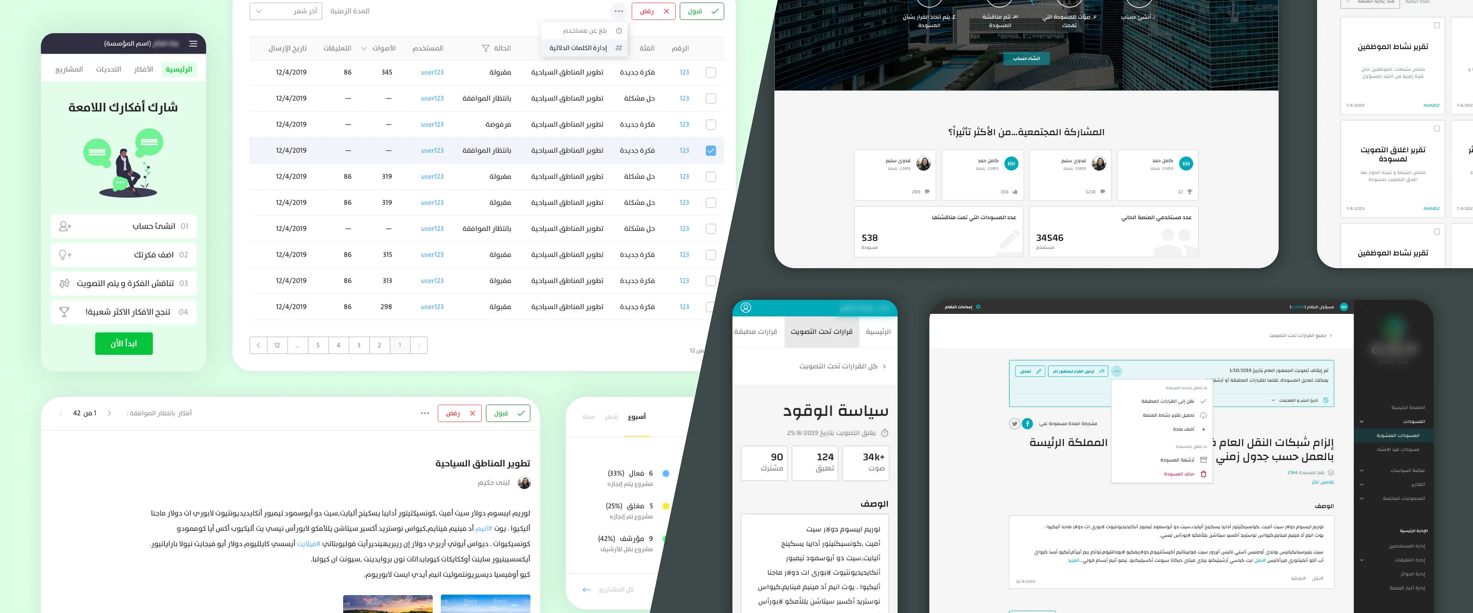
February to September. 200+ screens. 4 Platforms. UX, UI & everything in between. Desktop & Mobile.
Phase 1 is now history. The client is satisfied. We all learned so much. But both we and the client understand that no amount of testing will be like reality..when users begin to use the product in their day-to-day activities.
we’re prepared.
Like this project
Posted Nov 22, 2021
As the lead designer at UX Labs, I managed and executed most of the UX & UI Design of two platforms for public voting & ideation in KSA.
Likes
0
Views
40
Clients

UX Labs
SharedTech

