Hundinspiration Rebrand - Huge success
Maya Karampalasi
Hundinspiration is a successful Swedish business of 14 years that offers premium quality products and service to dog owners. They have a physical store and an e-commerse website.
When I was first contacted by the owners to discuss the possibility of a rebrand, I asked them a few critical questions:
Why do you want a rebrand?
What parts of your current branding do you think works and what doesn't?
What are your future plans with the brand?
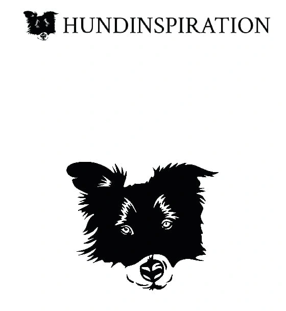
the old Hundinspiration logo
It was obvious from the start that they felt like their brand was outdated, it wasn't perfectly aligned with their values and it was "incomplete". They only ever did a logo design but never had specific brand typefaces, colour palette or even different logo variations.
At a first glance, I could see what they meant. Their old logo seemed outdated, it featured a dog's head and the brand name next to it in proportions that did not work when you scaled it down. Another important thing that was mentioned was the fact that their current dog in the logo was a random dog with no association to the brand or the owners, however the owner has a black Labrador named Bella.
Some things they already liked about their brand (and I agreed) was the feature of a dog's head and the use of Serif font. Something I haven't mentioned yet in terms of what they did not like, was the fact that the dog illustration looked too detailed and complicated and they wanted something simpler, elegant, timeless with a touch of bohemian.
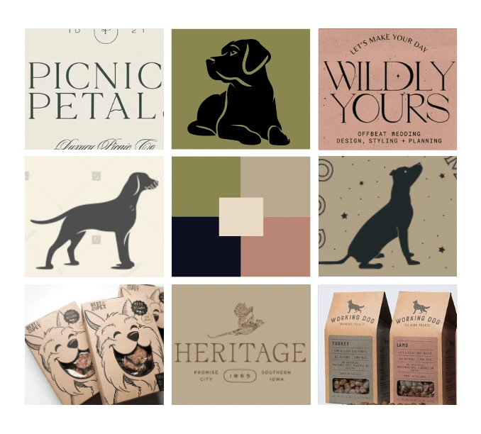
The approved moodboard for the rebrand
So I got into working, researching and putting together a brand moodboard based on everything we had discussed. I presented to them 2 moodboards that were quite different even though they ticked all the boxes. The above was the chosen one.
Then it was time for some brain dump of words that are linked to the brand, the audience, the products, the values. This was really fun to do and very helpful.
In the logo design process there was a lot of trial and error, however the direction was already very clear. Below you will see the logo that was presented after any tweaks that happened after the client's feedback.
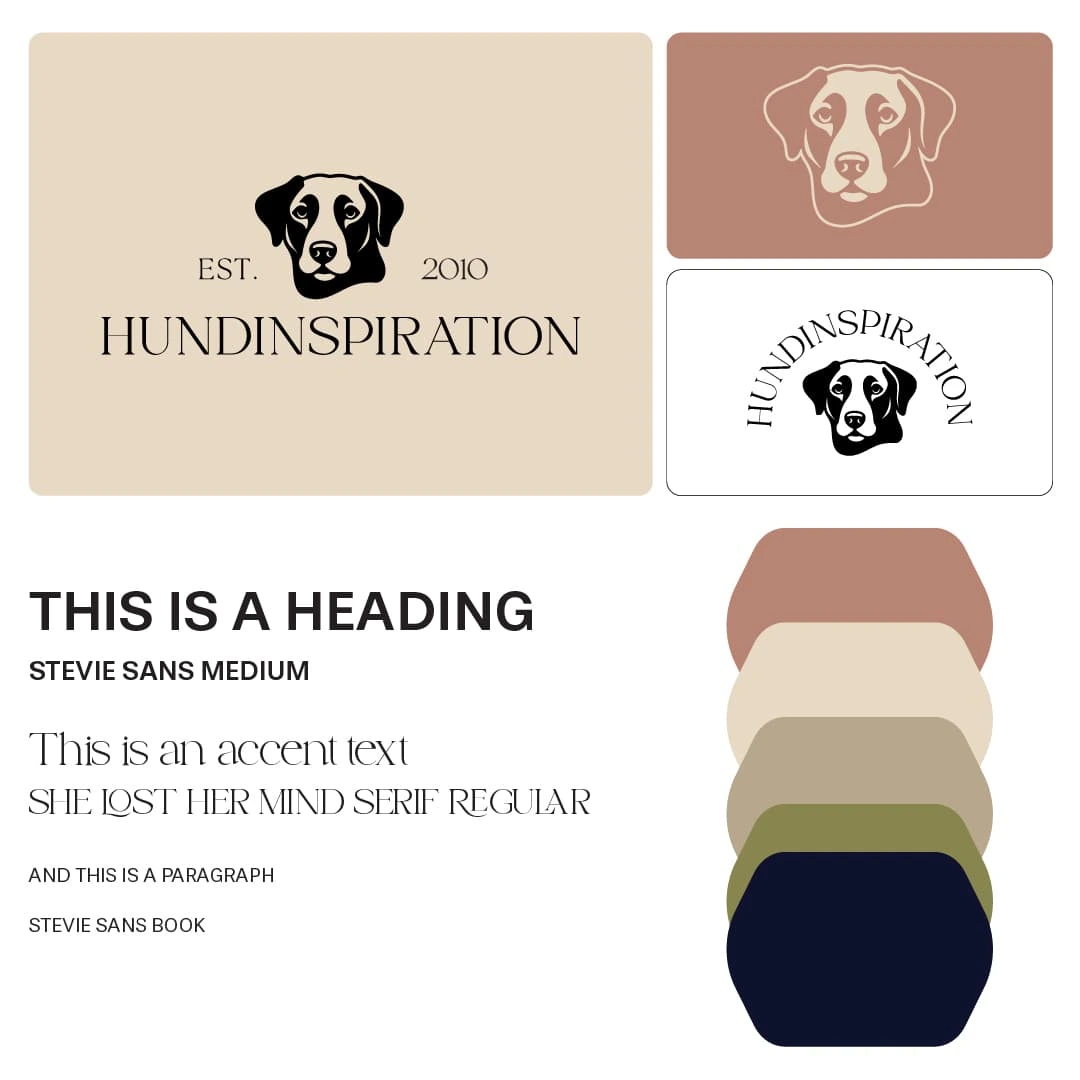
The new brand
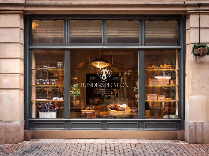
To help my client visualise their brand I also presented to them a few mockups related to their kind of business.
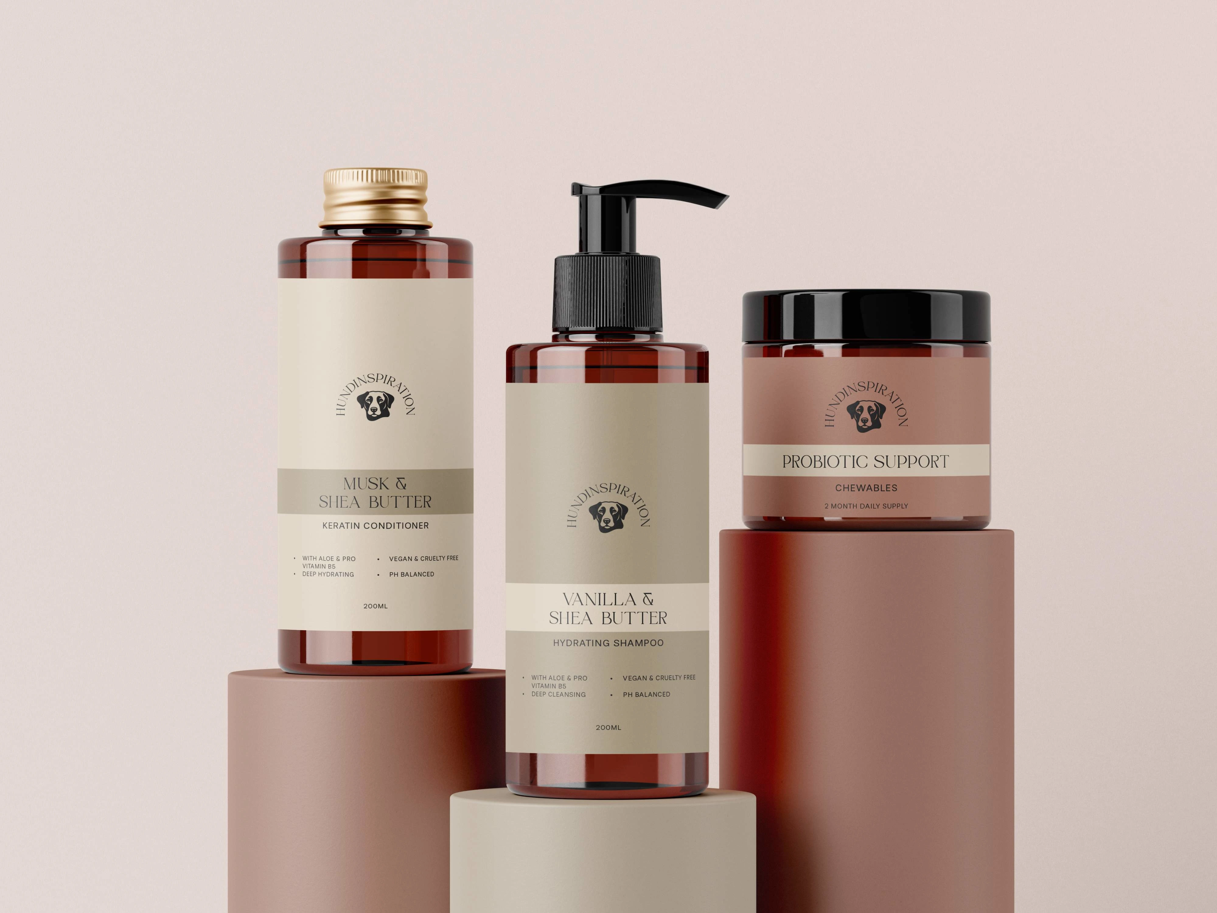
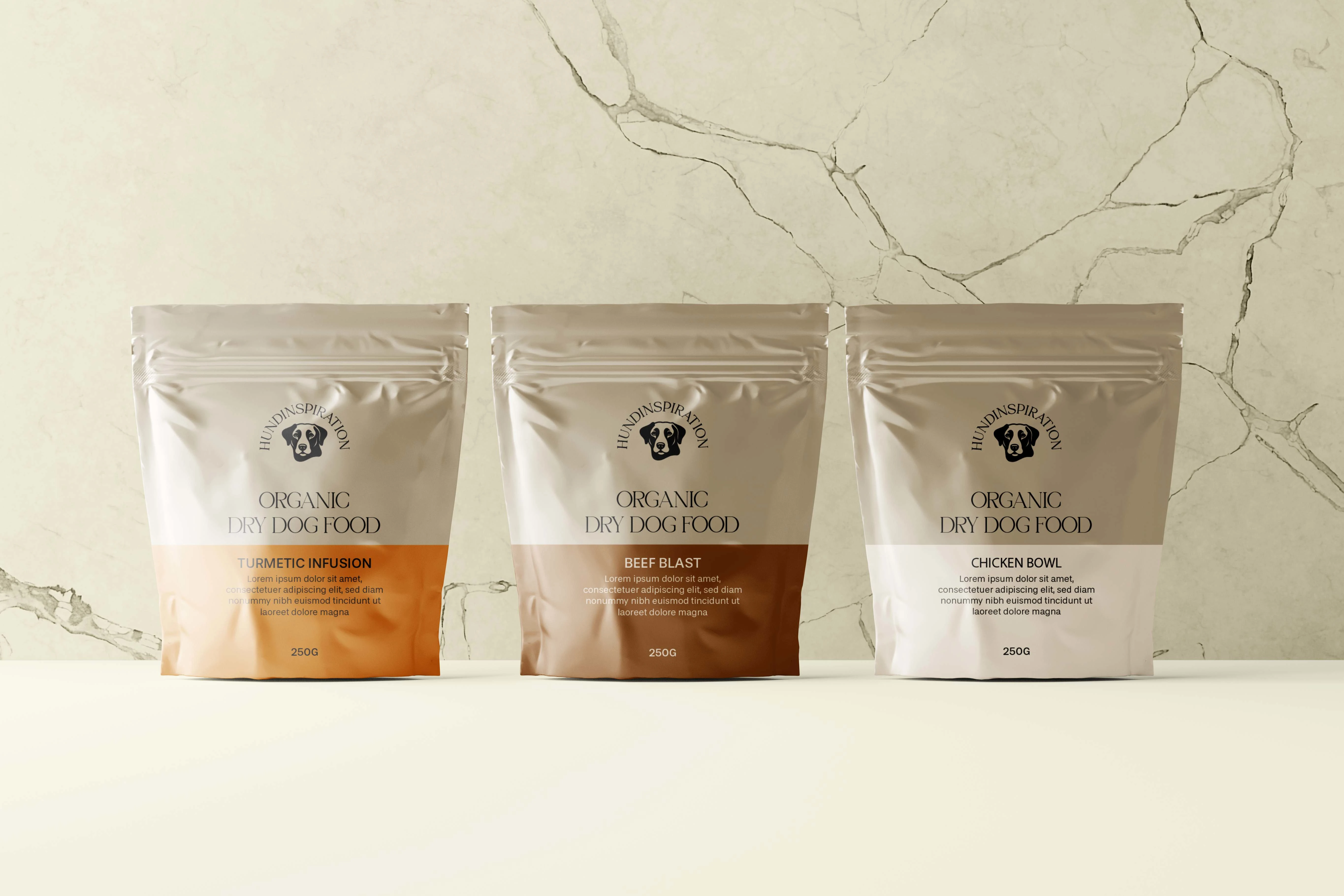
The client absolutely loves their new brand and their big relaunch was a huge success.
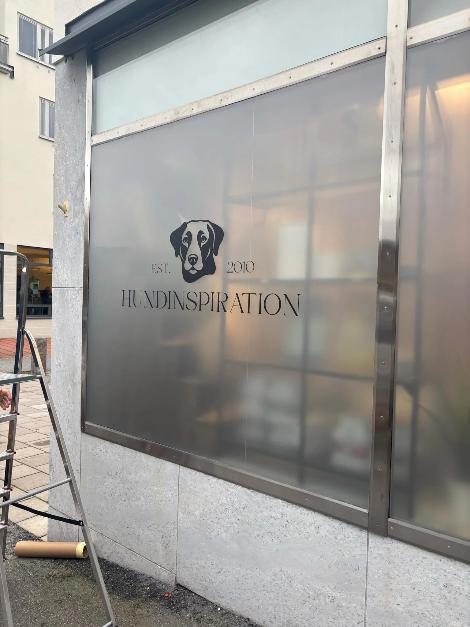
This is the new store window with the new logo
Like this project
Posted Nov 4, 2024
I redesigned the brand's logo, added brand typography and colour palette. I also put together the brand's mission and overall direction.
Likes
0
Views
7