Cardboard's Website Redesign

Hardi Kamlesh


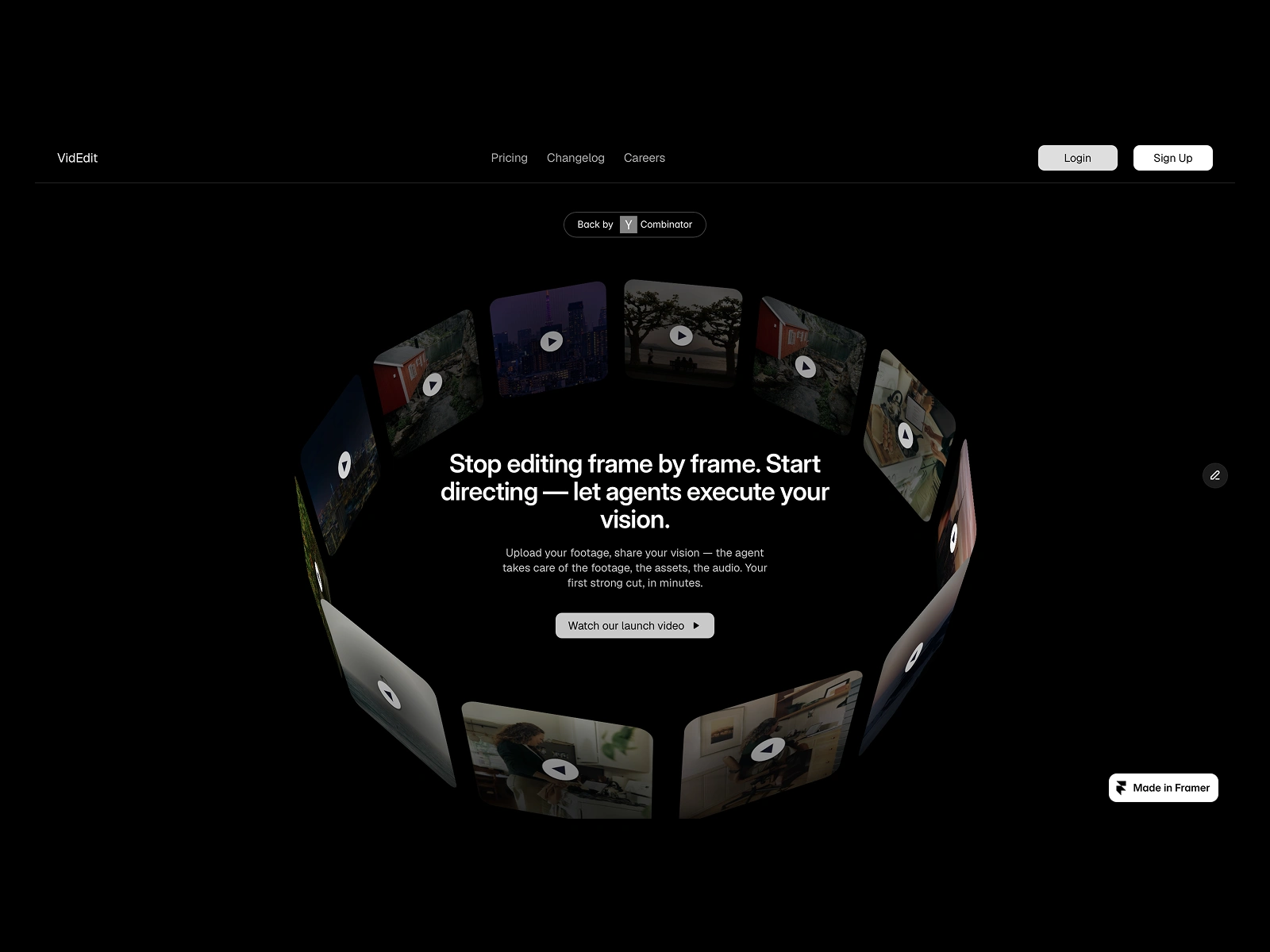
Cardboard (a YC company) website redesign project
Link of the website & Timeline: 3 days
The idea was to keep the colors dark (black & white) as the only pop of color (which eventually draws eyes - I wanted that to be videos. So when you take a look at the website in the hero section itself - you are taken in my the animation and the second thing which draws your eyes is the circular motion (which actually represents the logo design. So that is how the idea of replicating the logo in this style came to me in the first place.
I believe a person should be able to tell 3-4 lines about what a website does (after they have had glanced the website) and in those 3-4 things if a person is able to tell what the company does? USP. One should be able to answer 5W & 1H questions. And a visitor of the website is able to even answer 3-4 answers from 6 questions. We (as designers) have done a great job, I believe it.
👇 Below is the full video footage of the full experience of the website.
Video footage of the website
A video of the full experience of the website on desktop
Here are a few screenshots from website
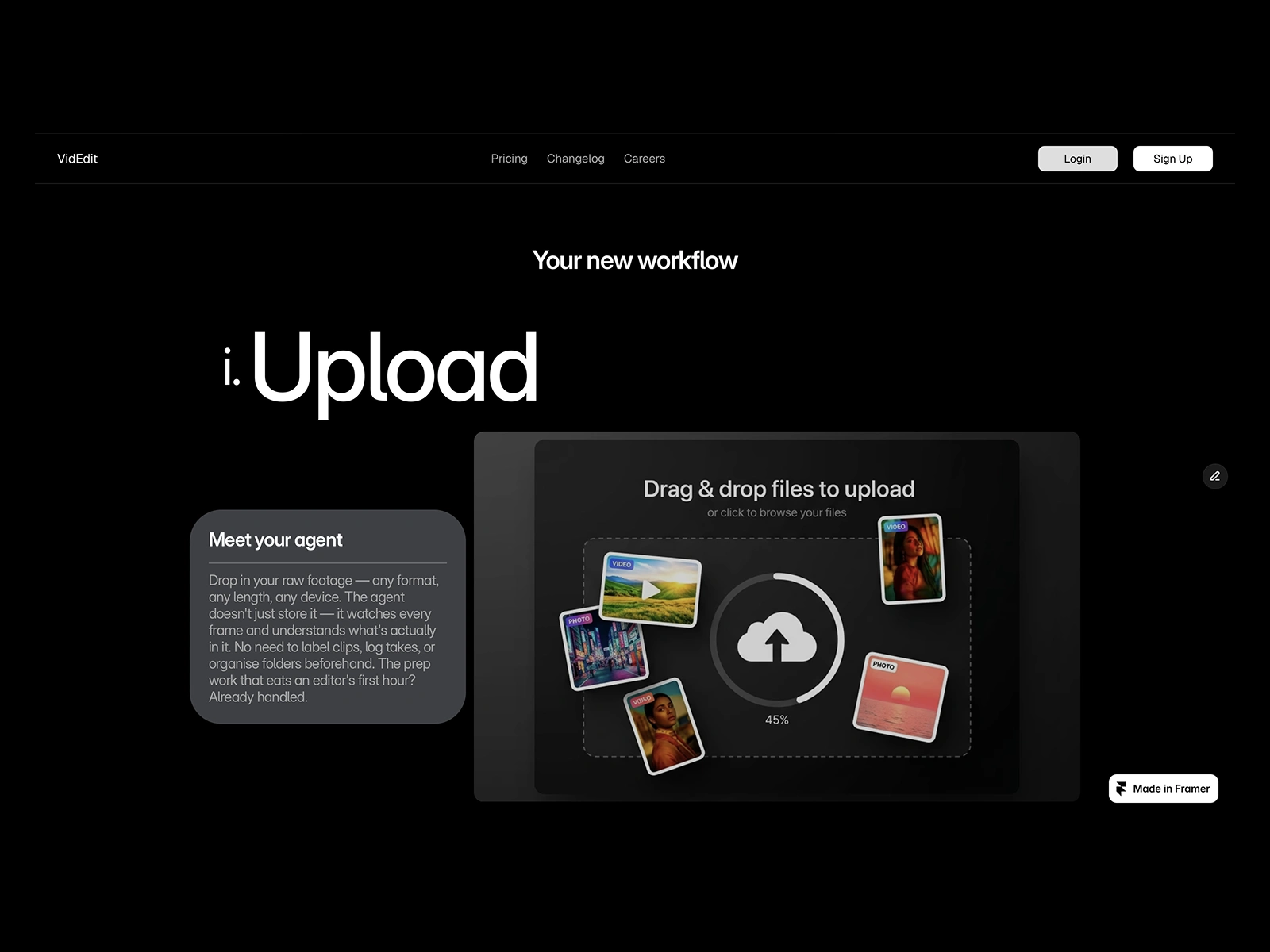
The breakdown of how to achieve goal - 3 simple steps mentioned & explained with copy & images
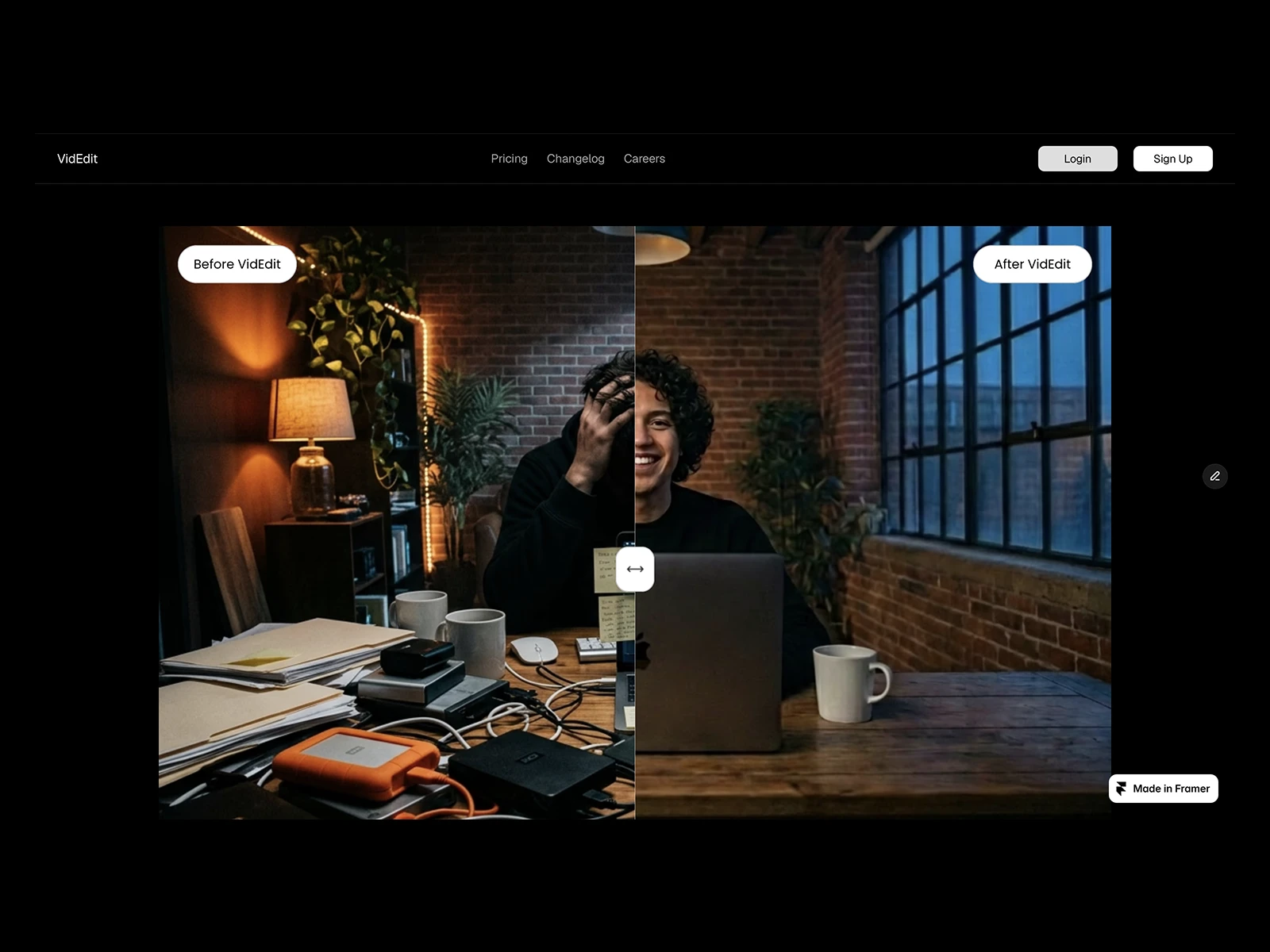
Before & after
This is the before & after effect - as it helps a visitor of the website image this reality & what will their state of mind, workload when they take the help of the our product. I believe the before & after image helps a person visualize their pain points & may be they can think of trying this product out. Alteast, give it a chance.
And then comes "different aspects rations for different apps & experiences.
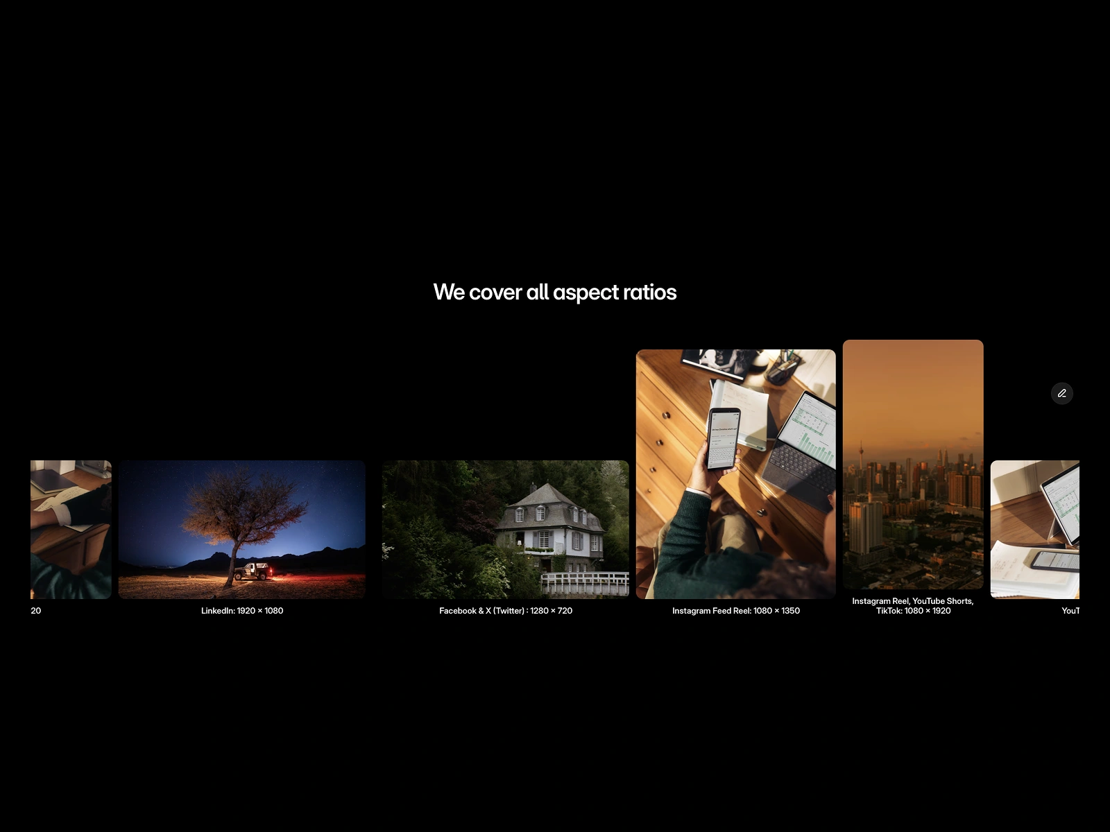
Video editing for all devices & different social media app requirements
Experience the website for yourself in your device. Trust me, you won't regret the decision. Link for the website
Here is the some behind the screens (strategy part) - thinking which one does as a method actor.
🎯The approach:
My approach to go about designing this project was to cater to the needs of the business & the users. Agentic video editor is a new concept - it might take explanation for people to understand it. On the other hand, people are generating copy using AI tools. So once that parallel is drawn - it becomes easy for people to understand it.
The sections one after another is explaining all the questions which might rise when you are introduced to the concept for the first time. Does it cover different accept ratio? What are the steps? What can it actually achieve it? can it compress it? can it create a montage? can it take my commands & work as I say?
The core idea of the website is to make lay out the concept, steps to achieve the desired result, and take off your world & give me mental peace. As a web designer, we are trying to pique the users interests & asking them to give the product a try.
Then the product speaks.
❤️My design process:
The goal was to tell the story - I have a set of questions which I ask & write down all the answers. Those questions gives an insight of users base, business, Industry, competitors, Industry standards, etc.
Once I have answers of those questions. Then I take pen & paper & try to strategize the story. Then comes copy - different sections starts taking up shape. And loose wireframes are ready.
Only then I touch my gadgets & try it implement those wireframes on Framer. Then animations, copy, images, colors, layouts - all these decisions are taken for each sections. And that is how the website takes up shape. And once I am happy with the final results. To show it to the client - I make it responsive in all the devices.
📔The Outcome:
From before & after one thing is clear. There is a big gap one has closed when it comes to narrating story. I showed it to 15 user base for research purpose. Out of those 15 user group. 5 were full-time editors, 5 were content creators & 5 were students in college & university.
Average NPS was 8 points.
Thanks a ton for sharing your valuable time on my work 🫶
Like this project
Posted Jul 10, 2026
Redesigned Cardboard's website with a focus on dark colors and engaging animations.