MusicPlayer: Pocket Nostalgia, Modern Control - case study
Alex Tatu
Project
Designed for:
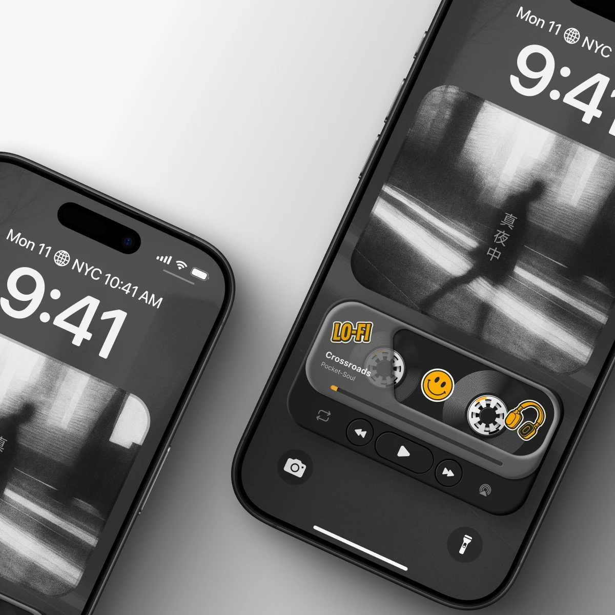
• Home Screen widget / in-app mini player (widget-like surface)
• Dynamic Island “Now Playing” concept (compact playback + quick controls)
Goal: Bring emotion, “product feel,” and a small ritual back into music playback—through a compact component that fits modern mobile behavior (glanceable, quick, always available), without sacrificing clarity or usability.
My role:
Concept & art direction
UX/UI design (layout, hierarchy, states)
Visual design (materials, depth, typography)
Iteration & refinement (variants, balance between retro + modern)
Tools used:
• Figma - UI design, vector work, prototyping
• ChatGPT - generating vintage-style sticker copy/ideas
• Jitter - motion refinement and loop exploration
Why I made it?
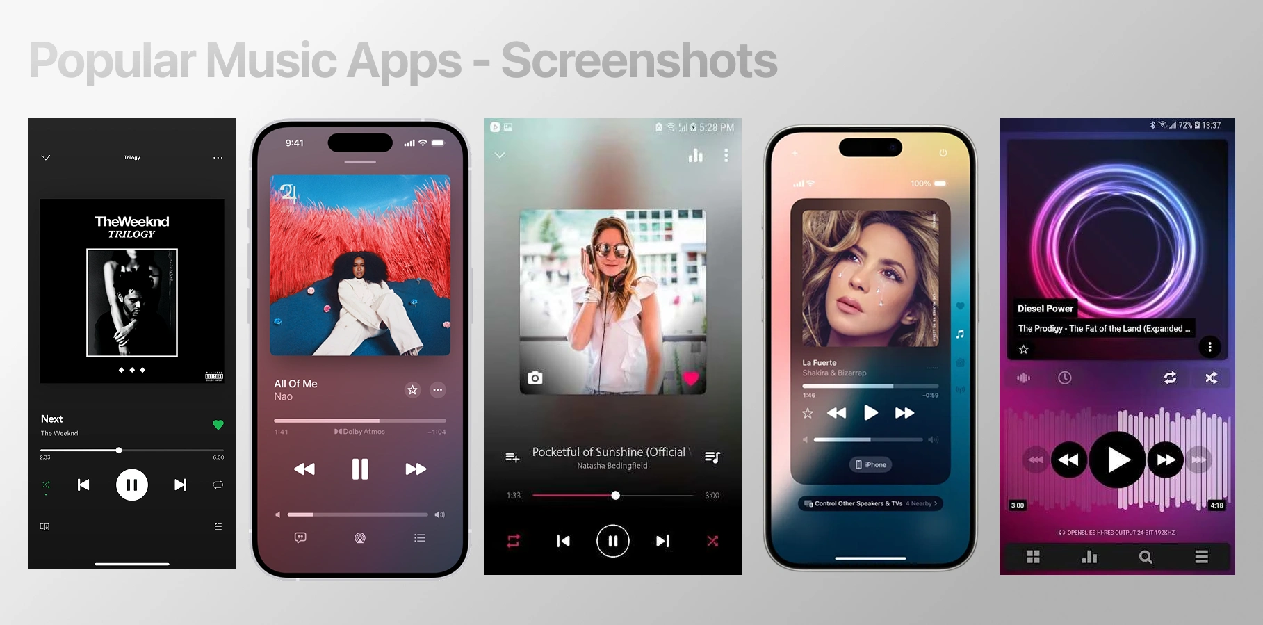
Most music players are efficient, but visually and emotionally interchangeable - especially in the “mini player” moments where you interact the most. I wanted to explore what happens when that mini player becomes a designed object: compact, tactile, and memorable - built for quick mobile interactions like widgets and Dynamic Island.
The trigger
I realized the part of music apps I touch the most isn’t the full-screen player—it’s the mini player: the quick “now playing” surface you tap dozens of times a day. And in most apps, that surface is functional but emotionally blank.
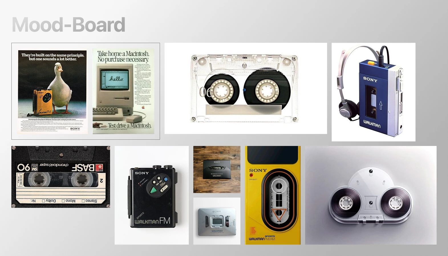
At the same time, I kept thinking about why devices like the Walkman felt so satisfying: they had character, tactile controls, and a small sense of ritual every time you pressed play.
That contrast sparked the concept:
What if the modern mini player - widgets and Dynamic Island - could feel like a real object again: compact, tactile, and expressive, while staying glanceable and fast?
Design goals
Glanceable first
Make the widget readable in under a second: track info, play state, and progress should be instantly clear.
Fast, one-thumb control
Core actions (play/pause, next/prev) must be effortless and reliable - built for quick taps, not deep navigation.
Tactile “object” feeling
Design the mini player like a small physical product: pressable controls, depth, material cues, and satisfying feedback.
Walkman DNA, modern execution
Translate the nostalgia into a clean, contemporary UI language - no heavy retro imitation, just recognizable emotional cues.
Works across surfaces
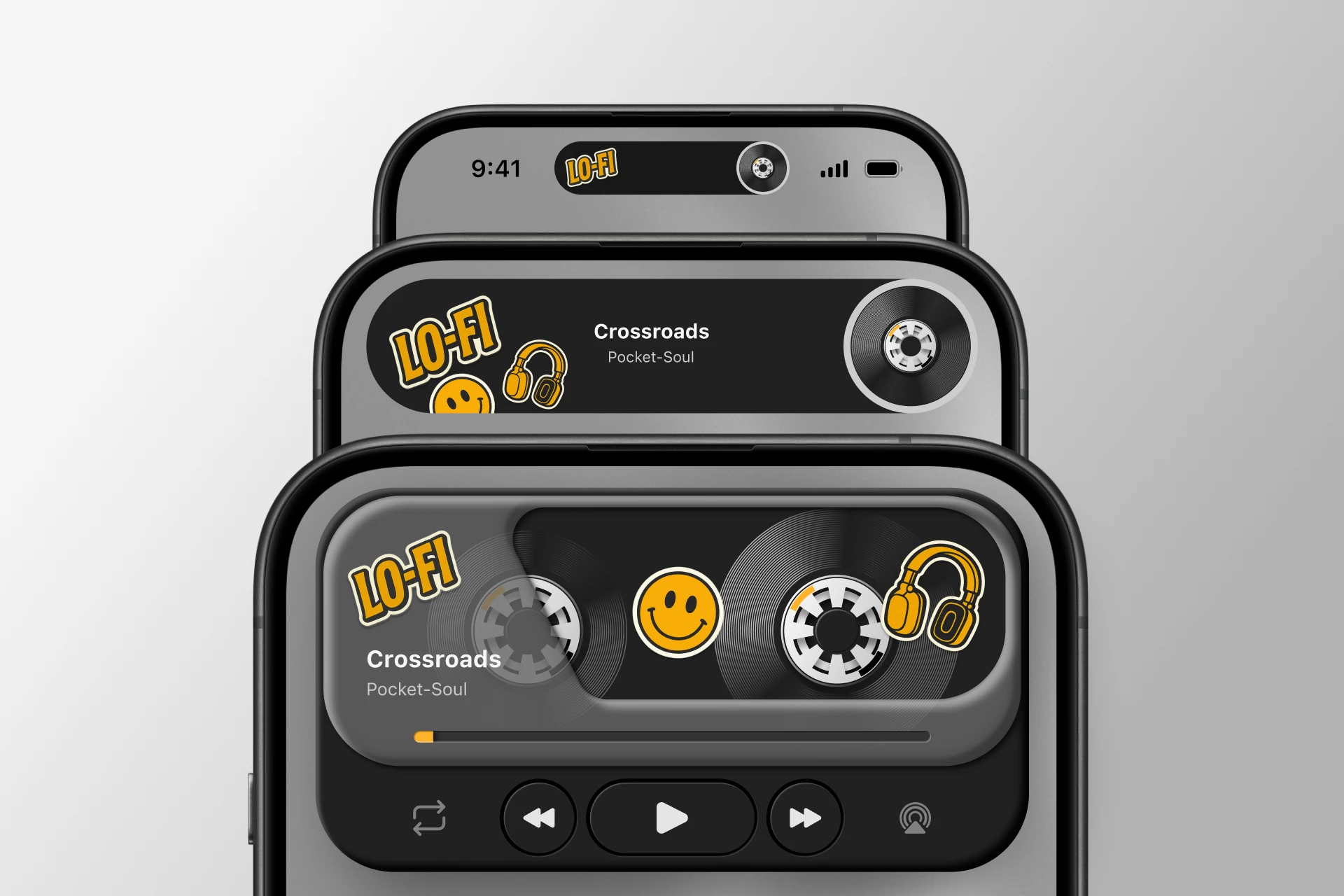
Create a system that can live in multiple sizes: widget-like mini player, larger expanded state, and a compact Dynamic Island version.
Delight without noise
Add personality through subtle micro-interactions (reels, press depth, sticker details), but keep it calm and usable, not gimmicky.
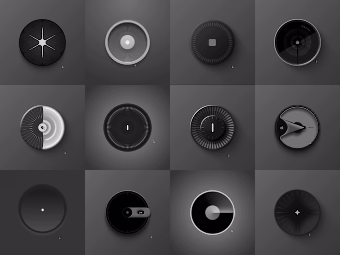
Core direction
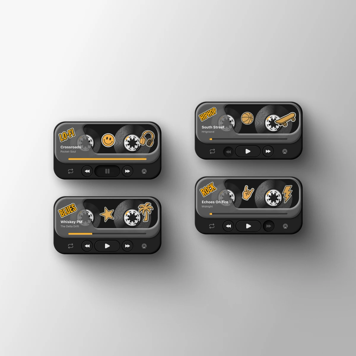
A compact “music object” rather than a full app screen
Cassette-inspired center as the emotional focal point
Transport controls that feel physical and satisfying to press
Modern layout discipline (clean hierarchy, readable type, limited actions)
Designed to live in multiple sizes
Widget / mini player surface: the main “object” view with identity and tactility
Expanded state (larger widget / in-app): more breathing room for progress + metadata
Dynamic Island version: reduced to essentials while preserving the same personality through shape, motion, and icon rhythm
Key design decisions
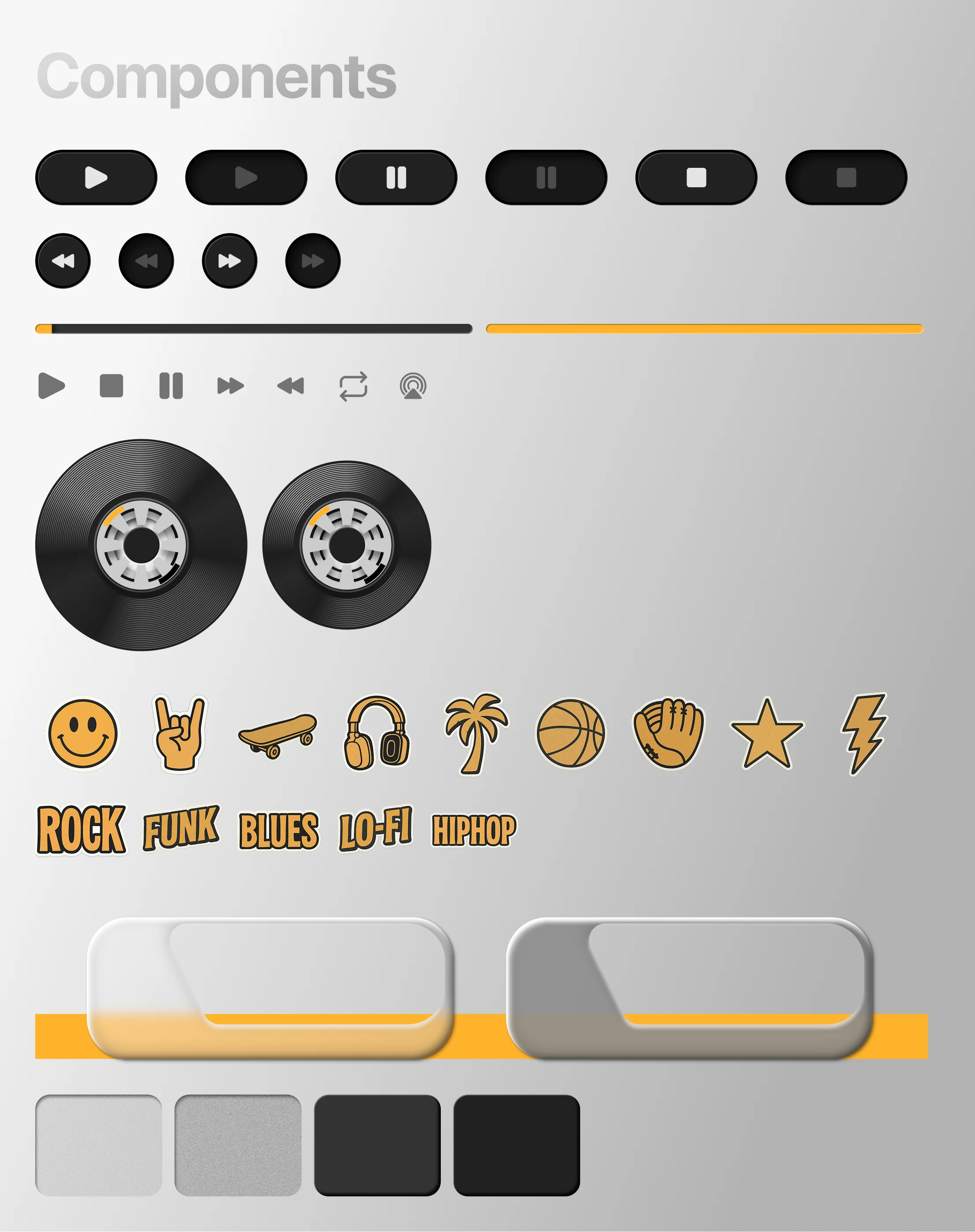
Keep actions minimal: play/pause + next/prev + progress (no feature overload)
Let the cassette carry emotion: motion + form create the “ritual”
Use stickers as character accents: fun, nostalgic cues without hurting clarity
Balance retro + modern: enough warmth to feel unique, enough restraint to feel current
What this direction solved
It turns the most-used playback surface (mini player / Dynamic Island) into something memorable—while still being fast, glanceable, and mobile-native.
Interaction design (how it behaves)
Because this is a widget-first concept, the interaction model is intentionally simple: fast taps, clear states, minimal friction.
Primary actions
Play / Pause: biggest, most reachable control (thumb-first)
Next / Previous: secondary controls with clear press zones
Progress: visible at a glance; supports quick awareness of where you are in the track
Widget interaction principles
One-tap success: every control is designed to be hit reliably (spacing, size, separation)
State clarity: the UI always communicates whether it’s playing, paused, or idle
Feedback loops: button press depth + subtle motion reinforce that the action was registered
Dynamic Island behavior (concept)
Compact state: shows the essentials (now playing + play state)
Expanded state: quick controls become accessible without opening the app
Motion cue: subtle cassette/reel-like movement to signal playback without distracting
What I learned
The most-used music surface is the glance layer (widget / mini player / Dynamic Island) - and that’s exactly where emotion is usually missing.
Nostalgia works best when it’s translated into principles (tactility, labels, motion, constraints), not copied literally.
A strong “product feel” comes from small details: spacing, depth, press feedback, and motion discipline - not from adding more features.
What I’d test next
5-user quick test (15–20 min each): can users instantly understand controls and state at a glance?
Preference test between 2–3 variants: which feels most “tactile” and premium, without hurting clarity?
Tap accuracy check: do people reliably hit play/next/prev at widget size (thumb test)?
Motion comfort: does reel/loop animation feel delightful or distracting over time?
It’s a reminder that even the smallest UI surfaces - like widgets and Dynamic Island - can carry emotion, tactility, and character, and still stay fast, clear, and practical.
Like this project
Posted Jan 6, 2026
Developed an emotional and tactile music mini player design for quick mobile interactions.