Geometric Bird Marks
Bird Marks
Bird Marks – A Collection of Geometric Avian Logos
Overview
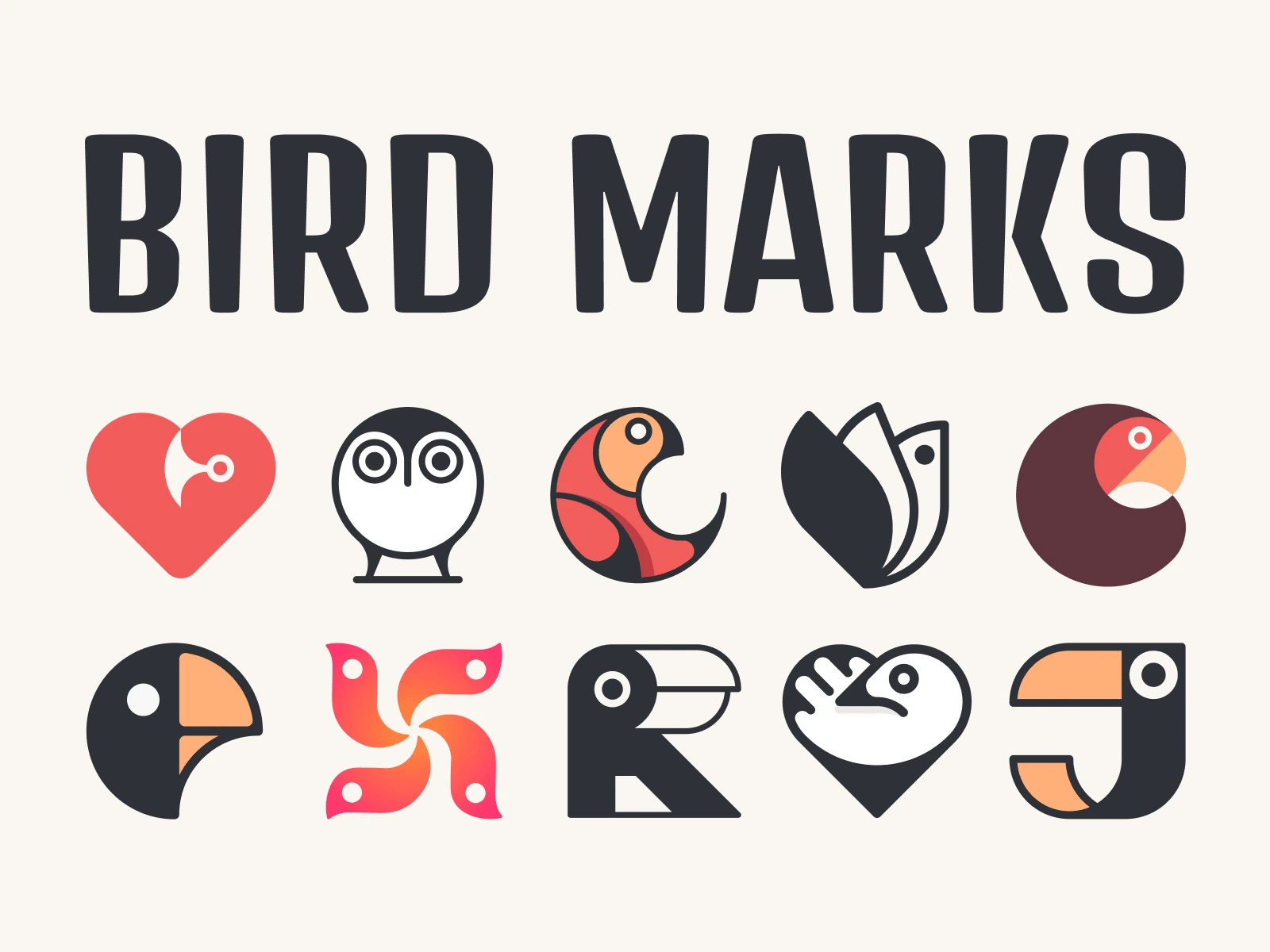
Over the years, I’ve designed a series of bird-inspired logo marks, blending geometric precision with minimalist aesthetics. Some of these were created for clients, while others were personal explorations in branding and iconography.
Design Approach
Concept & Style
Each mark captures the essence of a bird through a balance of clean lines, symmetry, and abstraction. The challenge was to create distinctive yet cohesive designs that remain recognizable at any scale.
Key Design Elements
Geometric Forms: Circles, curves, and sharp edges define the structure.
Minimalist Aesthetic: Simplified yet expressive representations of different bird species.
Clever Negative Space: Some marks incorporate hidden shapes to enhance meaning.
Versatility: Works well in both monochrome and color variations.
Exploration & Evolution
Throughout this collection, I experimented with:
✔ Different bird species (owls, toucans, parrots, abstract forms)
✔ Integrating birds with typography (letters & heart symbols)
✔ Using symmetry and asymmetry to create unique compositions
Final Outcome
This collection showcases a modern, timeless approach to bird-inspired branding. Whether for businesses, tech startups, or environmental brands, these marks maintain their boldness, adaptability, and elegance.
Let’s collaborate—if you need a custom logo, feel free to reach out! 🚀
Heart Parrot
Owl
Geo Parrot
Bird Wallet
C Parrot
Night Parrot
Fusion
R Parrot
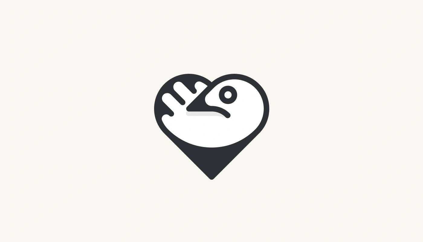
Heart Dove
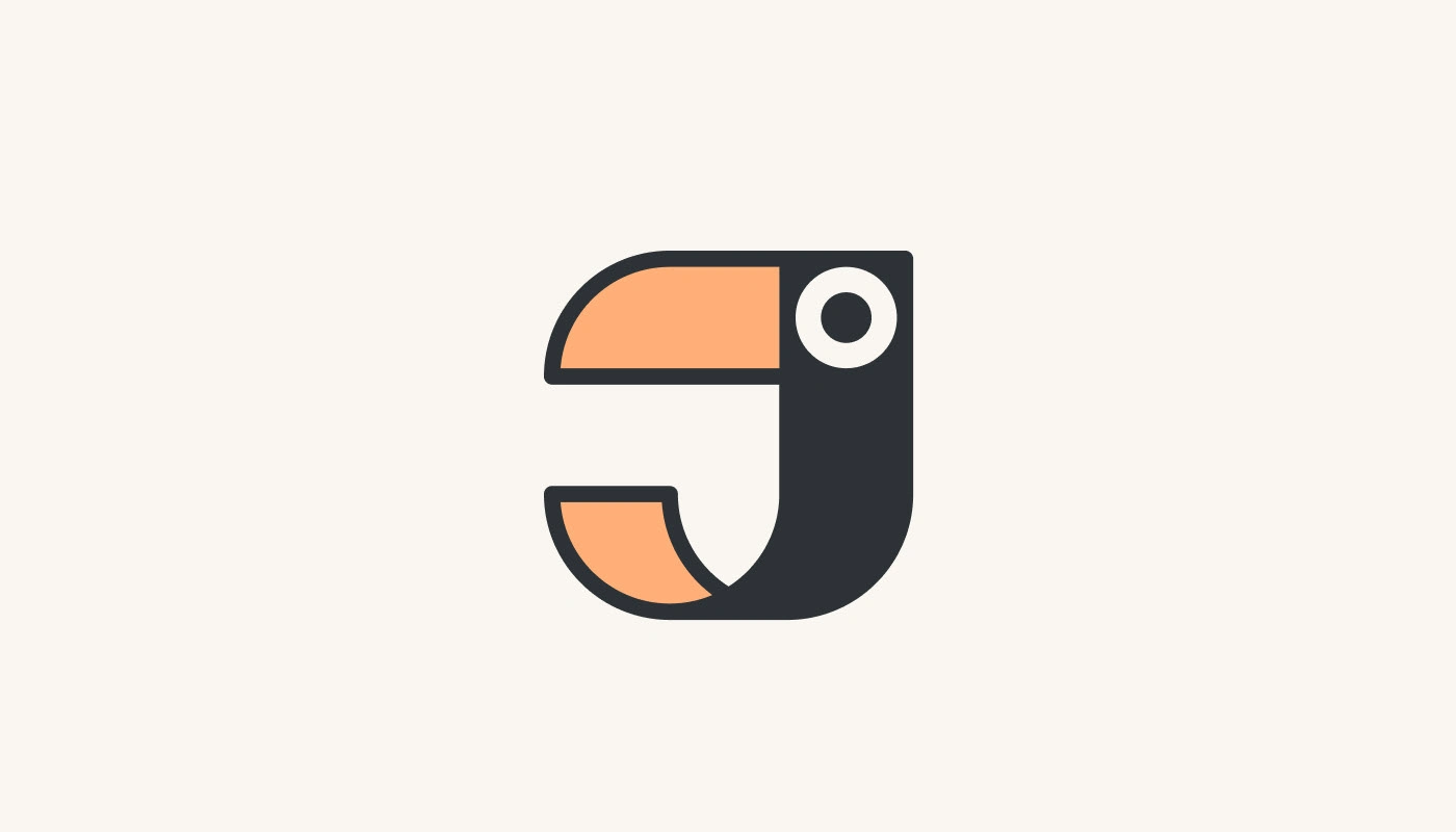
J Parrot
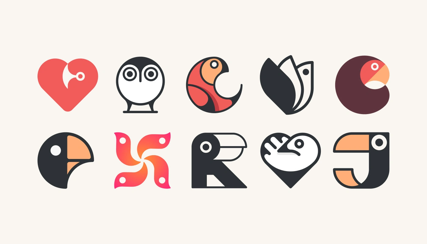
All
Like this project
Posted Nov 5, 2023
A collection of geometric bird-inspired logo marks, blending minimalism, symmetry, and clever negative space for bold and versatile brand identities.

