App Icons Collection
Nour Oumousse
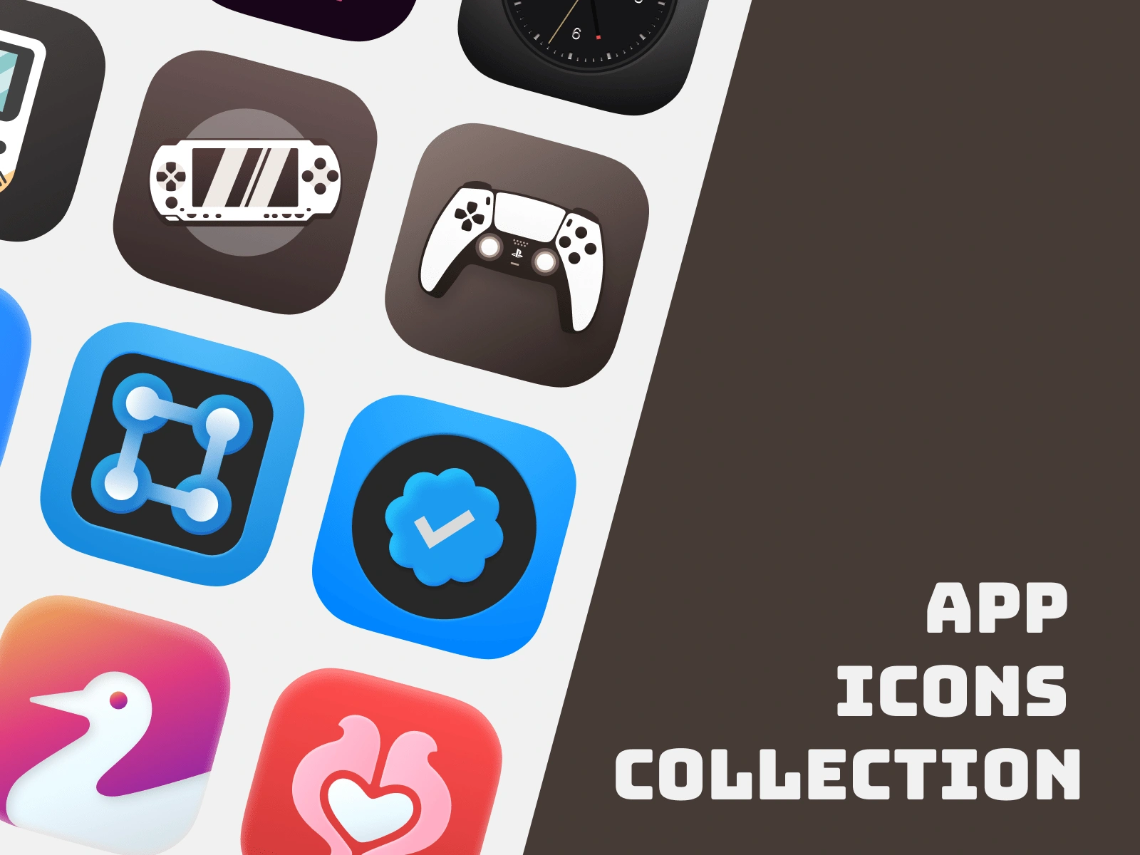


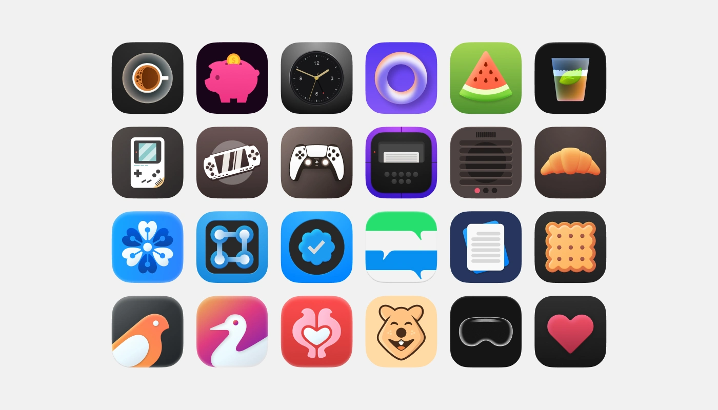
The full Collection
App Icon Collection
Project: Multi-year App Icon Design Collection
Purpose: Showcase design evolution and versatility in icon design
Project Overview
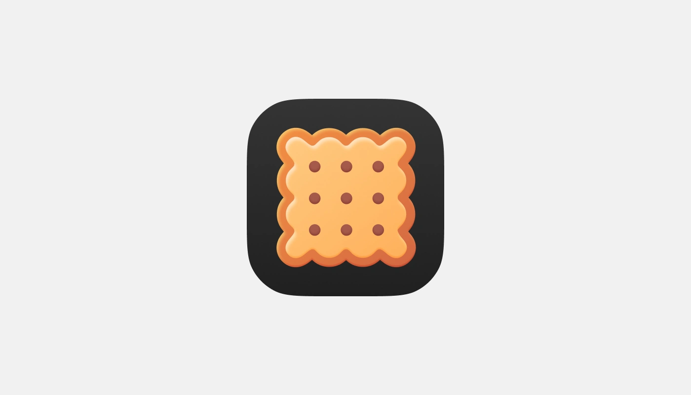
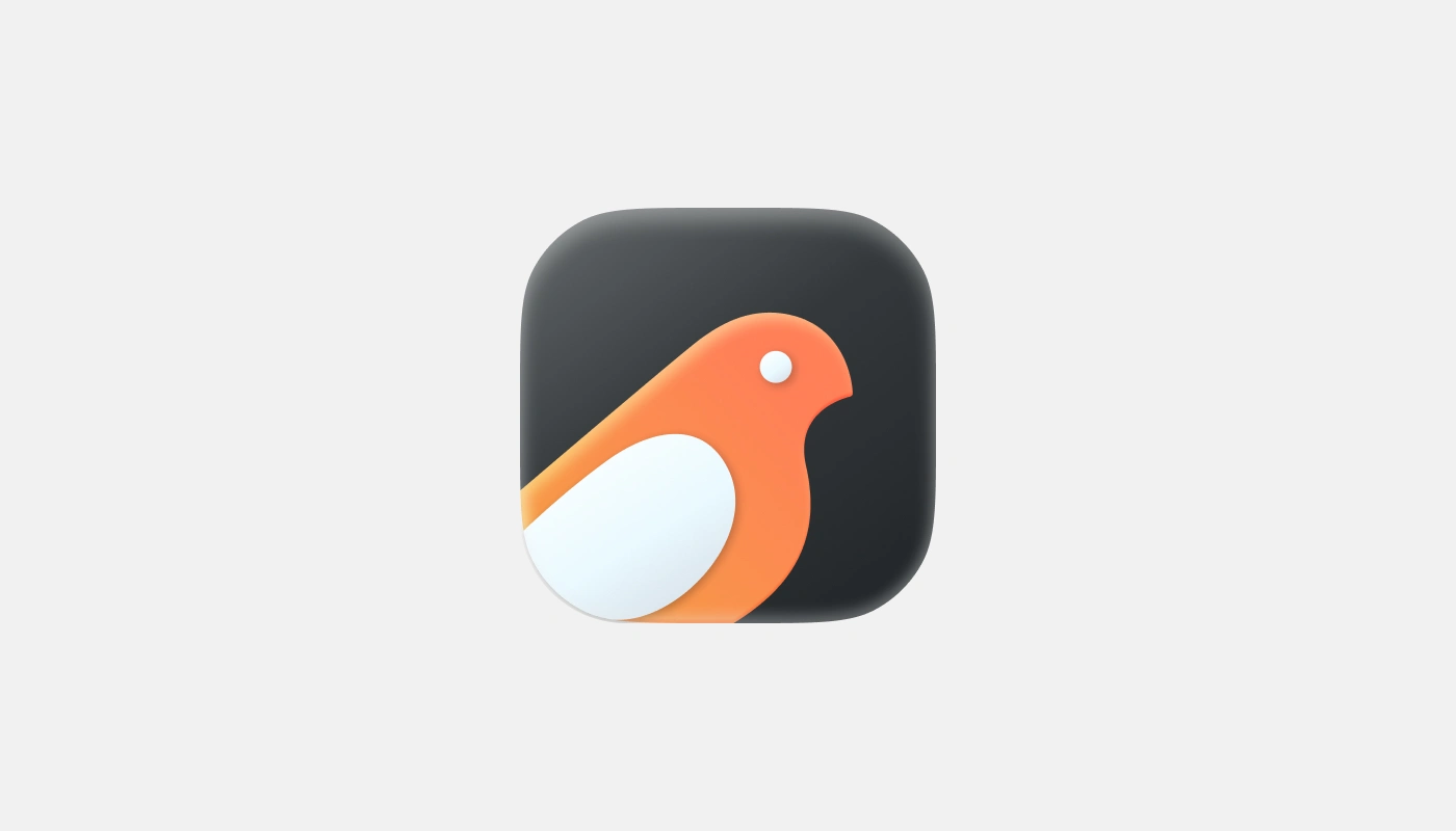
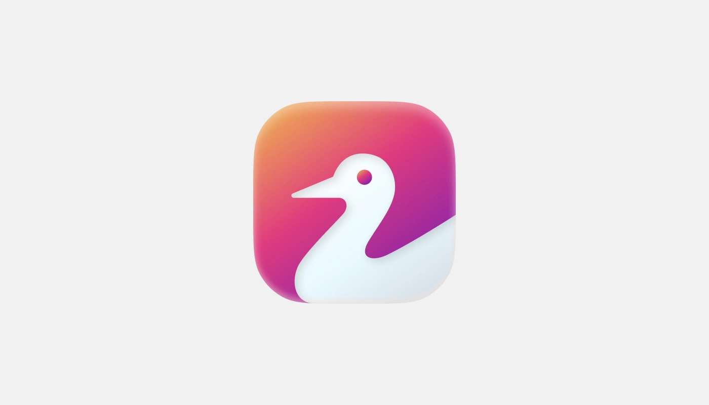
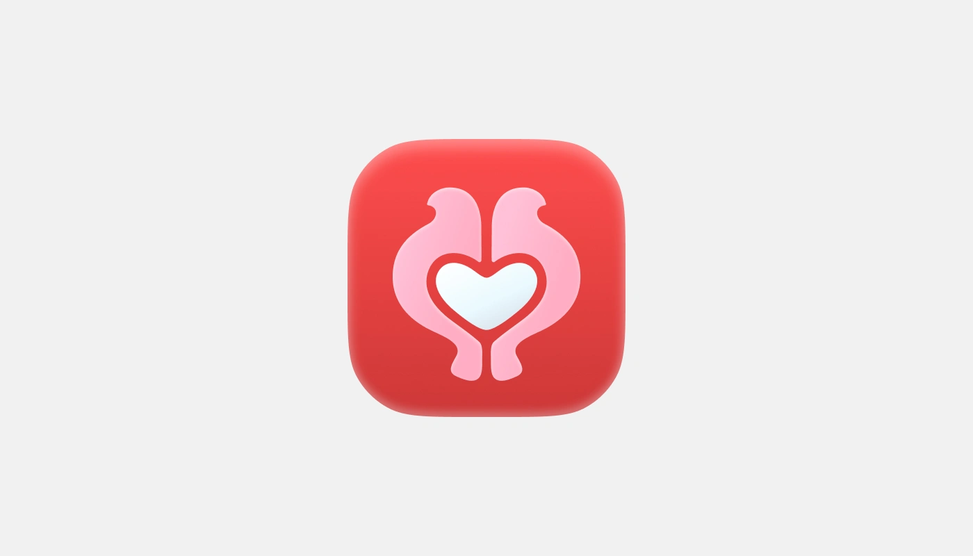
A diverse collection of 20 app icons created over several years, demonstrating range in style from flat design to dimensional illustrations across various app categories.
Design Process
Each icon follows a consistent rounded square format while exploring different visual concepts:
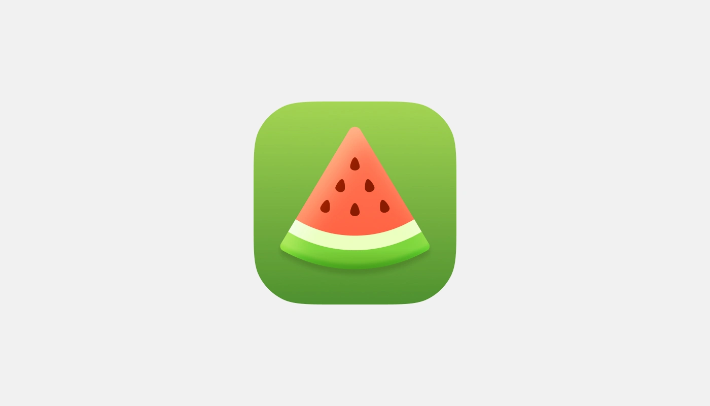
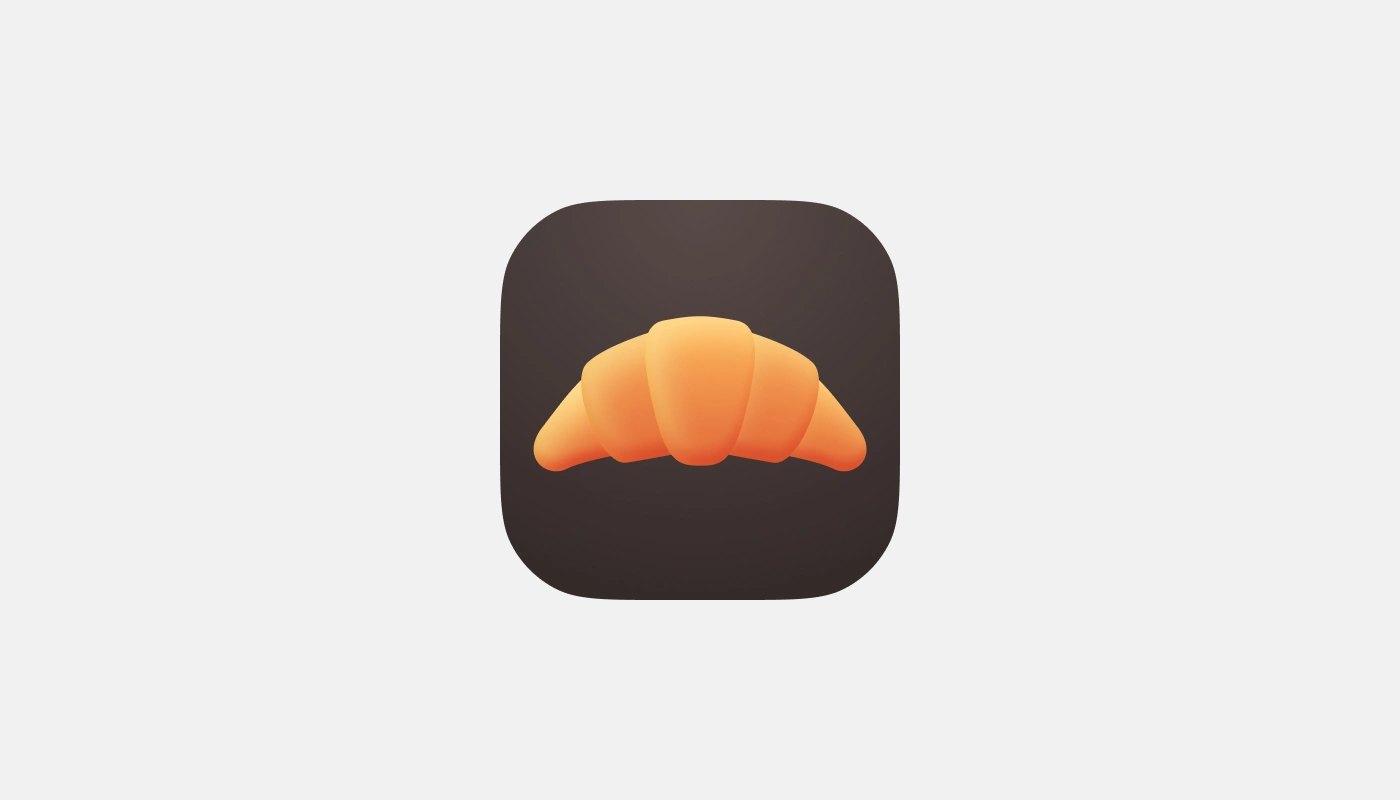
Lifestyle icons: Coffee cup, watermelon slice
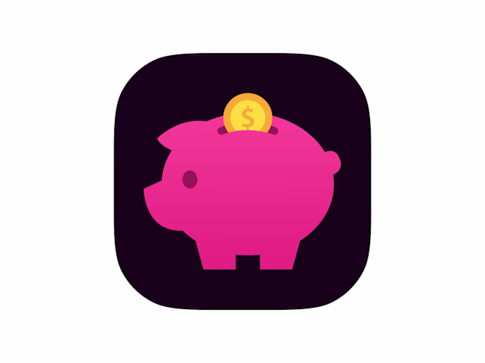
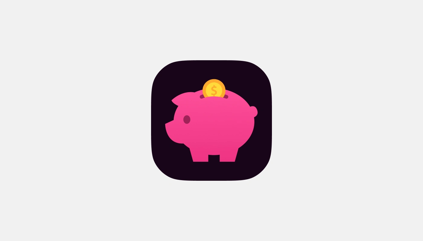
Finance tools: Piggy bank with coin
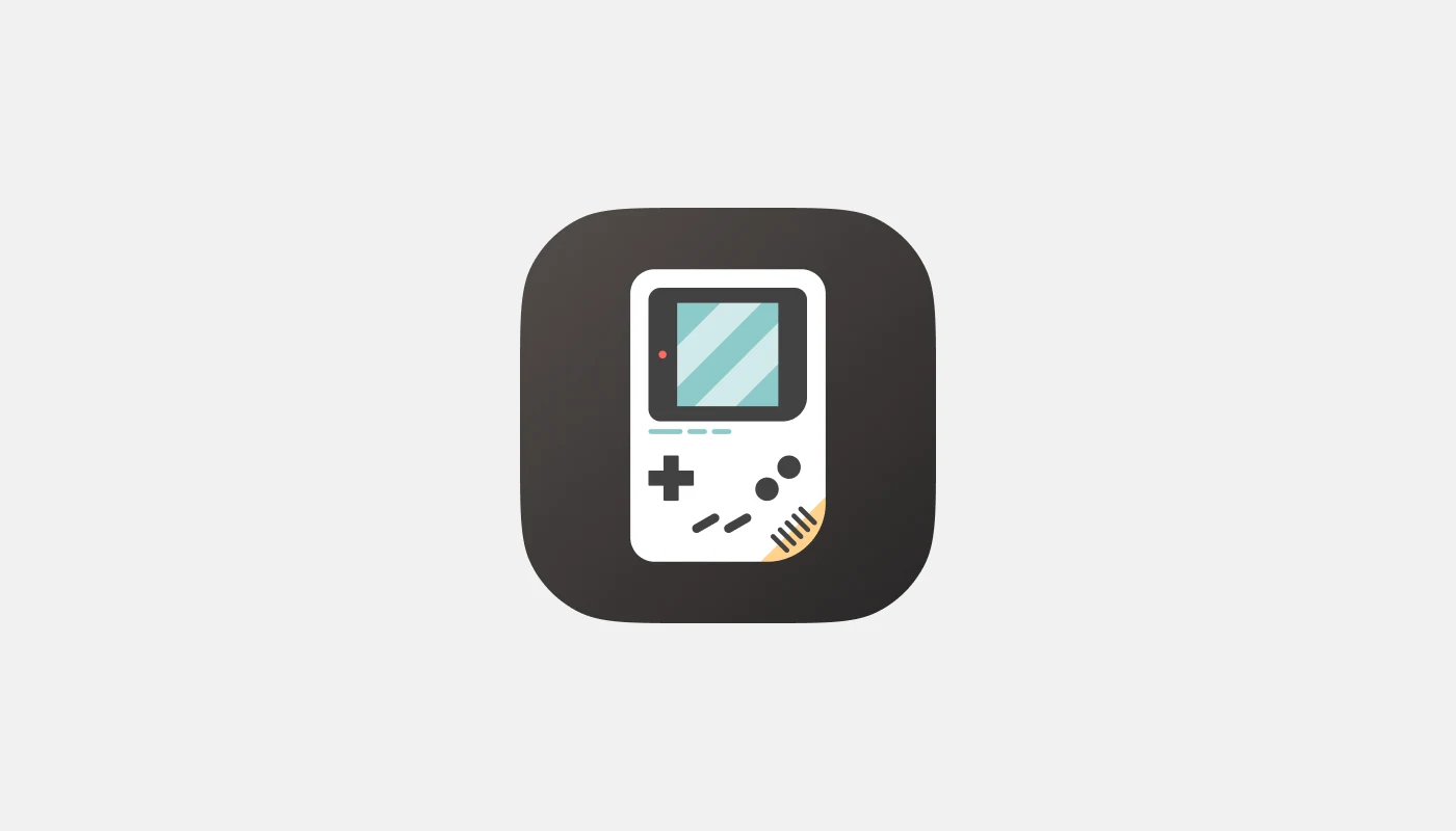
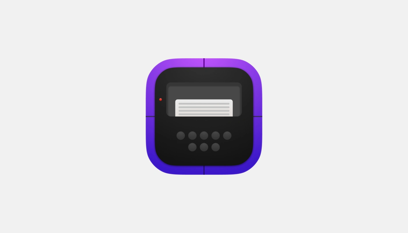
Gaming interfaces: GameBoy, PSP-style, PlayStation controller
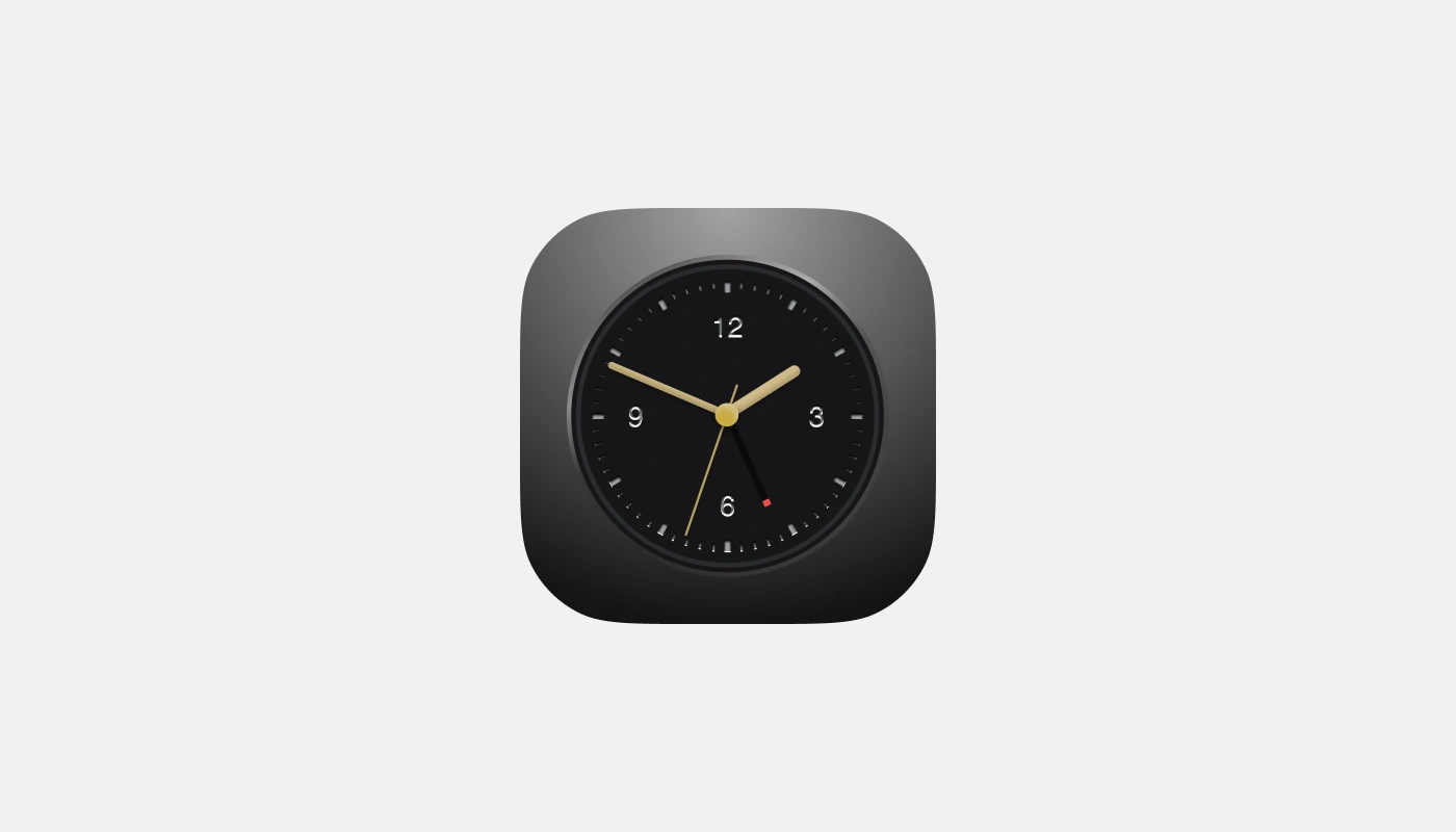
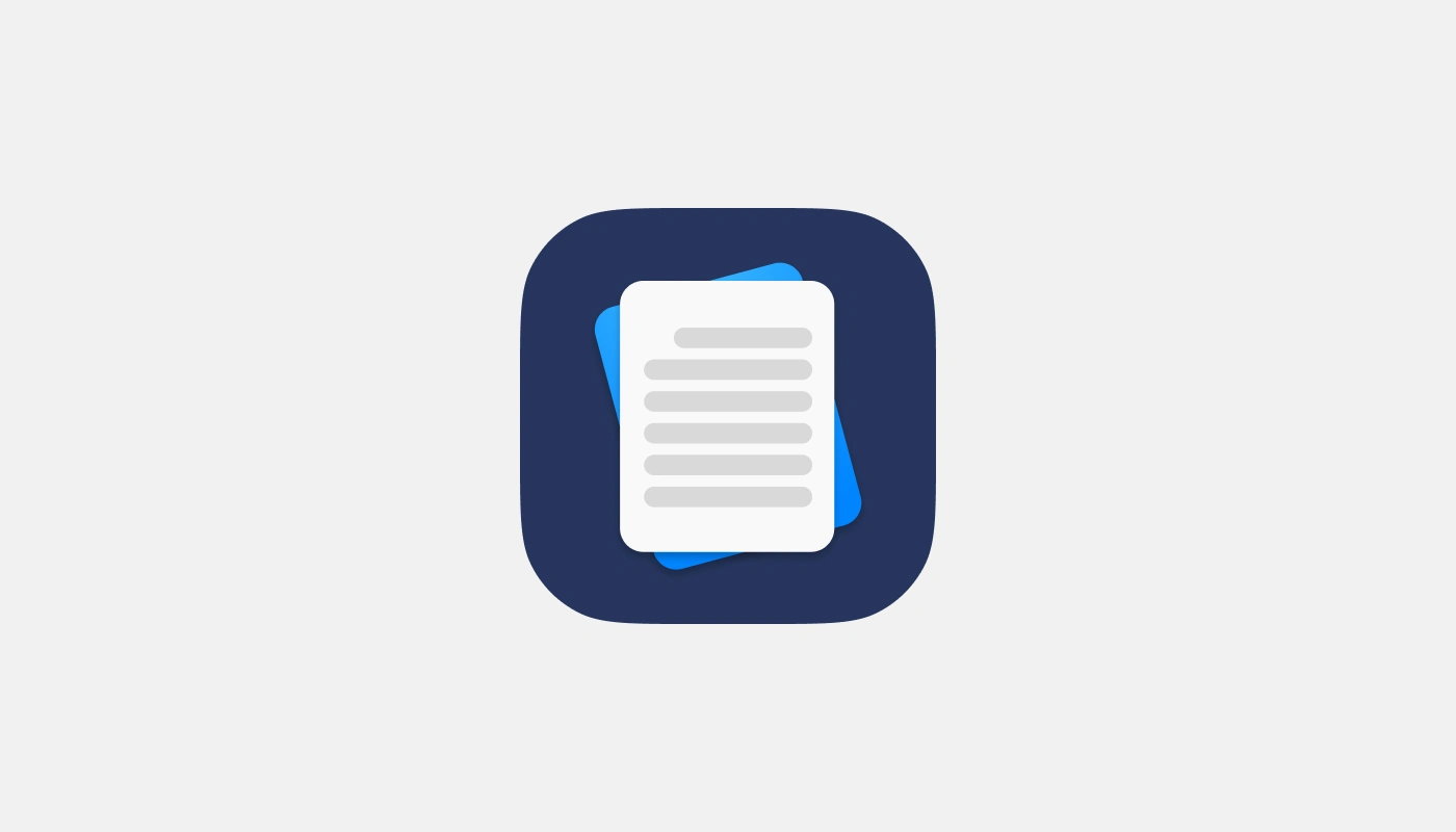
Productivity apps: Clock, document management, verification tools
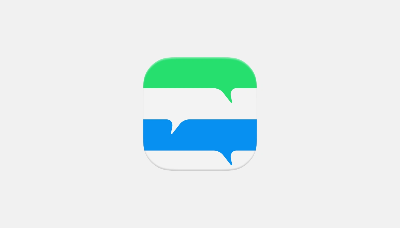
Communication tools: Messaging and social platforms
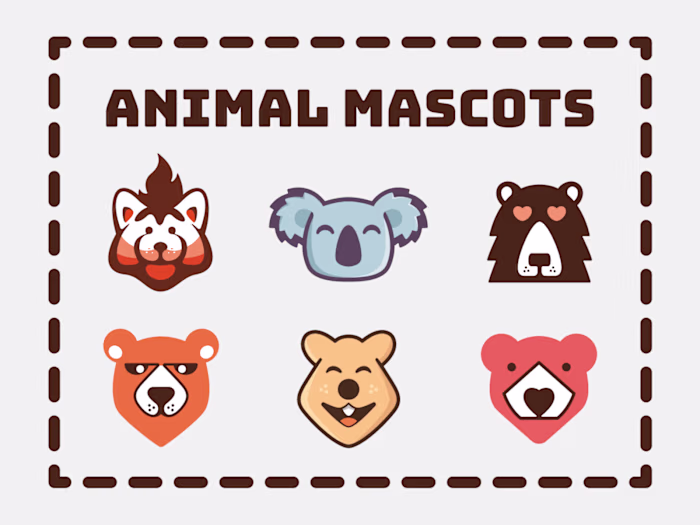
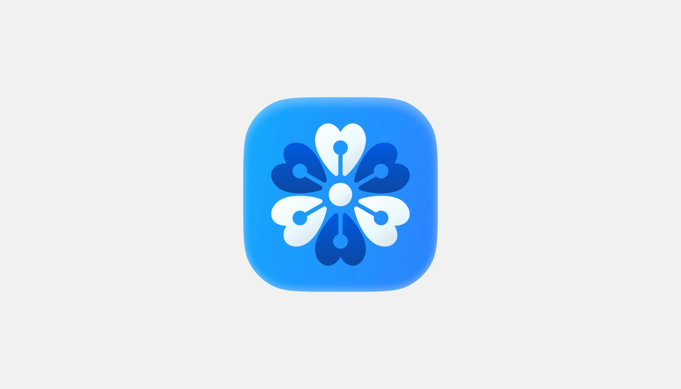
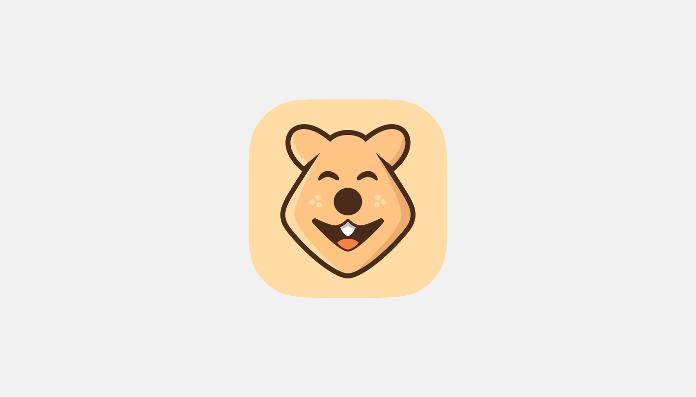
Character-based designs: Bear, bird, robot mascots
Design Elements
Consistently applied rounded corner containers
Strong color psychology (blues for trust, purples for creativity)
Mix of flat and dimensional approaches
Strategic use of shadows and highlights for depth
Simplified illustrations that remain recognizable at small sizes
Challenges & Solutions
Challenge: Creating distinctive icons in saturated app categories
Solution: Used bold color contrasts and unique illustrative elements to stand out
Challenge: Balancing artistic expression with functional recognition
Solution: Maintained clear silhouettes while adding personality through details
Results
The collection demonstrates technical growth and stylistic versatility while maintaining fundamental design principles of balance, recognition, and visual hierarchy.
Key Takeaways
Consistent formatting creates cohesion across diverse styles
Color strategy significantly impacts user perception
Effective icons balance simplicity with distinctive personality
Design language can evolve while maintaining recognizable branding
Check it on Behance
Like this project
Posted Mar 22, 2025
An app icon collection made of various icons I made over the years on different approaches and fields.
Likes
1
Views
7