
Sugarad is a digital agency that helps businesses improve their return on investment. The agency needed a brand identity that looked modern and trustworthy, and that showed its focus on data and results. I created the complete visual identity: logo, color palette, typography, app icon, and a full set of print, digital, and outdoor applications.
The Challenge
Digital agencies often look alike, with generic gradients and stock imagery. Sugarad needed to stand out and also show that its work is measurable. The brand had to feel creative and data-driven at the same time, and it had to work everywhere from a small app icon to a large billboard.
The Idea
The core idea is in the tagline, “See your growth differently.” The logo is an “S” built from small triangles. Each triangle stands for a single data point, and together they form one clear shape. The triangles point up and down, like a growth chart rising and dipping.

Triangle Logo Construction Grid: Sugarad Brand Identity
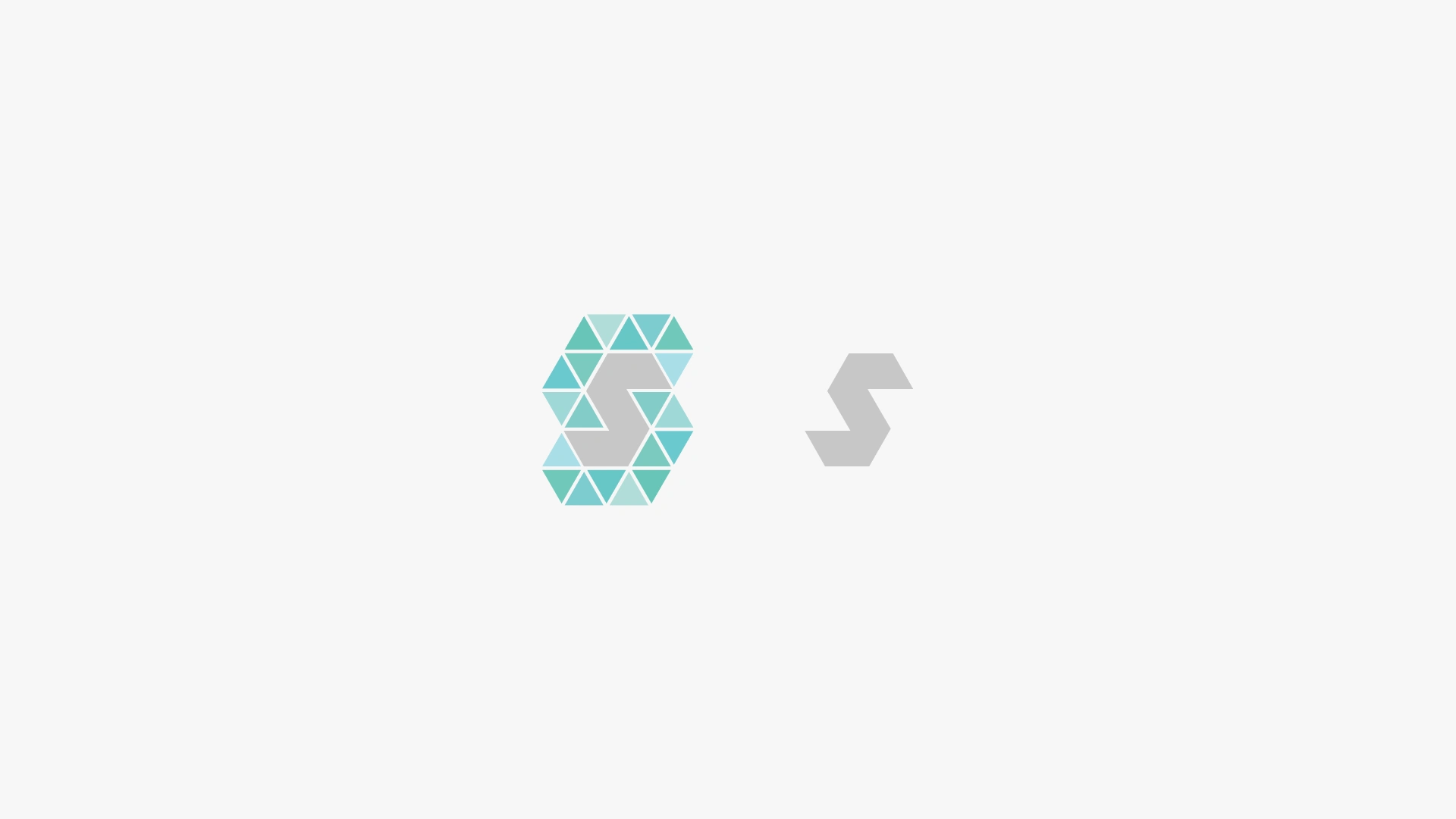
Sugarad “S” Monogram and Logo Mark Design
Colour Palette
I chose a fresh mint and aqua palette with a deep charcoal for contrast:
Mint Teal
#8DC8BF (Pantone 337 C)Pale Aqua
#B4DDE5 (Pantone 628 C)Charcoal
#212121 (Pantone Black 6 C)White
#FFFFFFA soft gradient from Pale Aqua to Mint Teal adds depth. The palette feels calm and professional, and it stands apart from the red and blue common in the agency space.
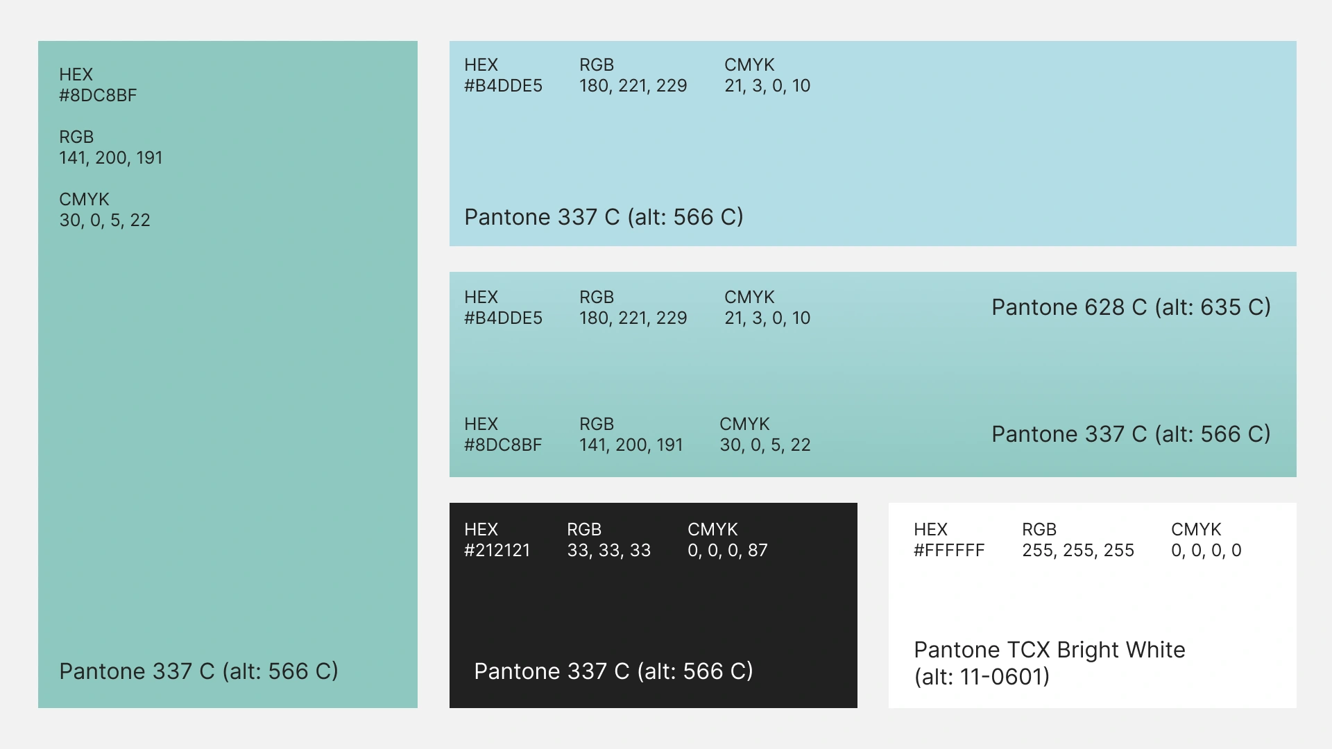
Branding colour guidelines
Logo System
The logo comes in a full-color version, a white version for dark and photographic backgrounds, and a standalone “S” monogram. A clear-space rule of half the logo’s height protects the mark, so it stays legible at any size.
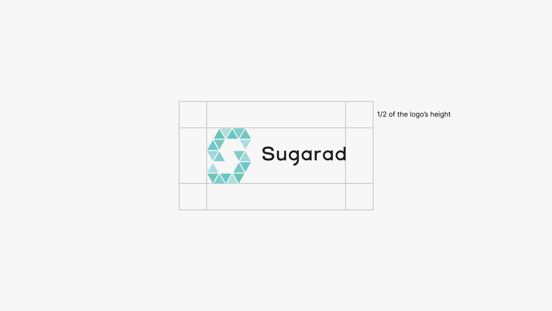
Logo Clear Space Guidelines: Half the Logo Height
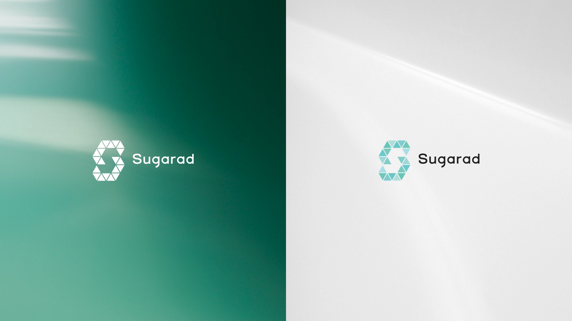
Sugarad Logo Variations on Green Gradient and Light Backgrounds
Typography
Gilroy Medium is used for headings and Gilroy Regular for body text. The geometric letterforms are modern and easy to read on both screens and print.
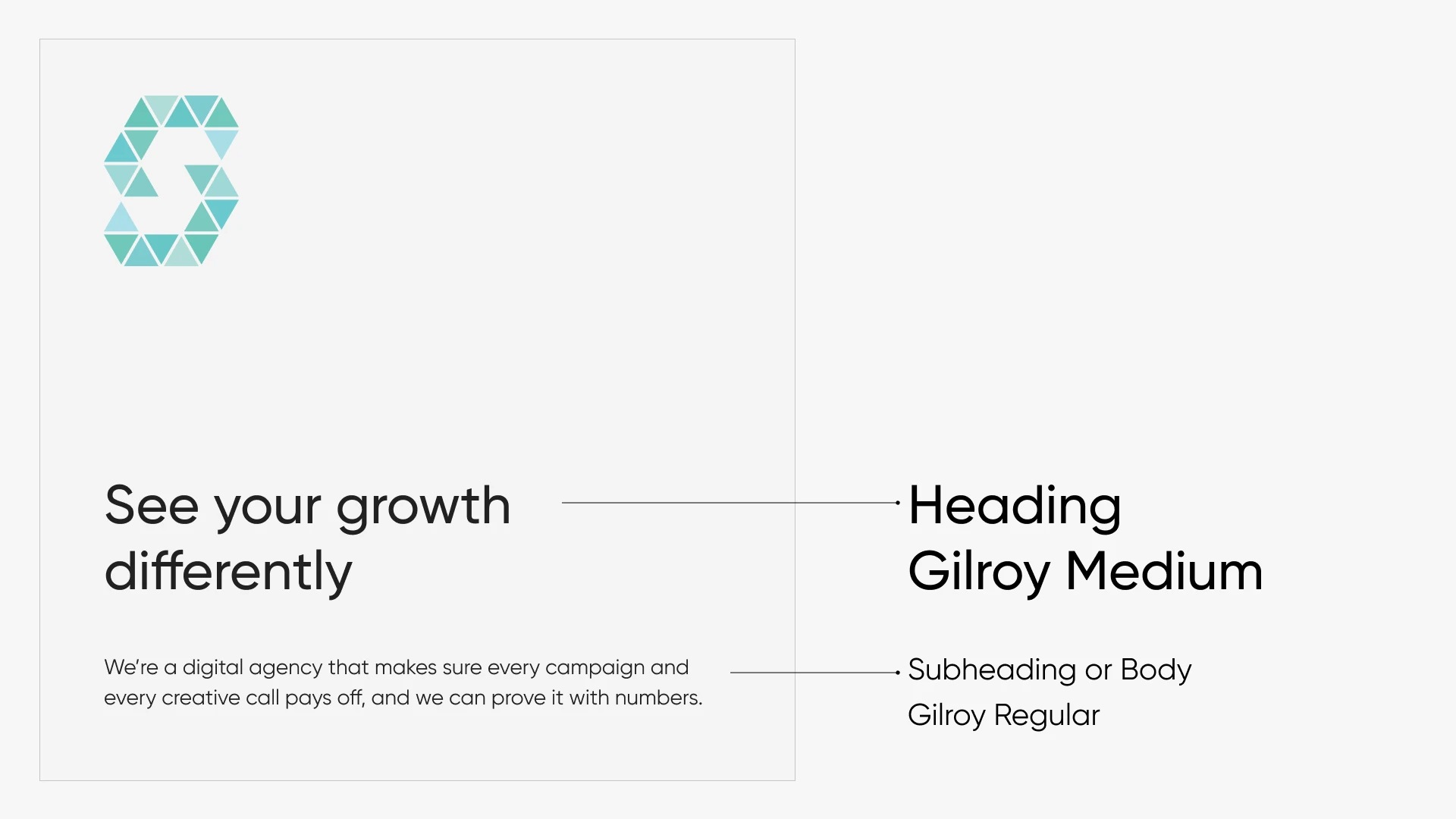
Gilroy Brand Typography for a Digital Agency: Heading and Body Text
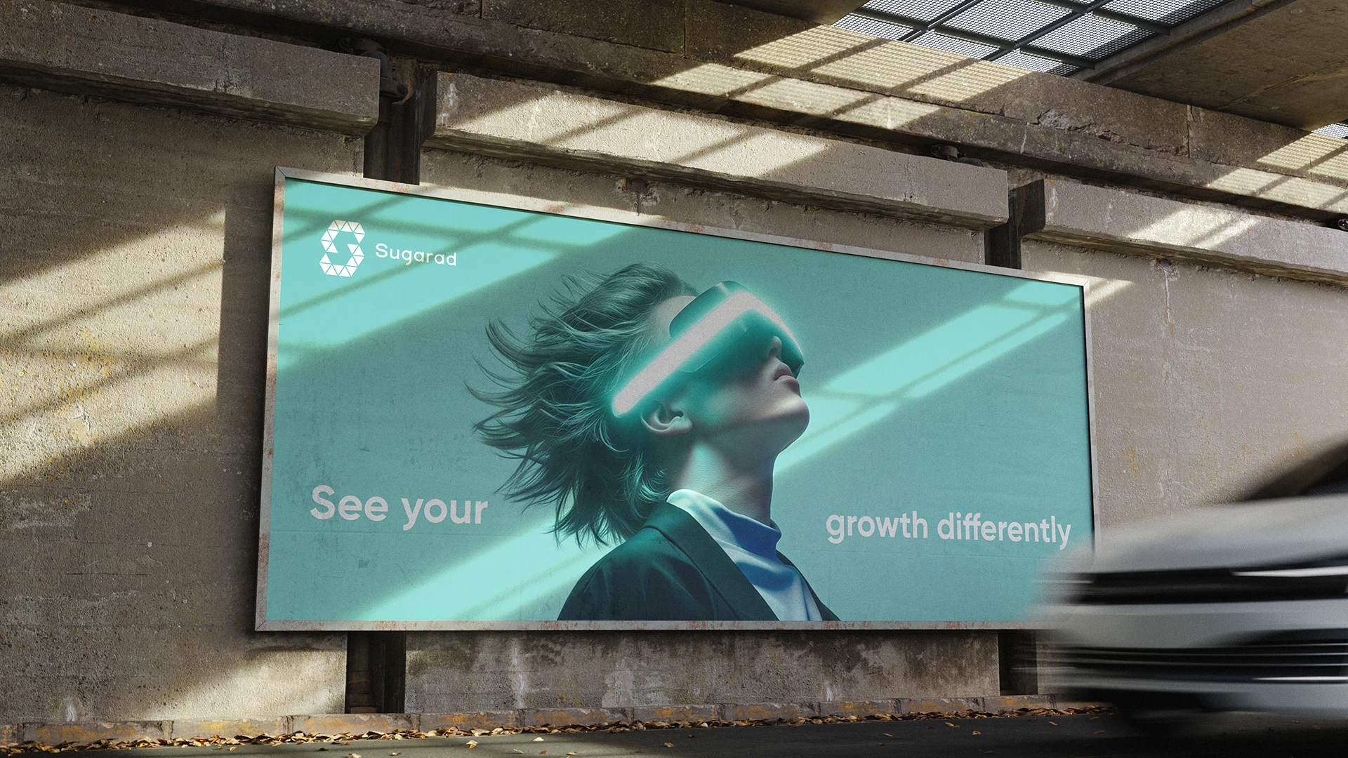
"See Your Growth Differently” Billboard Advertising Des
Brand Strategy
The positioning is simple: a digital agency that makes sure every campaign and every creative call pays off, and can prove it with numbers. Every design decision supports that promise, from the clean typography to the futuristic hero imagery.
I designed the identity to work across every touchpoint:
Brand Application
App icon: the “S” monogram in a rounded icon for mobile and app store listings
Web and print: stationery, business cards, brochures, and packaging
Events: a roll-up banner for conferences and offices
Social media: a consistent Instagram carousel style
Outdoor: billboard and large wall formats using a futuristic headset visual, which reinforces the “see your growth differently” idea
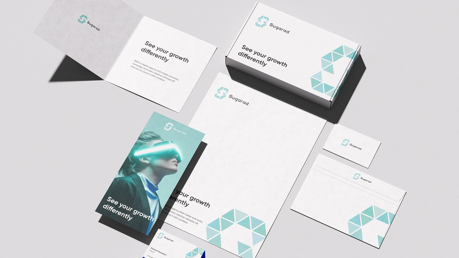
Digital Agency Stationery Set: Letterhead, Envelope and Brochure Design
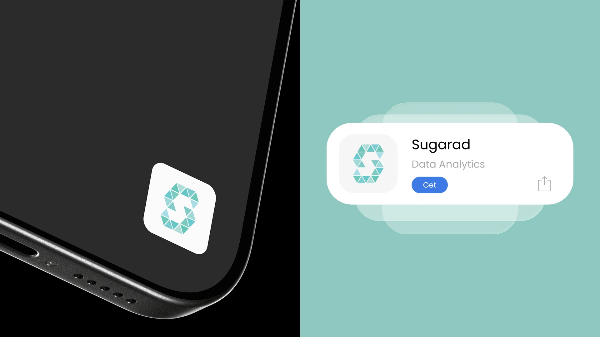
Sugarad App Icon Design on Smartphone and App Store Listing
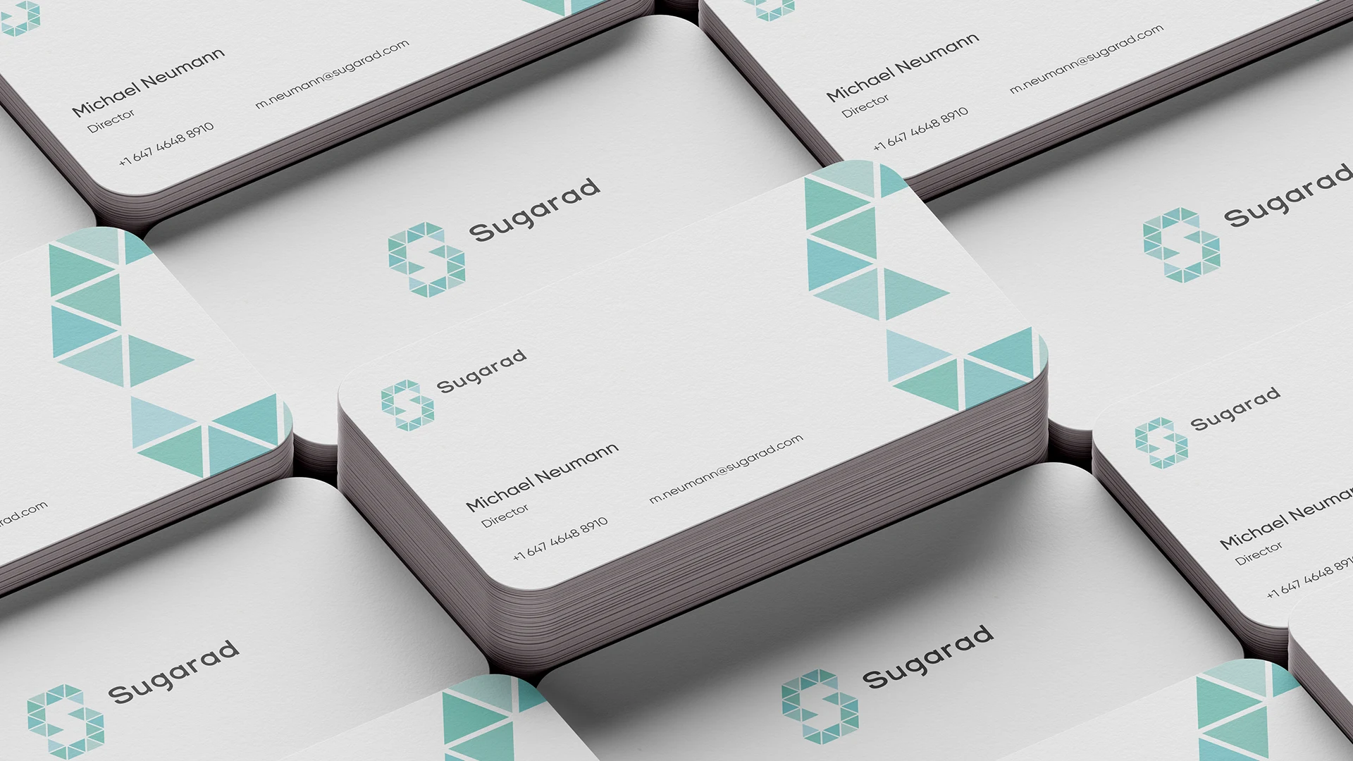
Sugarad Business Card Design with Triangle Pattern
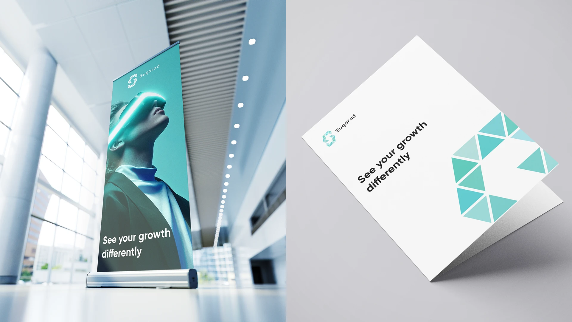
Roll-Up Banner and Folded Brochure Design for a Digital Agency
Instagram Carousel Post Design for a Digital Agency Brand
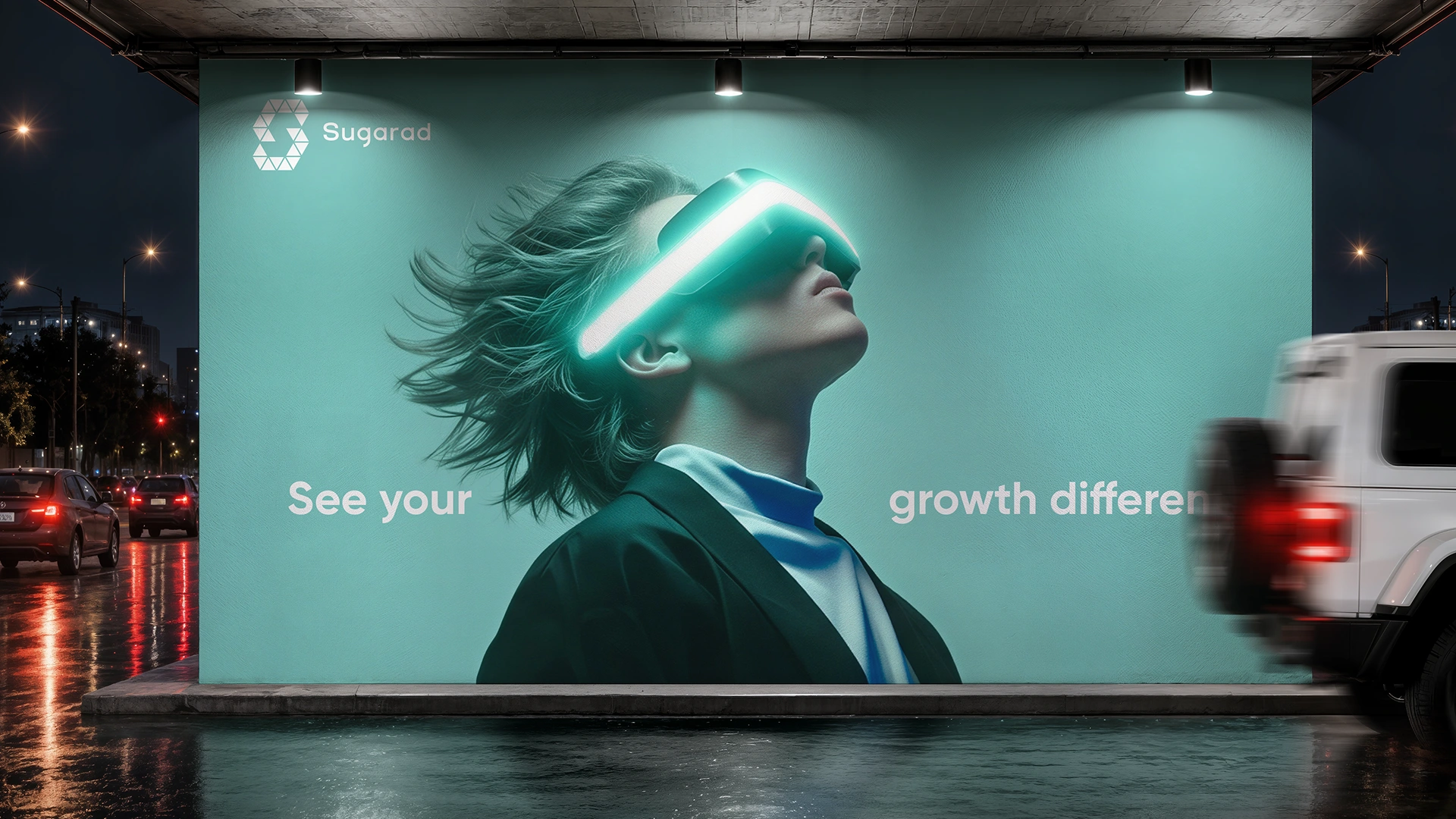
Large Outdoor Wall Advertising Mockup for Sugarad Brand Campaign
Digital agency website design
The Results
Sugarad now has a complete, flexible brand system that looks consistent from a business card to a billboard. The identity gives the agency a clear, recognizable presence and supports its message of measurable growth.
Services: Logo Design, Visual Identity, Brand Guidelines, Typography, Brand Strategy, Print and Digital Design
Have a brief or need branding? Contact me.
0 likes · 2 views · Nov 4, 2026
Sugarad’s brand identity positions a digital agency focused on strategic branding, creative design, and data-driven marketing for measurable business growth.
Timeline
Feb 3, 2018 - Mar 7, 2018


