Rently SaaS Dashboard Design for Rental Management

Akbar Rhadit


Rently: SaaS Dashboard for Rental Property Management
UI UX design for a rental web app that helps agents manage 100+ listings in one clear view.
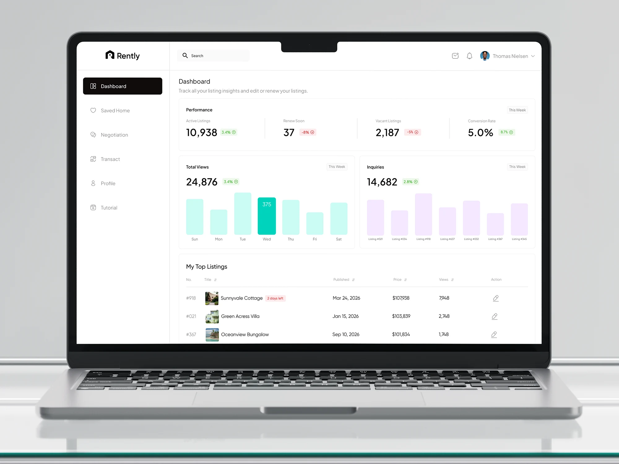
Imagine managing over 100 rental homes and not knowing which ones are performing, which are about to expire, or why inquiries dropped. That was my client’s daily reality. So I designed Rently, a dashboard that shows everything on one screen: summary cards, weekly charts, and a top listings table where you can edit or renew in one click. Expiry badges turn warmer as deadlines get closer, so nothing slips through. Less searching, more renting.
Summary
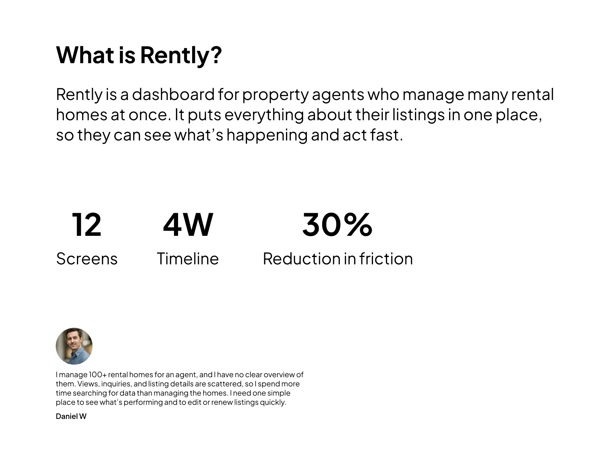
UI UX design for Rently, a rental SaaS dashboard and web app that helps property agents manage 100+ rental homes in one place. Built as an MVP for the tasks agents do every day: performance tracking, listing renewals, and quick edits.
The problem: no clear overview of rental listings
The client managed 100+ rental listings for an agent, but views, inquiries, and listing status were spread across different places. It was hard to see what was working and what needed attention.
The solution: a clean rental management dashboard
The dashboard turns listing data into quick insights. The MVP puts the key numbers and actions on one screen, so agents can act fast.
Key features
Performance summary: active listings, renew soon, vacant listings, and conversion rate, with color-coded trends.
Weekly charts: daily views and inquiries by listing, to spot peaks and top performers.
Top listings table: best-performing rental homes with price, publish date, views, and a quick edit action.
Expiry badges: status labels that turn warmer as a rental listing gets closer to expiring.
Simple web app navigation: Dashboard, Saved Home, Negotiation, Transact, Profile, and Tutorial.
UI UX design approach
Big numbers and color-coded trends, readable in seconds
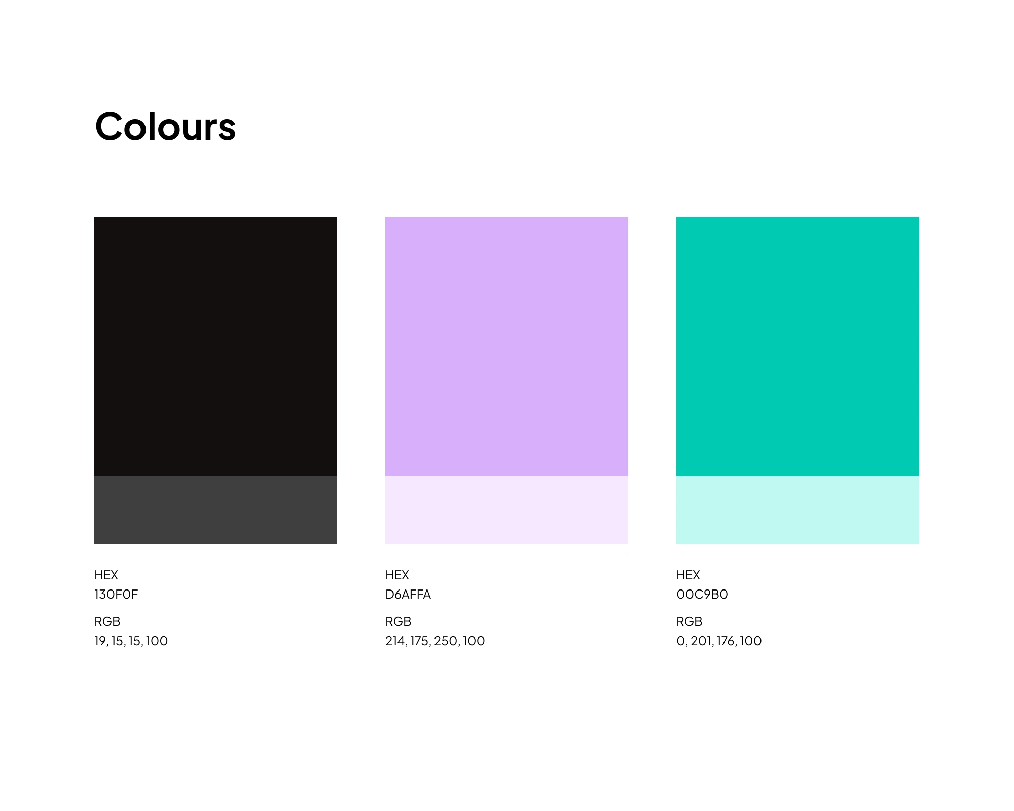
Lots of white space with a minimal black, teal, and lavender palette
Simple charts and tables with one clear action per row
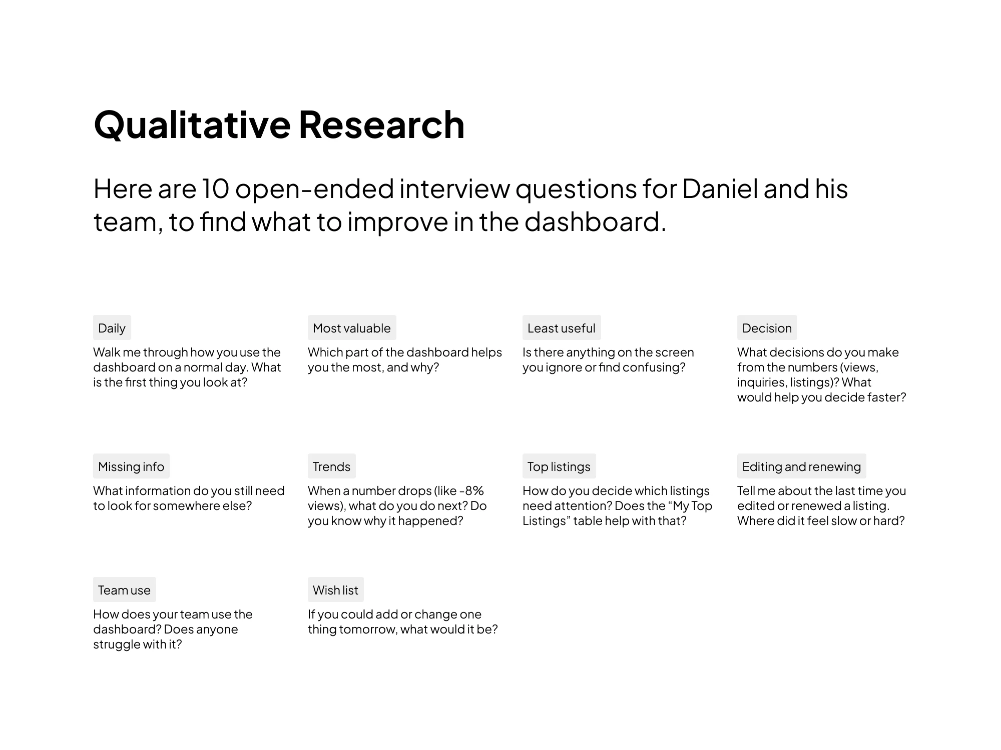
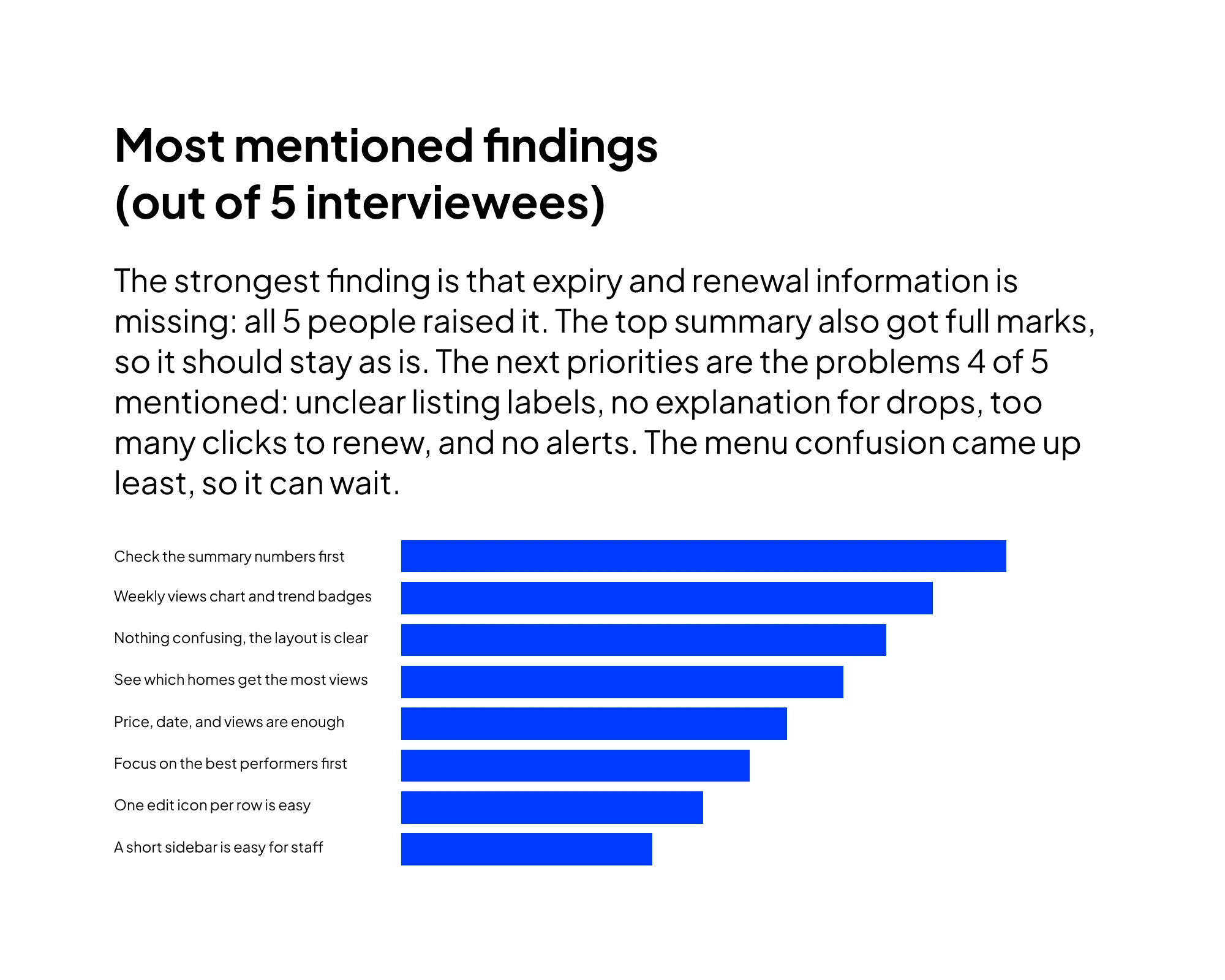
Shaped by user flows and interview questions to find the real pain points
Goal
Help property agents spend less time searching for data and more time managing rental listings and closing deals.
Tags
SaaS dashboard, rent, web app, UI UX design, MVP, property management, real estate, dashboard design, product design
User Flow
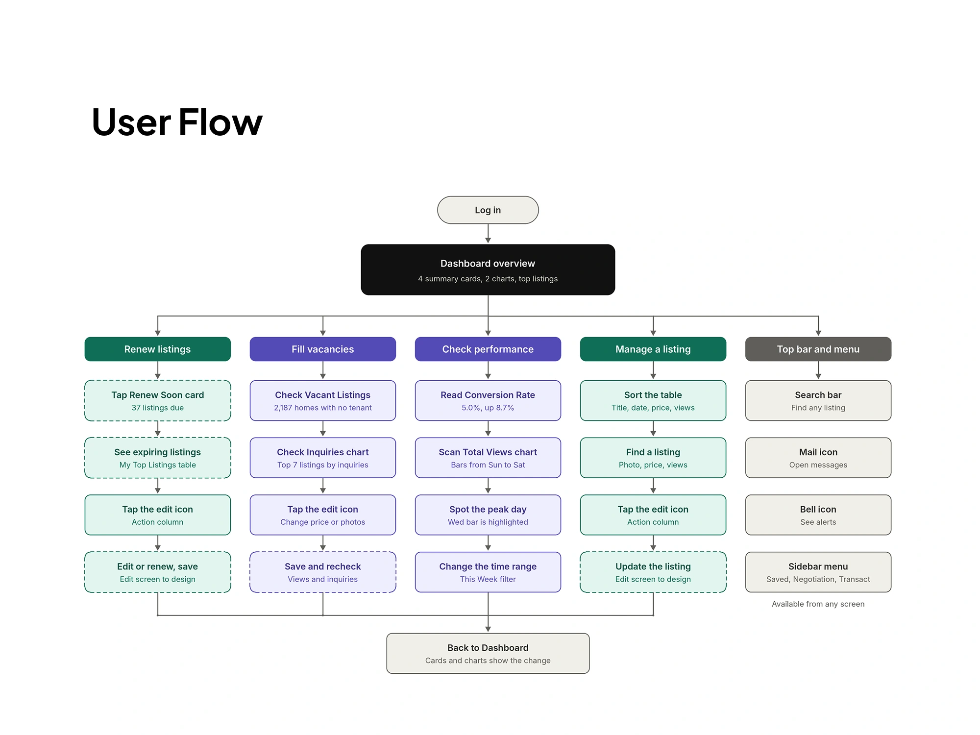
I turned the research findings into a user flow to check every step, so problems were fixed before the high-fidelity UI design.
Branding Colour
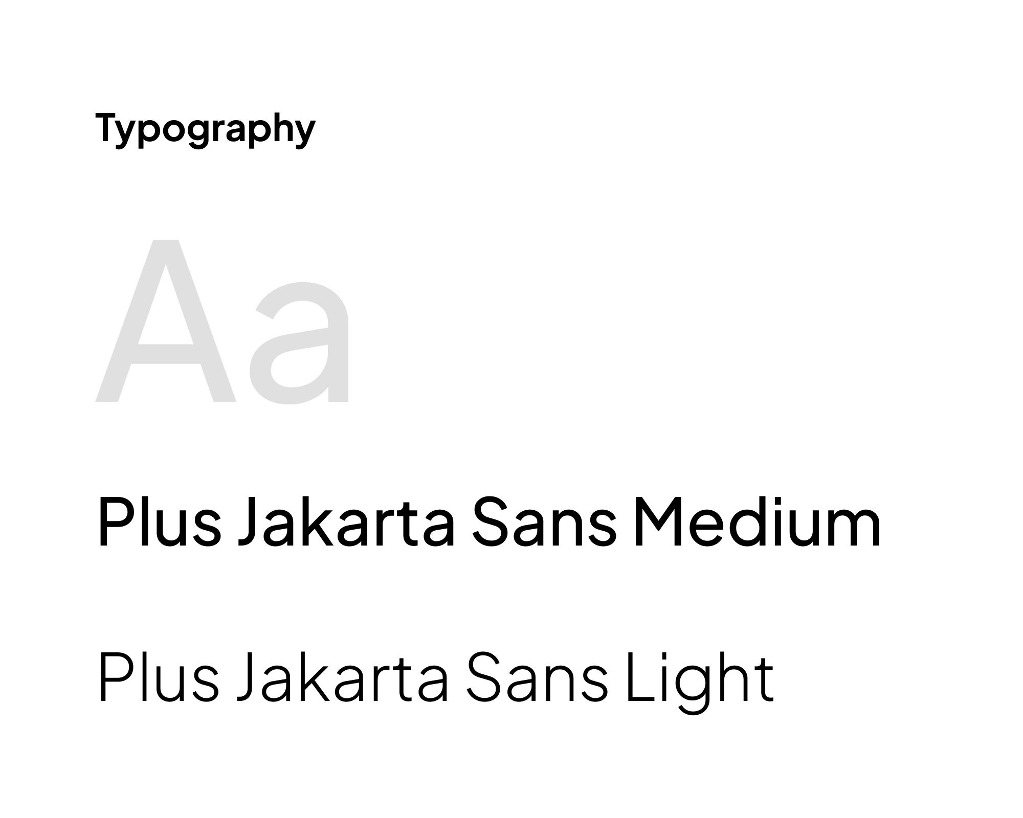
Typography
Teal, lavender, and black with Plus Jakarta Sans keep the SaaS dashboard calm and easy to read.
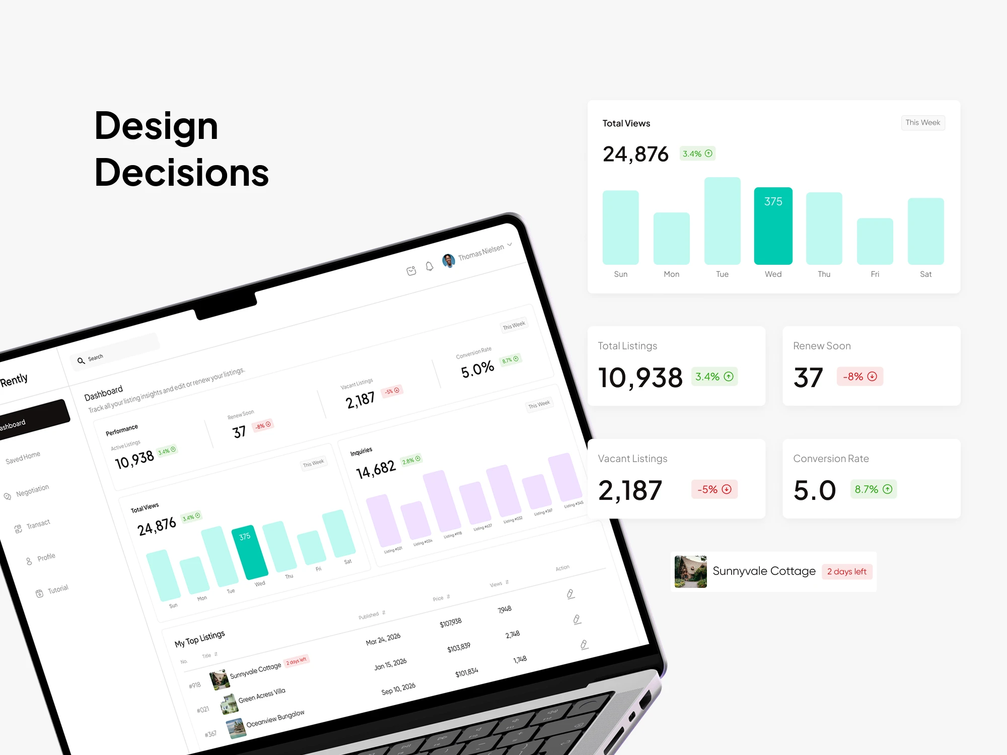
SaaS Dashboard Design Decisions
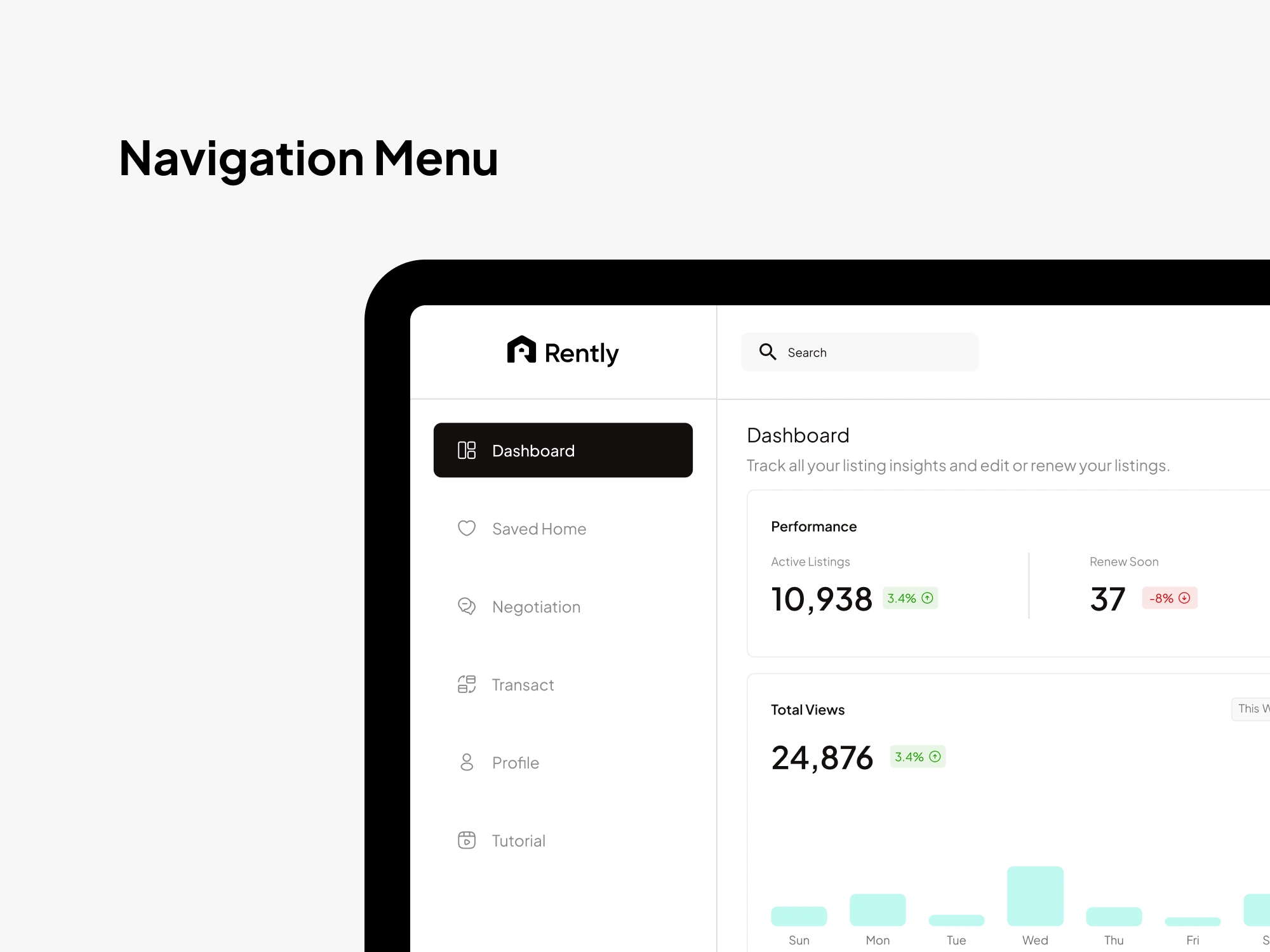
Web App Navigation Design
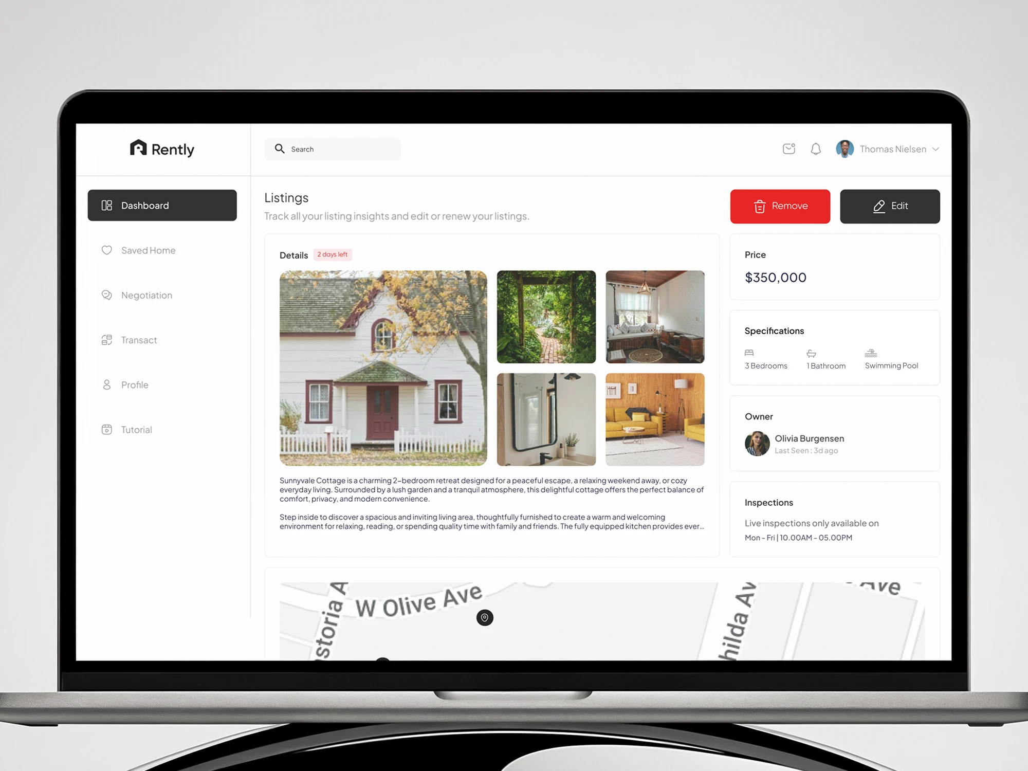
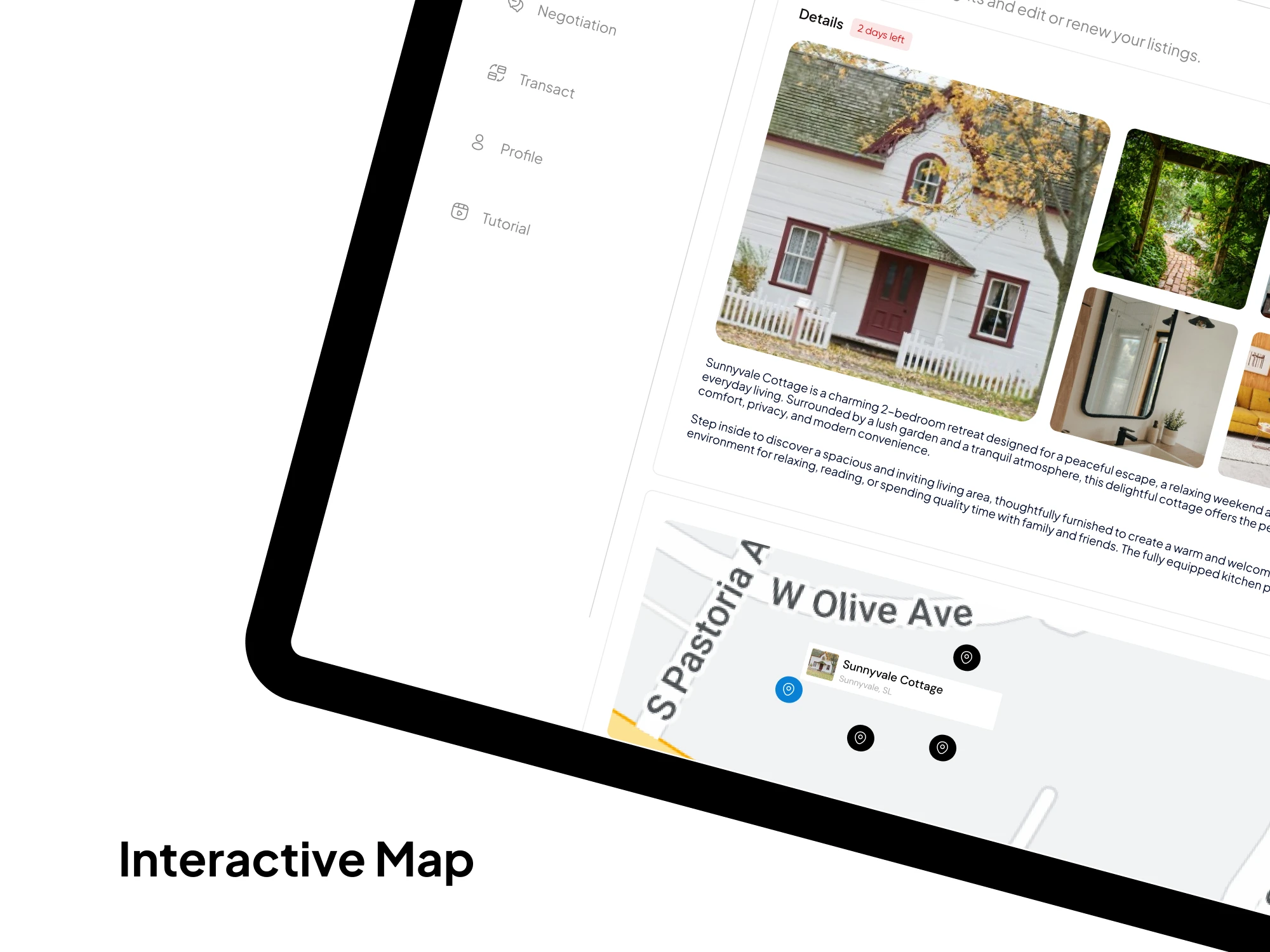
Rental Listing Details Page
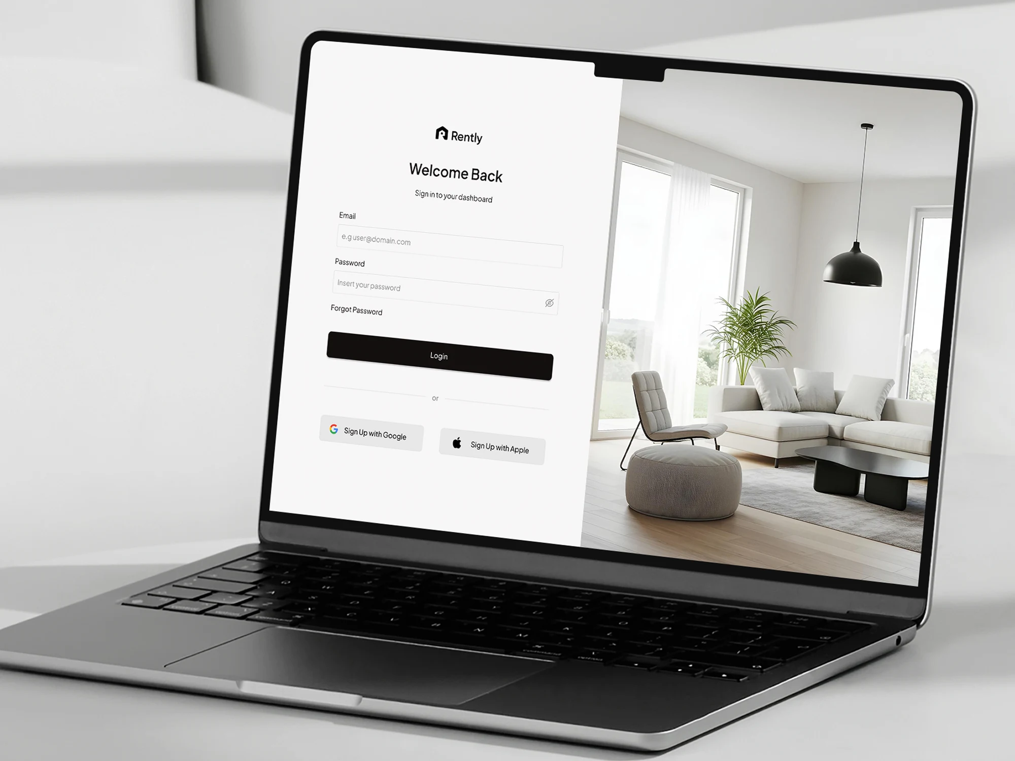
Login Screen Design
An MVP web app where agents sign in, track listings, spot expiring rentals, and renew fast.
Need a SaaS dashboard or web app designed? Let’s build something clear and easy to use. Let's talk!
Like this project
Posted Oct 17, 2026
Designed Rently, a SaaS dashboard for managing 100+ rental properties. UI UX design for a web app that tracks views, inquiries, and listing renewals.
Likes
1
Views
2
Timeline
Jul 17, 2026 - Aug 10, 2026