Reimagining a health insurance storefront
My Role Lead product designer, brand strategist
Team Roles UX researcher, product manager, developer
The Background
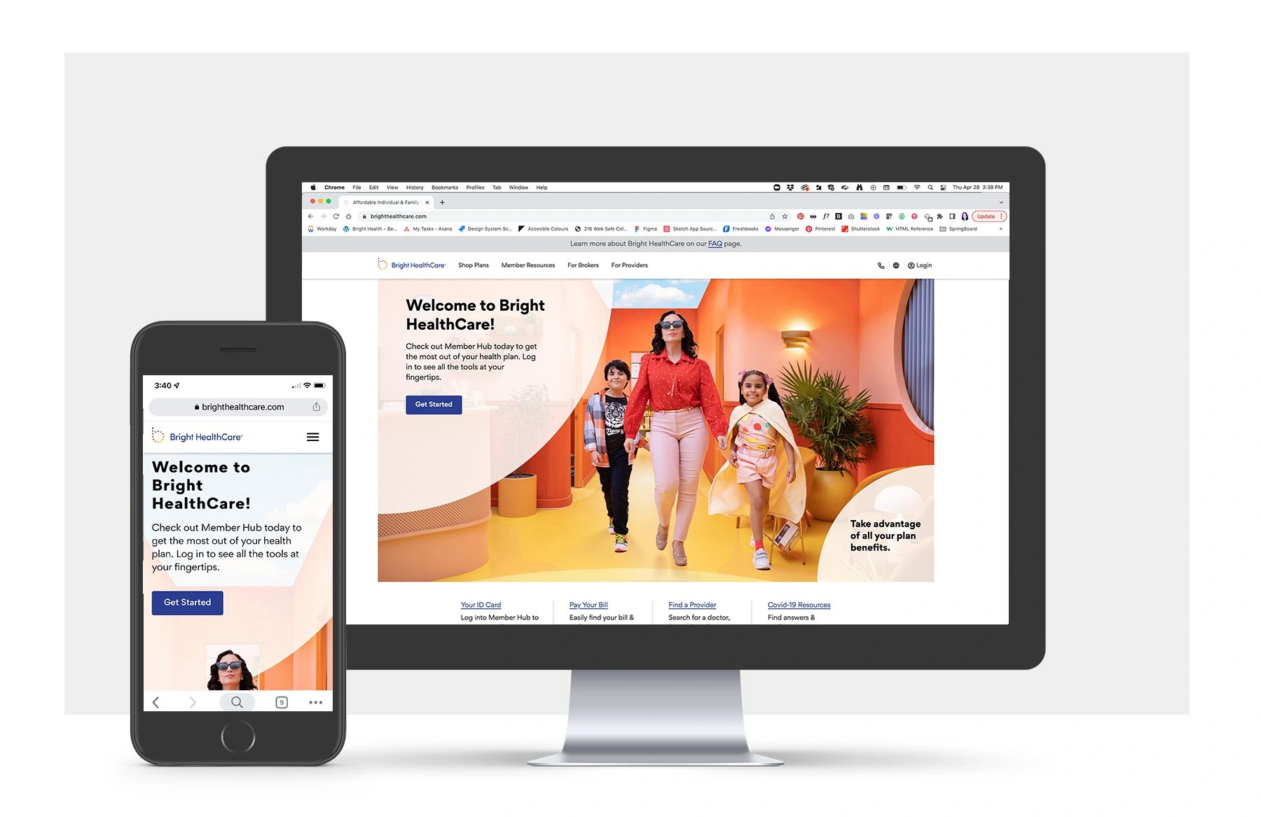
Bright HealthCare is a health insurance company that is available in over 15 states. Their mission is to make healthcare right. together. The primary goal of the site is for potential members to find a plan that is best for them and purchase through a third party app, HealthSherpa. The healthcare insurance season starts in October and ends in January, but with the pandemic, the government had implemented a “Special Enrollment Period” which meant that anyone who qualified could purchase insurance throughout the year.
The Challenge
Bright HealthCare had recently gone through a rebranding, which needed to be translated to the digital space. They were also dealing with the new Special Enrollment Period due to the pandemic. They also have a unique challenge as users cannot purchase the insurance directly from the site, they are redirected to a third party app. My first goal was understand the full scope of the website and from there identify any issues, pain points and through that research present a solution for the open enrollment period. Health insurance open enrollment period starts in October and ends in January.
The Research
The User
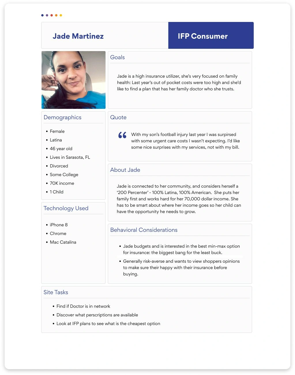
My first step was to identify the target audience. The website services 4 different lines of business with very specific needs, so I decided for our MVP we would focus on users looking to purchase Individual & Family Plans (IFP) health insurance. These users frequent the site the most and were the highest revenue drivers for the company,
I started pulling demographic data from our partner agency, Allant. Combined with previous internal interviews and research data, I started to build a more realistic idea of who our users are and why they choose to shop and purchase with Bright HealthCare. After the initial data synthesizing, I handed this project off to my colleague to complete, with myself as a reviewer of design and content.
The Site Map
To understand the full scope of a redesign, I built a site map. This lead to the discovery of multiple pages and redundancies within those pages. I used a content key to identify those redundancies or, in some instances, where links were broken or kicked the user back to the homepage. This discovery was key for me to see that our users were struggling to find pertinent information.

The User Flow
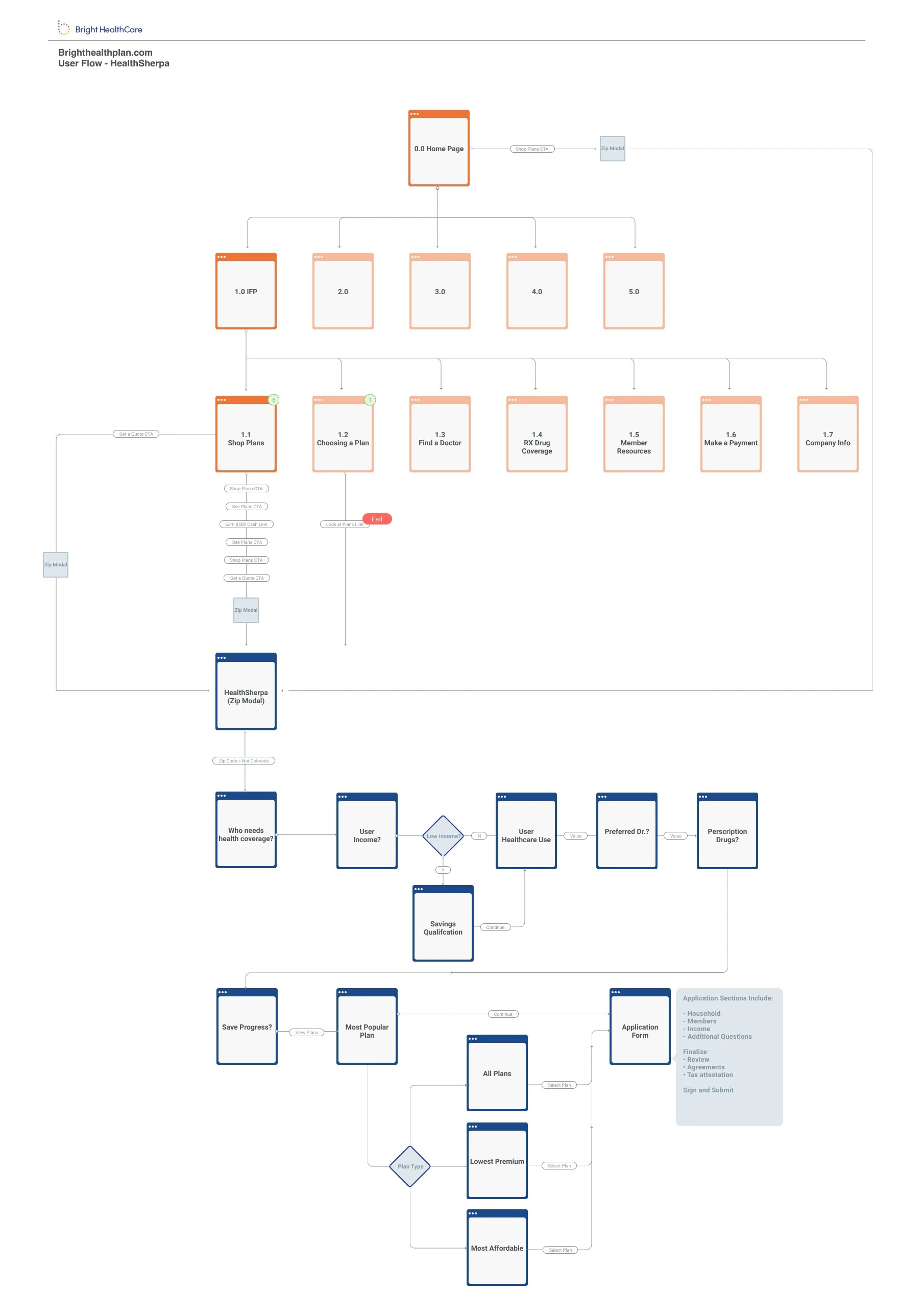
As I began to discover the breaks in links and redundancies of content on the site map, I applied those findings to building out a user flow for the IFP shopping experience. The orange represents that Bright website, whereas the blue represents when a user moves into the third party company, HealthSherpa.
The Problem Statement
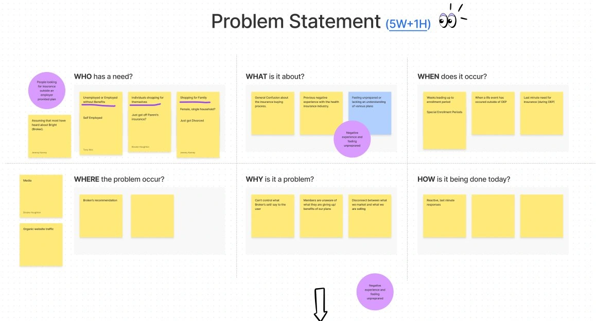
We focused on our users potential pain points and building a solid How Might We to help us build a solution strategy for the website. Between the site map audit and reviewing the content on the site, we came to the conclusion that users were struggling to gain a better understanding of the product and the benefits that could directly impact them. This could lead to stress during the decision process, a process already stressful given its impact in a users life.
The Build
The Style Guide
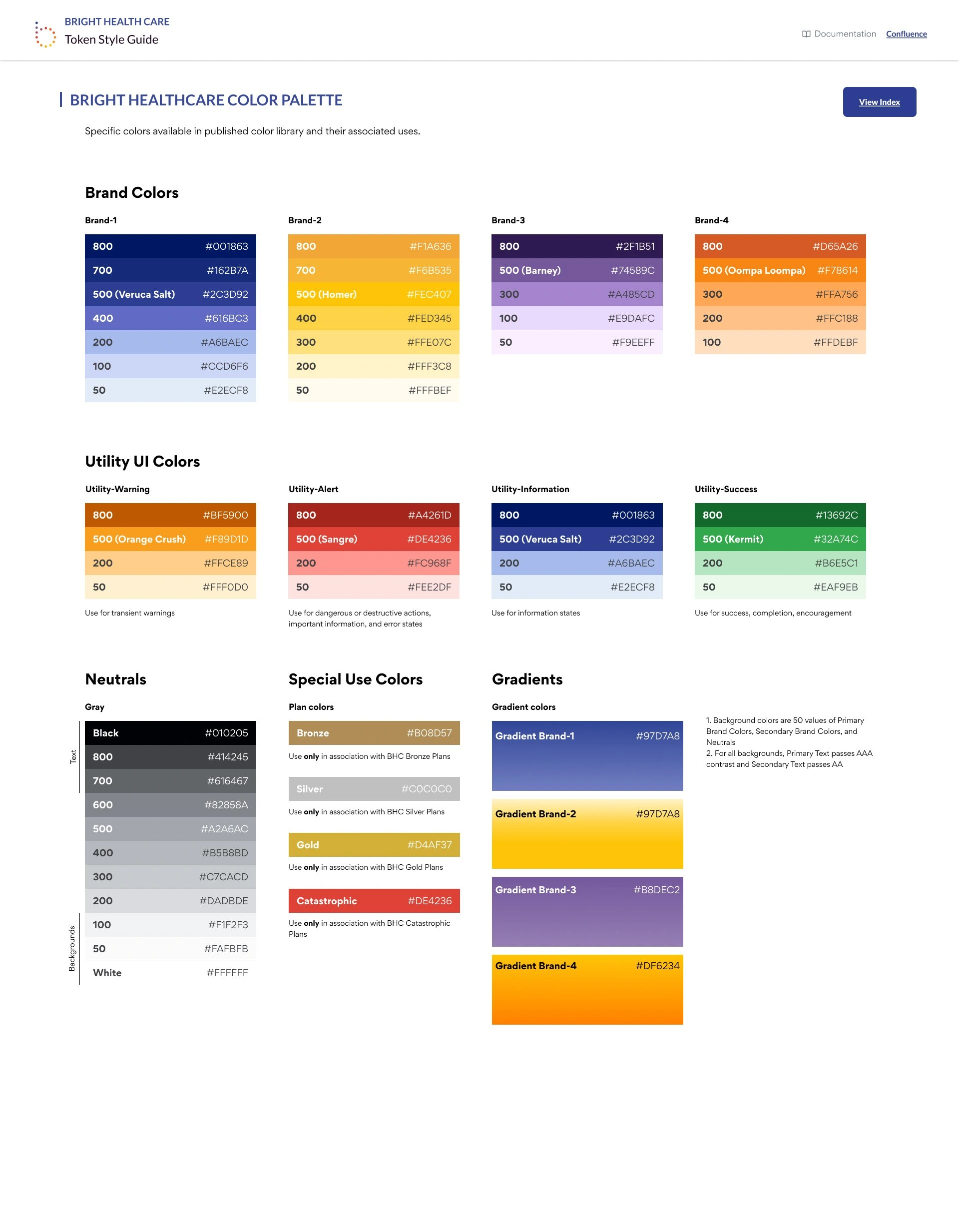
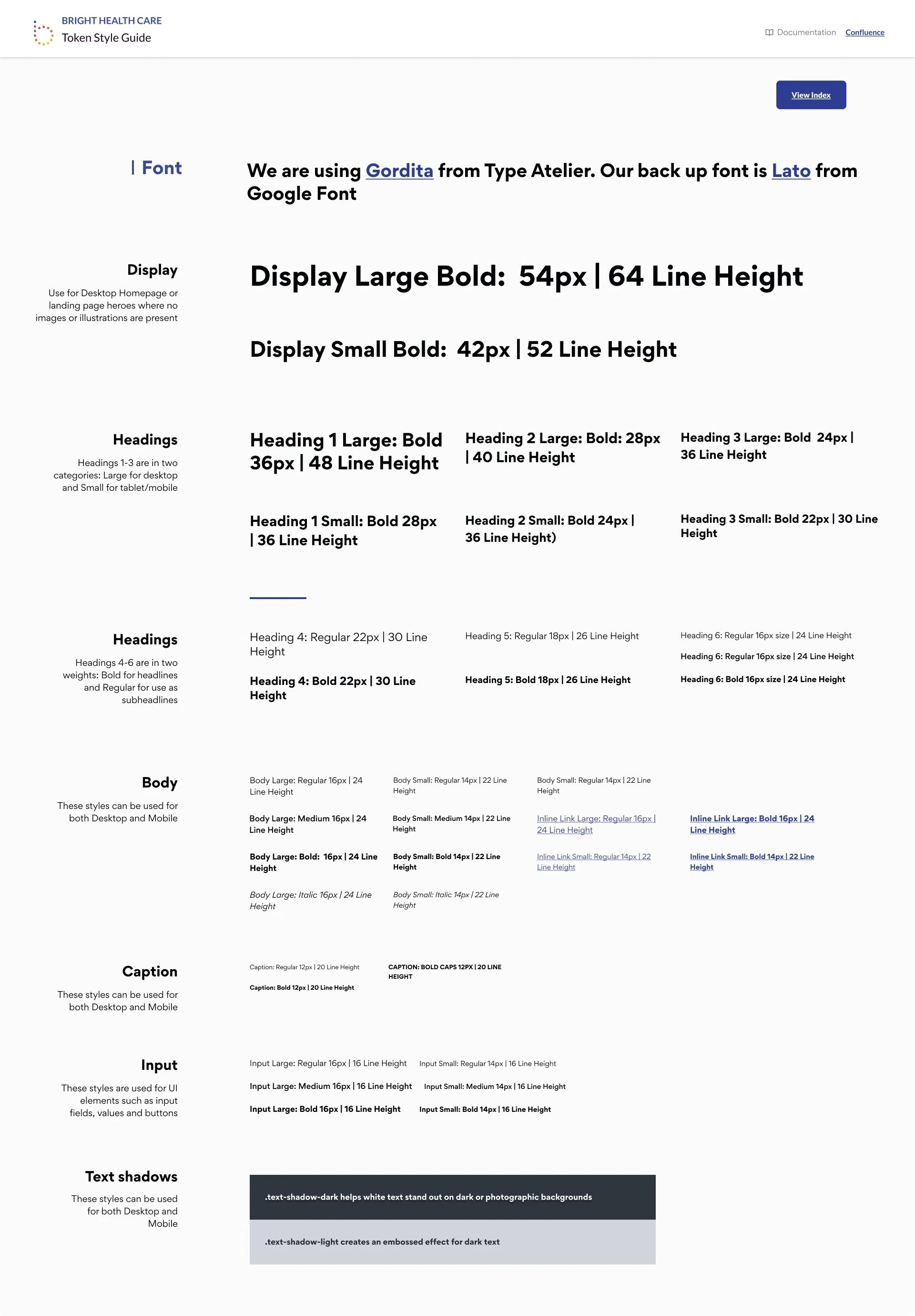
The new branding had update colors, typography and a new logo. However, these assets were not translated to fit digital needs. Bright Health Care has 8 primary brand colors, with 8 additional accent colors. I identified which colors had the highest accessibility rating and strongest brand usage to create the 4 main brand colors and utility colors, specifically to be used for web application.
Along with this, I also worked with Dev to build a dynamic grid system with the newly created breakpoints and spacers. All content was also documented in confluence so Designers could reference the Figma file while Developers could reference the confluence documentation.
I also created the brand color tones to be used for UI needs like hover states, select states and backgrounds as example. Additional brand colors were documented to be used in things like charts, graphs and the new illustrations.
The Illustration Library
The brand didn’t have an illustration library that was evergreen, they relied on campaign images or stock photos. I wanted to build an illustration library that could be used outside of a campaign and that reflected our very diverse demographic. We chose to use humaaans by Pablo Stanley which allowed us to have multiple skin tones and levels of accessibility representation and age range. I really wanted to make sure that when users came to the sight, they saw themselves and that the brand welcomes everyone.
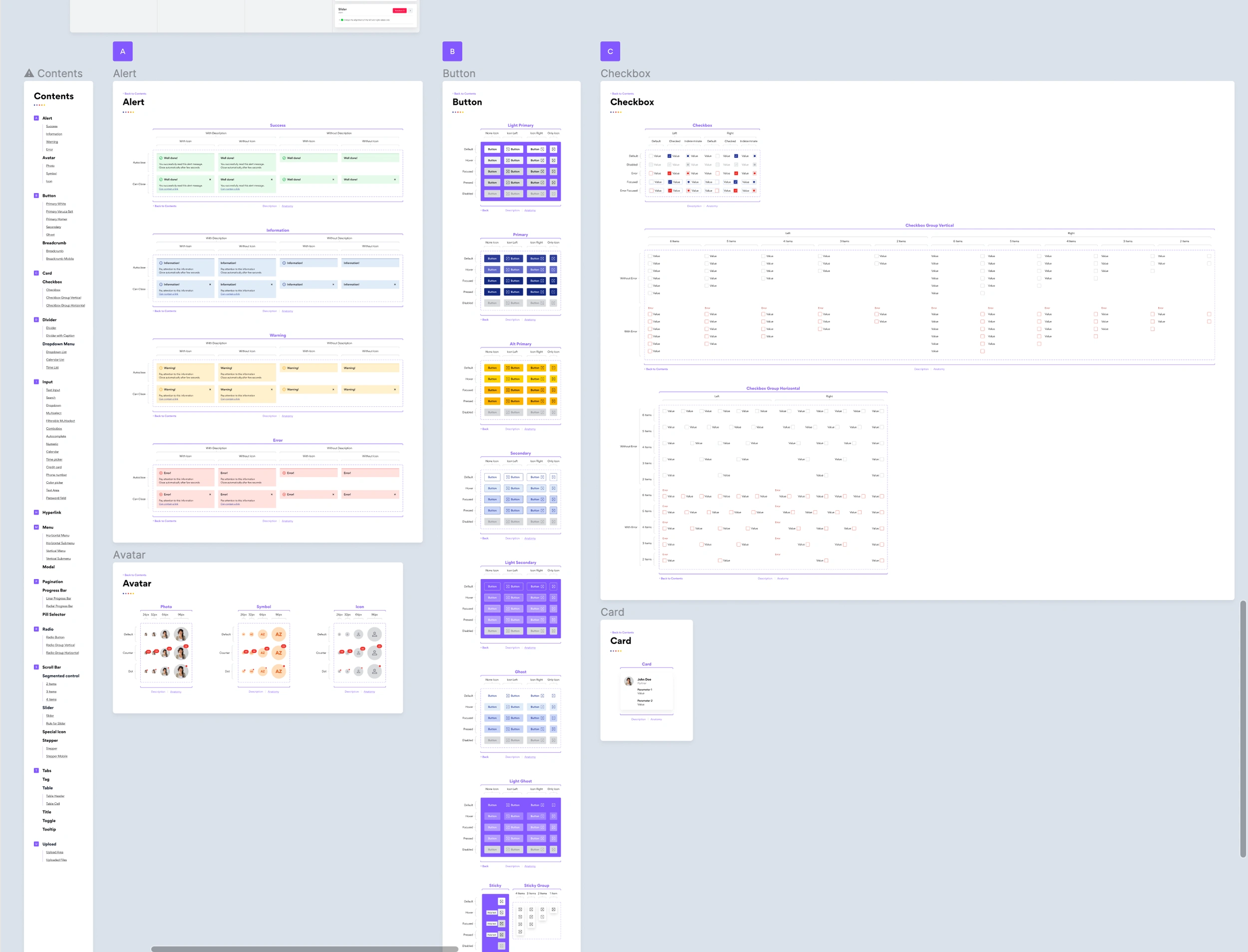
The Design Library (NOVA)
My first priority was moving the design system (Lumen) from Sketch to Figma. From there I did an audit to see what elements were missing. I then discovered a need to update the UI from the previous branding to the latest that had recently launched. My team worked with 2 designers from the Global Logic team to build the new design system in Figma. This effort is ongoing, with now a greater adoption and collaboration across all product teams with the new design system name, Nova.
The Design
The Mid-fidelity Prototypes
These prototypes served as a bridge between conceptual ideas and the final design, allowing us to assess the user experience in a controlled environment. The usability testing provided invaluable feedback from our target audience, helping us pinpoint usability challenges and uncover user pain points. Armed with these insights, we iterated upon the design, making strategic adjustments and refinements. This iterative process ensured that our final product was not just aesthetically pleasing, but also highly functional and user-friendly, aligning perfectly with the needs and expectations of our end-users.
First Iteration
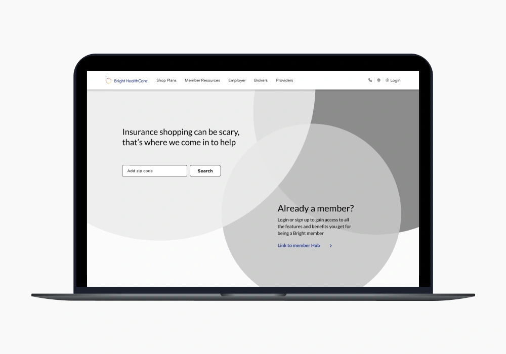
During our rigorous usability testing, a noteworthy revelation emerged: users expressed a recurring frustration with the over-reliance on the main navigation. Their desire for a more streamlined approach to reach their destination without the need to delve into intricate submenus became evident.
Second Iteration
I designed several solutions to help meet our users needs. By condensing site content, users will be able to gain important information about insurance plans, thereby reducing stress around the purchasing process and empowering them to make an educated purchase. I also created the “quick links” component that would sit below the hero. This would have the most critical links that users need to access as identified by our research, site analytics and stakeholders.
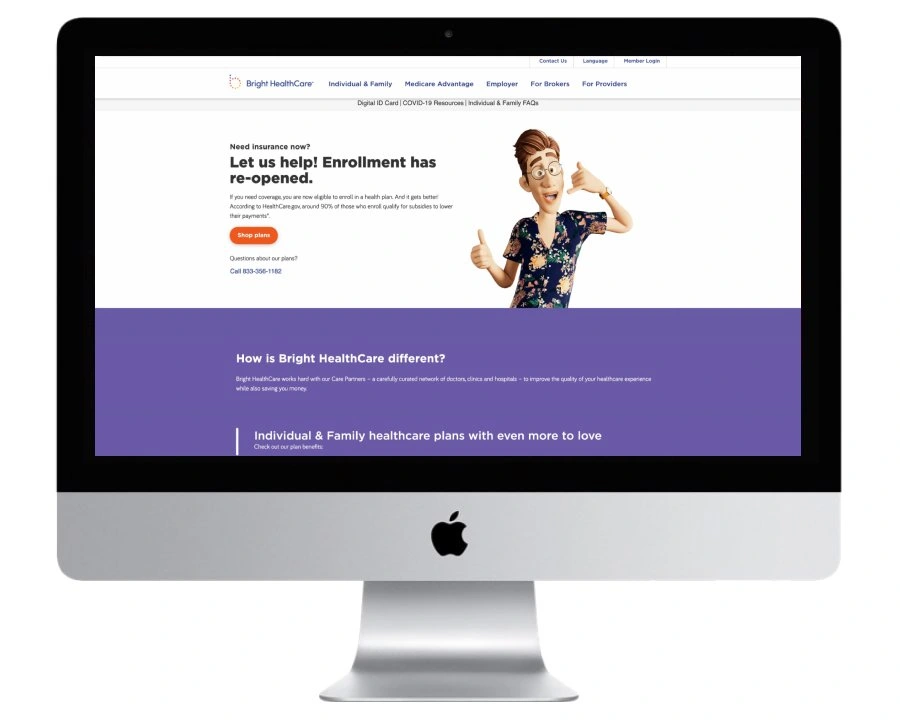
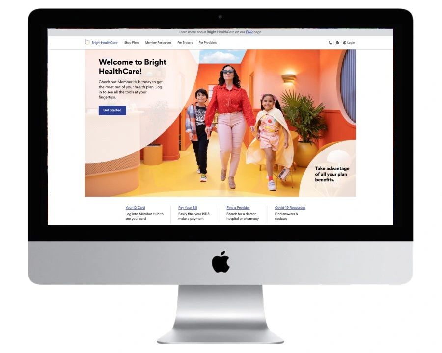
The Launch
Post Launch
Usability Testing
Positive Findings
•Users liked the BHC homepage: colors, design, copy, and the ‘Find Your Plan’ CTA Button (they can get started right away).
•Users liked the amount of information provided and did not think any information was missing.
•Users positively reacted to these homepage sections:
•“$0 Goes farther with Bright HealthCare”
•Map of cities and states that are covered
Pain Points
•When navigating to the IFP page, one user tried to click unclickable text in the Top Nav (“Shop Plans” and “Individual & Family Plans”)
•The list of qualifying life events are clear, but some users found the long list to be more visually challenging. They suggested the list to be consolidated.
User Survey
I worked with the analytics team along with strategy and research to build out a survey for our website to learn more about the user experience. The setup was to create a custom trigger for when a user has been on the site for longer than 30 seconds.The survey will pop up within a given session rather than a specific page.
•Target 20% of users who have been on the site for longer than 30 seconds. This is approximately 4k Sessions per day*.
Users who come to the site to visit their BHC account or learn about health insurance generally had the most positive impressions; 58% and 63% respectively gave 5-star ratings.
-Users who went to find a provider or for ‘Other’ purposes gave more negative ratings; 33% and 35% respectively gave 1-star ratings.
-This suggests that users who are completing tasks related to their existing member accounts are more likely to report a good experience with the site.
Users who hadn’t found what they were looking for were extremely likely to give only 1-star rating.
-Helping users better identify & quickly navigate to key site sections may drive more positive responses.
-48% of users who were ‘still looking’ when they took the survey gave 5-star ratings. It is likely that the 5-star responses given by these users were influenced by other factors (site design, positive brand association, etc.) even if the user had not accomplished their goal.
Next Steps
Improving user satisfaction and enhancing the overall user experience
Based on the insights from the user survey we created a list of items to review and add to the roadmap for continuous iteration and improvement:
Analyze the 'Still Looking' Segment:
Continuous Monitoring and Iteration:
Like this project
Posted Sep 25, 2023
Lead product designer, working end to end for the product launch. Oversaw research and analytics along with brand strategy to build comprehensive user flow.
Likes
0
Views
15

