Apollo | Creating a User Friendly CRM Integration Process

Andrea Margolis


Intro
What is Apollo?
Apollo is a platform that empowers sales and marketing professionals to find and reach out to their ideal prospects while also offering analytics that help users learn and optimize their process all in one place.
User and Business Objective
Overall the goal was to make it possible for users to link their CRM to Apollo without the help of Support or Customer Success. Core features of Apollo are unlocked when a company's CRM is integrated with the app.
This helps customers by giving them access to the value of Apollo in a simple stress free way. And it helps Apollo because happy empowered customers will want to stick around.
Target user
Salesforce implementation experts, Sales manager, Administrators who need to get their team up and running on sales tools that will sync with their existing CRM. In the case of this feature we were targeting two types of users:
New Apollo user who wants to sync their CRM
Established Apollo user who needs to edit their settings
Before
It all started with a hunch that integrating Apollo with your current CRM was NOT easy (as seen below).
Discovery Research then confirmed that users were failing at setting up their Salesforce integration correctly.
A lack of guidance frustrated users while broken information hierarchy and bad UI caused errors.
Every set-up option was presented at once, and it was not clear which ones were important to configure. Users even had to know to leave the integrations section and go to a separate settings page to complete their setup.
Research
Learning 1: No guidance or visual hierarchy overwhelmed and lost users
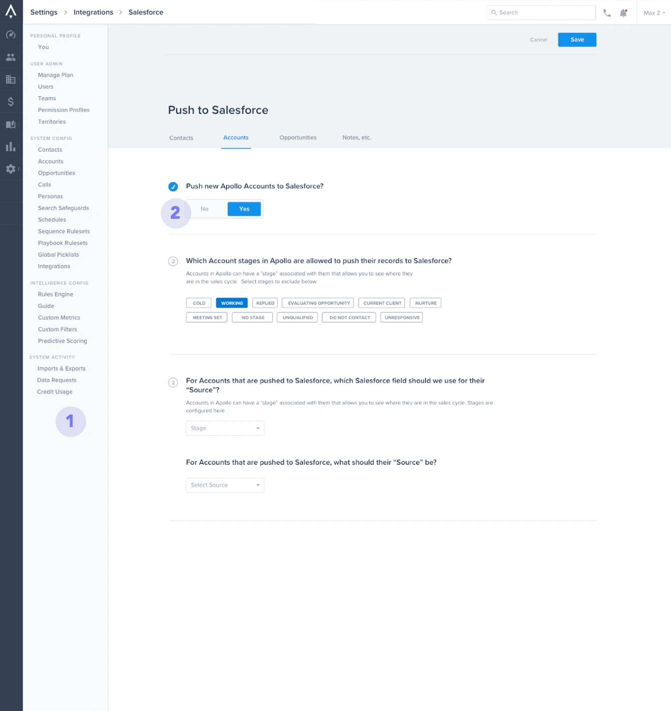
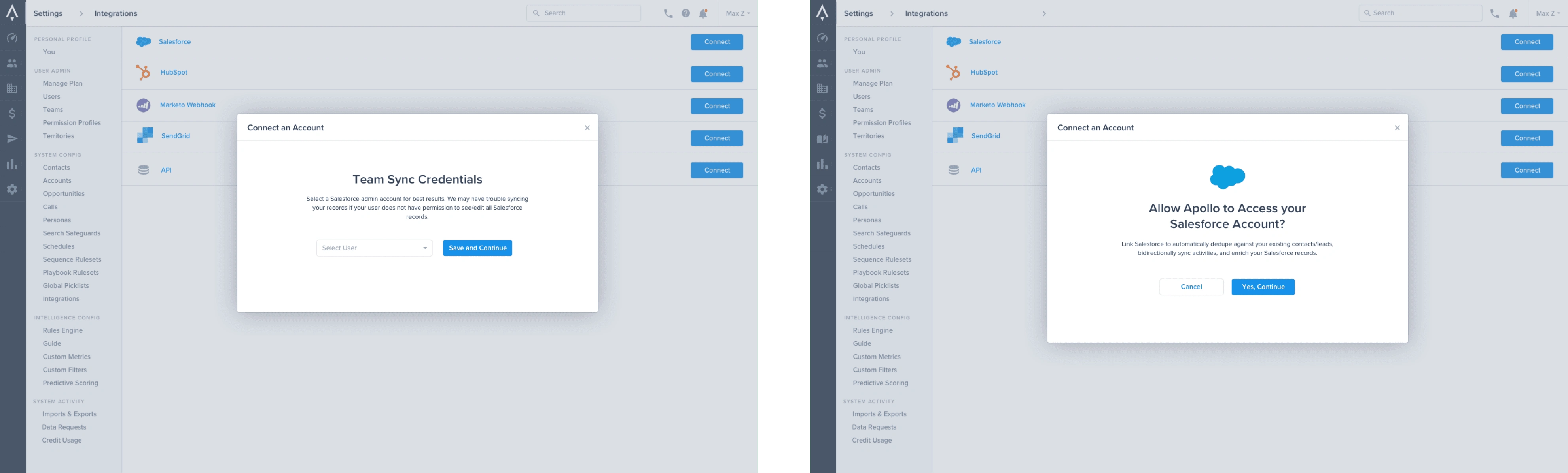
Users couldn't tell what was important or where to start and that made them feel overwhelmed. For example, a portion of the setup called "team sync credentials" was the MOST important thing you needed to do in the setup process and there was no way to tell. It had the same exact hierarchy and placement as everything else on the page.
Learning 2: Bad information architecture
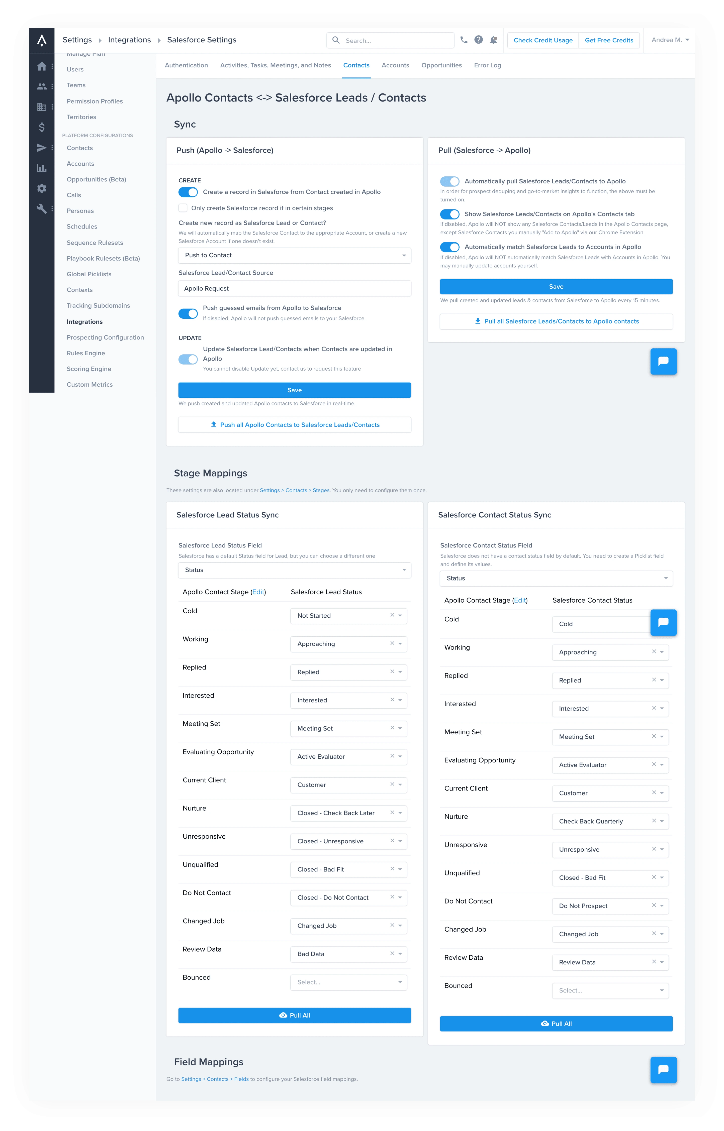
The setup pages were organized by Salesforce Objects which made for illogical placement. Radically different settings sat right next to each other (and you had to save them individually).
Core Functionality was also split between different pages. For example you couldn’t map stages and map fields in the same place even though they are both from SFDC
Learning 3: The stakes are high
For most companies their CRM info is like their gold. Using anything that could mess up their CRM would be a massive problem for them, and by extension us at Apollo.
I always have to go back and fix customer's mappings. They always do it wrong and it messes with their info - Apollo CSM
One of the issues that would happen a lot was "double mapping". Without getting into the details of it, the mistake was VERY easy to make and it would really mess up our clients CRMs if they did it. Double mapping mistakes made up a huge portion of our customer success tickets so fixing this was a big priority.
Design Process
PM and Design Sync
After we identified all the user pains through research my PM and I synced on how we wanted to proceed. I asked clarifying questions to make sure him and I were starting the project on the same page:
“what would the ideal set up be?”
“what is the bare minimum setup for this to work?”
“who are we trying to optimize for?”
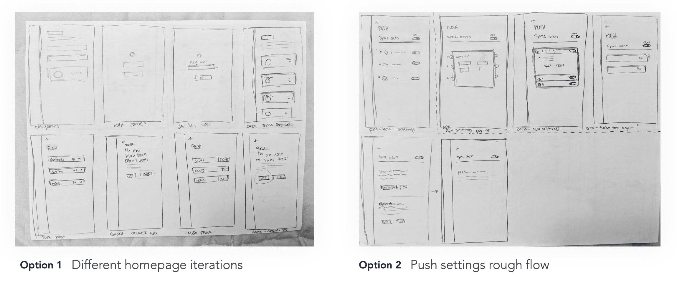
Sketches, Flows and Iterations
Paper sketches quickly communicated potential flow and page structure ideas to the team:
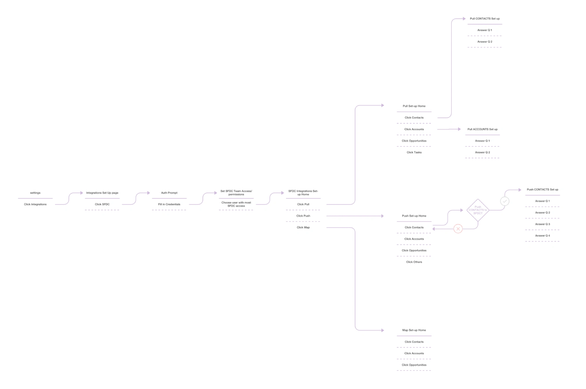
Higher fidelity iterations helped to visualize the pages themselves and how users would interact with the content on them
Usability testing gave us confirmation that users liked the idea overall but there were still some confusing usability aspects we could tighten up
For example the sidebar below distracted users and made them think it was the navigation for the setup flow.
Other feedback points:
Confusing sidebar placement
Users correctly guessed the usage of the blue checkmarks that replaced item numbers when a feature was on. Multiple people asked: “do these checkmarks mean the feature is on?” Which confirmed we were on the right track.
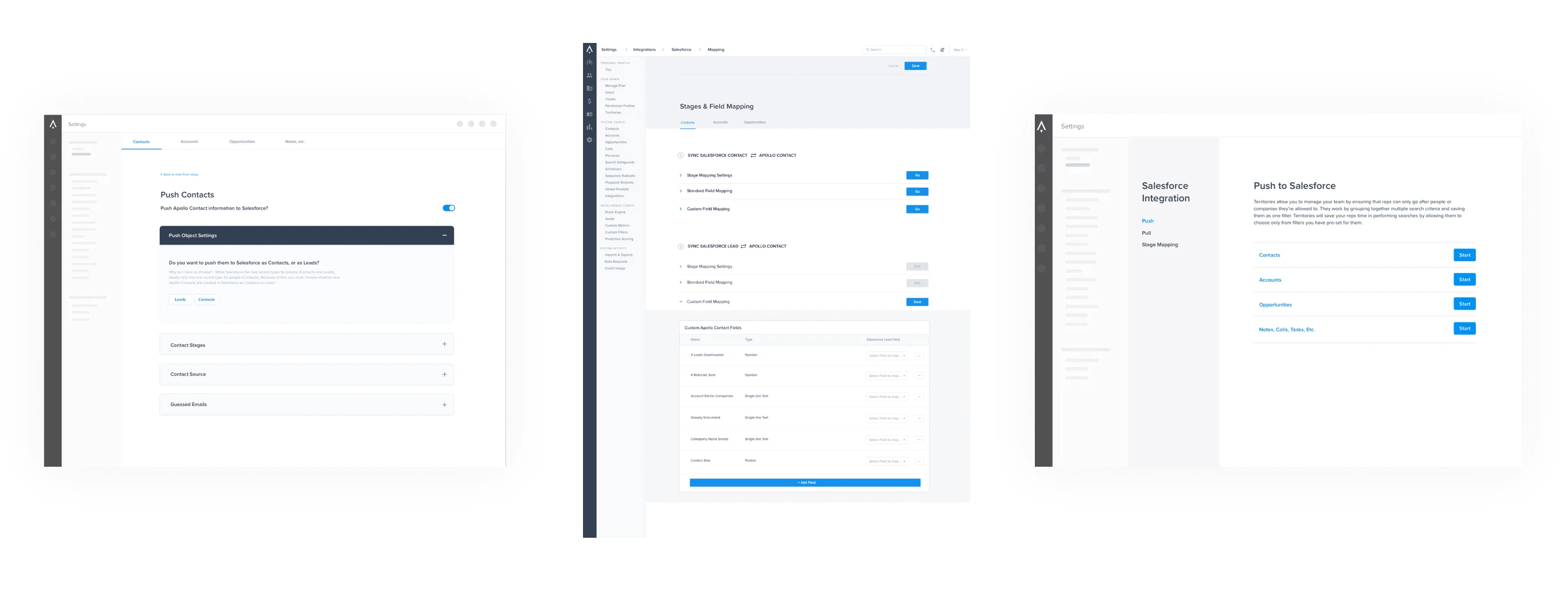
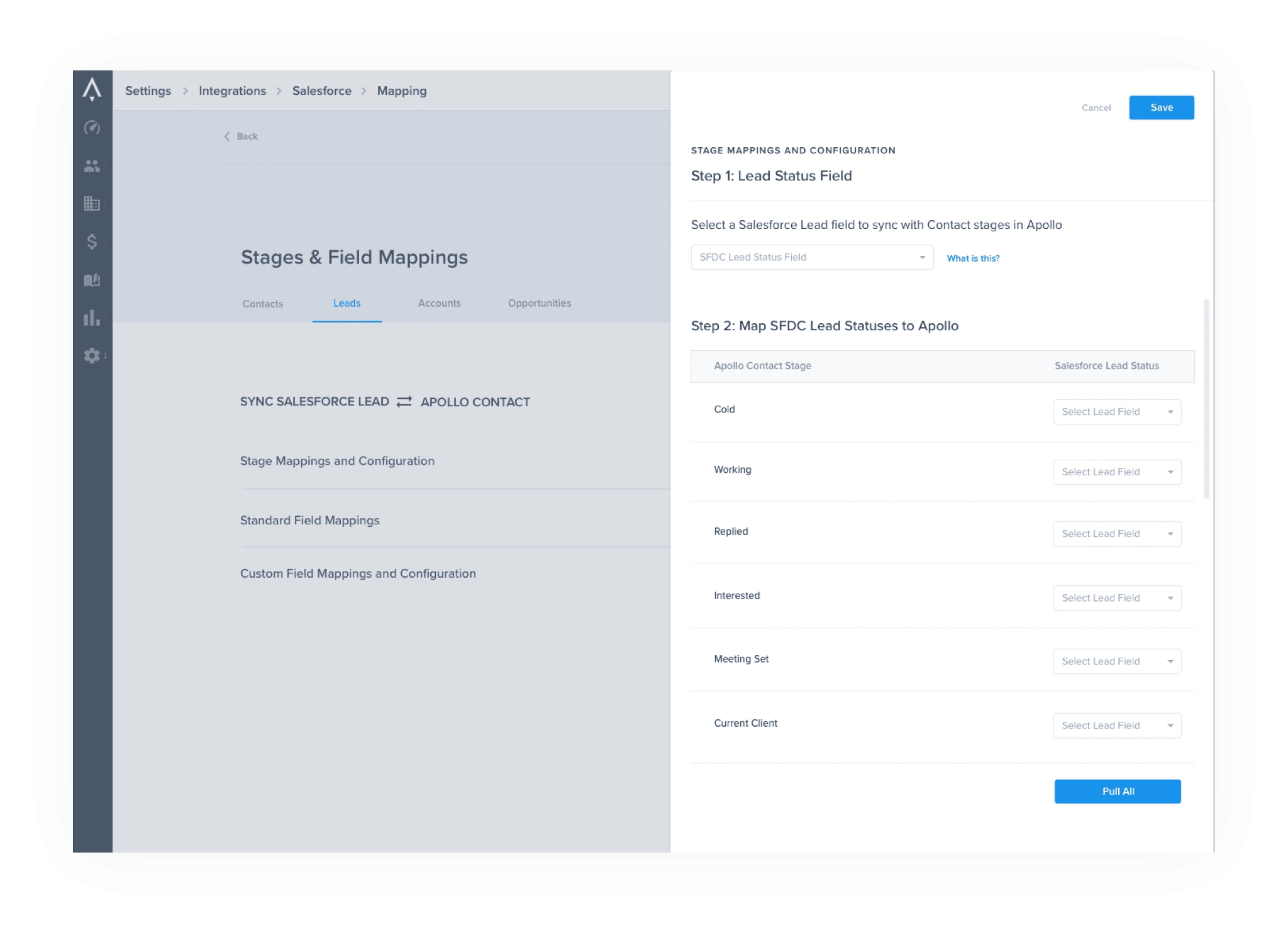
Final Solution
I created a new action-based workflow that guides users through each stage of setup while also informing them why each stage is essential to optimizing their experience with Apollo.
The new way the page was set up solved for the two type of users we talked about earlier: the 1st time user and the repeat user.
By avoiding a "wizard" style approach we avoided making revisiting this page and settings tedious for existing users. In order to make the process user friendly for first time users we simplified the amount of options and organized everything by user intent.
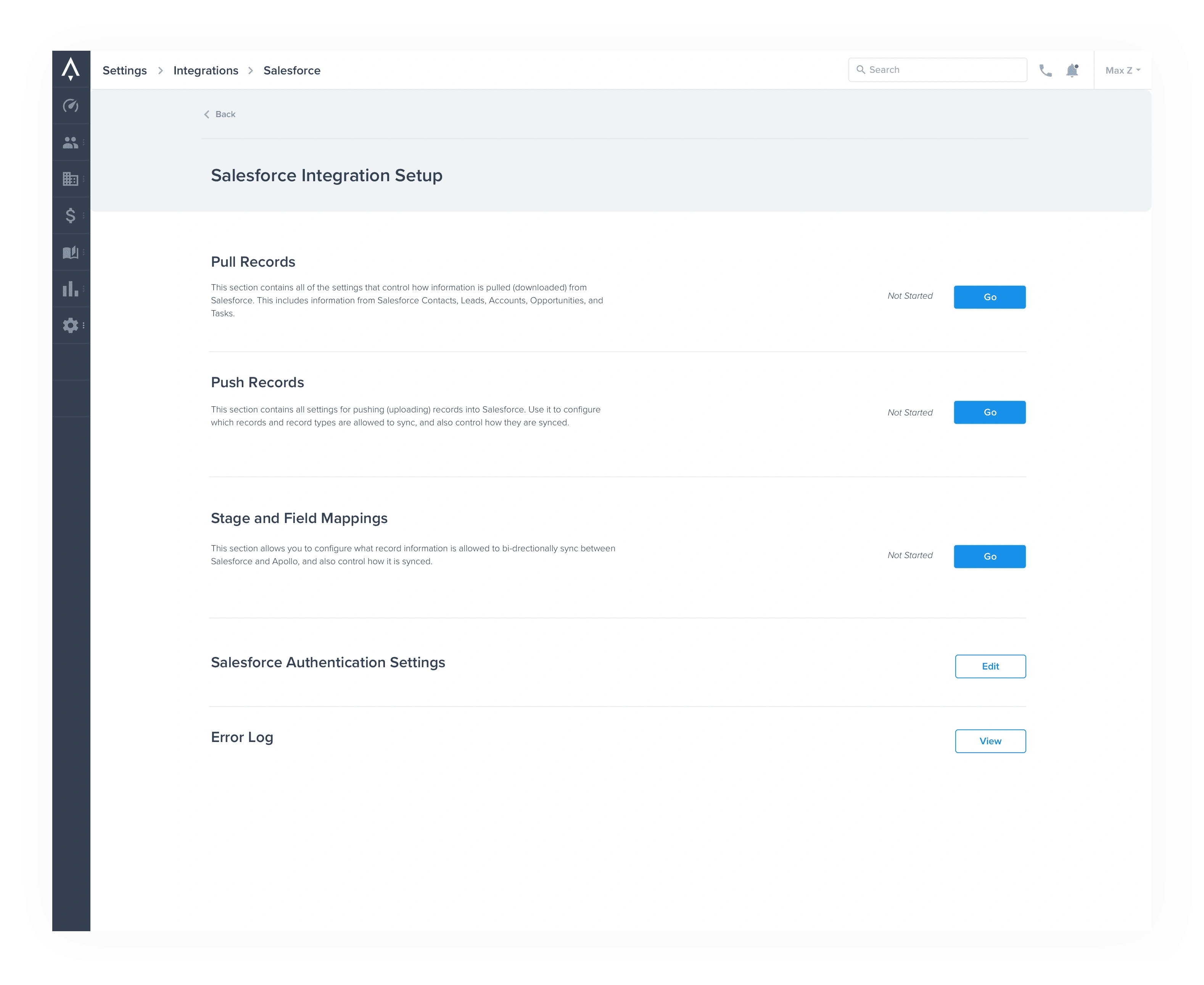
To make the setup process error proof I pulled out the most important parts of the process and made them required for all users to complete before reaching the flexible setup page.
This eliminated one of the MAIN places users were making mistakes before and also allowed us to explain WHY team sync credentials were important in the first place.
Better writing and new components made each individual settings option clearer
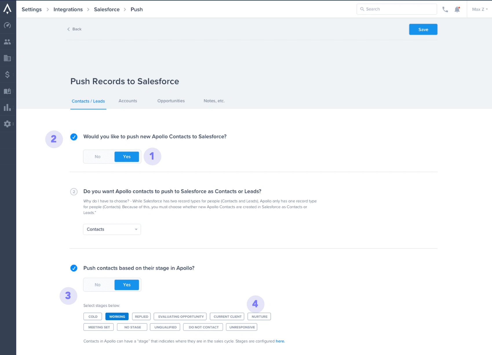
Yes/ No Toggle: The use of a large Yes/No toggle instead of tiny radio buttons was purposeful and was meant to implicitly lead the eye to some of the most important questions in the setup process. It was a way to provide some hierarchy to the page along with some visual user feedback so any user could quickly assess what was going on with a setup configuration at a glance.
Checkmarks: Gave users a visual signal for when a step was done or a feature was on.
Progressive Disclosure: My PM and I worked hard to cut out any superfluous information that a user might not need right away. Some questions would only appear if you selected yes on a question before it, whereas before everything was just splattered on the page all at once.
Stage tags instead of dropdowns: Visually we learned it was easier for users to comprehend the different stages of a sales cycle if they could see them all at once. Before this feature was formatted as a dropdown but we changed it to a group of tags so that users could more easily understand what they were looking at and plan out their stage mapping.
I also lowered cognitive load by segmenting the stage mappings setting into digestible pieces
Not all users going to the CRM settings area were looking for stage mapping settings. This was an advanced section of the setup process so it was placed one level lower than the basic setup as a way to lower cognitive load for most users.
In order to make the actual stage mapping process easier I did a few things:
I made sure to emphasized step one: this is where a lot of users would make a mistake, they didn’t really understand what step one was or why it was important so we segmented it out and also included a “what is this” tool tip to guide users with questions
I separated "Leads Mapping" and "Contact Mapping" into two different pages to prevent errors: Salesforce has two objects that can represent “people” and whichever one you use in SFDC will affect what you need to set up in Apollo. So by separating the mapping out by object we hoped to let users know they don’t HAVE to set up both just because both are on the screen, just the ones that are relevant to them. This was a major problem with the previous iteration of Apollo's setup process, people would setup both "people" objects and end up committing an error called "double mapping" that customer support always had to troubleshoot out with users.
Results and Learnings
Learnings
As Apollo becomes more and more self serve users increasingly come in with Hubspot since they are smaller companies. In retrospect it could have been a good idea to start with the Hubspot integration rather than salesforce since it would have helped the new bulk of self serve customers that were attracted to our feature.
Results
Salesforce related tickets have gone down by 50%!
Want to see more? View Prototype here.
Like this project
Posted Aug 4, 2023
Lowering Salesforce related customer support tickets by 50% though a new simplified and self serve CRM integration process with Apollo


Apollo | Pricing & Plan Management System

UI Goodies

Reddit: Creating a safer space for users
Apollo | People and Companies Searcher