Apollo | People and Companies Searcher

Andrea Margolis


Context
What is Apollo?
Apollo is a B2B SAAS platform that empowers sales and marketing professionals to find and reach out to their ideal prospects while also offering analytics that help users learn and optimize their process all in one place.
Who is the user?
Sales development reps (SDRs), business development, sales leaders, marketers, recruiters, or startup founders who are trying to find the right people to target and get in contact with them.
The problem
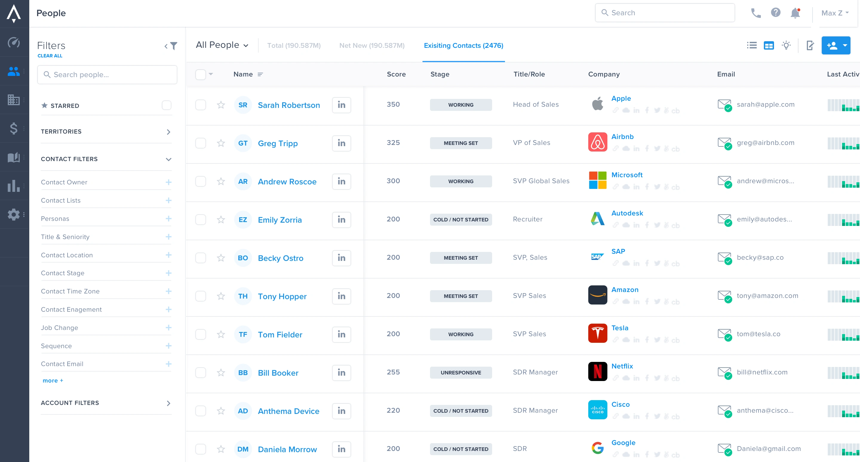
Getting value from the app was not straightforward. The contact search feature was the main reason people signed up for Apollo. At the time it was split across 3 different pages on the app: prospector (to find new people & companies), contacts (to find users in your CRM) and accounts (to find companies in your CRM).
New SDRs (sales development representatives) were often confused about how to start prospecting.
Seasoned users had adapted inefficient workflows due to the current way the app was structured.
My Goal
Improve the usability of Apollo’s core prospecting features so new users could immediately see the value of Apollo as a prospecting tool. At the time Apollo had an influx of new users who came in through our self service feature with no help from support. Users who can recognize value are happy users.
Research & Discovery
In order to make sure we were making the right changes we tested and investigated our hypothesis about the prospector issues through three forms of research: 1) Discovery Research 2) Usability Testing of the current product and 3) Customer Support feedback
Learning 1: Using Apollo was just confusing
Apollo’s visual language and site architecture for its three separate prospecting pages (prospector, contacts, and accounts) caused constant confusion with users.
There were three separate pages for what users really only thought of as two separate components, people and companies - so they would get confused and not know where to start. During tests we noticed users clicking into the wrong place all the time.
On the flip side we had new users go directly to the “contacts” page to find “net new prospects” and again could not find what they were looking for.
Learning 2: People just want to see who they should be targeting (keep it simple stupid)
For the second major learning we found that people just wanted to see who they should be targeting without any extra noise. We learned that users don’t perceive different people as "contacts" vs "prospects" - they just see them as people at different stages of the sales cycle.
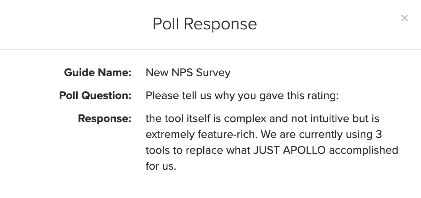
Learning 3 : Bad usability = loss of trust
Bad usability plus a bunch of user caused errors equalled our users losing trust in us in the end. Users commonly made mistakes when prospecting and blamed Apollo when results were not optimal. The way the tool was built we gave users too many ways to mess up a simple search - and when they would mess it up they just thought Apollo had bad data or wasn’t working. Below I listed just a few of the issues that were causing confusion for our users:
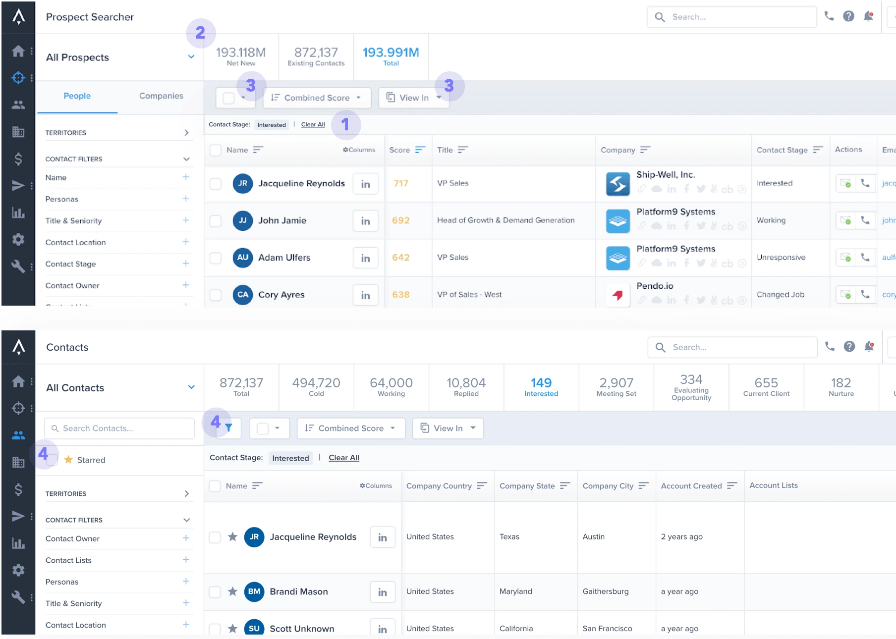
The "Clear all" issue:
The Pipe-bar Issue
Confusing and unnecessary action buttons
Random Discrepancies across pages
Design Stage
Sketches helped me play around with different visual hierarchies.
I had a list of tasks I knew users wanted to be able to accomplish but choosing what was of the most importance proved to be a challenge.
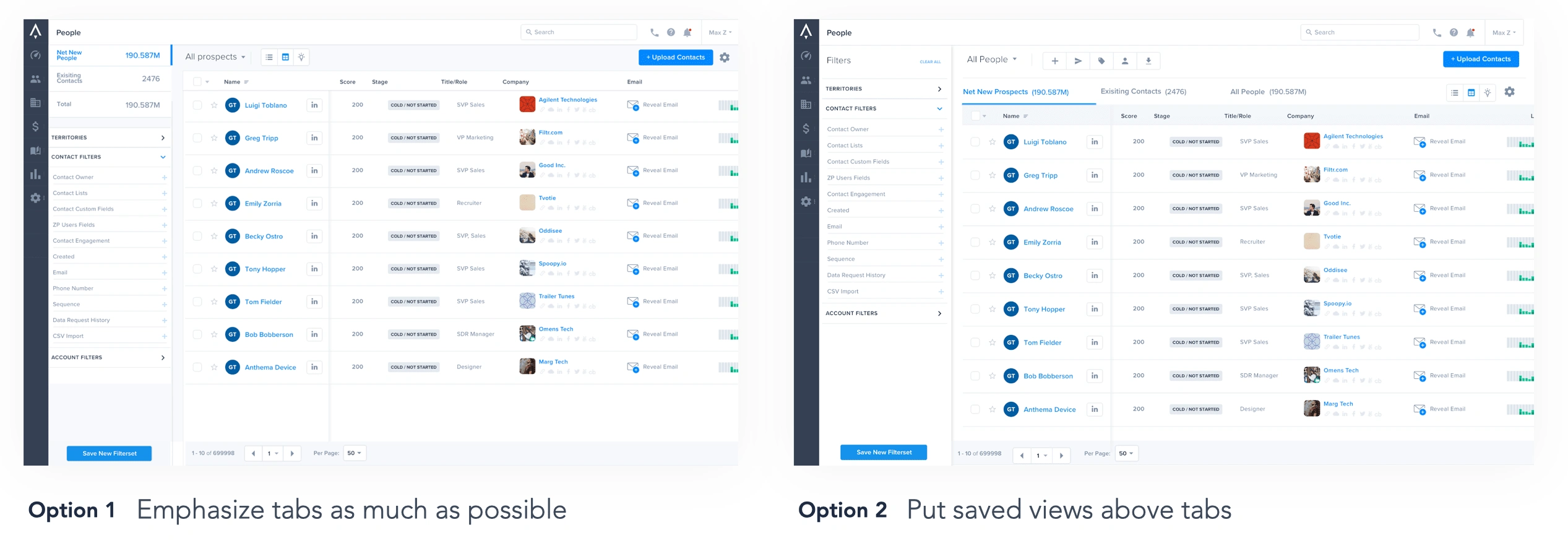
should tabs go above saved views? Should saved views be primary?
How do we crunch down the amount of horizontal bars taking up important space on the page?
Should we emphasize the tabs are they that important?
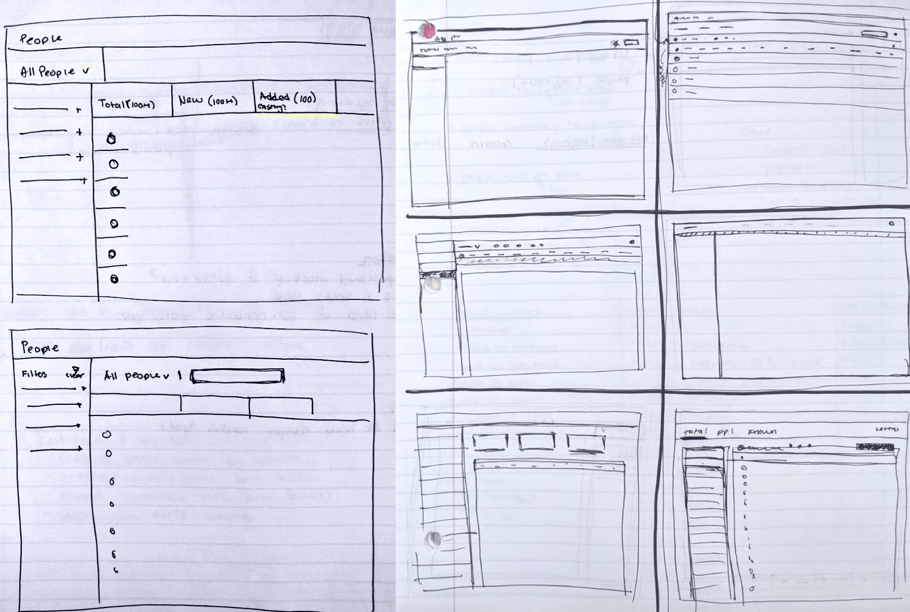
Iterations helped facilitate a team discussion before doing a final user test.
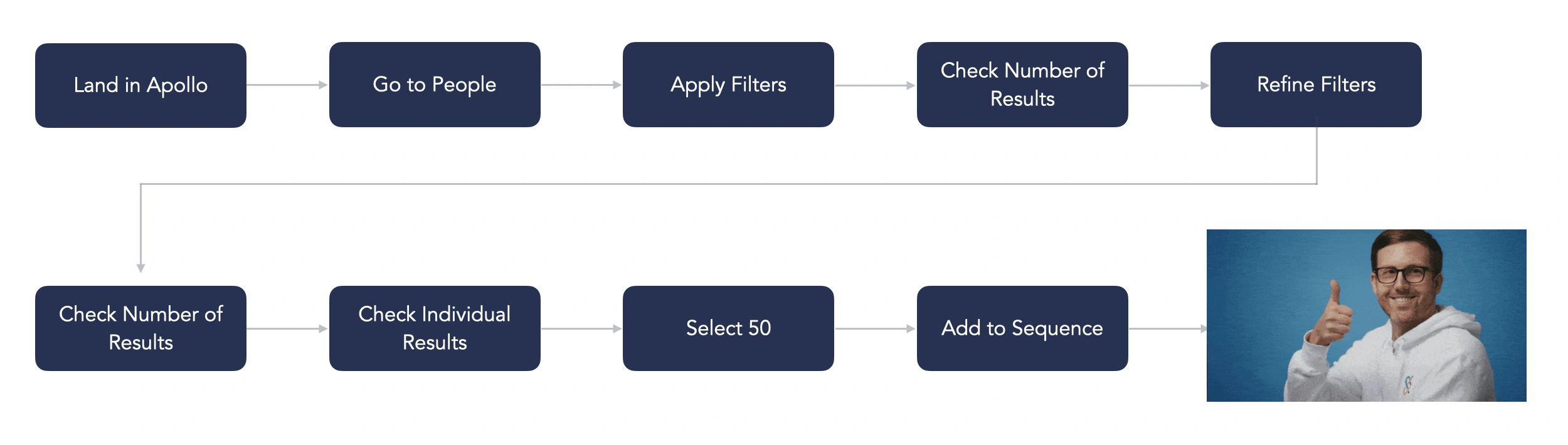
I then created an SDR’s optimal task flow to further guide the direction of my designs in a user centric way.
Final Solutions
Solution 1: Consolidation
I consolidated the three pages into “people” and “companies” pages and eradicated any confusion about where to find things.
Solution 2: Visual and Implicit Guidance
Added implicit guidance by deemphasizing certain elements that were taking up attention before (like blue buttons), making the tabs really obvious that you could click them and just removing action buttons that weren’t relevant
Solution 3: User flow driven design
I optimized the design for extremely common flows. For example, I made the filter bar collapsable on every page (it wasn’t before) so that the data could be the star of the page. In reality users were usually only applying filters once and then working with the data for a while so having the filter bar be ever present was not a good use of space.
Solution 4: Global improvements to Apollo's design system
I also proposed changes to the design system and worked with engineering to implement those changes.
Eng Handoff
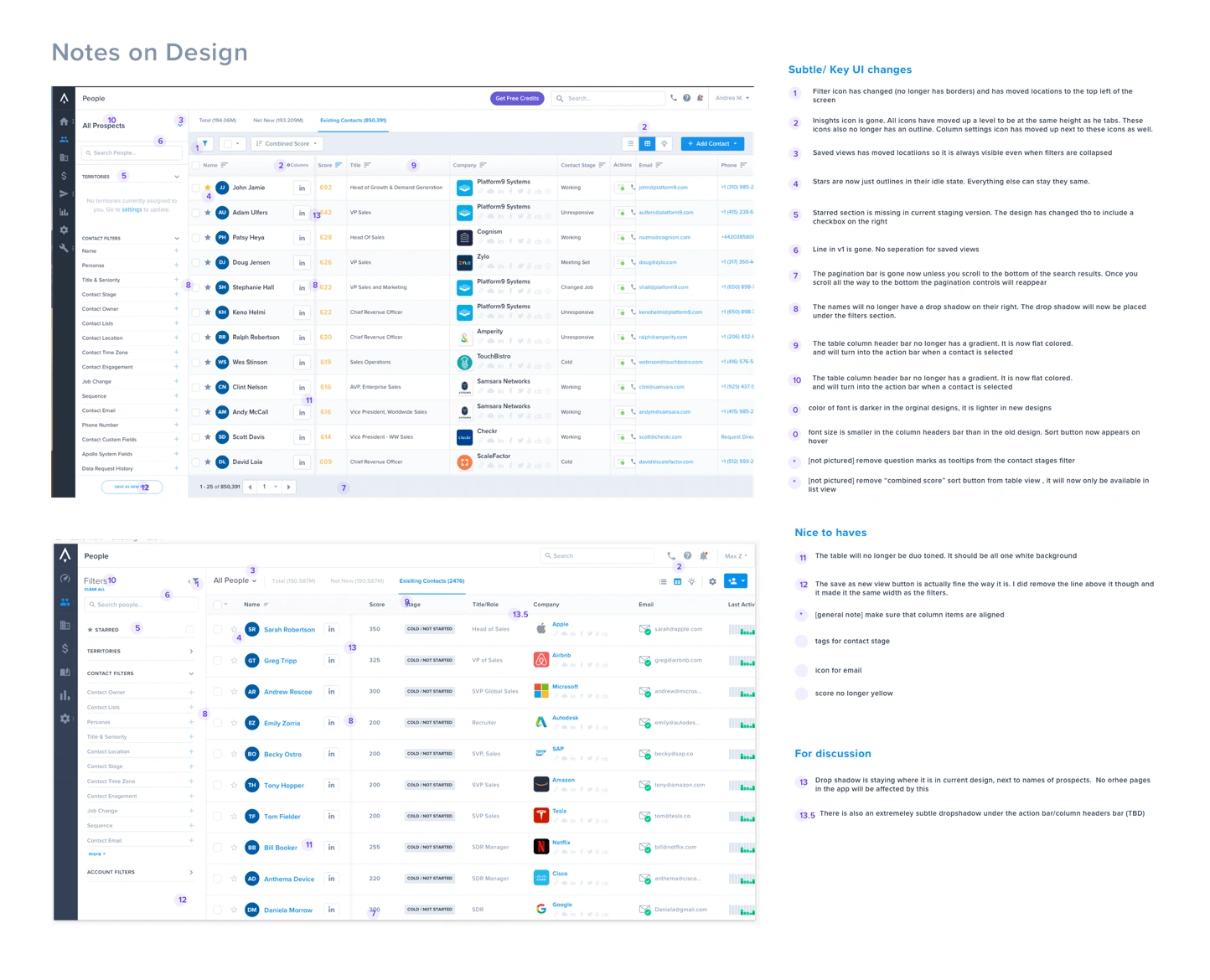
When it came to engineering handoff I wanted to make sure that the learnings we collected were not lost in translation. I used Zeplin to do the design handoff and created specific design specs in Sketch. Once the engineers had something for me to evaluate I did 3 rounds of design QA with detailed and prioritized notes as seen in the image below.
Results
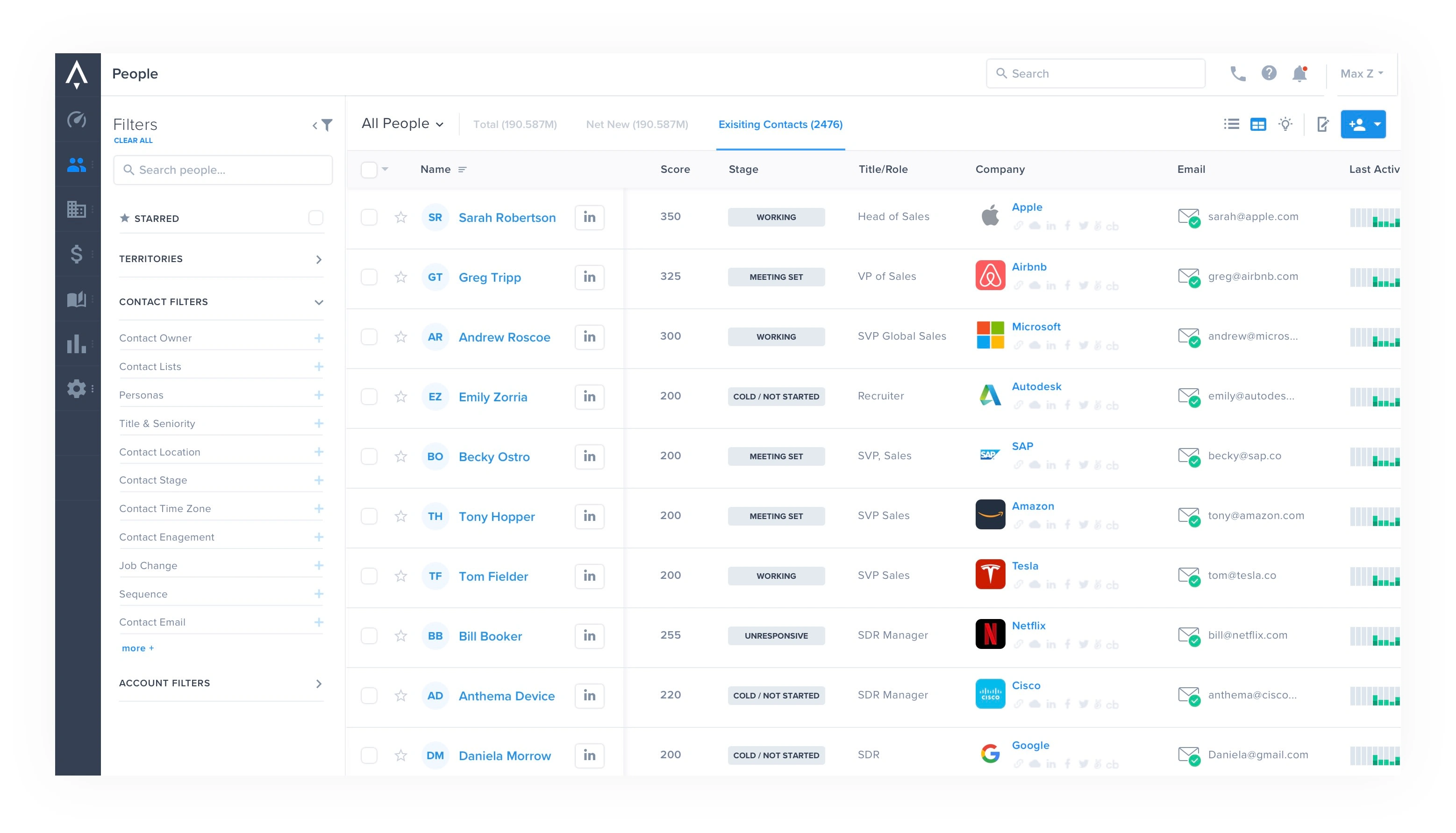
Before
Apollo previously had three core pages: Prospector, Contacts, and Accounts. Users had to search for leads on one screen and then go to a different screen just to find that person again.
After
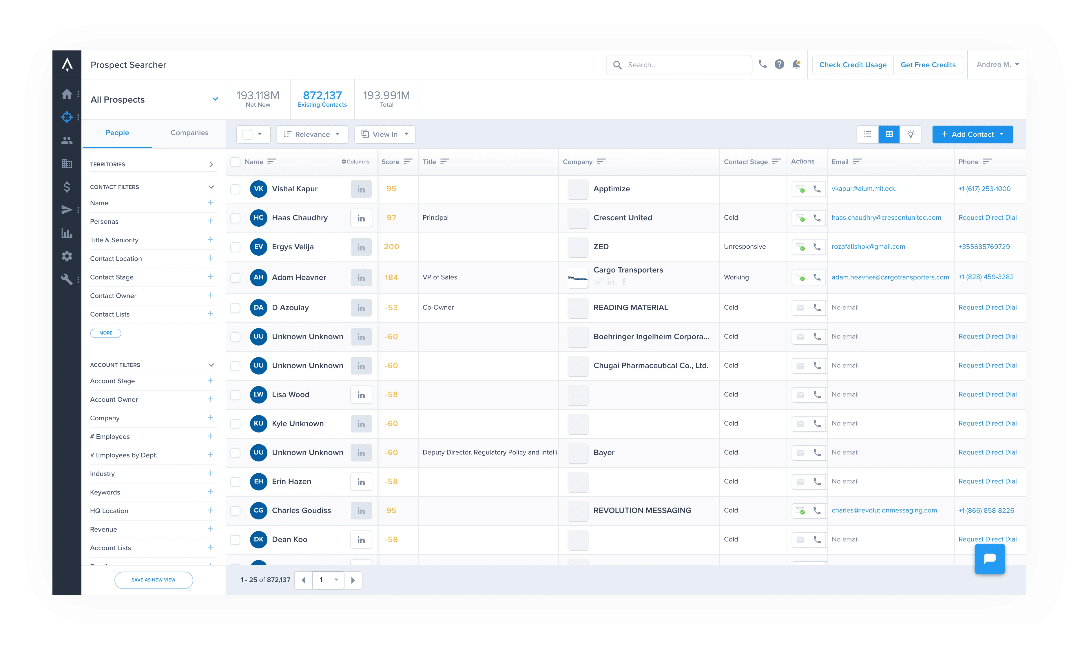
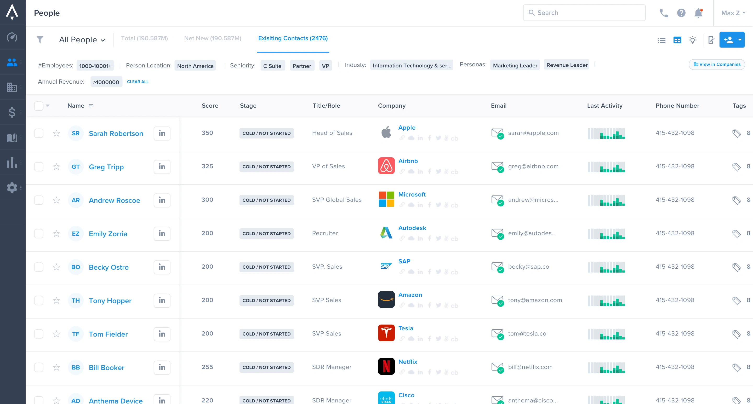
I consolidated our pages into an all-in-one solution for finding new leads and organizing CRM contacts.
Instead of having to pick between untouched contact "prospects" , people they had contacted before, and companies our users could now just think: "am I looking for a person or a company?". From there our users could drill down and find either uncontacted or contacted people and companies all without leaving the initial page they started on. It was a flip of the information architecture but it was way more intuitive.
Impact
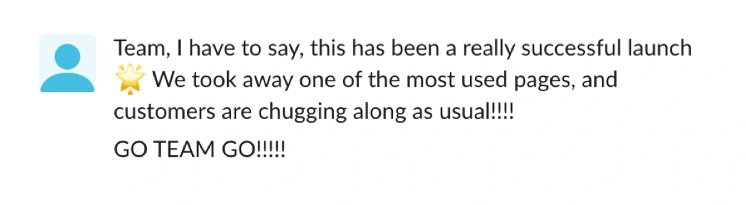
When the product was launched users and the team were happy. This was our first step in our initiative to simplify Apollo as a whole. As one of the most heavily used pages improving the prospecting experience was incredibly important in increasing Apollo's stickiness.
In the end 79% of survey respondents felt the new design was easy to use.
Want to see more? View the prototype here
Like this project
Posted Jul 20, 2023
Redesigning and simplifying Apollo’s core workflow.


Apollo | Creating a User Friendly CRM Integration Process
Apollo | Pricing & Plan Management System

UI Goodies

Reddit: Creating a safer space for users