Sekoni Fashion Brand Identity
Secil Akinyemi
Started with strategic research, looking at what is already available, being inspired by the world around us, discovering and applying best practices concepts from big players in this market and beyond.
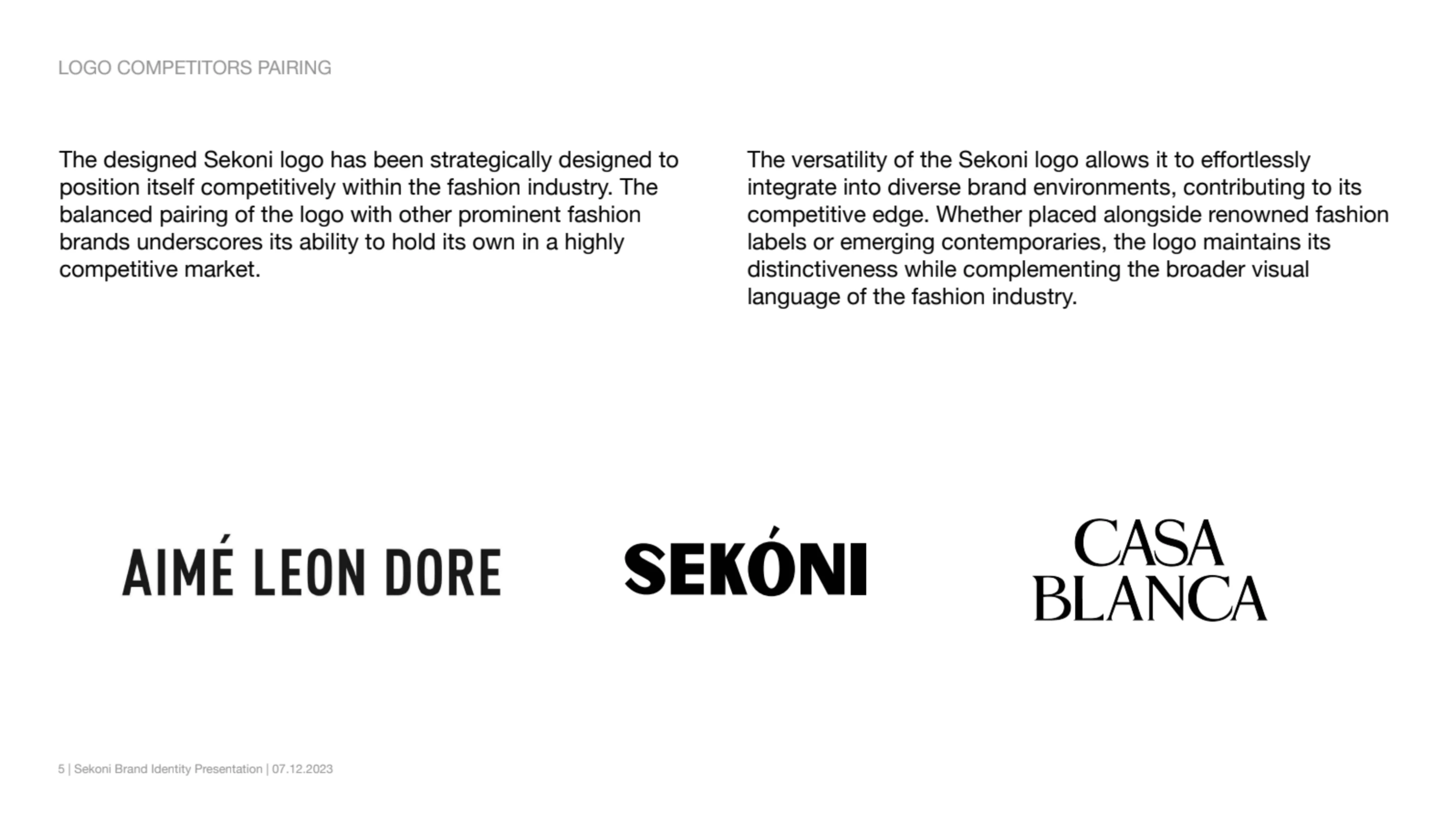
Following up from our discussion, here are some important aspects I have outlined to drive the overall identity design project for Sekoni Fashion Brand
Approach Strategy
To tackle Sekoni's brand identity, I had to understand the core of brand
What is the story behind the brand?
After lengthy discussion with the founder, Uthman. I realized that Sekoni is more than just a fashion brand; it is a message and a reminder to people.
Sekoni transcends conventional fashion, embodying a profound message summed up in the Yoruba saying "Se-Koni" meaning "Do to have." The brand promotes the synergy between hard effort and success, encouraging people to accept the grind to eventually relax in the warmth of success.
This takes us way back in time, through school. A childhood experience of a song we sang while growing up. Originating from the Yoruba language, Sekoni draws inspiration from the hardworking cultural heritage of Nigeria.
The childhood song "Bata mi a dun koka" serves as a nostalgic anchor, echoing the teachings of resilience, hard work, and the promise of a bright future.
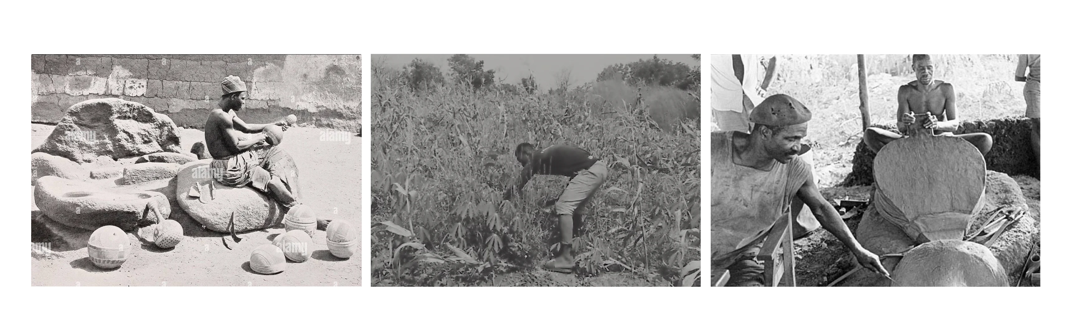
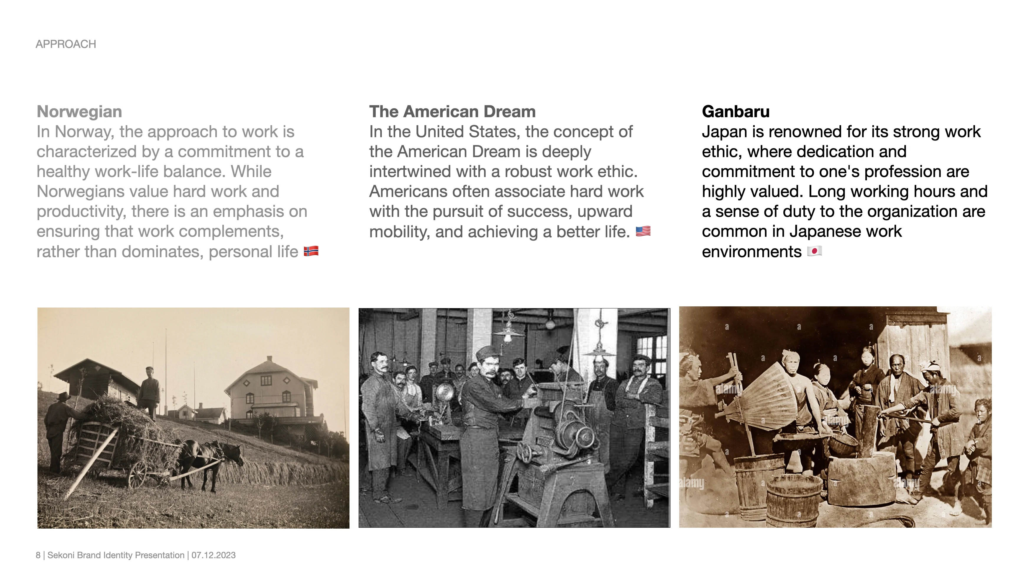
Hard work is a universal thread woven into the fabric of cultures worldwide. It transcends borders, languages, and traditions, shaping the aspirations and values of societies globally. Whether pursuing the American Dream, embracing the Japanese dedication to excellence, or prioritizing work-life balance as seen in Norway, the concept of hard work serves as a common denominator. It is the driving force behind individuals striving for success, the backbone of economies, and the shared belief that sustained effort yields personal and collective fulfillment. Globally, hard work is not merely an action; it's a universal language that unites us in the pursuit of progress and the realization of dreams.
Concept Statement - Work Hard, Live Easy
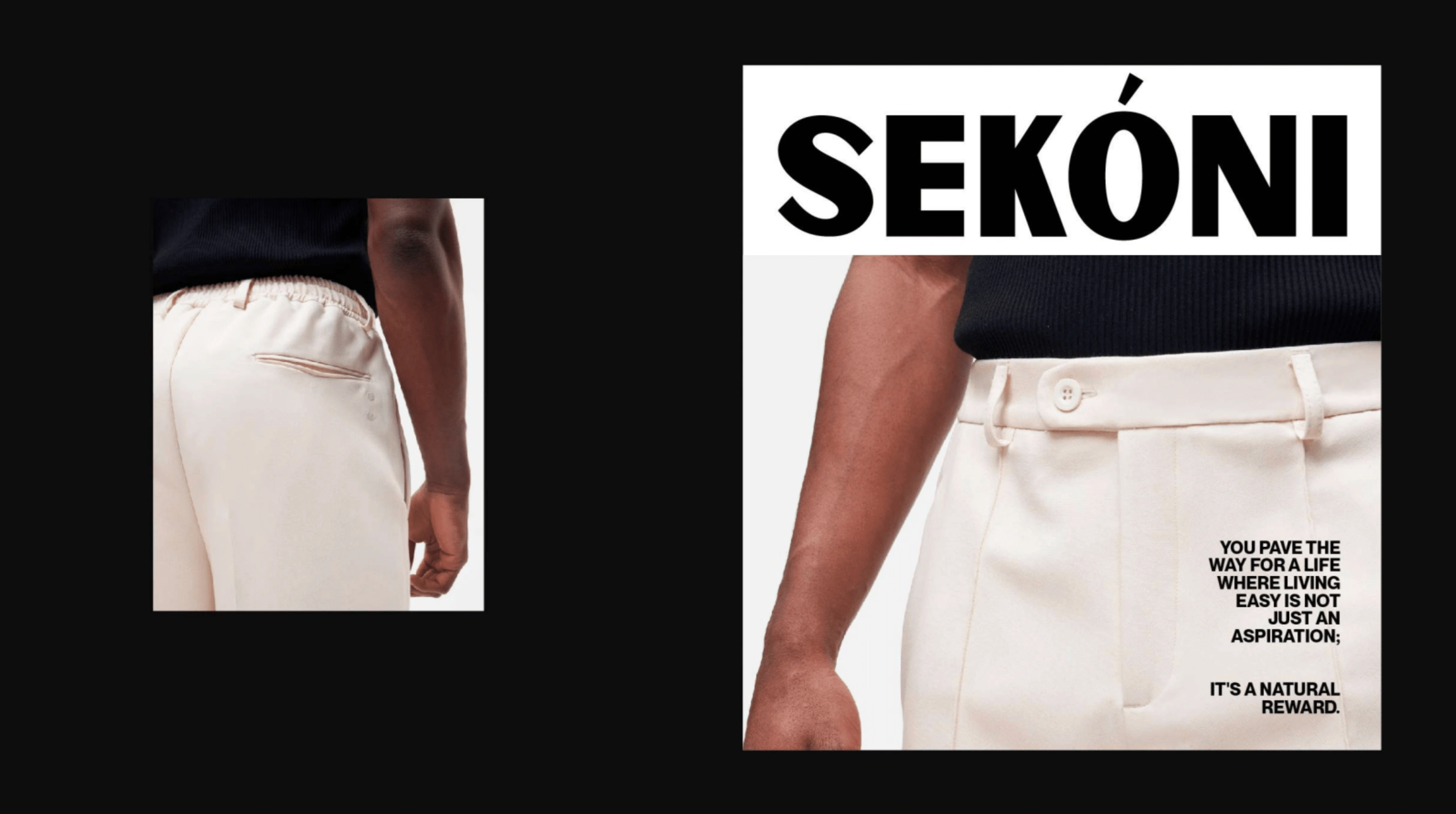
Selecting Sekoni is not merely about building a wardrobe; it's a deliberate decision to embody a philosophy of hard work and the resulting ease in every aspect of life.
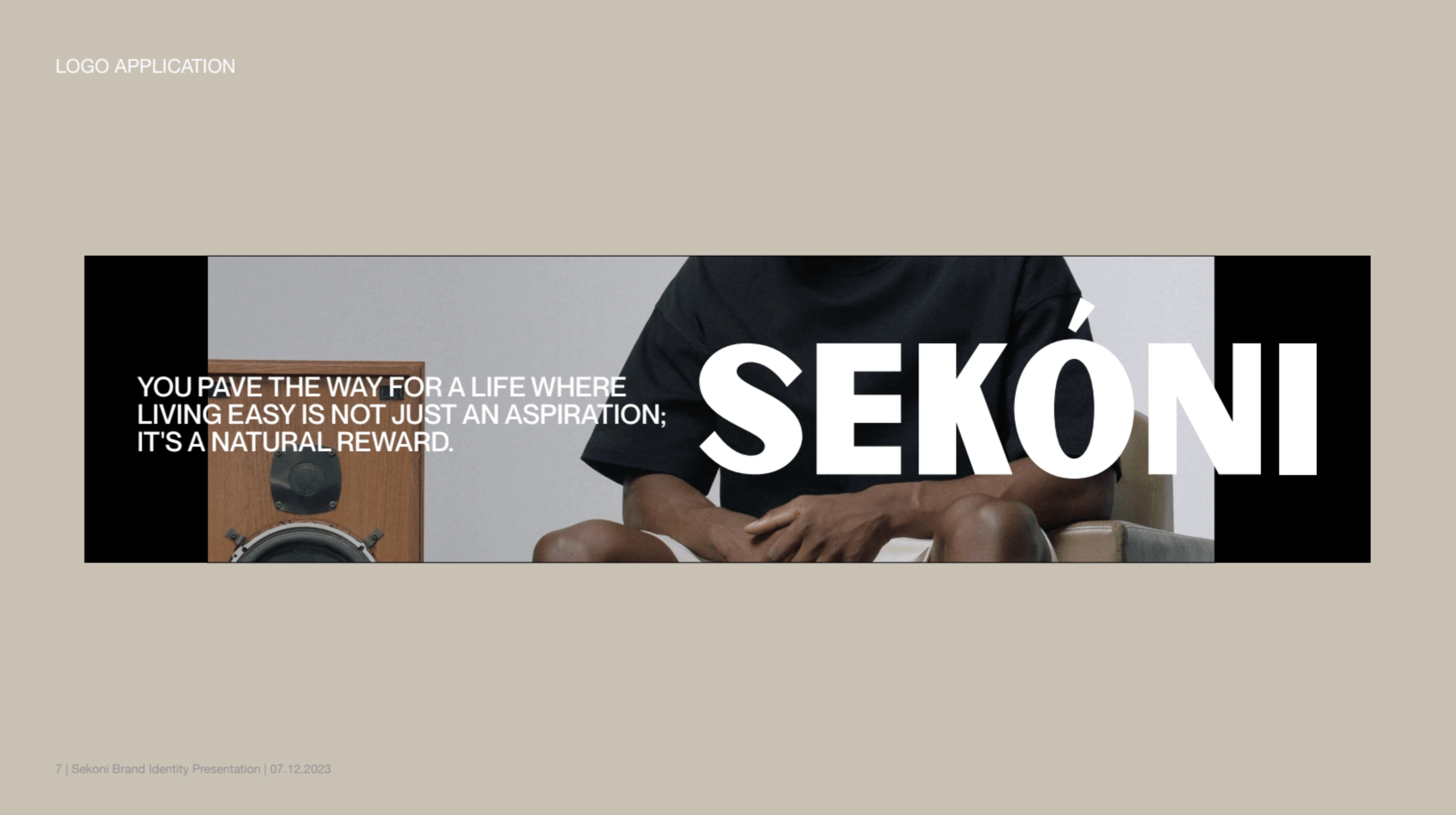
As you immerse yourself in Sekoni, we envision it as more than a brand - It’s a reminder that by working hard, you pave the way for a life where living easy is not just an aspiration; it's a natural reward.
In essence, Sekoni is an invitation to people to experience a life where the fusion of hard work and ease is not just an abstract concept but a tangible daily life; Working Hard
Fulfillment and Enjoyment:
Customers experience fulfillment through Sekoni products. Each purchase is not just a transaction but a source of enjoyment, contributing to a sense of satisfaction and happiness in their lives; Living Easy
Quality of Life
Sekoni's focus on elevating the quality of life extends beyond products. Customers align with a brand that values their overall well-being, creating a positive association that goes beyond the act of buying.
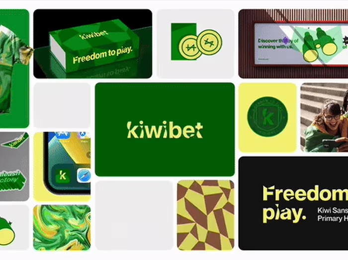
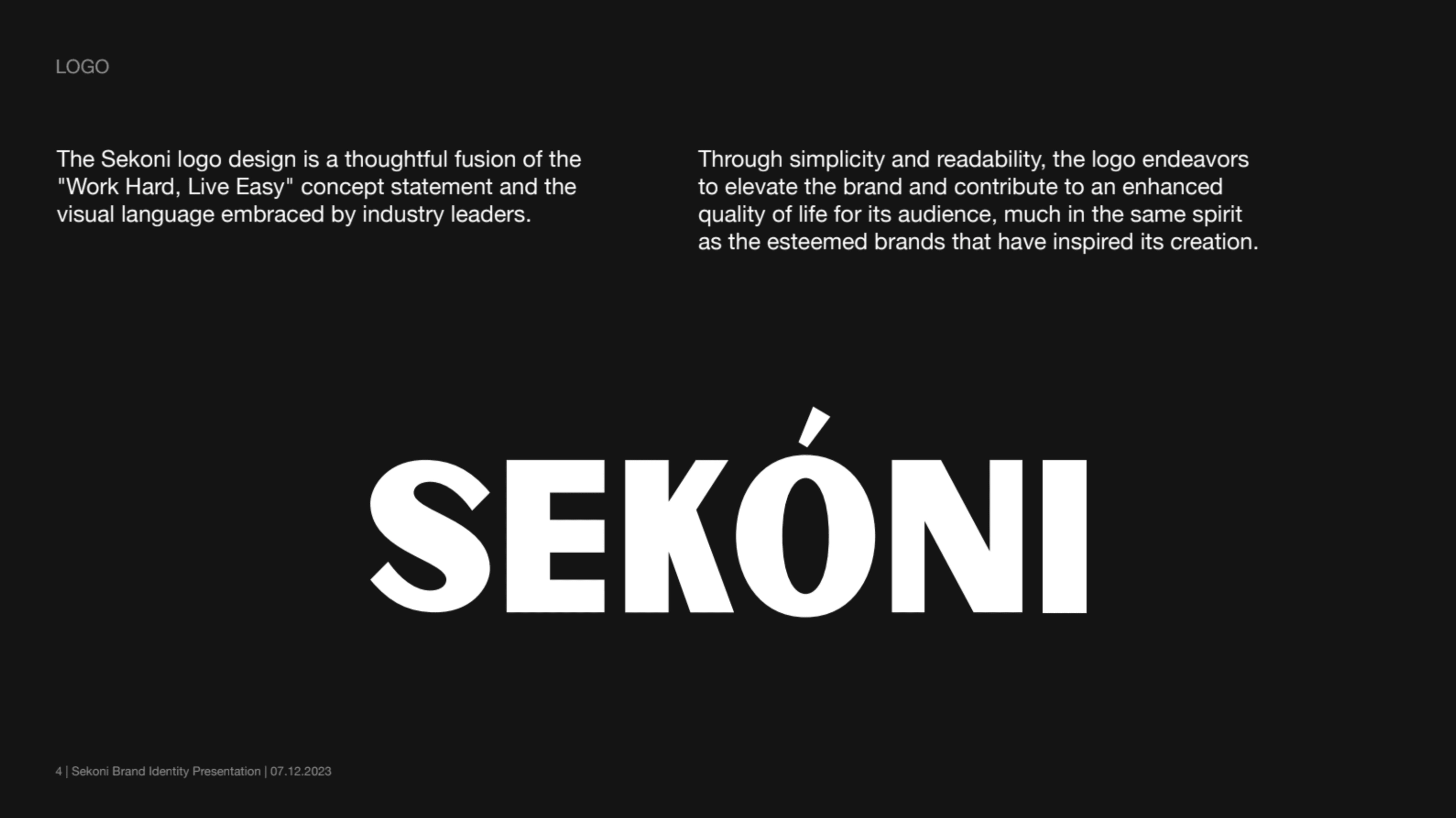
The choice of a simple and legible typeface reflects the clarity and straightforwardness seen in the branding of well-established companies renowned for enhancing everyday life.
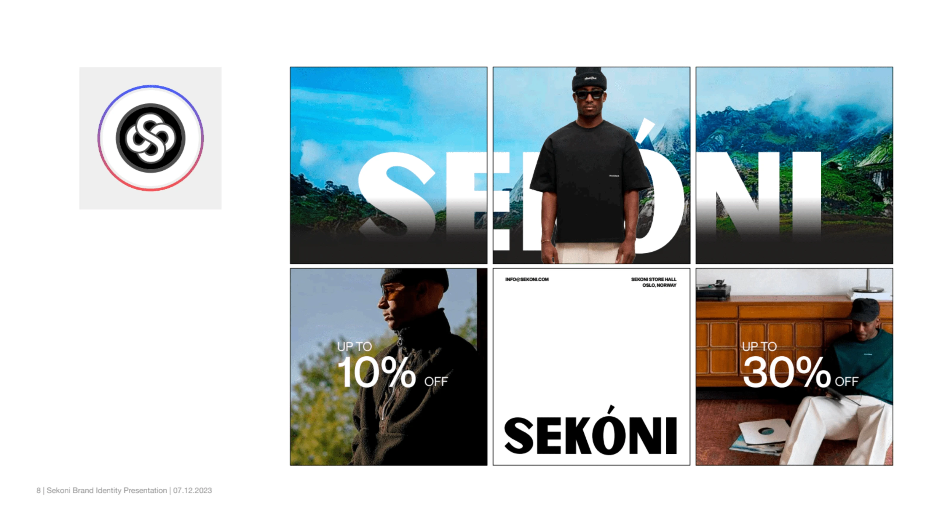
The Sekoni logo reflects the idea statement "Work Hard, Live Easy" and draws inspiration from renowned brands like Apple, LG, Samsung, and Headspace—all known for enhancing quality of life through their products and services. The use of a clean serif or sans-serif typeface aligns with the minimalist and approachable aesthetic associated with these brands.
Sekoni shares the same vision: to elevate the overall quality of life.
Logo Mark
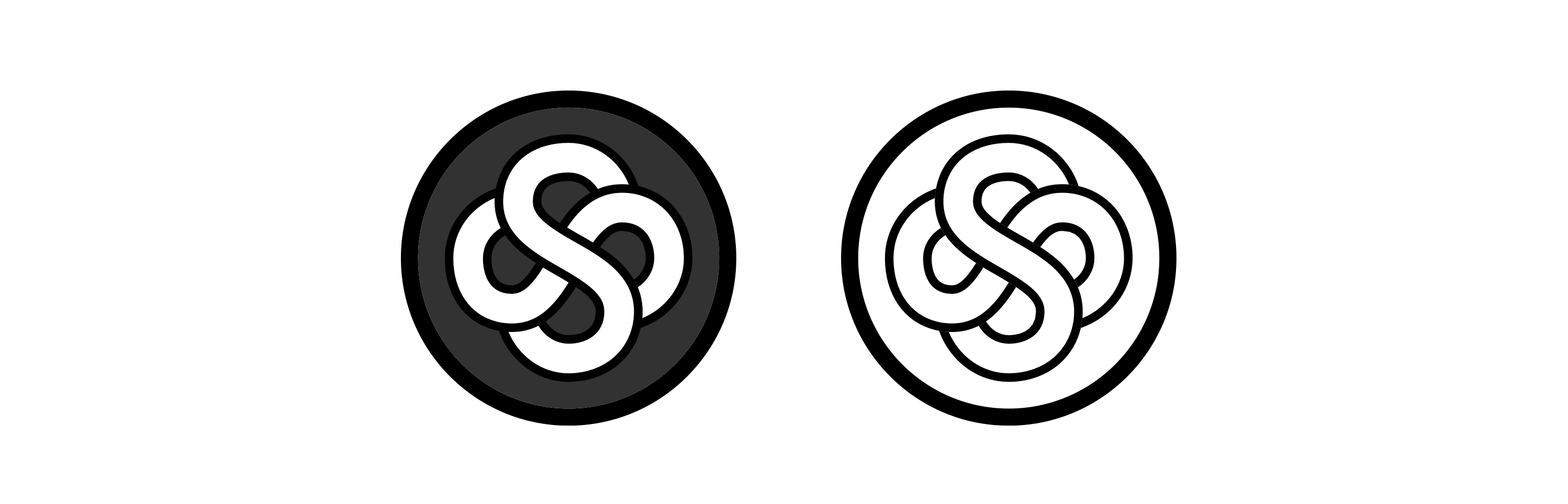
The Sekoni icon is a refined expression of the brand's ethos, 'Work Hard, Live Easy,' encapsulating the idea that 'your input equals your output.' It draws inspiration from the yin and yang principle, emphasizing the balance of effort and reward—what you give is what you get.
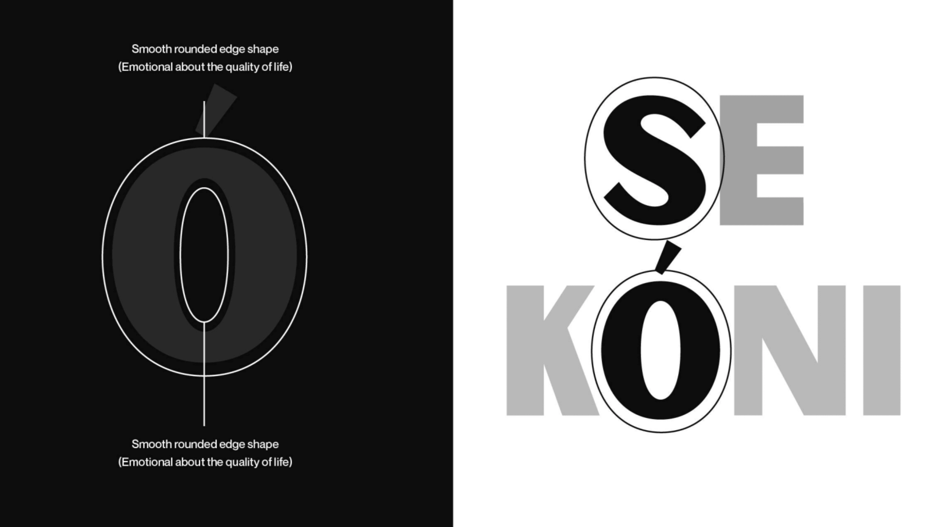
Wordmark Variation
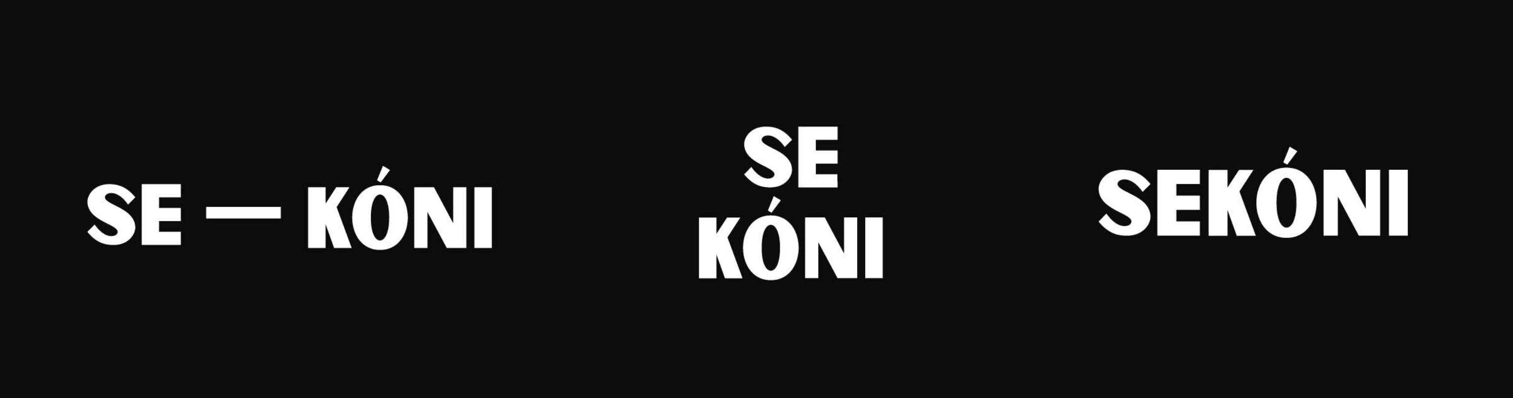
The first adaptation showcases a clean and impactful presentation of the logo, with the equal dash symbol prominently positioned from left to right. Representing 'input equals output,' this straightforward design ensures instant recognition of the brand's core philosophy, highlighting a balanced approach to work and life.
The second adaptation retains the essence of 'input equals output' while introducing a dynamic split variation. In this design, 'Se' is positioned at the top, with 'koni' below. This arrangement symbolizes a harmonious balance, visually reinforcing the brand's philosophy of equilibrium between effort and reward
Like this project
Posted Nov 18, 2024
Brand Identity for Sekoni Fashion, a sophisticated fashion brand based in Norway, with heritage root tied to west Africa