Betfuse Brand Identity
Secil Akinyemi
Betfuse is a sport recreation platform in West Africa
Looking at the space Betfuse occupies as a business in Africa, it is easy to understand the need for a fresh approach to sport betting.
Betfuse needed a brand that would adapt to the rhythm of everyfan
A Fuser (fan) that would understand the mood, set the tone and generate buzz before, during and after the game with high winning rate
Key Considerations
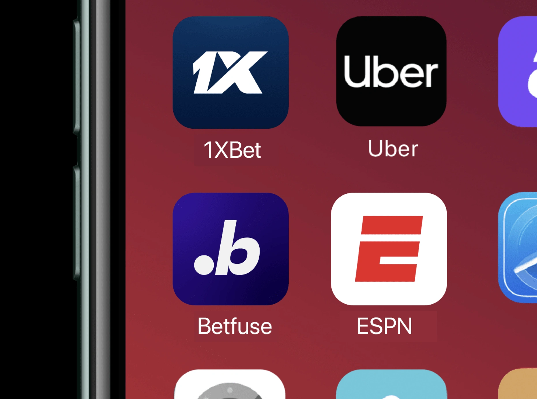
Take complete ownership of the name “Betfuse”
Standout from the competition without looking allien
Transform the brand identity from stale to believable and applicable.
Design for a smooth transition from the old identity to the new
Give the brand a strong sophisticated and forward thinking approach, from ideas, to metaphors, to execution
Concept
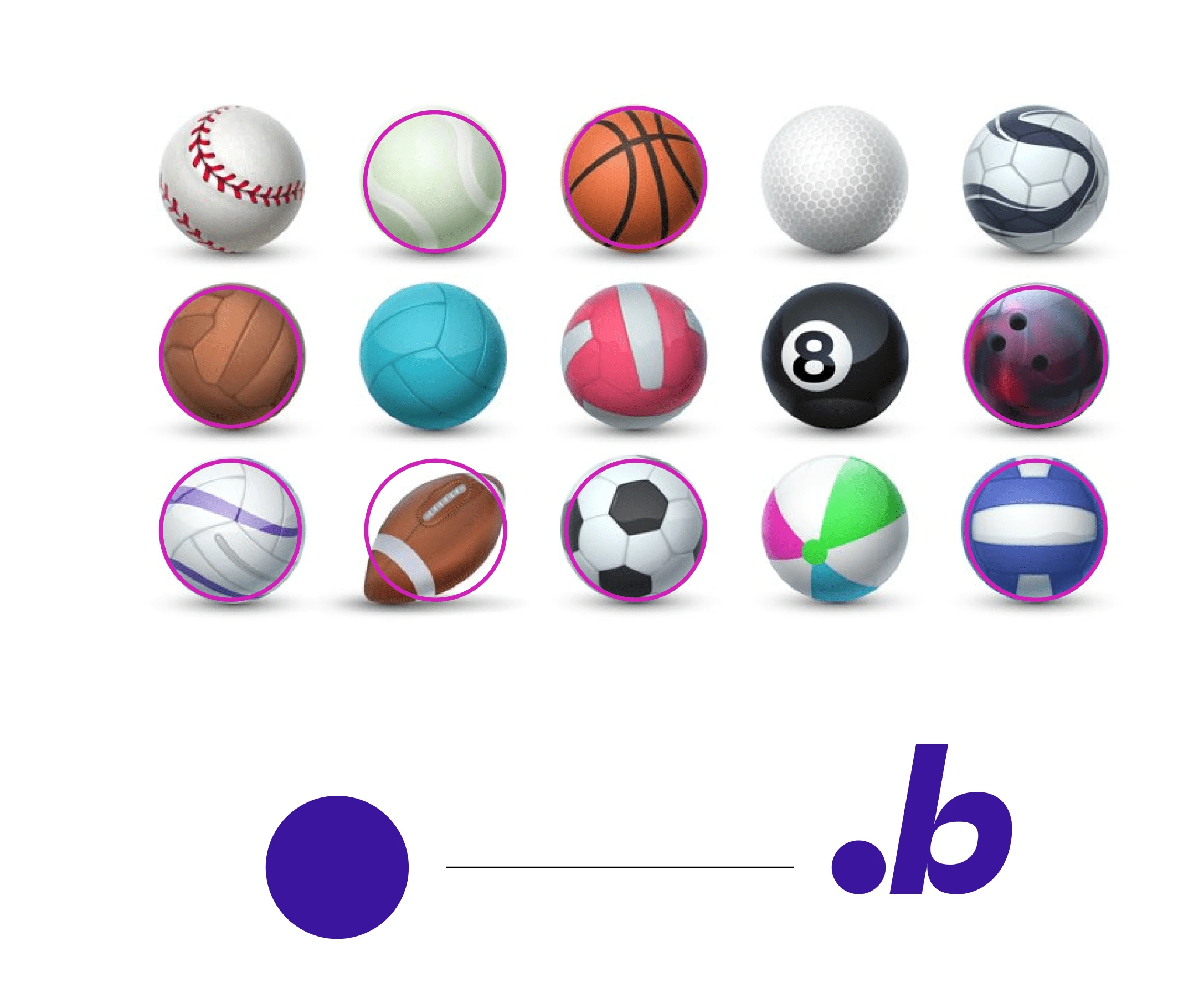
There are lots of different sports that use balls or spheres of some sort, ranging in size and weight.
Why do most sports use a ball?
What you likely find is that most team sports use balls because it serves as a central point of focus in games with many people. Trying to organize a sport with large teams playing against each other usually results in lots of smaller matches within the central game.
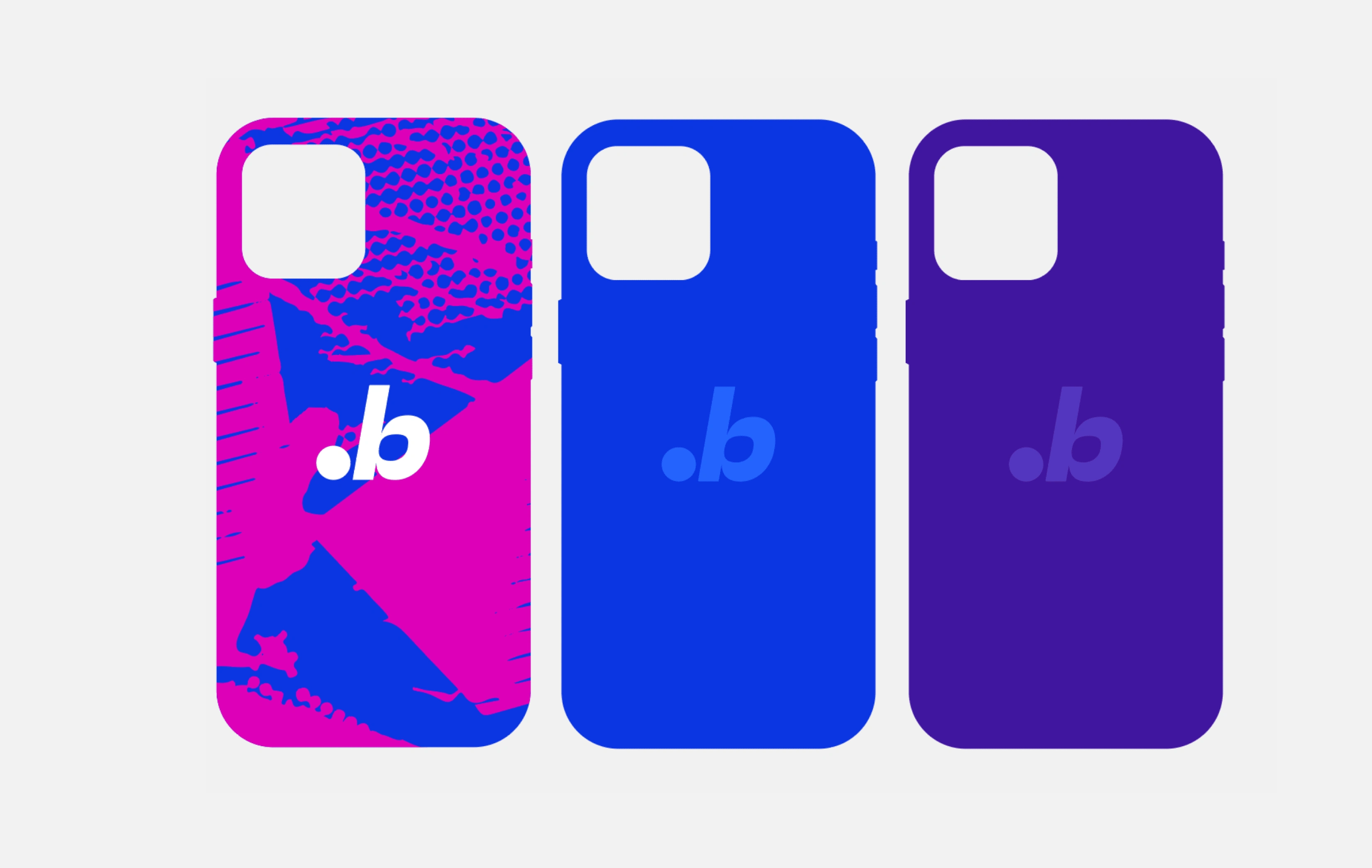
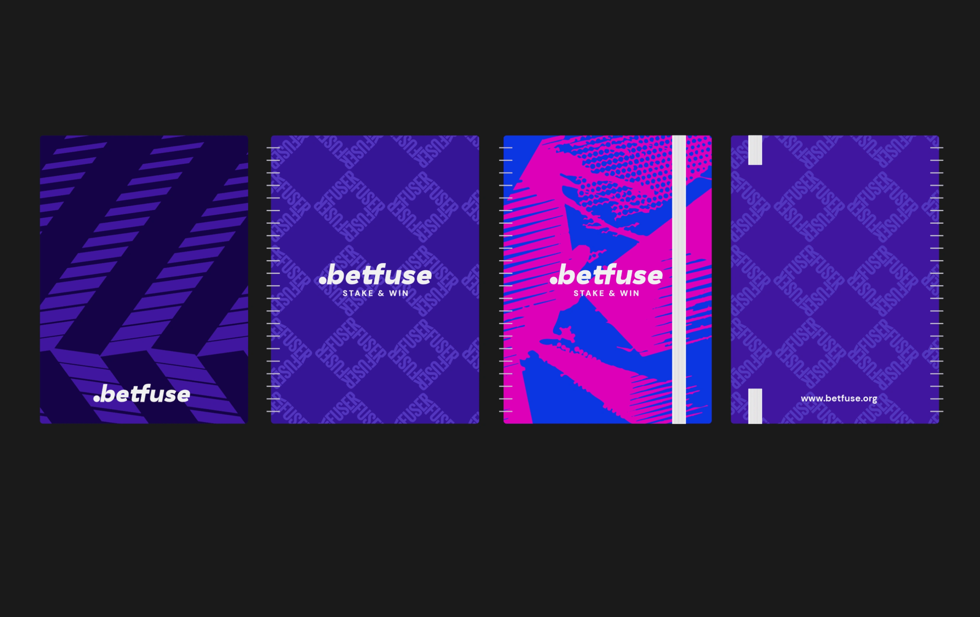
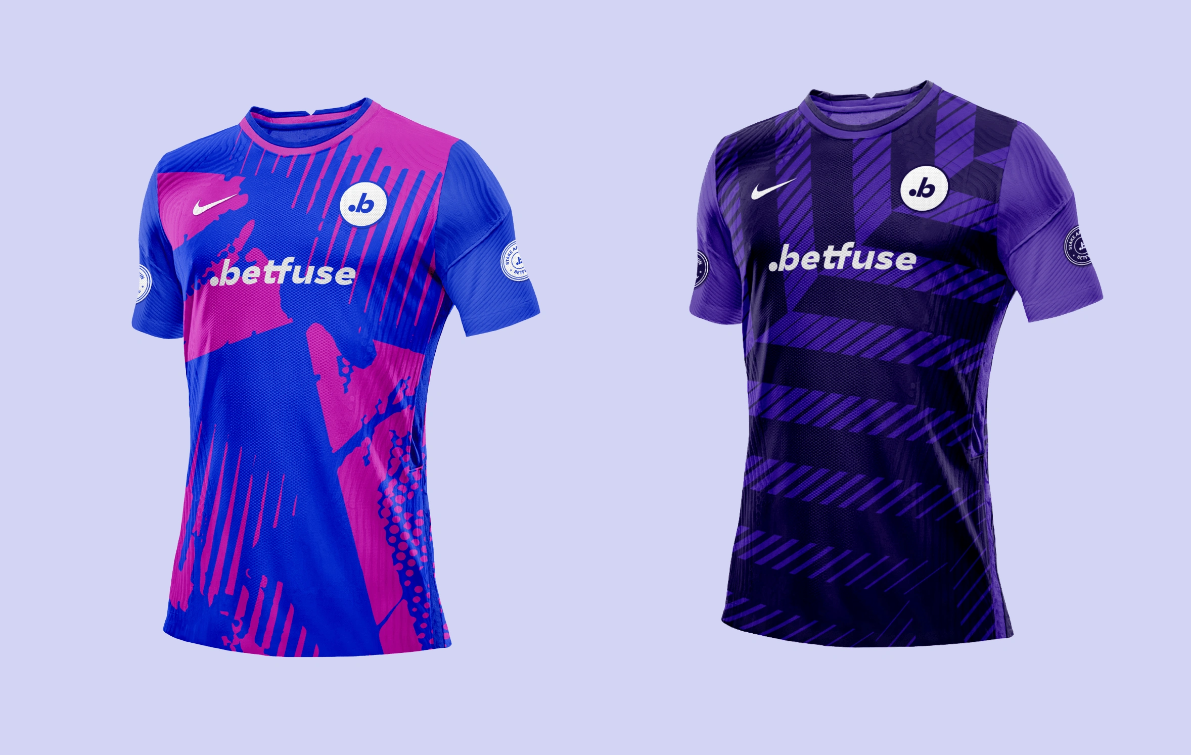
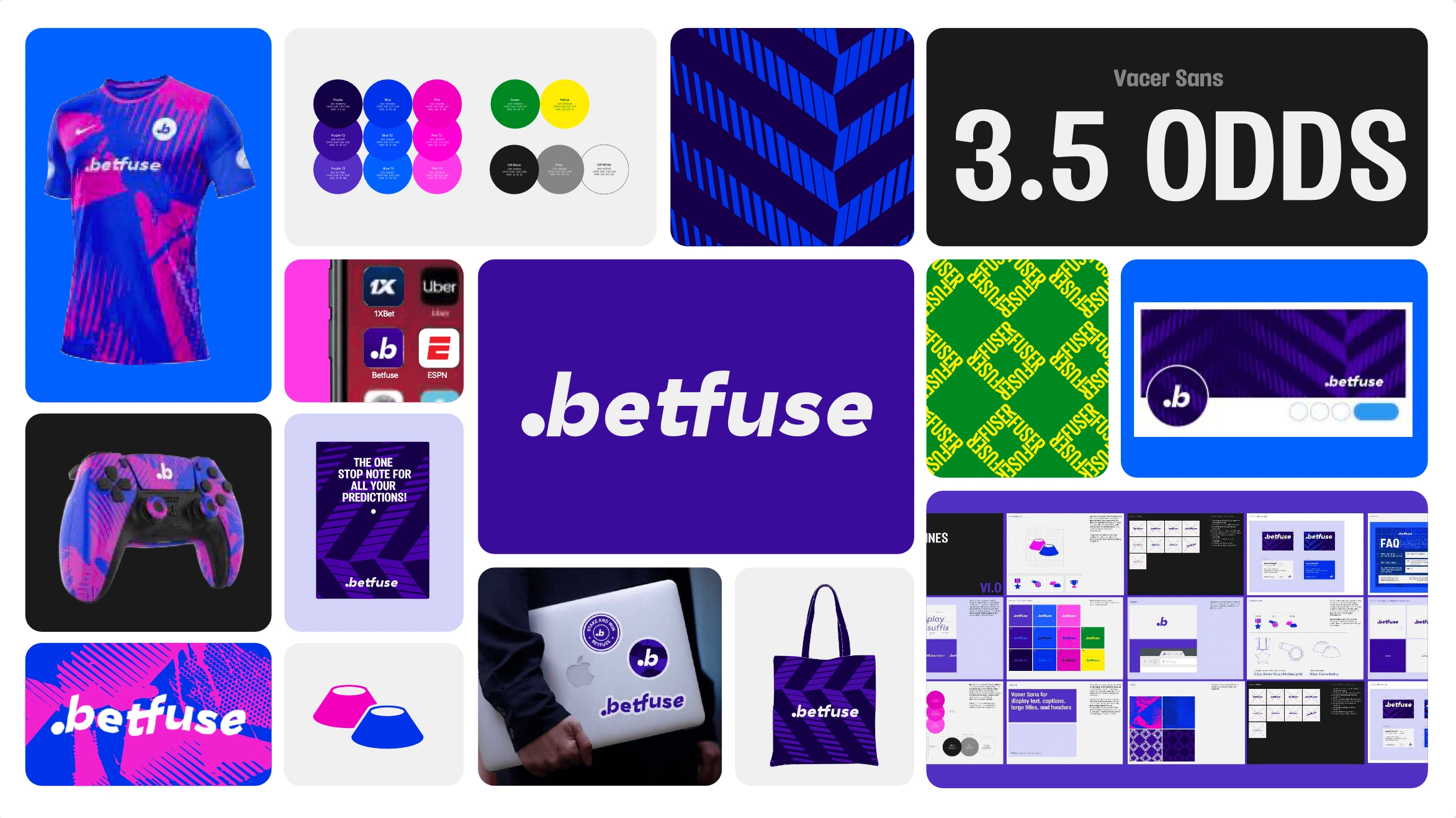
The concept statement “Stake & Win” led to the exploration of the visual reprentation of the ball yet maintaining the previous logo mojo
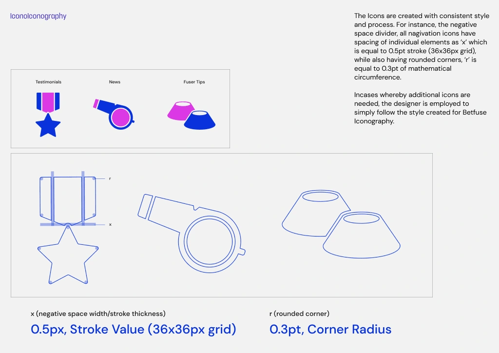
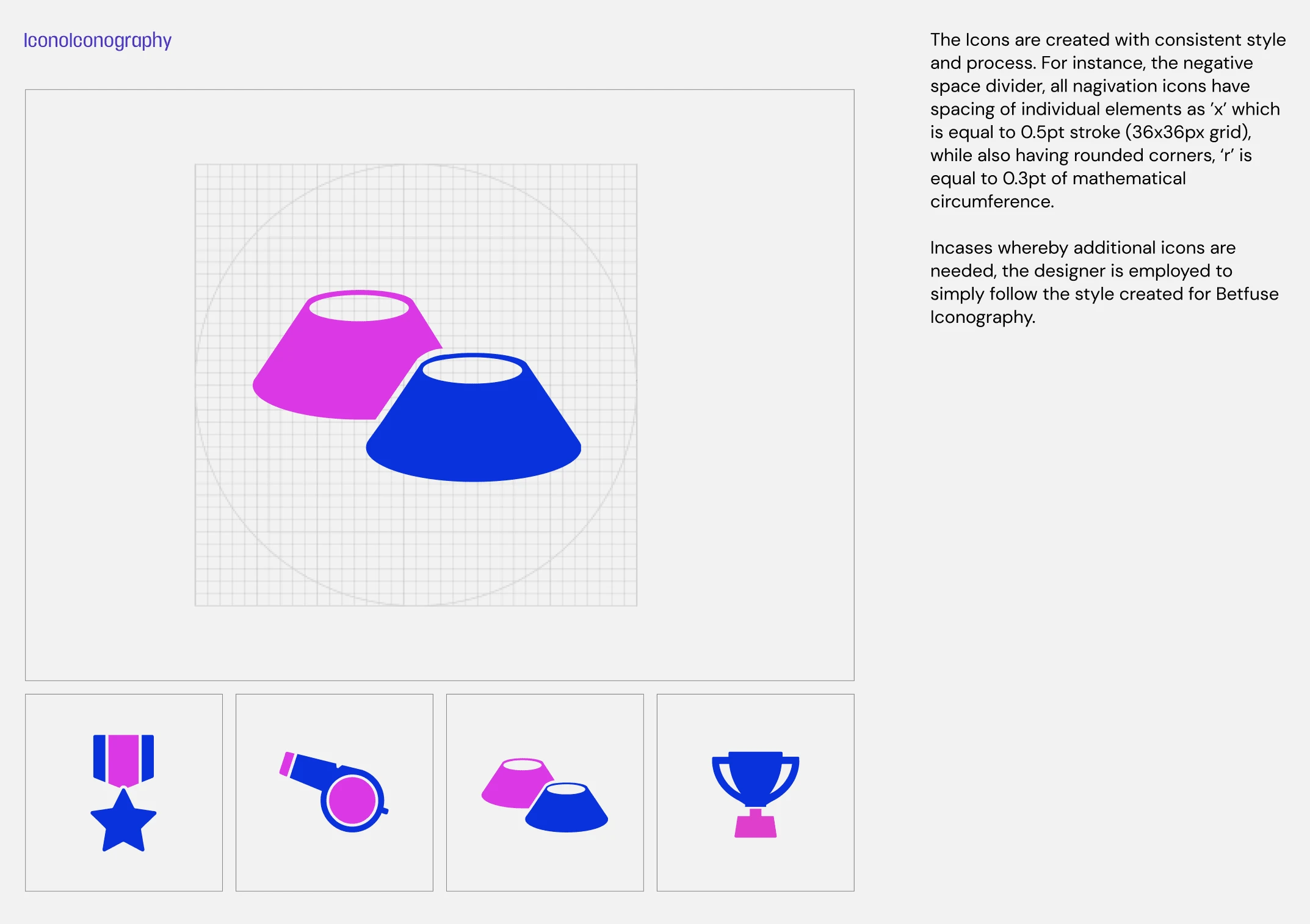
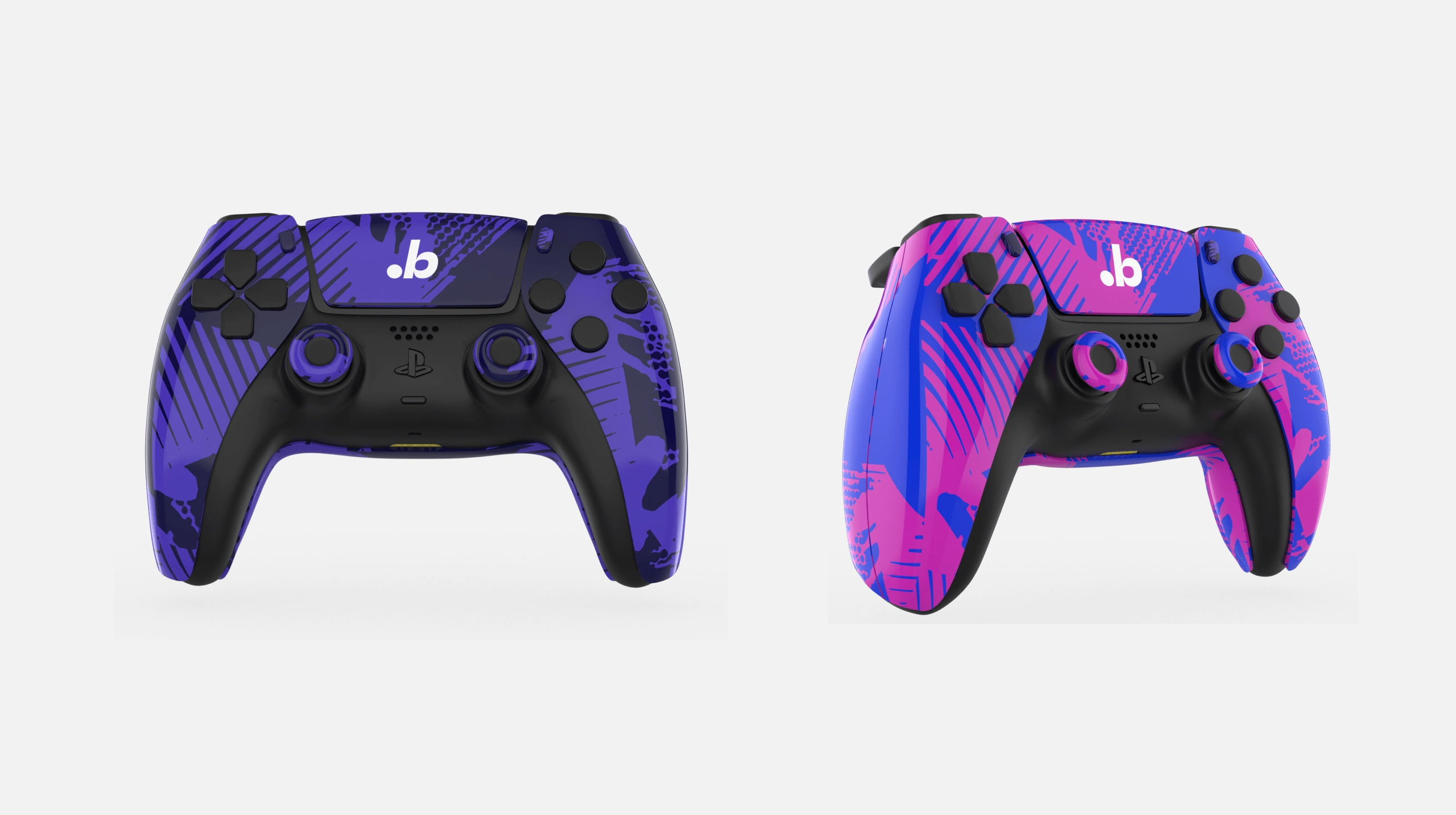
We gave the symbol its mojo back with a simpler design to represent the letter ‘B’ and to demonstrate a person kicking a football.
The Wordmark has undergone a significant alteration, making the ball (dot) half the size of the letter "e" to depict a major balance to the entire form.
Logo Mark
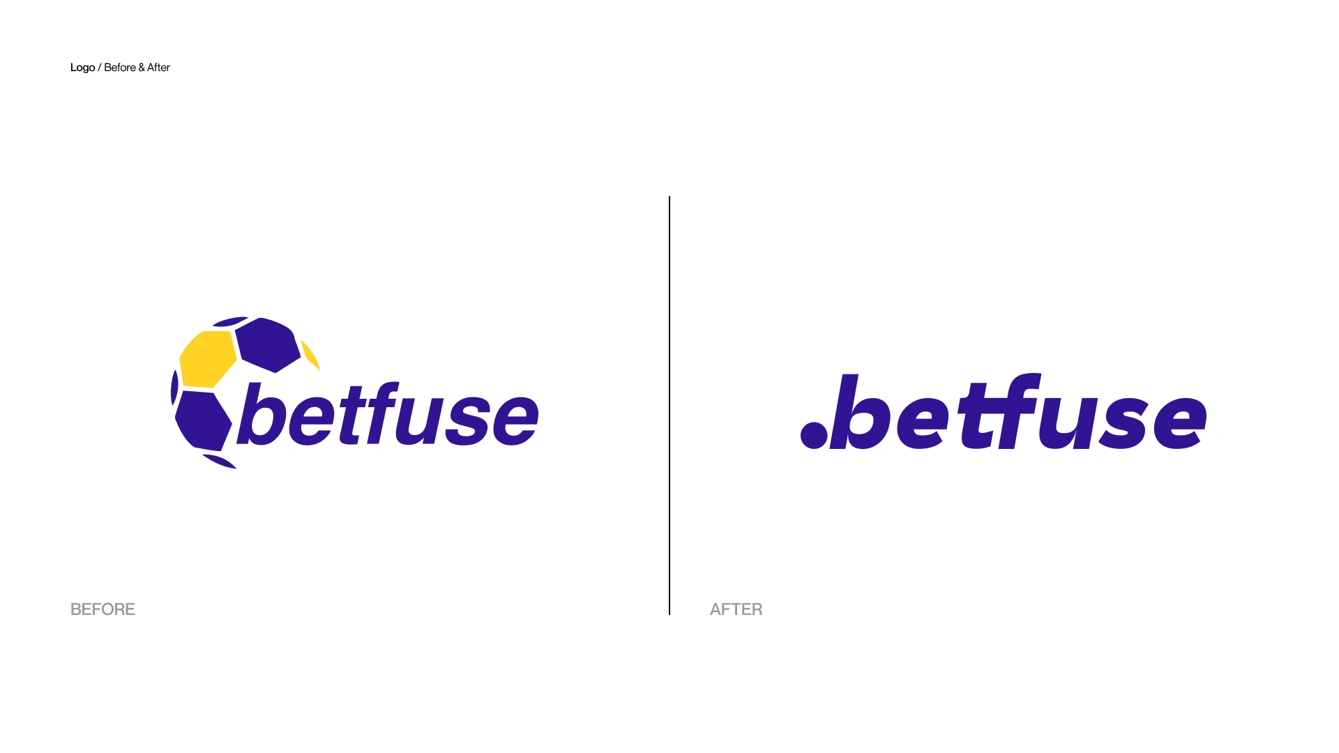
Before & After
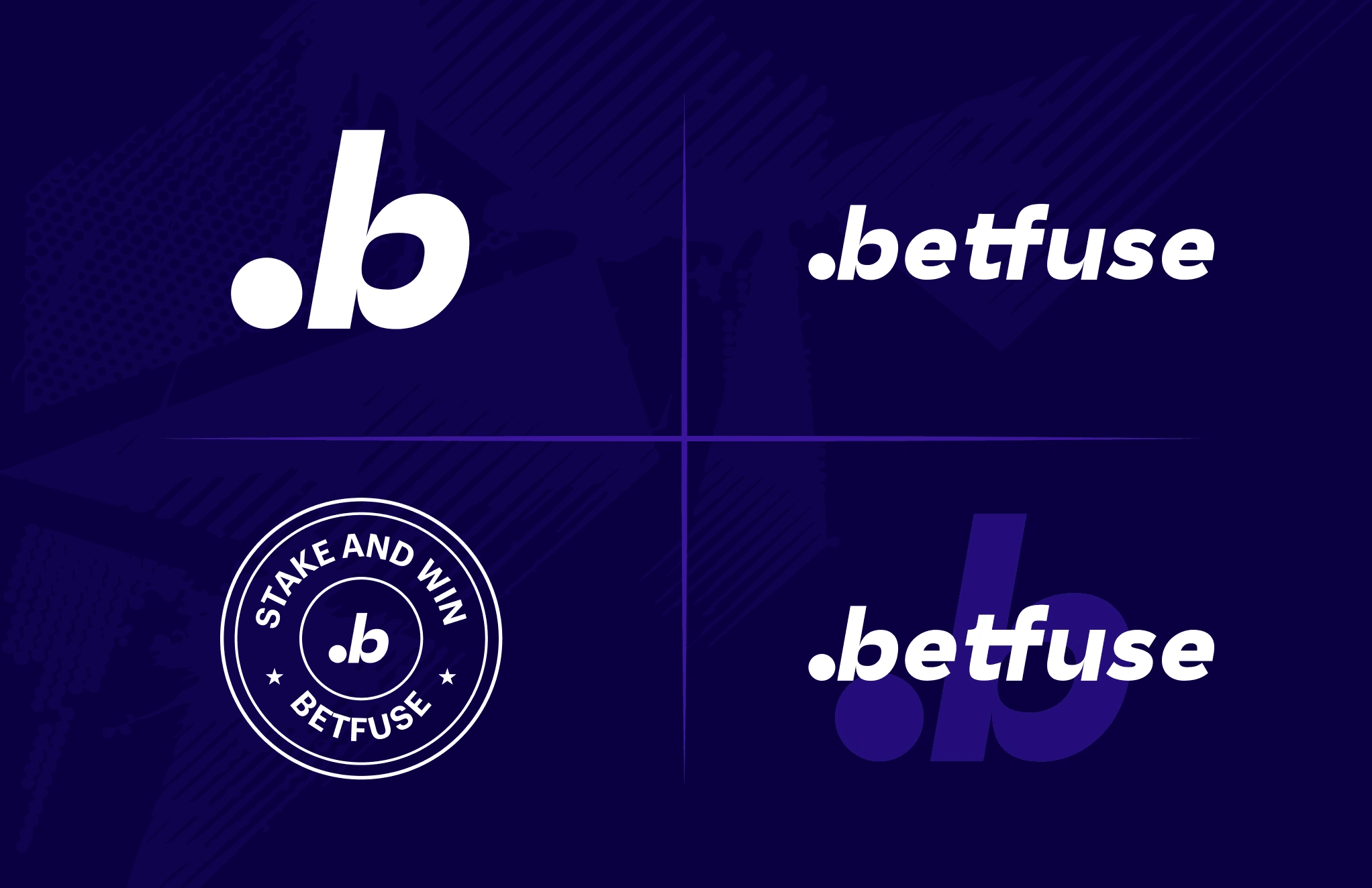
The wordmark is located in the top right corner, while the letter mark in the top left corner shows the letter "b" and the "ball."
After that, a emblem variant for the logo was developed to work with various specific application, such a badge featuring heraldic design inspiration
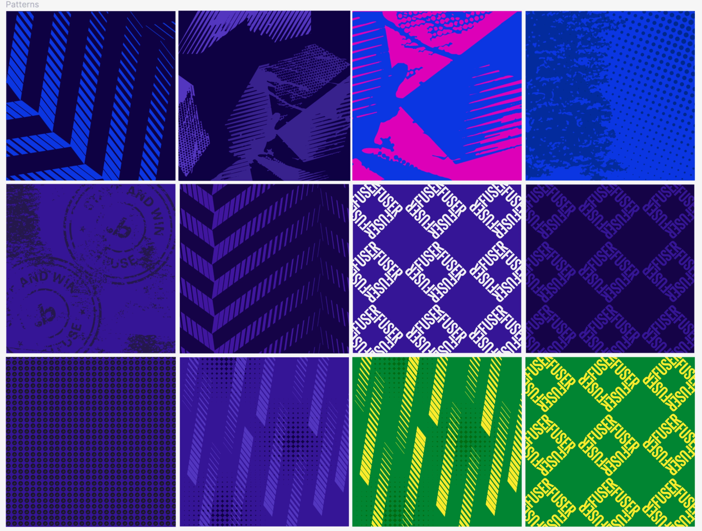
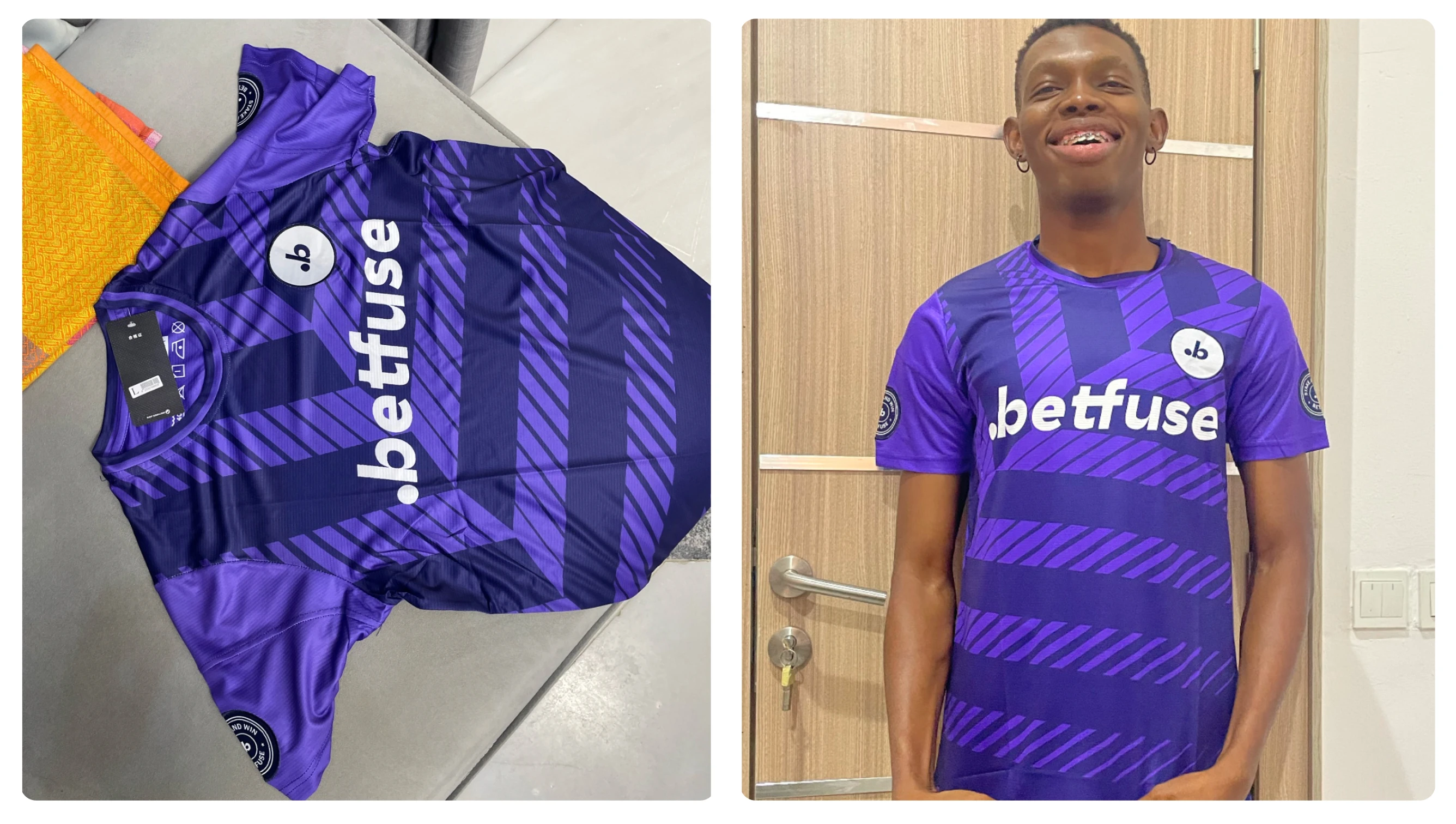
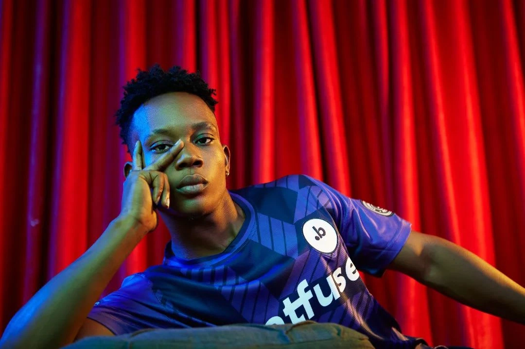
The Betfuse "Flux" was created as one of the motion style language and graphic device for Betfuse and thus is inspired by the Flags found in sports fields, giving it the wavy vibe (in motion)
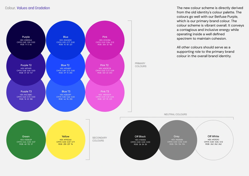
The new colour scheme is directly derived from the old identity's colour palette. The colours go well with our Betfuse Purple, which is our primary brand colour. The colour scheme is vibrant overall. It conveys a contagious and inclusive energy while operating inside a well defined spectrem to maintain cohesion.
All other colours serve as a supporting role to the primary brand colour in the overall brand identity.
Like this project
Posted Nov 2, 2024
Brand Identity for a sport betting prediction platform where I was able to developed a set of consistent rules for the brand