AI-Powered SaaS Analytics Landing Page Design. AI-driven das...
Arafat Ovi
AI-Powered SaaS Analytics Landing Page Design.
AI-driven dashboard redesign - 30% faster insights, 2× smoother workflow, unified dark-mode system.
Challenges: 👇
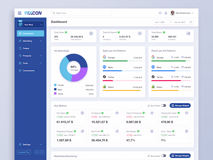
Presenting complex analytics clearly while maintaining balance and accessibility in a dark UI.
Solutions: 👇
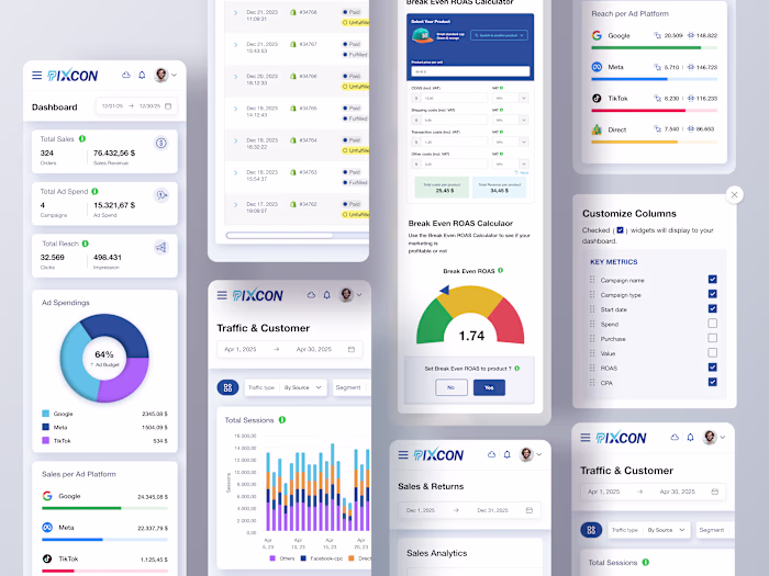
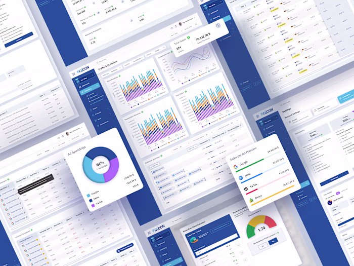
Used modular card layouts, gradient accents, and structured grids to enhance clarity and visual hierarchy — creating a seamless, data-focused experience that empowers better business decisions.
Results & Insights: 👇
During internal testing, task completion time was reduced by 25%, while user satisfaction scores improved from 7.1 to 9.0 out of 10 in post-test surveys. The redesigned system also enabled the team to launch updates twice as fast, thanks to reusable design tokens and a scalable component library.
Like this project
Posted Oct 28, 2025
AI-Powered SaaS Analytics Landing Page Design. AI-driven dashboard redesign - 30% faster insights, 2× smoother workflow, unified dark-mode system. Challenges...
Likes
0
Views
1