Coastal Clydesdales
Branding for a horse and carriage service.
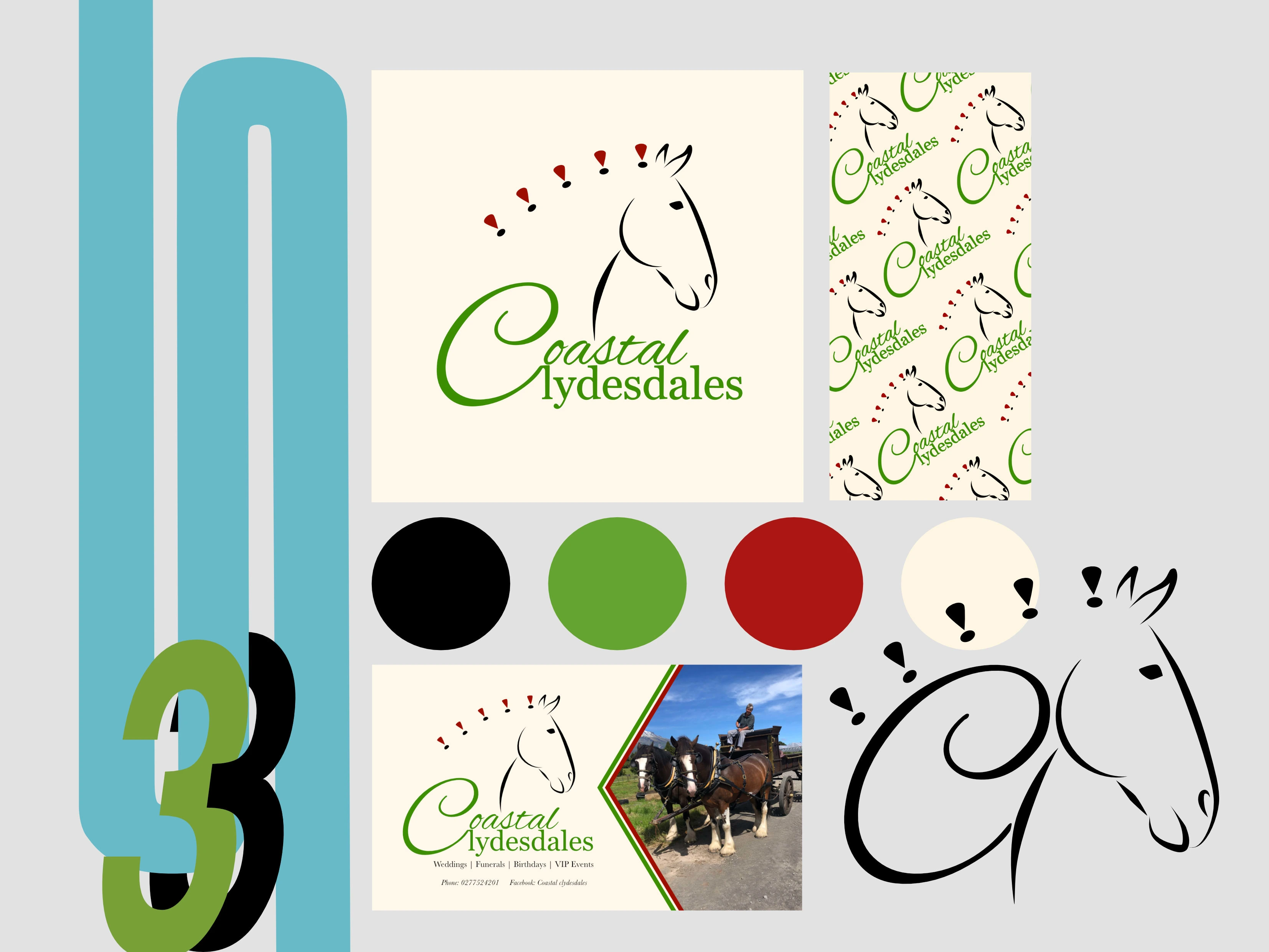
Coastal clydesdales is a small horse and carriage business in okato taranaki.
They were looking for a simple but recognisable design that could be used on a social media platform and on business cards.
The coastal colours are green and black, with Clydesdale ribbons normally being a colour red. Because of this we chose to incorporate these main colours into the design.
Because the green can be hard to read on many colours we also made sure to check that the logo was clear and could be used in black and white. There are also many instances where the whole logo won’t be needed so when thinking about the design I made sure that the horse head would work on its own, as a combination of the C and the head or as the full logo. This gives them more options in the future, when they may need to use their logo for other things such as uniforms, or a symbol on their carriages.
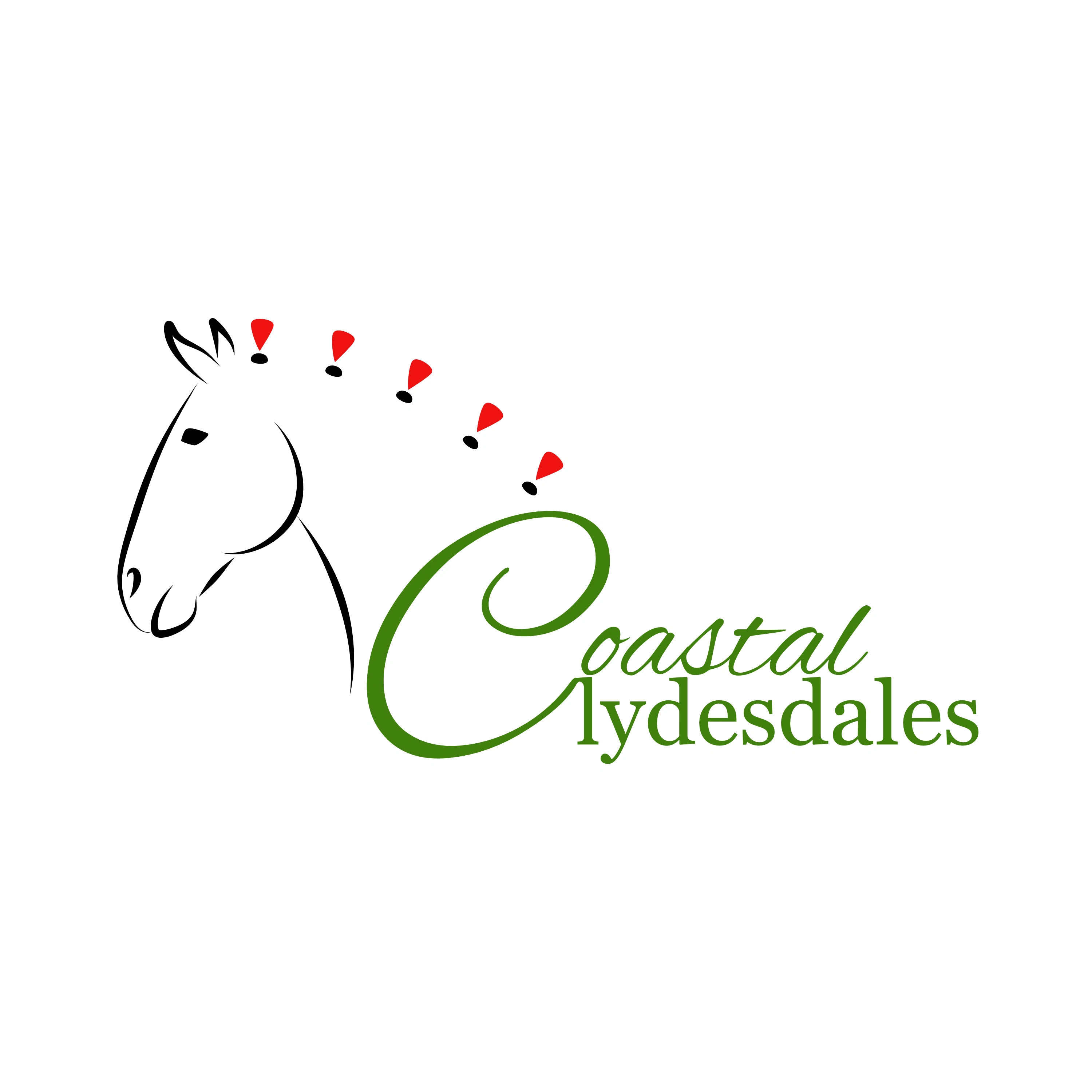
original concept
This was our original concept but it feels unbalanced especially when used in a circle profile picture on social media accounts and the red wasn’t quite right when being used with the other colours
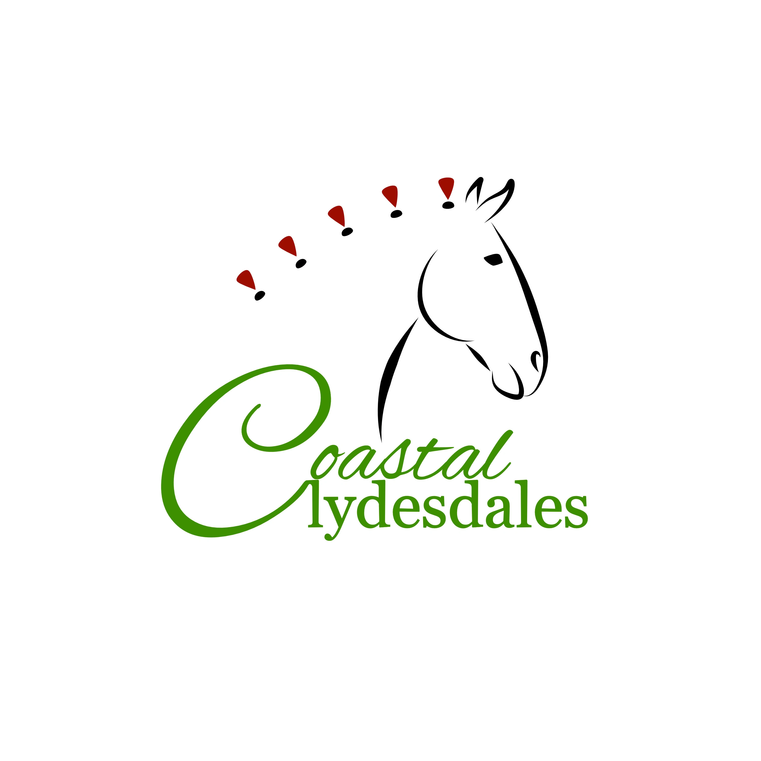
Final design
with the simple act of moving the head and changing the direction the design now feels more balanced and sits much better when using for different things. The red was also deepened to match the green better and make it easier for the eyes to scan over.

Horse head on its own
Black and white horse head pattern
Like this project
Posted May 13, 2022
Branding for a horse and carriage service.
Likes
0
Views
6


