🤓 Redesign of SaaS B2B BlueOptima's Product
📝Overview🤓Context✨Team Structure➡️The Process selected for the project👥 Understanding the users🗺 Mapping the current experience🔍Findings in a nutshell🖼Framing the problem💭Our Hypotheses📈Success metrics to track 🤔How might we session🎨Drawing Session➡️Userflow Proposal✏Initial wireframe (Lo-fi)📓Testing Sessions🗒AB Testing 🙌Hand-off👀Results until now👂🏻Always listen to the users and help the business achieve their goals. 🧠Learning from our decisions
📝Overview
Timeline: August - November 2021
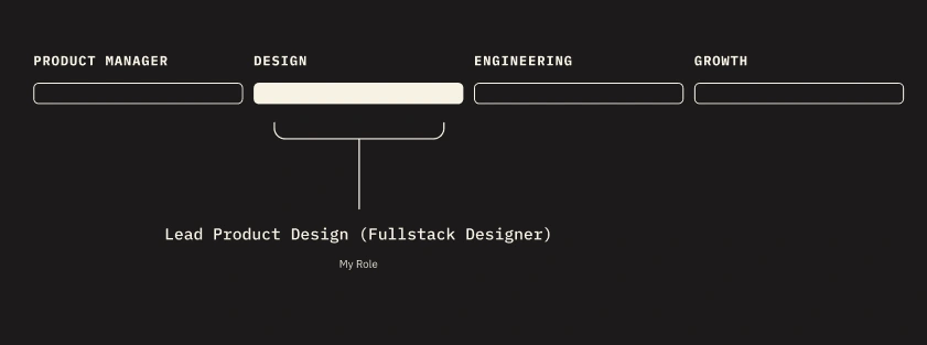
My Role: Lead Product Designer
Deliverables:Research insights, Brainstorming sessions output, Wireframes, Visual Design, User Flow & Journey
🤓Context
As the lead designer of the Predictive Assessment product, I oversaw the design process from beginning to end, but one particular aspect that I would like to highlight is the Testing Interface. This interface serves as a crucial platform for software engineers who are seeking new job opportunities, allowing them to showcase their technical skills through coding assessments. The design process was carefully crafted to create an intuitive and efficient experience for the users.
The Testing Interface is a key component of Predictive Assessment, where hundreds of software engineers seeking new job opportunities showcase their technical expertise by completing coding assessments.
✨Team Structure
➡️The Process selected for the project
Utilizing the principles of Design Thinking proved instrumental in navigating every step of this project, from its inception to completion. By immersing myself in the perspective of end users, I fostered a deep sense of empathy that informed my decision-making process. This approach enabled me to deliver a final product seamlessly to the development team, ensuring a smooth transition from concept to implementation.

👥 Understanding the users
To start the process, we initiated outreach to a selection of our users who had prior experience with the previous Testing interface. Our goal was to gain a deeper understanding of their experiences and perspectives through discovery sessions and user interviews, in order to empathize with their needs and perspectives.
We knew that we had issues with the platform, but there’s no better way to understand them than talking with the users 😊
Important to mention: Product Manager and 2 designers were involved in this process. We had sessions with 5 users

🗺 Mapping the current experience
🔍Findings in a nutshell
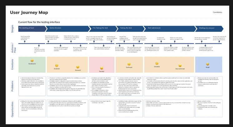
The email invitation was really bad, candidates needed help to understand what the email invite was about.
The demo is not actual a playable interface that candidates can use and get familiar it is more like a tool tip tour.
Candidates got really nervous when they saw the time counter moving without warning them before.
Is not clear what the main actions do, especially executing, and the difference between them.
The TI feels unfamiliar and old, which is perceived as less professional and often impact the perception of PA and the company’s.
🖼Framing the problem
The existing testing interface (TI) presents a major challenge for Darrell Stewart in terms of efficiently completing their job role assessment tests. The interface lacks a user-friendly and intuitive design, leading to an increased likelihood of test abandonment and resulting in an inaccurate representation of the candidate's coding abilities. This creates a need for a revised testing interface that provides a seamless and efficient testing experience to accurately assess the candidate's skills.

💭Our Hypotheses
By providing a superior coding experience to Darrell, the high drop-out rate associated with the current platform's complexity can be significantly reduced.
By replicating the familiar and intuitive experience of a personal Integrated Development Environment (IDE) within our Testing Interface (TI), user adoption and code writing activity within the platform will increase.
By adopting a warm and welcoming approach and clearly communicating expectations for the code test, the level of stress and anxiety experienced by software engineers as candidates can be reduced.
📈Success metrics to track

🤔How might we session
🎨Drawing Session
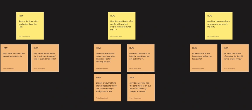
We arranged a series of brainstorming sessions with the Product Manager, Engineers, and two designers with the aim of generating ideas and determining potential solutions to the issue at hand. These sessions were deemed essential in order to align all stakeholders and ensure seamless collaboration.
➡️Userflow Proposal

✏Initial wireframe (Lo-fi)
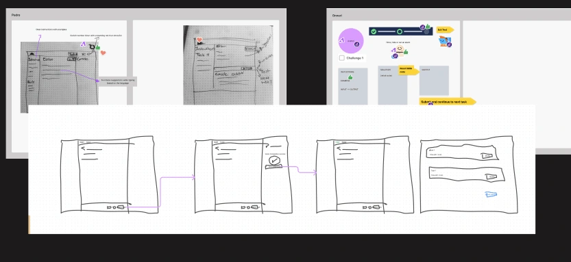
I created low-fidelity wireframes to experiment with potential solutions and evaluate the new flow. This approach, guided by the principle of "fail fast, fail often, learn faster," allowed for rapid iteration and improved the chances of identifying an effective solution in a timely manner.

📓Testing Sessions
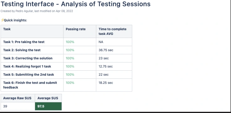
The testing sessions yielded positive results, with a 100% success rate and an impressive System Usability Scale (SUS) score of 97.5. However, during the testing, it was revealed that the developers encountered confusion due to the number of buttons present at the bottom of the Testing Interface. Originally, there were three buttons (Compile & Test, Run Code, and Submit Code), but after considering the feedback, it was decided to conduct an A/B test by reducing the number of buttons to two (Run Code and Submit Code).
🗒AB Testing
Given our uncertainty regarding whether to launch the version with two buttons or three buttons, I made a decisive choice to implement an AB testing approach. By conducting this test, we aimed to gather valuable insights and data that would ultimately guide us in making the most informed decision. This method allowed us to compare the performance and user response of both versions, enabling us to make an evidence-based choice that would yield the best results for our users and the project as a whole.
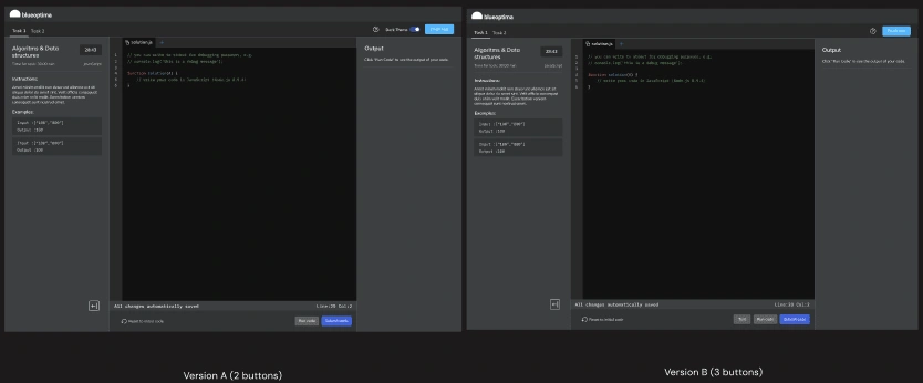
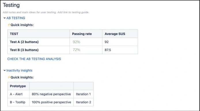
The results of the A/B testing showed that the version with two buttons (version A) outperformed the original design with three buttons. The subjective feedback from developers, such as "It closely resembles what we are used to in our Integrated Development Environments (IDEs) and feels comfortable," further reinforced our decision to confidently proceed with the launch of the two-button version.
🙌Hand-off
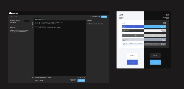
Following the successful A/B test, I focused on finalizing the User Interface (UI) design and polishing it to meet the highest standards. I collaborated closely with the engineers, having sessions with them, to ensure a smooth handoff process, streamlining the transition from design to development.
👀Results until now
Although our solution was not flawless, it made a substantial impact in reducing the drop-off rate of software developers by 30%. This was reflected in a 25% increase in the completion rate of tests, as well as positive feedback from a sample of 5 users who reported a generally favorable perception of the overall Testing Interface.

👂🏻Always listen to the users and help the business achieve their goals.
“A truly remarkable product is born when we blend the art of attentive listening with the science of continuous improvement. By iterating and adapting to the ever-changing needs of users, a design transcends static boundaries and thrives in a state of perpetual evolution. Fueled by the invaluable feedback from users, it becomes a living, breathing entity, propelling both user satisfaction and business success. Embrace the transformative power of user-centric design, where innovation and user empowerment coalesce to drive remarkable achievements.”
🧠Learning from our decisions
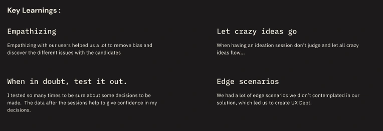
In design, the pursuit of perfection is ongoing and requires continuous evaluation and refinement of solutions. It is necessary to revisit and analyze the design, determine its effectiveness in solving the problem, and adjust accordingly. A living product is subject to constant evolution, with ongoing feedback, bug reports, and other issues that must be addressed in a timely manner. This makes it challenging to ever truly consider the design "complete."
Like this project
Posted Jun 17, 2023
The Testing Interface is a key component of Predictive Assessment, where hundreds of software engineers seeking new job opportunities showcase their technical e

