🔔 Notification Centre Redesign in mobile app

Pedro Mugartegui



Project Overview
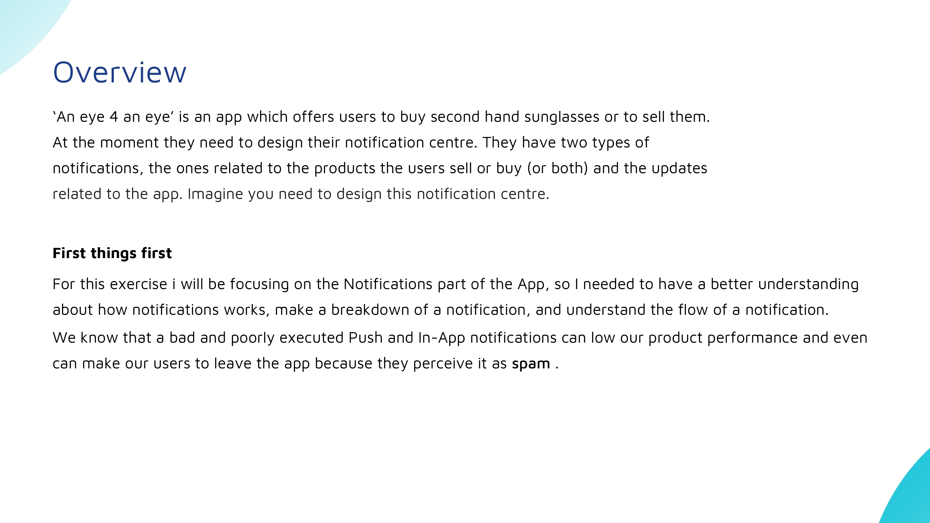
This project explores how mobile notifications can be redesigned to feel more useful, intentional, and less disruptive to users.
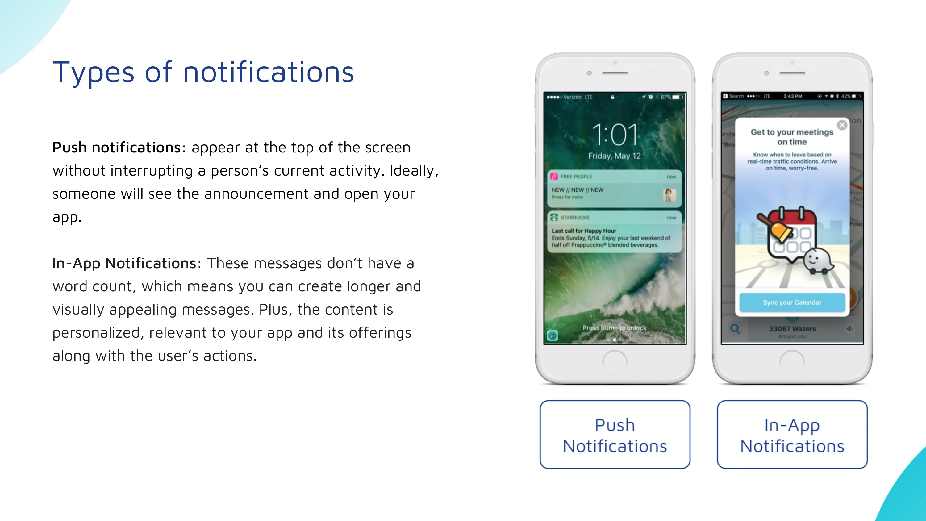
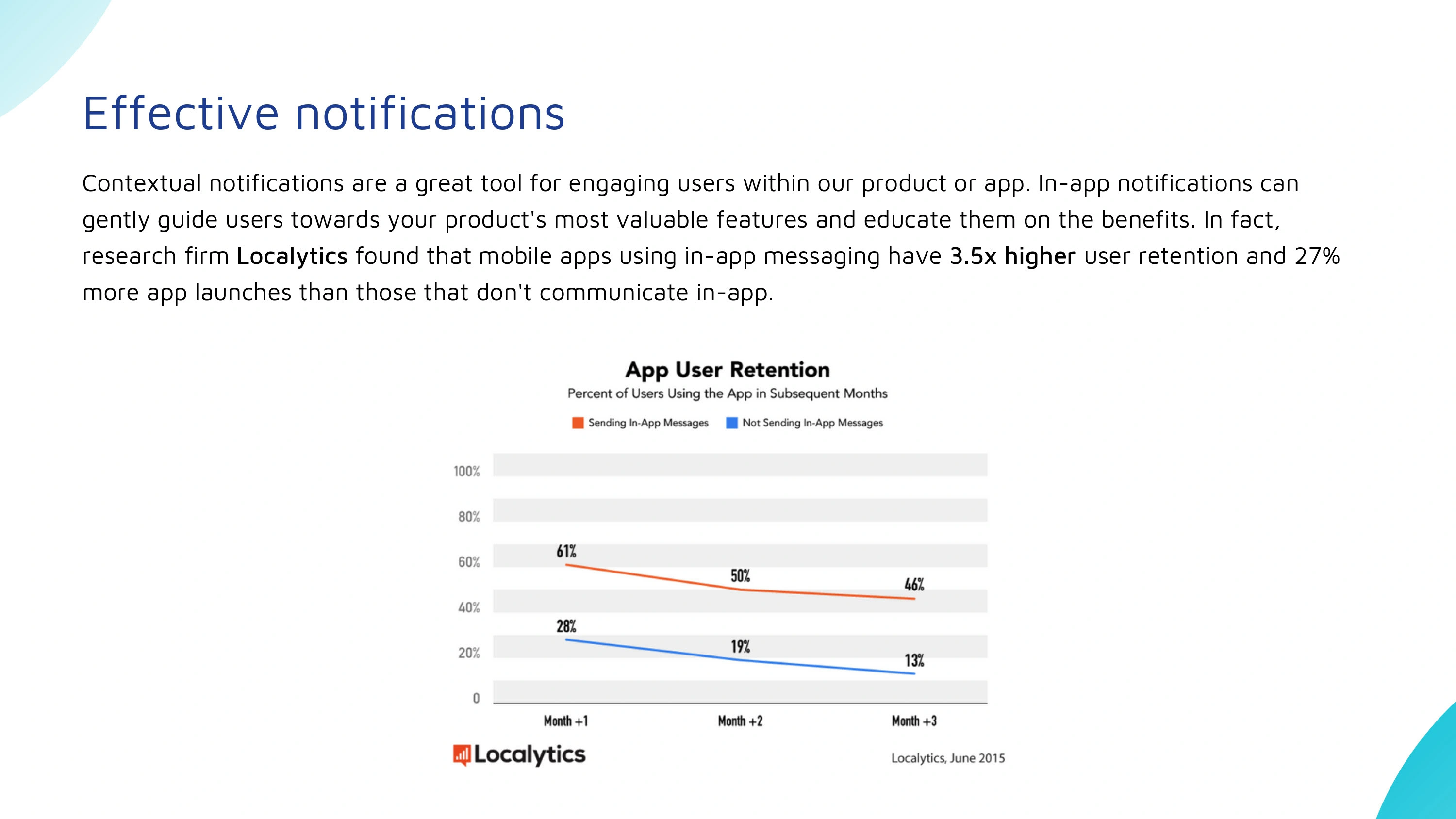
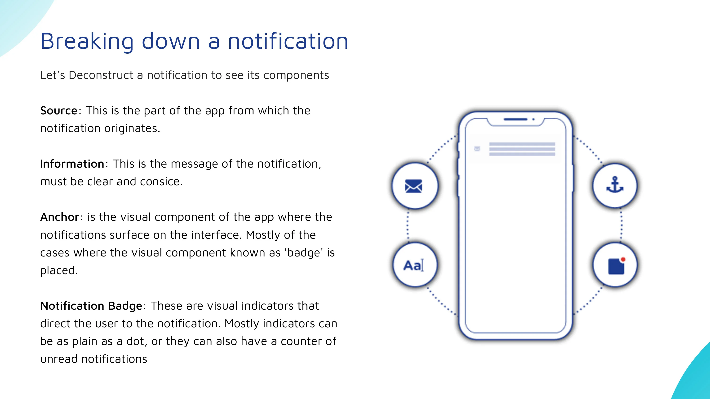
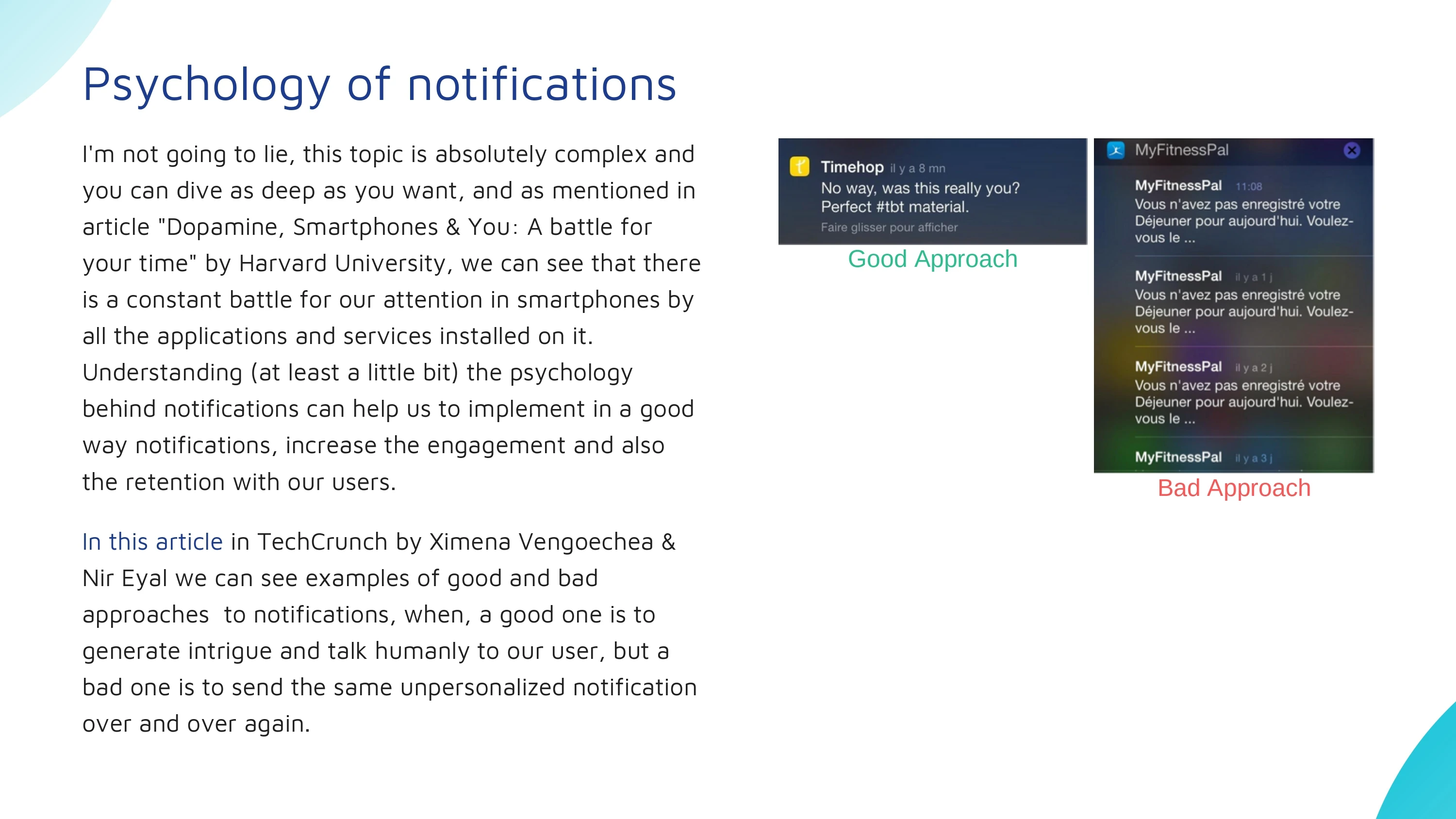
I started by researching different types of notifications, how users perceive them, and the psychological impact of frequent interruptions. The goal was to understand what makes a notification valuable versus distracting, and how users could have greater control over when and how they receive information.
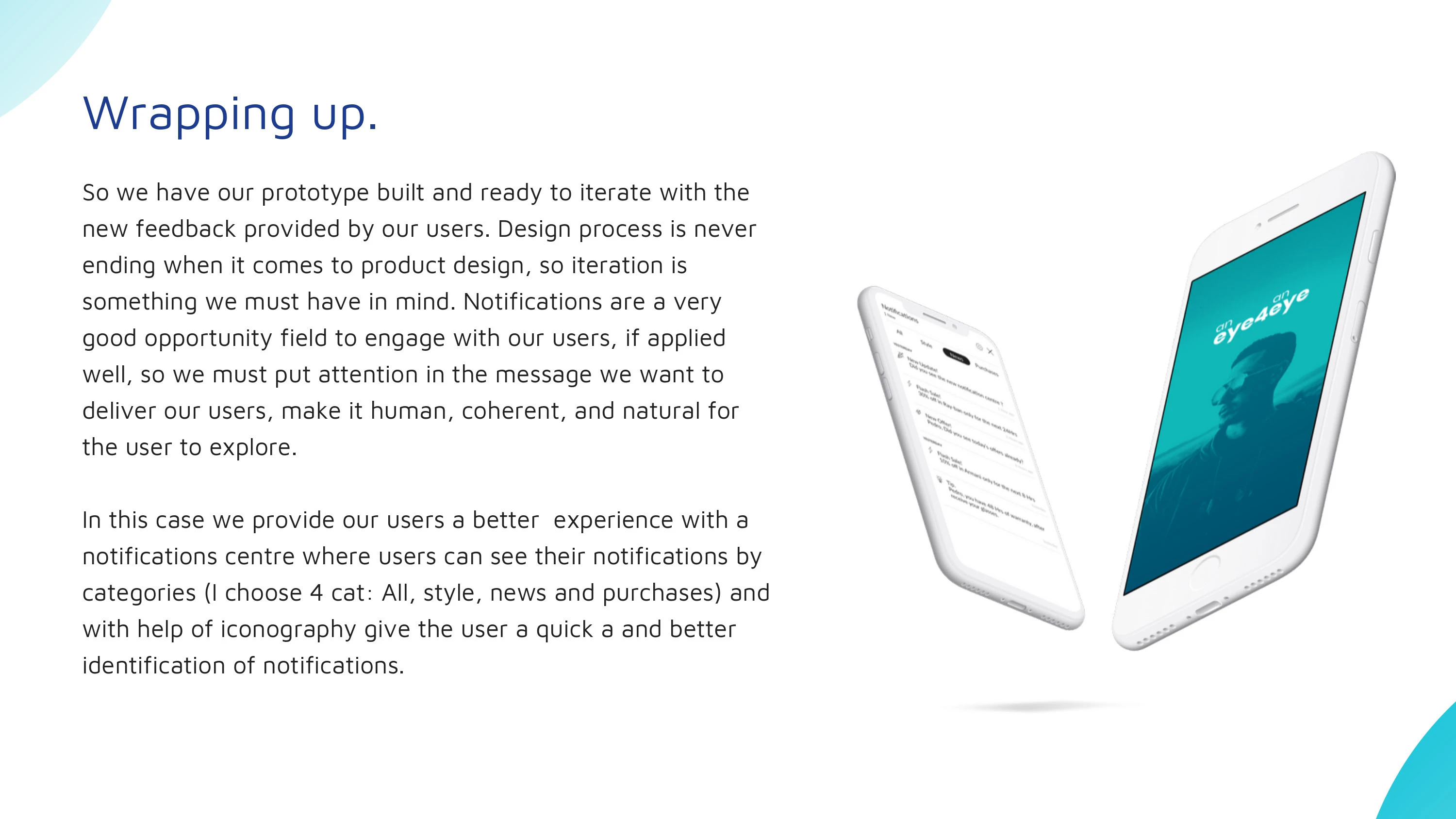
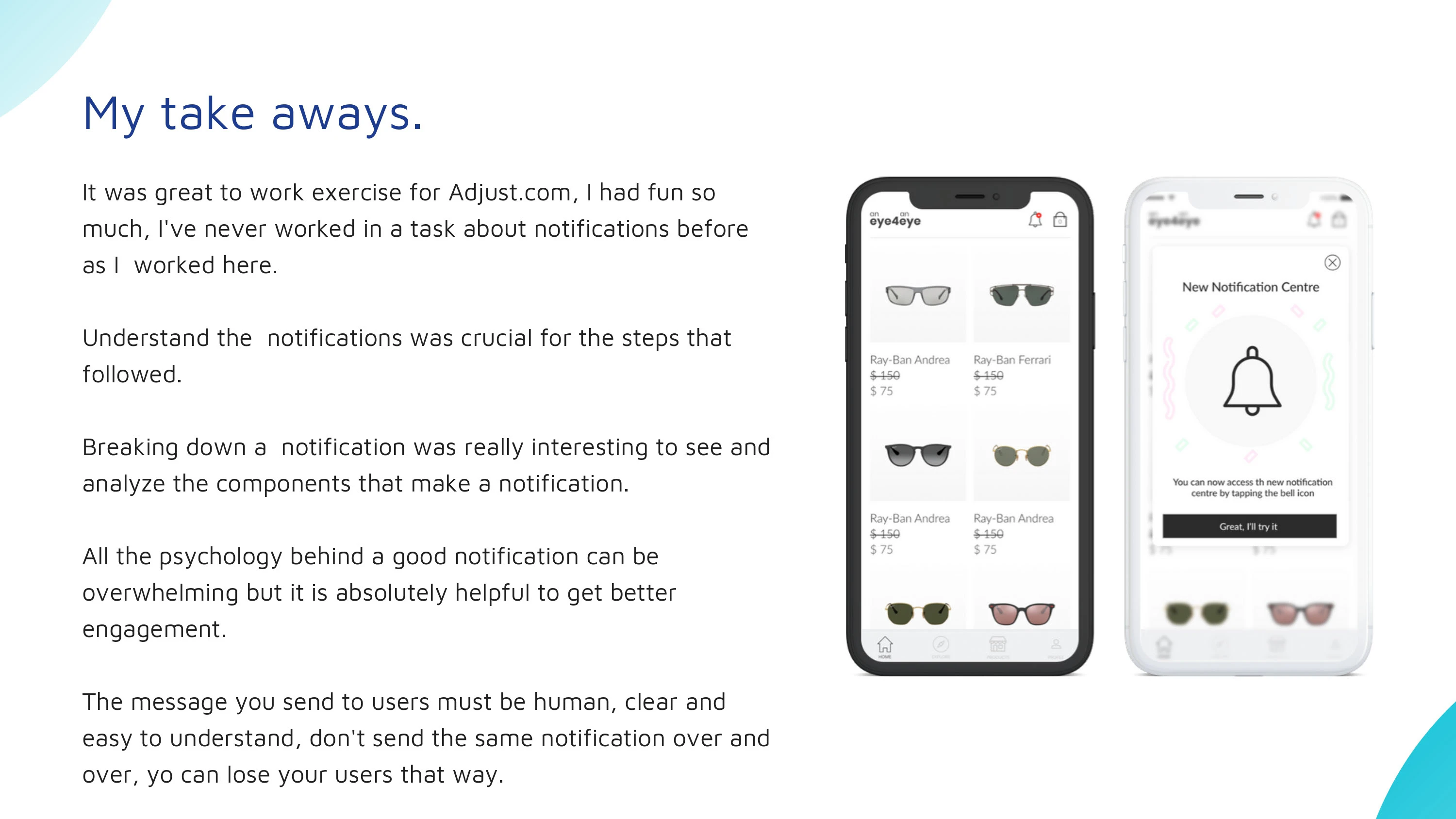
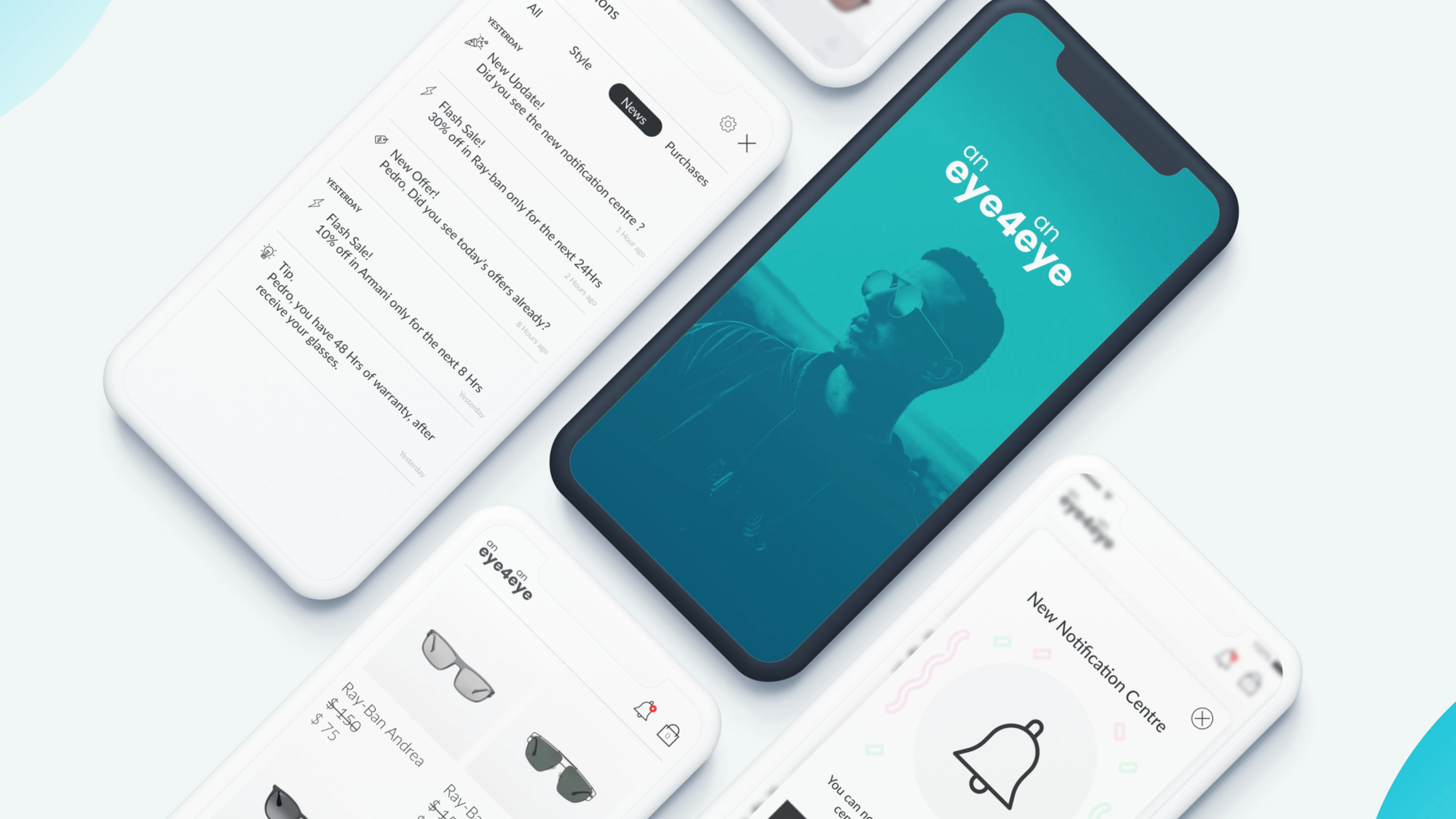
Based on these insights, I designed a mobile experience that helps users organize, prioritize, and manage notifications more effectively, reducing unnecessary interruptions while keeping important information accessible.
The project covers the full product design process, from research and problem definition to ideation, wireframes, interaction design, and high-fidelity UI.
My Role
I worked independently across the entire UX/UI design process, including:
UX research and competitive analysis
Research into notification behavior and psychology
Problem definition and opportunity mapping
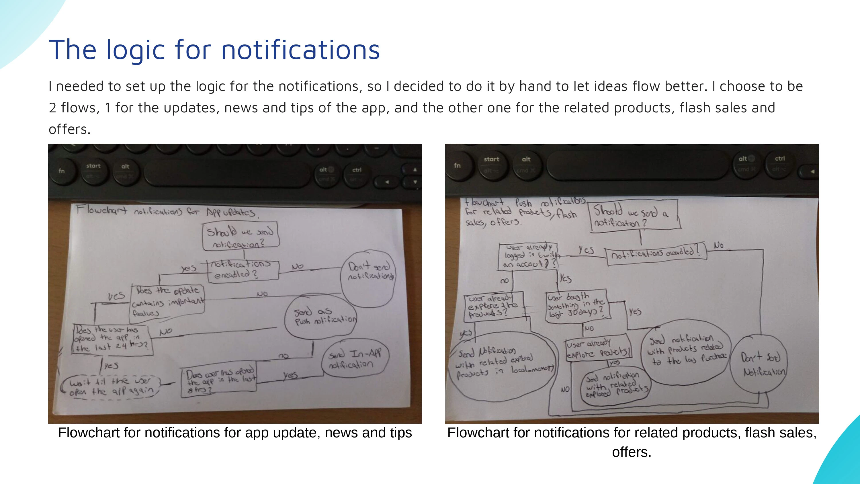
User flows and information architecture
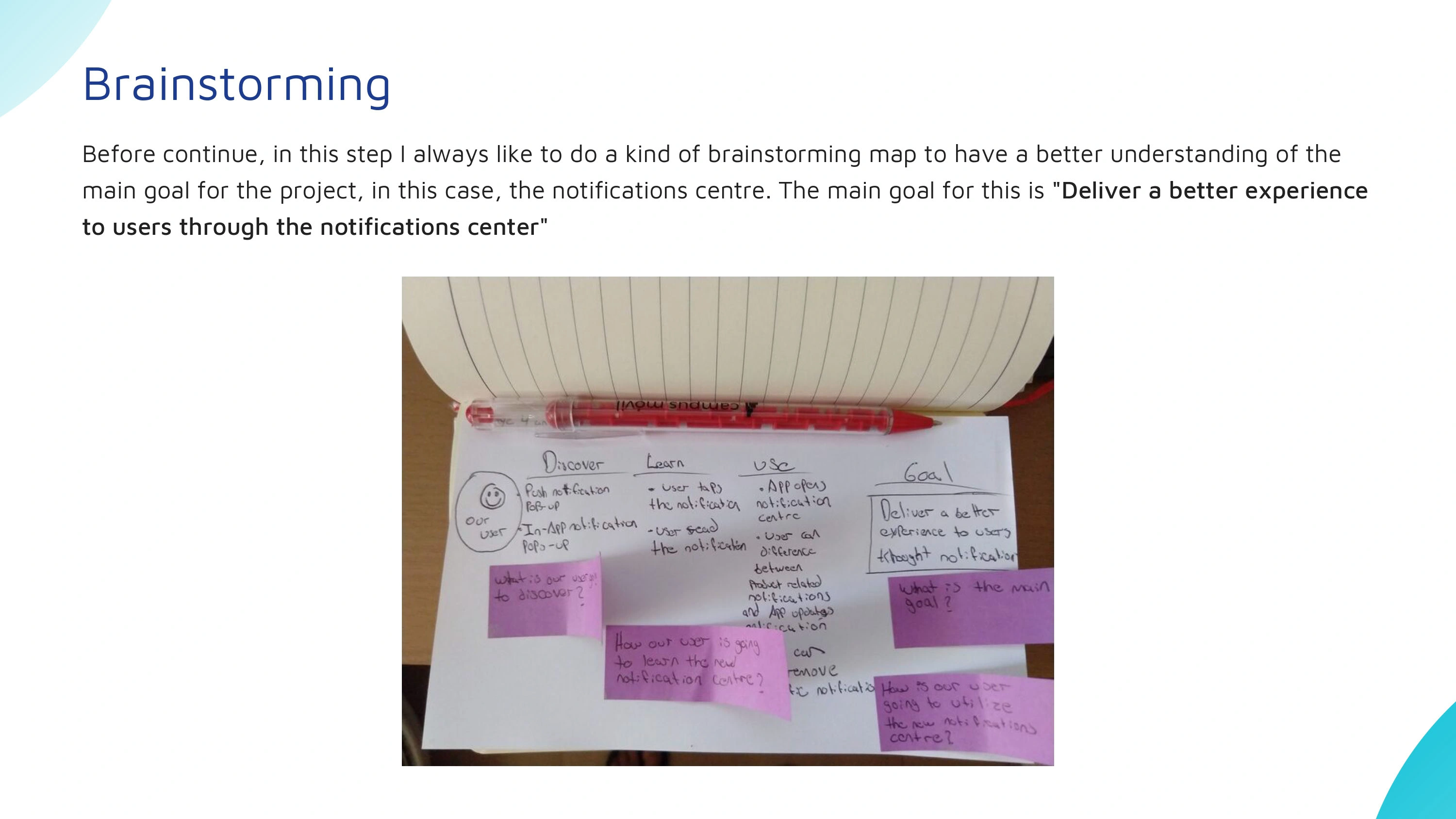
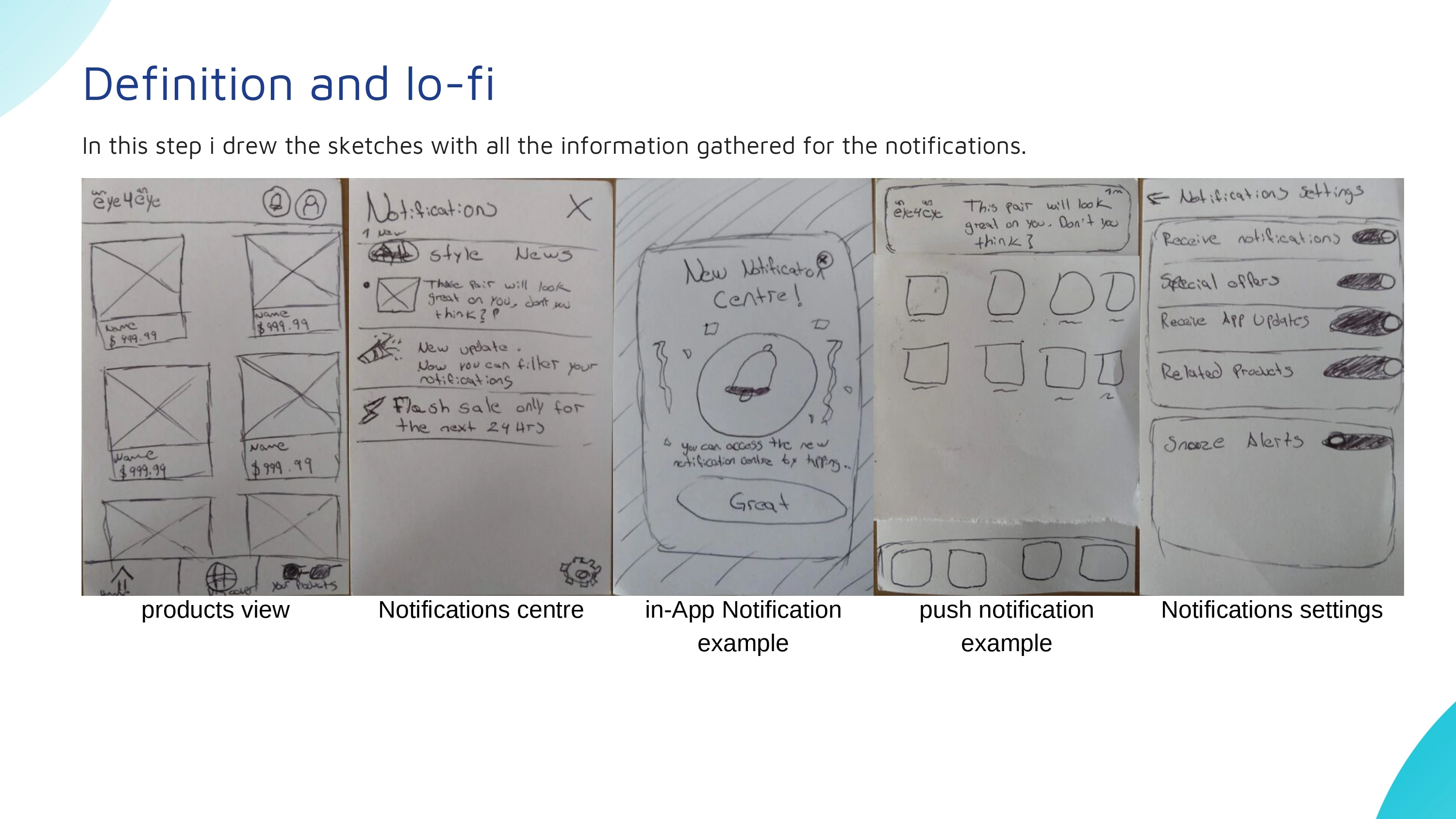
Sketching and early concept exploration
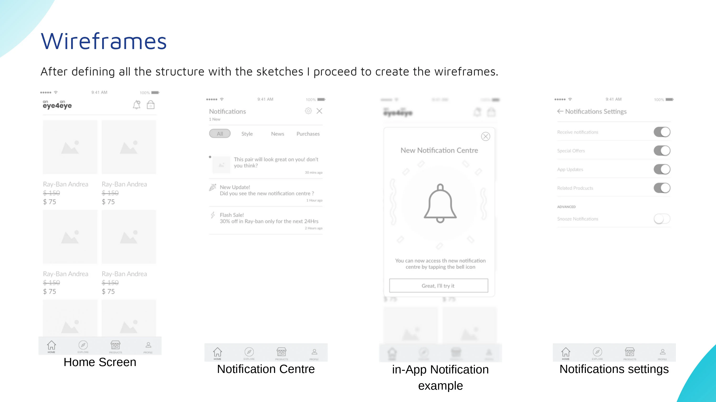
Wireframing and interaction design
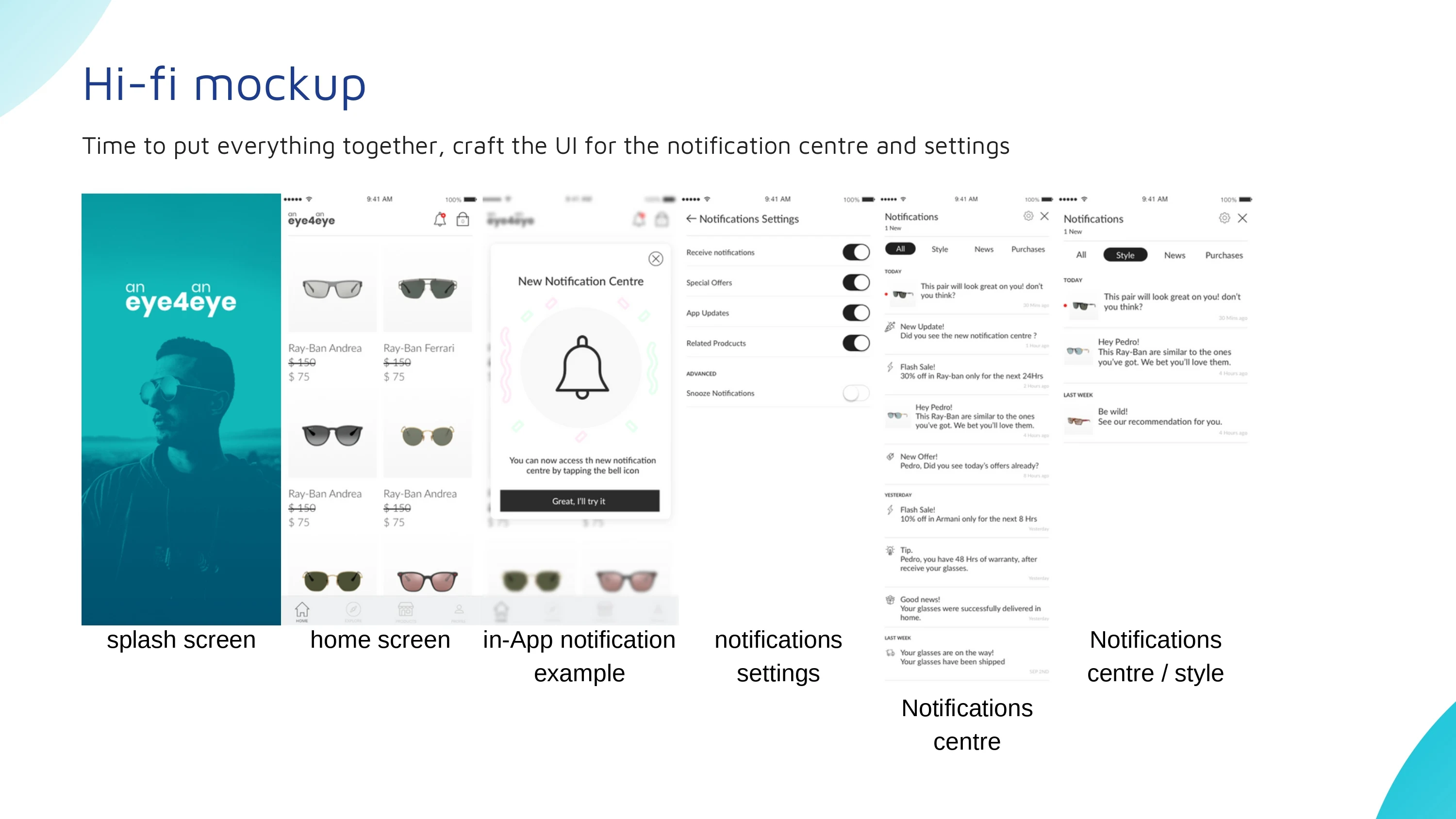
UI design and visual direction
Prototyping and final product concept
The project allowed me to combine behavioral research with product design decisions and translate those findings into a practical mobile experience.
Design Approach
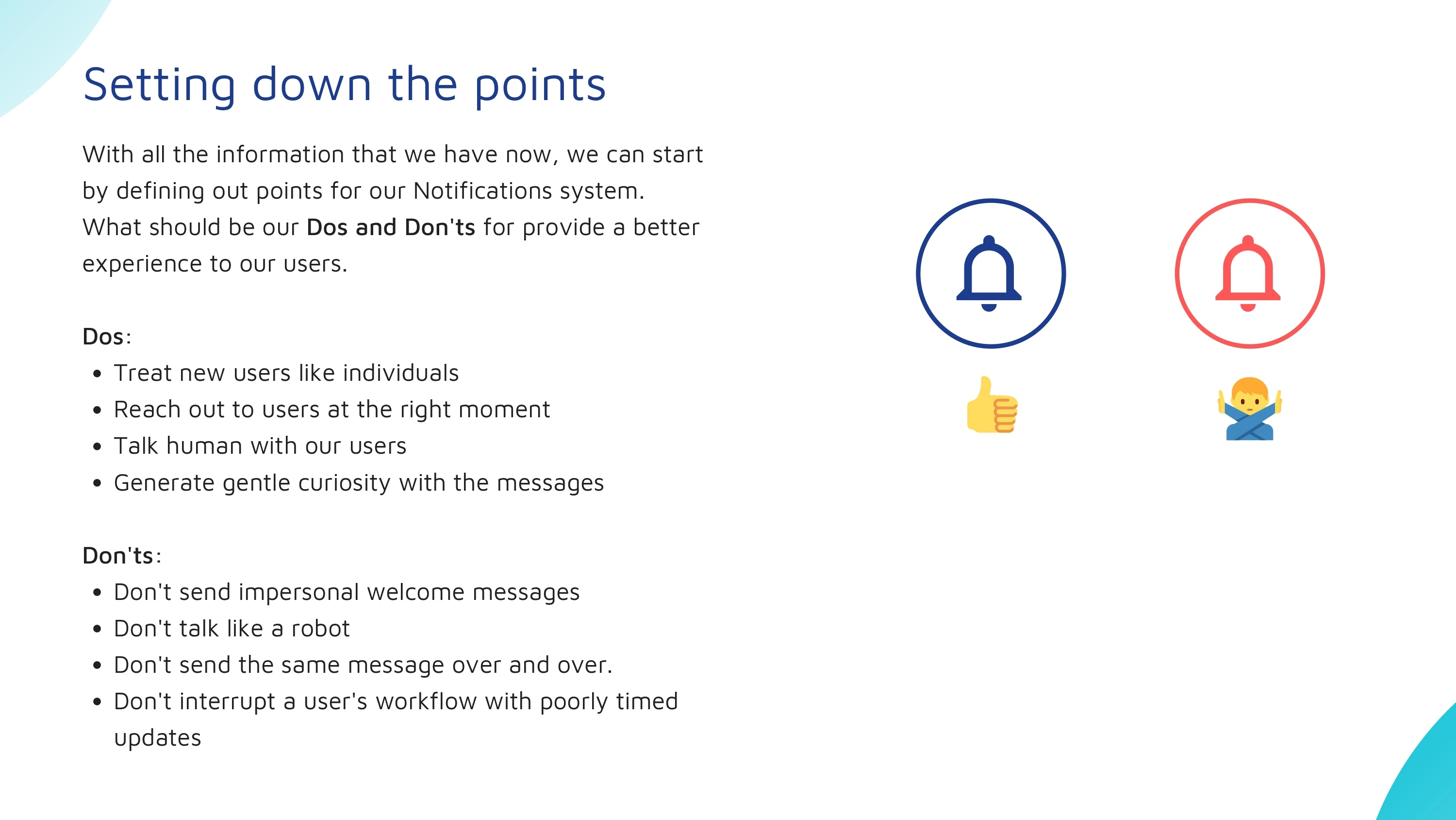
I began by studying existing notification patterns and identifying common issues such as notification overload, lack of prioritization, unnecessary interruptions, and limited user control.
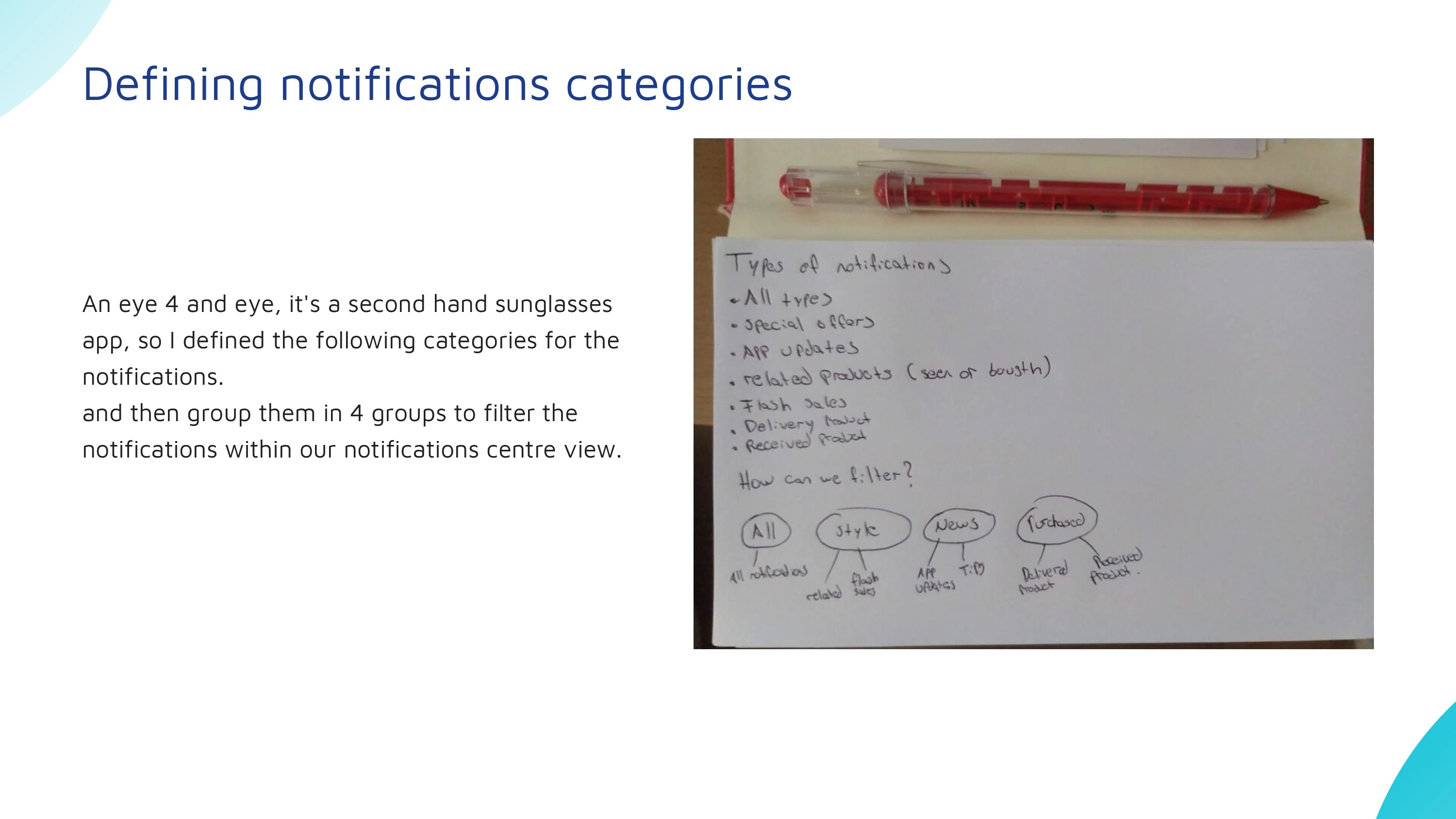
From there, I explored different ways of grouping and prioritizing notifications according to their importance and context. Early concepts were developed through sketching, user flows, and low-fidelity wireframes before moving into the final interface.
The final experience was designed around clarity, control, and prioritization. Rather than treating every notification equally, the system gives users greater flexibility over what deserves immediate attention and what can be reviewed later.
The visual design follows a clean and lightweight mobile interface, keeping the focus on content hierarchy and making notification preferences easy to understand and adjust.

Like this project
Posted Aug 9, 2024
UX/UI case study exploring how users can organize, prioritize, and manage mobile notifications with greater control and fewer interruptions.