Brand identity - VELOPOINT
Omar Elsayed


Posted May 16, 2026
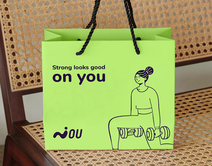
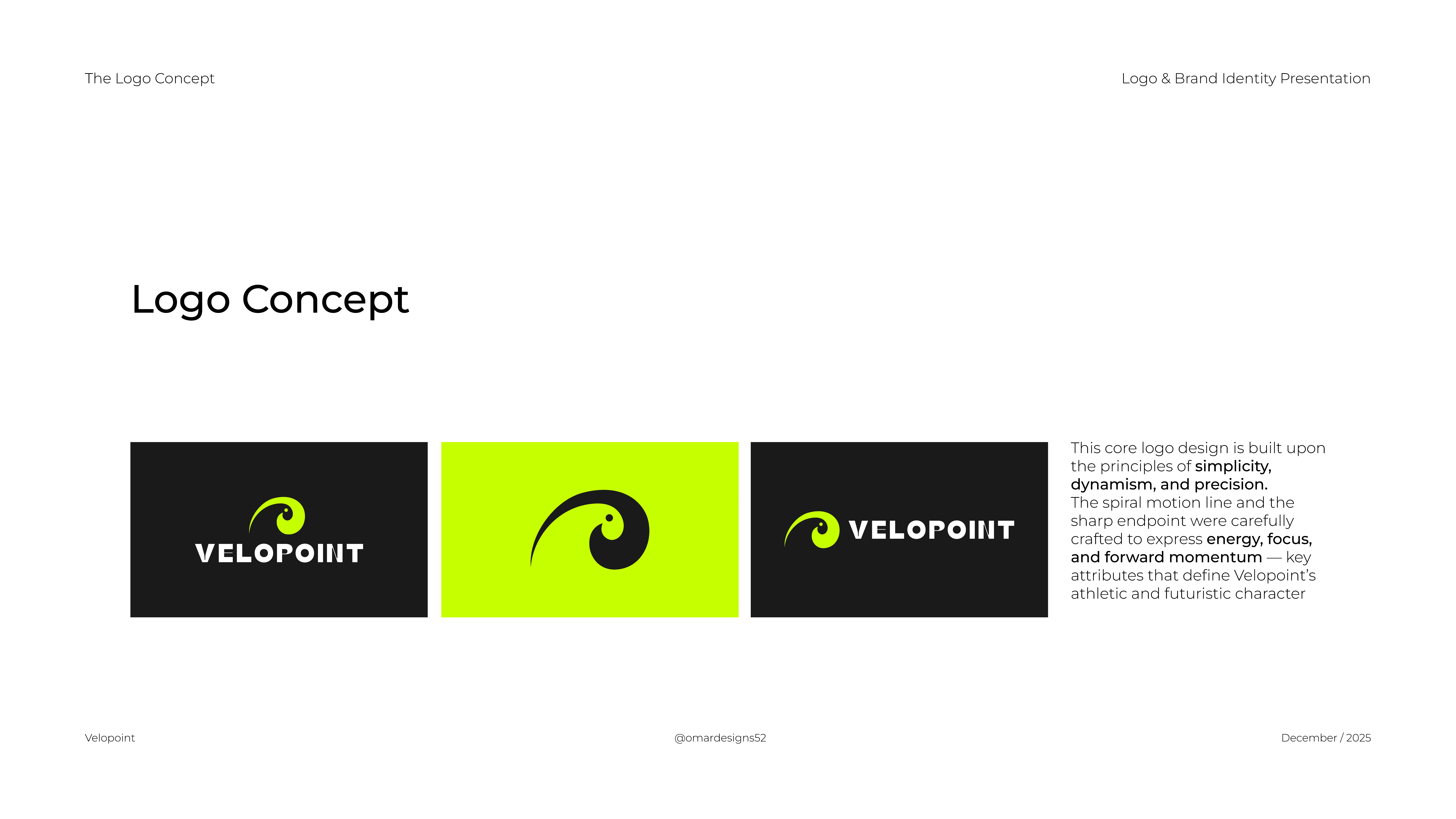
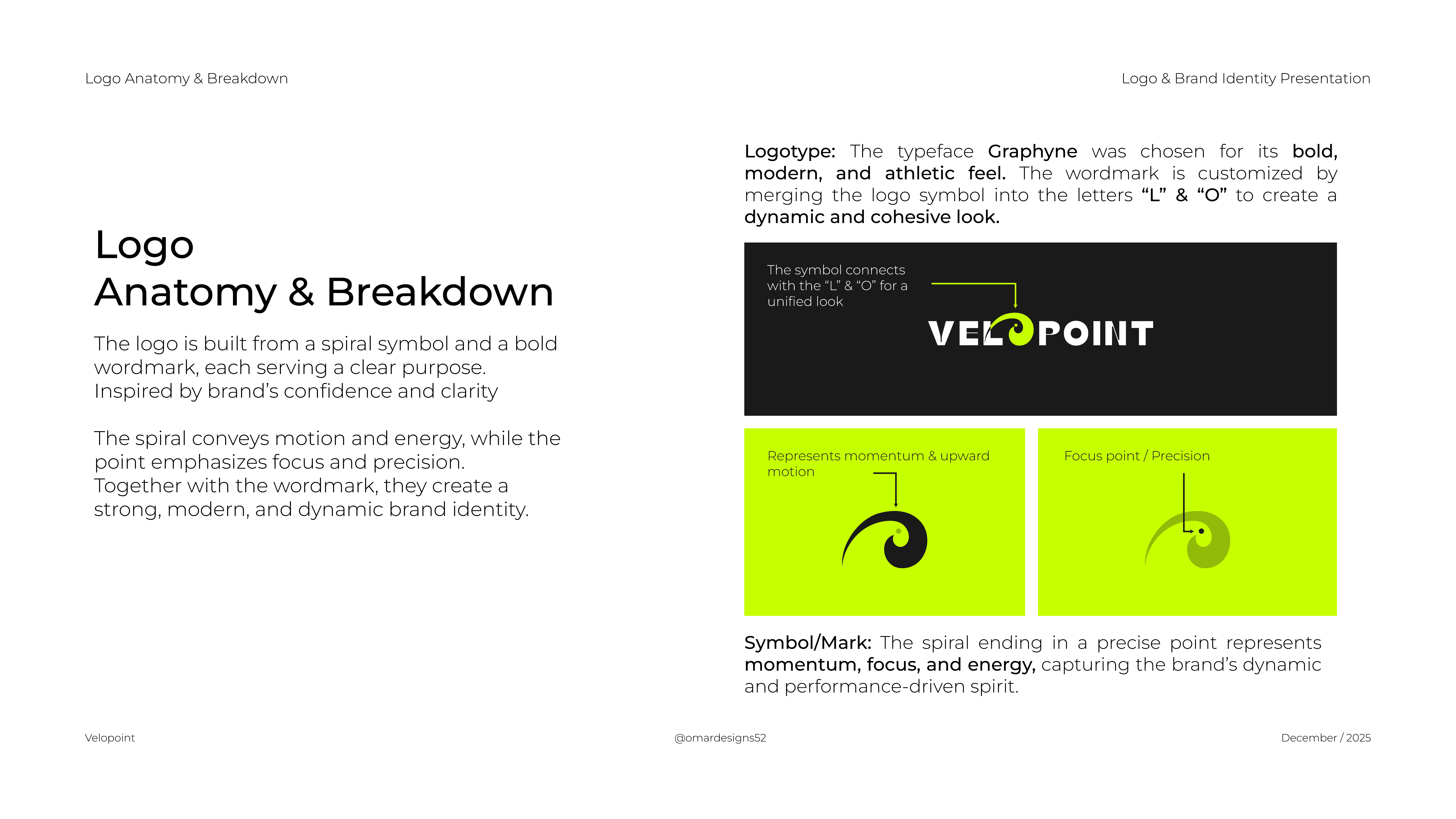
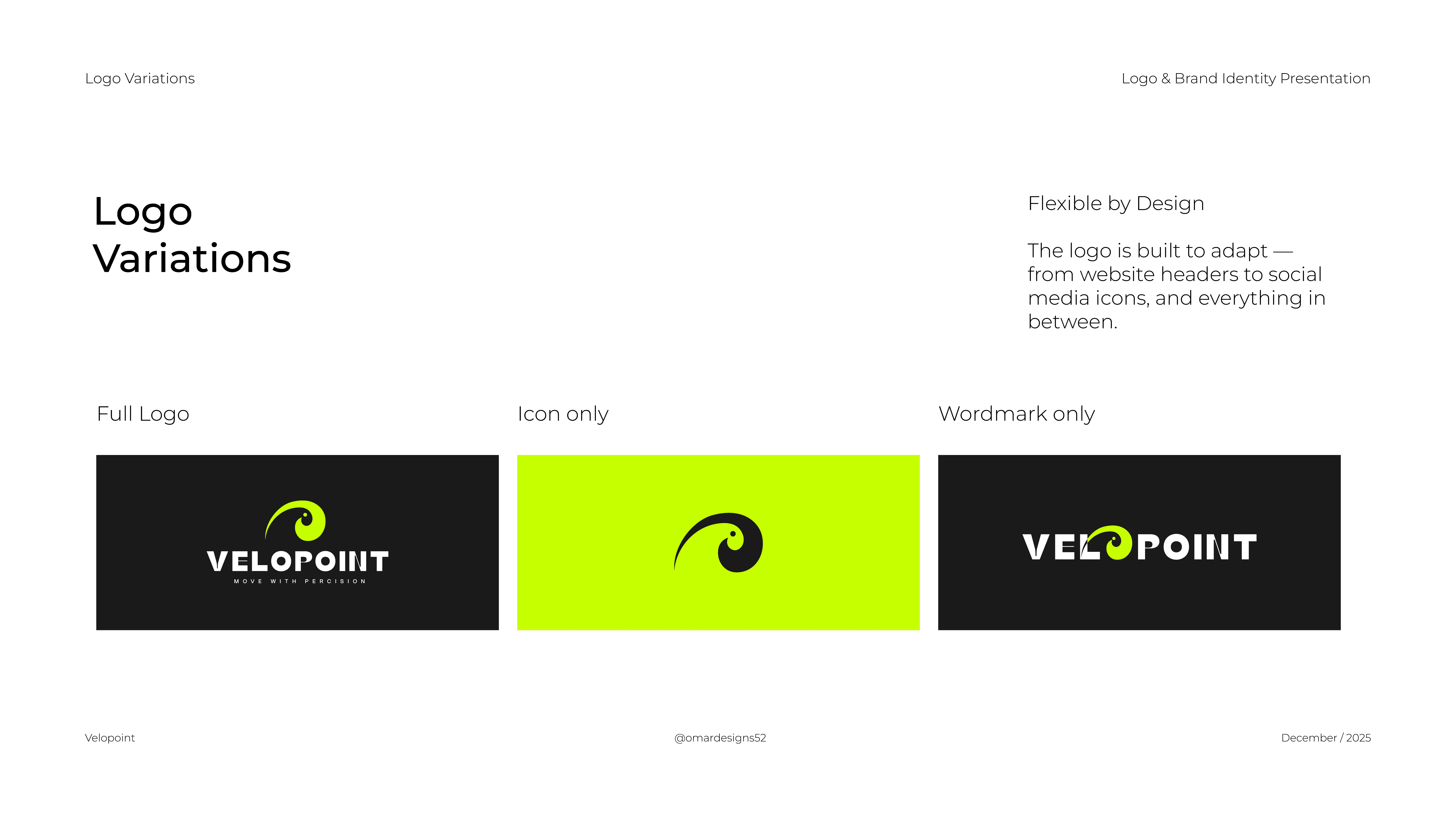
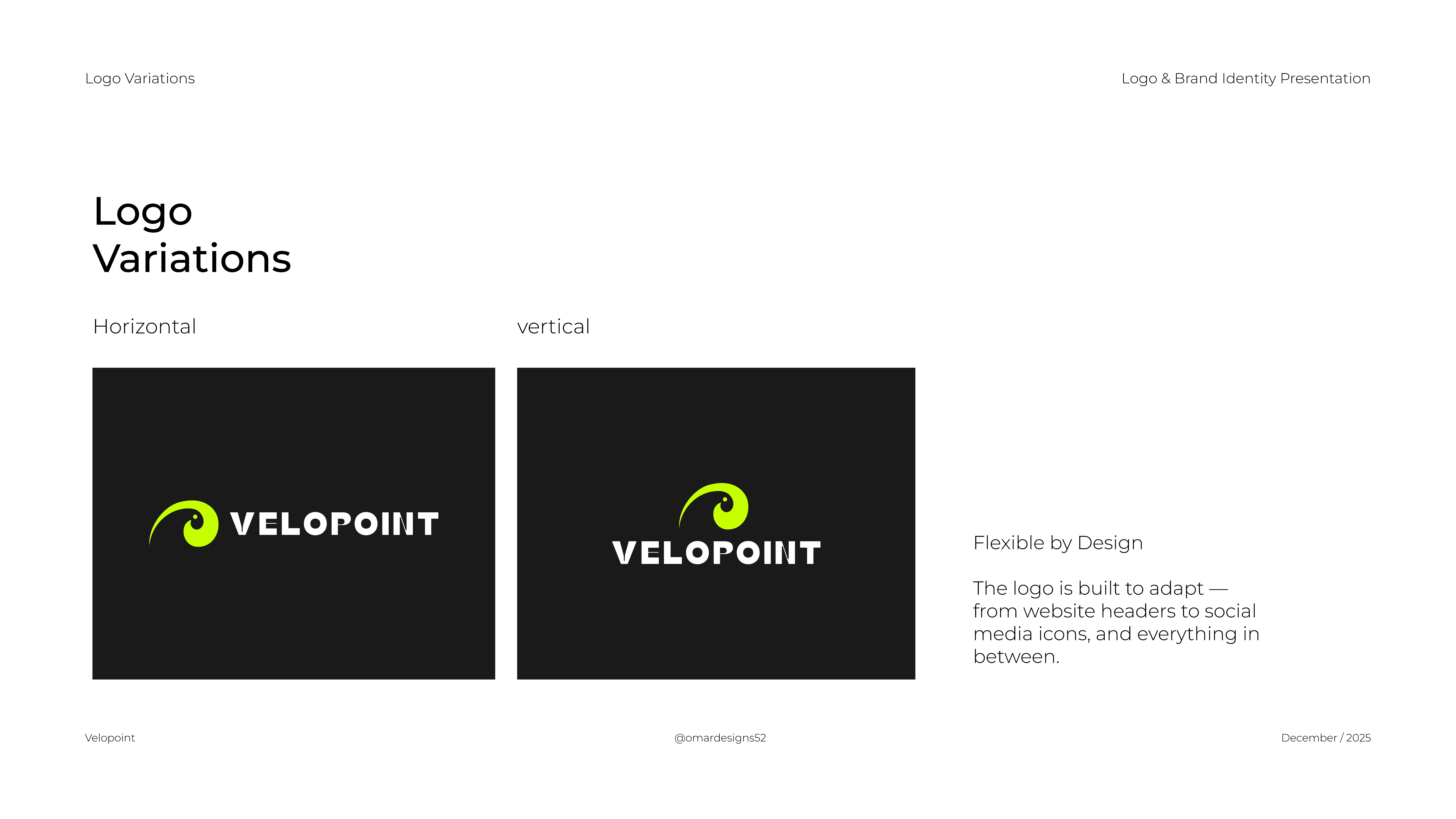
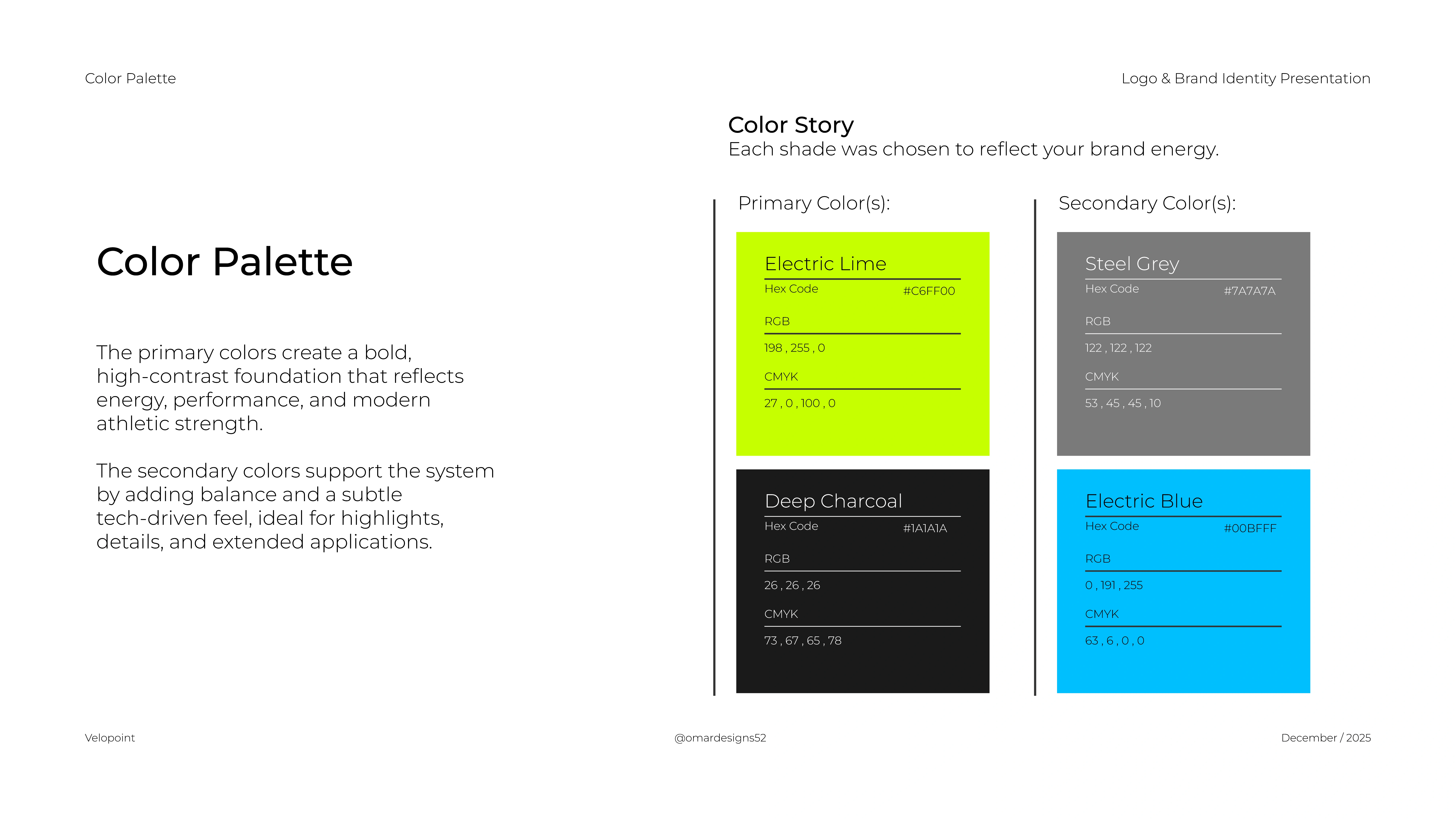
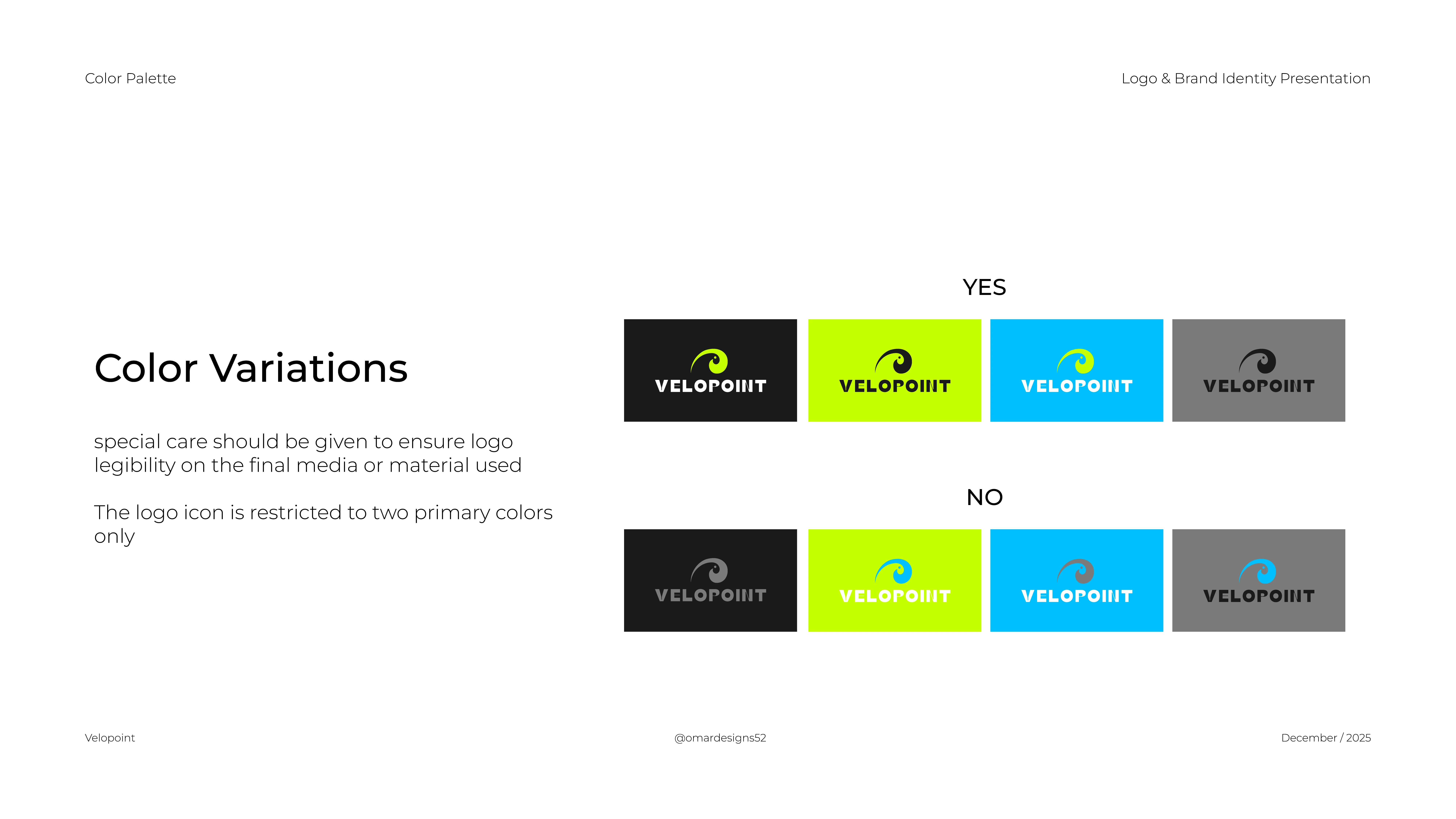
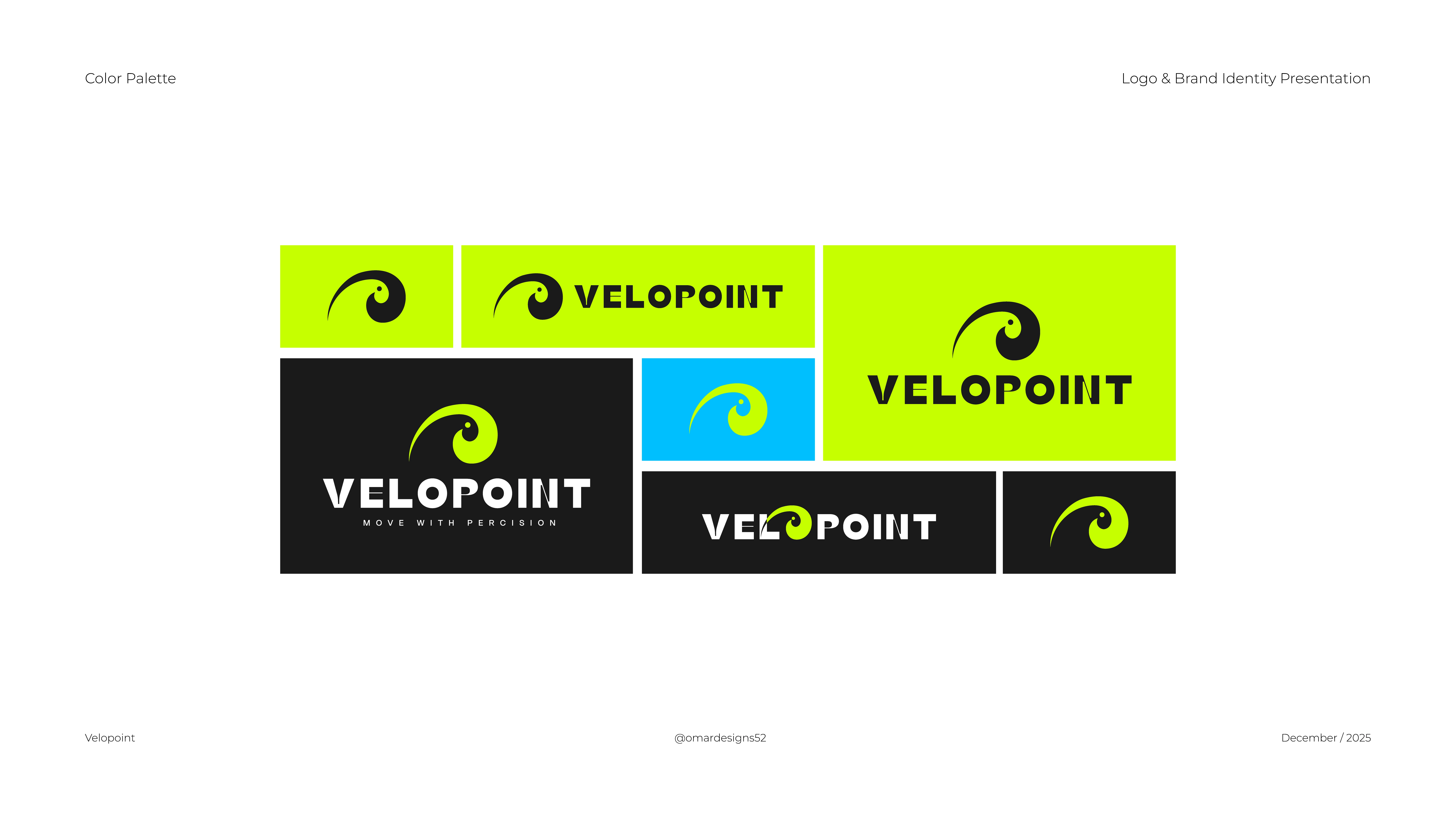
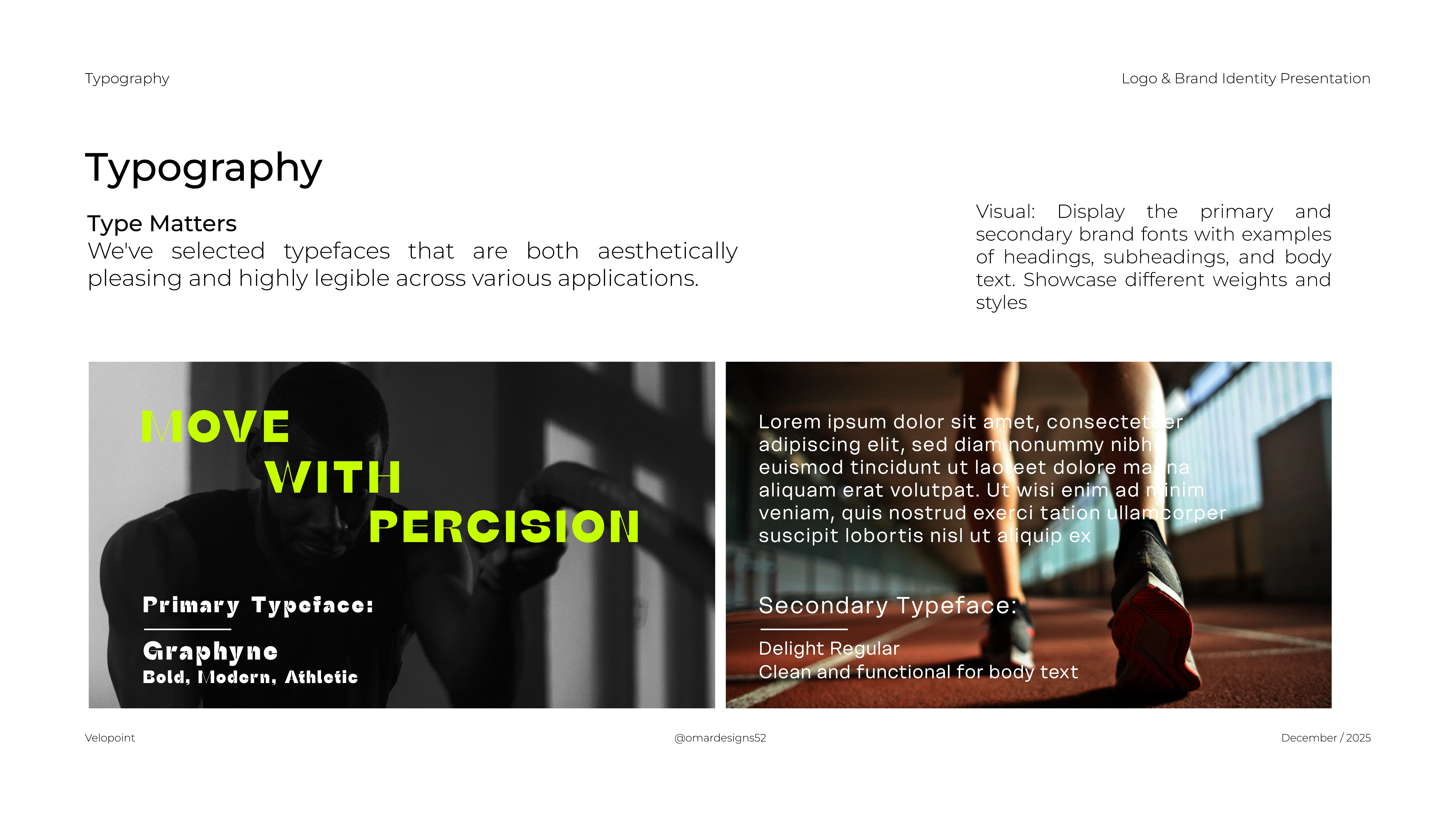
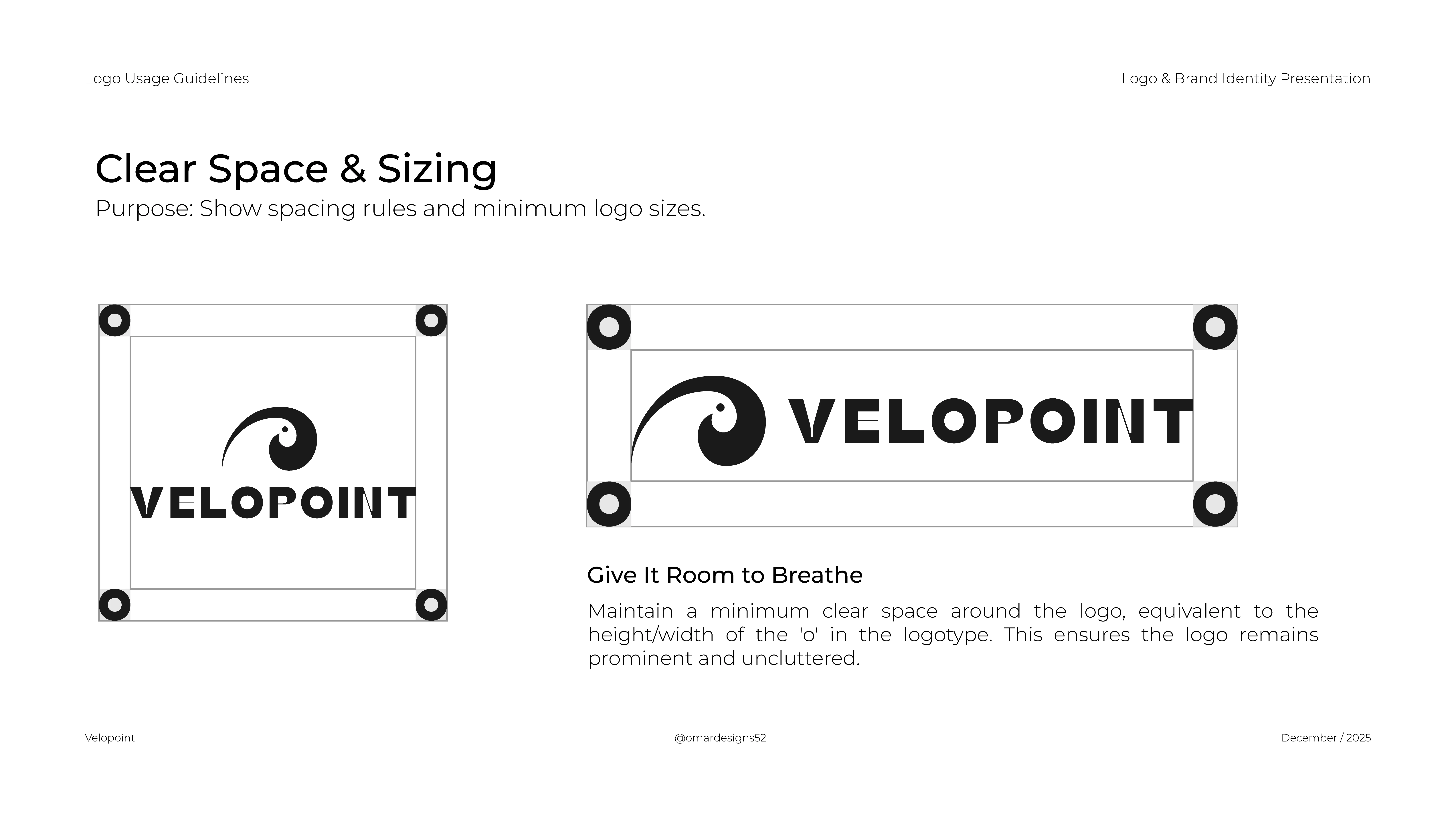
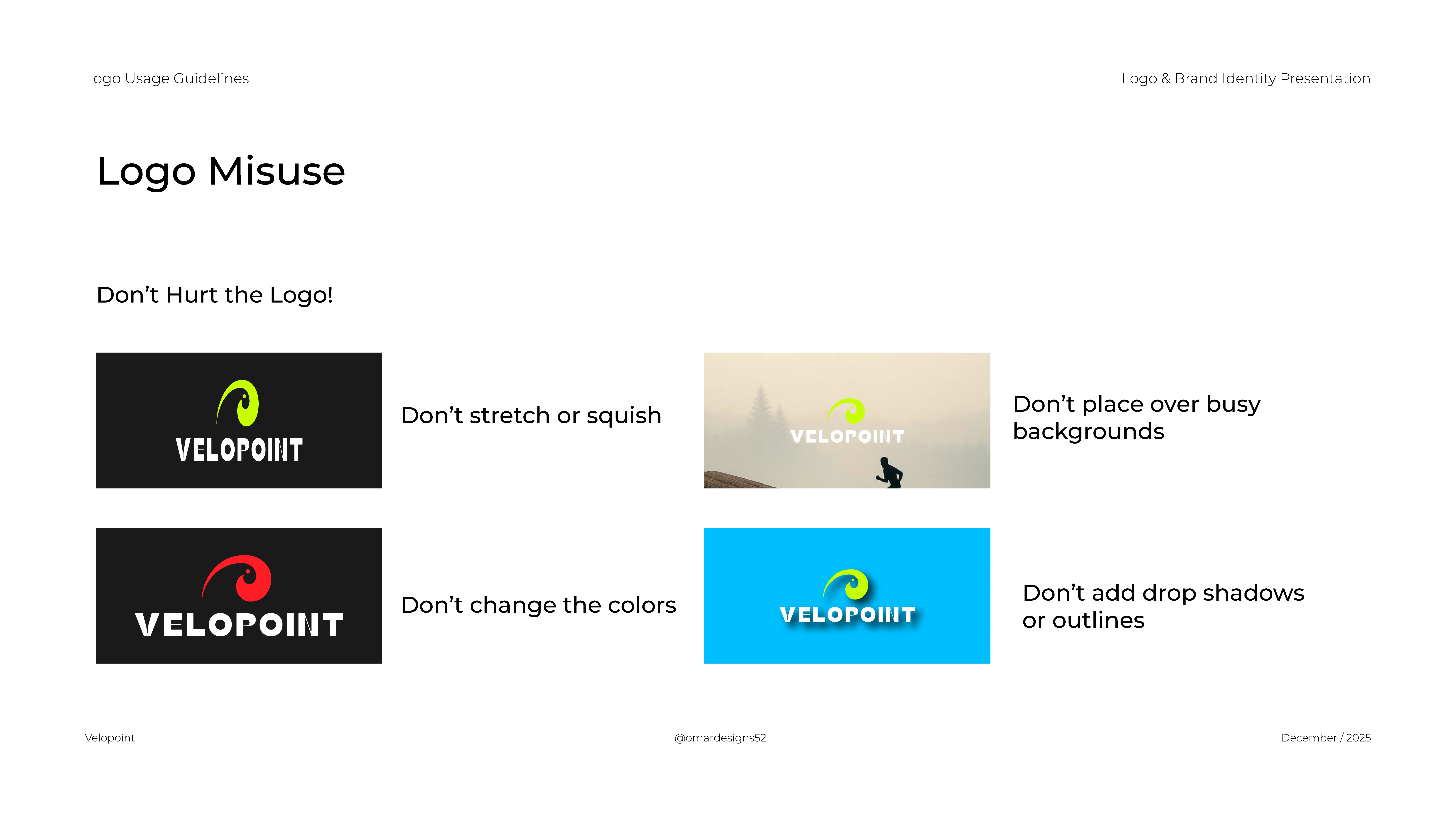
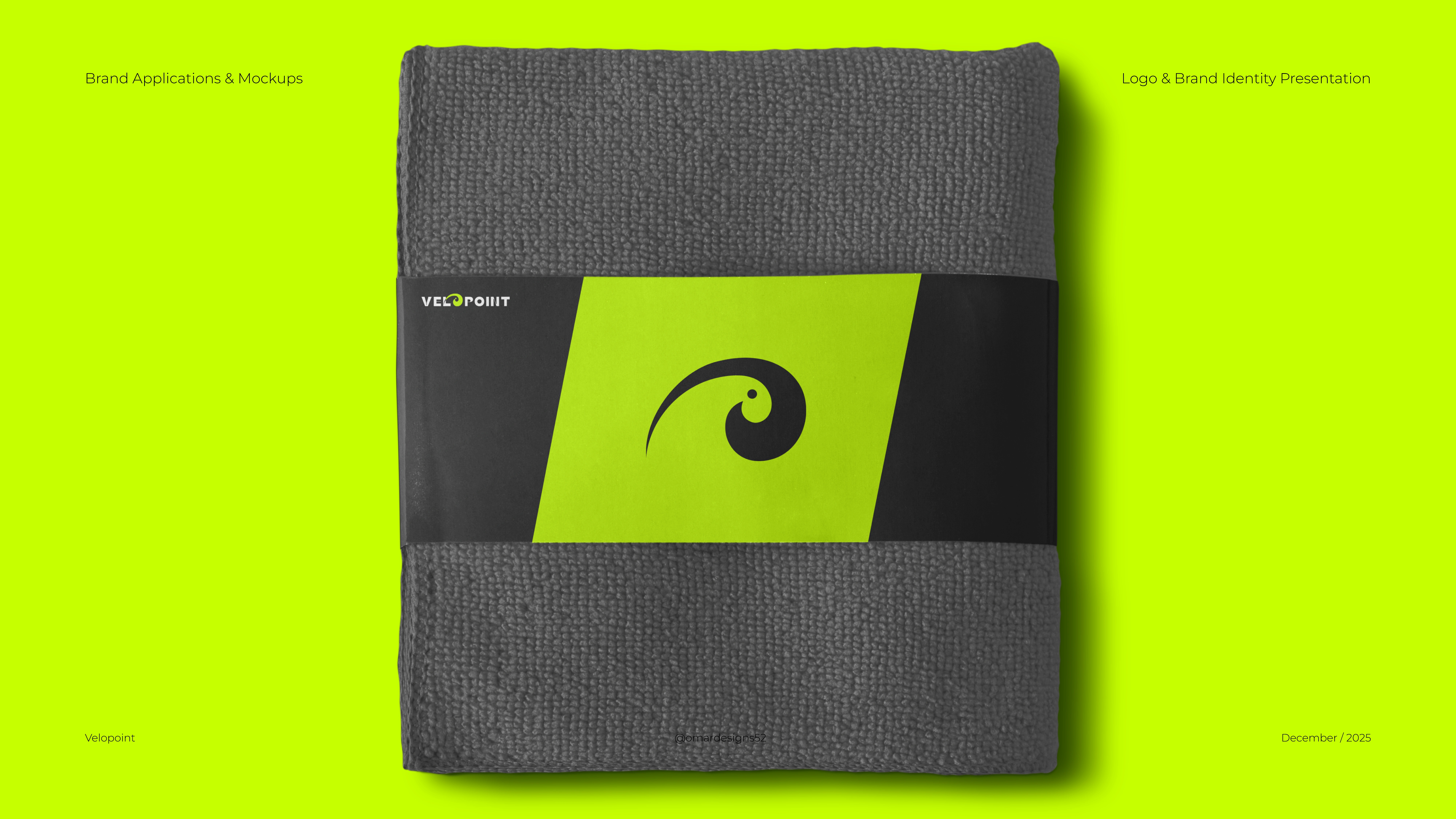
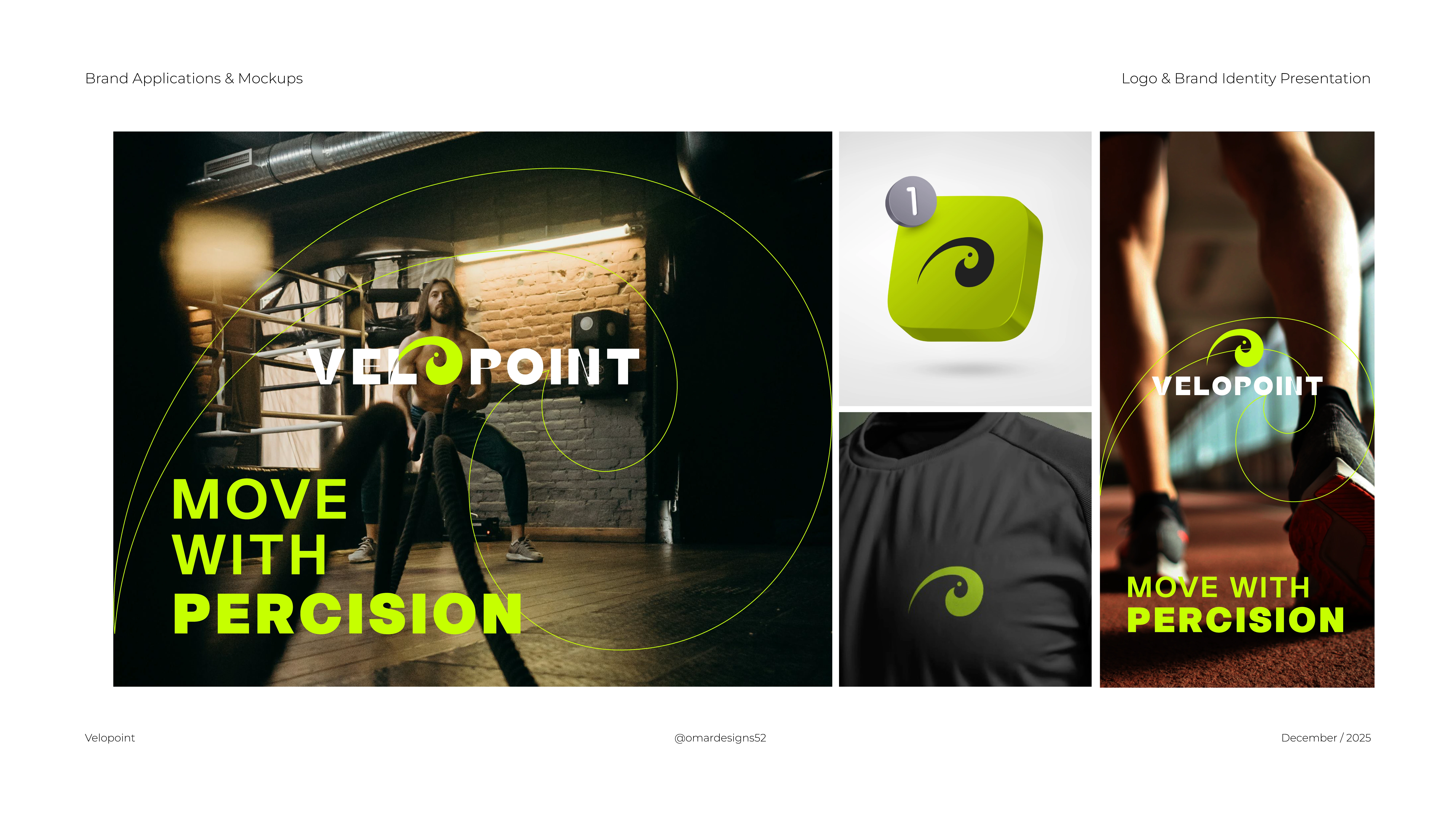
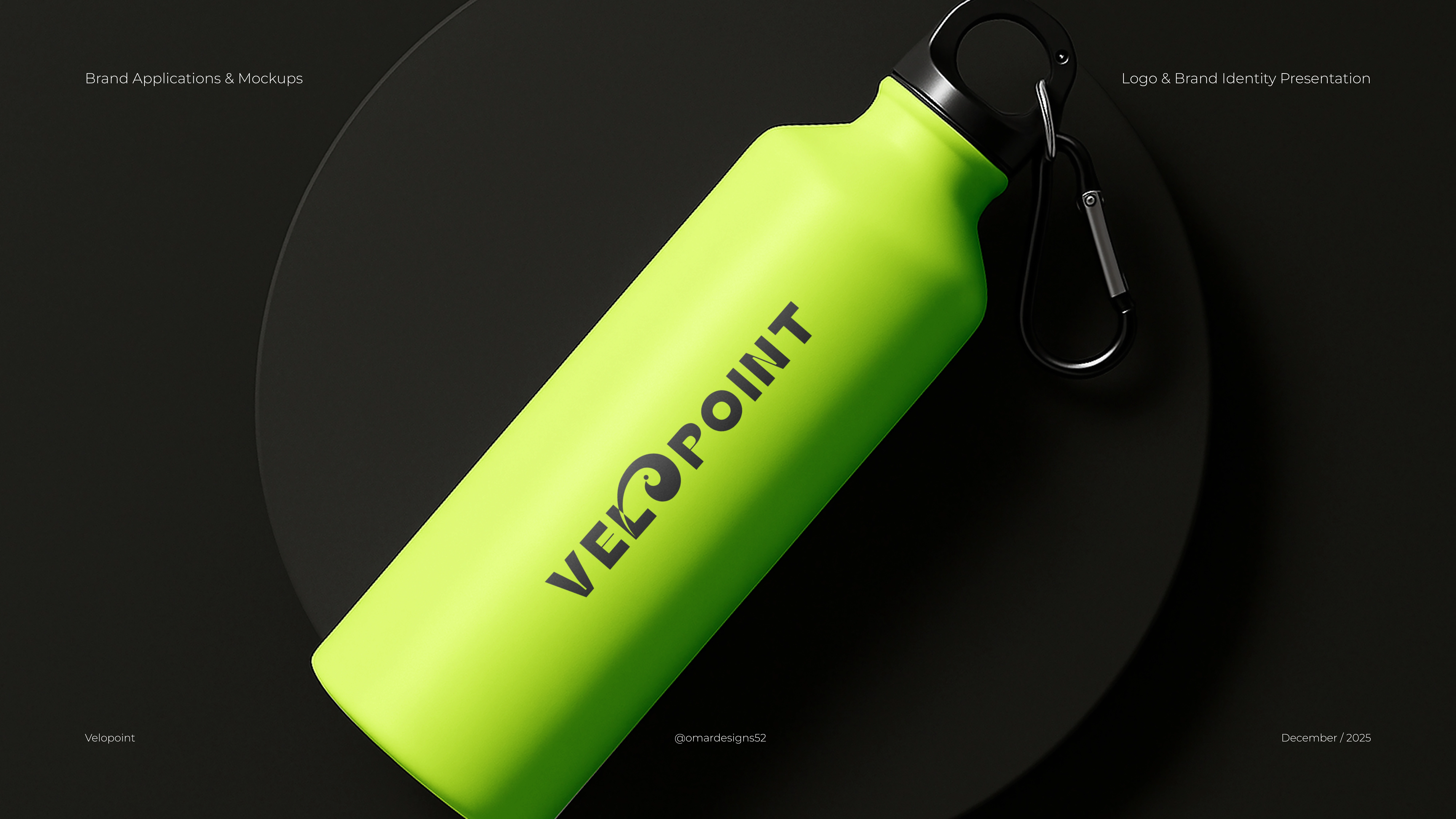
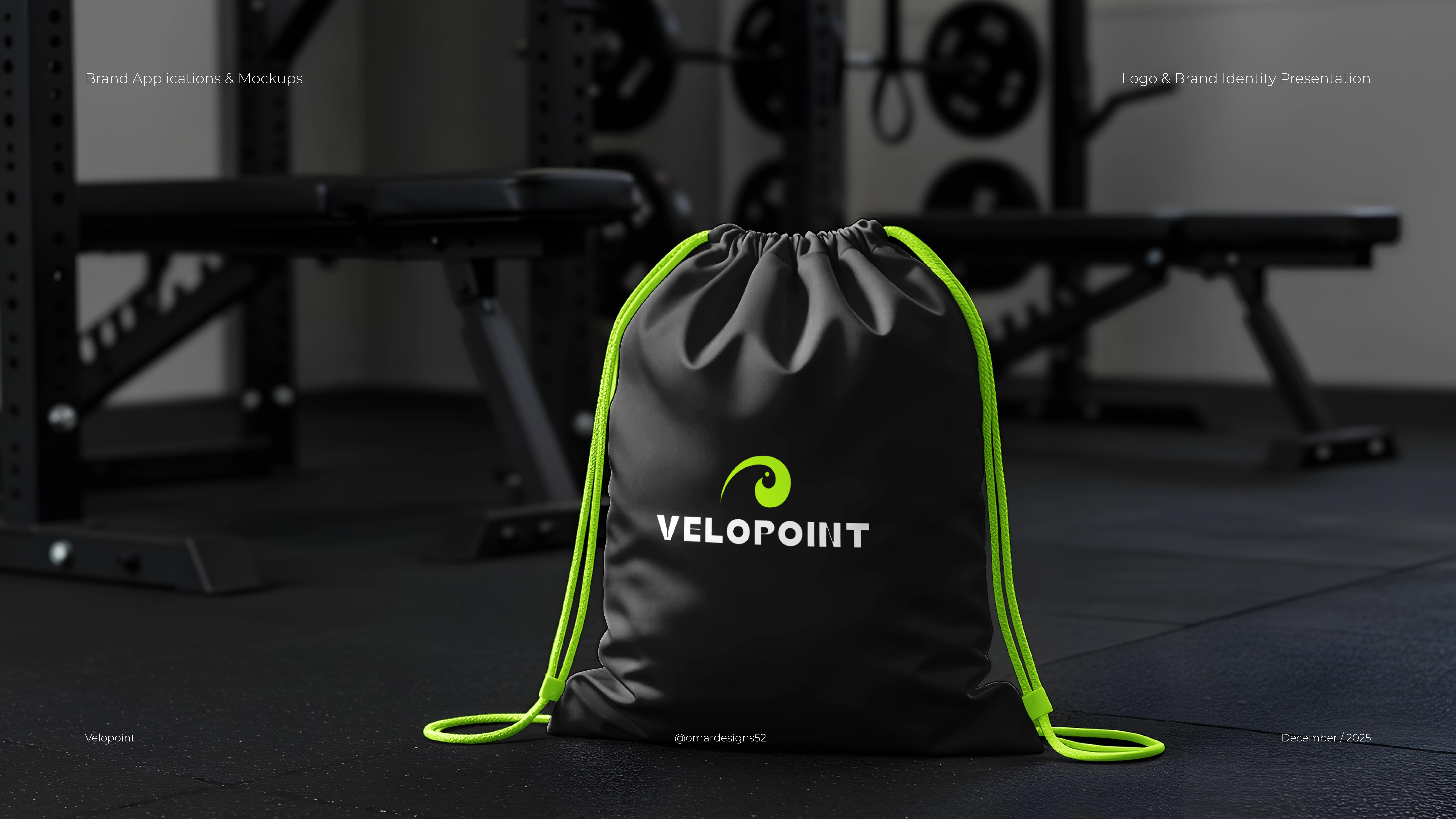
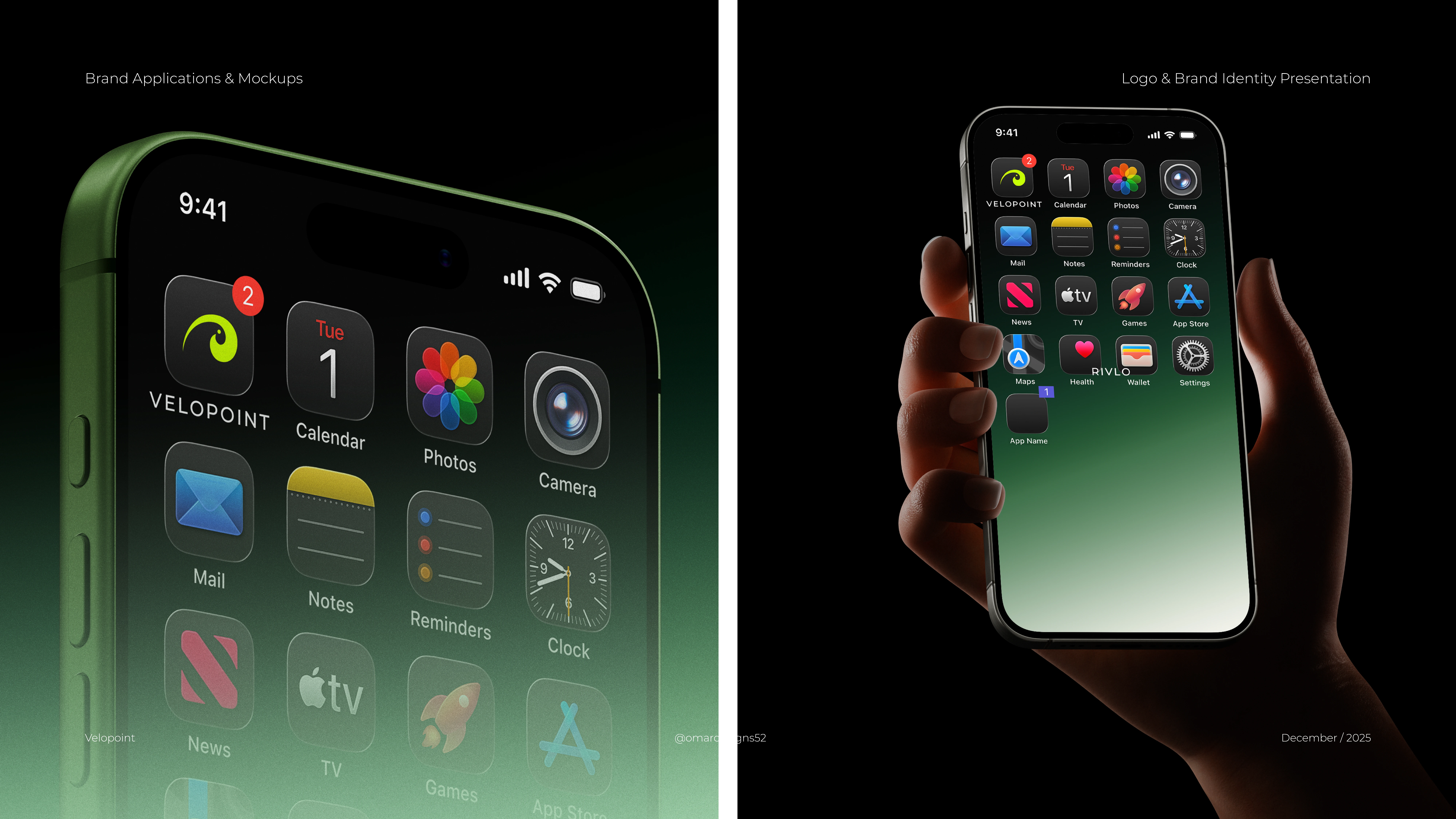
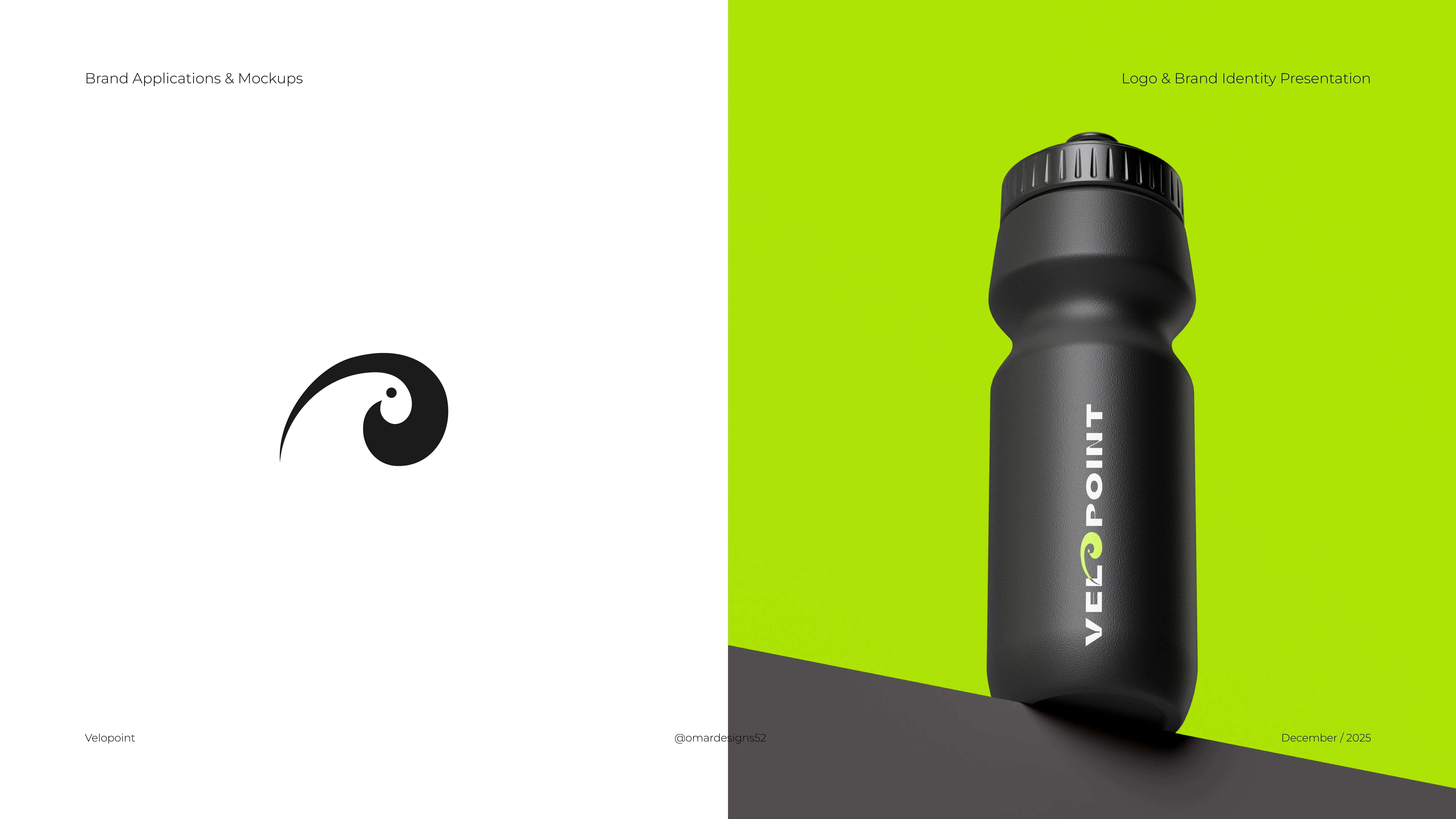
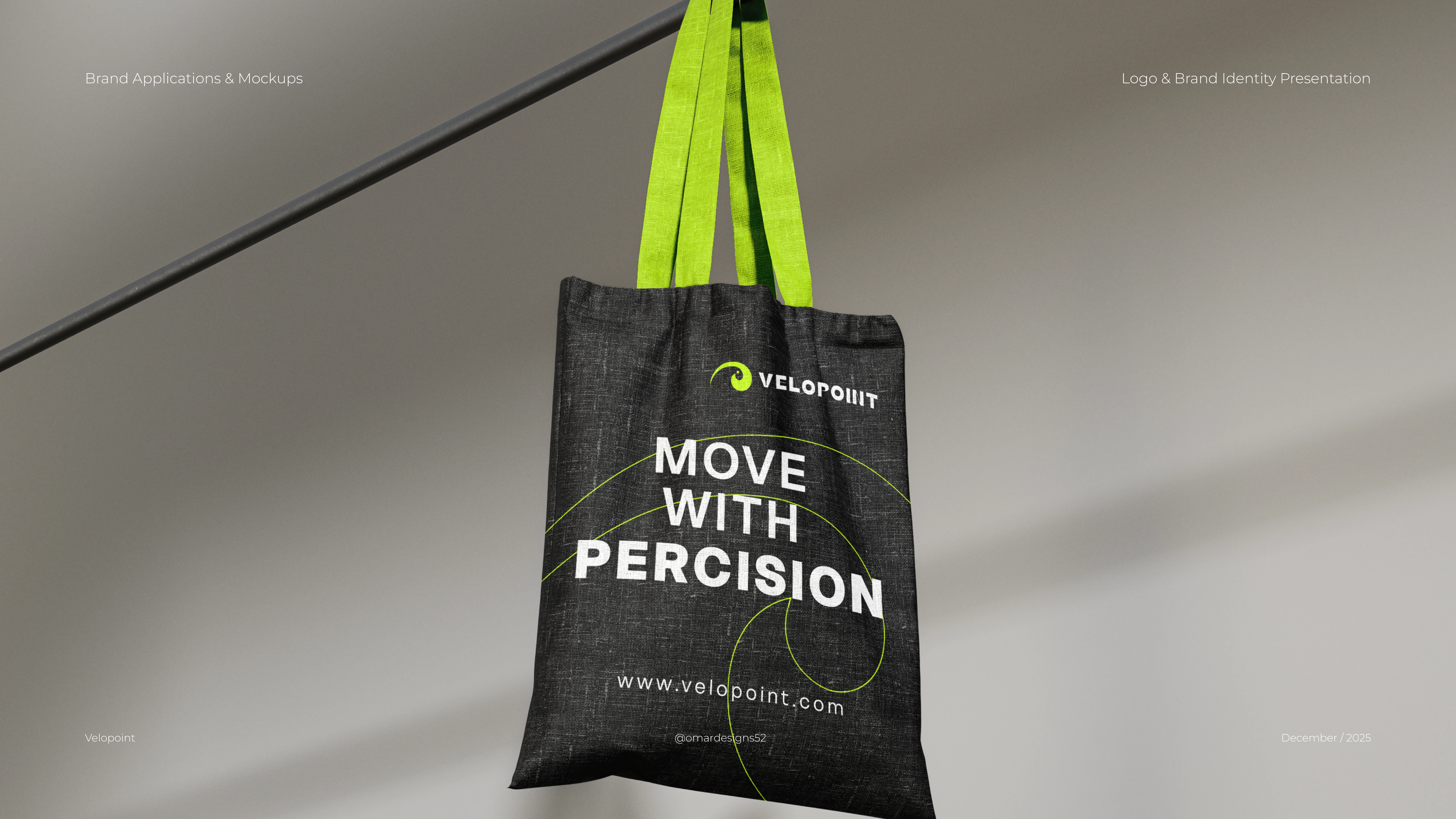
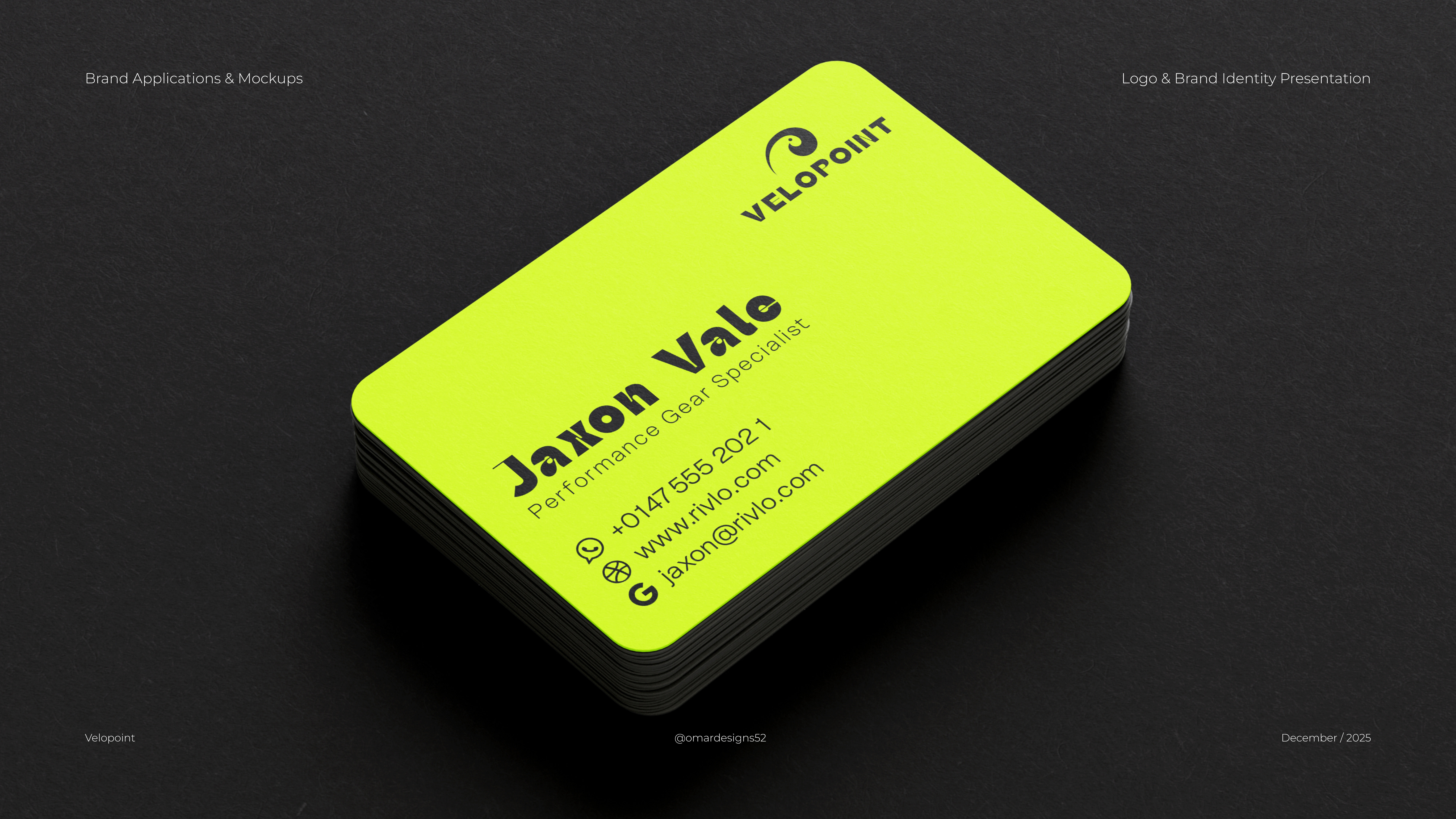
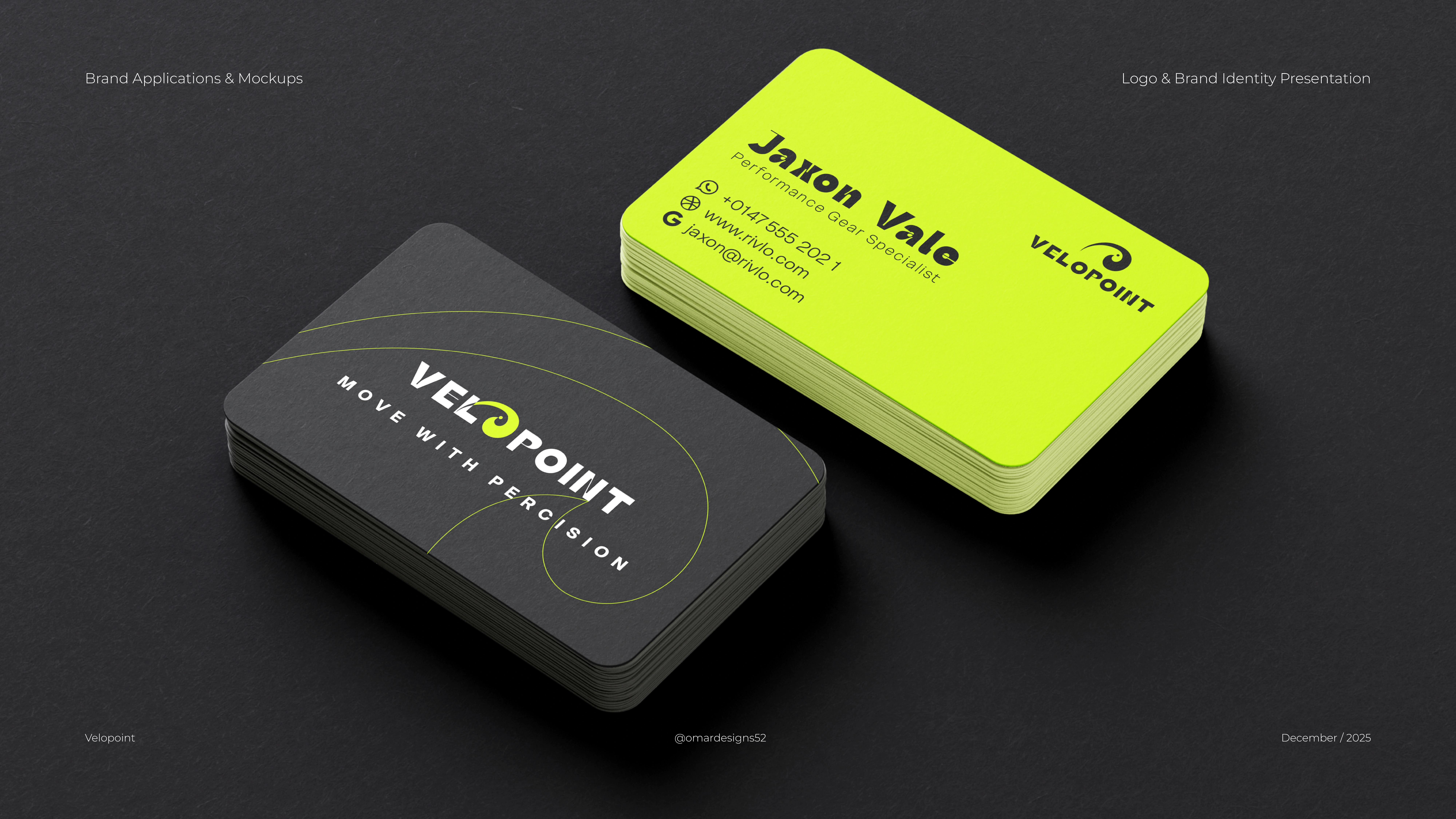
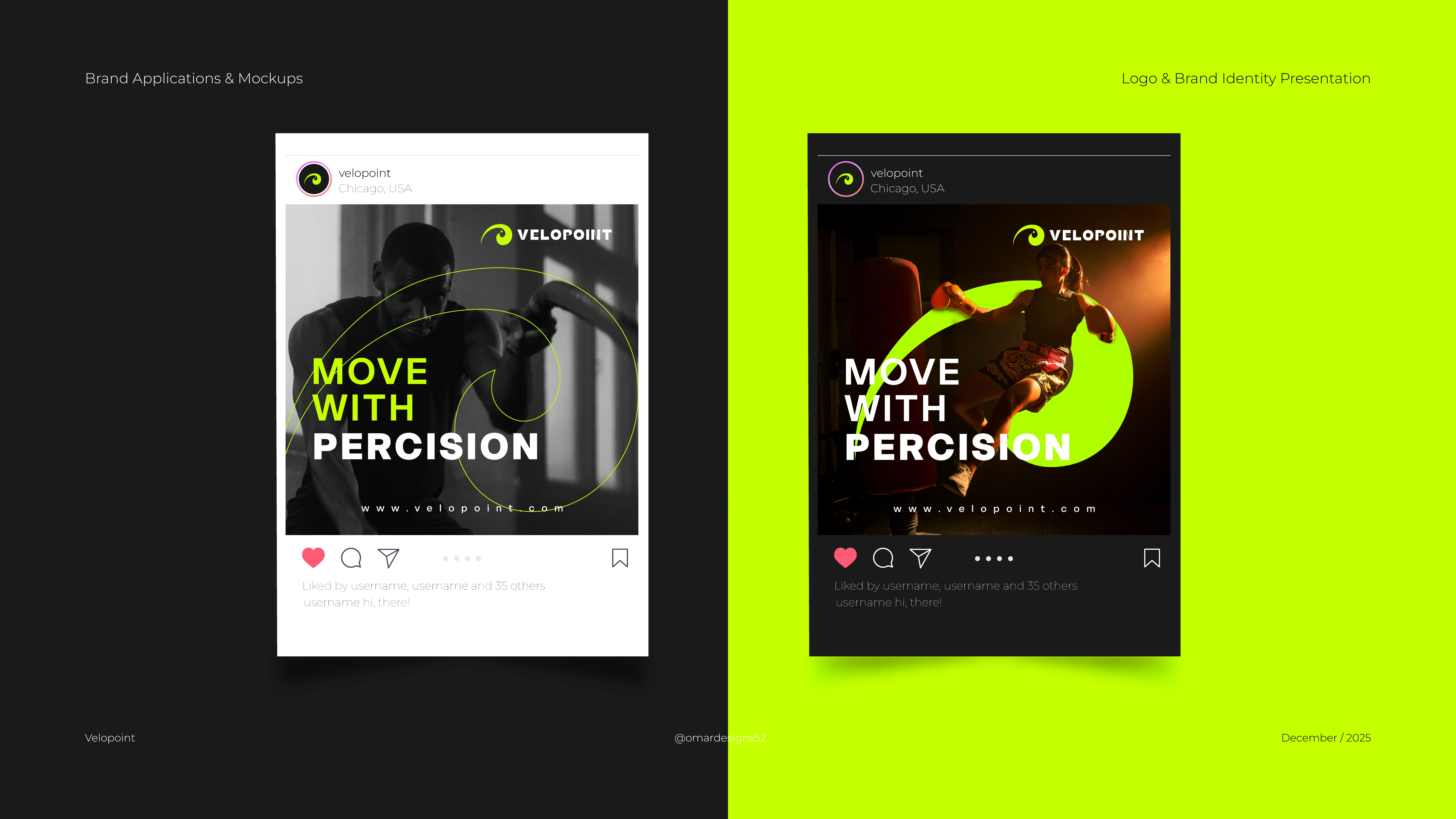
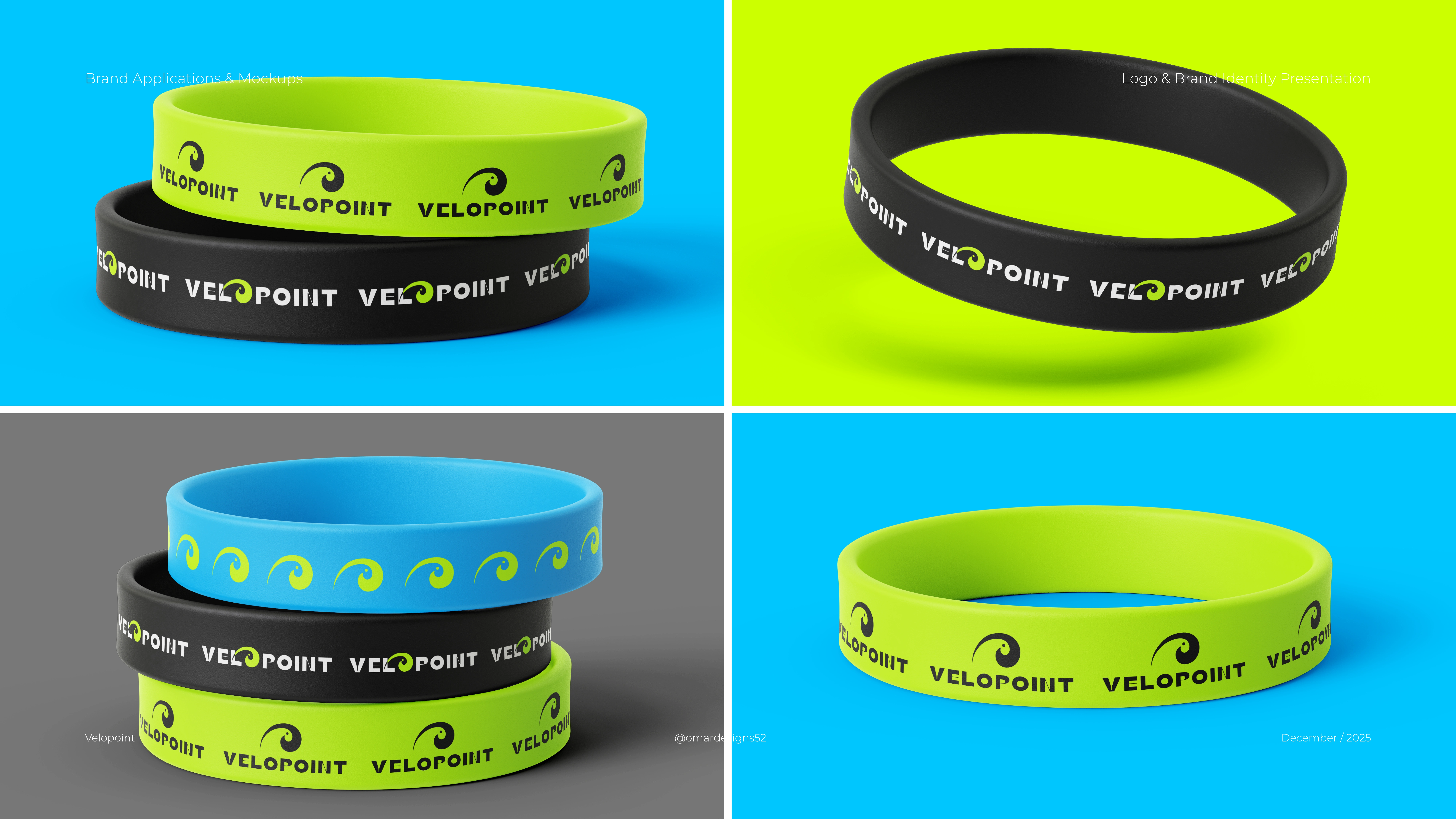
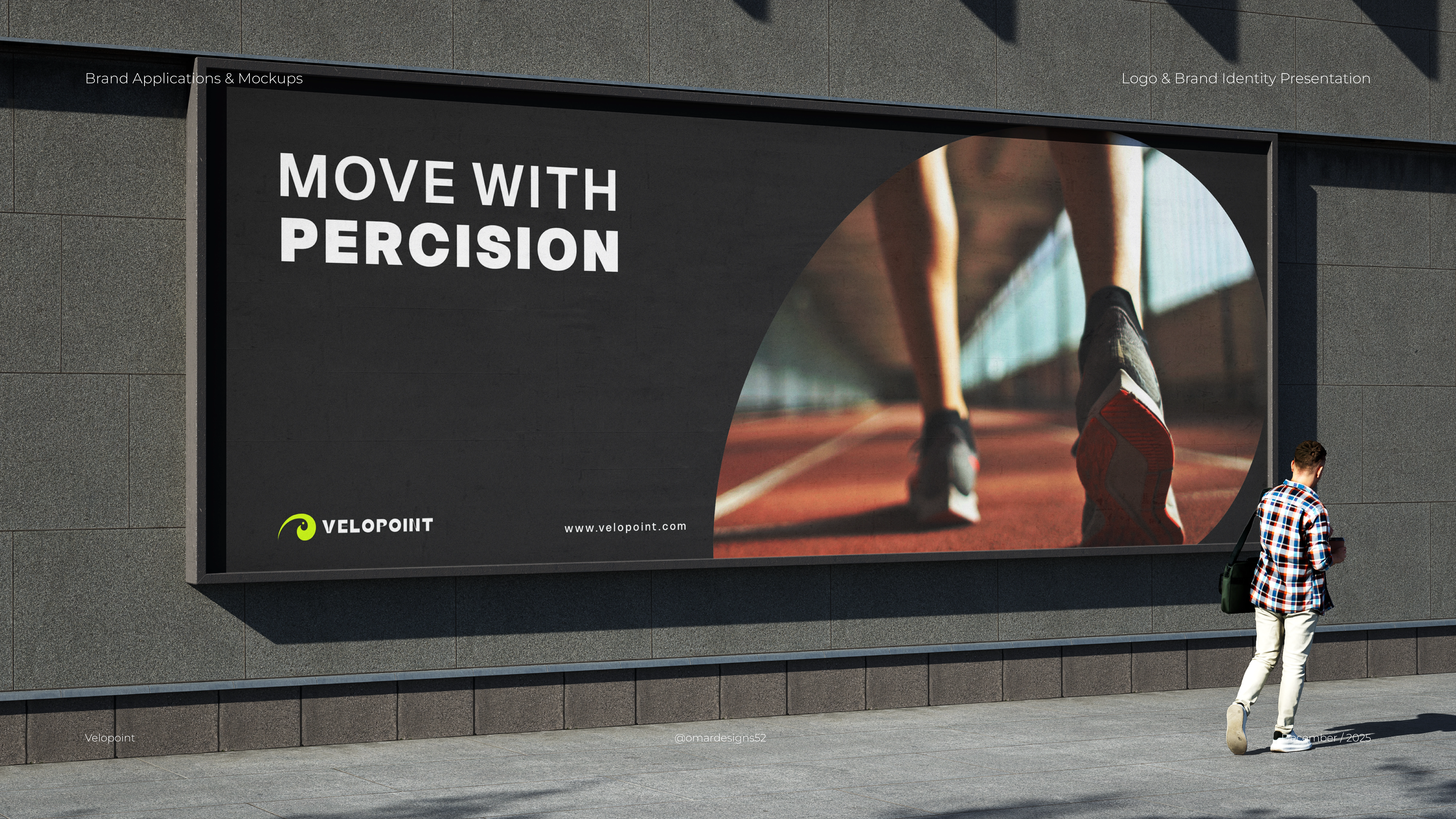
Velopoint is a performance–driven brand built for athletes who value clarity, precision, and forward momentum. This identity system blends a bold geometric mark with a clean, modern logotype to express strength, elevation, and continuous progress. The visual language focuses on dynamic lines, balanced structure, and a confident color palette designed for high-impact communication across digital and physical touchpoints. The project showcases the full brand system, including logo construction, symbol breakdown, typography selection, and a versatile color palette built for both performance and lifestyle applications. Realistic mockups demonstrate how the identity adapts across packaging, apparel, signage, and social media. This case study highlights a clear, functional approach to brand design—delivering an identity that feels fast, modern, and built for movement