Millife Brand Identity Design
Amrita Banerjee
The Challenge
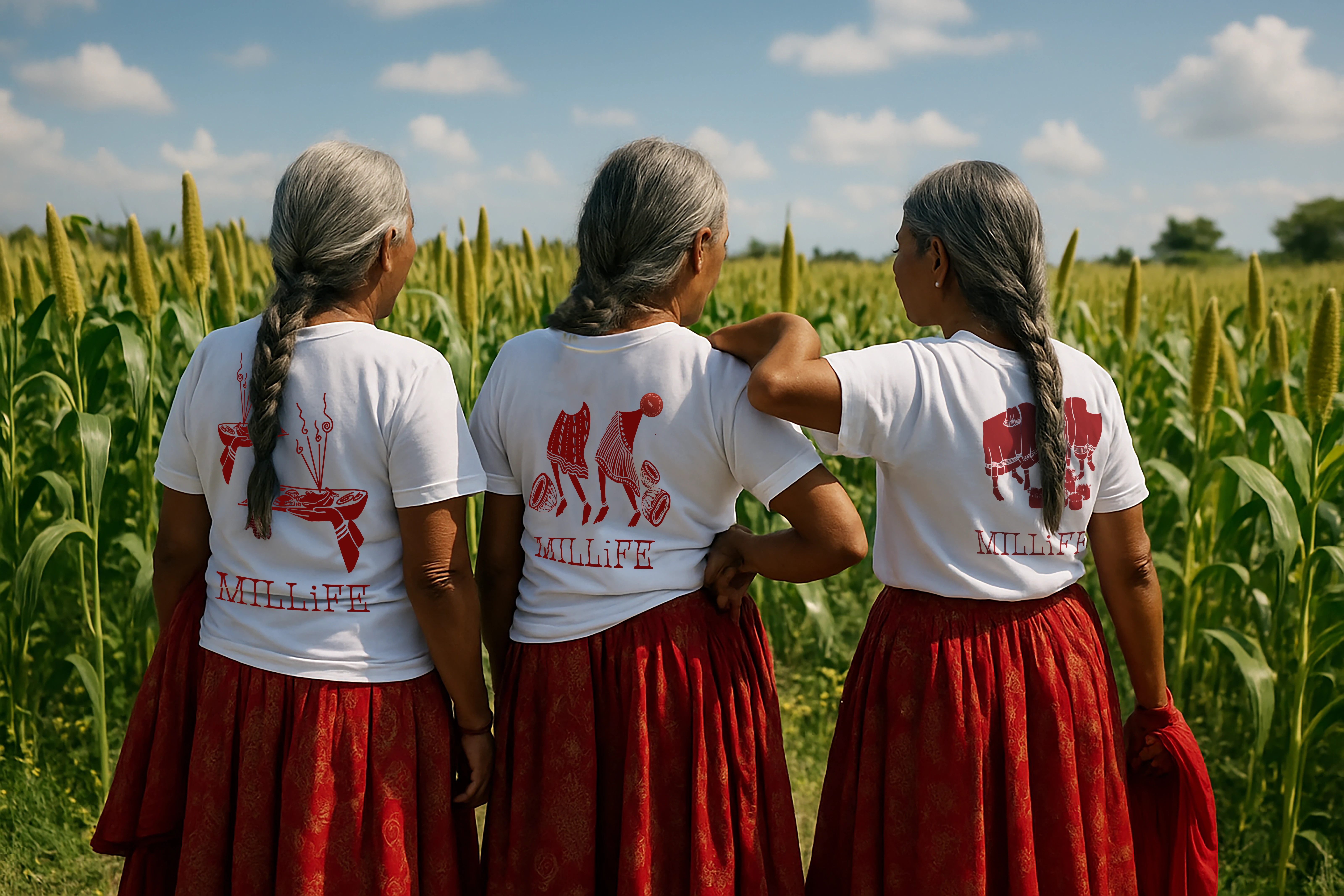
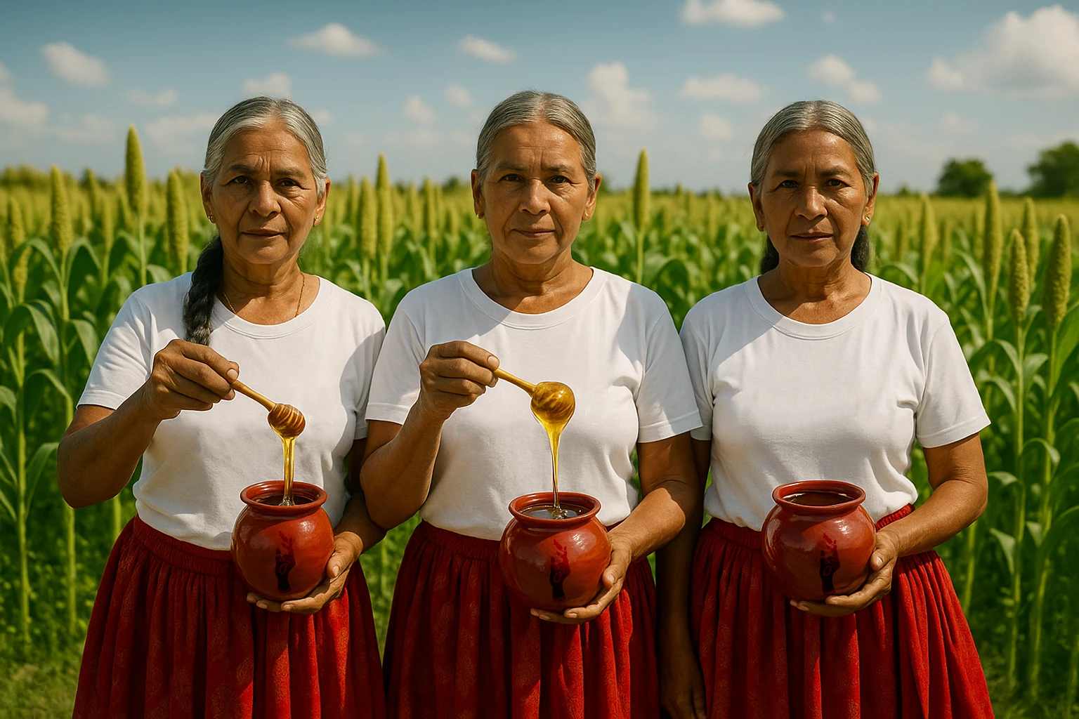
Millife wasn’t just another millet brand. The goal was to build an identity that honored the women farmers behind it, while also capturing the essence of Ranchi—its culture, traditions, and quiet strength. The client wanted the story of the land and its people, especially the women who farm, cook, and nourish with millets, to be deeply embedded in the brand.
The Solution
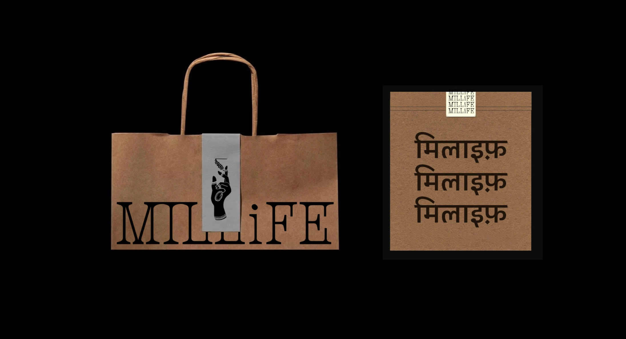
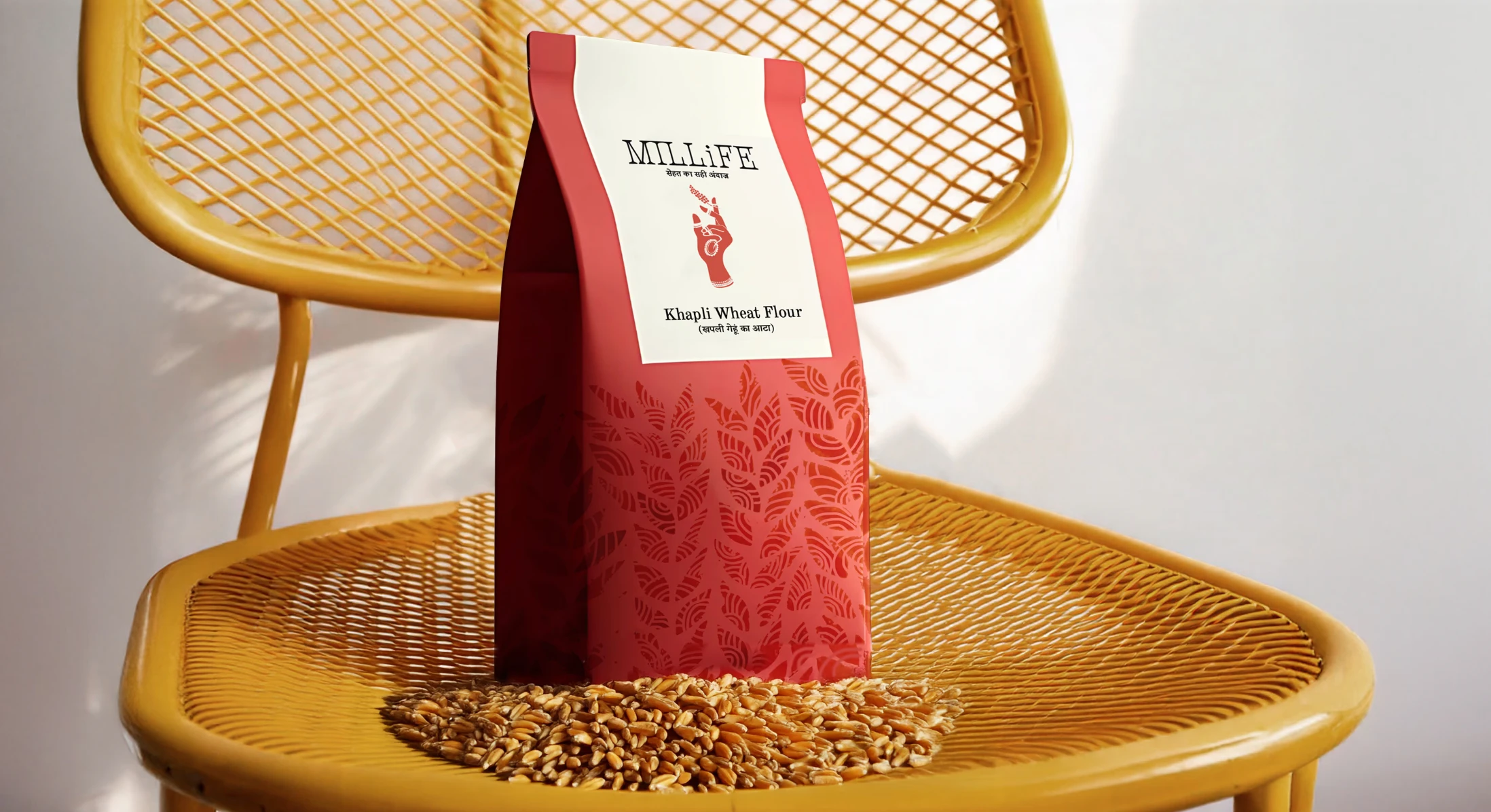
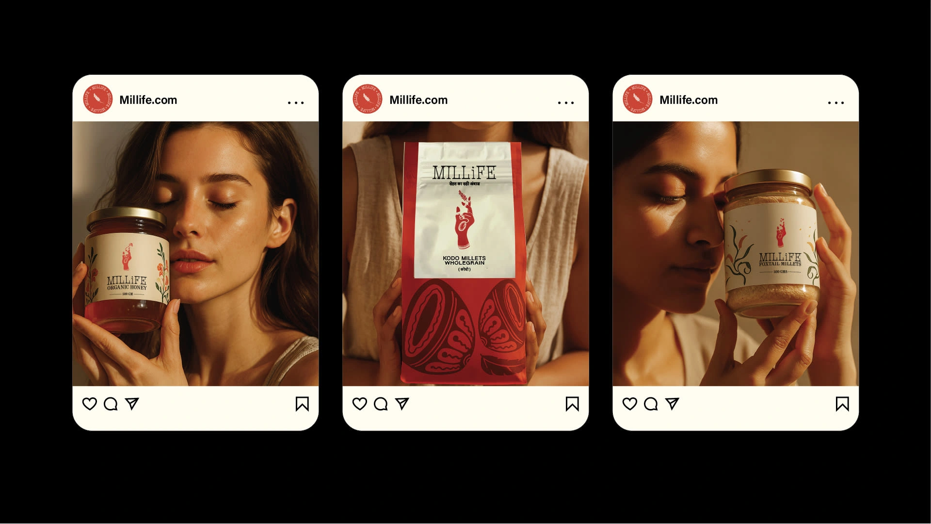
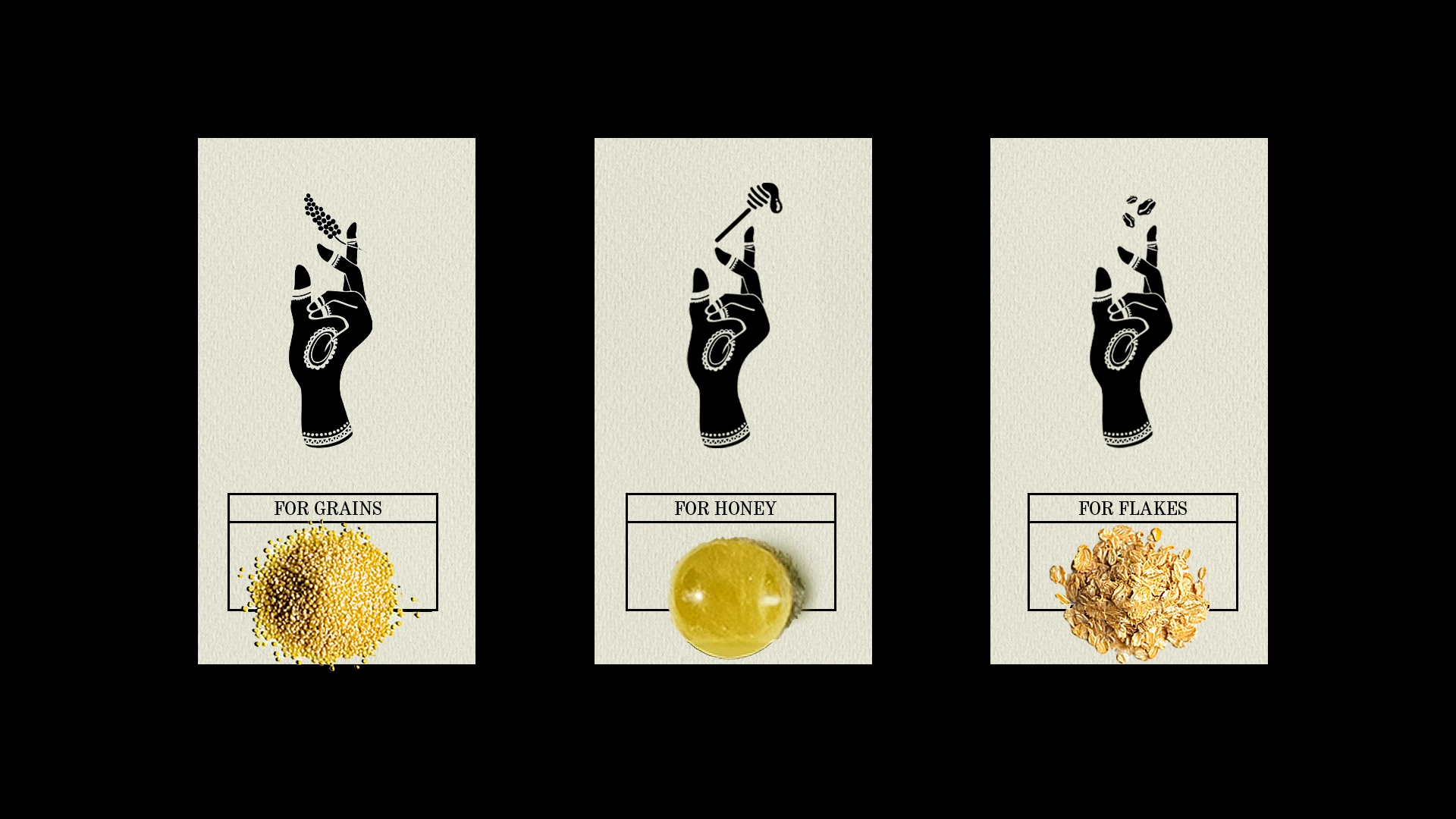
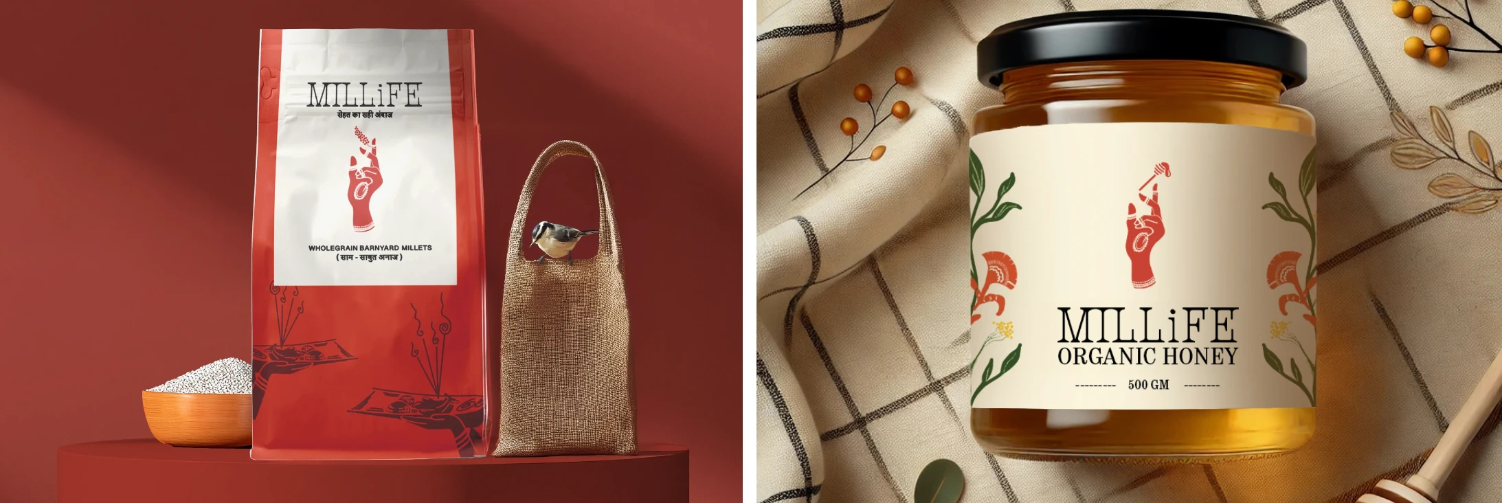
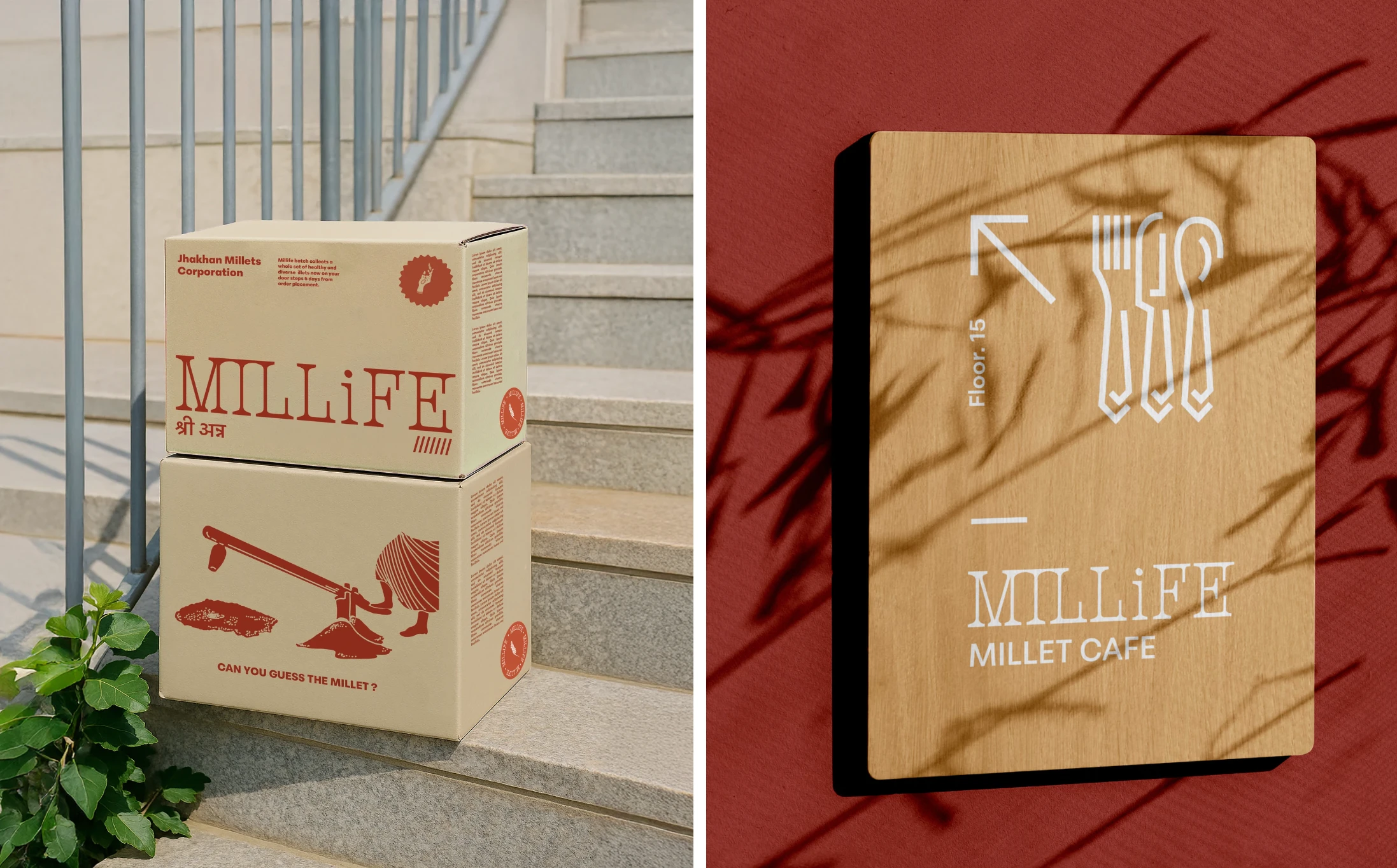
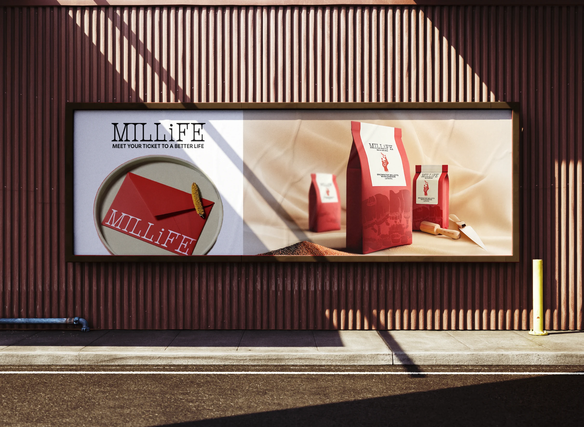
At the center of the brand is the logo: a hand adorned with mehendi, symbolizing the 40,000 women farmers of Jharkhand who do more than grow millets—they bring it home, cook it, and nourish their families with it. The hand became a tribute to their labor, care, and heritage.
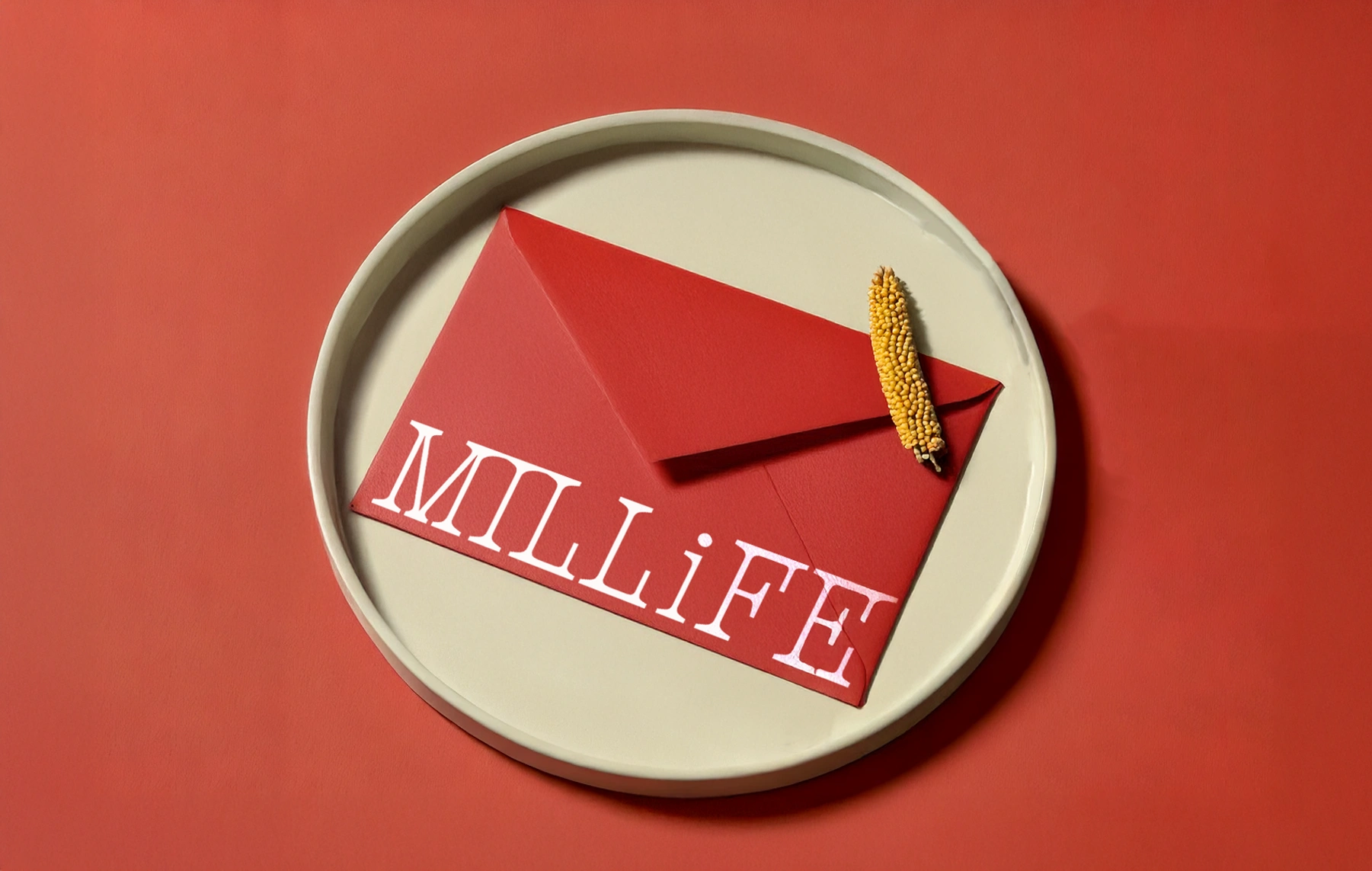
To extend this spirit, we turned to Sohrai—a traditional wall art form in Ranchi practiced exclusively by women. Just like they adorn their homes, we chose to adorn the packaging with the same illustration style, transforming each pack into a piece of cultural storytelling. The brand color, a deep red, mirrors both the region’s laal maatia soil and the distinctive local mehendi—an earthy red that connects land and ritual.
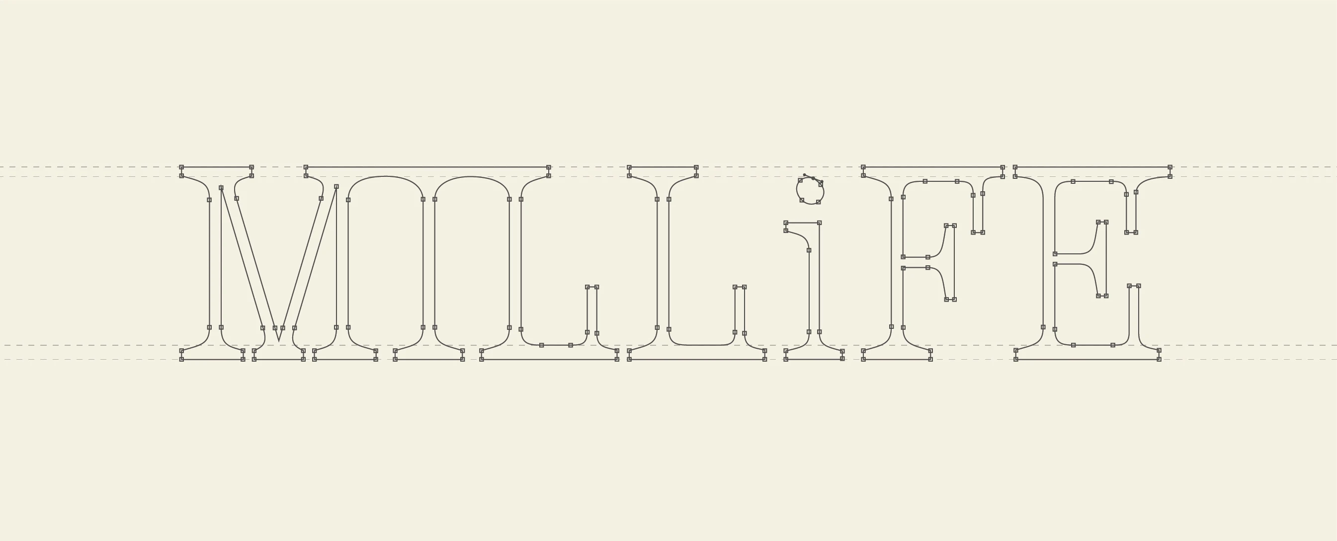
Typography was crafted with Hindi-inspired forms and textures, giving the brand an unmistakably Indian visual rhythm. The packaging layout was kept intentionally simple, allowing the story and the illustration to lead,rooted, honest, and quietly powerful.
The Opportunity
By anchoring the identity in the lived experiences of Ranchi’s women, Millife became more than just a functional food brand. It stood out as a celebration of tradition, a reflection of everyday care, and a reminder that sometimes, the most nourishing stories are the ones we’ve always known.
Like this project
Posted Jun 12, 2025
Developed Millife's brand identity and packaging design to best represent the culture, people and traditions of Ranchi in an elevated yet grounded manner.