The Balance Story - Packaging Design
Amrita Banerjee
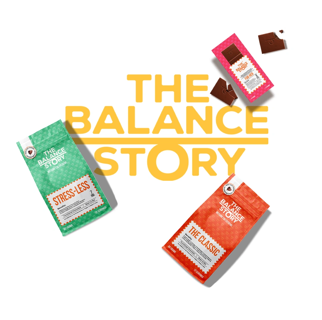
THE BALANCE STORY
Packaging Design
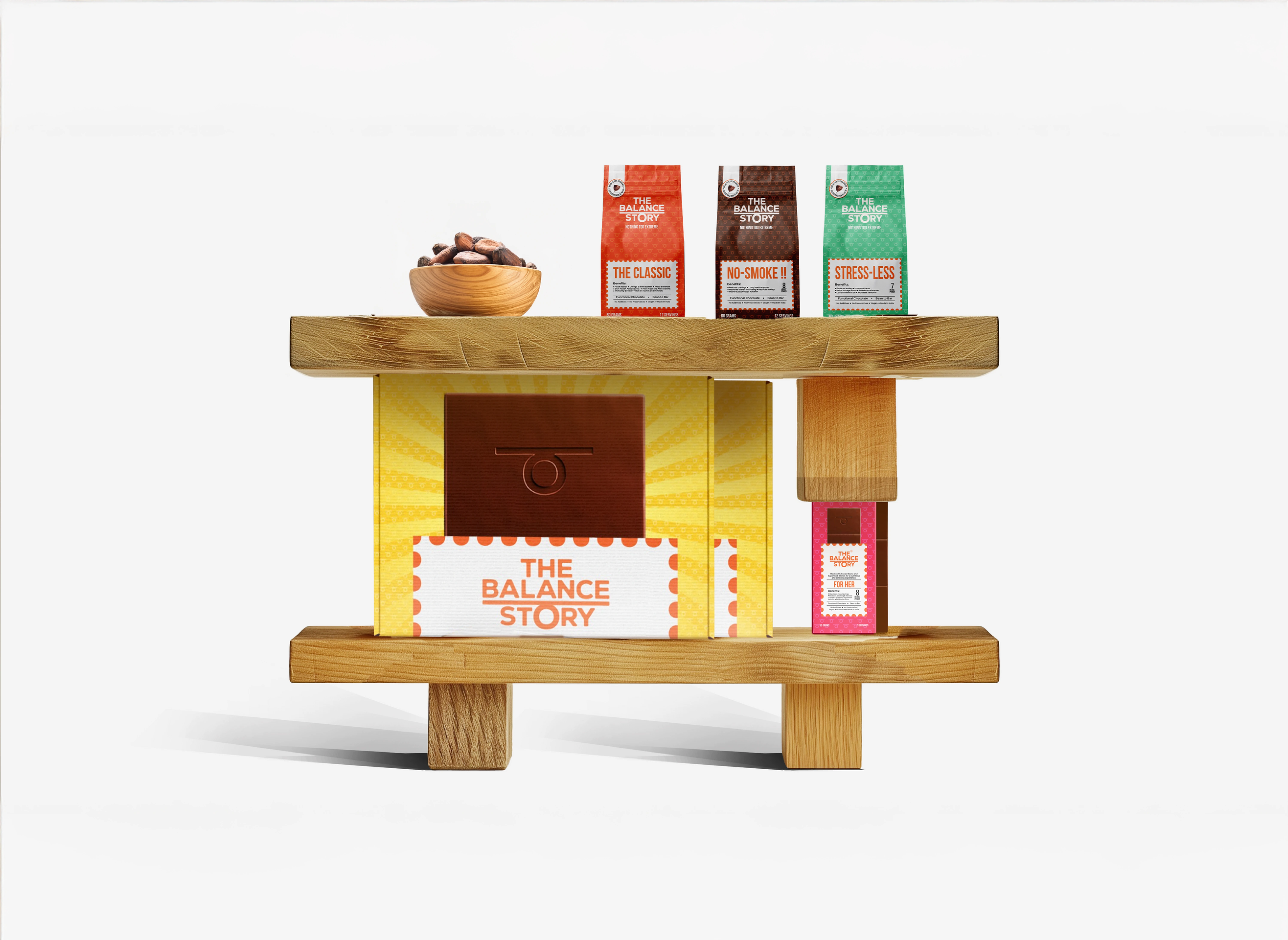
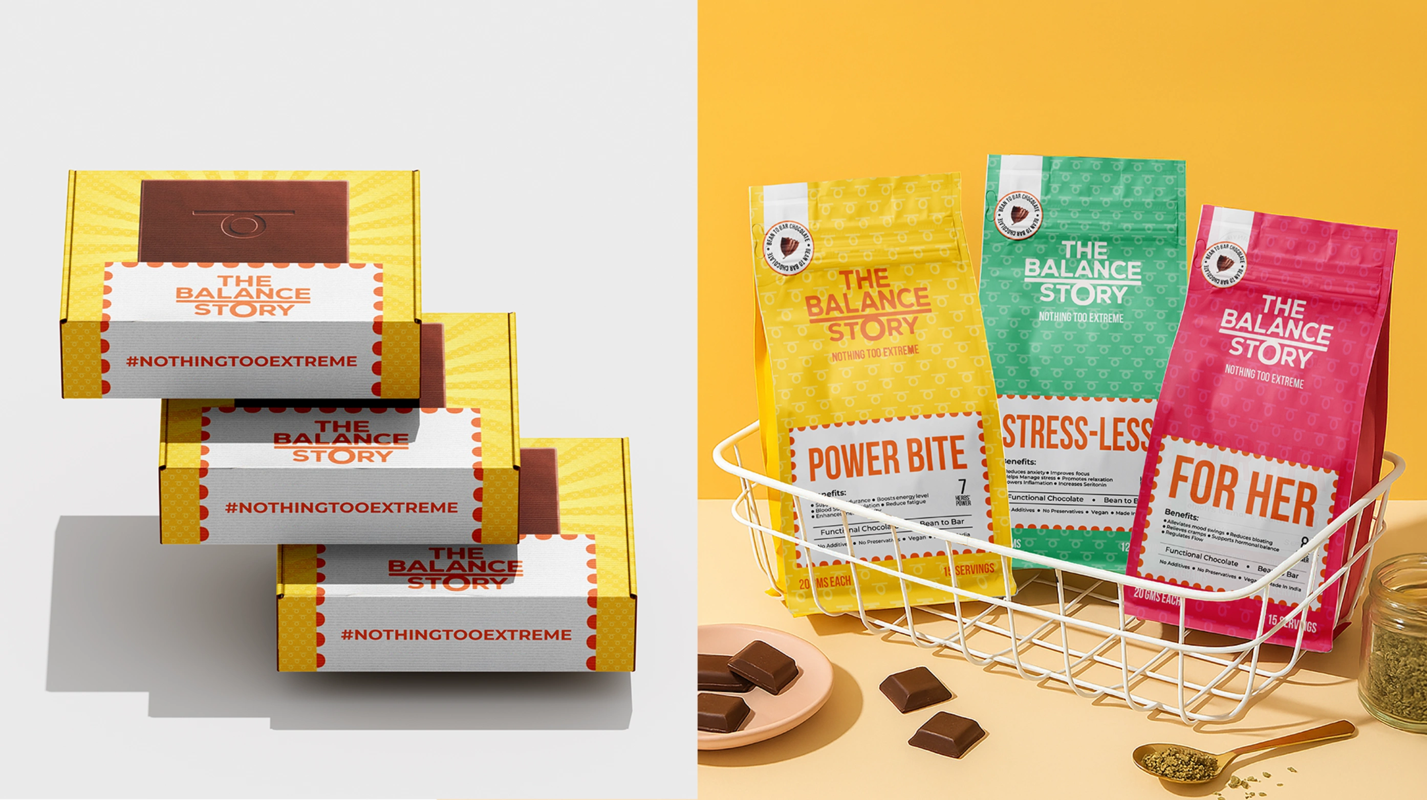
The Balance Story is a wellness-forward functional chocolate brand that fuses herbal benefits with indulgent snacking. The challenge was to create packaging that not only differentiated each herb-infused variant clearly but also conveyed the brand’s ethos - “Nothing too extreme.” The goal was to maintain a balanced, minimalist aesthetic while effectively communicating the product’s functional benefits.
DESIGN APPROACH
The Ask
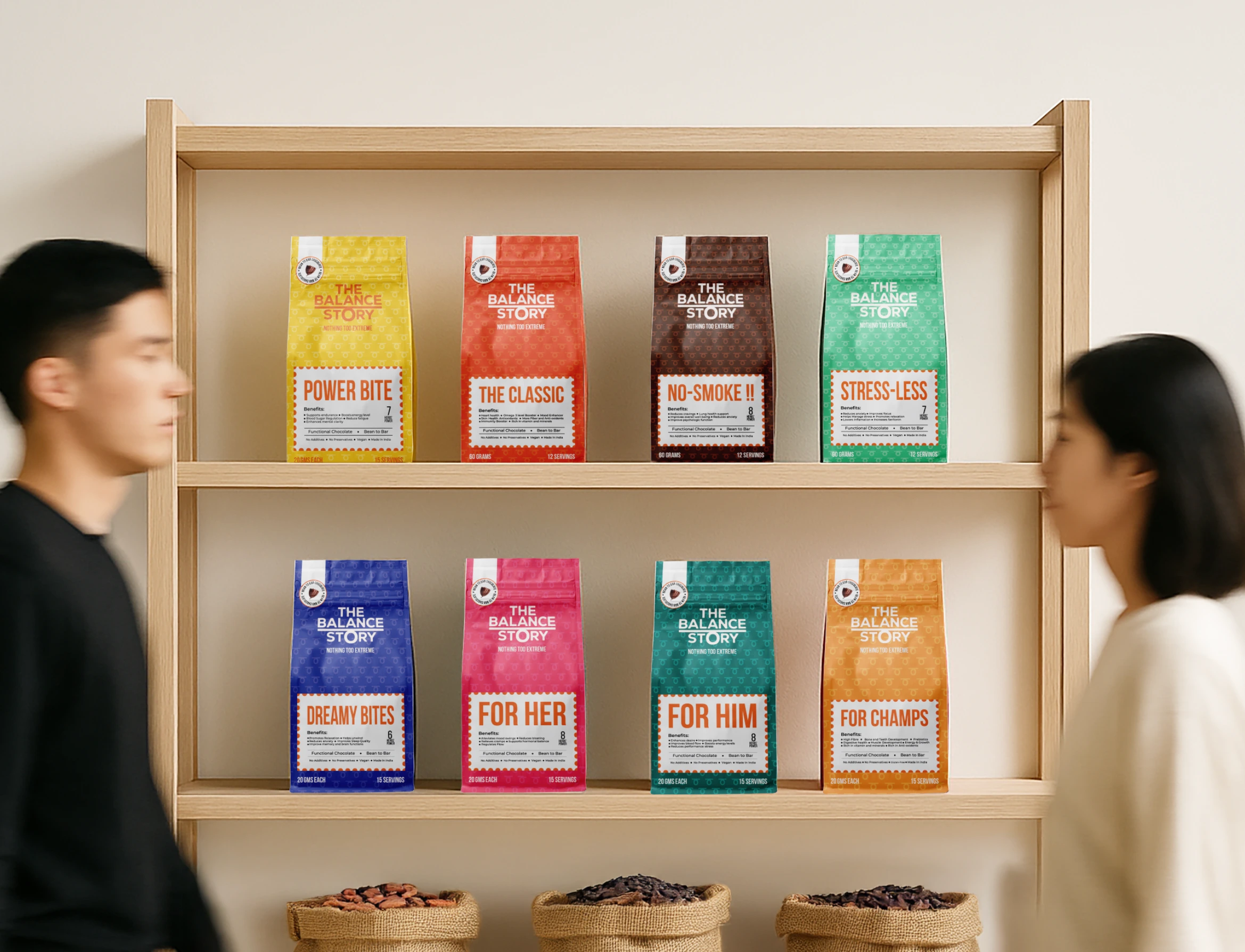
With multiple herb-infused chocolate variants under one brand, the core challenge was achieving clear differentiation on shelf while staying true to the brand's minimalist, calm, and balanced identity. Additionally, the packaging needed to communicate each product’s functional benefits, without leaning into loud, medical, or overly complex design cues.
Solution
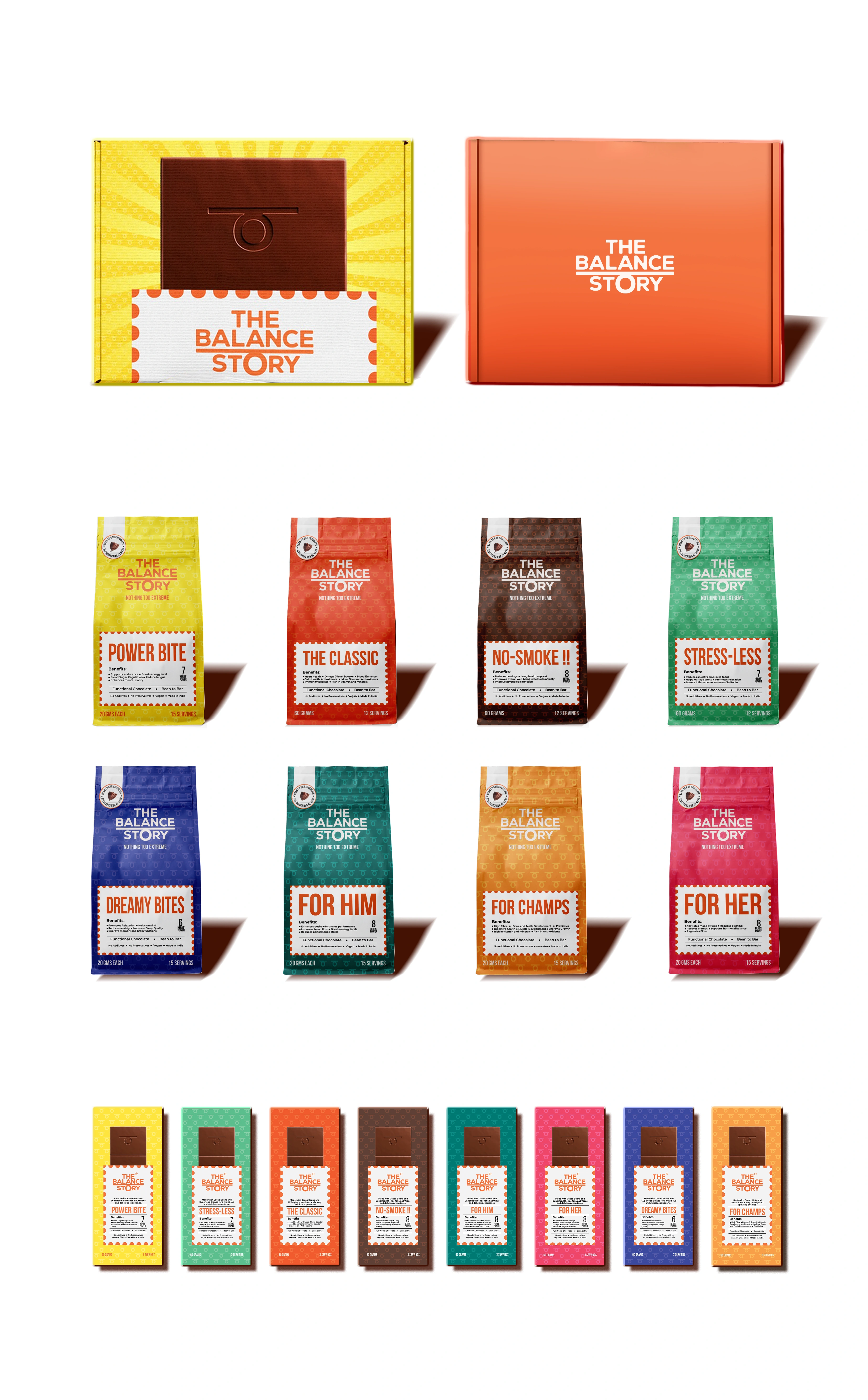
To bring clarity and intention to the shelf, a color-coded system was implemented. Each variant is anchored by a distinct hue inspired by the emotional and psychological associations of its primary function. For instance, a calming light green signals the stress-relief variant, soothing to the eye and aligned with the calming nature of the ingredients.
To subtly unify the entire system, a playful motif derived from the brand’s logo was used as a background texture across all variants. It adds an element of identity and recall without overpowering the clean visual language.
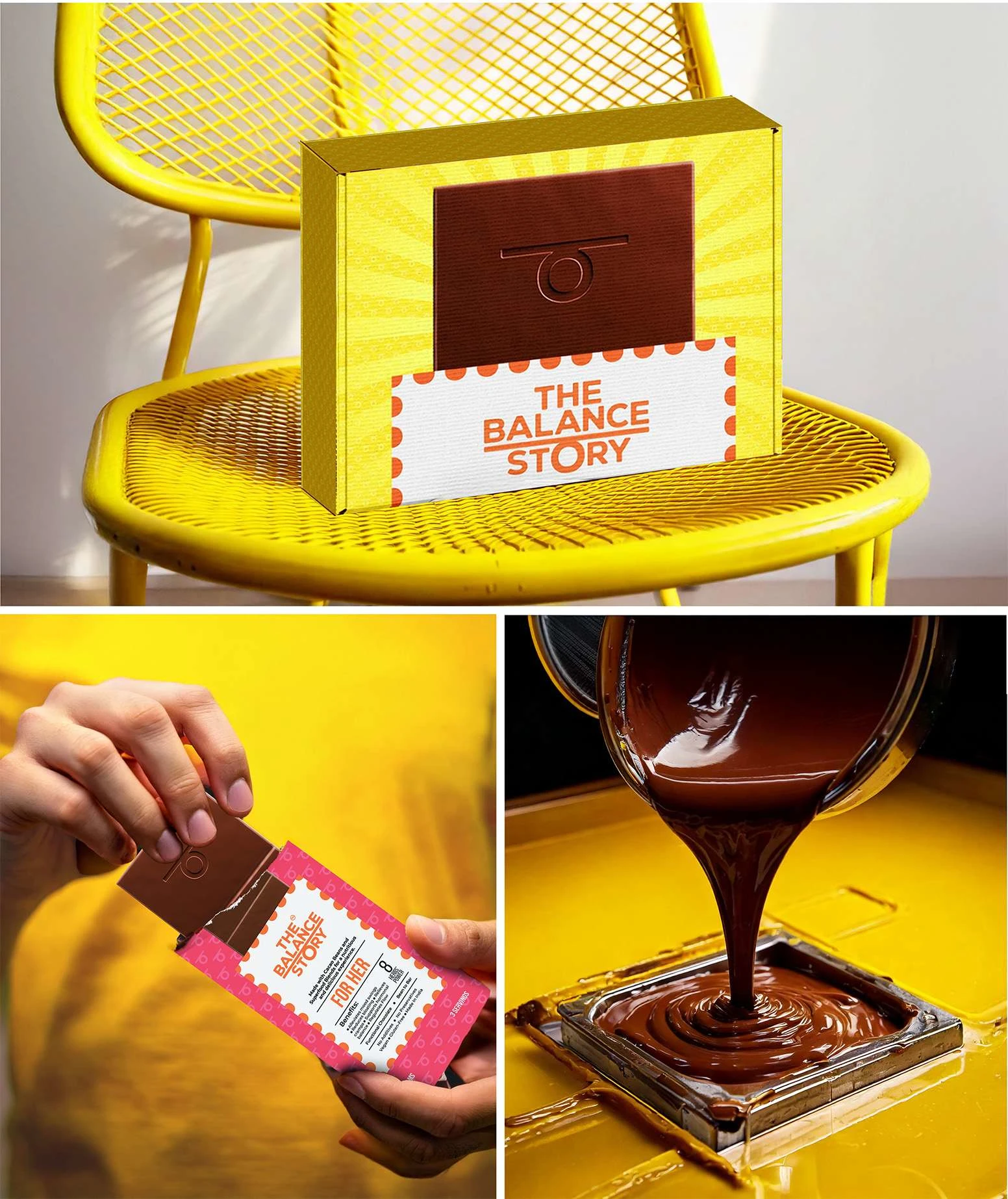
The layout is intentionally simple, allowing high-quality product imagery to take center stage, ensuring immediate recognition and appetite appeal. The chocolate is presented in an honest, almost tactile way - grounding the concept of wellness in something accessible and desirable.
A Utilitarian design approach was adopted for the typography and front slip layout, inspired by the clarity of traditional herbal remedy labels, which were often direct, informative, and purpose-driven. This allowed functional details such as benefits, usage, and restrictions to be communicated efficiently and elegantly, without leaning into a clinical or overly crowded look. The result is a packaging surface that feels informative yet approachable, honest in tone, but never sterile.
The Opportunity
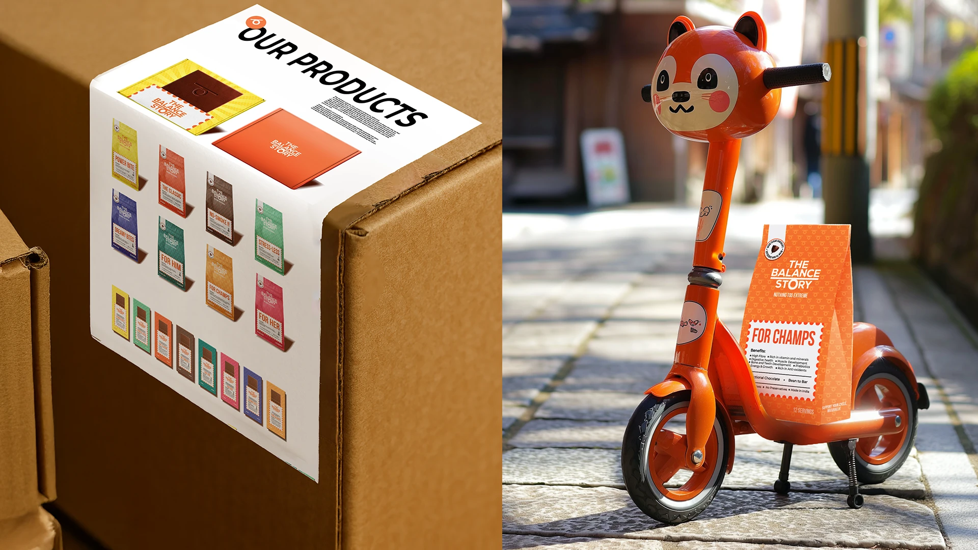
This design framework not only brought harmony and clarity to the packaging but also created a scalable system that can easily adapt to future variants or categories. It positions The Balance Story as a modern wellness brand rooted in trust, making the packaging a functional extension of the product promise - subtle, soothing, and meaningful.

Like this project
Posted Jun 12, 2025
A deceptively playful packaging system for herb-infused chocolates, crafted to stand out in the saturated functional food market.