Wandering Compass Branding & Identity Concept
Amrita Banerjee
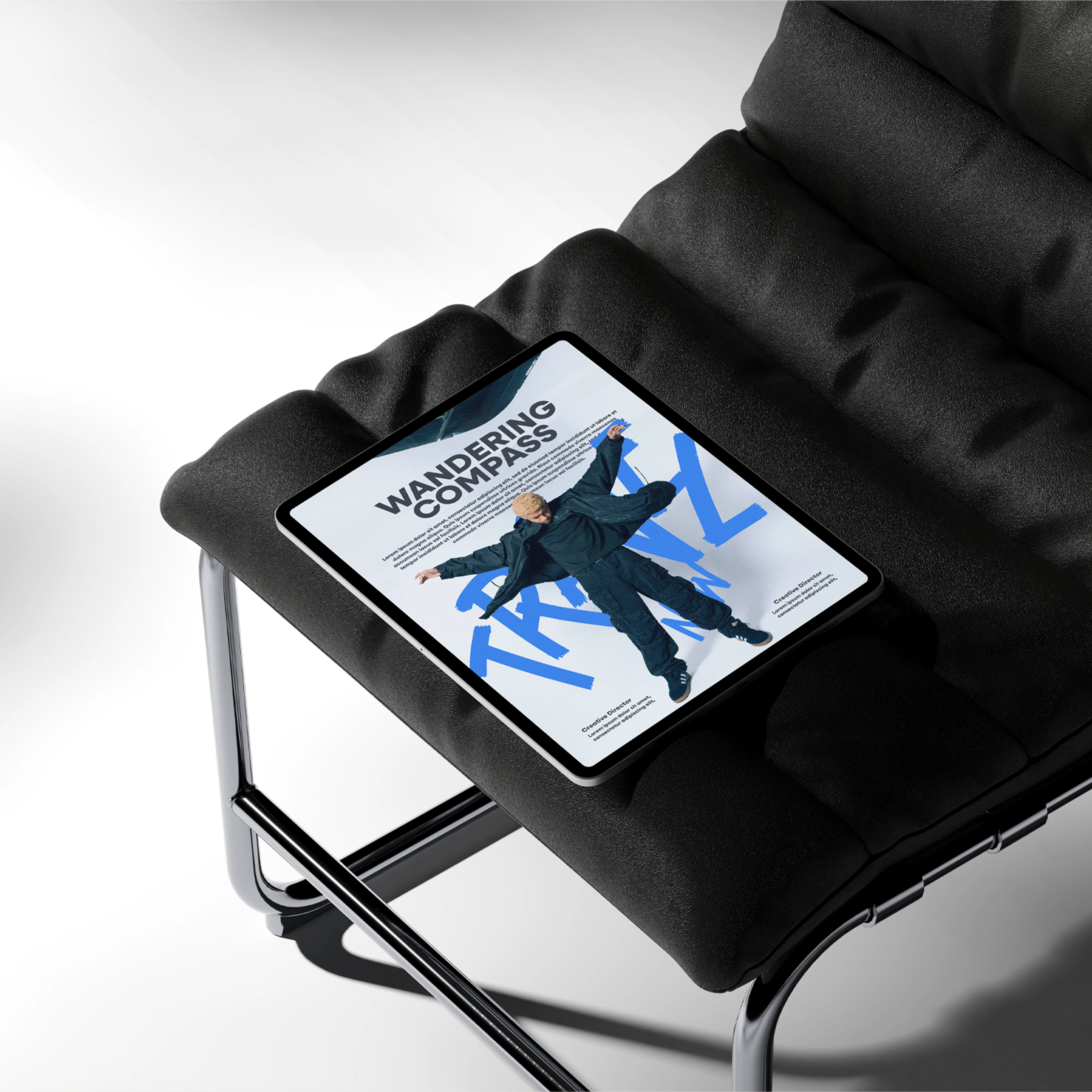
WANDERING COMPASS
Branding Concept
The Ask
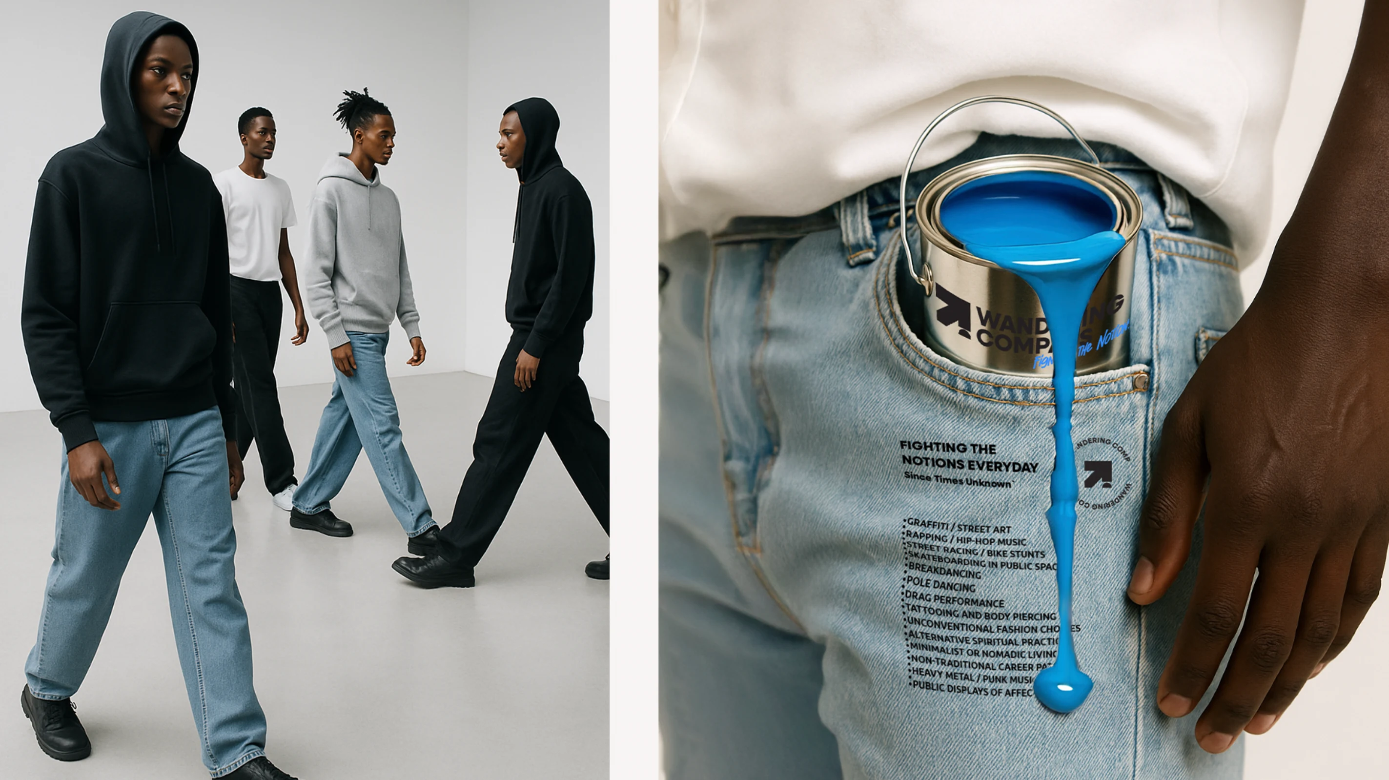
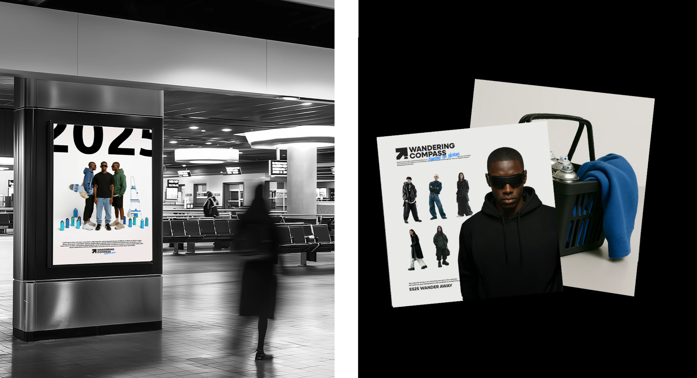
Wandering Compass set out to become more than just a streetwear brand — it aimed to represent a movement rooted in defiance, fearlessness, and self-ownership. The brand needed an identity system that would not only reflect its minimalist, no-frills philosophy but also embed itself in the cultural spaces it belonged to — from skating subcultures to street murals. The challenge was to translate this raw cultural energy into a cohesive, intentional brand world that didn’t feel performative or forced.
Solution
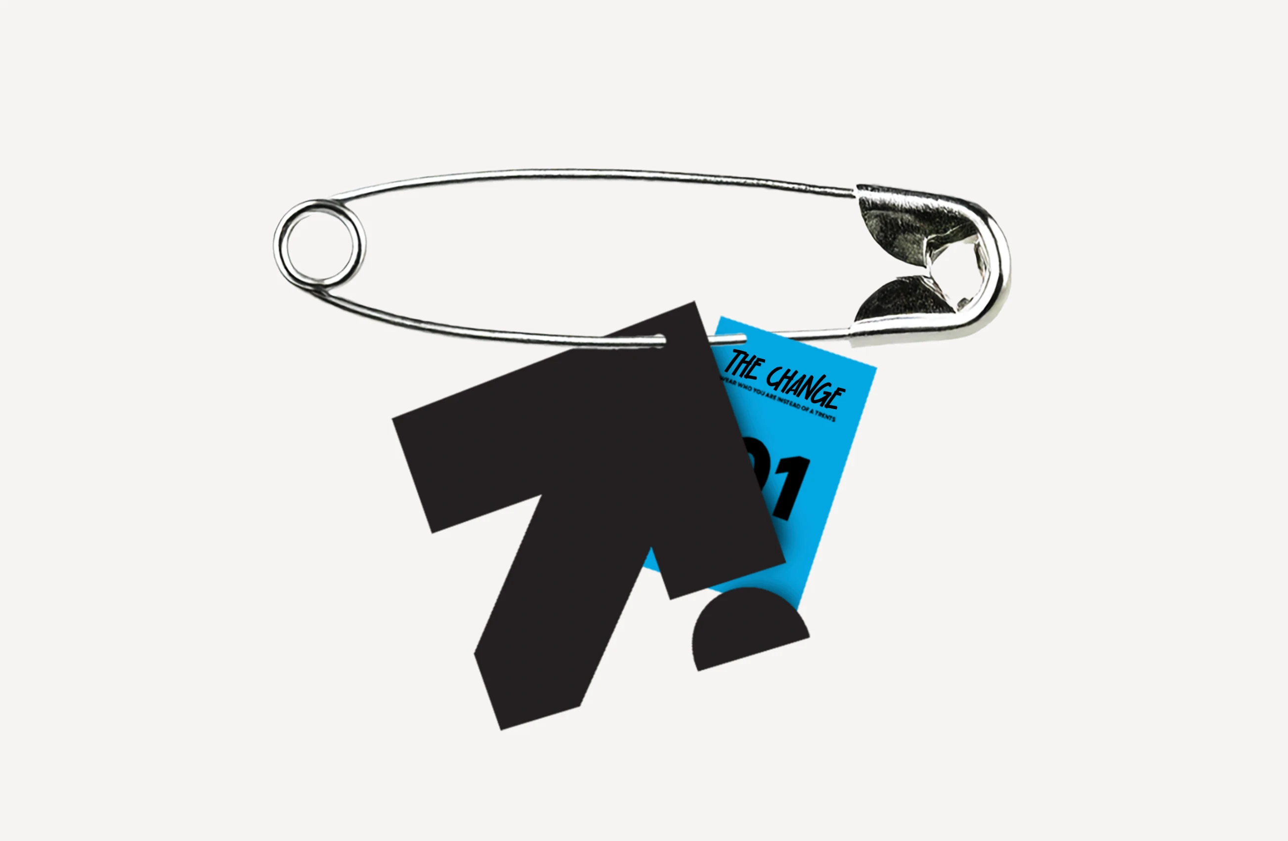
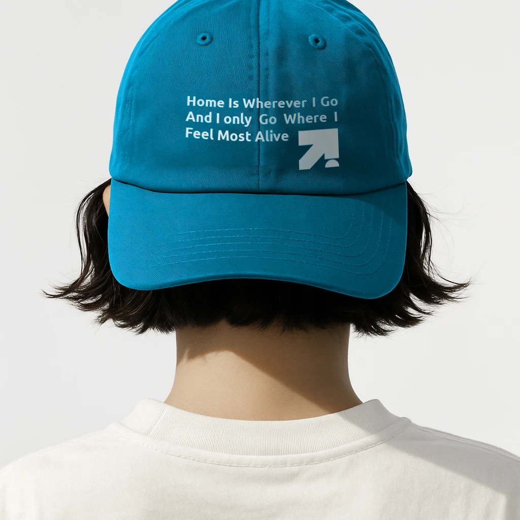
Logo as a Symbol of Defiance
At the core sits a simplified compass needle, deliberately pointing away from true north — a quiet but powerful mark of resistance, instinct, and individuality.
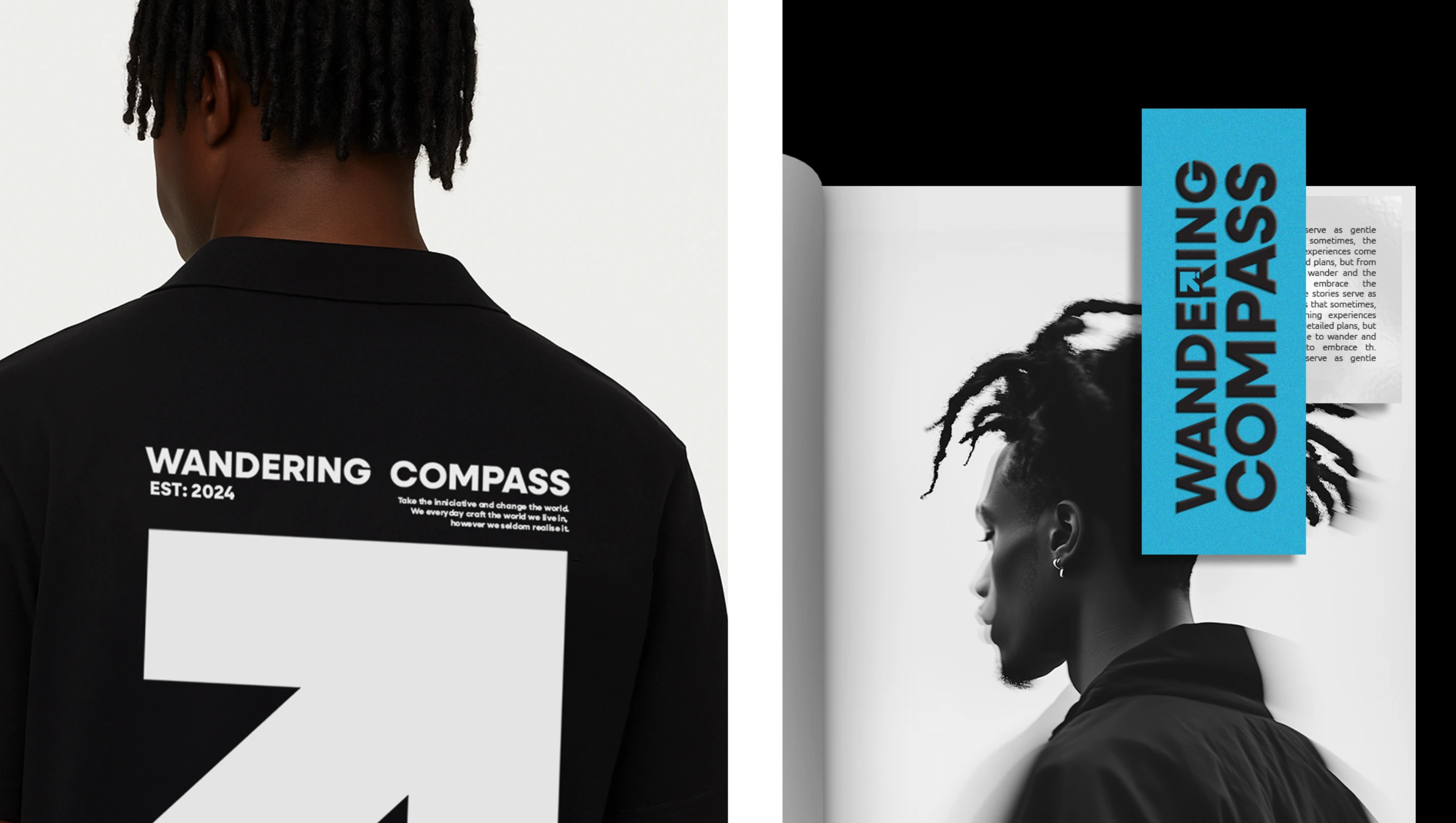
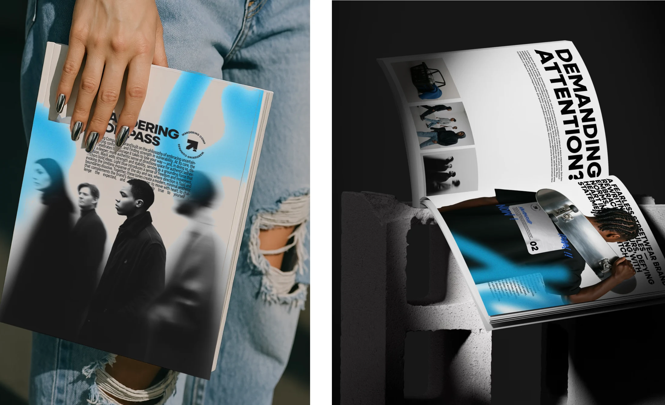
Rooted in Streetwear Minimalism
The branding adopted a stripped-down aesthetic, bold in its restraint and intentional in its simplicity.
A Stark, Confident Palette
A trio of black, white, and grey laid the visual foundation — clear, focused, and unshakably grounded.
Accented with electric blue to inject a jolt of unexpected energy, evoking digital culture, motion, and urban edge.
Typography with Edge
Experimental type brought in rawness and unpredictability, reflecting the rhythm, imperfections, and character of the street.
Cultural Anchors, Not Decorations
Visual references to skateboarding and mural art were woven into the identity not for aesthetic appeal, but as honest reflections of the brand’s roots and the subcultures it exists within.
The Opportunity
While this route wasn’t the final direction taken, it laid the groundwork for a brand that could truly live on the streets and in the culture, not just on shelves. It positioned Wandering Compass as more than clothing but as a platform for individuals who reject the polished path and embrace the freedom of their compass. A concept built not just to wear, but to live in.
Like this project
Posted Jun 12, 2025
While working on a branding project and exploring the potential and voice of the brand, this was one of the directions that was taken and explored.