synopticom / Brand Identity & Illustration
Neringa Nina
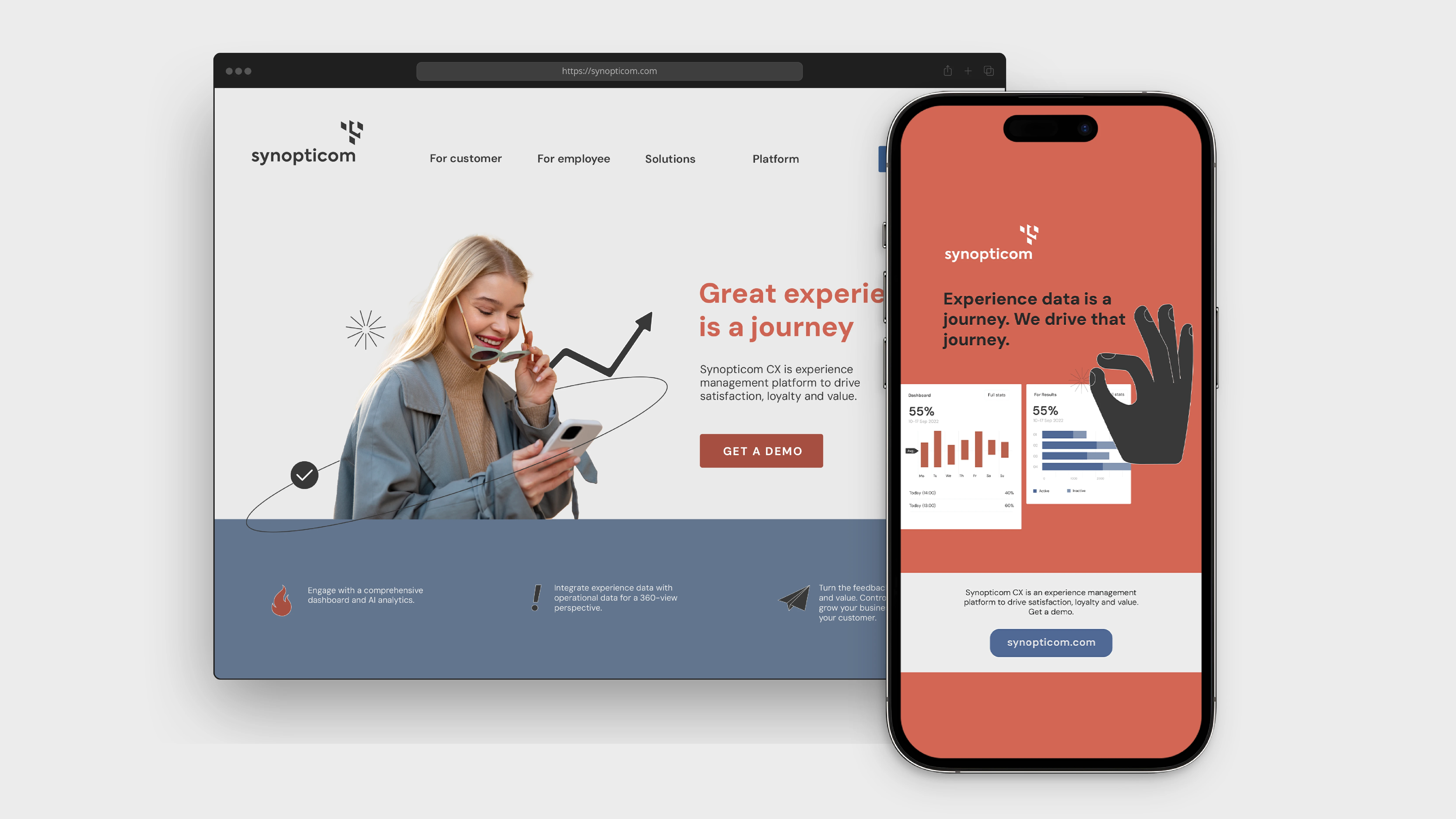
synopticom is a user feedback management service. Their main goal was to rebrand keeping their existing logotype and to create a new identity that would be in line with the Lithuanian tech scene – light, modern, and playful.
The Visual
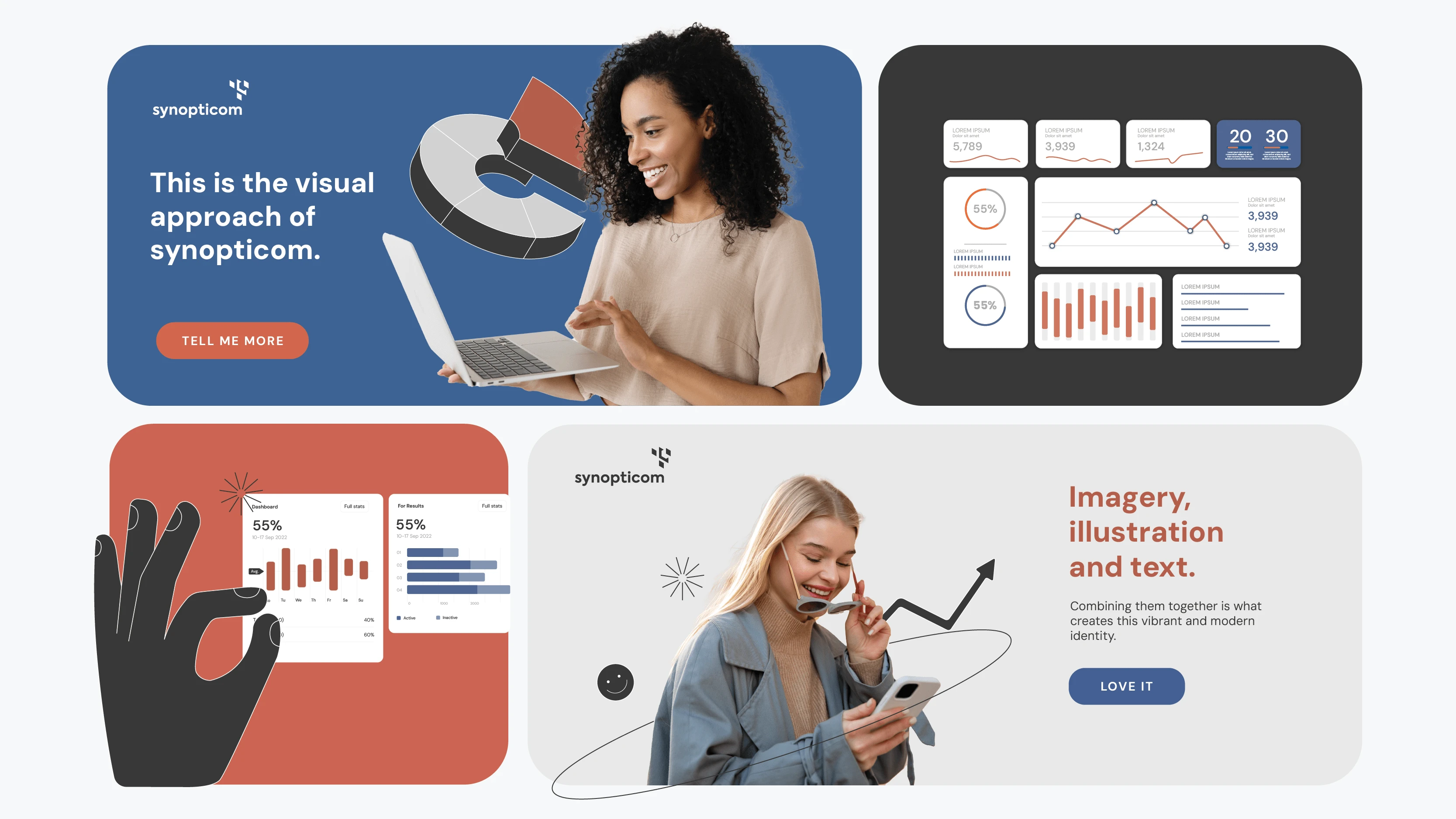
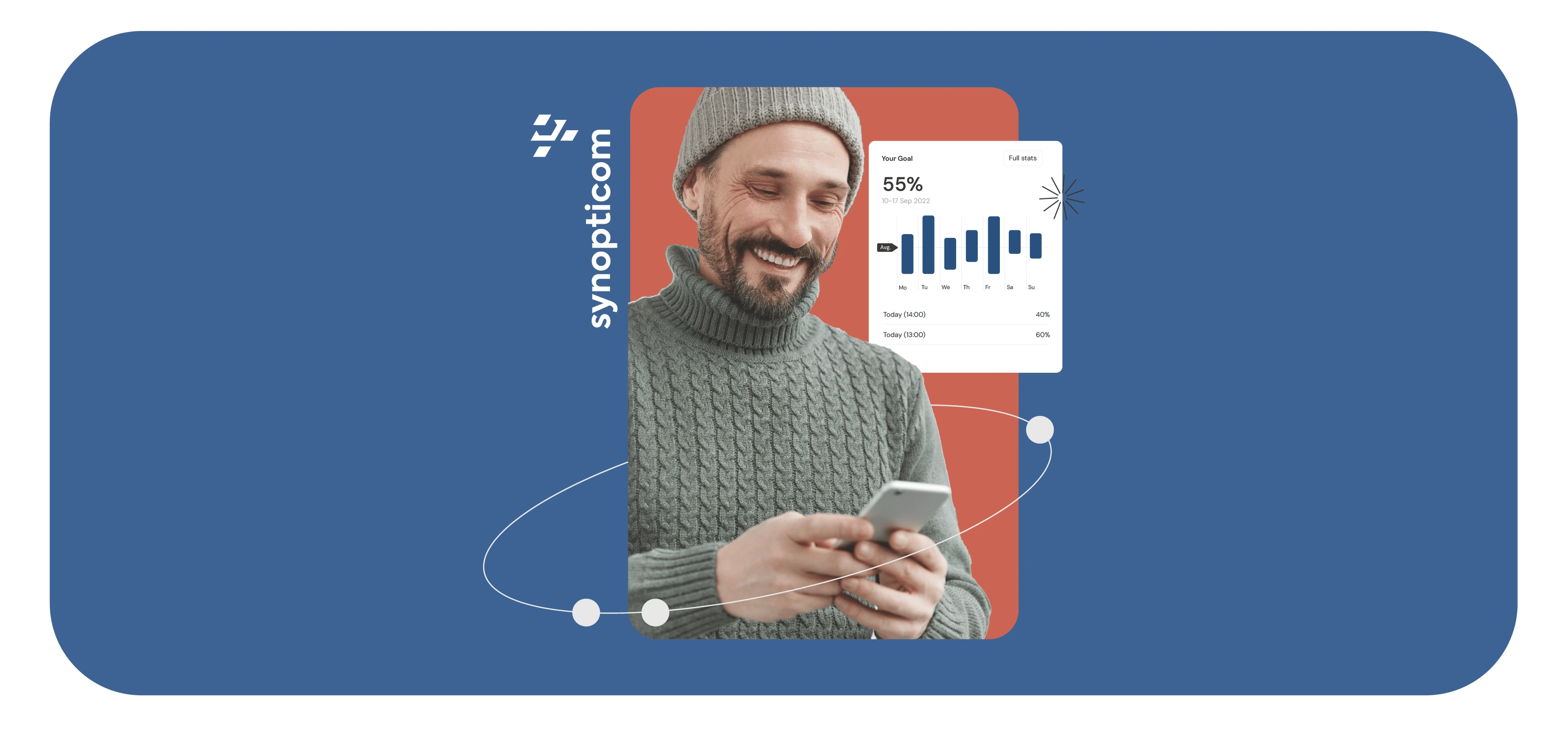
synopticoms’ brand identity combines images of people, dashboards, and bold illustrative elements.
The use of portraits conveys a human touch while dashboards remind of synopticom’s goal of feedback data management and add a clean take on tech services.
The identity as a whole is youthful and alive - in line with the start up scene.
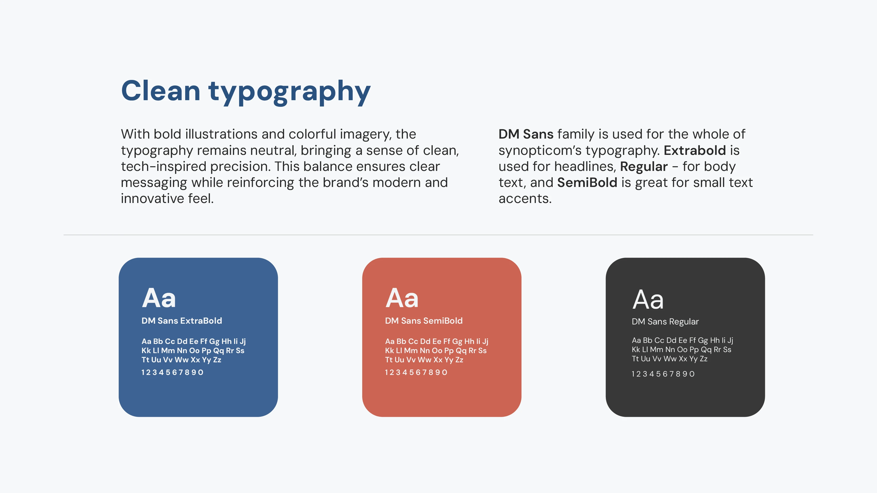
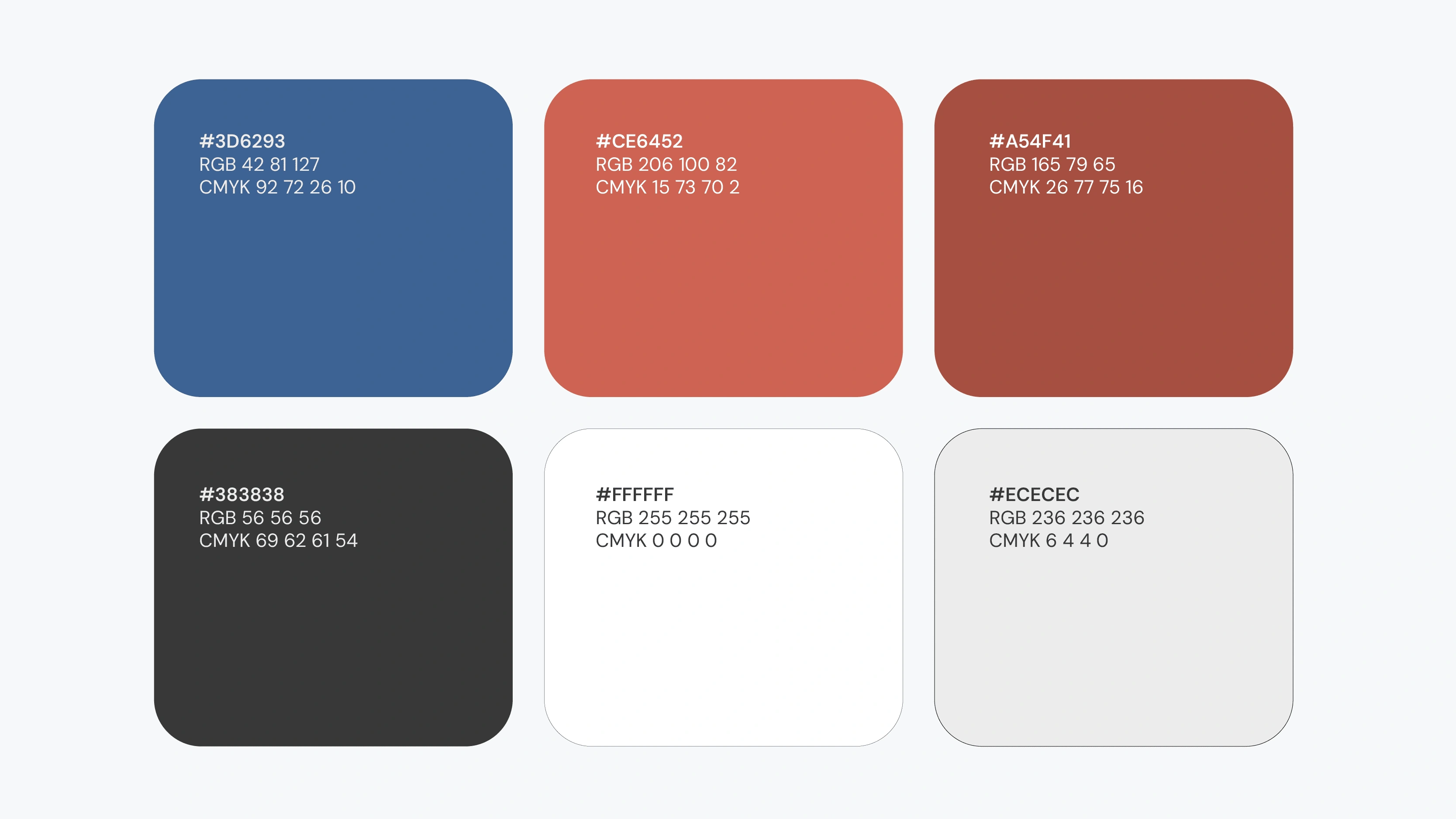
Color & Typography
Illustration
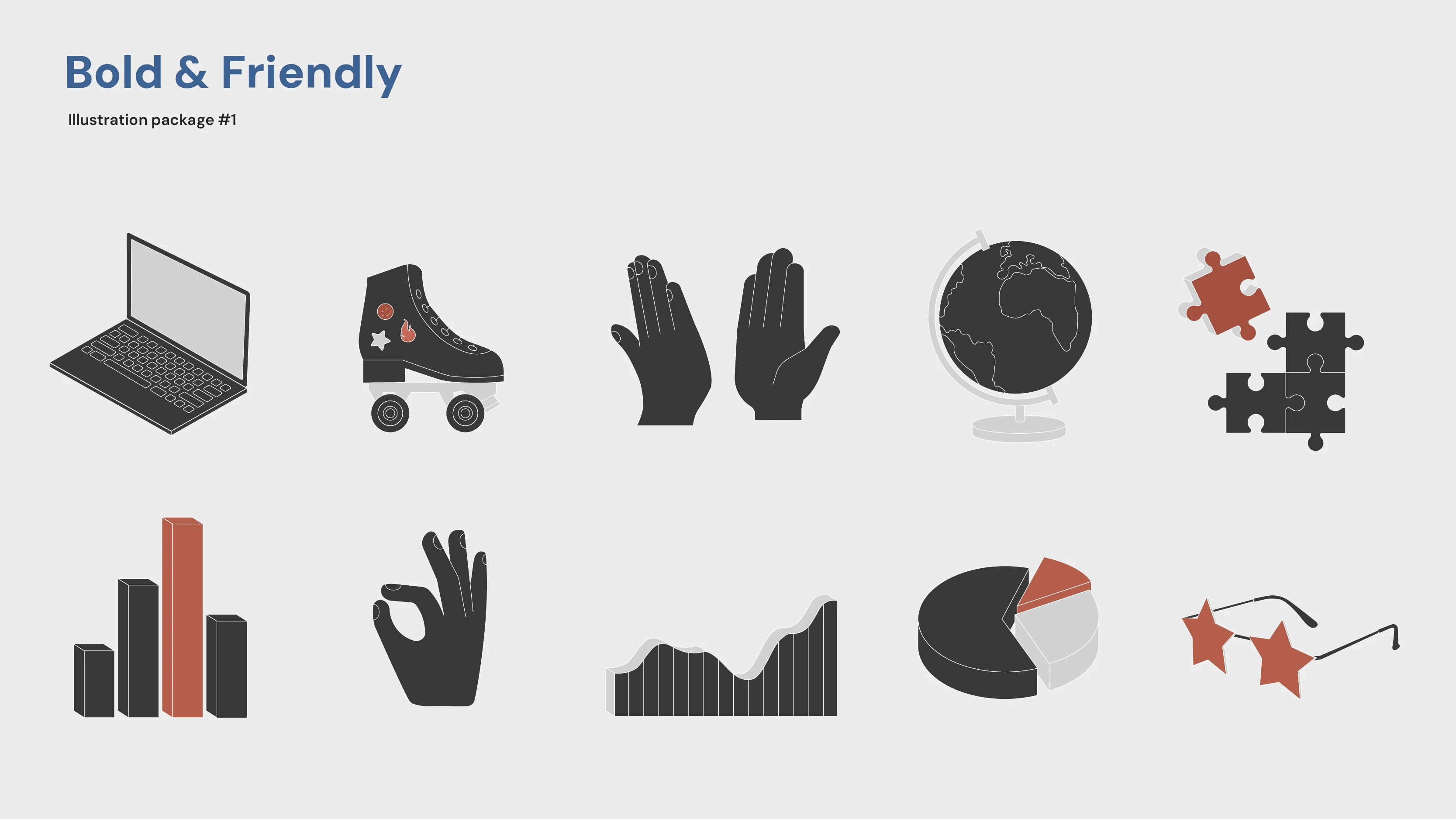
Illustration package #1
The essence of synopticom is portrayed by bulky illustrative elements with bright accents. Stylized graph visuals convey the importance of data and user feedback while hand gestures give a human touch and a sense of support and community.
The face of synopticom is wrapped up by various abstract illustrations inspired by synopticom’s values. These bring zest and a friendly vibe.
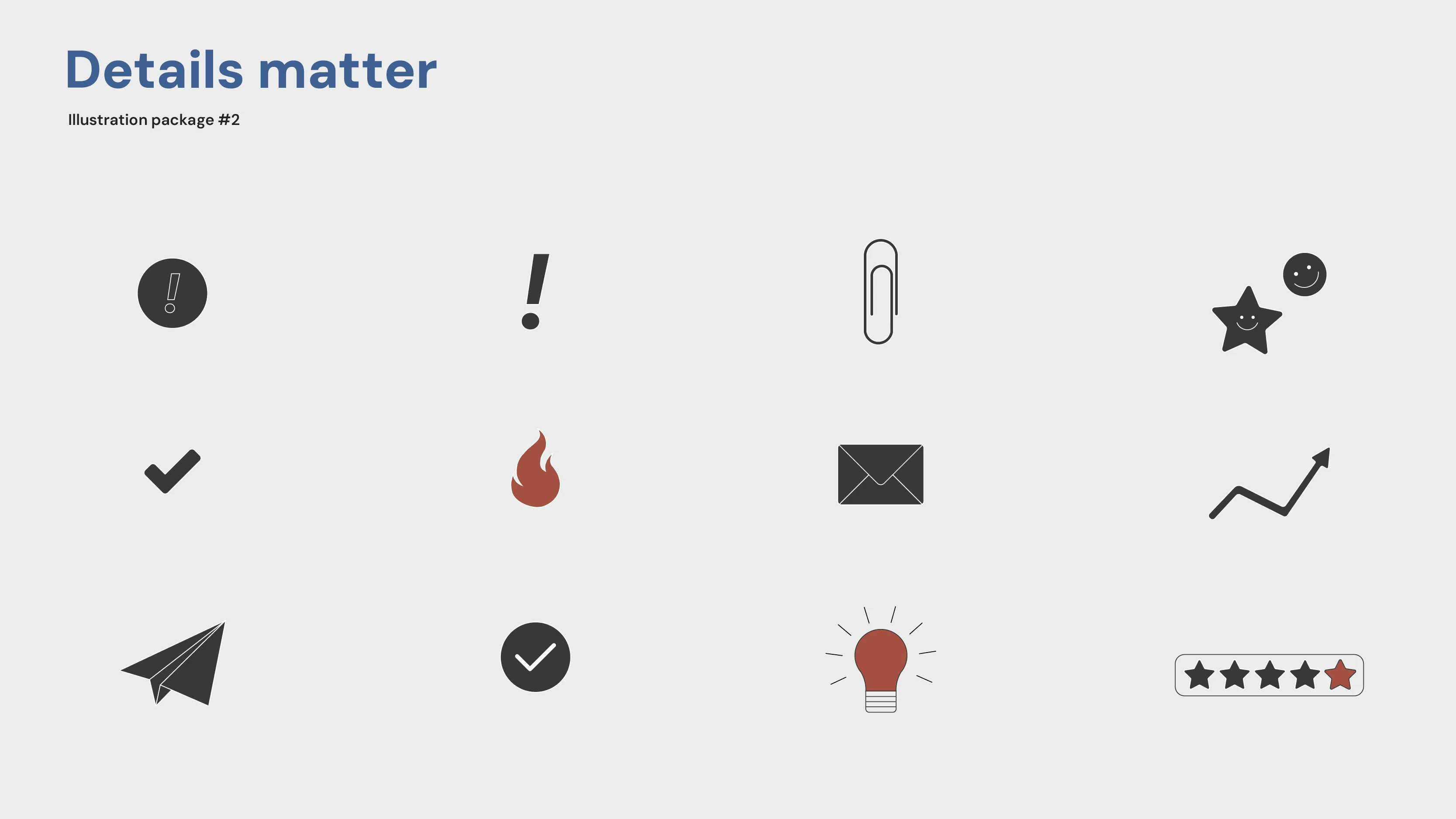
Illustration package #2
Adding life to every visual with small, yet impactful elements and badges.
These simple symbols are meant to be used in combination with other illustrations, creating a fun bunch.
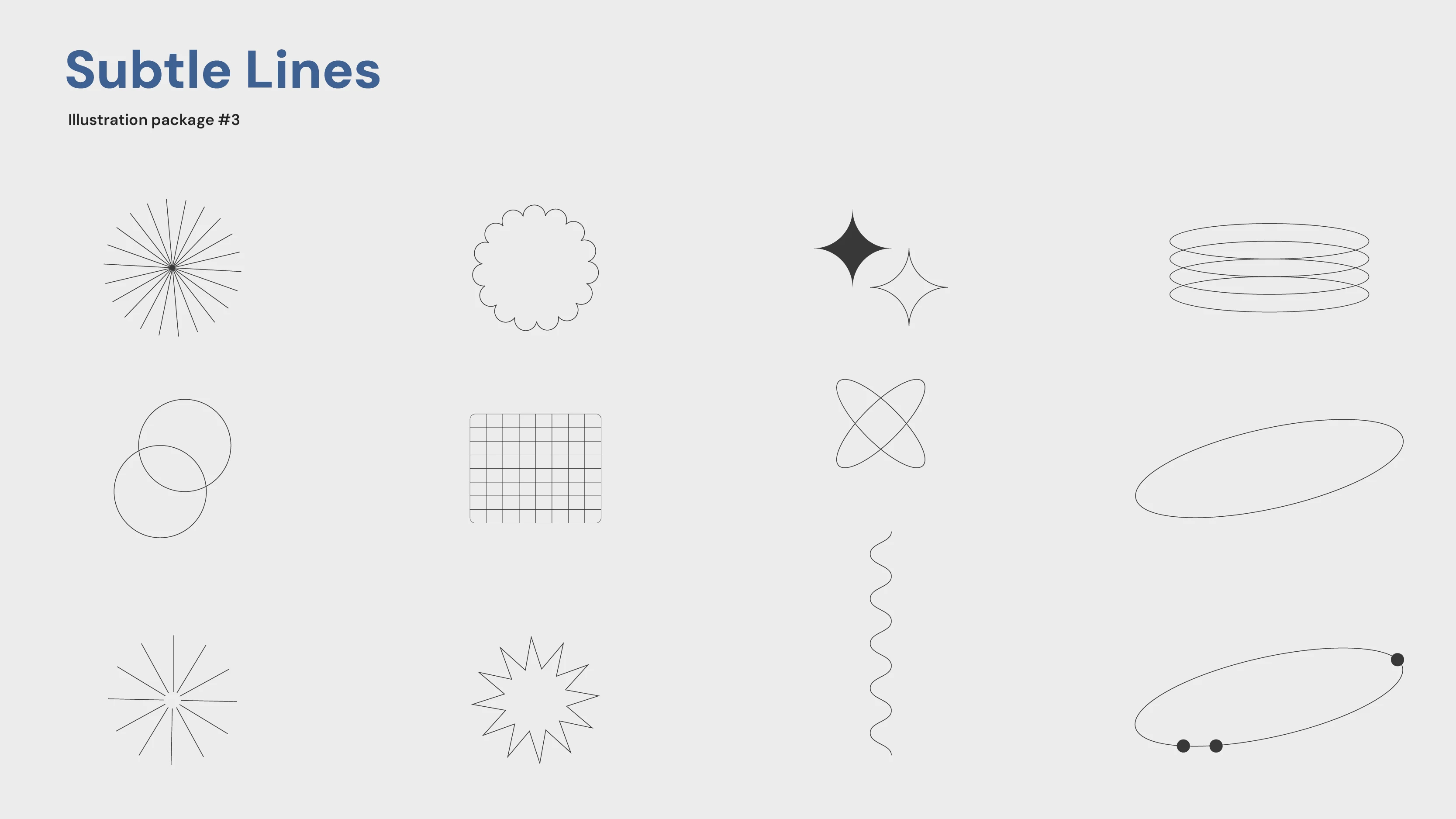
Illustration package #3
Abstract line elements are the glue to a synopticom composition.
Subtle line balances out heavy illustrative elements creating balance and rounding up the visual synopticom experience.
The look

Like this project
Posted Apr 1, 2025
Mashing up bold illustrations, dynamic dashboards, and human portraits to give this tech brand a fresh, human touch with a startup vibe.
Likes
2
Views
14